This week’s #FridayFeed restaurant branding review is Crushcraft Thai Street Eats – in the Quadrangle
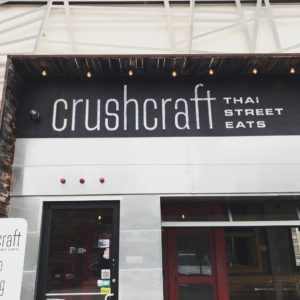
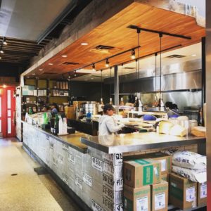
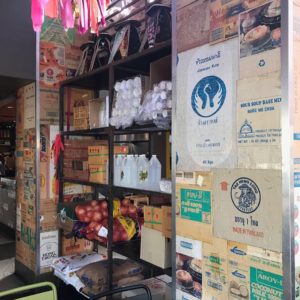
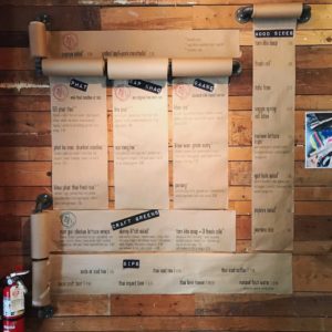
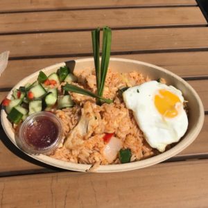
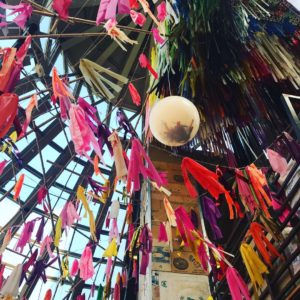
The exterior of the building has a beautiful fractal screen that complements their minimalistic type logo. We love the double screen door entry. Right inside we were met with an open kitchen full of great sounds and grill smoke – this really sells the “street food” part of the concept. I love it when brands incorporate their ingredients into the design, i.e. big bags of rice and cans, jars, boxes and crates of stuff with cool colorful labels. When it works, it really adds to the authenticity. They have an amazing spice bar but it is lacking DANGER signs on a few of the items. Danny found out first-hand that crushed Thai pepper is not the same as crushed red pepper!!! (Insert red jalapeño emojis). This particular location has a very unique layout, creating multiple dining environments including an outdoor patio. I’d like to see how the interior design translates to a typical “box.” We’ll have to go see the Frisco location. In summary, while we discovered we might not be Thai street food fans, we love the freshness, color and presentation of the food. The interior design was great and website was solid. MJ gives this concept an A. Danny gives this concept a B+.
Every Friday, Studio B Dallas visits a local fast casual concept for lunch to critique the brand (and eat lunch). Three rules apply: it’s a concept we haven’t been to or it’s been in the restaurant news and it’s within 10 miles of our office. Wait, four rules – it can’t be sushi. Danny doesn’t do sushi.
If you have any suggestions on where we should eat next, feel free to leave it in the comments. Look for our restaurant branding reviews each Friday! MJ & Danny
