This week’s #FridayFeed restaurant branding review is Dickey’s Barbecue Pit on Wycliff by the Tollway.
Order Up!
Danny and I were looking at our categories and realized we hadn’t reviewed any barbecue. Oddly, there are very few concepts that fall into the Fast Casual BBQ space but Dickey’s does! Dickey’s has 512 locations with 137 in Texas.
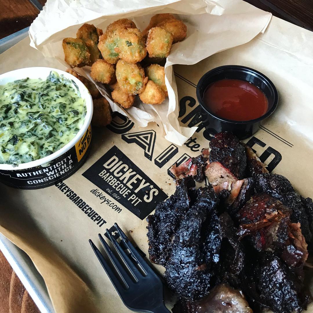
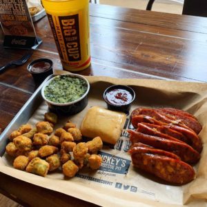
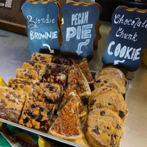
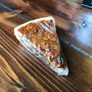
I love brisket but I also love pretty much everything barbecue. I was so happy when they added some unique sides to the menu a few years back. I always get the creamed spinach and I never pass up fried okra. This trip I was told they had a new item: BURNT ENDS! Get out! I got ‘em and they were delicious – see my photos. Danny ordered the jalapeño cheese sausage, the creamed spinach and fried okra. We’re SUPPOSE to get different things but he didn’t get the memo. We also decided to grab a piece of pecan pie but only so we could test how difficult this was going to be to unwrap and eat. As much as I love you, Dickey’s, please put this pie in a container or on a plate? Saran wrap is not working. I worked through it but it wasn’t pretty.
Environmental Branding:
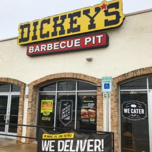
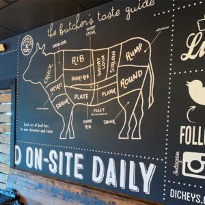
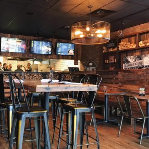
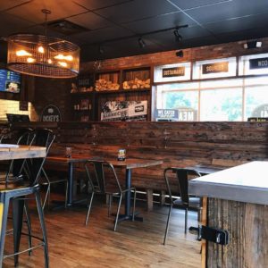
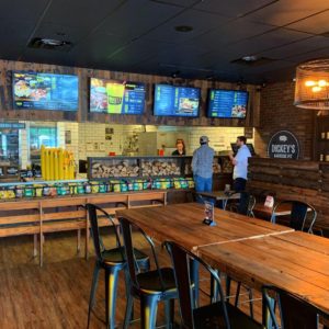
The Wycliff location is the Corporate Testing and Training store so this is where all the cool stuff is. Also – there are always lots of corporate types in there training so the service is fantastic. The outside of this store is not impressive but walk inside and “instant cool.” Nice warm decor and furniture with lots of attention to the details, like little chunks of wood stacked up at the line. I have to assume this is Hickory wood since that’s what gives their BBQ its signature flavor. Great light fixtures and wall graphics. This location also has a secondary room that can be closed off with a big wooden slat sliding door – a great solution for the space that adds to the overall decor. They also have a large glass-front meat cooler behind the register that shows off big cuts of meats. I love this. I noticed on this visit, they are testing digital menu boards. They look great and have enough interactivity with rotating images but not too much that it’s distracting.
We asked one of the “corps” if he knew who designed the interior and graphics. He put us in touch with the Director of Communications, Ashley Richardson, who told us this: “we have an in-house design team that is responsible for all graphics on the Walls inside the Dickey’s stores. Our partner, Stanford Sonoma, is responsible for all furnishings and fixtures. Together, we think they create a great vibe to enjoy our authentic, Texas-style barbecue!” We agree Ashley.
Branding DNA:
Classic logo. Good name. Rich history and BEAUTIFUL, MOUTH WATERING photos of food. They also do a great job with their “brand language.” Example – they have a sandwich called the CUEBEN, love it. There are a few new copy lines in use that I like also – “SMOKED ON SITE” and “LEGIT. TEXAS. BARBECUE. There’s so much you can do with BBQ words and phrases, like PIT MASTERS, PIT CREWS, LOW & SLOW, IT’S NOT LEGIT WITHOUT THE PIT. That reminds me of a cool T-shirt I saw online that says “MY HUSBAND SMELLS LIKE BRISKET”. Love that.
We’re big on packaging so we want to give a shout out to the team who designed the take out bags – those are legit and we love all of the iconography. The BIG YELLOW cup, of course, is an icon of the brand and fans take selfies with the cup all over the world to show their love of the brand.
Digital Branding:
Dickey’s has a great website that is easy to navigate. When you first visit the site, you’re greeted with a big scrolling banner full of beautiful food photography with hints of marketing sprinkled in. Their Instagram and Facebook features mouthwatering food videos and imagery, great lifestyle photography, and just like their website hints of marketing. Overall, Dickey’s has amazing digital branding across the board!
–Danny
Score:
MJ and Danny give it an A.
#FridayFeed:
Every Friday, Studio B Dallas visits a local fast casual concept for lunch to critique the brand (and eat lunch). Three rules apply: it’s a concept we haven’t been to or it’s been in the restaurant news and it’s within 10 miles of our office. Wait, four rules – it can’t be sushi. Danny doesn’t do sushi. If you have any suggestions on where we should eat next, feel free to leave it in the comments. Look for our restaurant branding reviews each Friday! MJ & Danny
- Dickey’s Barbecue Pit
- Interior Branding
- Interior Artwork
- Burnt Ends
- Jalapeño Cheese Sausage
- Dessert Selections
- Pecan Pie Packaging
- Interior Decor
- Interior Decor 2
- Digital Menu Boards

