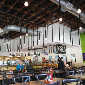
This week’s #FridayFeed restaurant branding review is Liberty Burger in Lakewood.
I LOVE this brand. The Lakewood interior was very functional and still engaging. This concept has a casual little bar, beverage station and seating flanked by the queuing line and order counter. Restrooms down the back hall and some patio seating, it checks all the boxes. What I really like about this brand are the words and the food. They really put in the time to craft their brand language. You only have to read the menu names and descriptions to know what this brand is about. Their tagline is Give me Liberty or Let Me Starve. It’s as if they sat in a room and wrote down every word, phrase, historical and television reference they could think of that has to do with Liberty and created their own brandspeak dictionary. Branding specialists live to have clients that understand how important this is.
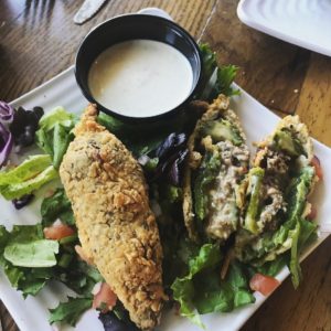
Let’s move on to food. My burger, Chillerno, was a custom blend of tenderloin, brisket and chuck. As this series takes off, you will find out that I love brisket like…you don’t even know. Conjures thoughts of Rodeo Goat’s brisket blend Terlingua Burger, yum. Ok so then they have the most beautiful steakhouse style of onion rings ever. We also ordered some Torches – Liberty Burger’s take on yum-stuffed jalapeño poppers. See photos to appreciate.
I have three branding comments. The pendant light choices in the Lakewood space were just “too much and too many.” Secondly, while I like digital menu boards, they were way too bright and you’re standing less than 2’ from them in the queue line. I think this is an easy solve – just adjust the brightness or put the menu on a dark grey background for better readability. Lastly, I hate to say that I don’t love the logo icon and the green brand color. That Liberty name just begs to have some red in it. Otherwise, Mariel, I think your concept is awesome and I’m sure you respect my “freedom of opinion!”
Liberty Burger co-founder Mariel Street might crave liberty from constant association of her name with well, you know who. If you don’t, read the full page Dallas Business Journal piece here.
Their website totally delivers. MJ gives this concept an A and Danny gives it an A+
Interesting side note – there was a fridge on the counter with Joy Macaron ice cream sandwiches in it. Joy makes a second appearance in a fast casual brand review. See first.
Every Friday, Studio B Dallas visits a local fast casual concept for lunch to critique the brand (and eat lunch). Three rules apply: it’s a concept we haven’t been to or it’s been in the restaurant news and it’s within 10 miles of our office. Wait, four rules – it can’t be sushi. Danny doesn’t do sushi. If you have any suggestions on where we should eat next, feel free to leave it in the comments. Look for our restaurant branding reviews each Friday! MJ & Danny
- Liberty Burger Lakewood
- Logo Signage
- Liberty Burger’s Amazing Onion Rings
- Cool beverage bar, check out the bikes
- Digital Menu Boards
- Liberty Burger’s jalapeño “Torches”
- Give me liberty or let me starve!


