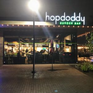
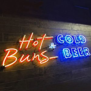
This week’s #FridayFeed restaurant branding review is Hopdoddy in College Station, Texas, Whoop!
Order Up!
Hopdoddy is an Austin-born brand and has 35 locations in Arizona, California, Colorado, Florida, Oklahoma, Tennessee and Texas (22 TX locations). You enter to an order line which directs you to the counter where you can order from a menu of “burgers, sides, shakes & bar”. They tout handmade buns and handmade burgers in their in-house bakery and butchery – most of which have cool names like the Dubliner and the Buffalo Bill and maybe they’re a little “famous” for being one of the few places that has the Impossible Burger – a burger made entirely of plants. Photography and presentation both excellent. They also have a cause – the Goodnight/Good Cause burger for which they donate a $1 for every one purchased. They have raised more than 1 million dollars for local charities. That supports their culture message that they are “part of the neighborhood.” I like it.
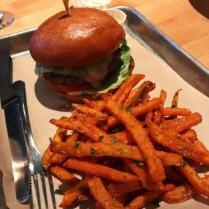
This FridayFeed review was a road trip version. Danny didn’t make the trip, but I took 4 college kids with me for this Friday Feed so everyone ordered shakes, burgers and fries. The shakes had those “colossal” straws and looked pretty damn good. Sides menu is pretty simple – fries, fries and salad. I ordered the hand cut sweet potato fries which were good. All of the food was good but after Rodeo Goat, the burger bar is really high so I’d have to put the burger in third place behind the Goat and Liberty Burger.
Environmental Branding:
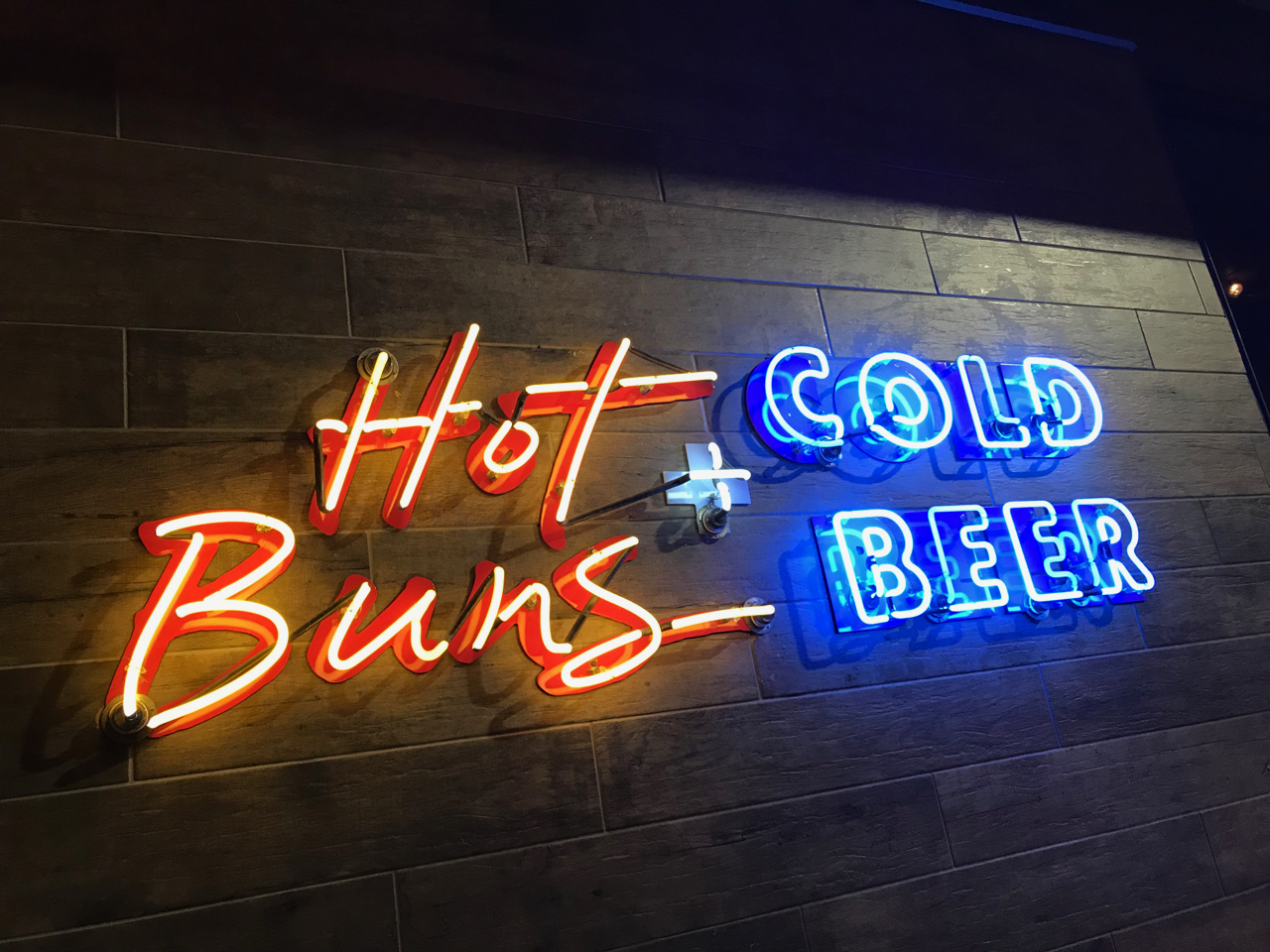
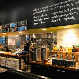
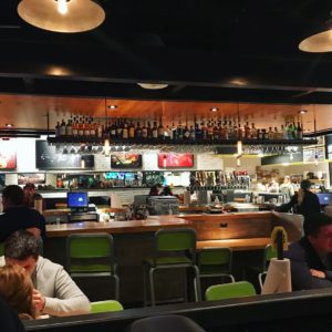
Hopdoddy (“hop” is for the beer and “doddy” is a Scottish term for cows) is a cool burger chain that doesn’t feel chain-like. I’ll start with the lighting and ambiance. Warm woods, perfect lighting, inviting atmosphere all around. There’s a bar in the middle of the space and seating around the perimeter. A mix of high booths and tables line the wall and There’s a nice upholstered banquette along the order line. Like many brands, they have an open kitchen where you can see people busy prepping orders. Not all open kitchens look that great, but this one looked clean and organized and the sounds and smells really added to the overall ambiance.
The downside to the seating was that we couldn’t all sit together. I was surprised that there wasn’t a community table – who doesn’t design a community table anymore? Maybe it was just this location. 9:30 pm dinner in a college town on a Friday night, this place was hoppin’.
Branding DNA:
The College Station Hopdoddy interior and exterior was designed by Levy from Austin. A google search indicates that Catie Lucey is responsible for a lot of Hopdoddy graphic design – posters and new menus. A disclaimer on her site indicates the logo was designed by a *previous designer.
Digital Branding:
Hopdoddy’s website is one of the better restaurant websites out there. It’s fairly easy to navigate and uses a great flexible grid layout that keeps things interesting. Their Instagram and Facebook do a good job at mixing marketing images and food photography together, but could use more lifestyle imagery like they have on their website. Lifestyle images are key because they let the customer know what type of atmosphere to expect when they visit one of your locations. Mouthwatering food porn will draw people in, but lifestyle photography will make them take action and visit your restaurant.
–Danny
Score:
MJ gives it an A. Danny gives it an A-.
#FridayFeed:
Every Friday, Studio B Dallas visits a local fast casual concept for lunch to critique the brand (and eat lunch). Three rules apply: it’s a concept we haven’t been to or it’s been in the restaurant news and it’s within 10 miles of our office. Wait, four rules – it can’t be sushi. Danny doesn’t do sushi. If you have any suggestions on where we should eat next, feel free to leave it in the comments. Look for our restaurant branding reviews each Friday! MJ & Danny
- Hopdoddy Burger Bar
- Open Kitchen
- Bar Area
- Primetime & Sweet Potato Fries
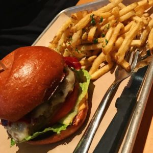
- The Impossible Burger
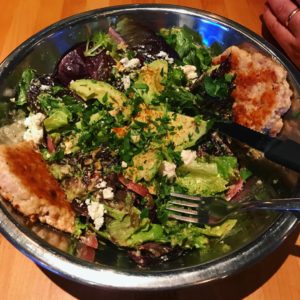
- Farmer’s Market Salad
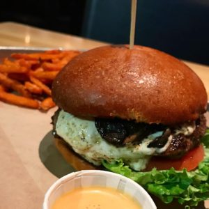
- Magic Shroom Burger
- Interior Neon

