START. by maybe changing your name but DON’T STOP cooking those awesome Start Burgers!
This week’s #FridayFeed restaurant branding review is START on Lemmon Avenue. The concept a healthy FAST FOOD restaurant with a drive through. Think McDonalds with tasty, healthy food! Start is a Dallas based brand with 2 locations open from 7am to 11pm, serving breakfast, lunch, dinner and catering.
Order Up!
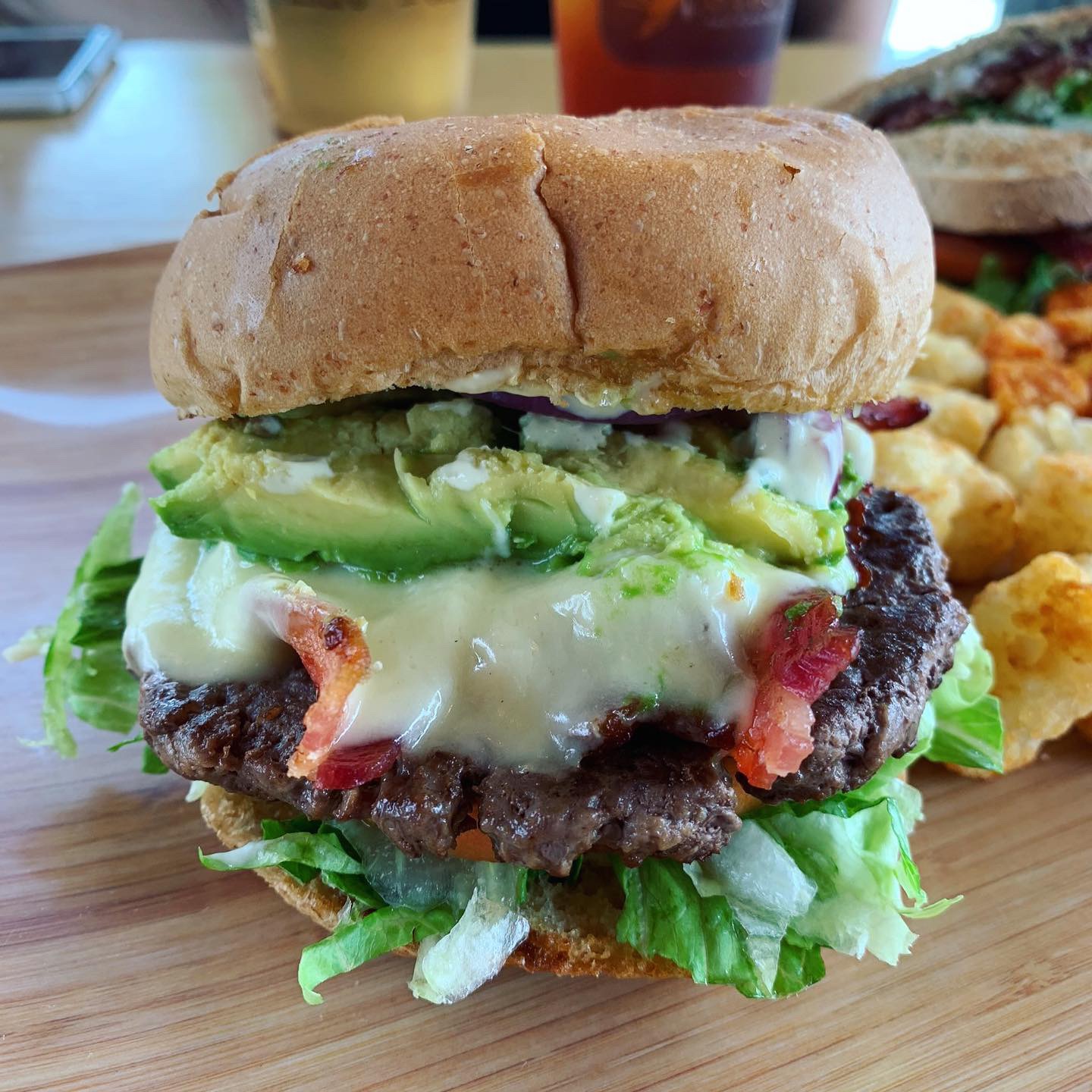
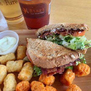
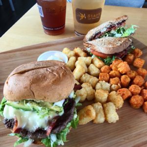
I’m going to start with the START Burger. In a word, amazing. Seriously, this burger competes with my unhealthy love of Rodeo Goat. The Start Burger is a grass-fed beef burger patty, applewood smoked bacon, white cheddar, red onion, avocado, tomato, romaine lettuce and homemade dijonnaise on a really fresh and tasty wheat bun. I know that ingredient list doesn’t sound crazy unique, but it was so fresh and the flavors were all just perfect. Danny ordered the BLT and sweet potato tots. He said it was the second best BLT he’s ever had; East Hampton’s version being his favorite.
They don’t fry anything but the baked tater tots were crispy and delicious. They make their own mayonnaise and dressings. They also have a flourless chocolate cake that is gluten free and made with quinoa. Because this was our first time at Start, we were given a bite-sized cake “on the house.” You would never know it was made with quinoa, it was decadent and delicious. We ate them before we could get a picture, sadly. “Everything” is either humane, antibiotic, hormone and nitrate Free, organic, filler-free, scratch made, fair trade, shade-grown, you get it… They use paper straws, eco friendly packaging and don’t use fryers, aspartame, corn syrup or plastic water bottles.
Branding DNA:
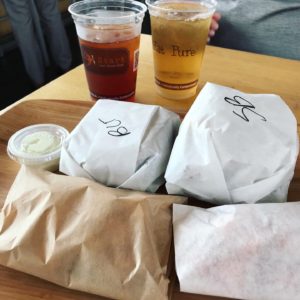
We normally review fast casual brands so the expectation is branded paper goods or sometimes on glass plates with real silverware. We forgot we were in a fast food environment until our food came out in unbranded packaging wrapped to-go on a bamboo tray. Once we unwrapped it, the food looked great. The take out bags are stamped and the cups are logo’d but no custom branded packaging really anywhere else, including the menu boards.
MJ’s Brand Commentary:
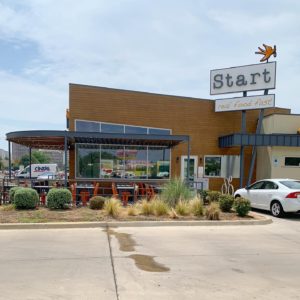
What’s cool about Start? It’s a Healthy, Fresh FAST FOOD CONCEPT with mass appeal potential (more so than a typical salad and wrap concept). The challenge with Start is getting customers to try them as an alternative to other fast food brands.” I’ve driven past this restaurant on Lemmon fifty times. I thought it was a breakfast place. I never even considered going there. The name, the logo and colors and exterior just don’t register as a fast food place or a lunch place. I’m not saying those elements are all wrong but when you’re trying to change the habits of the general fast food eating public (GFFEP), you’ve got a tough road ahead. So let’s say you’re NOT trying to convert the GFFEP and you’re just trying to be a healthy, fresh and fast restaurant that has a drive through – that’s also unique. I still have a problem with the name.
Environmental Branding:
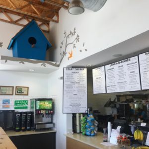
If you go inside, you’ll find contemporary materials, wood tables and booths, community table with really nice, wide-seat stools. A few touches of orange but beyond that mostly neutral natural woods, unfinished particle board used as wainscoting and booth framework. Then there are painted trees and orange birds on the walls which unfortunately look too much like a daycare center or children’s ward in the hospital. We’ve reviewed Modern Market (cool “unisex” design) and Unleavened which I would call healthy, clean eating places. Start has a better overall menu in my opinion because you CAN get a hearty burger and tots but you can also get a great salad or wrap. I only wish the brand had a different name and was a touch more masculine. The blue birdhouse, the murals, the low-energy music and the general vibe just wasn’t comfy or hip. I’d love to see somebody take a super BALLSY approach to this emerging restaurant segment. Like a healthy menu & drive through with a Torchy’s attitude.
Digital Branding:
Start’s website is fairly easy to navigate and has all the things you would expect from a healthy fast casual concept’s website; their story, press, online ordering, catering and their menu. Their Facebook and Instagram accounts showcase mouthwatering food photography, but leave much to be dissed in way of lifestyle marketing imagery. Having a balanced mix of food and lifestyle photography drives sales and customers into your restaurant. In short, the food is the big hero at Start.
–Danny
Score:
MJ gives START an A for food; C for branding and Danny gives it A for food and a B- for branding.
#FridayFeed:
Every Friday, Studio B Dallas visits a local fast casual concept for lunch to critique the brand (and eat lunch). Three rules apply: it’s a concept we haven’t been to or it’s been in the restaurant news and it’s within 10 miles of our office. Wait, four rules – it can’t be sushi. Danny doesn’t do sushi. If you have any suggestions on where we should eat next, feel free to leave it in the comments. Look for our restaurant branding reviews each Friday! MJ & Danny
- Start Exterior
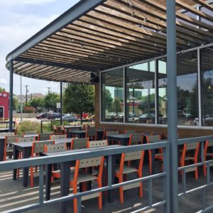
- Start Patio
- Start Interior
- Start Interior & Menu Boards
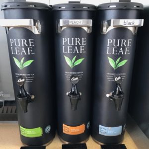
- Matte Black Tea Dispensers
- Bamboo Food Tray Presentation
- BLT & Tots
- Start Burger
- Amazing Food
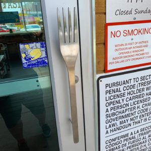
- Custom Fork Door Handle

