
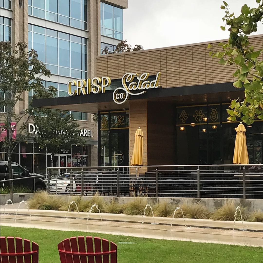
This week’s #FridayFeed restaurant branding review is Crisp Salad Co. in the Shops at Park Lane.
I love this location. Crisp and neighbor Zoe’s look onto a beautiful patch of green grass across from a nice Starbucks and other retail shops. Upon entry, I see white subway tile, whitewashed planked wood walls and natural wood accents along with a really cute display of pots and plants – I love this little decorative detail! Layout and furniture all work well. The Crisp logo and signage are “so fresh and so clean clean!” Props to OutKast here if you missed the reference.
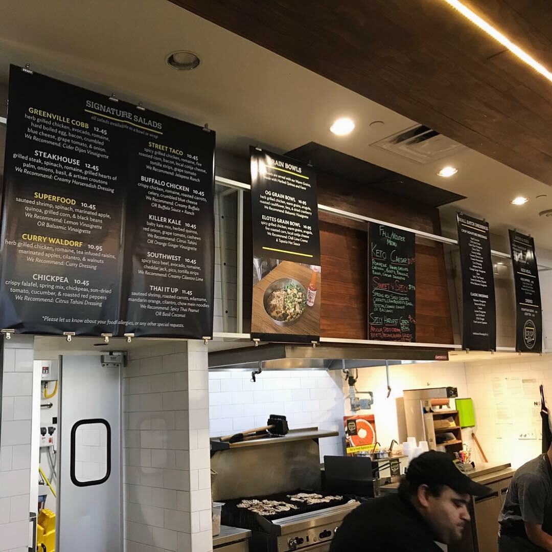
The concept is apparently all about chopped salads and the chopping is the “entertainment” part of the concept. You can build your own or select a salad from the menu. This all works ok except that I chose arugula as my green and arugula does not need to be chopped. The result was a bruised concoction. Compared to Salata’s topping line, Crisp’s lacks light and organization and labeling – where they could promote their “naturally raised meats and local produce,” per their website copy. The service here was excellent and my salad “artist” offered me complimentary soup since it was my first visit. The menu board system is great in theory but the clipped-on posters looked too thin and were “floppy” – easy fix. There was one singular item in the store that didn’t match – see the restroom sign in the photos. Everything else in this concept was clean and crisp and then they used a vintage style metal restroom sign that looked like it belonged in an old gas station, surely this was a one-off?
Upon review of the website, I discovered that there are only two locations. Based on the quality branding, I really thought this was a larger chain. Maybe it’s growing.
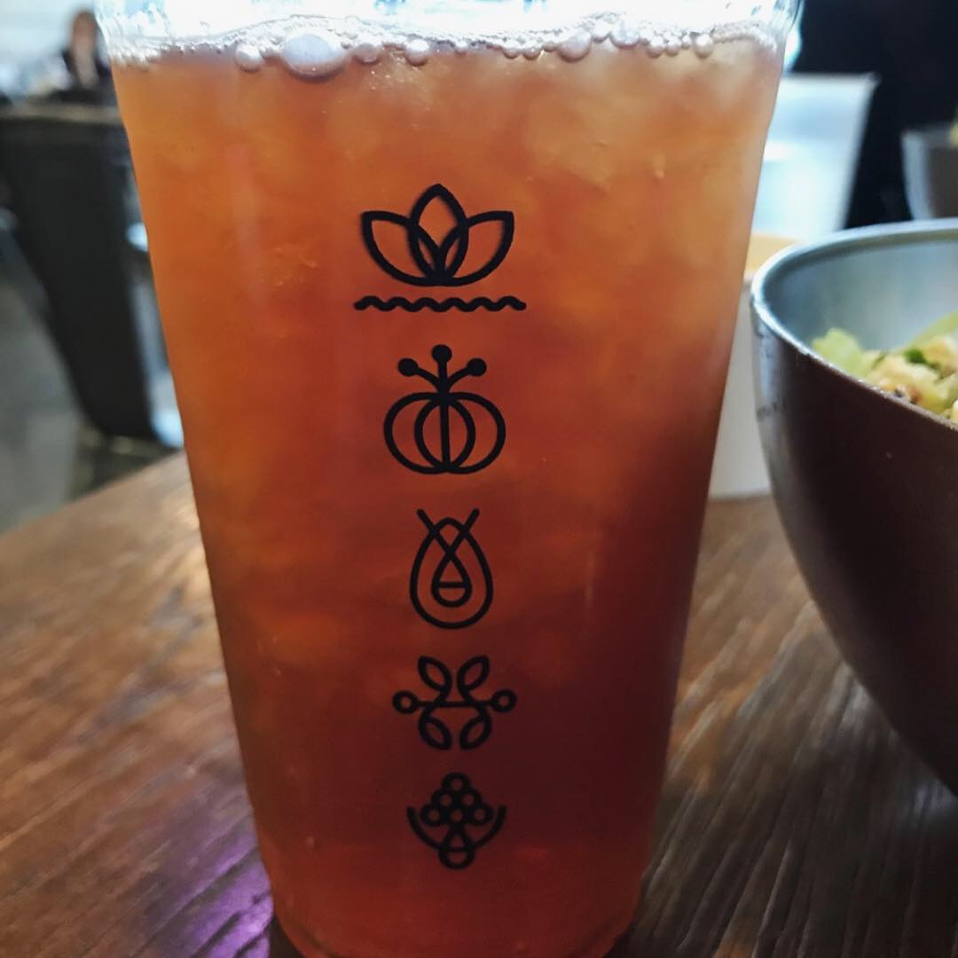
Great logo, nice set of icons, colors, interior design, bowls, printed cups, etc. I liked it so much I investigated who designed the brand and want to give them props. See onefastbuffalo link. I give this concept an A for branding and a B for food and operations but definitely worth a second visit. Danny gives it an A for branding and a B+ for food and operations.
Every Friday, Studio B Dallas visits a local fast casual concept for lunch to critique the brand (and eat lunch). Three rules apply: it’s a concept we haven’t been to or it’s been in the restaurant news and it’s within 10 miles of our office. Wait, four rules – it can’t be sushi. Danny doesn’t do sushi. If you have any suggestions on where we should eat next, feel free to leave it in the comments. Look for our restaurant branding reviews each Friday! MJ & Danny
-

- Crisp Exterior Signage
-
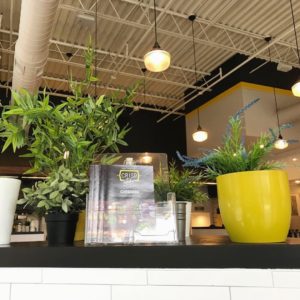
- Beautiful Greenery Entrance

-
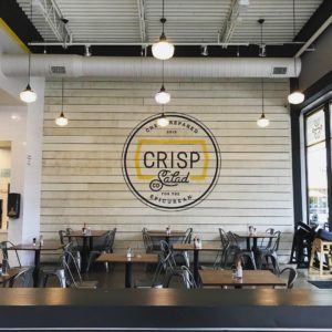
- Interior Decor

-
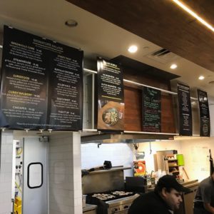
- Crisp Menu Boards
-
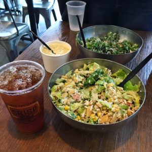
- Salads, Soup, & Tea

-
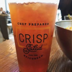
- Crisp Drink Design

-

- Crisp Drink Design Back
-
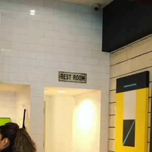
- Restroom Sign
