Monthly Archives

December 2018

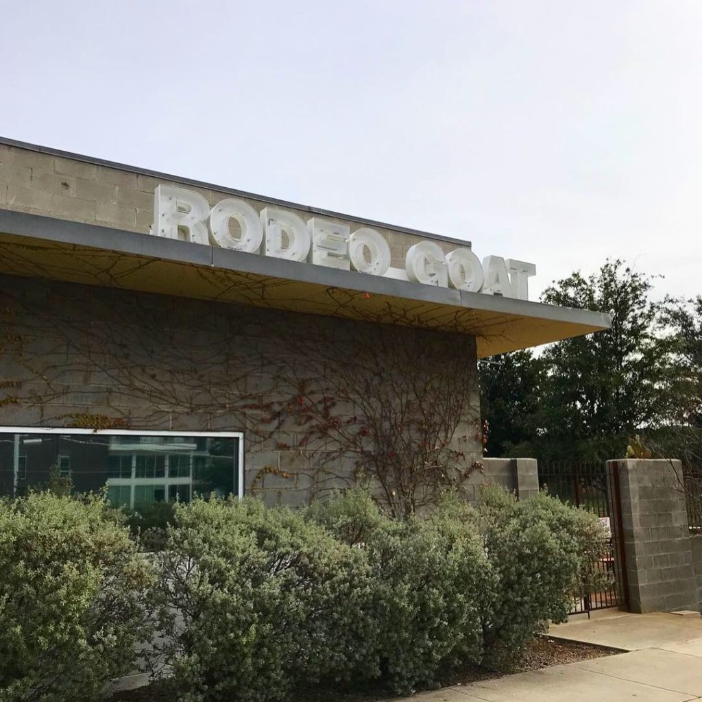
Rodeo Goat Icehouse

Brad Sham Burger
Brad Sham Burger

“Rodeo Goat Icehouse is the GOAT”

This week’s #FridayFeed restaurant branding review is Rodeo Goat Icehouse on Market Center Blvd. with celebrity guest, Mike Snyder.

Order Up!

Rodeo Goat has 5 locations. Full disclosure-I’ve been here 5 times. 4 of the 5 times I got the Terlingua Burger. Let me give you the description so you can enjoy it in its full glory: Terlingua Burger: havarti, homemade brisket chili, onion, corn chips, garlic-herb mayo. Mike Snyder (Brinker, Corner Bakery, Newk’s Eatery and currently Partner in Ecotrack), was my “celebrity guest” on this visit. He ordered The Brad Sham. Measuring 5” tall, this burger has bacon, beefsteak tomato, jalapeños, fried onion, cheddar, pickle chutney, and house made bbq sauce. We shared a basket of fries because Foursquare said they were the #1 place for fries in Dallas/Fort Worth. I’ve got hot sports opinions (unwikit) about fries so I don’t agree, but hey, I tried them, again, in the name of research. 

Environmental Branding:

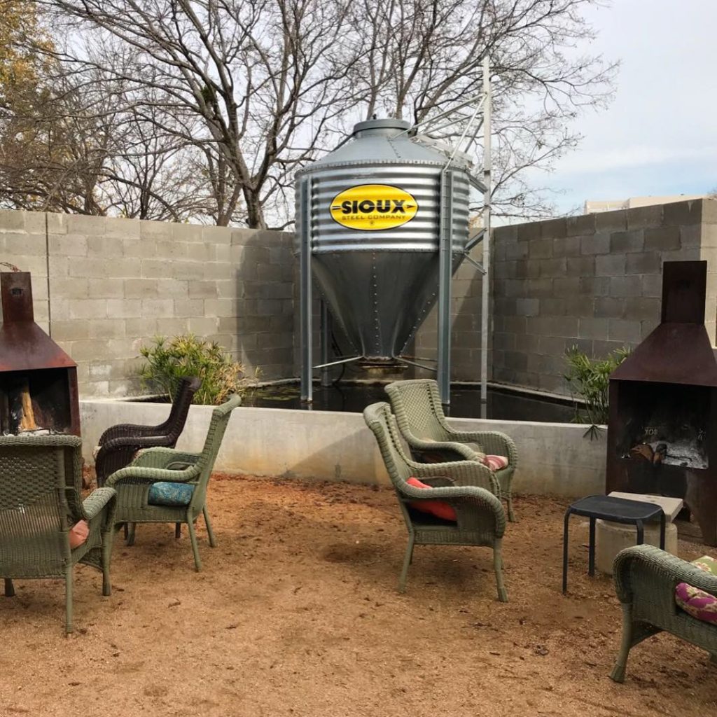
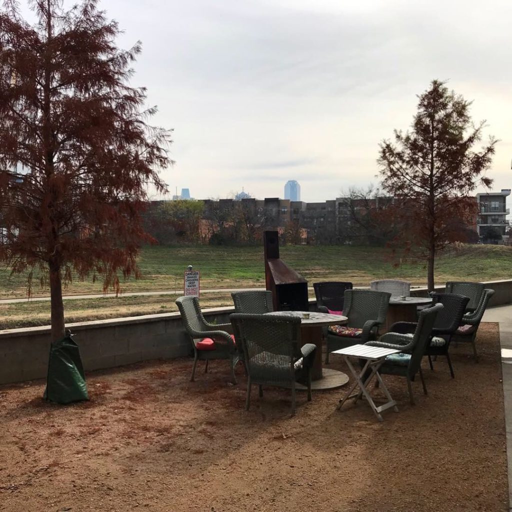
The interior is big and open with high ceilings. Cinder block walls, concrete floors, lots of high community tables pretty much sum up the interior. Aluminum gate room dividers, kind of (exactly) like a livestock pavilion, separate the space between the high tables and a room with upholstered booths. I wouldn’t call it cozy but it matches the brand so there you go. There is a huge outdoor patio with picnic tables, yard games and a view of the “Elm Fork” of the Trinity river which hasn’t really come into it’s own yet. Looks like a grassy ditch but better than looking at concrete and cars and there’s a pretty good view of the city.

Branding DNA:

On the subject of branding, one of Rodeo Goat’s slogans is “WE GRIND SO FINE!” and they warn that the patties may be juicer and messier than everybody else’s. This is true and it is excellent brand positioning! I didn’t see any branded packaging, no logos on cups, napkins, etc. I DID buy a cool long-sleeve goat t-shirt though. Founder Willard “Daddy-O” Watson’s story about “How I Got The Goat” is a great read (located on the backside of the menu). I also love brands with “people” behind them.

Mike’s Thoughts: 

Signage was hard to read. I actually drove past the building. “Was not over branded as I did not see the word- Rodeo Goat on anything in the restaurant except the menu.” “Very engaging menu that made you read through all items. Unique local names that caught a Dallasite’s attention.” “It was a three napkin burger.”

Mike Snyder, former VP of Development at Newk’s Eatery and I worked together on the Gen 2 store redesign. We once remodeled a store together in one night!

Street Cred:

They’ve got lots of INK. People love this place. They’ve been featured in Fort Worth Magazine, Dallas Observer and Thrillist just to name a few.

Digital Branding:

I don’t like websites that force me to choose a location before I am let into the site. However, I discovered that the locations have some different menu items based on location. Food photography on the website is obviously taken in-house. Instagram rocks great food photos, however. Website does an ok job for information but could be much better.

Score:

MJ gives it an A for the Terlingua burger because that might be the only thing I ever order, ever. I’ll go A for branding. Room for improvement on the website. Mike gives Rodeo Goat a solid B.

#FridayFeed:

Every Friday, Studio B Dallas visits a local fast casual concept for lunch to critique the brand (and eat lunch). Three rules apply: it’s a concept we haven’t been to or it’s been in the restaurant news and it’s within 10 miles of our office. Wait, four rules – it can’t be sushi. Danny doesn’t do sushi. If you have any suggestions on where we should eat next, feel free to leave it in the comments. Look for our restaurant branding reviews each Friday! MJ & Danny

#FridayFeed Piada

Piada Italian Street Food

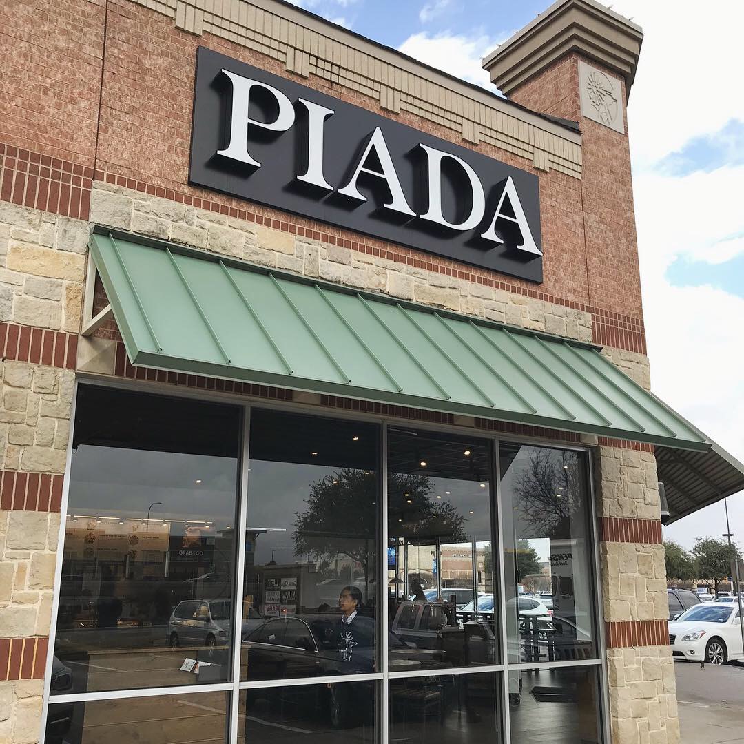
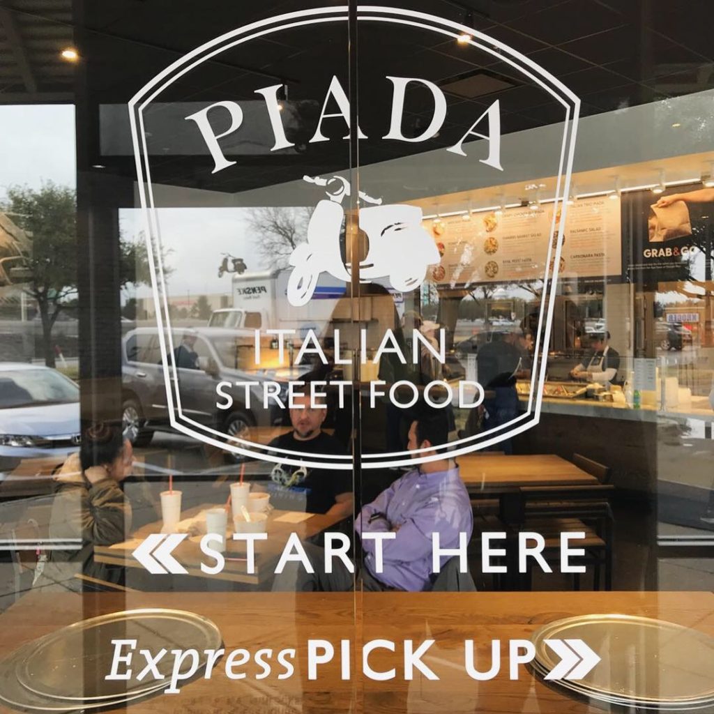
This week’s #FridayFeed restaurant branding review is Piada Italian Street Food at Parker and the Tollway. Piada has 41 locations concentrated in and around Ohio, Michigan, Minnesota and Dallas. 

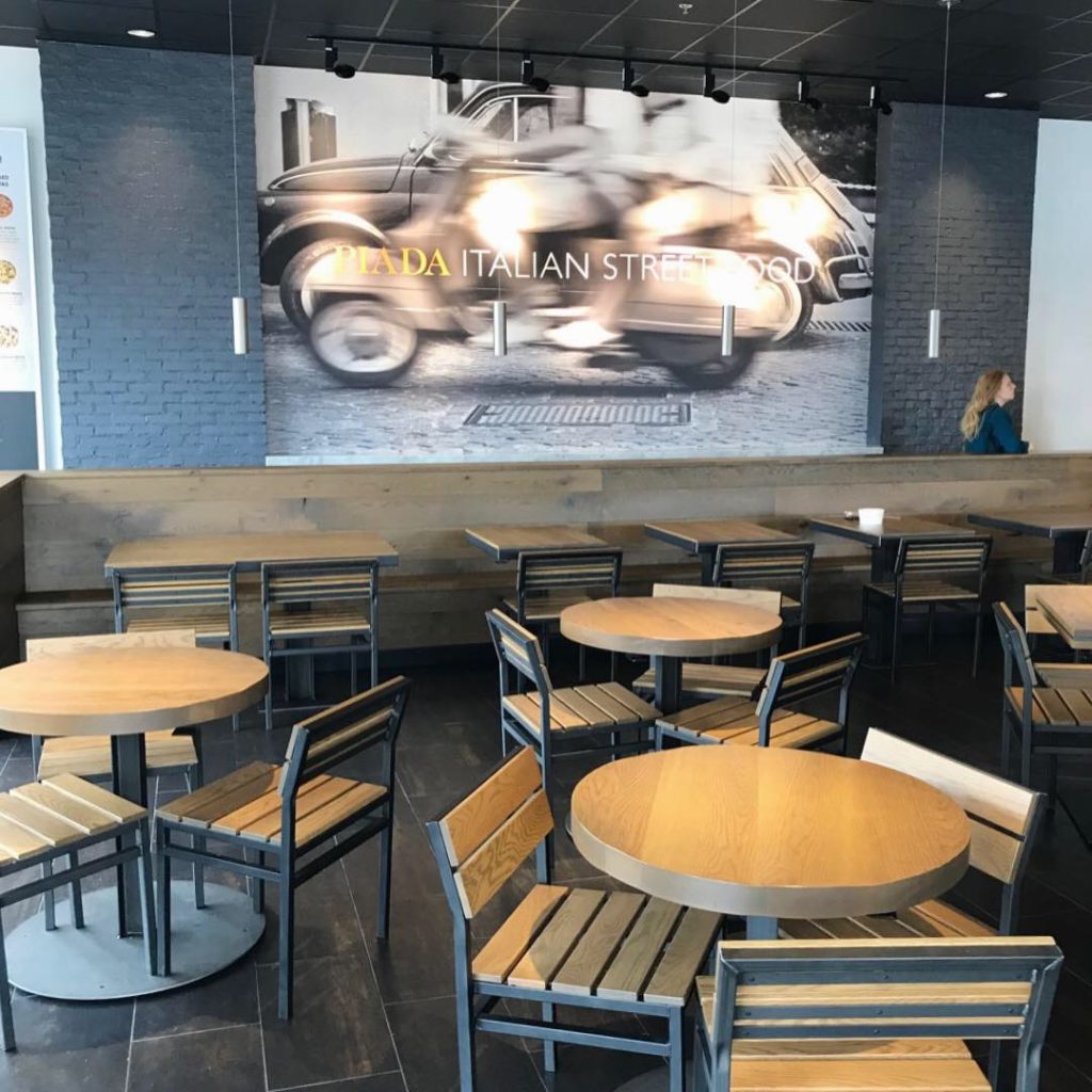
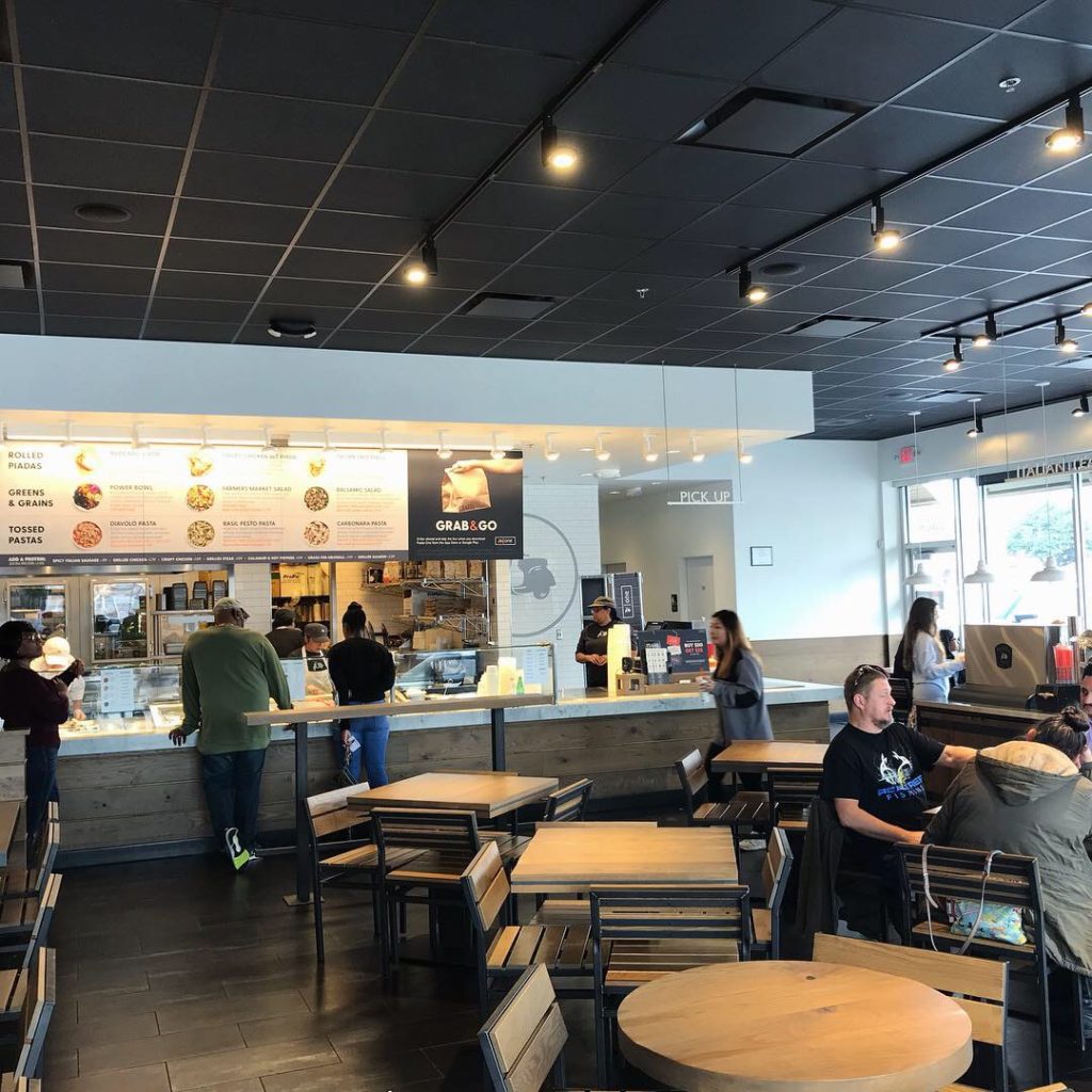
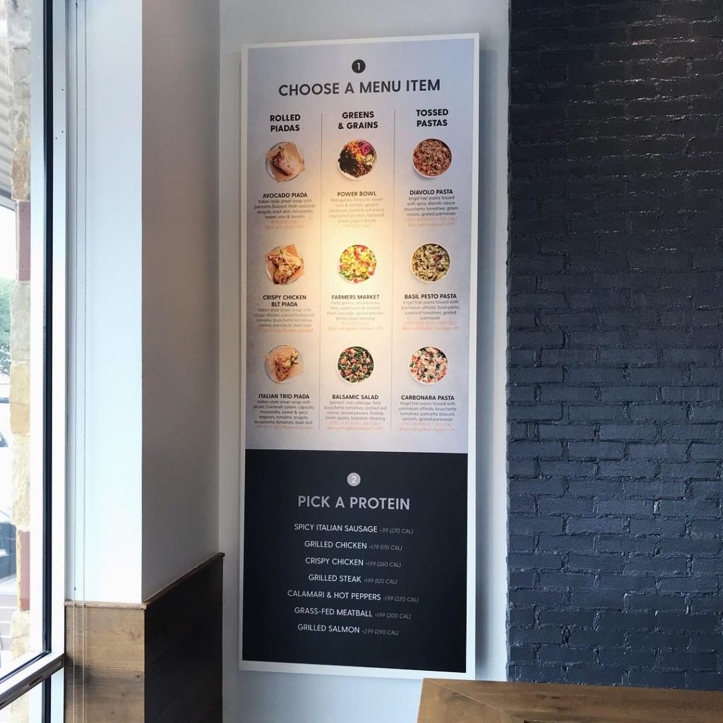
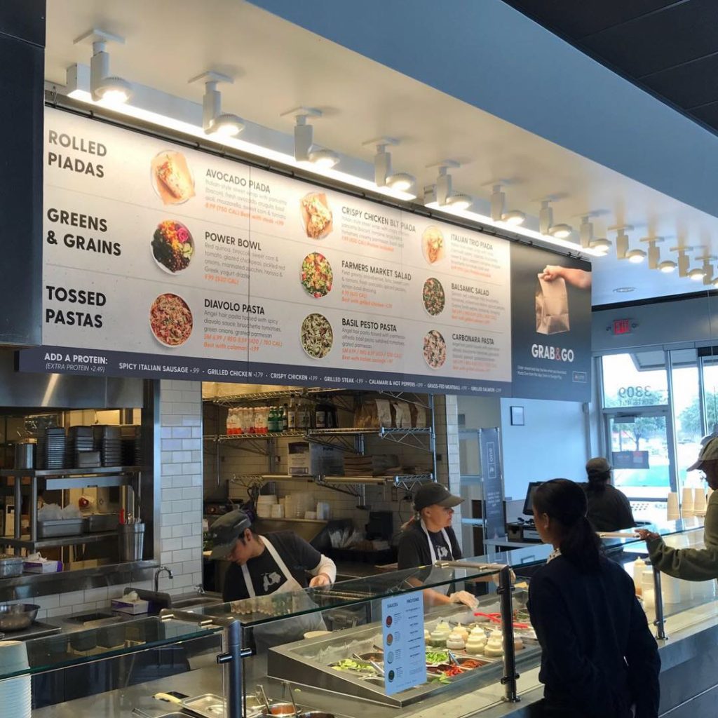
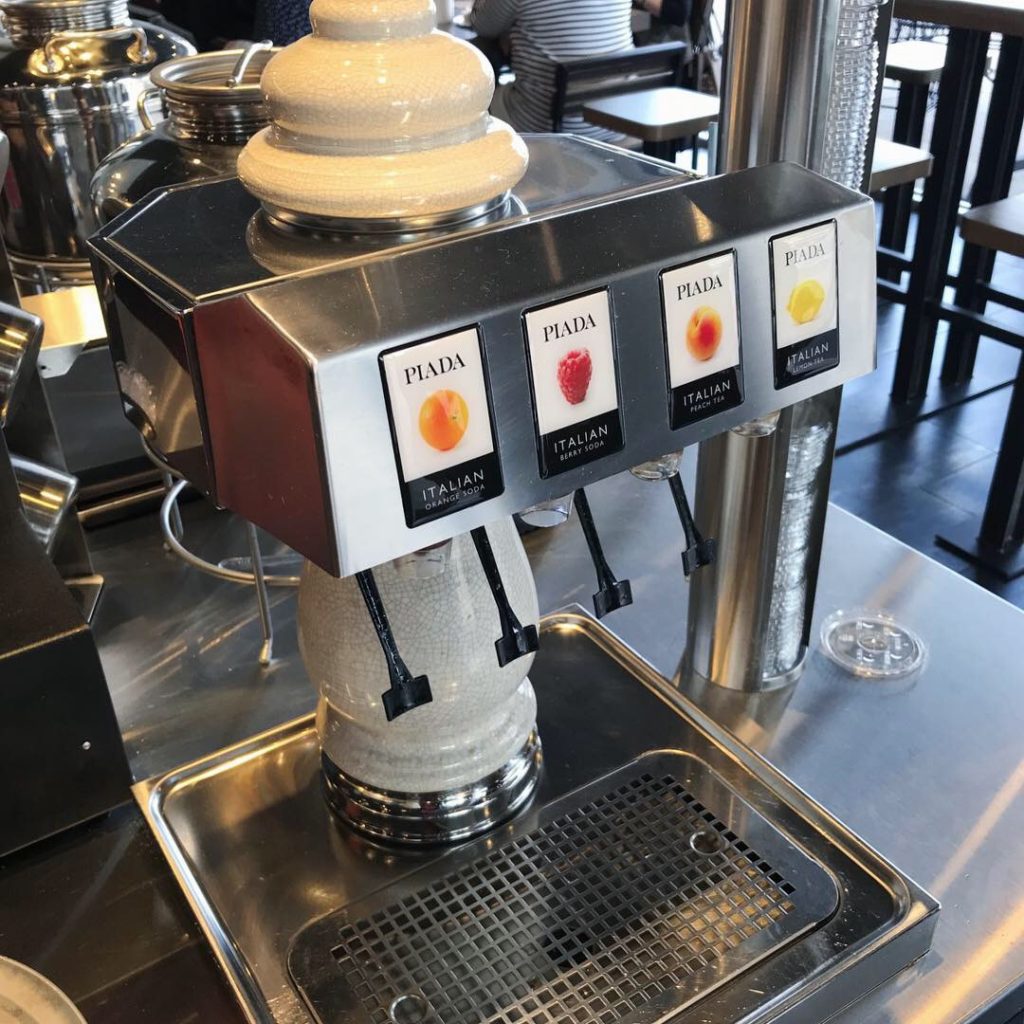
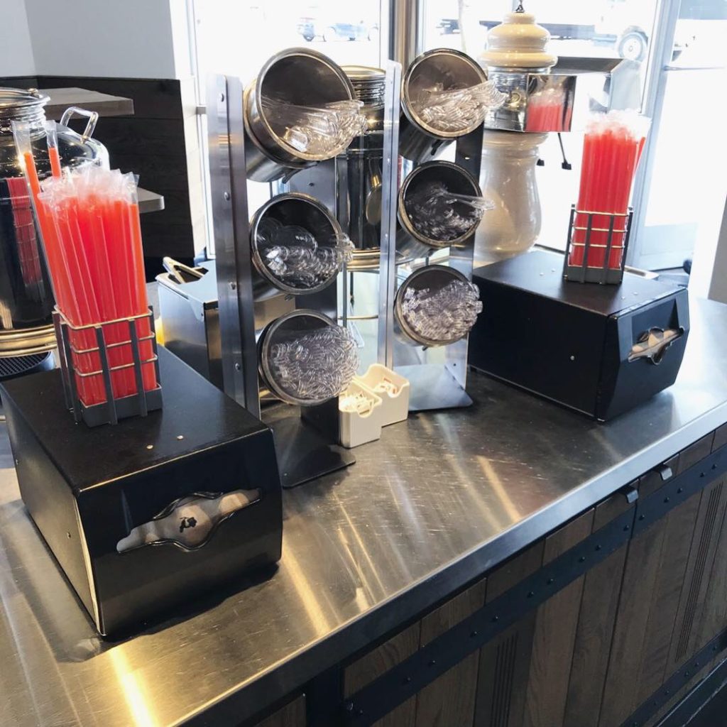
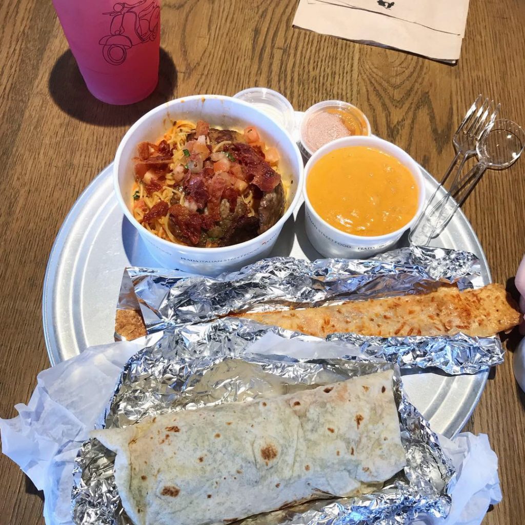
Danny and I spend a lot of time looking at fast casual concepts. Italian fast casual concepts are rare if you don’t include pizza. Piada follows the popular “food in a line” model so imagine Chipotle with Italian ingredients. Pasta instead of rice. Piada instead of flour tortilla. Diavolo sauce instead of salsa. Their point of difference is the Piada – a very thin tortilla-like wrap that they brush with olive oil, dust with spices and warm on a stone grill before filling it with good stuff. You can choose a Piada, a Pasta Bowl or a Salad plus delicious sides, which include lobster bisque, calamari, or their signature parmesan or pepperoni Piada sticks. We ordered a pasta bowl with Diavolo sauce, the Italian Trio Piada, a cup of lobster bisque and a parmesan stick. All delicious! The beverage choices are teas, Italian sodas and a blackberry hibiscus lemonade served from a very well designed beverage bar. The thing that makes this beverage bar so nice is the actual equipment they have chosen. Every single item from the beautiful Italian soda dispenser to the containers for the lids and straws were thoughtful decisions. They do a great job incorporating the function with design. This is a nice break from the giant soda machines everywhere else.

The packaging was nice and clean. They have about 5 different sizes of branded paper bowls – all white. Paper drink cups in the same clean white with minimal branding plus a large clear cup with a large simple line drawing of the scooter. Oh, and orange straws. They use brown kraft take out bags which is the only disconnect I could see. The orange is so nice, I would love it if the take out bags were white with that pop of color. We noticed that even the plasticware was branded – something we never see.

Speaking of color, while we were impressed with the thickness and quality of the pricey wood tabletops, there was nothing in the dining room to break it up. Unfortunately it resulted in monotony. Sadly, no upholstery or soft seating to be found. (If you’ve been following my reviews you know that I love brisket and upholstered booths.) Clearly there was a professional behind the branding. Credit goes to Big Red Rooster who also does work for YUM! brands and many others.

The website is nice and easy to navigate although I was annoyed with the screen-size ad for gift cards. Why don’t brands show photos of their interiors? How about a video of brushing that piada with olive oil on that stone grill? Moving on to the CONNECT tab, you can download their app, read the blog or check out their swag. I love swag. But, this is where it gets kind of weird. The photo is an annoyed blonde in a T-shirt that says “SOCIALLY FATIGUED” with some anti-social copy about grab n go. I keep clicking and find a another “Introverted Tee” that says “DON’T TALK TO ME.”

Completely contrary to this, the career/culture page talks about how passionate they are about the guest experience and hospitality. So, if you WORK here, you need to be really nice and hard working and love food. But if you EAT here, I guess it’s ok if you’re a social grump and want to just get your food from the grab n go shelf and run. Hmmm…

Danny’s social media commentary:
Piada’s social media has very clean and professional looking images with crafted copy and content that draws in a younger health-conscious demographic. However, their imagery falls a little heavy on the marketing side with multiple posts with things like gift cards and their odd way of promoting their new grab n go with socially awkward t-shirts. They should mix in more lifestyle posts and let some of the food in their shots look more natural and less staged.

I give Piada Italian Street Food an A for food and packaging, a B+ for the interior design and a “WHAT?” for introverted pride. Danny gives Piada an A for food and packaging, an A- for interior design and an B+ for their social media.

Every Friday, Studio B Dallas visits a local fast casual concept for lunch to critique the brand (and eat lunch). Three rules apply: it’s a concept we haven’t been to or it’s been in the restaurant news and it’s within 10 miles of our office. Wait, four rules – it can’t be sushi. Danny doesn’t do sushi. If you have any suggestions on where we should eat next, feel free to leave it in the comments. Look for our restaurant branding reviews each Friday! MJ & Danny

#FridayFeed Modern Market

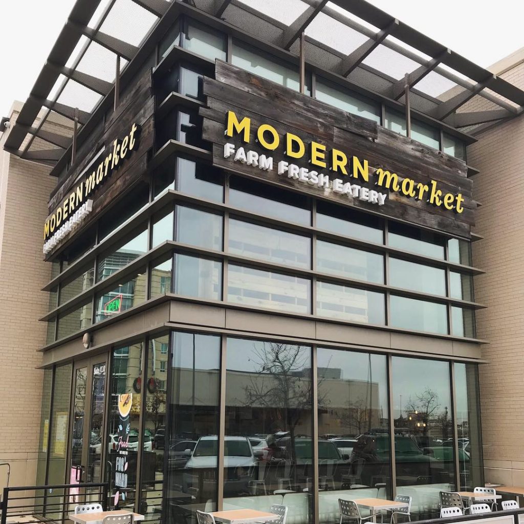
This week’s #FridayFeed restaurant branding review is Modern Market – Farm Fresh Eatery at Central Expressway and Walnut Hill Lane.

We mixed things up this week by going to the website first. I wanted to see if the branding on the website would deliver the experience in the store. I was instantly captivated by a video on the home page of the cook preparing a salad, grilling meats and chopping. They also tagged a photo at the end of the video of a salad with a wine glass with Modern Market logo. Within 15 seconds – I know that they grill and chop my salad fresh and I can get a glass of wine with my lunch or dinner. Great photos throughout the site mixed in with lifestyle photos – also smart! The founder video in the “About Us” page was also great. As opposed to counting on me to read the information or translate icons to concepts, the founder told me all about eating well and importance of sourcing fresh, healthy food that fills you up and makes you feel good. 

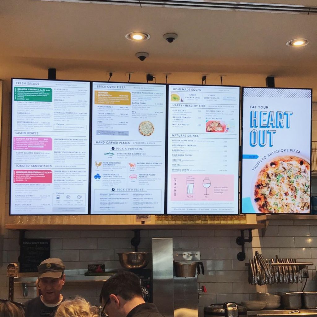
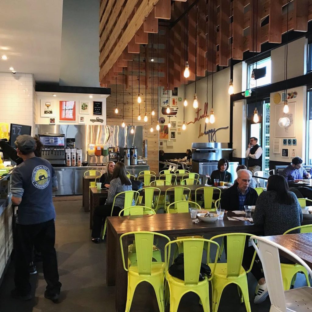
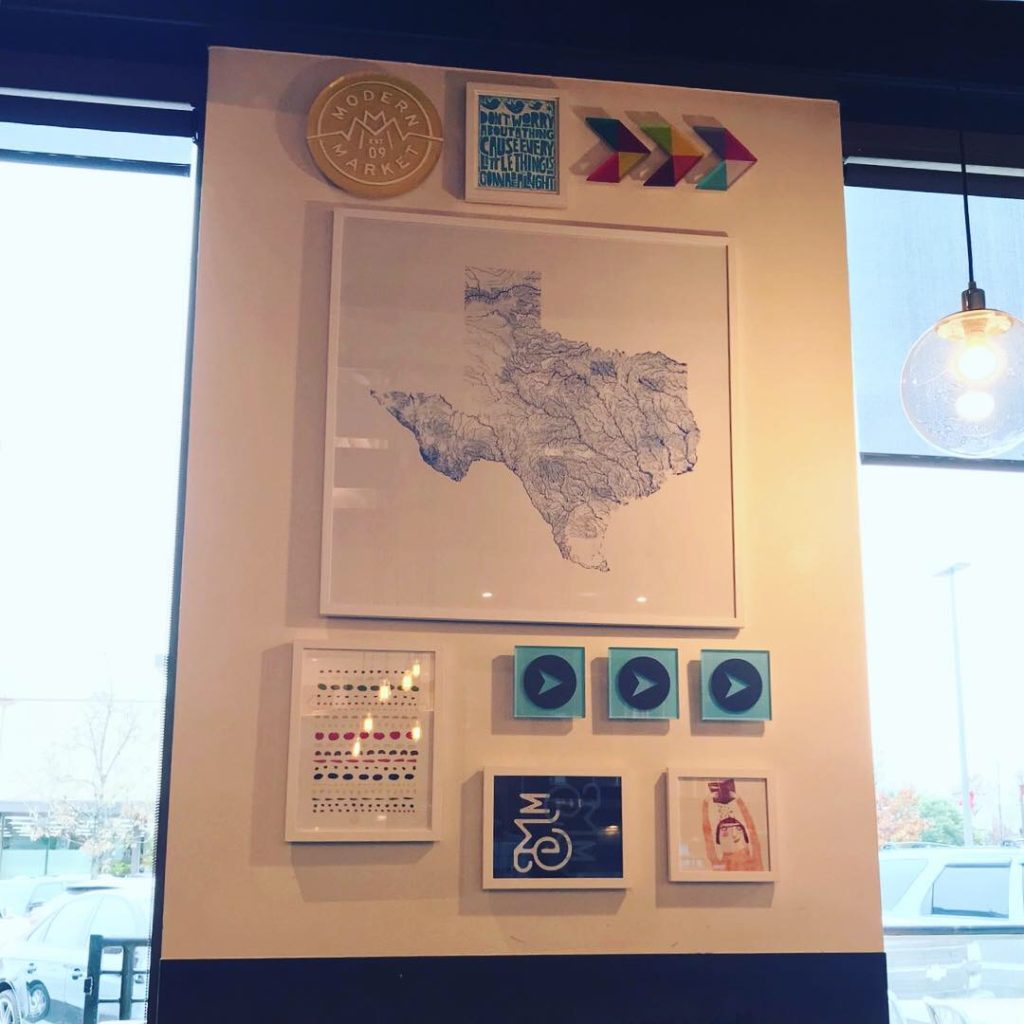
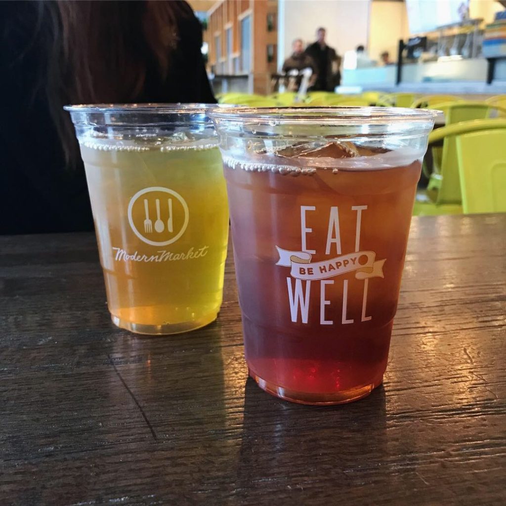
After seeing the website, Danny and I had big expectations and were not disappointed. The interior design was fresh, clean and comfortable. There were walls of framed prints and decor that added lots of color and interest. The yellow metal chairs were comfortable and sturdy. The large video menu boards were bright and easy to read. They offer salads, grain bowls, brick oven pizzas and carving plates (protein plus 2 sides), a couple of soups and desserts, wine and beer. We got our glasses and headed to the beverage station where we had a choice of custom fountain drinks, 3 teas, 3 beautiful lemonades (regular, carrot and cucumber mint) plus 2 coffees.

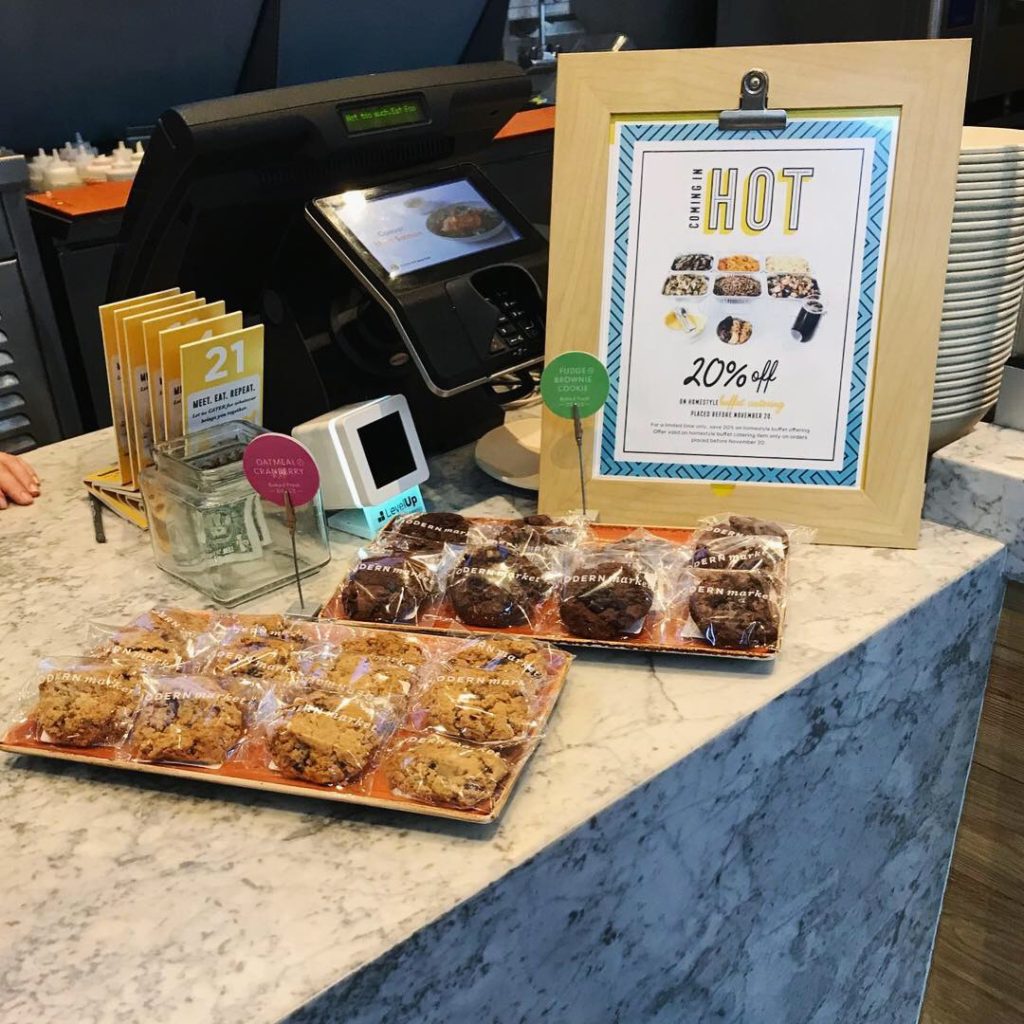
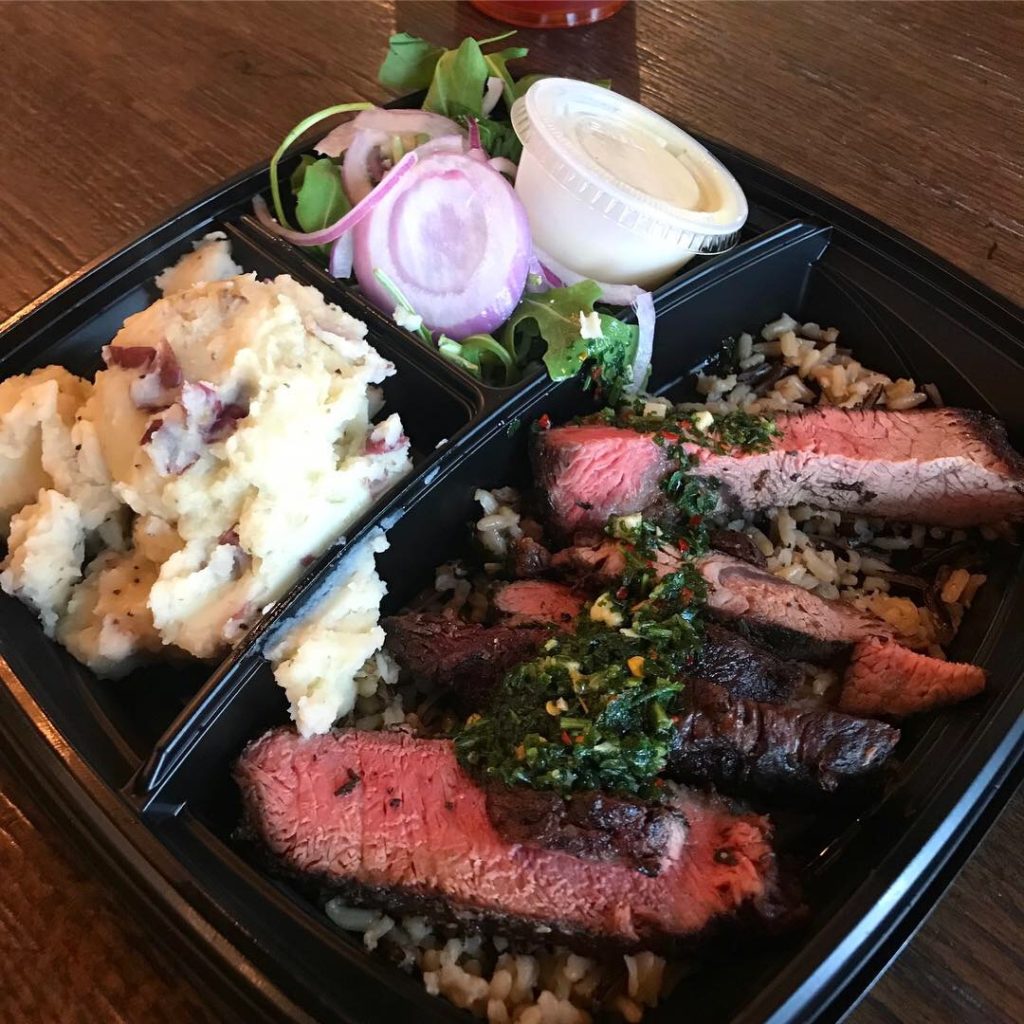
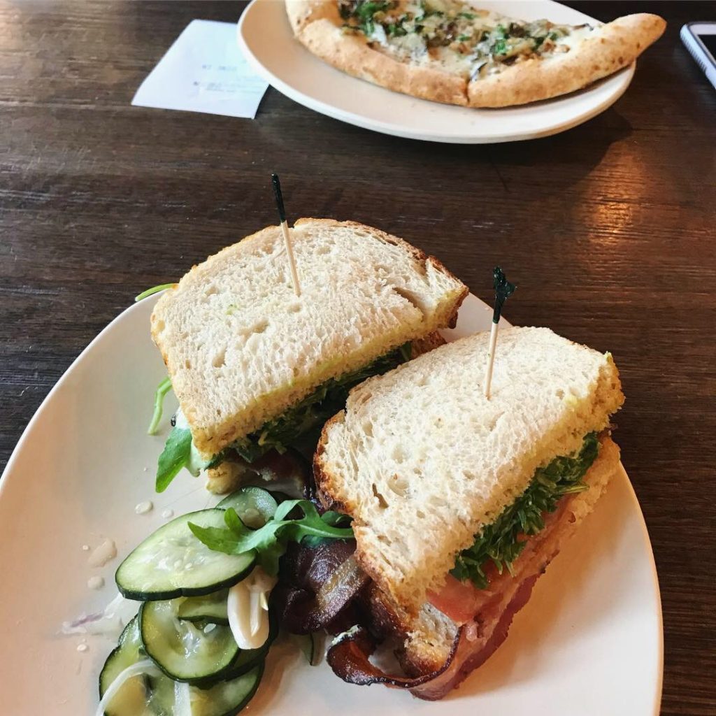
I ordered the Truffled Artichoke Pizza – in Half Size. I knew from reading the pizza boxes on display that they make their own crust and sauce. Danny ordered the Tender Belly™ BLT+A  on sourdough. We also ordered a had carved plate of humanely-raised, herb marinated beef with chimichurri and sides to-go. We were served quickly and the food was fantastic. 

The packaging was really nice as well. Clear plastic drink cups to highlight the colorful beverages and pretty yellow take out bags that say “Eat Well” and “Be Happy.” I know I’ve used the word “pretty” and “beautiful” so you may be thinking this is a female-centric place but there was an equal mix of men and women and a few families.

Signage, custom door handles, staff apparel and packaging were all very nicely branded. There really wasn’t anything we didn’t like here! I looked around for the agency/design firm who is responsible for the branding as well as who designed the interior but we couldn’t find anything. Add a comment if you know. I think there have been a few versions.

Modern Market has 28 restaurants across Colorado, Texas, Arizona, Washington, D.C., and Maryland. QSR magazine reports that MM was acquired by LA Private Equity Group, Butterfly, in February. This happens to a lot of hot concepts and the founders usually justify the acquisitions by saying it will allow for rapid expansion. The rapid expansion part is true. Hopefully the brand is able to maintain what made it great during the expansion because we really like it!

Now back to their website. Modern Market’s website is engaging, modern and inviting with crucial components that captivate consumers. Their social media has beautiful photographs that look professional while still maintaining a candid feel.

MJ and Danny give it a solid A+ for food and branding.

Every Friday, Studio B Dallas visits a local fast casual concept for lunch to critique the brand (and eat lunch). Three rules apply: it’s a concept we haven’t been to or it’s been in the restaurant news and it’s within 10 miles of our office. Wait, four rules – it can’t be sushi. Danny doesn’t do sushi. If you have any suggestions on where we should eat next, feel free to leave it in the comments. Look for our restaurant branding reviews each Friday! MJ & Danny