
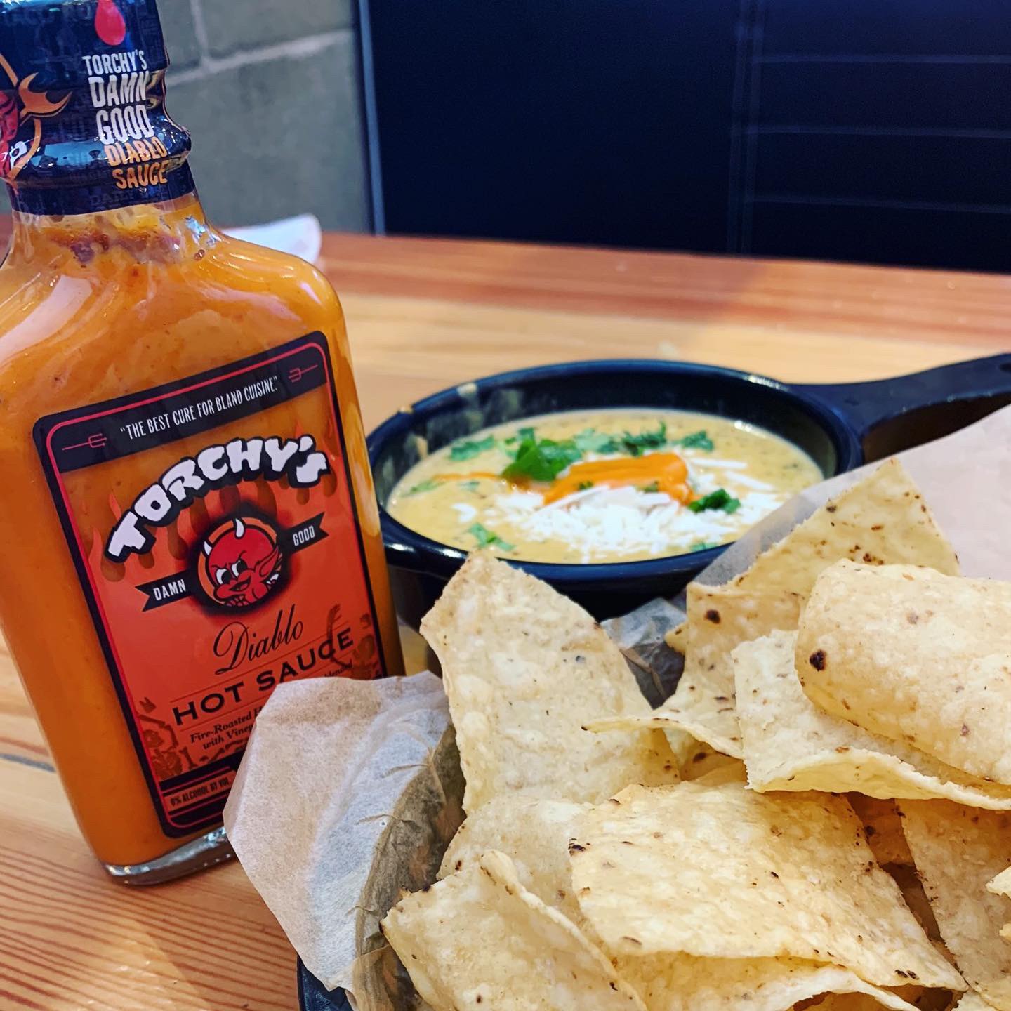
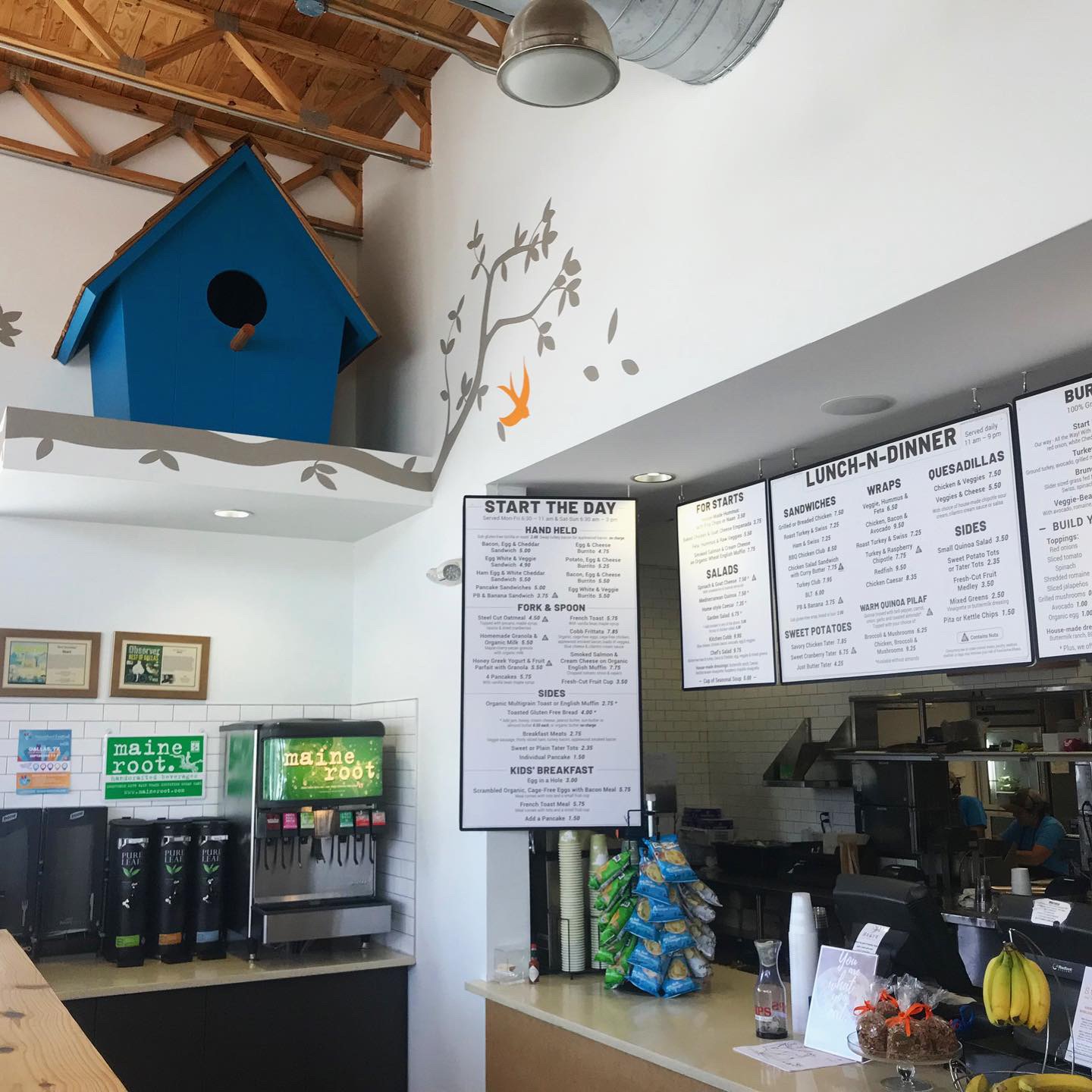
Green Chile Queso & Chips
The Devil went down to Austin lookin’ for a soul to steal. He found Mike Rypka and Torchy’s was born!
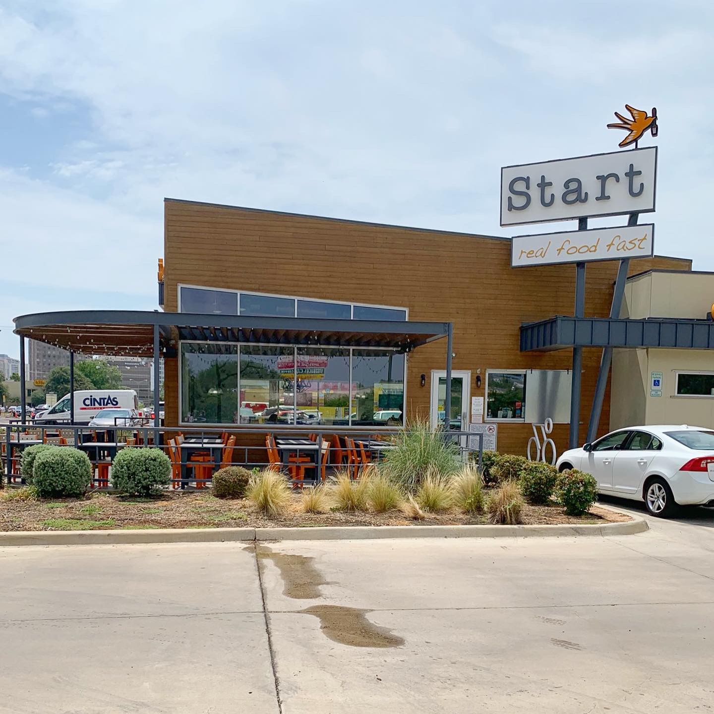
This week’s #FridayFeed restaurant branding review is Torchy’s Tacos on SMU boulevard. Let’s be honest, If you haven’t heard of Torchy’s by now, you’ve been living under a rock! They have DAMN GOOD tacos and queso that you’ll sell your soul for. Torchy’s is an Austin born brand and has over 60 locations and more in the queue.
Order Up!
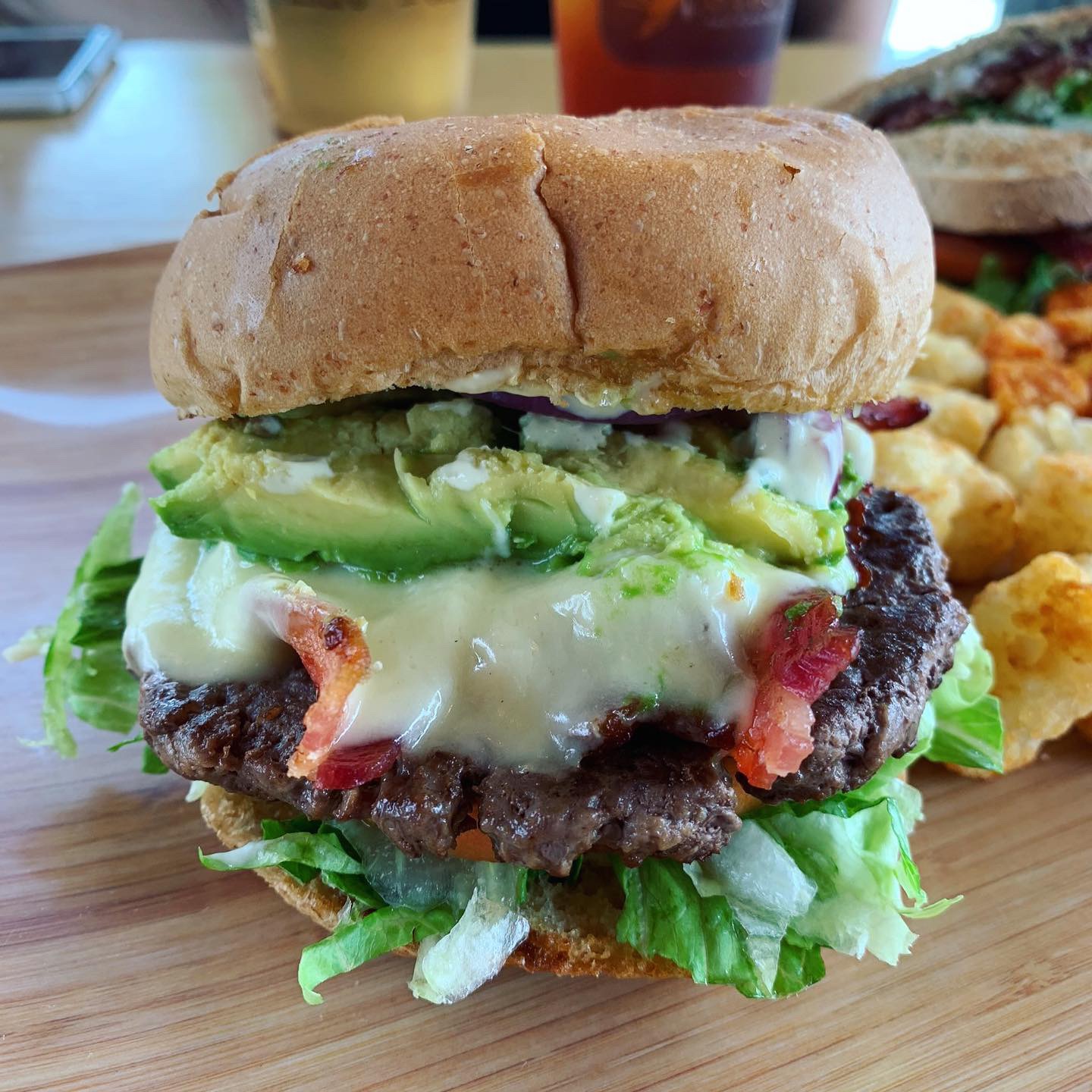
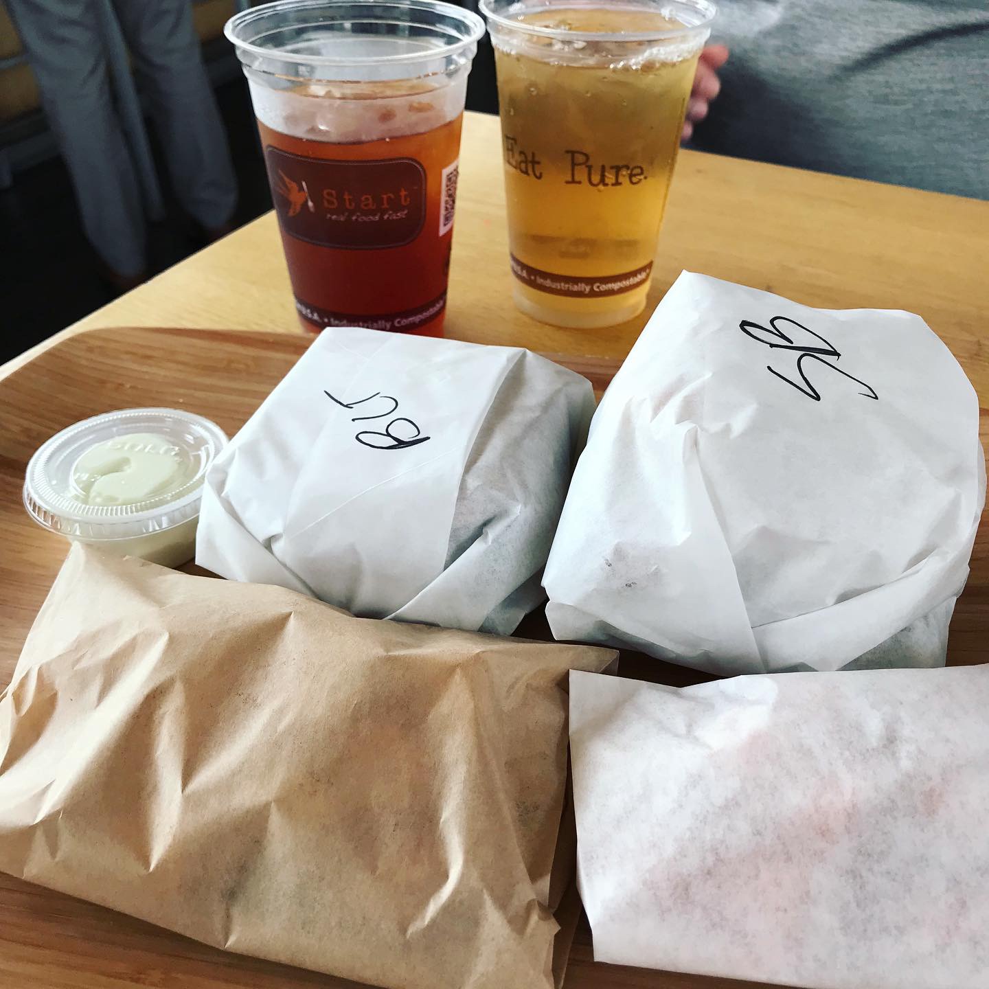
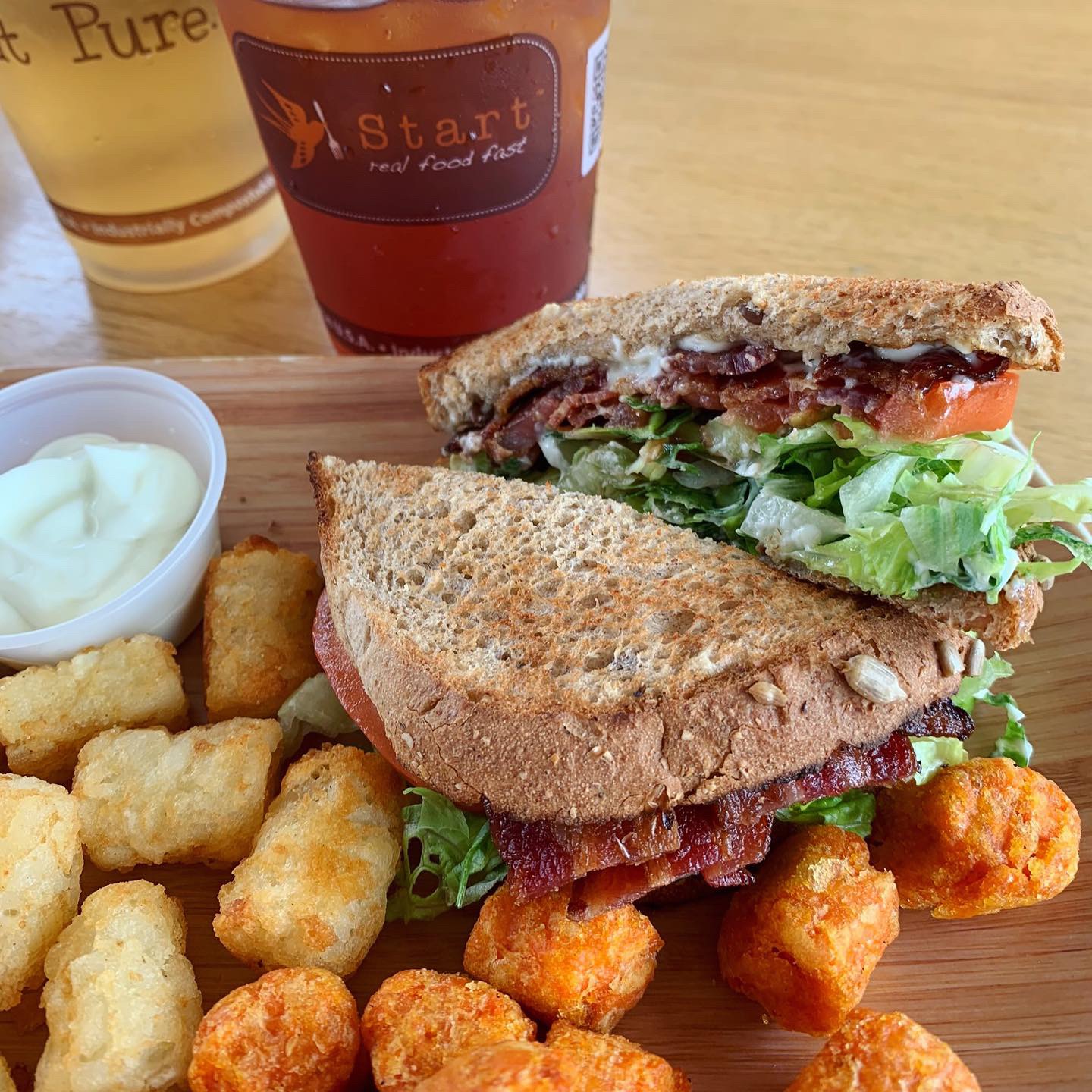
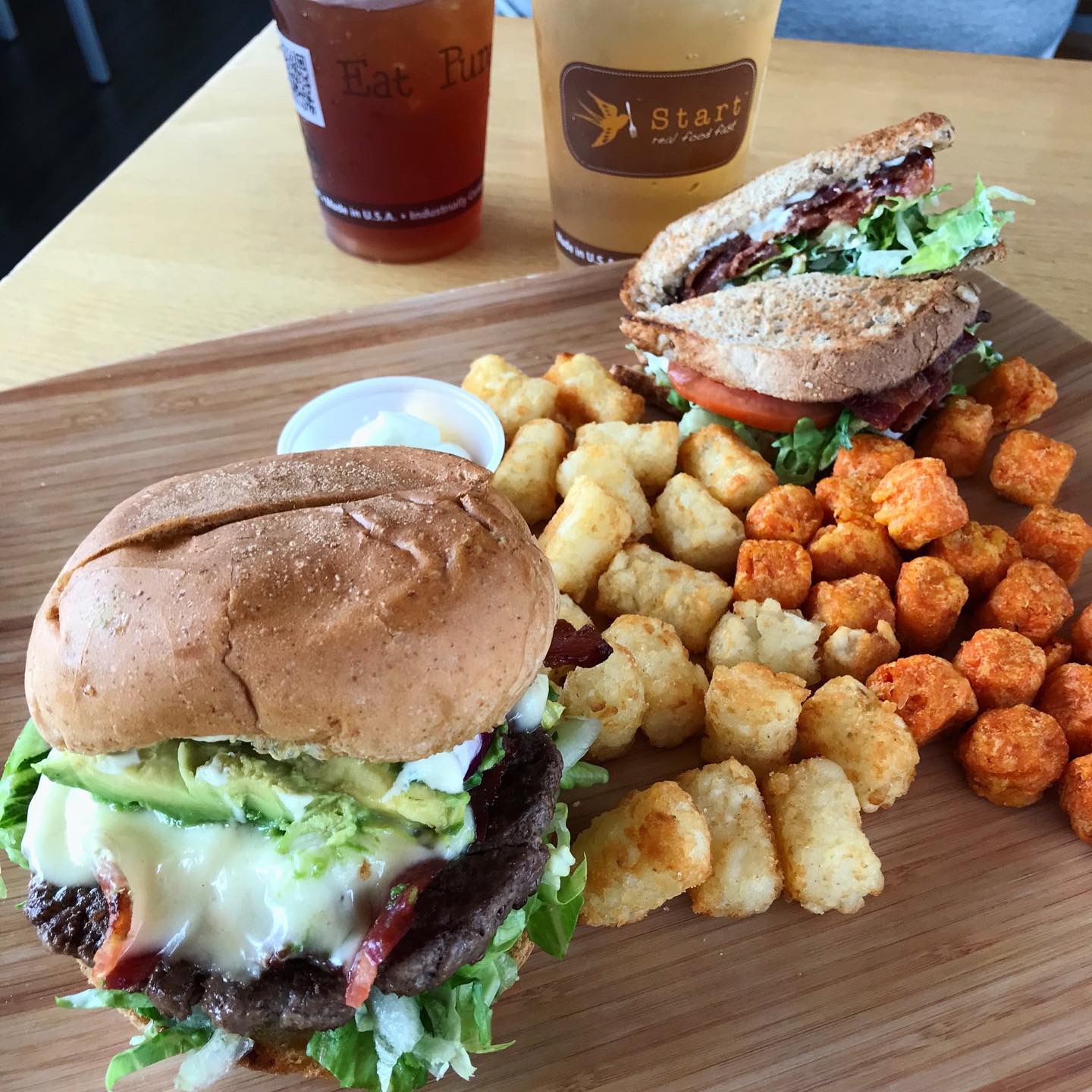
Let’s dive straight into the food. I ordered a Tipsy Chick taco off of their regular menu – grilled chicken breast, spinach, grilled corn, green chilies, and cheddar cheese with a side of bacon bourbon marmalade & a Trailer Park Hillbilly Style off of their secret menu – fried chicken, chorizo, chopped bacon, green chilies, green chile queso, cheddar jack cheese, and pico. If you know me, you know I love chorizo and have an unhealthy obsession with queso so this taco is by far, my all time favorite taco! MJ ordered the Green Chile Pork taco & Crossroads. And of course we had to order some Green Chile Queso & Chips to share. We didn’t get one this time, but they also have feature taco of the month similar to Velvet Taco’s Weekly Taco Feature (WTF).
Branding DNA:
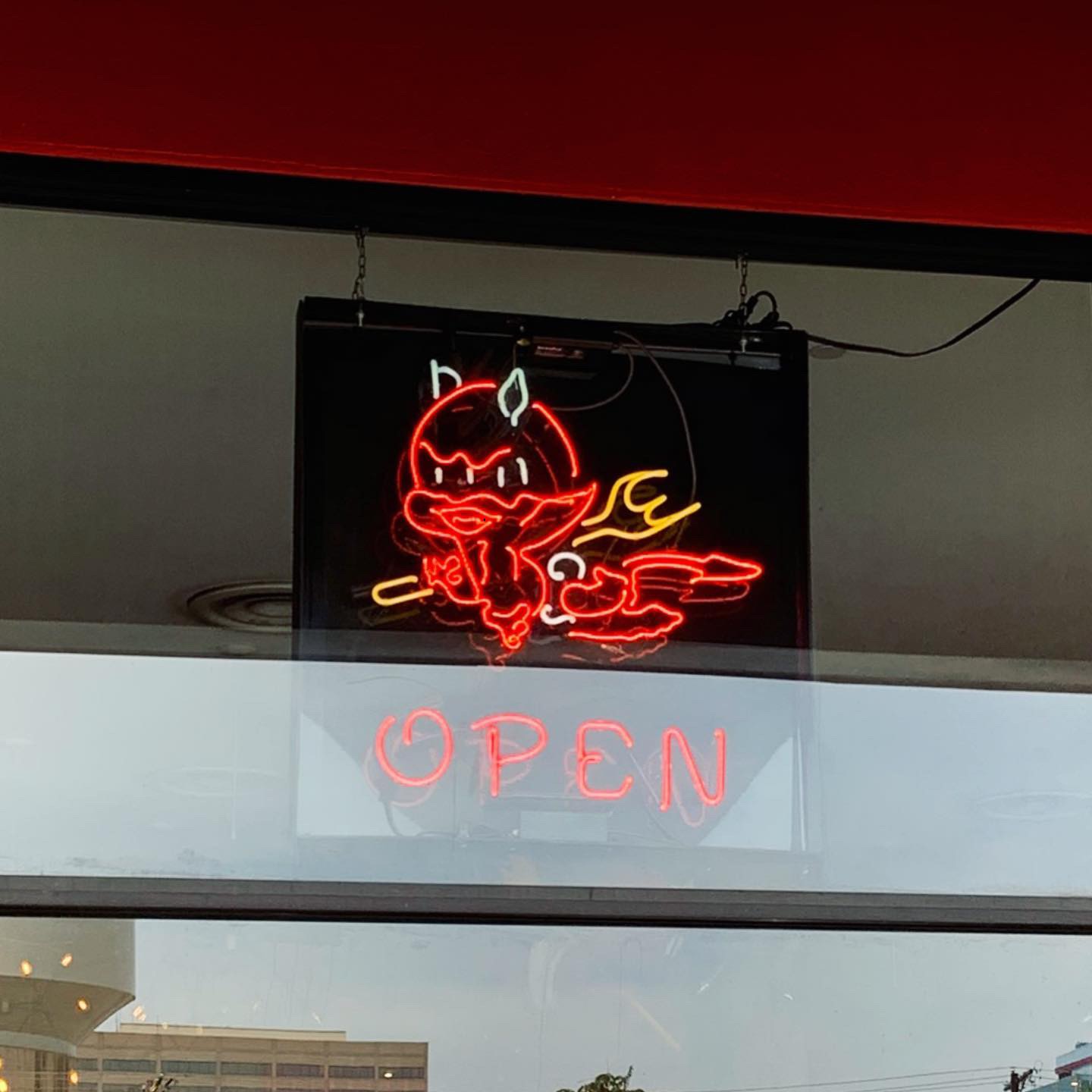
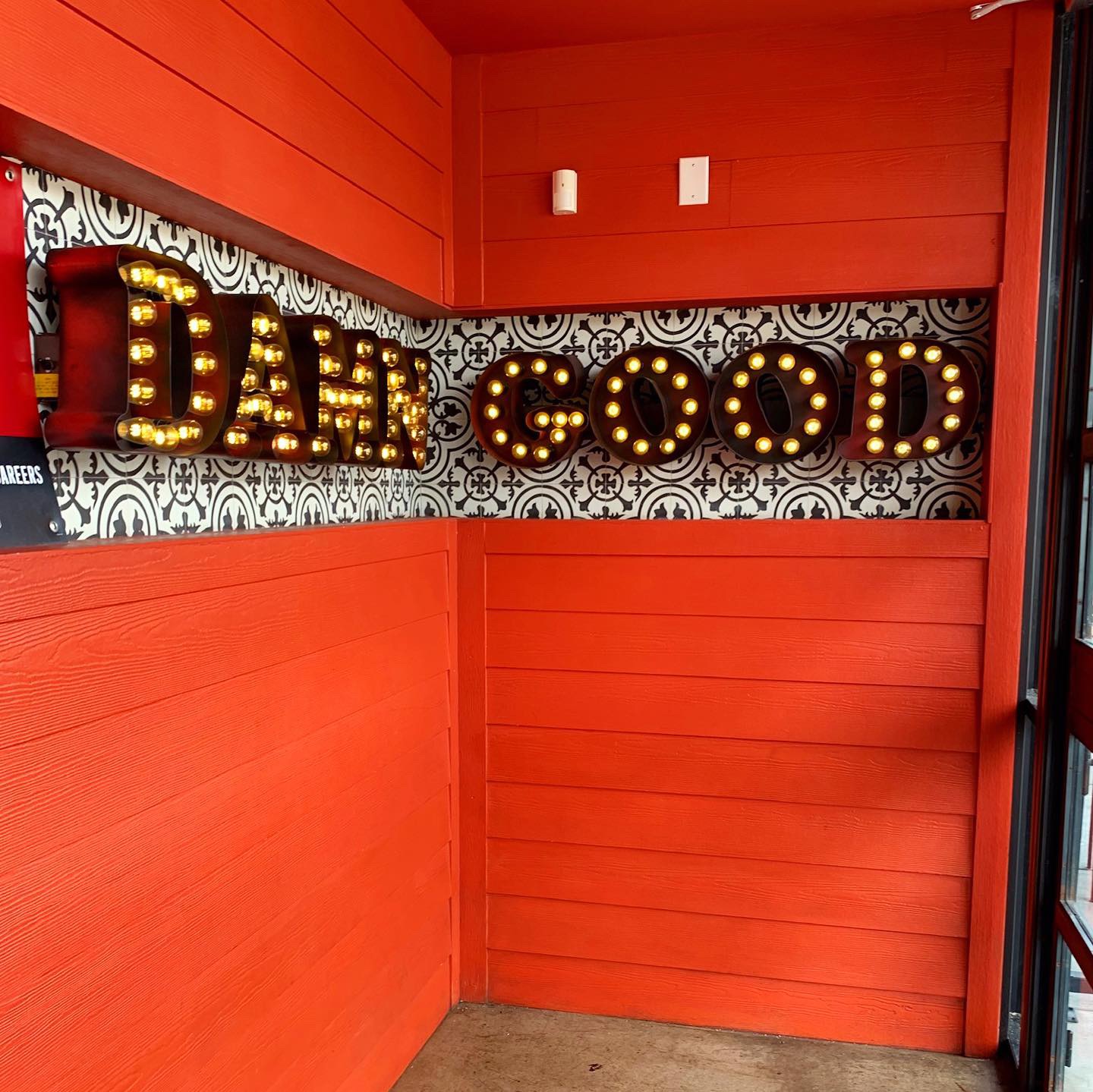
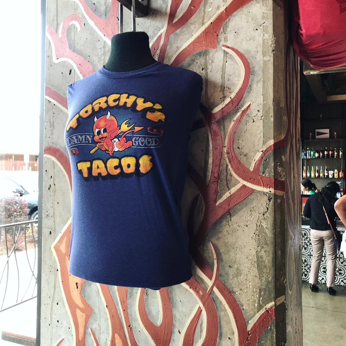
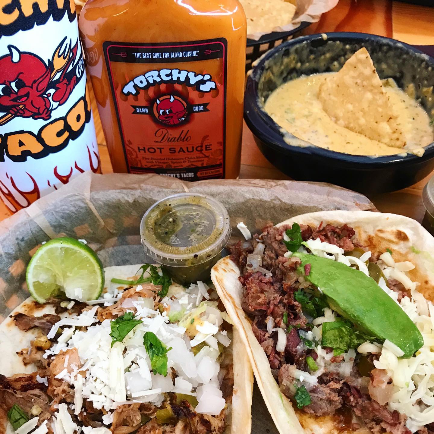
Torchy’s is a brand with Austin attitude. I would consider them one of the more ballsy fast casual restaurants. Not too many restaurants would use a baby devil for their mascot and DAMN GOOD as their tagline, but Torchy’s does! They started out as a food trailer in Austin by chef and founder Michael Rypka. They’ve kept some of that same grit as they’ve expanded into the fast causal market. Not only does Torchy’s have DAMN GOOD tacos, but they also have DAMN GOOD branding. They have branded shirts, hats, baby onesies, matchbooks, custom bottled Diablo hot sauce, and even their own soda-Pucker Up Punch.
Torchy’s restaurants are eco-friendly, something I wasn’t aware of until I visited the culture page of their website. They only use responsibly and ethically sourced ingredients which really shines in each of their tacos. They also only stock napkins, cups, and cutlery made from 100% renewable resources and turn their cooking oil into car fuel. In addition, Torchy’s donates tacos, time, and resources to a variety of charities.
Environmental Branding:
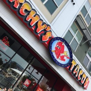
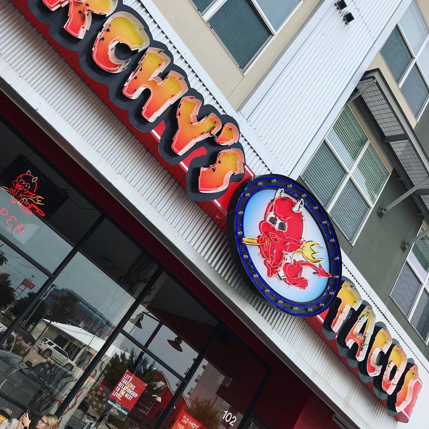
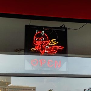
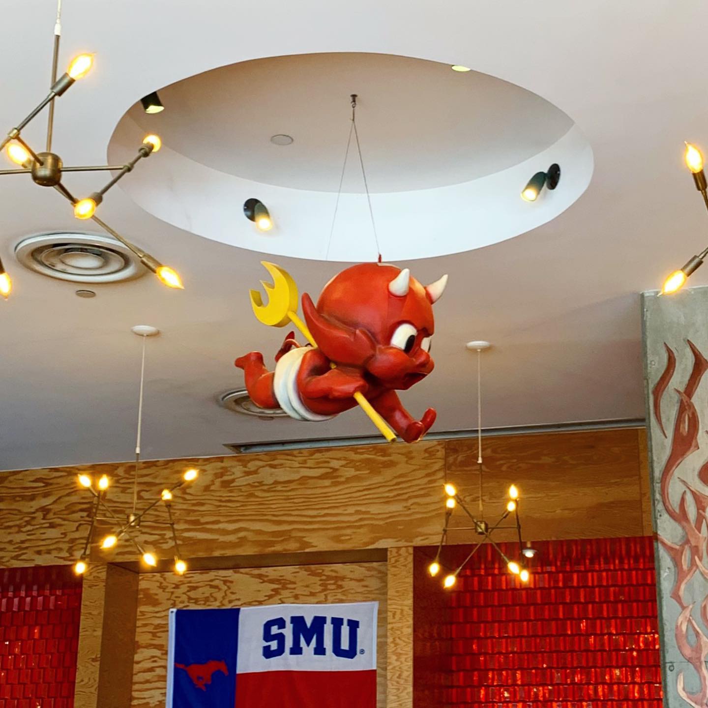
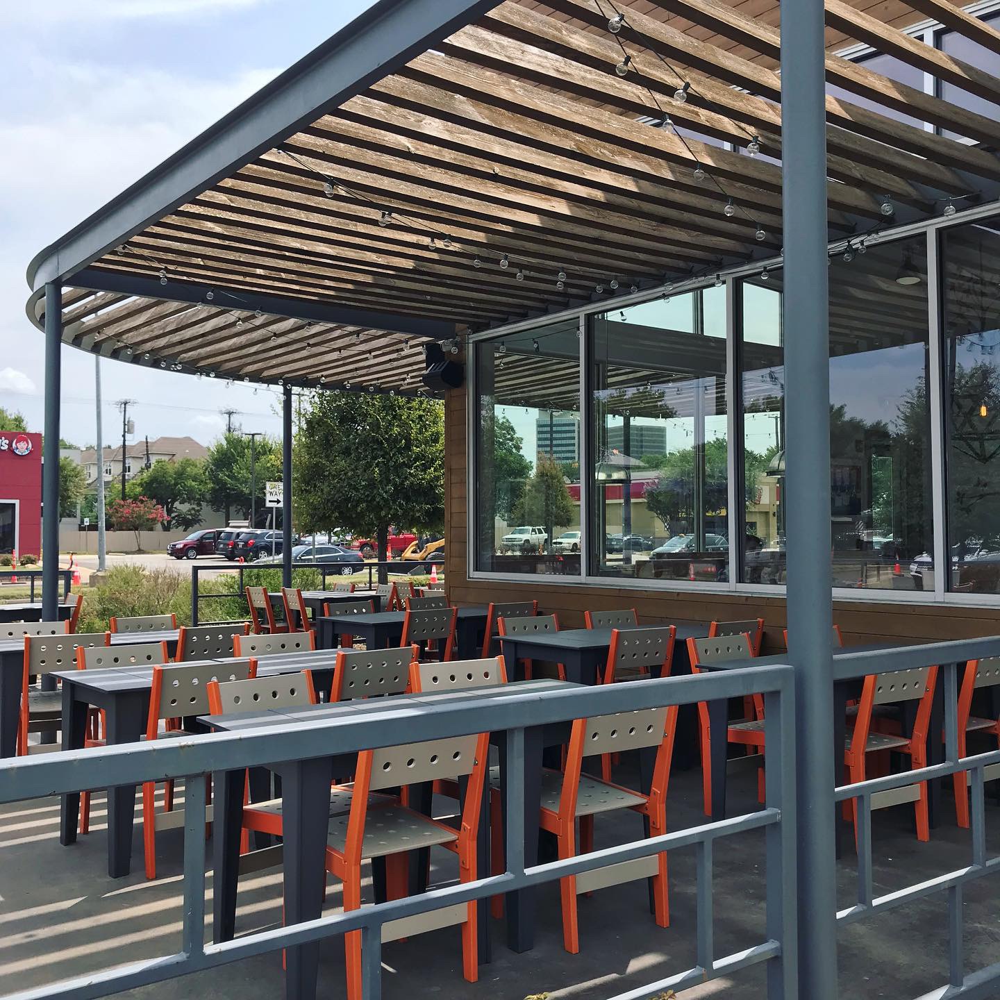
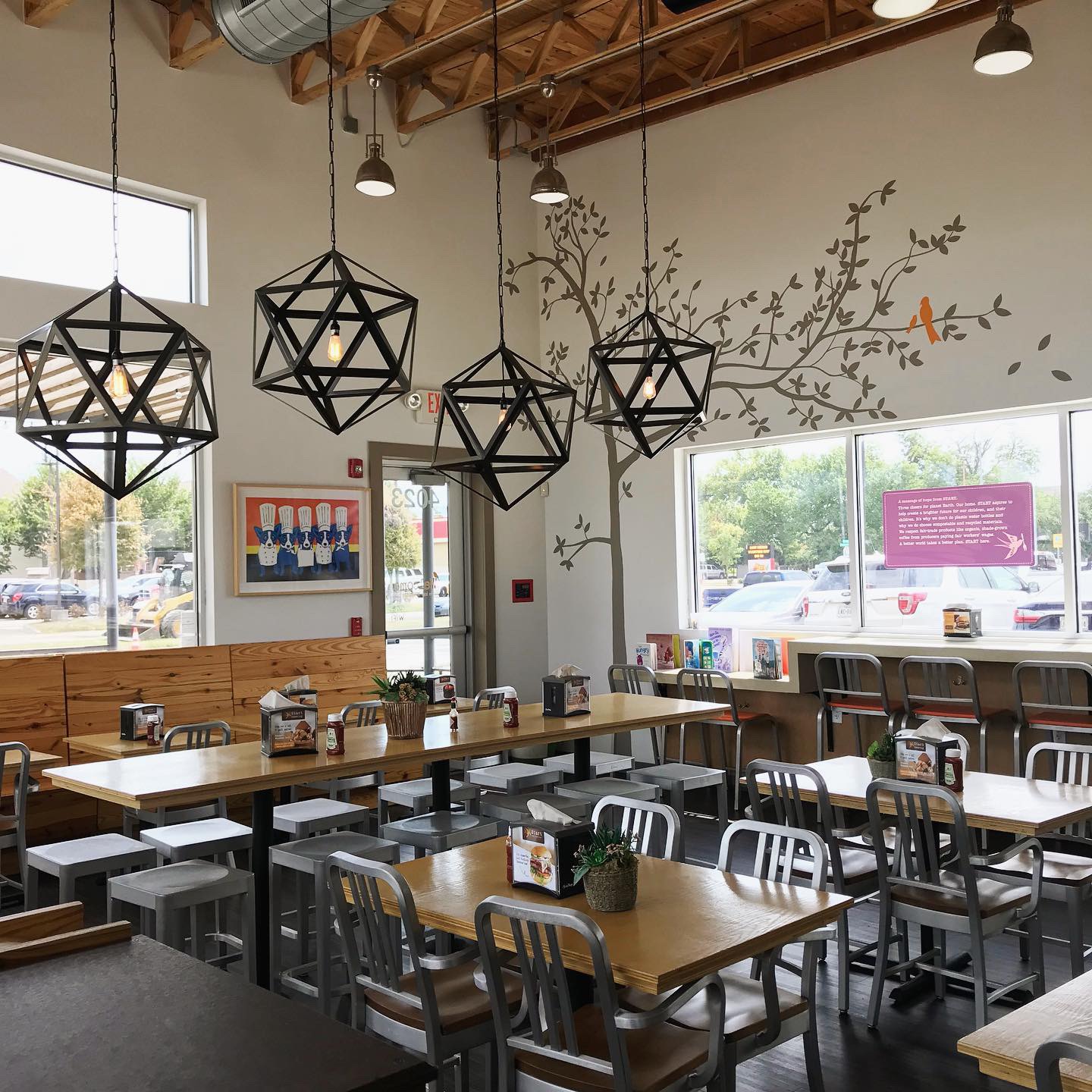
The devil baby, the exposed bulb lighting, the road reflector walls, concrete, steel, the whole cycle shop/tattoo parlor look is awesome. It looks and feels authentic.* Funky brass retro light fixtures, big graphic tiles, a bunch of COOL T-shirt designs – it all just really works. I’m not a big fan of the lacquered plywood but it fits with the space. We’re not sure who to give the logo and design credits to. It looks like a lot of people have been involved but we’re all in. Torchy’s brand really has street cred.
*Authentic like: they have real founders and struggles and stories vs being created in a conference room designed to “create” appeal to customers.
–MJ
Digital Branding:
Torchy’s website breaks the conventional mold and I wouldn’t expect anything less. They have a nontraditional header, beautiful food photography, and a website that is easy to navigate with a gritty tattoo-esque branded pattern. They have great Facebook and Instagram accounts that feature a mixture of mouthwatering food photography, fun lifestyle imagery, and a sprinkle of marketing. Overall, Torchy’s is a brand with attitude, great branding, and most important… great food!
Score:
Danny gives Torchy’s an A+ and MJ gives it an A.
#FridayFeed:
Every Friday, Studio B Dallas visits a local fast casual concept for lunch to critique the brand (and eat lunch). Three rules apply: it’s a concept we haven’t been to or it’s been in the restaurant news and it’s within 10 miles of our office. Wait, four rules – it can’t be sushi. Danny doesn’t do sushi. If you have any suggestions on where we should eat next, feel free to leave it in the comments. Look for our restaurant branding reviews each Friday! MJ & Danny
-
- Torchy’s Tacos
-
- Torchy’s Mascot Open Sign
-
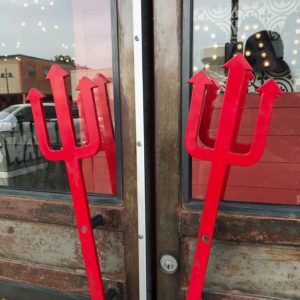
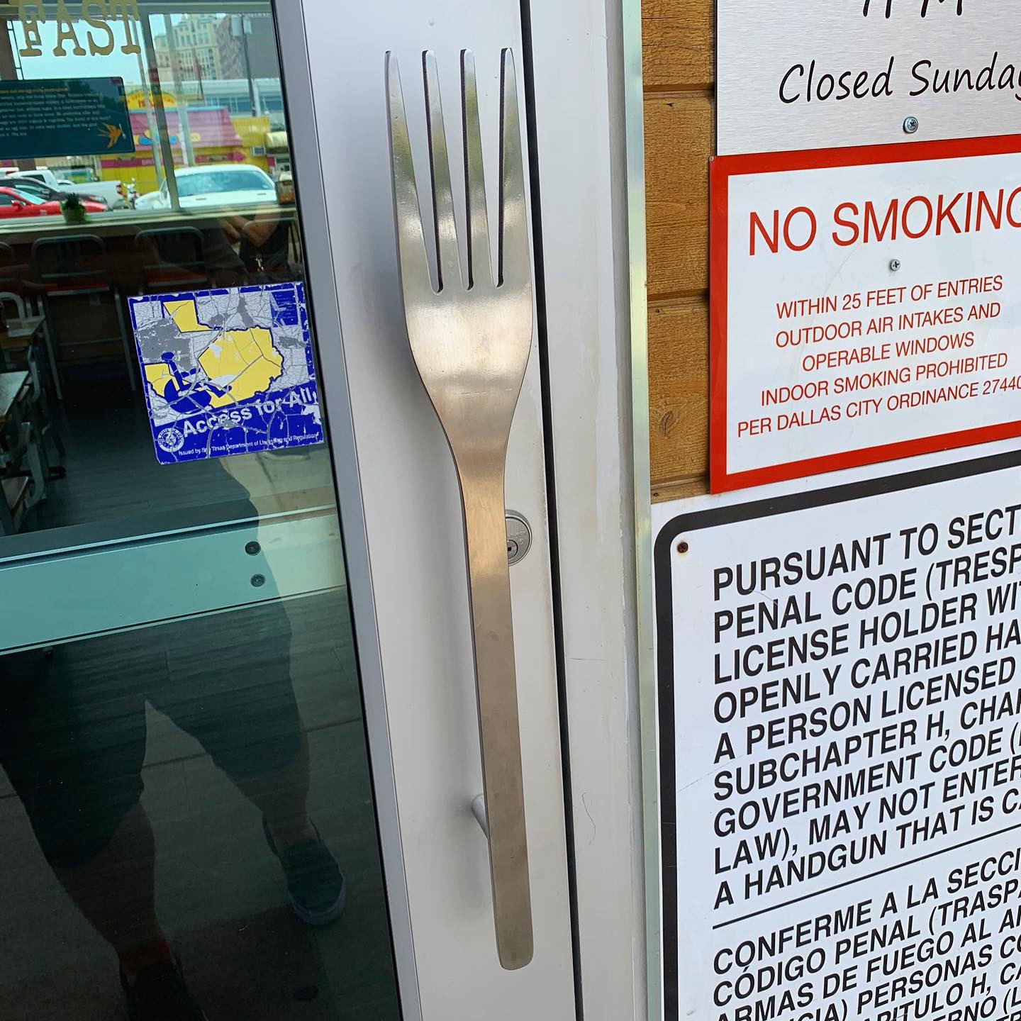
- Trident Door Handles

-
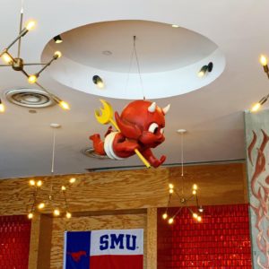
- Torchy’s Mascot
-

- Green Chile Queso & Chips
-
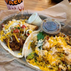
- Trailer Park Hillbilly Style & Tipsy Chick

-
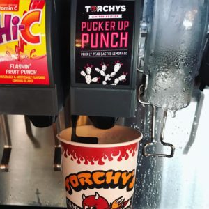
- Torchy’s Branded Soda

Recent Comments