
The Disaster
“Simply Tex-Mex” “Simply Ok” This week’s #FridayFeed restaurant branding review is Taco Joint in Preston Center.
Order Up!
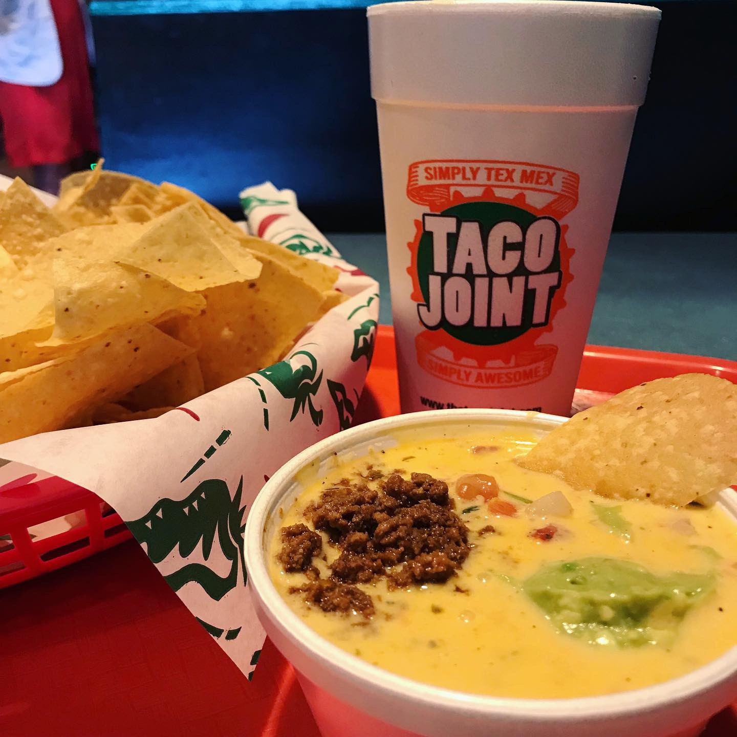
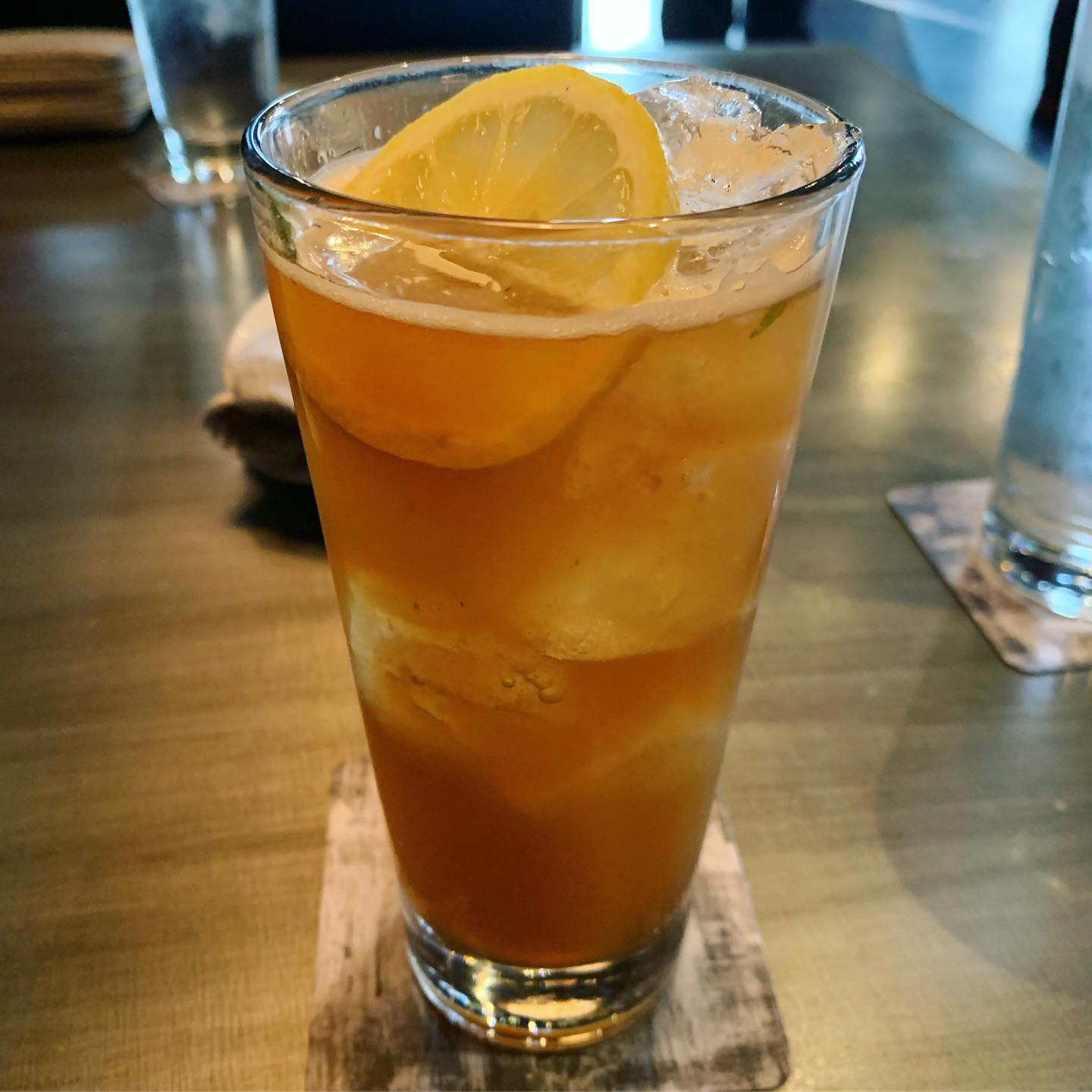
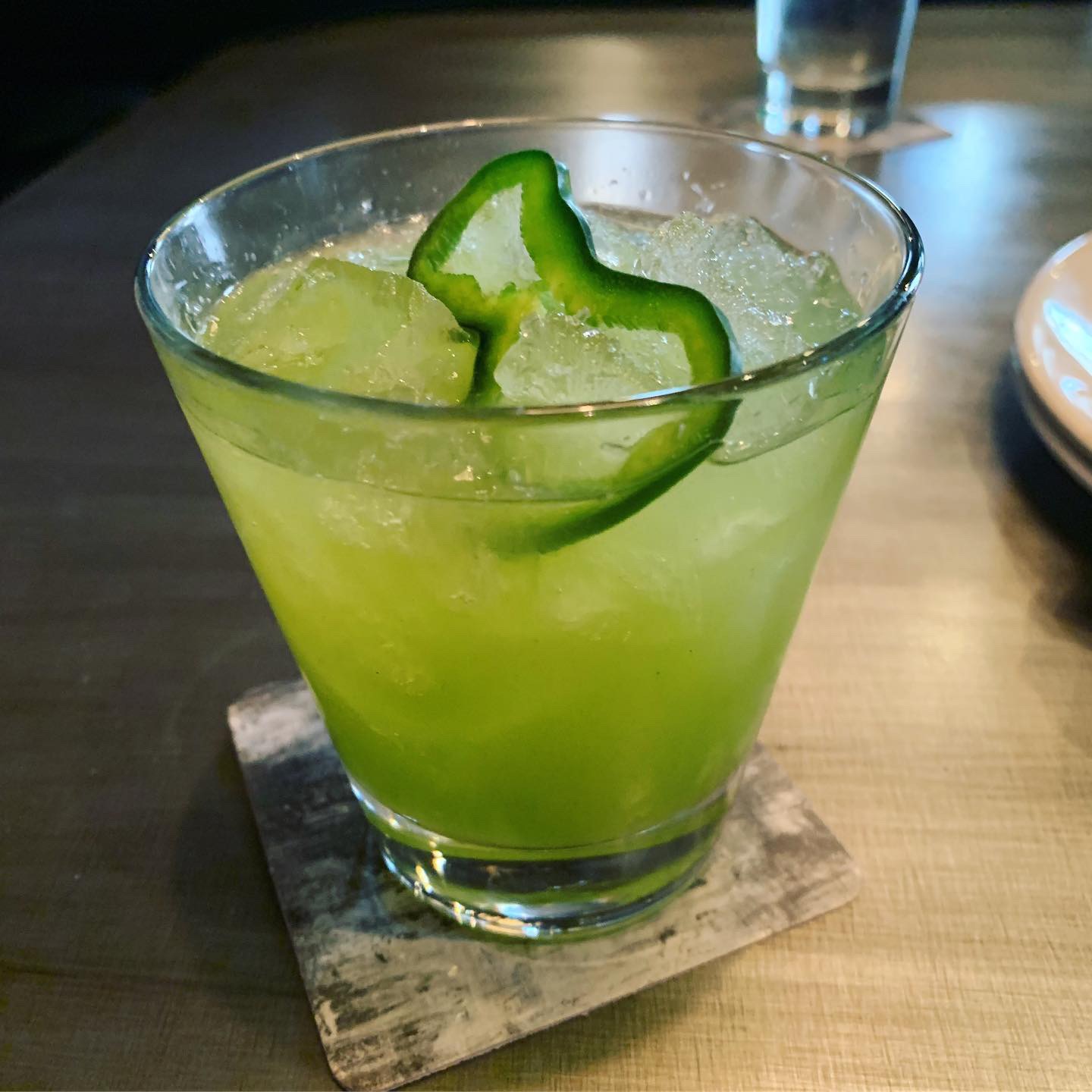
I like tacos and I love queso, so taking a preview of the menu on the website, I was prepared to order the “Disaster” which is a big bowl of cheesy queso with meat, pico and guac and a giant basket of chips. I got suckered into ordering the Wednesday special – the sour cream chicken enchiladas, because obviously the specials sign caught my eye AND because the menu was pretty busy AND I felt “order pressure” at the counter with people waiting behind me. You know what I’m talking about. Danny ordered the Spicy Pork and the Spicy Fried Chicken tacos. As we find at most restaurants, what most people think is spicy is not really spicy at all. I guess spice is different than hot, that’s fair. He said they were “ok but not hot.” The disaster & chips came out first and it was pretty good. My enchiladas were ok but presentation was not great. It came in a round aluminum pan. My issue with the food is that there are so many taco concepts in Dallas that have elevated their food and presentation and brand, that while it might be pretty popular with the locals, I just didn’t see anything WOW on the menu, on the walls or on the table. The iced tea was fresh. 😉
Environmental Branding:
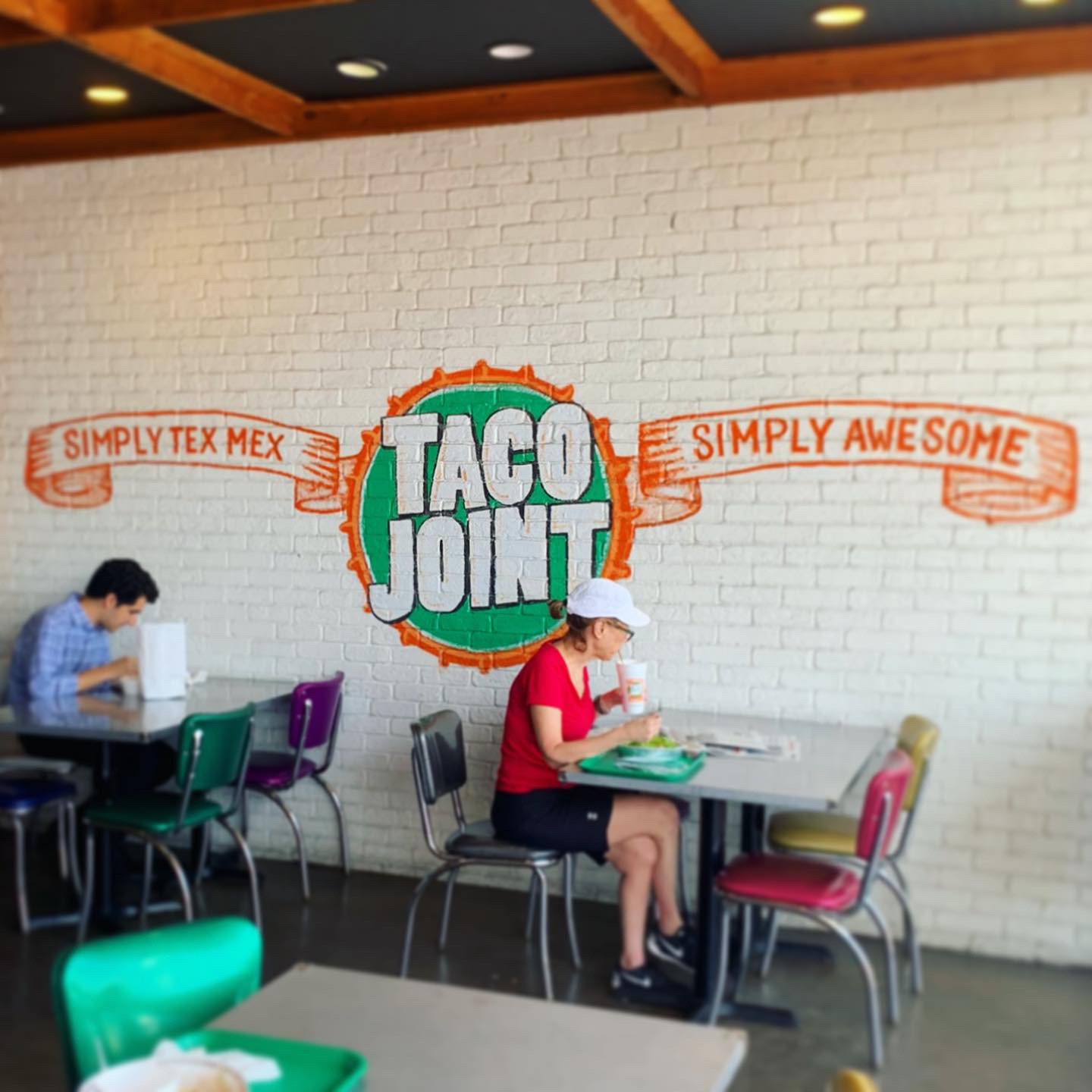
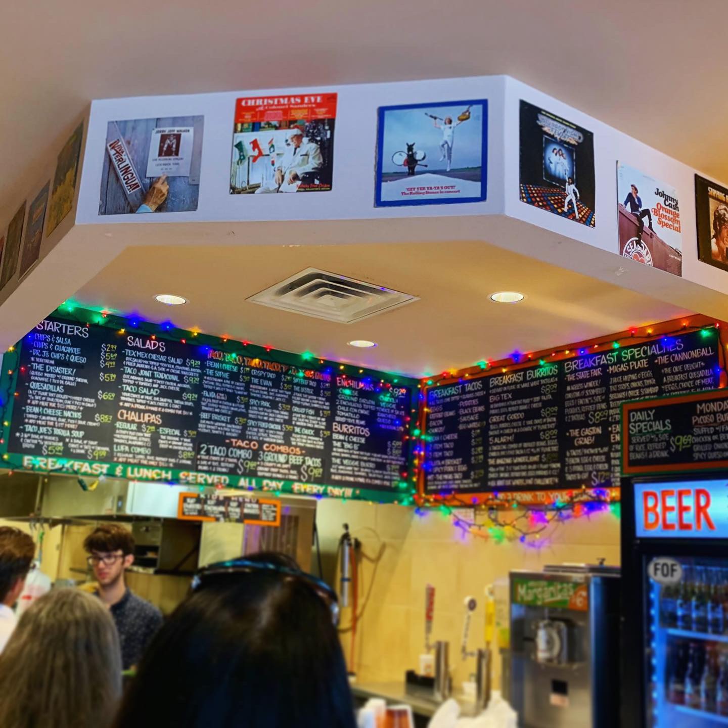
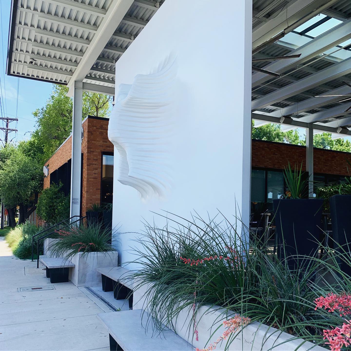
Taco Joint’s Preston Center location is the brand’s fourth location. It occupies the former Extreme Pizza space. I’ve always loved this space because it has a built in covered outdoor patio in front which I think makes for a nice inviting entry and opportunity to put your brand in the face of passers-by. This strip gets lots of walking traffic and it was pretty busy when we got there with a line at the counter. Beyond my love of the entry, this brand is not very polished like many of the other restaurant brands we review. It reminds me of Texadelphia – just a neighborhood joint with unspectacular furniture and decor. The walls were filled with album covers stapled to the wall. There were some painted murals as well. The menu board is total chaos. Chalkboard-style, filled edge to edge and draped with some colored christmas lights. No signature light fixtures, no feature decor items. Since “joint” is in the name, the environment did meet that expectation.
Branding DNA:
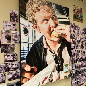
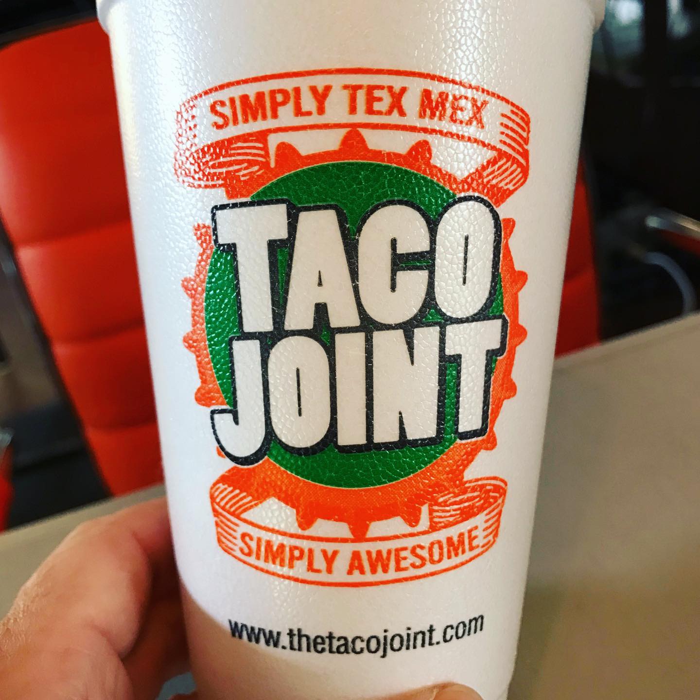
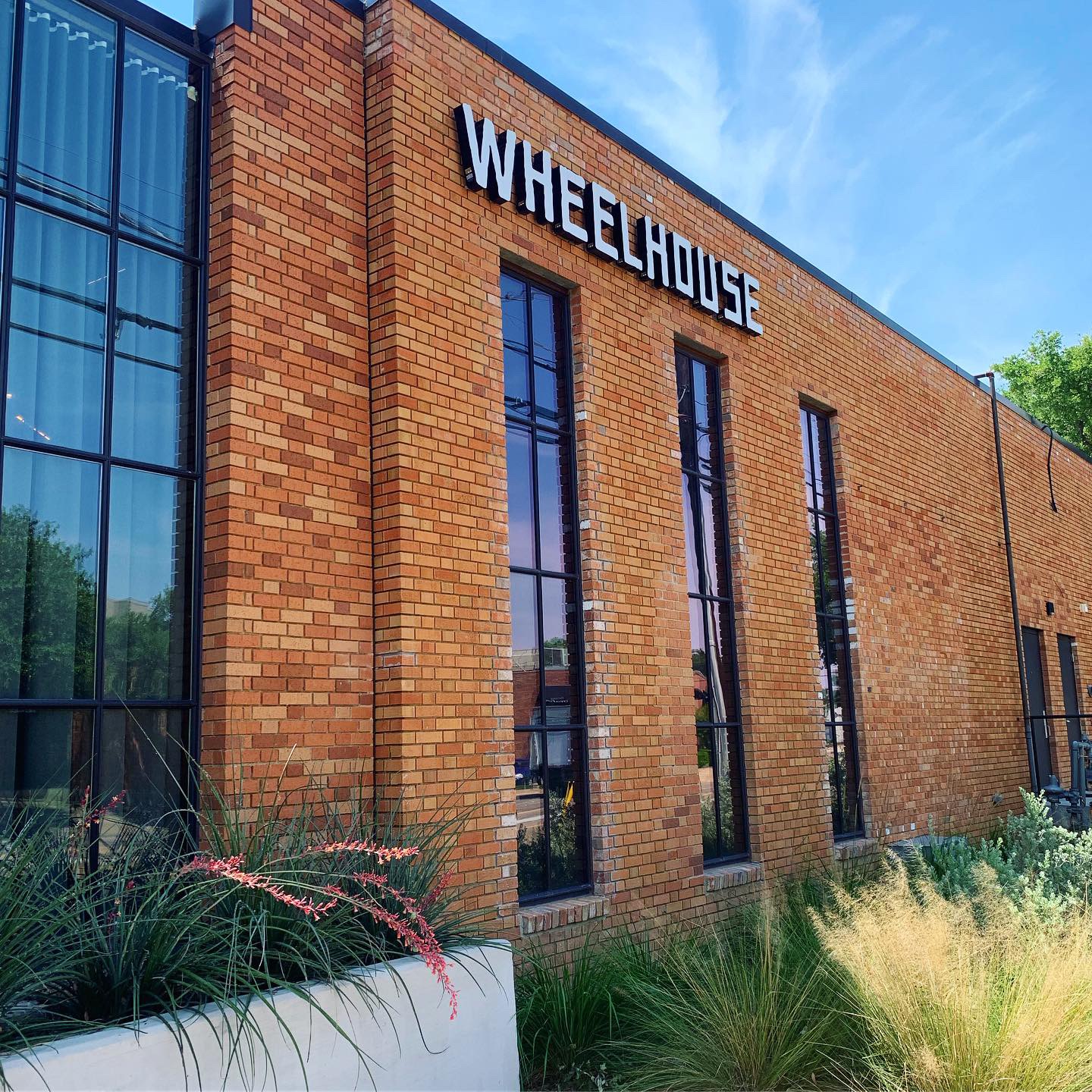
Taco Joint has a decent logo and custom printed cups. They serve their food in red plastic baskets lined with tissue & foil. I didn’t see any custom bags or other branded items. The had good exterior signage. I think part of the mass appeal of this brand is its “joint-ness” and its history. I give mad props to restaurants that make it 11 years and expand because they must have decent food and a local following. I’m just saying that new customers can only judge a place on its current merits and I think it could up its game.
Digital Branding:
We always check out the website before we visit a restaurant. The design of the website was pretty good I thought. Great use of color, graphics and typefaces. I only had issue with using the menu. I’d prefer that Breakfast, Lunch/Dinner and Tacos/Combos were one scrolling menu so I could see everything without having to click on a different tab. To say their social media accounts could use some love would be an understatement. Taco Joint has social media accounts, but it’s been years since they’ve made any posts. To me this feels like a huge missed opportunity, especially in today’s digital age.
–Danny
Score:
MJ gives it a B- and Danny gives it B
#FridayFeed:
Every Friday, Studio B Dallas visits a local fast casual concept for lunch to critique the brand (and eat lunch). Three rules apply: it’s a concept we haven’t been to or it’s been in the restaurant news and it’s within 10 miles of our office. Wait, four rules – it can’t be sushi. Danny doesn’t do sushi. If you have any suggestions on where we should eat next, feel free to leave it in the comments. Look for our restaurant branding reviews each Friday! MJ & Danny
-
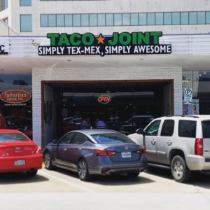
- Taco Joint Exterior

-

- Taco Joint Patio
-
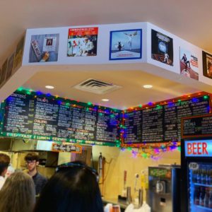
- Taco Joint Menu
-
- Interior Decor
-

- The Disaster
-
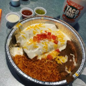
- Wednesday Special

-
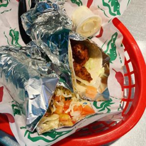
- Spicy Pork & Spicy Fried Chicken Tacos

-

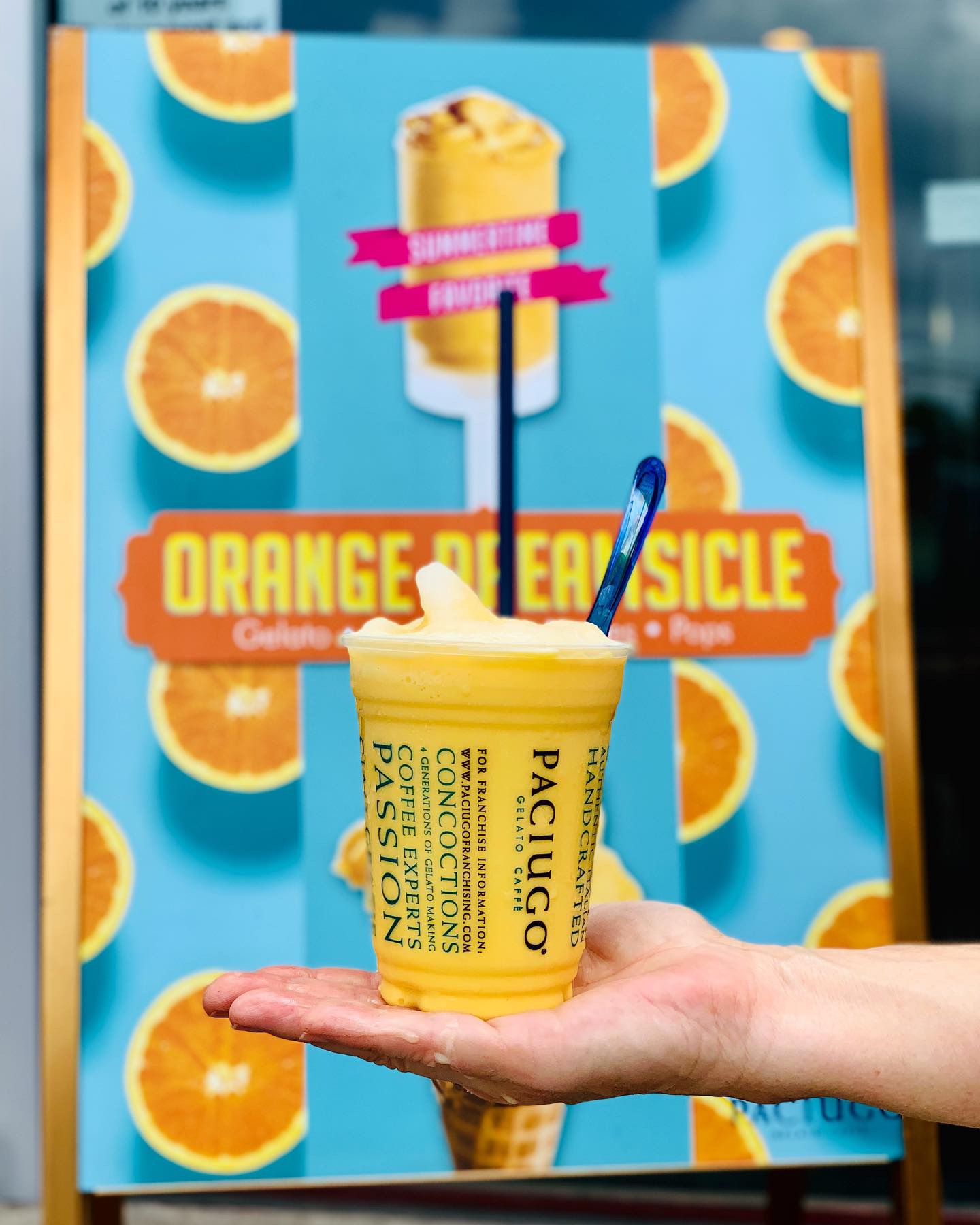
- Custom Printed Cups

Recent Comments