
This week’s #FridayFeed restaurant branding review is Velvet Taco on Greenville Ave.
Order Up!
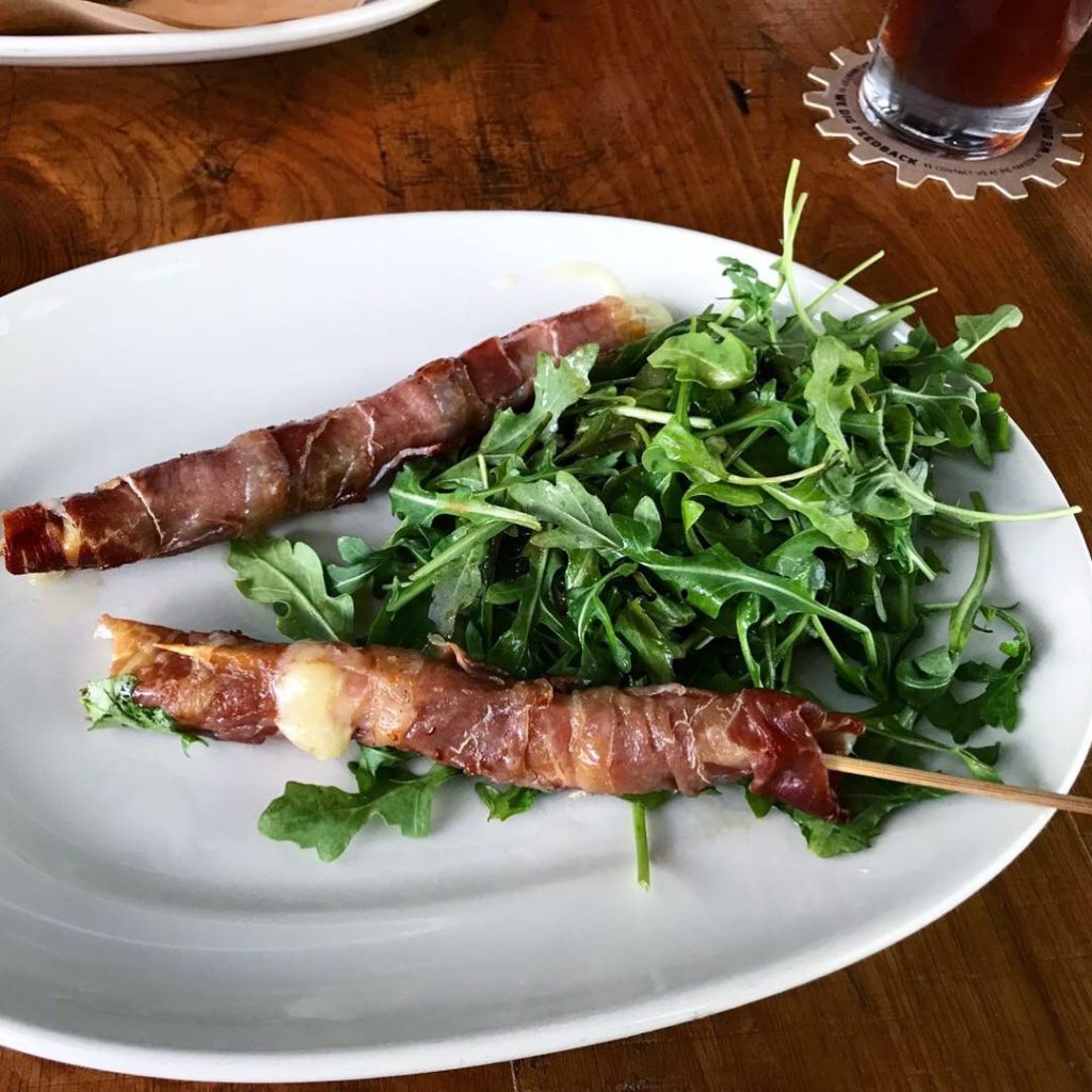
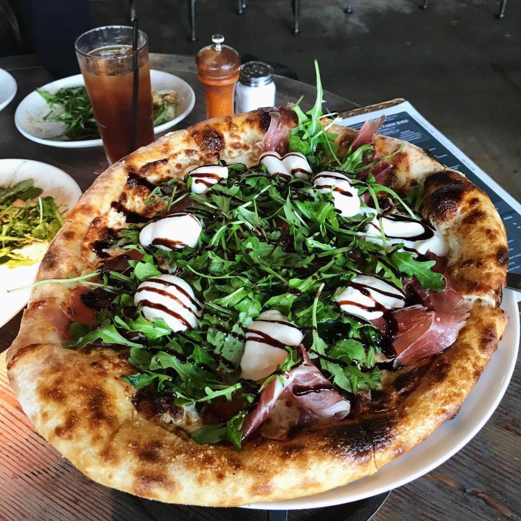
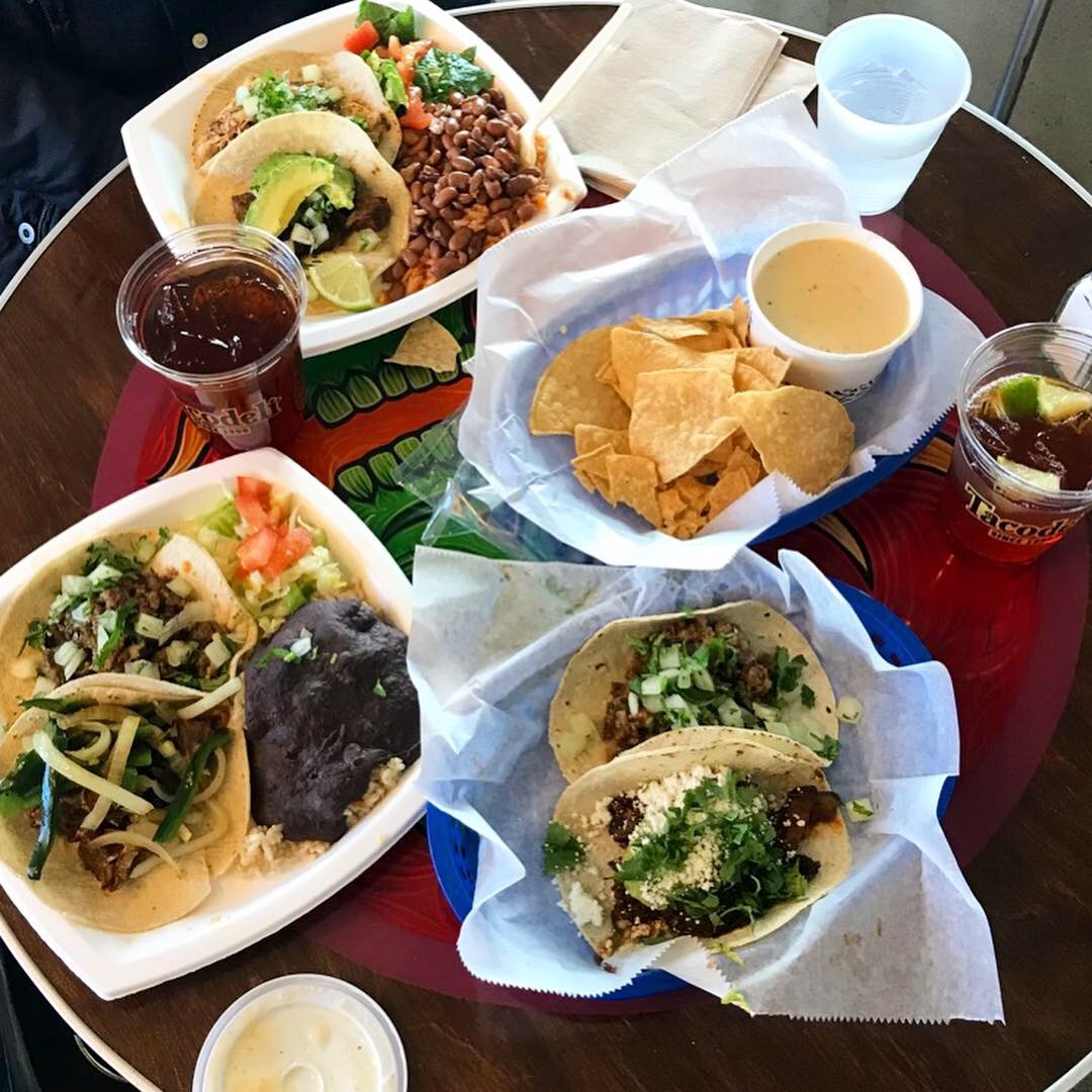
Velvet Taco has 10 locations with the Fitzhugh location being the O.G. The FOOD at VT is the hero. Notice I didn’t say tacos. This is Velvet TACO but really, their menu is a culmination of delicious international dishes SERVED in various tortillas. The flavor combinations are amazing and the menu is not overwhelming or expected. I ordered two tacos. My first was the fried cod with curry mayo, yum…I didn’t bother with the tortilla or slaw and I would have rather had two pieces of cod on a plate. The brisket taco has a comté (French origin – I looked it up) cheese-encrusted tortilla so basically it’s a tortilla with crispy fried cheese on the outside. AHH-mazing surprise. We ordered the tater tots and they were good. The fried egg on top makes a good picture and since I love fried eggs, I ate it but c’mon, the “spork” is no bueno. Next time, I’m bringing my own fork. Danny ordered the spicy tikka chicken taco. Which is crisp tenders, spicy tikka sauce, buttered cilantro basmati rice, raita crema and Thai basil on a flour tortilla. Danny says “it’s the prefect amount of heat and extremely flavorful.“ I hear the red curry coconut queso is delicious. I like curry and I like coconut and I like queso but the I’m not sure I’m going to like them in the same dish. We’ll see next visit!
VT has, what I hear, is a really delicious red velvet cake. When you see a photo of it with the bourbon drizzle it looks pretty tasty but the counter presentation and display needs some serious love!
Secret Menu:
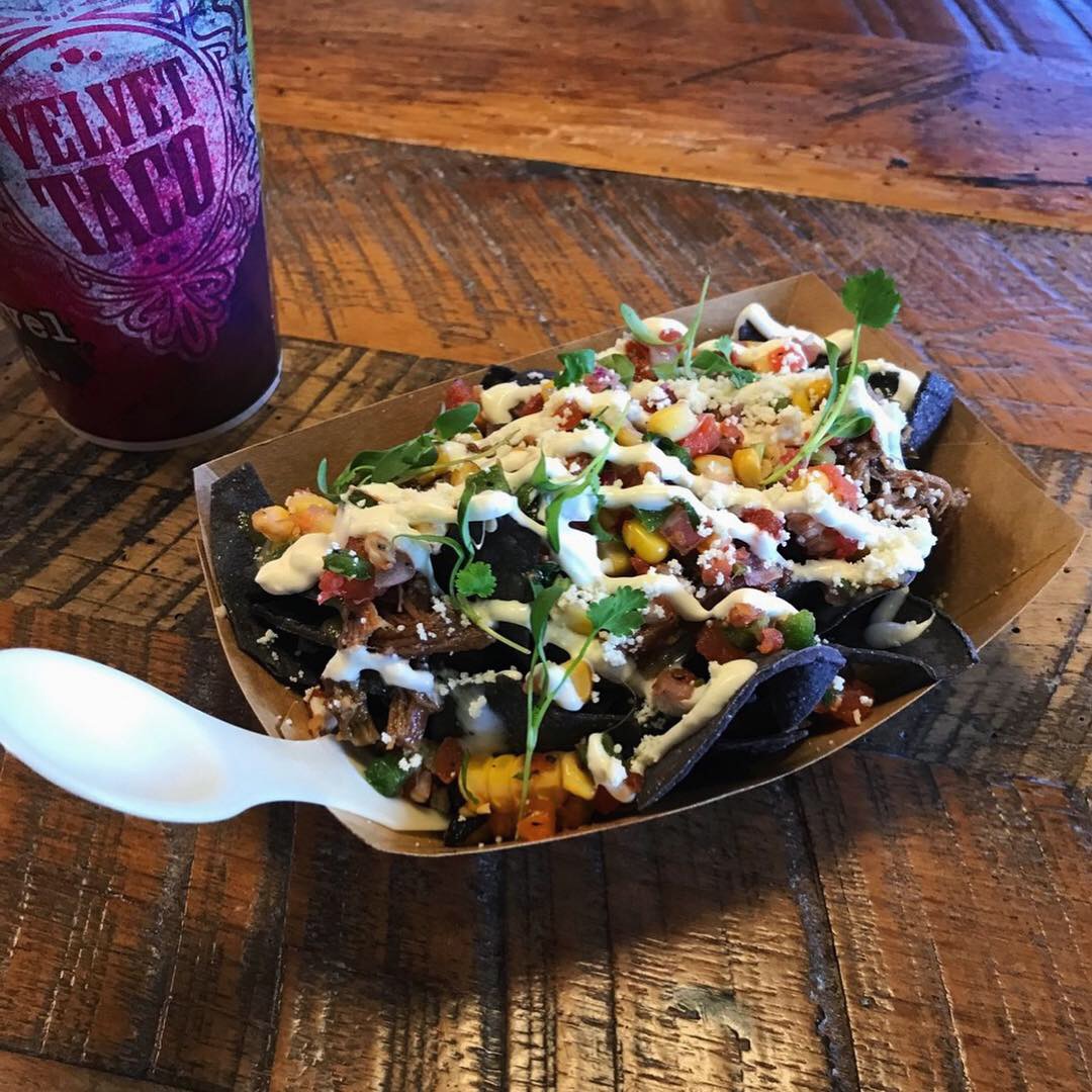
Velvet Taco has a secret menu item that we are about to blow the lid off of. BRISKET NACHOS! That’s right, Velvet Taco has Brisket Nachos and they’re euphoric! The Brisket Nachos are only on the menu at their Ft. Worth location, but remain a secret menu item that you can get at any of their other locations… if you know to ask. The secret Brisket Nachos are blue corn chips loaded with barbacoa beef, queso blanco, roasted corn pico, lime crema, salsa verde, quest fresco, and micro cilantro. Note that they are a “sides” portion so you still need to order some tacos or queso.
Environmental Branding:
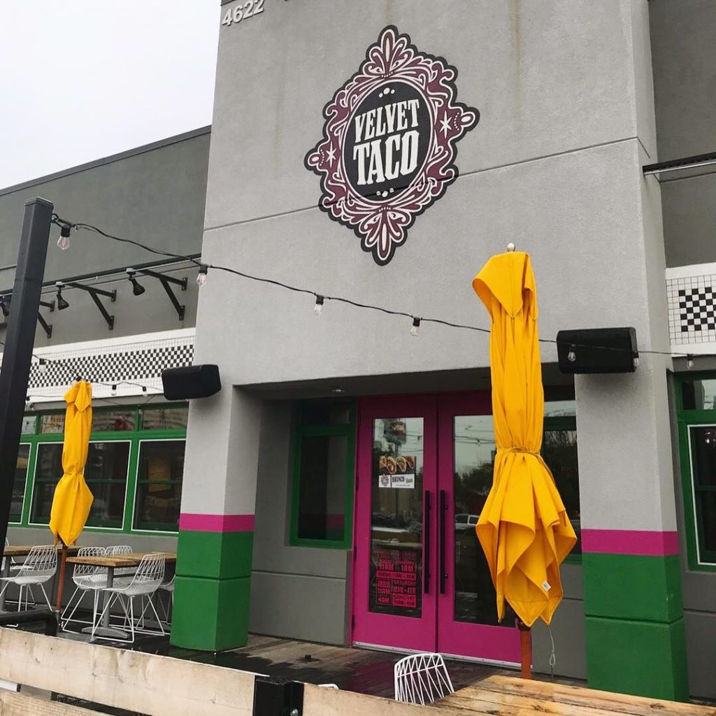
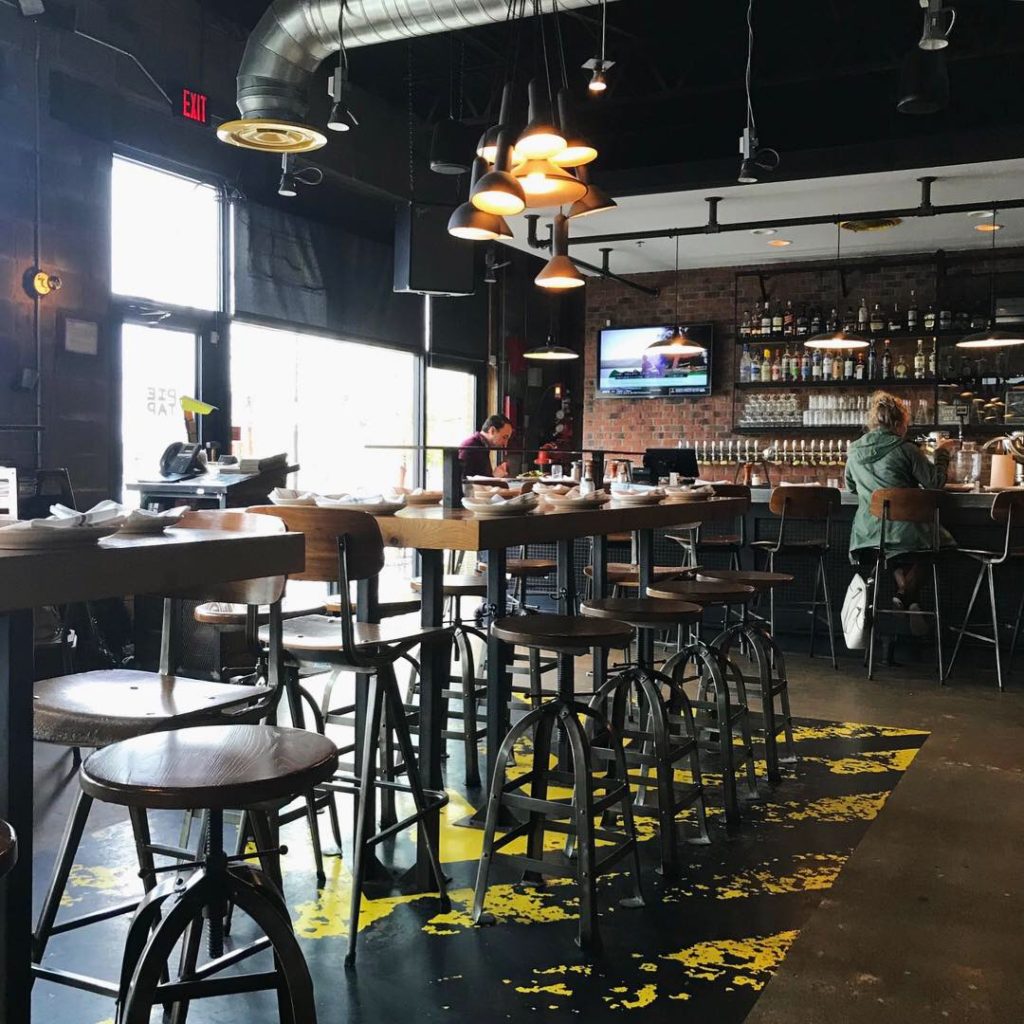
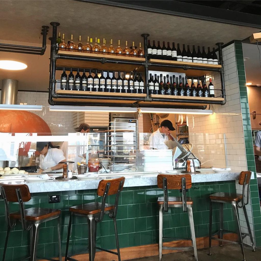
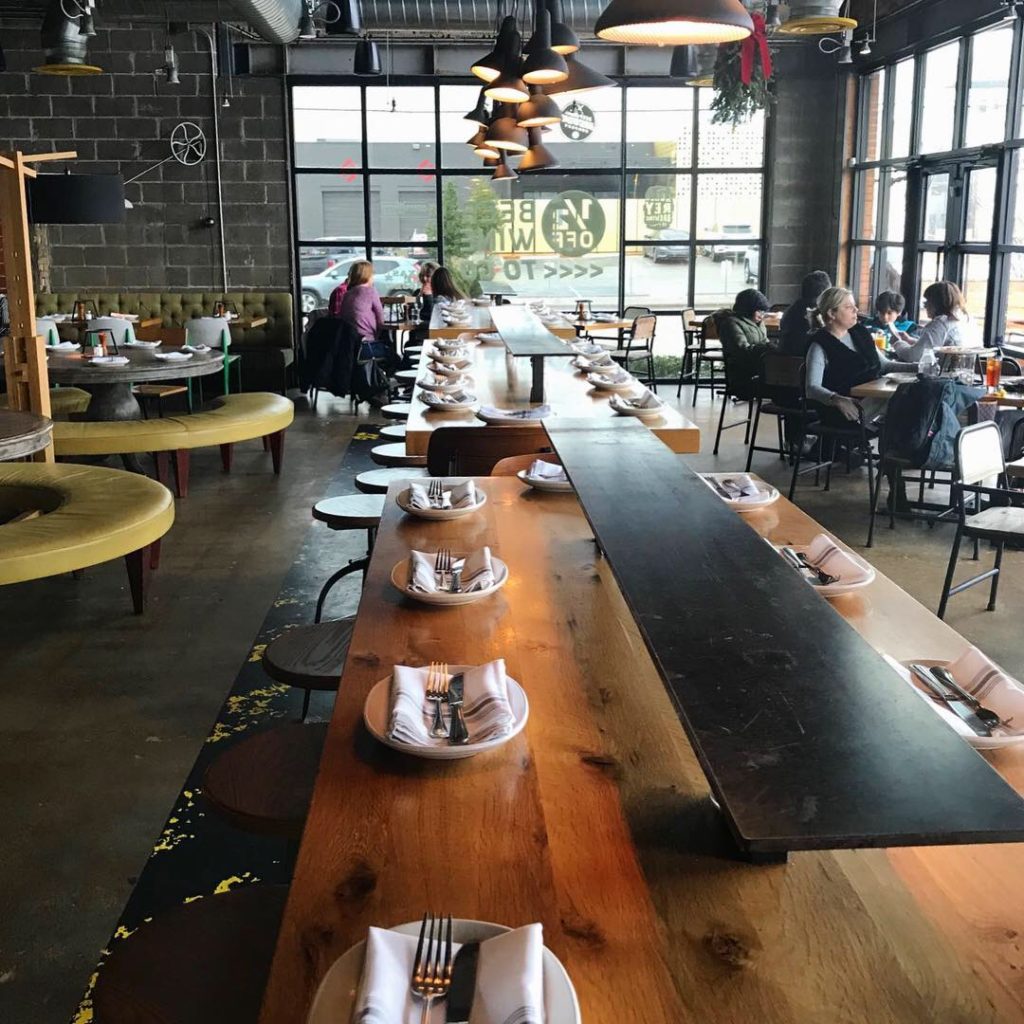
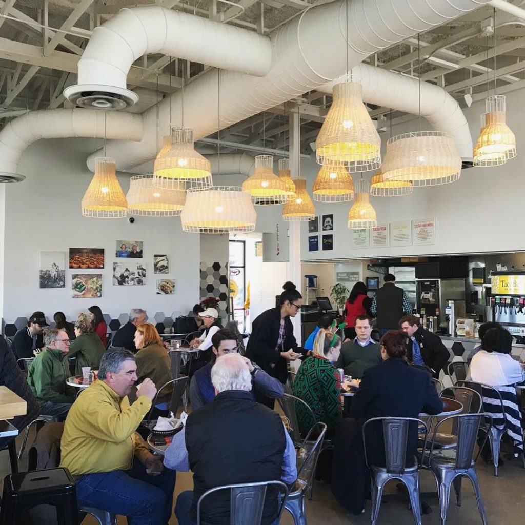
Signage is good. Outdoor seating is nice and there’s a giant colorful mural on one wall. There is also a drive up window for call-ahead orders. It achieves the goal of looking simple and industrial. I wouldn’t call it comfortable but there are some cool upholstered swivel stools all along the window bar. I’d really like to see something soft somewhere in the interior.
Branding DNA:
I like the logo. I like the hot pink. I feel the packaging is a little un-evolved for such a hot brand. I’m not a big fan of the menu board design and the margarita sign unless the “start up” look is intentional and then I guess that’s genius. Velvet Taco has the “indie” look working for them, I just think there’s opportunity to add another layer. If the interior was as rich as the food, that’d be sweet.
Backdoor chicken. Clever. I Like it. Adds a quirky layer to this funky concept.
Digital Branding:
Velvet Taco has a nice website. The left side navigation threw me off so it took me a while to find the “about us” and the “location” info. The “about us” video is great. They should put a link to that on the home page. Their Instagram and Facebook pages mix some marketing images with beautiful food photos that promote their WTF, Weekly Taco Feature. They would benefit from adding some lifestyle images that would showcase their brand style.
-Danny
Score:
I give it an A for food & a B+ for environment. Danny gives it a solid A.
#FridayFeed:
Every Friday, Studio B Dallas visits a local fast casual concept for lunch to critique the brand (and eat lunch). Three rules apply: it’s a concept we haven’t been to or it’s been in the restaurant news and it’s within 10 miles of our office. Wait, four rules – it can’t be sushi. Danny doesn’t do sushi. If you have any suggestions on where we should eat next, feel free to leave it in the comments. Look for our restaurant branding reviews each Friday! MJ & Danny
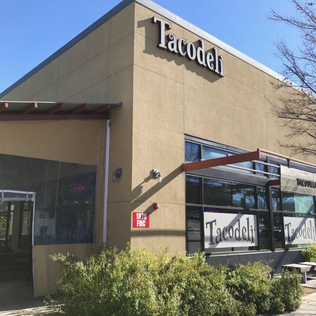
Velvet Taco 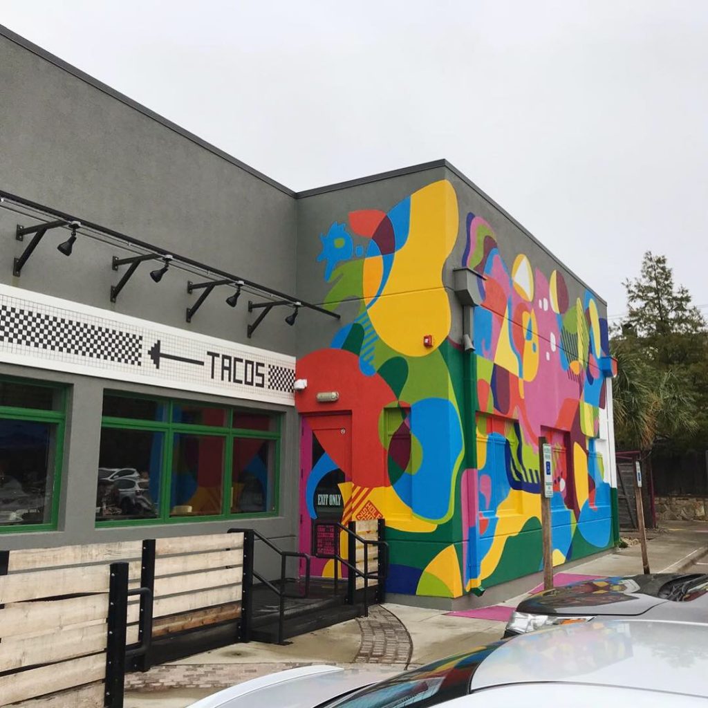
Giant Colorful Mural 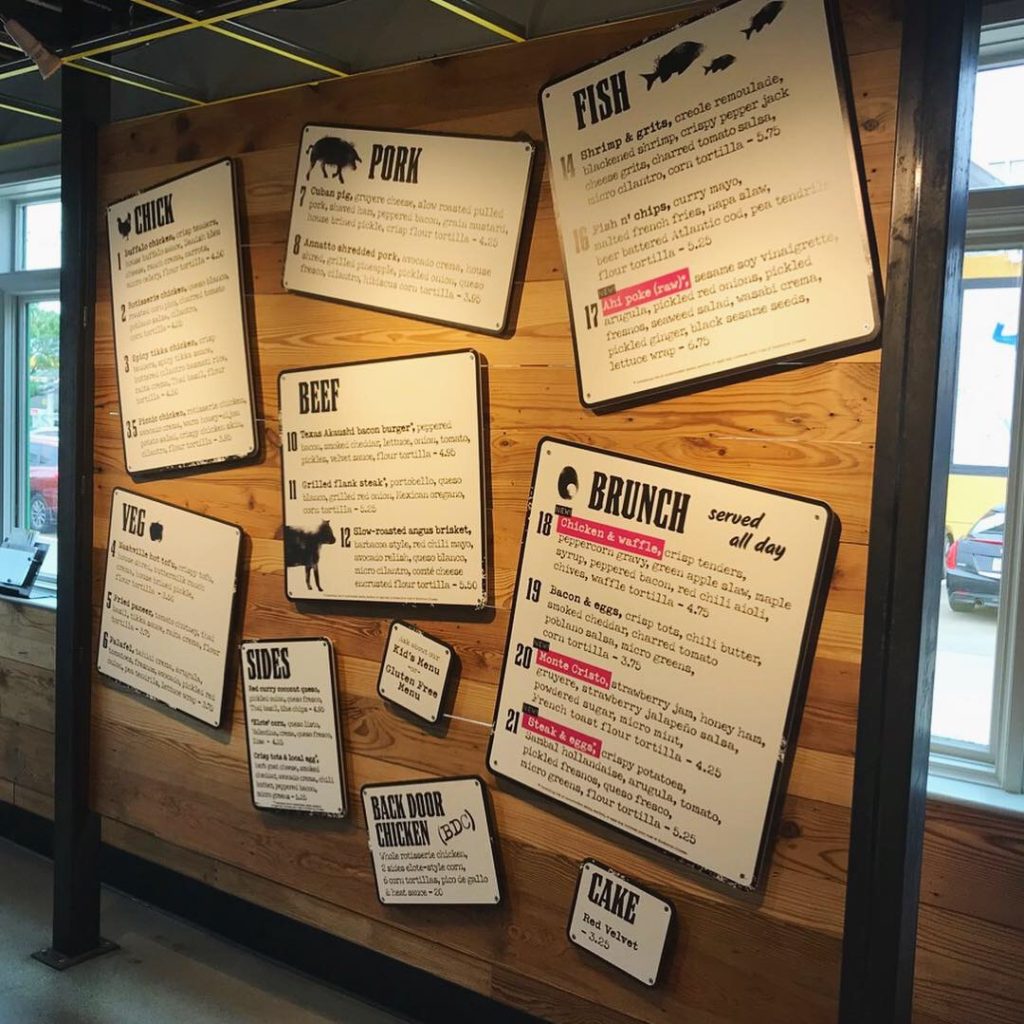
Menu Boards 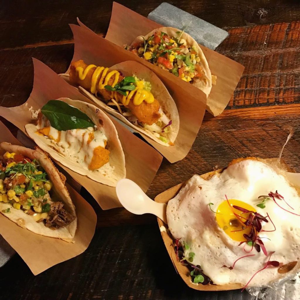
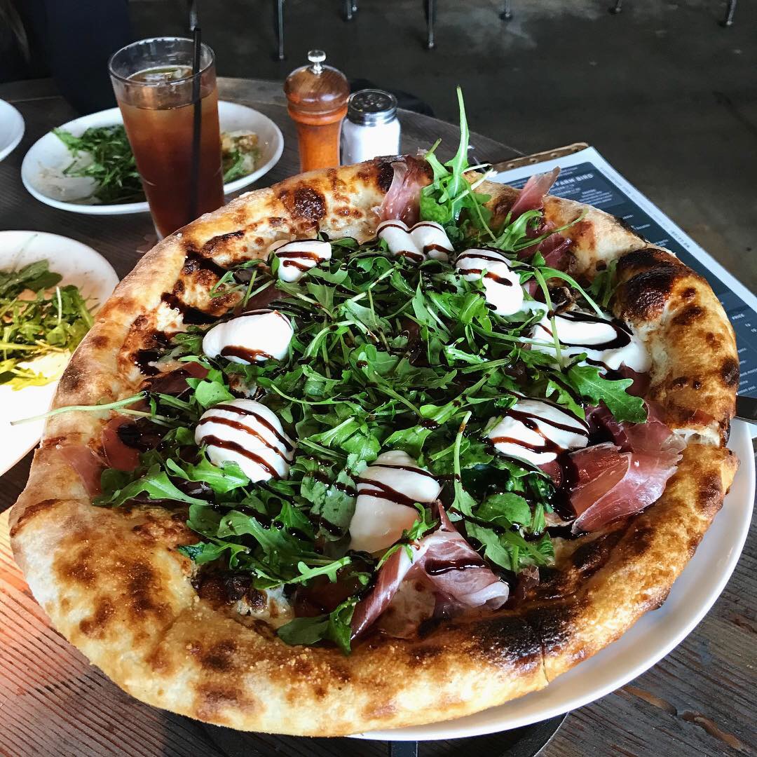
Delicious Tacos & Tots 
Secret Menu Brisket Nachos 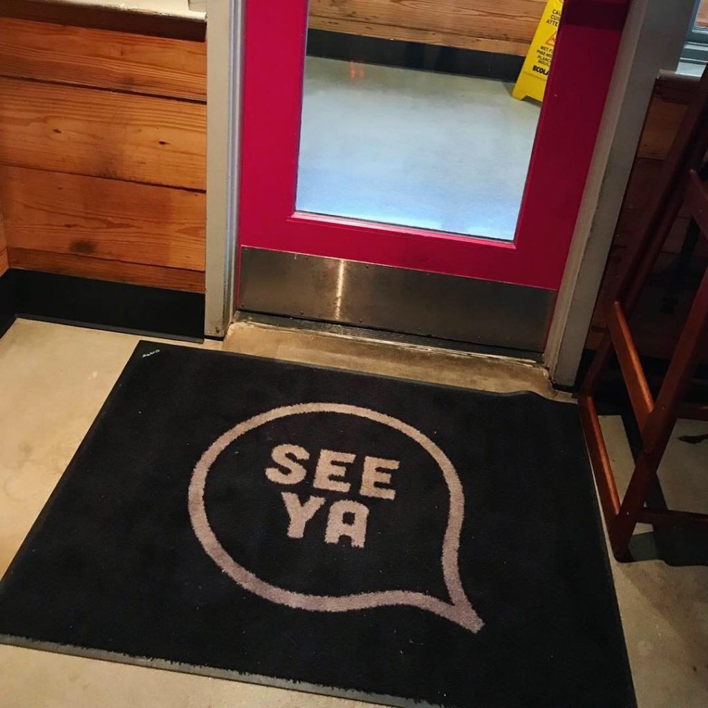
Fun Floor Mat 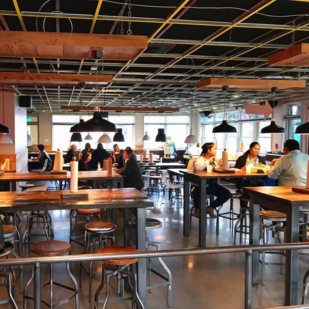
Interior Decor


Recent Comments