
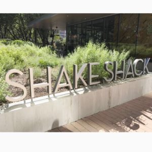
This week’s #FridayFeed restaurant branding review is Shake Shack in Uptown.
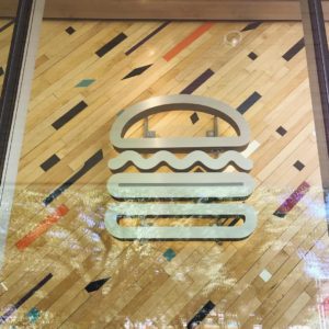
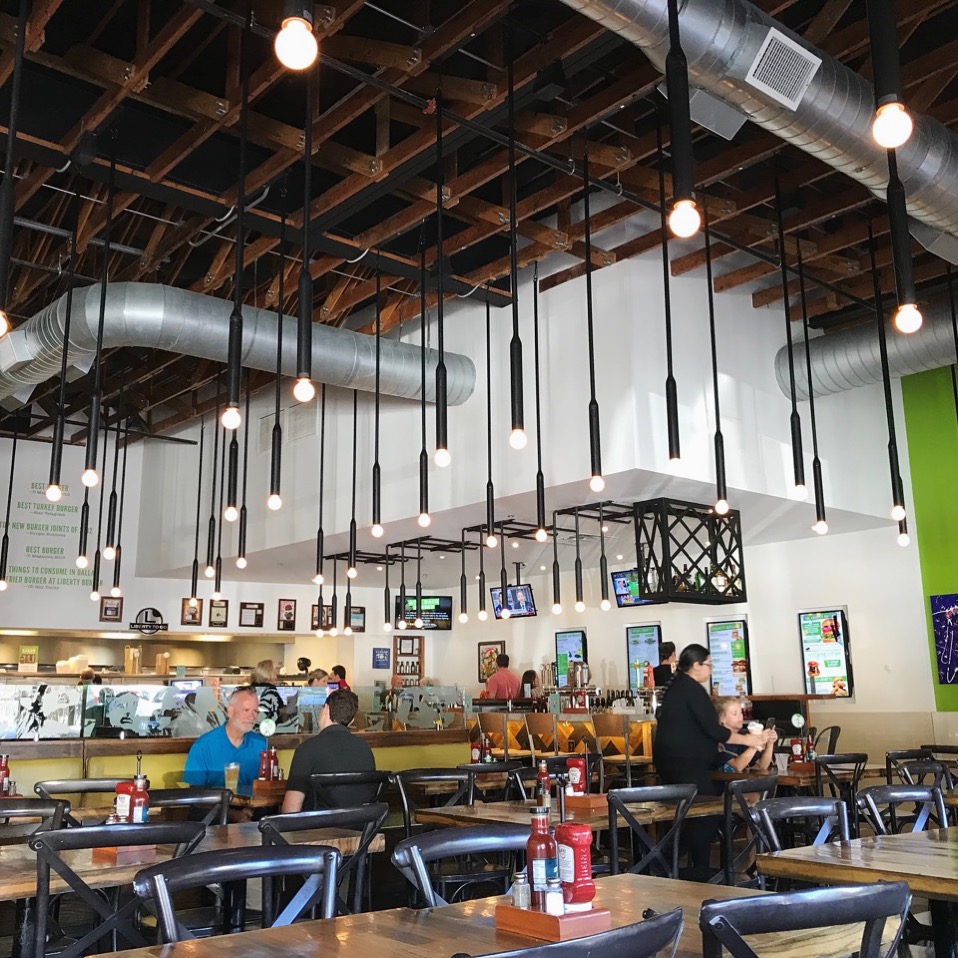
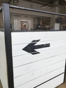
Recently Nation’s Restaurant News released an article on Shake Shack naming its new executive chef, John Karangis. Burgers, fries, and shakes – we couldn’t think of a more perfect place for our #FridayFeed. The Uptown location has a huge, beautiful grass area in the front complete with a few cornhole sets, patio seating, and even water dishes for dogs. This outdoor area is reminiscent of their first location in NYC’s Madison Square Park. Before you get to the cashier to order your food, they have a small display of Shack apparel. I found the “baby got shack” onesie especially clever. Similar to Liberty Burger, Shake Shack put a lot of time into fashioning their brand language. However, Shake Shack took it a step further by creating minimalist icons for everything in their restaurant, even the signage in the restrooms.
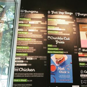
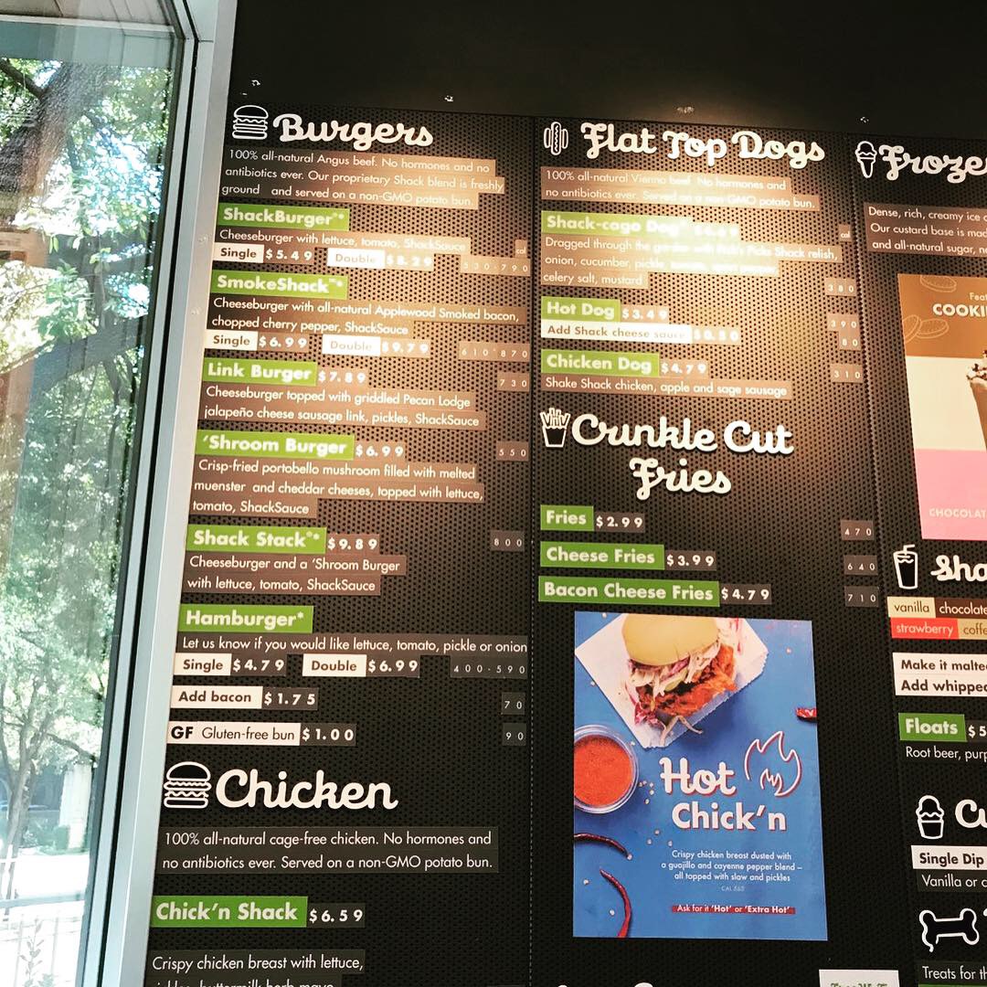
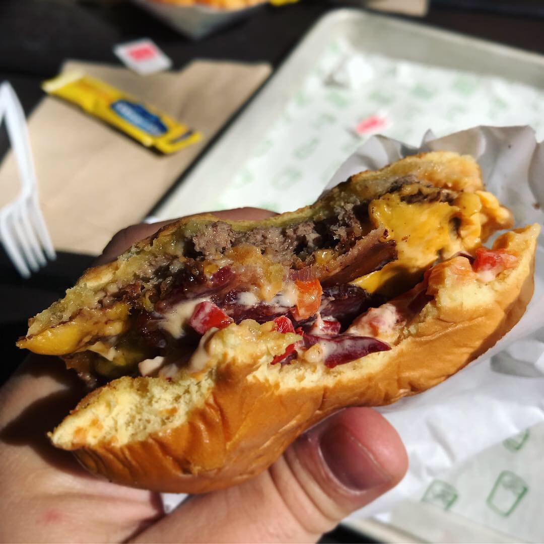
Moving on to the food. I had the Smokestack®, which is a single or double 100% all-natural Angus beef patty topped with applewood smoked bacon, chopped cherry peppers, and Shacksauce™ served on a non-GMO Martin’s Potato Roll. I also had a side of crinkle fries… that’s right, crinkle fries. They are one of the few restaurants around that still serve amazing crinkle fries. In 2013, Shake Shack actually changed their crinkle fires to fresh-cut fries, but due to a massive public outrage they quickly changed them back. Get the full scoop here.
This fast casual concept has exceptional branding, great food, and a modern interior/exterior style. My only complaint was about the sticky outdoor dining tables.
Shake Shack’s brand identity was designed by Paula Scher of Pentagram. She is considered the queen of typography, one of the most instrumental graphic designers in the world, and “master conjurer of the instantly familiar.” Her use of typography is like painting with words. She is even the feature of episode 5 in the Netflix series Abstract.
Their website and social media get major props for promoting their cult following. MJ and I give this concept an A.
Every Friday, Studio B Dallas visits a local fast casual concept for lunch to critique the brand (and eat lunch). Three rules apply: it’s a concept we haven’t been to or it’s been in the restaurant news and it’s within 10 miles of our office. Wait, four rules – it can’t be sushi. Danny doesn’t do sushi. If you have any suggestions on where we should eat next, feel free to leave it in the comments. Look for our restaurant branding reviews each Friday! MJ & Danny
-
- Shake Shack Uptown

-
- Shake Shack Interior Decor

-
- Shake Shack Menu
-
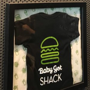
- “Baby Got Shack” Onesie

-

- The Amazing Smokeshack Burger

Recent Comments