FUZZY’S TACO SHOP – Add Friends and Alcohol
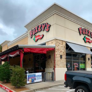
This week’s #FridayFeed restaurant branding review is FUZZY’S TACO SHOP on Mockingbird near Love Field airport. I went to my first Fuzzy’s in Waxahachie about 12 years ago. Cool little taco shop, good food and that’s all I remember. After doing a little research on the brand, I learned that the original founder, Paul Willis was involved in a ton of restaurants and opened the original Fuzzy’s in Ft Worth, near TCU. In 2003, Father and son restaurateurs Alan and Chuck Bush bought the Shop and began franchising in 2009. The brand has more than 100 locations according to their website.
Order Up!
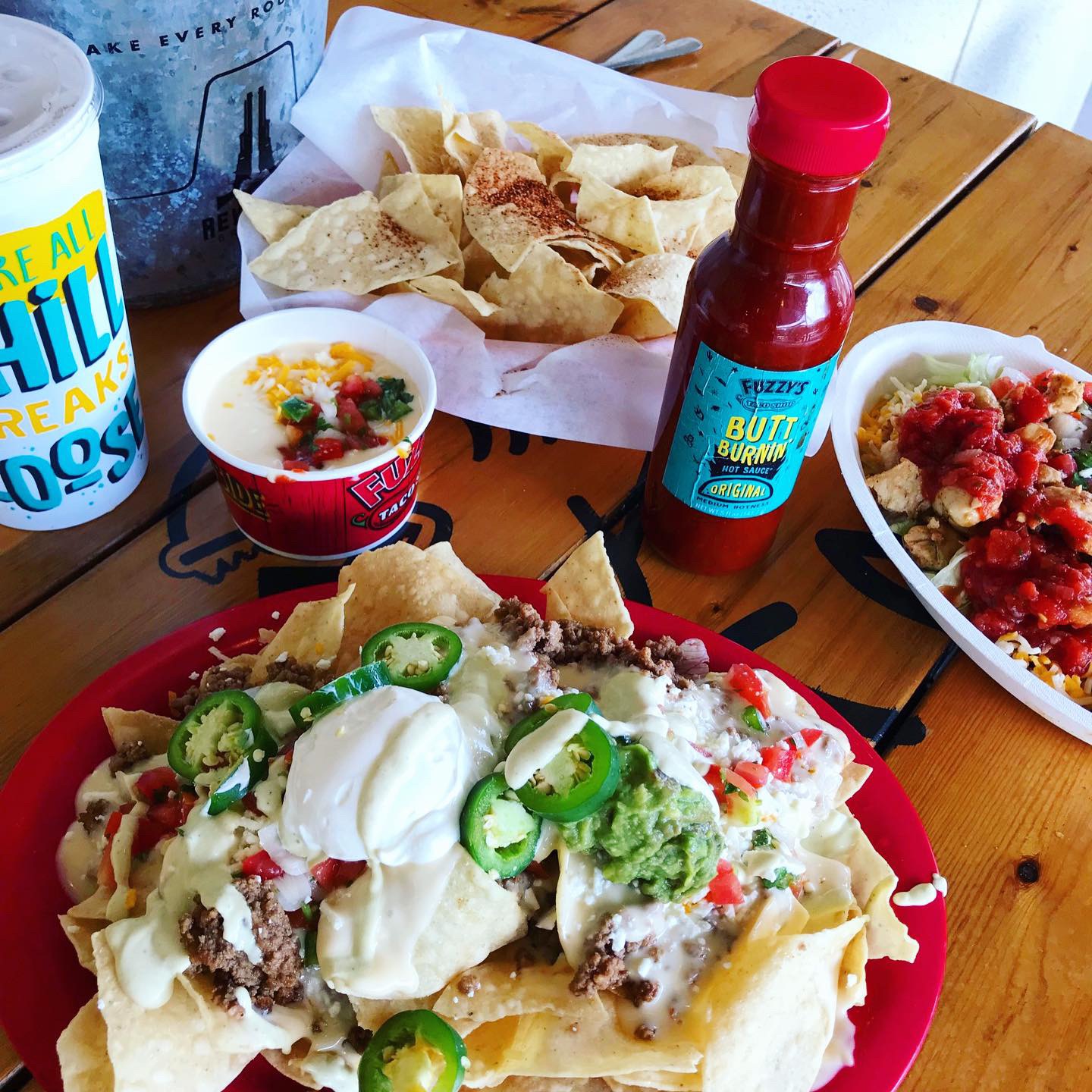
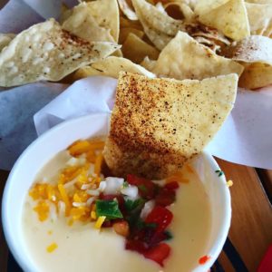
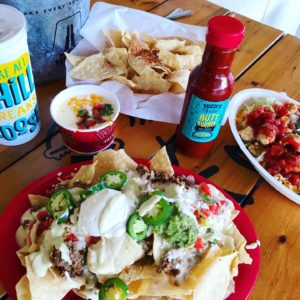
I ordered the nachos and made them “ultimate” by adding sour cream, fresh jalapeños and guacamole. Danny got a burrito bowl and we got a side of chips & queso, just because. My nacho order was a huge plate of yummy cheesy, creamy goodness. No complaints. Queso was so-so. I LOVE Queso, especially white queso. It was good but I just needed it to be awesome.
Branding DNA/Environmental Branding:
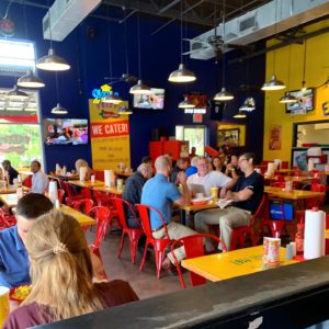
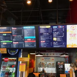
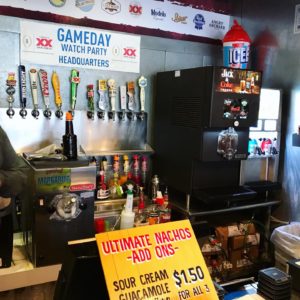
I didn’t notice anything super special about the interior design here. Lots of bright paint colors, MASSIVE – like the biggest I’ve ever seen – Digital Menu Boards and some nice outdoor seating. It’s ok but it’s just missing something. The interior is just a dining room with seats. I didn’t leave there knowing anything about Fuzzy’s tacos – why it’s named that or what it means or where they’re from, what they’re known for, what’s the deal with that cute fish? Don’t blame me but there’s a lot of pressure put on the experience in the fast casual space now. It’s not enough that you have to make great food with some blingy, instagram worthy items and be ever-present on social media – you have to deliver an “experience” on-site as well. Oh, and deliver. with drones. and CBD, make sure you’re thinking about adding something with that… To be fair – an experience can be had when you add friends, family and/or alcohol – which they have plenty in their small little service bar which I loved. Danny and I visit concepts specifically to see what a brand is delivering so we come in with white gloves and take note of everything we like and don’t like. Overall notes – I don’t get the Baja component. The Mockingbird location needs an update and re-paint. I loved the crazy little bar set up at the register. If I was in college still, drinking with friends at a cooler location, maybe I would love it more.
Marketing Miss:
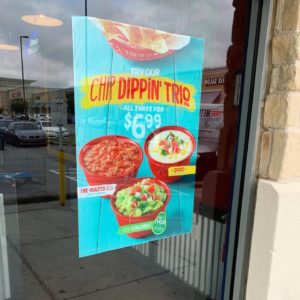
We decided to go to Fuzzy’s because it was on our list but also because I recently connected with the VP of Development on LinkedIn. I’m also doing some research on queso for another project and I noticed their current promotion online. If you donate $2 to No Kid Hungry, you get FREE chips and queso* *Disclaimer – FREE on your next visit…psyche! Anyway…we got there and I realized that the cashier didn’t ask me to donate and I didn’t see a sign for the promotion so maybe this franchisee isn’t participating or maybe I just missed it. Here’s some FREE data for the Fuzzy’s marketing team: I saw FREE queso marketing online. I saw picture of queso & chips online. I went to Fuzzy’s to get queso and chips. I ordered nachos and STILL ordered Queso and chips. Data results: Queso sells!
Digital Branding:
Fuzzy’s Taco shop has a great website filled with bright color schemes and can be easily navigated. On their site they also have a stream of their social media post, which I think is brilliant! My only issue is the parallax scrolling on the menu page of the website. The images are not big enough vertically to be able to see the beautiful food photography. On their Facebook and Instagram account they mix some marketing with and large portion of great food photography and a dash of lifestyle. They do an awesome job with the food photos, but could use some more lifestyle imagery. Overall they have a good website and even better social media posts, but what they’re really missing is the unique factor that sets them apart from other taco joints.
–Danny
Score:
MJ gives FUZZY’S TACO SHOP a B- and Danny gives them a solid B+. This concept is missing something.
#FridayFeed:
Every Friday, Studio B Dallas visits a local fast casual concept for lunch to critique the brand (and eat lunch). Three rules apply: it’s a concept we haven’t been to or it’s been in the restaurant news and it’s within 10 miles of our office. Wait, four rules – it can’t be sushi. Danny doesn’t do sushi. If you have any suggestions on where we should eat next, feel free to leave it in the comments. Look for our restaurant branding reviews each Friday! MJ & Danny
- Fuzzy’s Taco Shop
- Fuzzy’s Window Cling
- Fuzzy’s Interior
- Huge Digital Menu Boards
- Bar Setup at Register
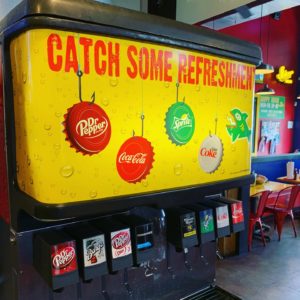
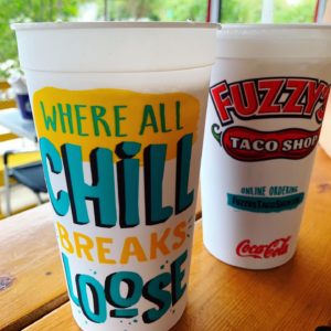
- Fuzzy’s Fountain Drinks
- Chips & Queso
- Nachos & Burrito Bowl
- Fuzzy’s Branded Cups


Recent Comments