Nostalgia is brand currency

In a world where every brand is shouting to be seen, nostalgia whispers—and everyone listens.

There’s something about a vintage logo, a familiar jingle, or a throwback color palette that makes people stop scrolling. It’s not just clever design or old-school vibes. It’s emotional muscle memory. When brands tap into nostalgia, they’re not just selling a product—they’re reconnecting people with who they were when they first felt something.

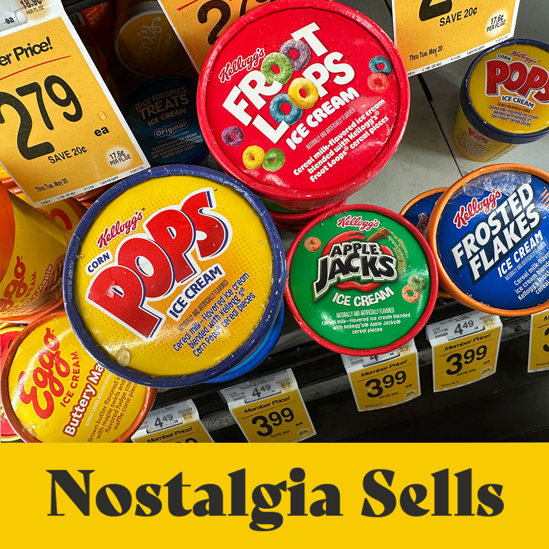
Check out these breakfast cereal flavored ice creams. These aren’t just food items. They’re edible time machines. One bite of Apple Jacks or a scoop of Eggo Waffles, and boom—you’re back in the grocery store with your mom, begging for the box with the prize inside.

Smart brands know that tapping into this nostalgia isn’t about being retro for retro’s sake. It’s about emotional resonance. That’s why cereal brands are reissuing their original box designs, and why ice cream companies are bringing back discontinued flavors with cult followings. People don’t just want a snack—they want a feeling.

But here’s the thing: nostalgia isn’t about getting stuck in the past. It’s about using the past to spark something new. The best brands don’t mimic—they remix. They create products and experiences that feel both timeless and timely.

So if your brand feels like it’s trying too hard to be “next,” maybe it’s time to look back. Because sometimes, the future of branding is just a familiar feeling—cleverly disguised as dessert.

The colors make me “feel things” about the brand

What’s black & white and red all over? Not the New York Times Games!

I’m in the business of customer experience so I’m hyper aware of things that get my attention. The big obvious ones are obvious, duh, but it’s the ones people don’t realize are having an effect on them that fascinate me. It could be a sound, a smell, a noise or in this case – colors. Big beautiful saturated colors.

While I’m not a daily gamer, I have a large family and somehow The NYT’s wordle game has become the morning greeting on the family text thread. When I remember, I’ll jump on the app and do the spelling bee, the wordle and maybe the mini but there’s something the NYT games have that I really respond to – so much so that it makes me want to play more games – HAPPY, FUN, POSITIVE COLORS. I think they actually make me “like” the brand more. Good move for a brand built on black and white.

**Oddly, the most popular Wordle game is the only one that doesn’t have a fun color.

Reveal your genius design self!

Who designed this awesome Hot Sauce bottle? Like, seriously, who is the person who actually sketched out this bottle design and said – “This would be cool.”?

Three of the most saturated categories in grocery are SALSA, COFFEE and SPICES.

As a package designer, I’m always so excited when a new product breaks through in one of these categories because it must have a really good brand position.

 In order to actually make it to a grocery shelf it takes so much work. If you’re a startup, this means probably years of thinking about your product, tinkering with the recipe, giving to friends and family, selling at a farmers market before you ever find a buyer who is willing to pull another product to put yours in. Once you get there, it takes a lot of marketing and money to stay there.

I’m a member of the DFWCPG (Dallas Fort Worth Consumer Packaged Goods). They host in-person and virtual events and it’s free to join. These events are where I meet people on their entrepreneurial journey to get their product on the shelf. The buyers will tell you that nothing is more important than a unique product offering and a great founder story. I’m getting off-topic, sorry. The reason I’m writing this post is because I purchased a new hot sauce last month. Granted, this product is made by Herdez, a well established brand with many products. I’m sure it was a little easier to get this product in the store but it’s the BOTTLE and the DESIGN that made me buy it. Scratch that – its the BOTTLE that made me buy it. The label design is nice but it’s this adorable, fit-in-your-hand-size avocado shaped glass bottle that I’ve never seen before. The lid even has a pebbly texture like the outside of an avocado from Mexico (not a California avocado). A first, I thought it was their guacamole salsa in a new package but it turns out that it is a new product that Herdez launched in October .

POM, Truff, Mrs. Butterworths Syrup, Method Soaps – all products with unique bottles. Here’s the thing – you can’t go buy unique bottles somewhere and just put your product in them. They have to be designed and prototyped and then commissioned to be made – and in large volume. A glass company is not going to make you 1,000 custom bottles for your locally famous hot sauce. That opportunity is reserved for the established and the rich. I got to go to the Pepsi Innovation Lab in New York a few years ago and while I was there, I saw that their team of designers was working on new bottle shapes and they were making their prototypes with 3-D printers. That is the stuff that package and brand designers dream of right there.

What’s my point again…right – Herdez hot sauce.

So many topics that I could spin off of this but I’ll wrap it up by saying to the person that designed this bottle for Herdez Hot Sauce – “Please comment on my post – reveal your genius design self!”


Inside the Dallas Morning News, literally.

Dallas Morning News staff writer, Maria Halkias gave me a personal tour of the DMN offices last week in Downtown Dallas. Maria wrote a front page story about my client, Wicked Bold Chocolate founder, Deric Cahill, last year and she offered to show me around the news room. Maria interviewed me about how my company transformed Deric’s brand and package from a farmers market start-up special to a professionally branded line of chocolates on the shelves of Whole Foods, Sprouts and thousands of Walmart stores.

The Dallas Morning News has won nine Pulitzer Prizes and is the oldest continuously operated business in Texas, dating back to 1842 where it began publication of The Daily News in Galveston.

Designed by Gensler, DMN occupies the historic Old Dallas Central Library next door to the Statler Hotel. My favorite feature is a running ticker that you can see from the street level windows. Check out the pics of the office here.