
SERIOUS PIZZA + TATTOOS + TAKE OUT
This week’s #FridayFeed restaurant branding review is SERIOUS PIZZA in Deep Ellum. I was seriously wanting to review some pizza this week. I love the &pizza brand but they aren’t in Texas yet. Mod Pizza is in Frisco – aka Oklahoma – too far north. With a quick internet search of pizza near me, I found Serious Pizza in Deep Ellum, right next door to the famous Elm Street Tattoo. I remembered that they are “famous” for their 30” pizza. EATER indicates the brand is now owned by MILKSHAKE CONCEPTS (Imran Sheikh, Citizen, Stirr and Vidorra) but founders Mike Turley and Andrew Phillips are still involved in Ops and culinary.
Order Up!
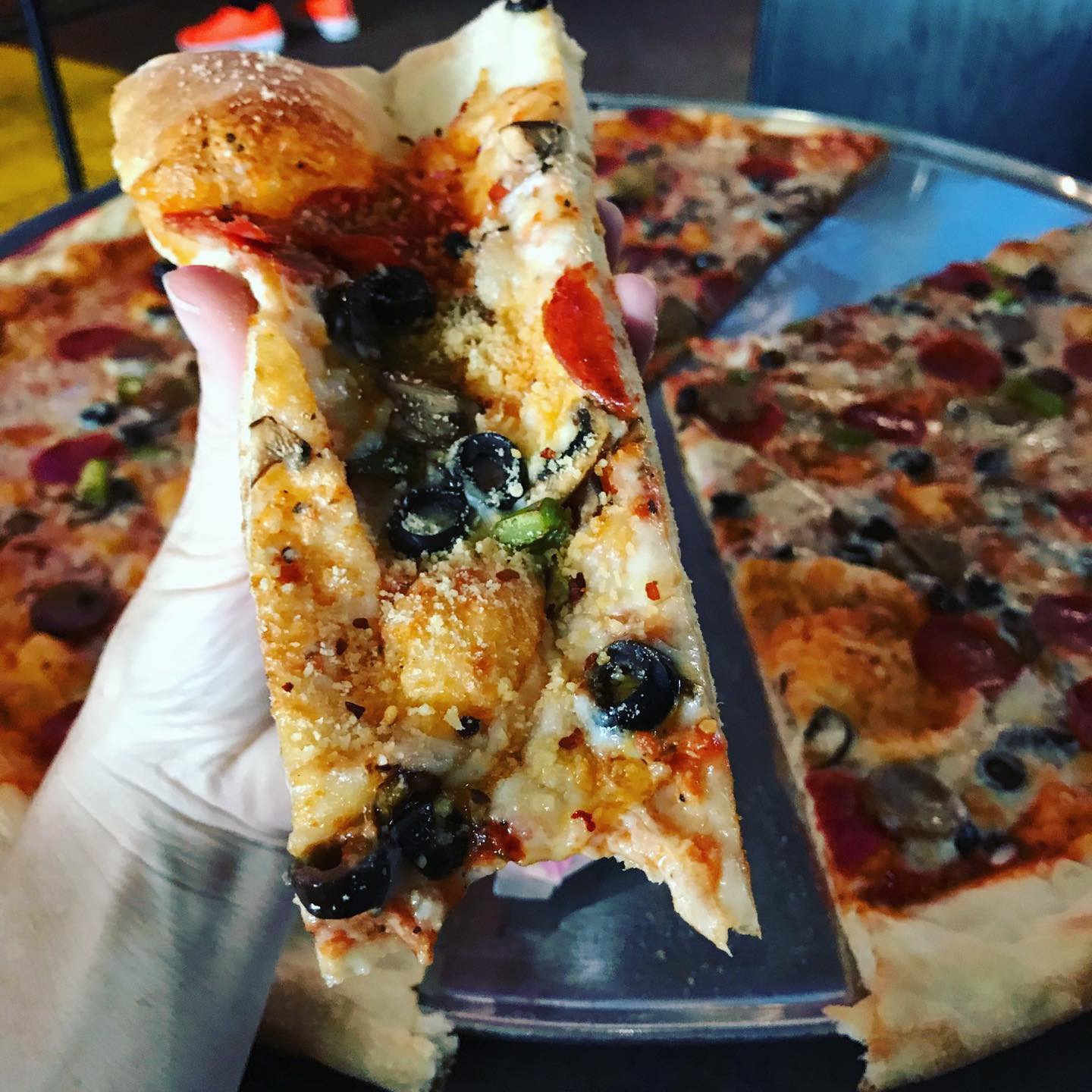
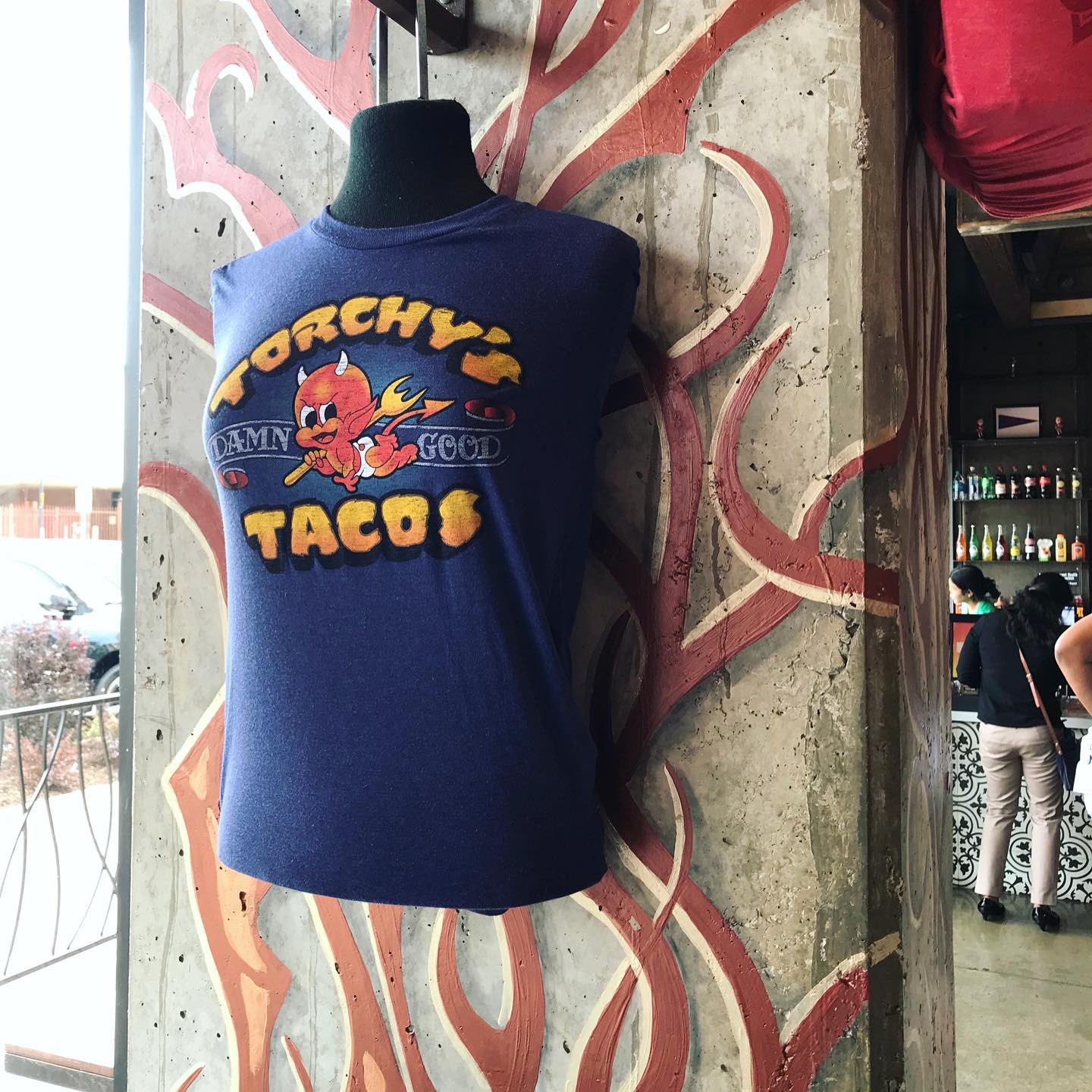
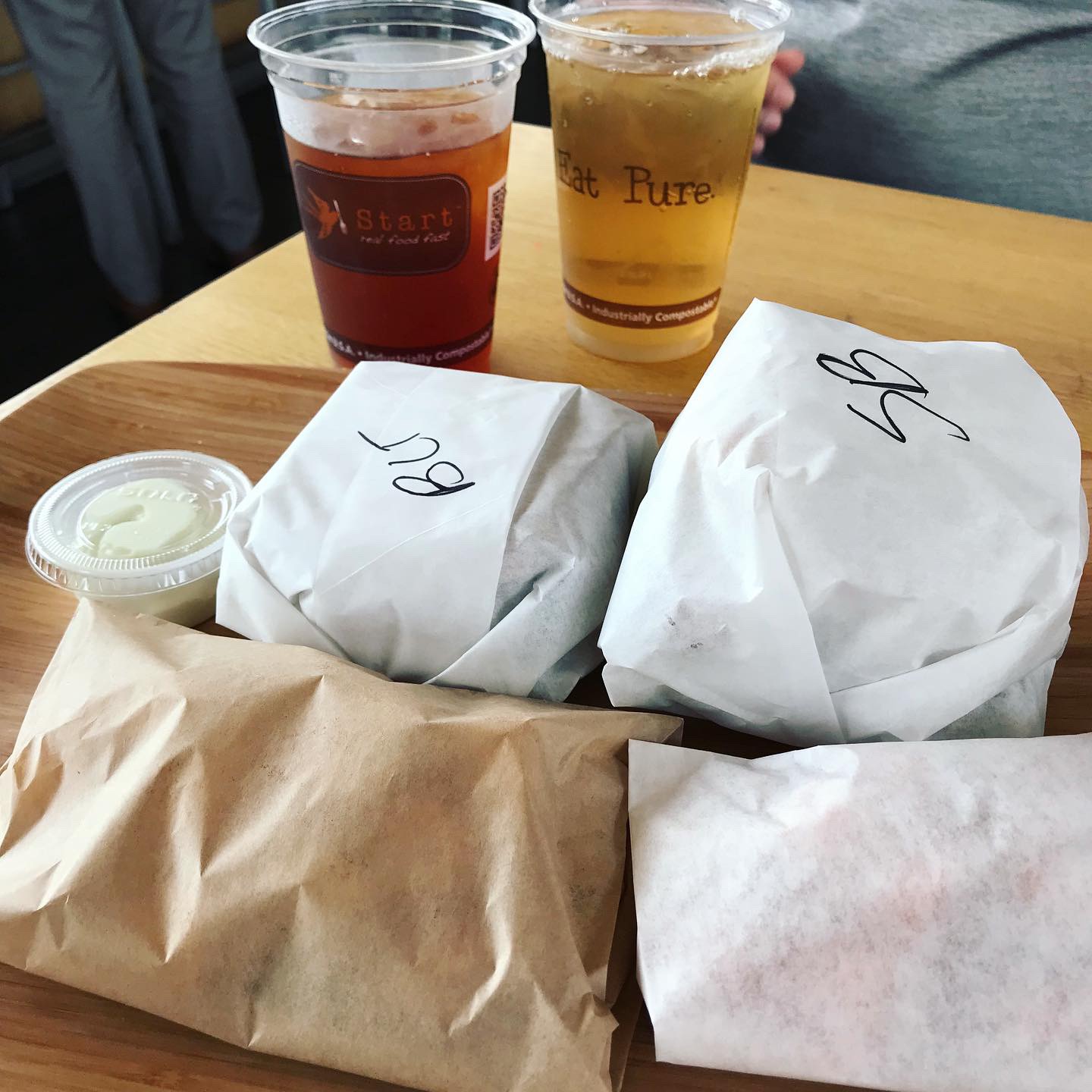
We ordered the Deluxe 30” pizza which has homemade dough and sauce, topped with pepperoni, italian sausage, bell pepper, black olive & fresh mushrooms. We didn’t order any sides or extras but we did see they had a cooler with some gelato and Ben & Jerry’s ice cream. They were sold out of the logo’d T-shirts but they had some “Supreme” styled Serious Pizza logo shirts for $25.
Branding DNA:
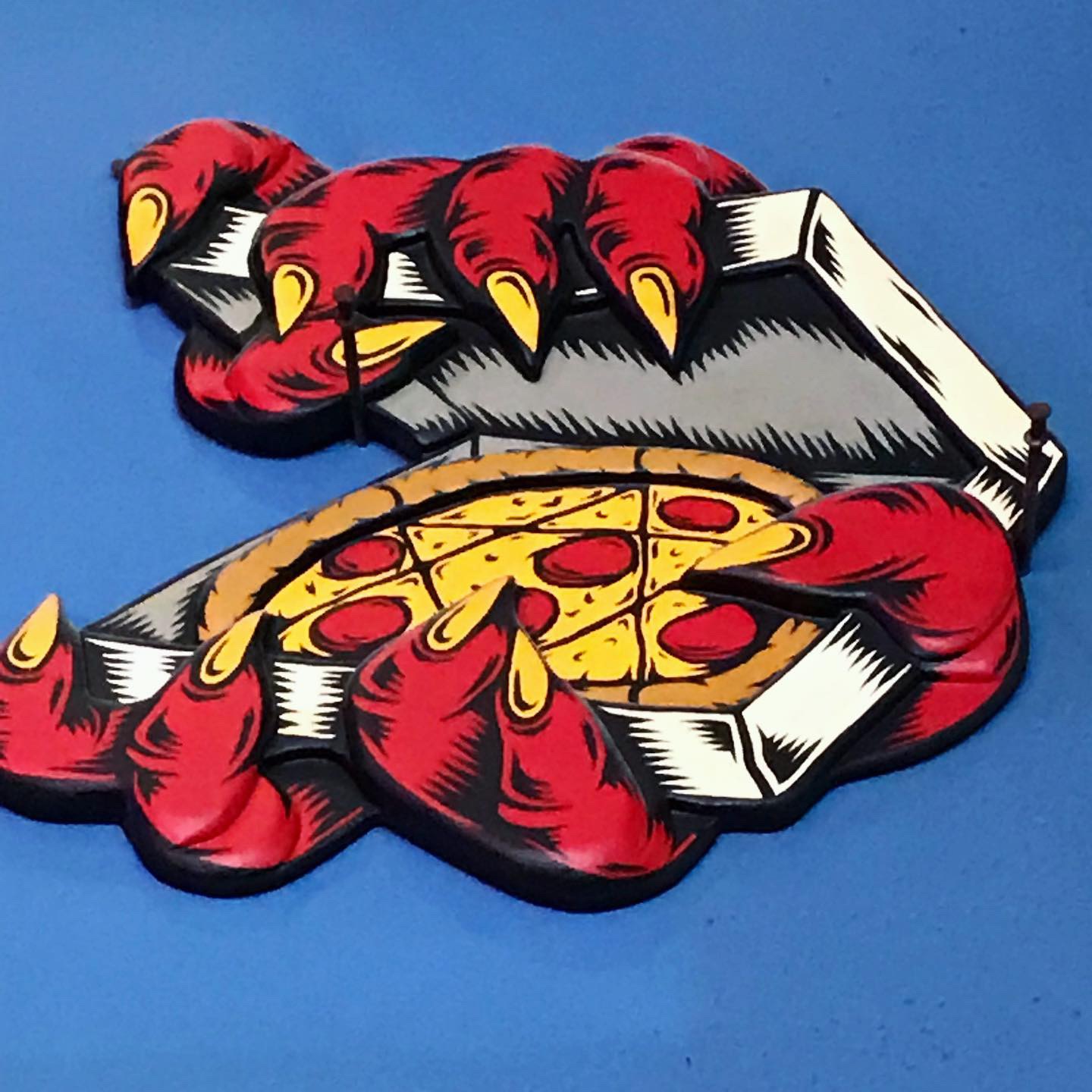
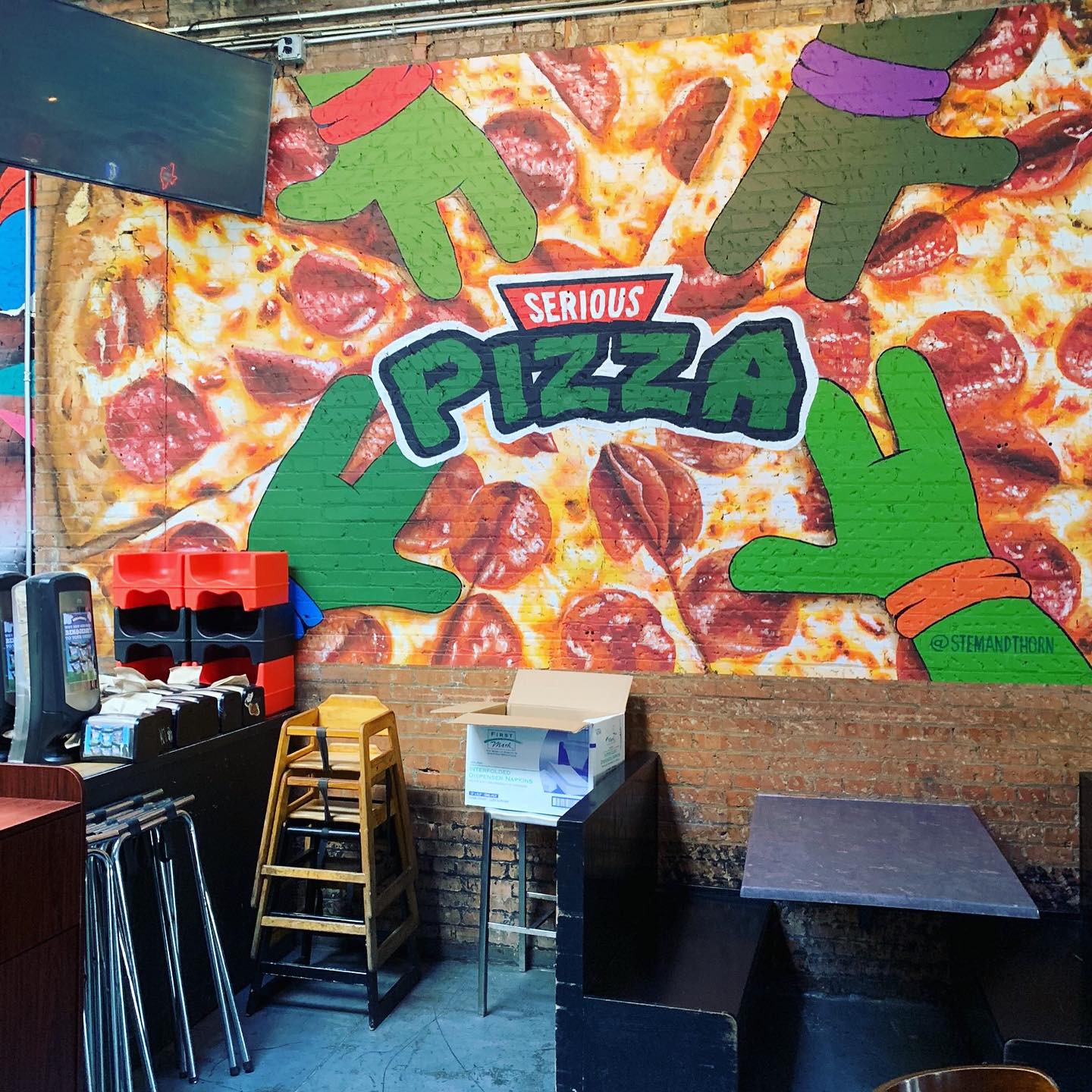
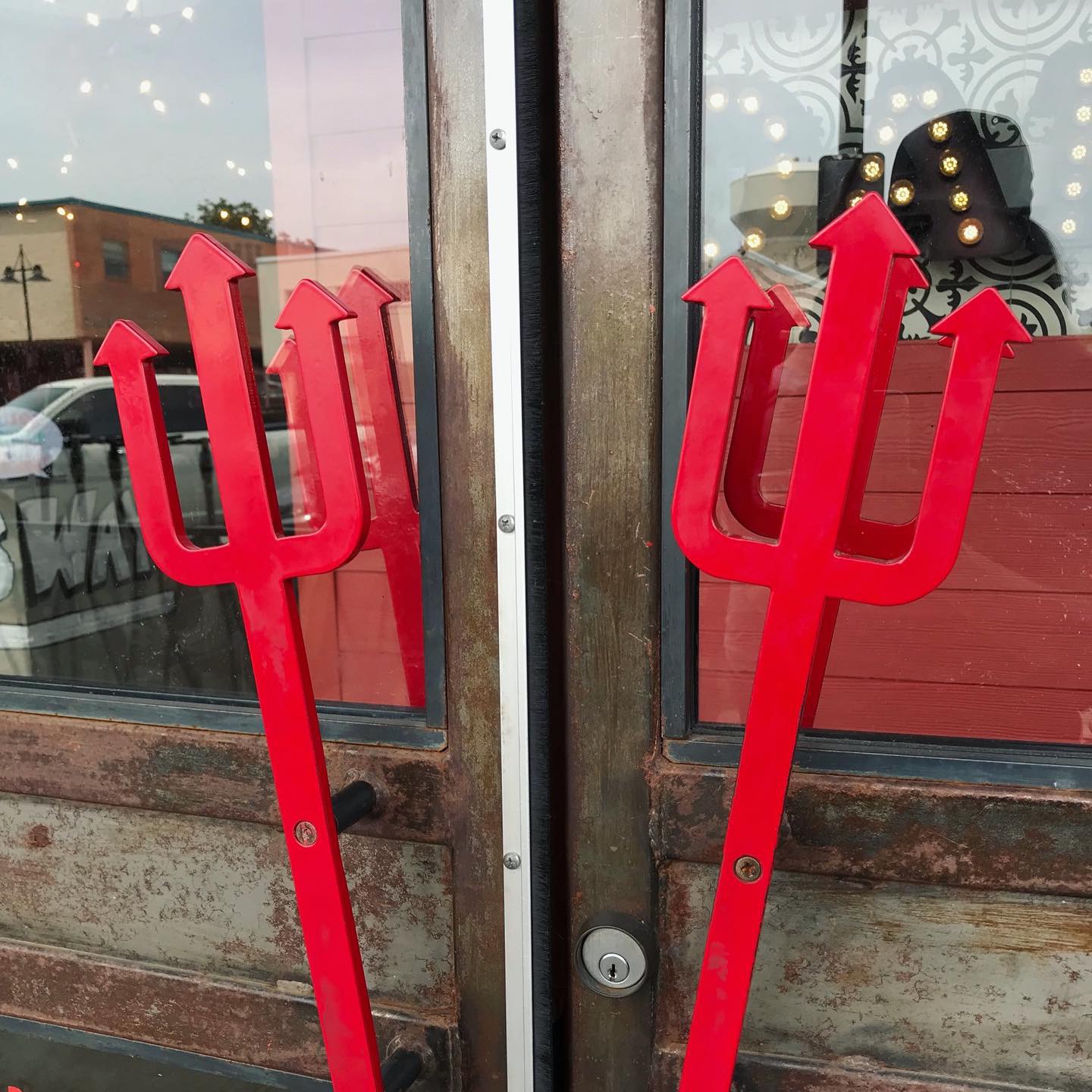
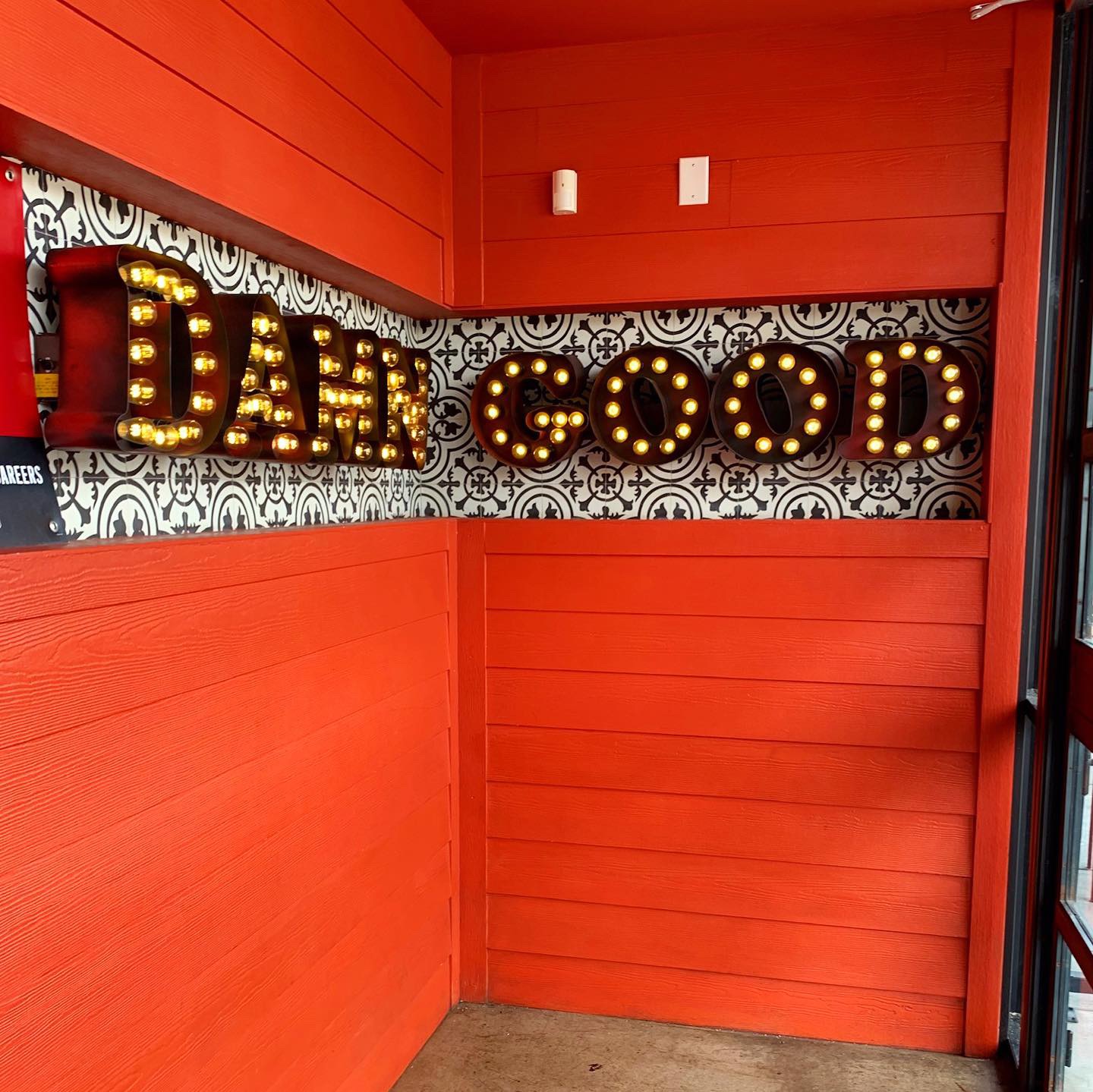
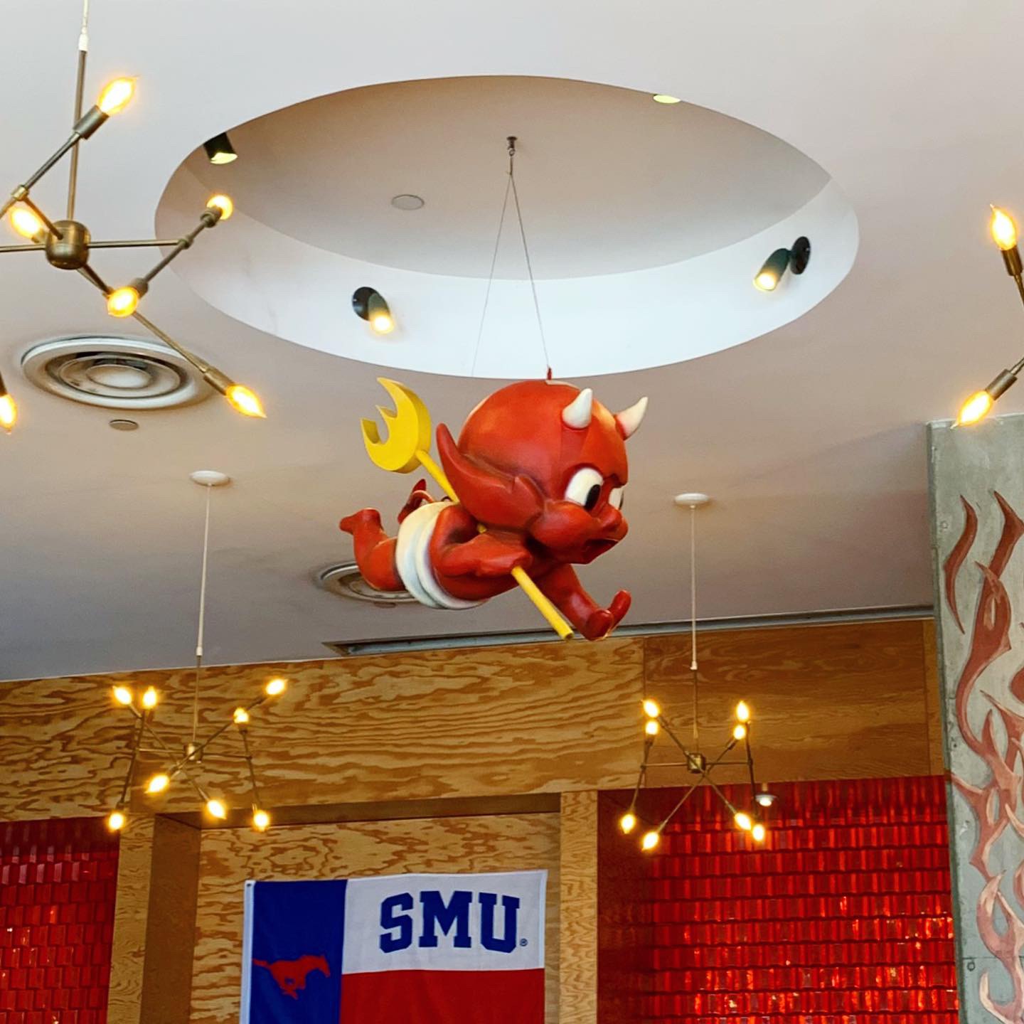
We usually review brands that have multiple locations and call out the work of the interior/brand firms that work on the projects, oooh and ahh over cool design features, etc. SERIOUS PIZZA has one location. I’m pretty sure the only artist or designers behind the brand involve the tattoo-esque logo and wall art and the guy that throws that massive pizza dough – which, that IS an art. I definitely give them props for the entertainment element.
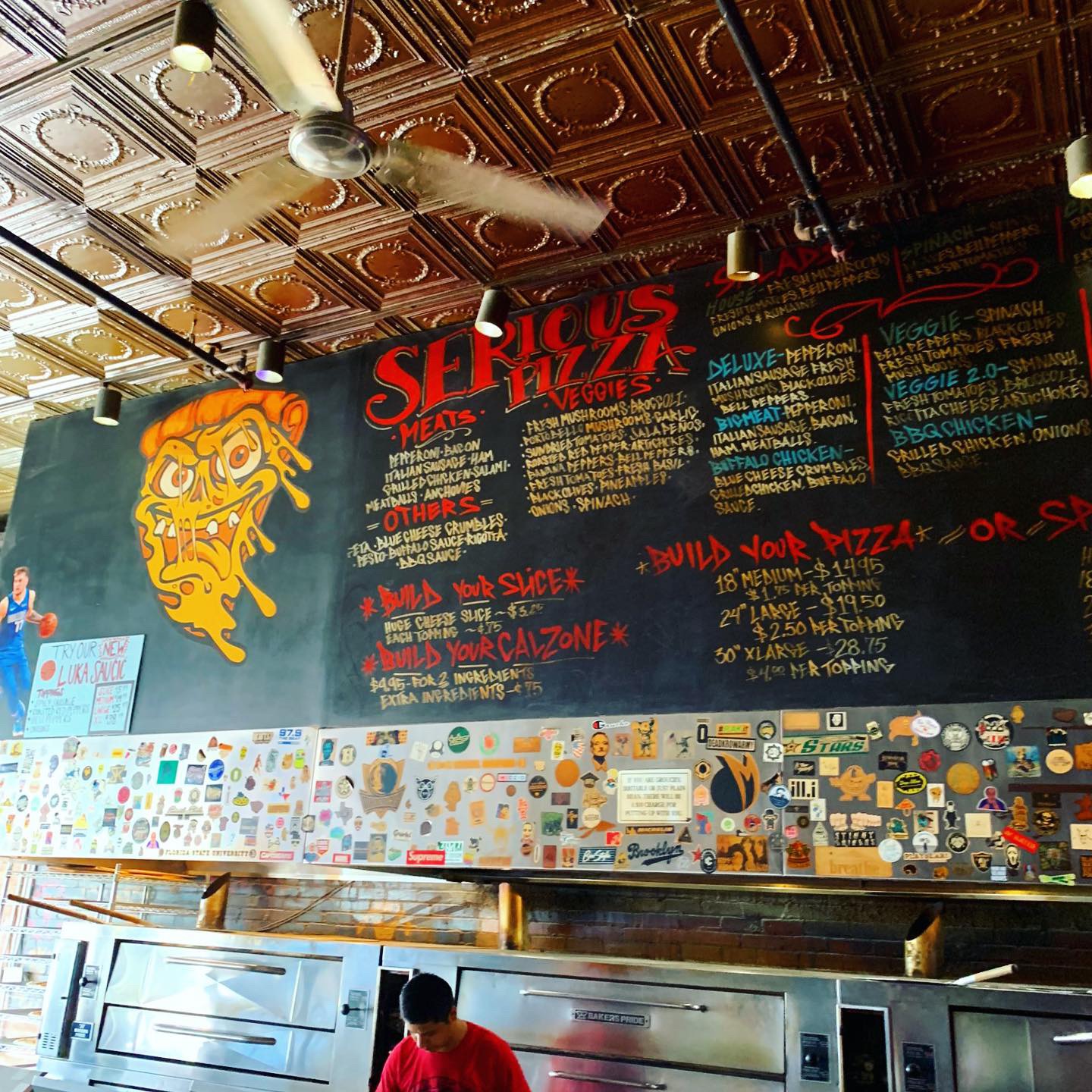
Chalkboard menu, random cool stickers stuck on everything. It’s basically a really good New York style thin crust pizza joint with a Texas sized novelty 30” product that occupies a stinky, dirty Deep Ellum bar space that has been every kind of bar since the 80’s. The spaces where they were making the pizzas looked ok but OMG – I hope the lease negotiation and renovation that CEO Imran Sheikh refers to in the Eater article is in progress. My advice is to get it to go and enjoy pics online until that happens.
Digital Branding:
Serious Pizza’s website could take a lesson from their social media accounts. Unlike their website, their Facebook and Instagram feature great candid photos of their delicious pizza with just the right amount of marketing. Their website is a pretty simple one page site and could use some love especially their about section. Under the info tab in the About section it only states “Huge Pizza!!! Slices & Beer!” While this could be seen as clever on their part, I see it as being just plain lazy. Under the hours tab in the About section it says “ No opening hours found.” How are your customers suppose to know when and what days you’re open? This is your website and more often than not it’s many consumers first impression of your restaurant. The lack of photographs on their website is baffling to me! Especially since their social media accounts have such great photos. A simple coding fix would push the beautiful food photography from their social media to their website and drastically change potential customer’s opinions. Serious Pizza could use more of a digital presence and it all starts with the website! While social media is great for promoting your brand, it should NOT be the only source of your digital presence. Especially in this day and age where there is a ton of amazing website templates available and all you have to do is plug in your info and upload your images.
–Danny
Score:
MJ gives SERIOUS PIZZA an A if you’re doing take out and a C- if you dine in during daylight hours or if your sober. Danny gives the food an A- and the website a C-.
#FridayFeed:
Every Friday, Studio B Dallas visits a local fast casual concept for lunch to critique the brand (and eat lunch). Three rules apply: it’s a concept we haven’t been to or it’s been in the restaurant news and it’s within 10 miles of our office. Wait, four rules – it can’t be sushi. Danny doesn’t do sushi. If you have any suggestions on where we should eat next, feel free to leave it in the comments. Look for our restaurant branding reviews each Friday! MJ & Danny
-
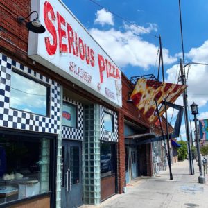
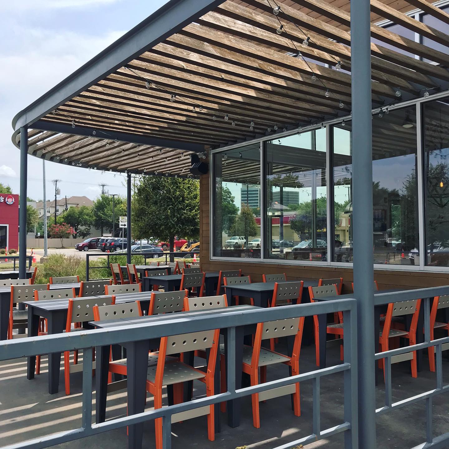
- Serious Pizza Exterior

-

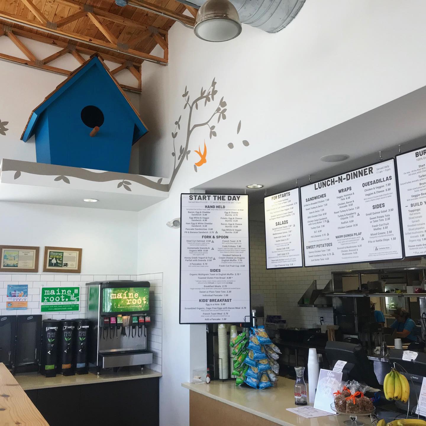
- Chalkboard Menu
-
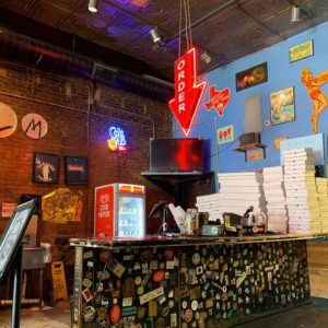
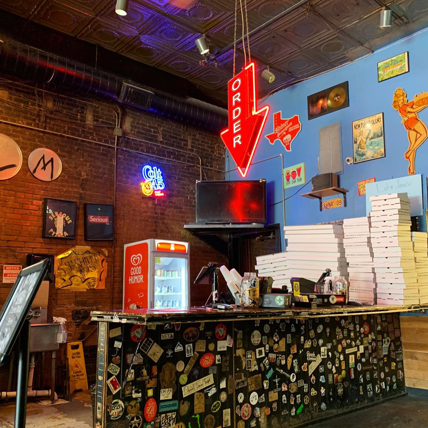
- Order Counter
-
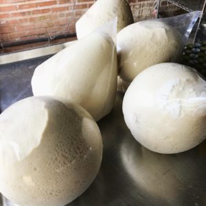
- Pizza Dough

-

- Giant Pizza Slice
-
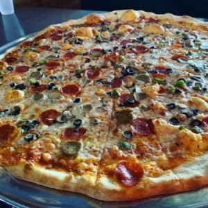
- 30″ Deluxe Serious Pizza

-

- Serious Pizza Rack
-

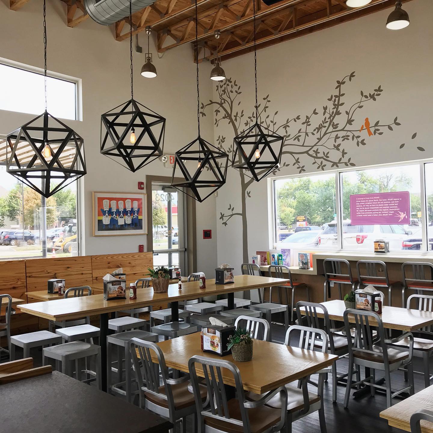
- Interior Mural
-

- Serious Pizza Banner
-

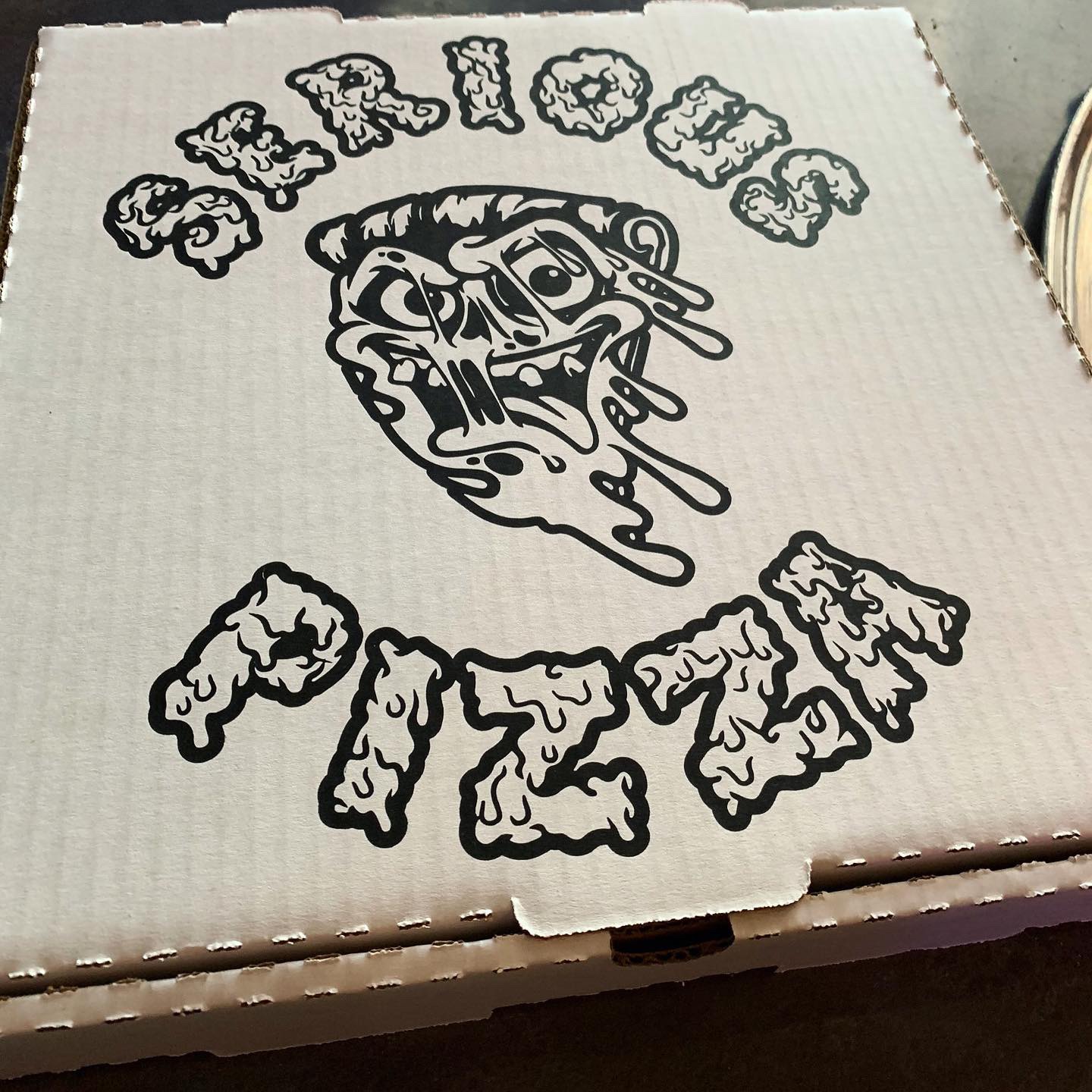
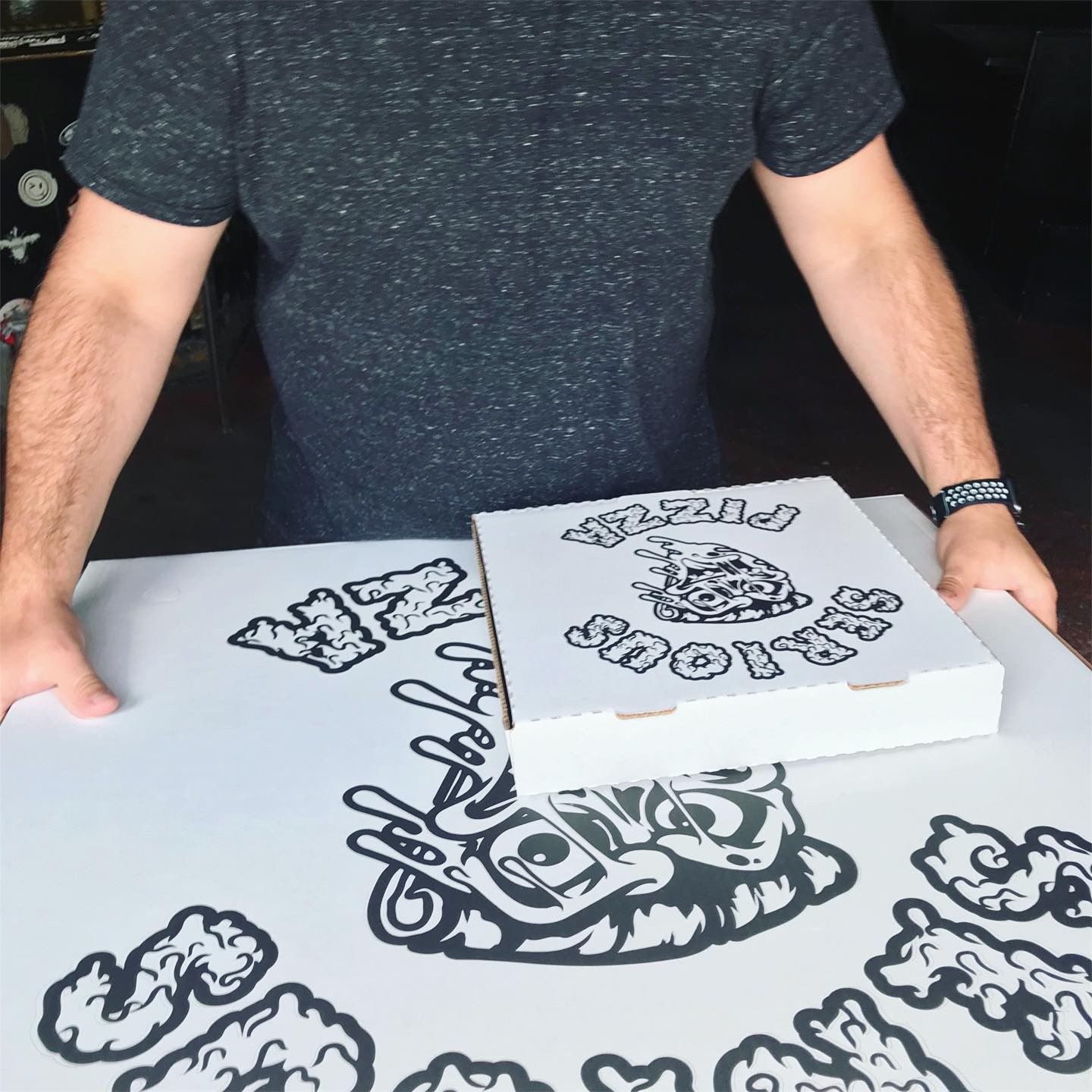
- Branded To-Go Box
-
- Leftovers for Days!


Recent Comments