Rex’s Seafood & Market

Parmesan Crusted Tilapia

Parmesan Crusted Tilapia

This week’s #FridayFeed restaurant branding review is Rex’s Seafood & Market on NW Hwy and Hillcrest in Dallas.

Order Up!

Rex’s has a super popular location at the Farmer’s Market and we heard they were opening a traditional location near Highland Park. Rex’s doesn’t really fit into a fast casual category – actually we don’t know any seafood concepts that do. You go from Long John Silvers (fast) to Joe’s Crab shack (casual) pretty much, right? But – we haven’t reviewed any seafood yet and figured it was close enough. AND, we heard that Coeval had done the design – more on them later – let’s talk food.

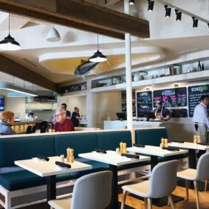
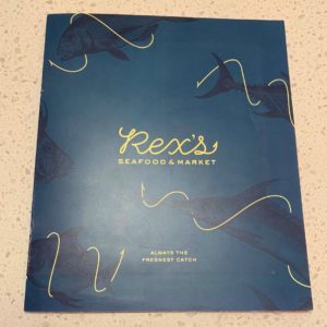
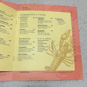
Upon entry, we were greeted by a server who offered us a look at the “market” case of fresh seafood, a seat at the bar or a table for two for lunch. We chose a nice booth along the wall where we had a good view of the open space. The menus were nicely designed and pretty – not a piece of paper on a clip board or busy laminated kind with cartoon photos of crabs and such. Colors are a deep ocean blue and butter yellow.

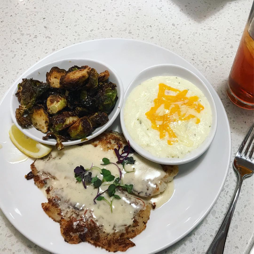
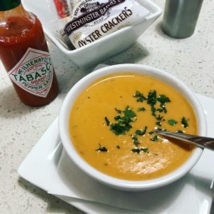
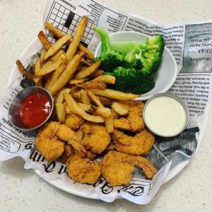
I love lobster bisque so I ordered a cup to start with and the parmesan crusted Tilapia with fried Brussel sprouts and cheesy grits for my entrée. Danny ordered the fried shrimp basket with fries and broccoli with a side of jalapeño ranch. The bisque was perfect. Creamy, velvety, yummy. The tilapia came with a lemon butter sauce on top and it was delicious. Fried Brussel sprouts  – yum. Cheesy grits – could have been cheesier. I love grits so I inquired about shrimp & grits which they said they have on the weekend brunch menu. They offer a nice selection of desserts and ice cream as well .:) They have daily specials and a sweet happy hour special M-F from 3-6 – Gulf Oysters $1 and Premium Oysters for $2 each and $2 off all draft beer and wine.

Environmental Branding:

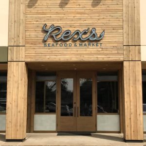
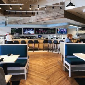
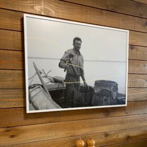
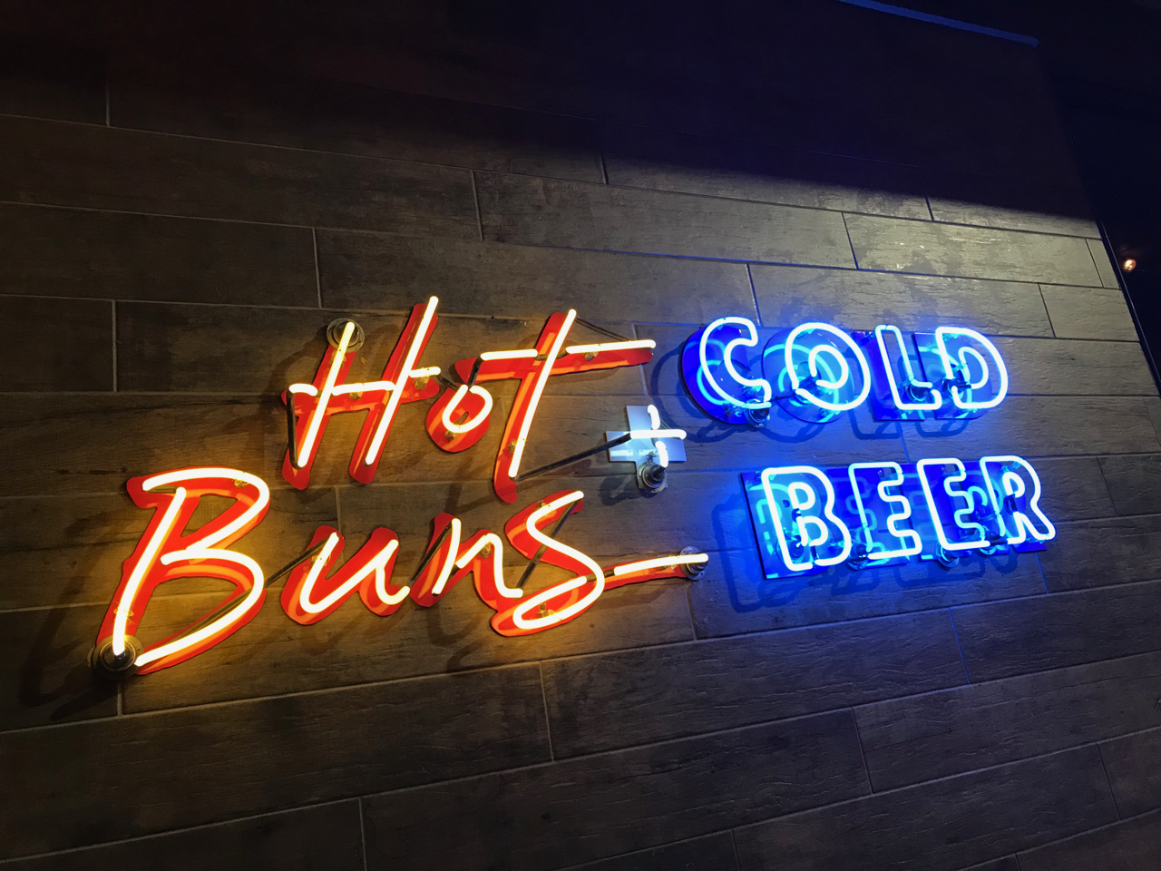
Rex’s has a really nice neon script logo sign on a background of clean plank wood and a storefront of windows so the natural light is really nice. The overall interior design is really buttoned up. They chose a nice mix of materials and colors and have several unique design features. The nods to “seafood/ocean” were more like home decor than pier & bait shack – I didn’t see one galvanized bucket of crackers or a lifesaver or net and buoy – thank goodness! I’d call it refined casual – a great middle space between a crab shack and an Oceanaire – a neighborhood restaurant where you can get beautiful fresh seafood for lunch or dinner or pop in and have a cold draft or glass of wine while you have the market steam some clams for take out.

Since our reviews include interior design, we like to give credit to the designers. Coeval Studio is responsible for the design and have worked on so many great concepts – Whistle Britches, Liberty Burger, El Bolero, The Rustic, Happiest Hour…nice work!

Branding DNA:

Great logo, nice menus, pretty interior. The only thing missing was a view of the ocean.

Digital Branding:

Rex’s Seafood has a great website. Easy to navigate, parallax scrolling and user-friendly online ordering for pick-up. Their social media accounts feature great lifestyle photographs, mouthwatering food imagery and even some shout outs to their suppliers. Their supplier spotlight is brilliant! This shows customers that they put thought and care into where their ingredients come from.
–Danny

Score:

MJ and Danny give it an A.

#FridayFeed:

Every Friday, Studio B Dallas visits a local fast casual concept for lunch to critique the brand (and eat lunch). Three rules apply: it’s a concept we haven’t been to or it’s been in the restaurant news and it’s within 10 miles of our office. Wait, four rules – it can’t be sushi. Danny doesn’t do sushi. If you have any suggestions on where we should eat next, feel free to leave it in the comments. Look for our restaurant branding reviews each Friday! MJ & Danny

Hopdoddy

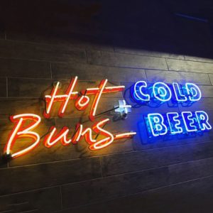
Hopdoddy Neon

Hopdoddy Neon

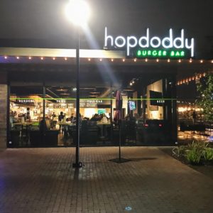
This week’s #FridayFeed restaurant branding review is Hopdoddy in College Station, Texas, Whoop!

Order Up!

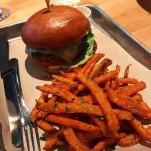
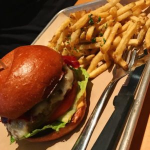
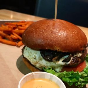
Hopdoddy is an Austin-born brand and has 35 locations in Arizona, California, Colorado, Florida, Oklahoma, Tennessee and Texas (22 TX locations). You enter to an order line which directs you to the counter where you can order from a menu of “burgers, sides, shakes & bar”. They tout handmade buns and handmade burgers in their in-house bakery and butchery – most of which have cool names like the Dubliner and the Buffalo Bill and maybe they’re a little “famous” for being one of the few places that has the Impossible Burger – a burger made entirely of plants. Photography and presentation both excellent. They also have a cause – the Goodnight/Good Cause burger for which they donate a $1 for every one purchased. They have raised more than 1 million dollars for local charities. That supports their culture message that they are “part of the neighborhood.” I like it.

This FridayFeed review was a road trip version. Danny didn’t make the trip, but I took 4 college kids with me for this Friday Feed so everyone ordered shakes, burgers and fries. The shakes had those “colossal” straws and looked pretty damn good. Sides menu is pretty simple – fries, fries and salad. I ordered the hand cut sweet potato fries which were good. All of the food was good but after Rodeo Goat, the burger bar is really high so I’d have to put the burger in third place behind the Goat and Liberty Burger.

Environmental Branding:

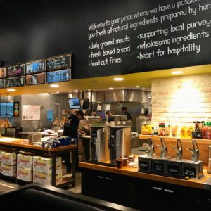
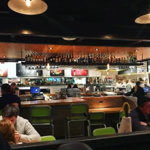
Hopdoddy (“hop” is for the beer and “doddy” is a Scottish term for cows) is a cool burger chain that doesn’t feel chain-like. I’ll start with the lighting and ambiance. Warm woods, perfect lighting, inviting atmosphere all around. There’s a bar in the middle of the space and seating around the perimeter. A mix of high booths and tables line the wall and There’s a nice upholstered banquette along the order line. Like many brands, they have an open kitchen where you can see people busy prepping orders. Not all open kitchens look that great, but this one looked clean and organized and the sounds and smells really added to the overall ambiance.

The downside to the seating was that we couldn’t all sit together. I was surprised that there wasn’t a community table – who doesn’t design a community table anymore? Maybe it was just this location. 9:30 pm dinner in a college town on a Friday night, this place was hoppin’.

Branding DNA:

The College Station Hopdoddy interior and exterior was designed by Levy from Austin. A google search indicates that Catie Lucey is responsible for a lot of Hopdoddy graphic design – posters and new menus. A disclaimer on her site indicates the logo was designed by a *previous designer.

Digital Branding:

Hopdoddy’s website is one of the better restaurant websites out there. It’s fairly easy to navigate and uses a great flexible grid layout that keeps things interesting. Their Instagram and Facebook do a good job at mixing marketing images and food photography together, but could use more lifestyle imagery like they have on their website. Lifestyle images are key because they let the customer know what type of atmosphere to expect when they visit one of your locations. Mouthwatering food porn will draw people in, but lifestyle photography will make them take action and visit your restaurant.
–Danny

Score:

MJ gives it an A. Danny gives it an A-.

#FridayFeed:

Every Friday, Studio B Dallas visits a local fast casual concept for lunch to critique the brand (and eat lunch). Three rules apply: it’s a concept we haven’t been to or it’s been in the restaurant news and it’s within 10 miles of our office. Wait, four rules – it can’t be sushi. Danny doesn’t do sushi. If you have any suggestions on where we should eat next, feel free to leave it in the comments. Look for our restaurant branding reviews each Friday! MJ & Danny

PORCH SWING

Porch Swing Restaurant

Porch Swing Restaurant


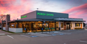
Come for the food. Stay for the music. PORCH SWING Restaurant opened to a full house Monday, February 18th in Mesquite, Texas across the street from Town East Mall. 

Porch Swing restaurant is a new concept by seasoned entrepreneur, Antonio Swad, best known for his concepts Wing Stop and Pizza Patron. Porch Swing offers a menu of southern classics – Fried Chicken, Chicken Fried Steak, Ribs, Fried Catfish, Pork Loin, Shrimp and a Grilled Meatloaf. The menu also includes homemade cheesy drop biscuits and a Pie Company baking and serving scratch made pies like Cookie Top Pecan, Buttermilk, Banana Cream and Toasted Coconut to name a few.
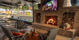
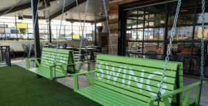
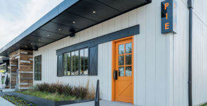
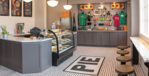
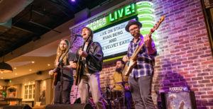
The design is a blend of contemporary and classic Southern touches with some unique features including double sided porch swings, a state of the art sound system and stage as well as the Pie Company store where customers can purchase a slice or whole pies in custom branded packaging. Porch Swing has a 3,000 sq. ft. covered patio with a massive fireplace, perfect for meeting with friends or watching a game. The LIVE music stage will host bands every Friday and Saturday night.

Porch Swing is gaining momentum in the press and with foodies from all around the DFW. They have been mentioned in Culturemap, Nation’s Restaurant News and Restaurant Hospitality just to name a few.

Studio B acted as the design team on the project handling interior design, branding, custom packaging, photography and apparel. Truly the most fun project to work on EVER! Please go to our portfolio page and check out all of the photos!

MidiCi

Chef Making Pizzas

Chef Making Pizzas

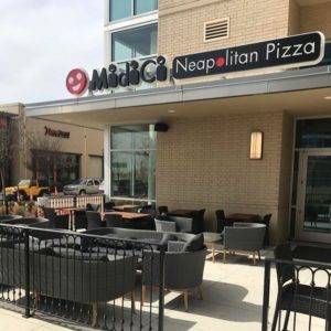
This week’s #FridayFeed restaurant branding review is MidiCi The Neapolitan Pizza Company at Walnut Hill and 75 on the Trader Joe’s side.

Order Up!

We’re always looking for buzz on fast casual concepts so when YELP called out MidiCi as No. 1, we planned our trip.  Of course that was a couple of weeks ago.

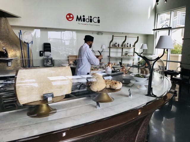
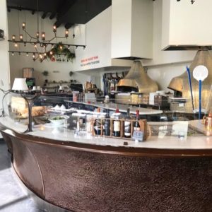
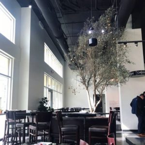
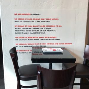
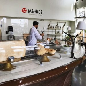
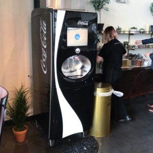
First impressions – MidiCi reminds me of a concept in a big Vegas casino. Lots of brass details, those old black fancy footed table bases, a couple of cool light fixtures. The large open kitchen was really fancy with pizza makers in chef coats, big expanse of beautiful white granite counters covered in flour and dough, pretty ingredients and 2 massive wood fired pizza ovens. There was a potted tree in the center of the space and a combination of booth seating, high tops and low tables. You order at the counter and then the servers deliver your food. Drinks are self serve and it was really odd to see a big Coke soda machine in the beverage area while everything else was more elegant. I’ll also note that the wait staff was wearing T-shirts. 

Food:

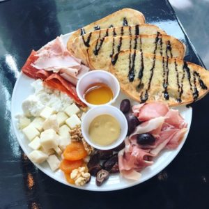
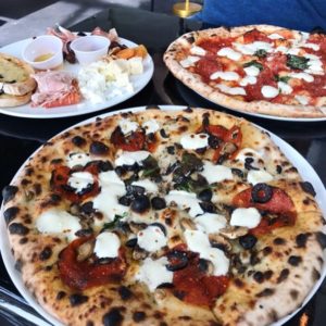
We like to try a few food items when we review, so I ordered the House meat & cheese board ($16.95). Danny and I ordered two different pizzas. I built my own with white sauce, pepperoni, black olive and mushroom. Danny ordered The Devil’s ($12.45). It was a pricey lunch.

Meat & cheese board looked good and included some grilled bread with a balsamic drizzle. One of the salamis was super spicy so we liked that one, it also had some turkey on the board which I thought was odd – is that normal? – web menu says rosemary ham but ours was smoked turkey. My pizza really wasn’t great. White sauce is not a sauce I found out, it’s olive oil on crust with some parmesan and some baby mozzarella balls – not a sauce. Toppings were spare and the crust was just ok. I guess Danny’s pizza didn’t live up to it’s name because he still ended up putting crushed red peppers on it.

Environmental Branding:

The interior design was really oddly ornate to pair with counter service and a coke machine. Let me take this opportunity to say that music is a huge part of a branded interior and the music was like a nightclub – again, I swear I thought I was in a Vegas casino. They have a playlist online. The bathrooms were notable because literally, it looked like a bathroom in a swanky night club. Glass and brass cart with selection of lotions? Soaps? Candles and succulents – crazy shiny large format tile on one wall – I should have taken photos. Here’s a photo I found online.

Digital Branding:

MidiCi’s website is moderately difficult to navigate. They have a side navigation menu that has 3-5 sub navigation options under each navigation link. This makes it more difficult for the user to find what they are looking for. Also, all their webpages are really short in length. Most pages don’t even scroll down and the pages that do only scroll once. MidiCi’s Instagram and Facebook is a little better than their website, but not much. They have beautiful food photography, but their lifestyle photos look like that of a night club.
– Danny

Something to Chew On:

Overall, I was not into this restaurant. It just wasn’t cohesive. It wasn’t comfortable. It was a mix of fancy things and graphic wall decals stuck to a fancy stucco type wall finish. The logo doesn’t really match the interior. As I’m writing this, I realize I’m not doing a great job of explaining – I think you’re just going to have to drop in and see for yourself. Since we reviewed, it’s rankings have dropped to #90 as of today.

Score:

MJ gives it a D. Danny is nicer than me so he gives it a C-.

#FridayFeed:

Every Friday, Studio B Dallas visits a local fast casual concept for lunch to critique the brand (and eat lunch). Three rules apply: it’s a concept we haven’t been to or it’s been in the restaurant news and it’s within 10 miles of our office. Wait, four rules – it can’t be sushi. Danny doesn’t do sushi. If you have any suggestions on where we should eat next, feel free to leave it in the comments. Look for our restaurant branding reviews each Friday! MJ & Danny