In a world where every brand is shouting to be seen, nostalgia whispers—and everyone listens.
There’s something about a vintage logo, a familiar jingle, or a throwback color palette that makes people stop scrolling. It’s not just clever design or old-school vibes. It’s emotional muscle memory. When brands tap into nostalgia, they’re not just selling a product—they’re reconnecting people with who they were when they first felt something.
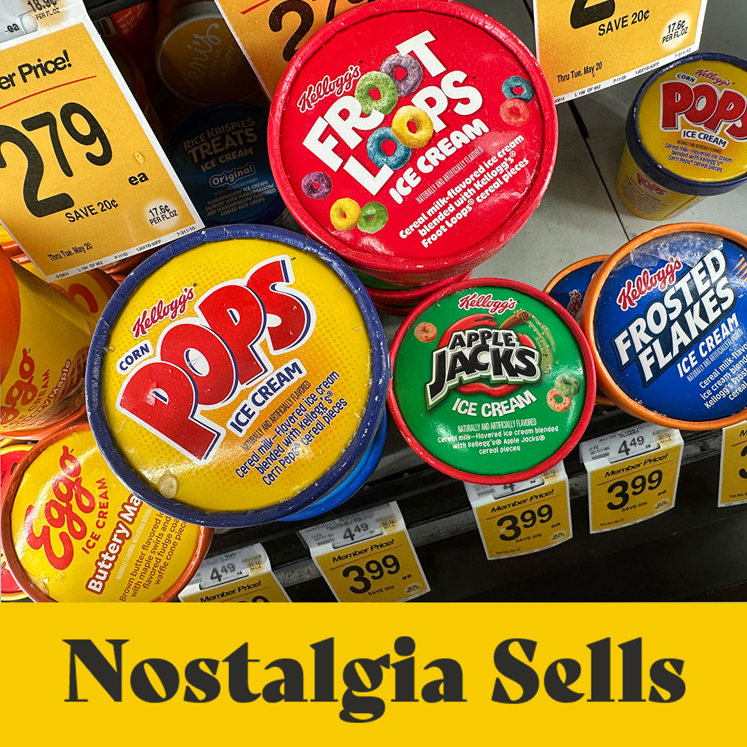
Check out these breakfast cereal flavored ice creams. These aren’t just food items. They’re edible time machines. One bite of Apple Jacks or a scoop of Eggo Waffles, and boom—you’re back in the grocery store with your mom, begging for the box with the prize inside.
Smart brands know that tapping into this nostalgia isn’t about being retro for retro’s sake. It’s about emotional resonance. That’s why cereal brands are reissuing their original box designs, and why ice cream companies are bringing back discontinued flavors with cult followings. People don’t just want a snack—they want a feeling.
But here’s the thing: nostalgia isn’t about getting stuck in the past. It’s about using the past to spark something new. The best brands don’t mimic—they remix. They create products and experiences that feel both timeless and timely.
So if your brand feels like it’s trying too hard to be “next,” maybe it’s time to look back. Because sometimes, the future of branding is just a familiar feeling—cleverly disguised as dessert.
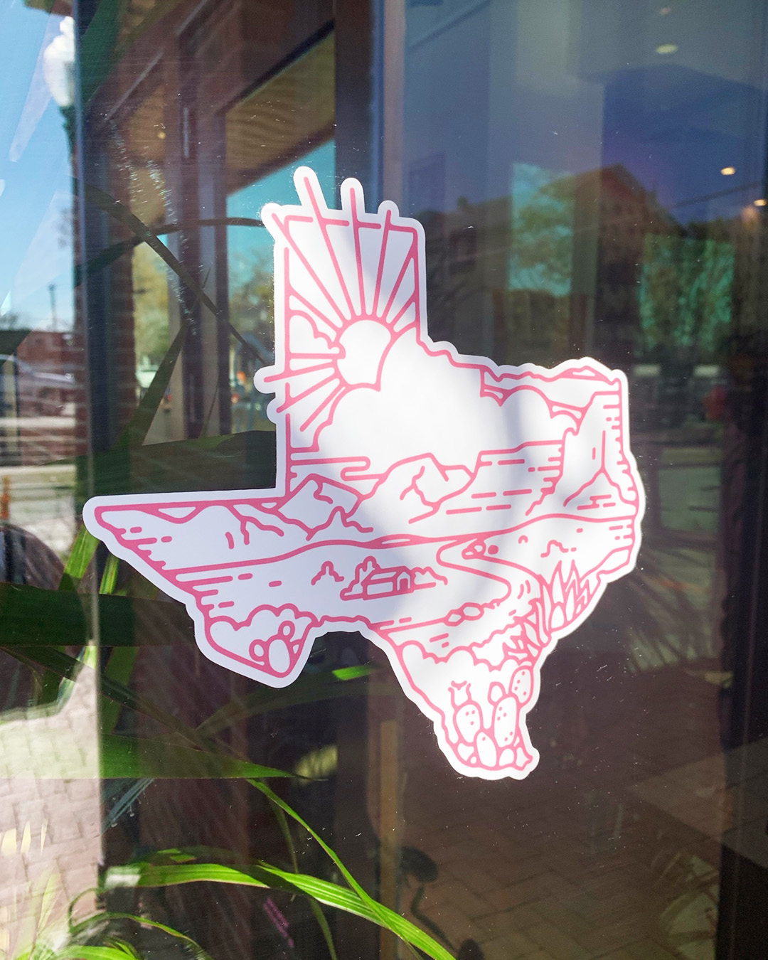
What’s black & white and red all over? Not the New York Times Games!
I’m in the business of customer experience so I’m hyper aware of things that get my attention. The big obvious ones are obvious, duh, but it’s the ones people don’t realize are having an effect on them that fascinate me. It could be a sound, a smell, a noise or in this case – colors. Big beautiful saturated colors.
While I’m not a daily gamer, I have a large family and somehow The NYT’s wordle game has become the morning greeting on the family text thread. When I remember, I’ll jump on the app and do the spelling bee, the wordle and maybe the mini but there’s something the NYT games have that I really respond to – so much so that it makes me want to play more games – HAPPY, FUN, POSITIVE COLORS. I think they actually make me “like” the brand more. Good move for a brand built on black and white.
**Oddly, the most popular Wordle game is the only one that doesn’t have a fun color.
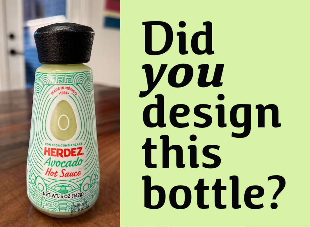
Who designed this awesome Hot Sauce bottle? Like, seriously, who is the person who actually sketched out this bottle design and said – “This would be cool.”?
Three of the most saturated categories in grocery are SALSA, COFFEE and SPICES.
As a package designer, I’m always so excited when a new product breaks through in one of these categories because it must have a really good brand position.
In order to actually make it to a grocery shelf it takes so much work. If you’re a startup, this means probably years of thinking about your product, tinkering with the recipe, giving to friends and family, selling at a farmers market before you ever find a buyer who is willing to pull another product to put yours in. Once you get there, it takes a lot of marketing and money to stay there.
I’m a member of the DFWCPG (Dallas Fort Worth Consumer Packaged Goods). They host in-person and virtual events and it’s free to join. These events are where I meet people on their entrepreneurial journey to get their product on the shelf. The buyers will tell you that nothing is more important than a unique product offering and a great founder story. I’m getting off-topic, sorry. The reason I’m writing this post is because I purchased a new hot sauce last month. Granted, this product is made by Herdez, a well established brand with many products. I’m sure it was a little easier to get this product in the store but it’s the BOTTLE and the DESIGN that made me buy it. Scratch that – its the BOTTLE that made me buy it. The label design is nice but it’s this adorable, fit-in-your-hand-size avocado shaped glass bottle that I’ve never seen before. The lid even has a pebbly texture like the outside of an avocado from Mexico (not a California avocado). A first, I thought it was their guacamole salsa in a new package but it turns out that it is a new product that Herdez launched in October .
POM, Truff, Mrs. Butterworths Syrup, Method Soaps – all products with unique bottles. Here’s the thing – you can’t go buy unique bottles somewhere and just put your product in them. They have to be designed and prototyped and then commissioned to be made – and in large volume. A glass company is not going to make you 1,000 custom bottles for your locally famous hot sauce. That opportunity is reserved for the established and the rich. I got to go to the Pepsi Innovation Lab in New York a few years ago and while I was there, I saw that their team of designers was working on new bottle shapes and they were making their prototypes with 3-D printers. That is the stuff that package and brand designers dream of right there.
What’s my point again…right – Herdez hot sauce.
So many topics that I could spin off of this but I’ll wrap it up by saying to the person that designed this bottle for Herdez Hot Sauce – “Please comment on my post – reveal your genius design self!”
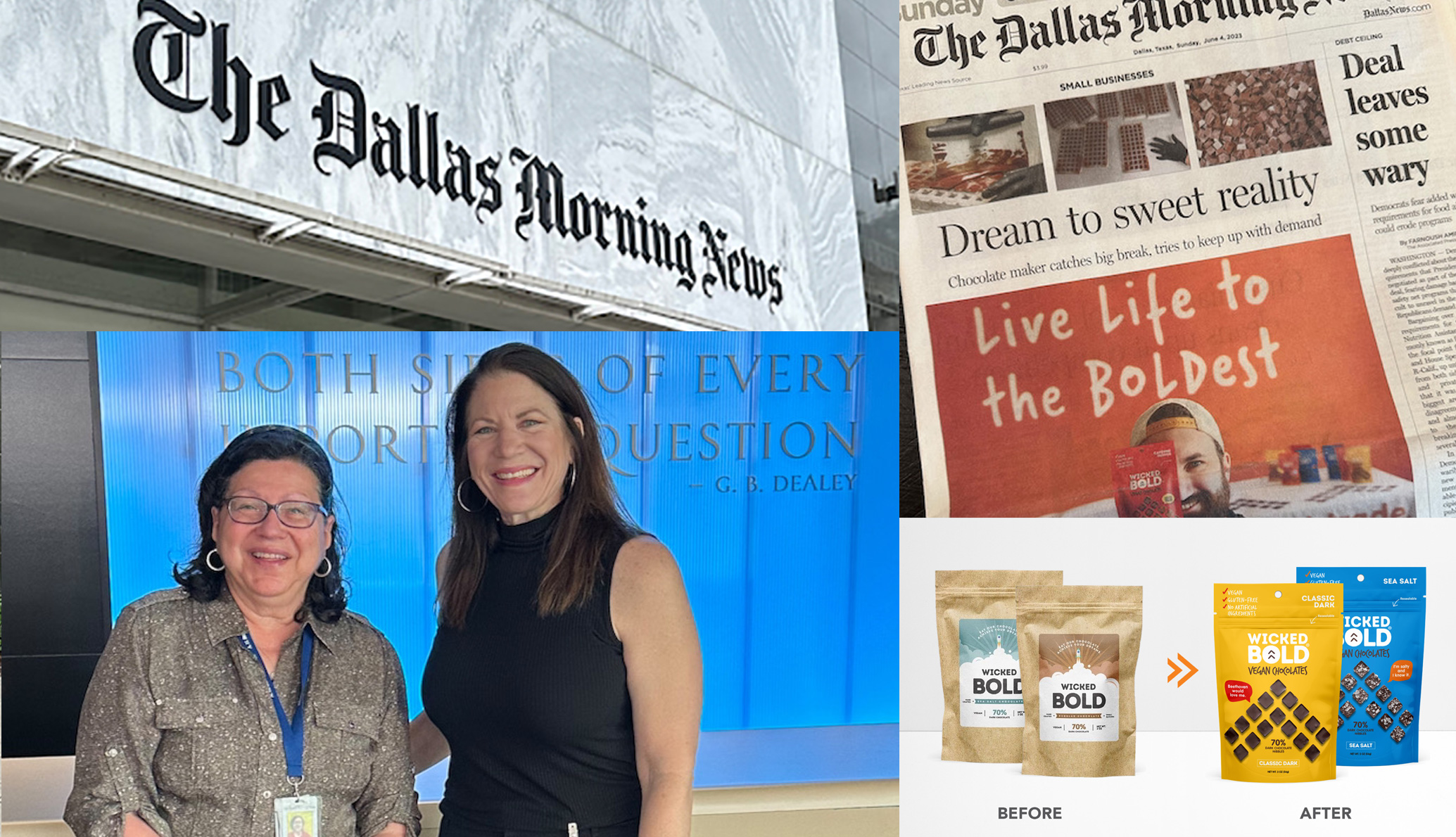
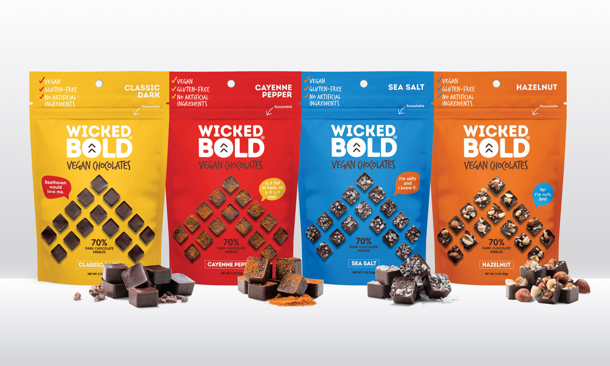
Dallas Morning News staff writer, Maria Halkias gave me a personal tour of the DMN offices last week in Downtown Dallas. Maria wrote a front page story about my client, Wicked Bold Chocolate founder, Deric Cahill, last year and she offered to show me around the news room. Maria interviewed me about how my company transformed Deric’s brand and package from a farmers market start-up special to a professionally branded line of chocolates on the shelves of Whole Foods, Sprouts and thousands of Walmart stores.
The Dallas Morning News has won nine Pulitzer Prizes and is the oldest continuously operated business in Texas, dating back to 1842 where it began publication of The Daily News in Galveston.
Designed by Gensler, DMN occupies the historic Old Dallas Central Library next door to the Statler Hotel. My favorite feature is a running ticker that you can see from the street level windows. Check out the pics of the office here.
With countless dining choices, how do you grab the attention of potential customers and turn them into loyal patrons of your establishment? Well, my friend, it all comes down to crafting a remarkable restaurant brand.
In the digital age of 2023, your restaurant’s online presence is crucial. Having a well-defined and easily accessible online brand can be the difference between a thriving night and a slow one. A memorable brand doesn’t just catch people’s eyes; it keeps them coming back for more, all thanks to your branding strategy.
Now, here’s a little nugget for you: 65% of a company’s business comes from its loyal regulars. But let me tell you, creating a beloved restaurant brand is no walk in the park. It’s more than just a fancy logo; it’s a labor of love that pays off handsomely.So, what exactly is a restaurant brand, you ask? Well, it’s not just about appearances and sounds; it’s the complete package. It’s the impression you want to leave, from the moment guests step through your door to when they’re Googling you late at night. It’s in the ambiance your diners soak up and the posts on your social media.
Now, let’s dive into the nitty-gritty of crafting your restaurant brand:
Step 1: Dream Big
Begin by painting a crystal-clear picture of what makes your place exceptional. What sets you apart? What’s the mission that drives your eatery?
Step 2: Know Your Playing Field
Figure out your place in the foodie landscape. Who’s your competition, and what’s your unique flavor? This isn’t a one-size-fits-all gig.
Step 3: Find Your Voice
Nail down a voice and tone that perfectly represents your brand’s personality. It’s like describing your brand as a person in three words – and then delving into each word’s vibe.
Step 4: Looking Good
Dress your brand to impress with exceptional design, logos, colors, and all the visual elements. Make sure your brand exudes personality, from your menu to your decor.
Step 5: Consistency is Key
Maintain your brand’s vibe across the board. Create a brand book to keep everyone on the same page.Why does this whole branding thing matter, you ask? Well, it’s all about building a loyal fan base. Brand loyalty is the name of the game, especially in the competitive restaurant world. When your regulars become your brand’s biggest advocates, word spreads like wildfire.Think about industry giants like Starbucks and Dunkin’ Donuts. Despite the fierce competition, folks keep coming back for more. Why? Because these places have strong branding that tells a story, defines their mission, and solidifies their position.
So, how do you build a restaurant brand with that kind of strength? Let’s break it down into five straightforward steps:
Step 1: Craft an Exceptional Mission
Create a mission statement that serves up your eatery’s unique flavor, purpose, and why it’s a cut above the rest. Hire a professional branding studio to help.
Step 2: Find Your Sweet Spot
Determine where you fit in the foodie landscape. What’s your pricing, what’s your cuisine like, and how do you communicate your value effectively?
Step 3: Let Your Voice Shine
Describe your brand as if it were a person in three words, then dive deeper into each word to define your brand’s character.
Step 4: Hire professionals
If you want your brand to look professional, hire a professional! Done right, your brand can look like a multi-unit franchise with only one location. Strategic design includes the logo, the colors, words, and interior design package.
Step 5: Keep the Brand Book Handy
Keep everybody on the same path by following the brand book that outlines the brand’s voice, colors, style and vibe.Remember, your brand isn’t set in stone – it’s a dynamic entity that grows as your customer base does. So, let it evolve with your business. Building a restaurant brand isn’t just about appearances; it’s about crafting a memorable experience. So, start serving up a brand that stands out, and watch your restaurant flourish! 🍔🎨🔥
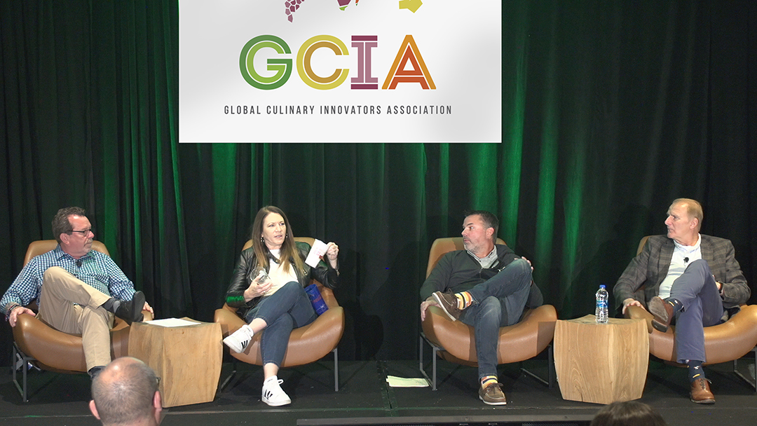
I’ve been a package design nerd for my entire career so when I was invited to speak about packaging at a GCIA (Global Culinary Innovators Association) event in San Diego, CA, I was in!
I was asked to participate on a panel as a packaging expert to talk to a group of international corporate chefs about sustainable restaurant packaging. Think paper cups, take out containers, pizza boxes, etc. At the time, Studio B was knee-deep into a 16-piece fast casual restaurant packaging project for plant-based fast food brand Earth Burger, so this was perfect timing. I shared the stage with Dan Nolan of Good Start (Sustainable) Packaging and Rick Findlay – a grocery packaging pro with awesome Whole Foods stories.
Sustainable packaging
I wish I could say that sustainable packaging is an option for every brand. It’s just not, yet. The demand, however, is encouraging the industry to look for more earth friendly solutions – on the daily.
Expert status equals time in the game.
Working with restaurant and retail brands always involves some form of package design. Whether it’s a take out bag or a full-blown pallet display full of swim goggles for Costco, the package can be the primary brand vehicle. Studio B designs roughly 50 retail or restaurant package items a year. We have great vendors for short and long print runs and we manage the process from design and function to final printed product.
Is your package design shelf-ready?
If you need design for a new product or an update to your existing products, we’d love to take a look! If you’re on the fence, DM Deric Cahill of Wicked Bold Chocolate who calls me a packaging genius. He can attest to the value of a great package. We (and Perry Fink) helped him get from the farmers market to the end caps at Whole Foods with more deals in the works.
Shout out to Jeff Sinelli for recommending me and Kevin Ryan, ICCA/GCIA for letting me participate in this awesome event.
Effective packaging design requires collaboration between designers, marketers, and product developers to create packaging that not only meets these requirements but also enhances the product’s appeal and brand recognition.
Graphic designers are often the driving force behind packaging design. Their expertise in visual communication, typography, and color theory is essential for creating eye-catching designs. They bring a brand’s story and values to life through compelling visuals.
Industrial designers play a pivotal role too. They focus on the structural and functional aspects of packaging, ensuring it’s not just aesthetically pleasing but also practical for protecting and displaying the product.
Marketers and brand strategists provide valuable insights into the target audience and market trends, guiding design decisions to resonate with consumers.
In some cases, specialized package designers may work exclusively on creating packaging solutions. These experts combine graphic design skills with a deep understanding of materials, printing techniques, and regulations specific to the industry.
Ultimately, it’s a collaborative effort that brings packaging to life, and the key is finding that perfect balance between aesthetics, functionality, and brand representation. So, next time you pick up a beautifully designed product, know that a team of creative professionals has worked their magic to make it look so appealing.
Packaging design requirements encompass a comprehensive set of guidelines and specifications crucial for creating effective and appealing packaging. Whether you’re designing for a product, food item, or any other consumer goods, here are the key elements typically included in packaging design requirements:
1. Product Information: Clear and accurate details about the product, including its name, description, usage instructions, and any regulatory information, must be prominently displayed.
2. Brand Identity: Packaging should reflect the brand’s visual identity, including logos, color palettes, typography, and design elements, ensuring consistency across all products.
3. Size and Dimensions: Precise measurements and dimensions are essential to ensure that the packaging accommodates the product securely and fits within logistical constraints.
4. Materials: Specify the type of materials to be used, such as cardboard, plastic, glass, or eco-friendly options, taking into account sustainability, durability, and cost considerations.
5. Printing and Labeling: Detail printing methods, colors, and finishes. Specify label placement, barcodes, and any other essential information to be incorporated into the design.
6. Regulatory Compliance: Ensure that the packaging adheres to relevant industry and legal regulations, especially in sectors like food, pharmaceuticals, and cosmetics, which have strict labeling requirements.
7. Visual Aesthetics: Describe the desired look and feel of the packaging, including design elements, imagery, and themes that align with the product and brand.
8. Functionality: Consider how the packaging will function in terms of ease of use, resealability, and any special features required for product handling and storage.
9. Cost Constraints: Set budget limitations to ensure that the design remains economically viable.
10. Target Audience: Define the target demographic and preferences to tailor the design to resonate with the intended consumers.
Packaging is like the unsung hero of the retail world. It plays a vital role in the industry. Packaging isn’t just about wrapping a product; it’s a powerful tool that can make or break a brand’s success. Example: POM pomegranate juice would have never been the success it is today if it hadn’t done two things: use a unique bottle shape AND identify itself as an “antioxidant superpower”. Read an interesting article about Pom’s strategy here.
A Hot Package Success Story
If that package success story is too vintage for you, maybe you’re familiar with TRUFF hot sauce? “Truff differentiates itself in several ways, beginning with its trademark truffle flavor, as the name suggests. “That not only helped elevate the brand and the flavor profile, but it allowed us to really separate ourselves from anything that had been done in the market before,” per co-founder Nick Guillen.” Ok, yes, the truffle oil is total luxury – never been done before in hot sauce that I know of.
But that bottle! The real difference for me is the bottle, the bottle cap and the label design. First comes the bottle, then comes Oprah. I didn’t realize until I read this article though, that their strategy was built on a social platform first. I’m going to talk about that in another post where we will look at brands started on social… I’m talking about you Black Rifle Coffee.
Packaging is for Protection.
You can see that from a practical standpoint, packaging is crucial for protection. It shields products from damage, contamination, and environmental factors, ensuring they reach customers in perfect condition. It’s the essence of packaging’s importance.
Packaging is for Branding.
Packaging is also the face of a product. It’s the first thing customers see on store shelves or online listings. A well-designed package can turn a mundane item into a must-have. It communicates a brand’s identity, values, and story, creating a connection with consumers. Think about how a unique and visually striking package can make a product stand out in a crowded market. Let’s party!
Packaging is for Information.
Business in the back. Packaging serves as a practical tool for information dissemination, with labels providing details like ingredients, usage instructions, and compliance information in various market spaces. It’s the unsung storyteller, protector, and communicator that plays a pivotal role in a product’s journey from production to the hands of delighted customers.
Package design is big business. If you have a product to take to market, make sure you hire a professional package designer!
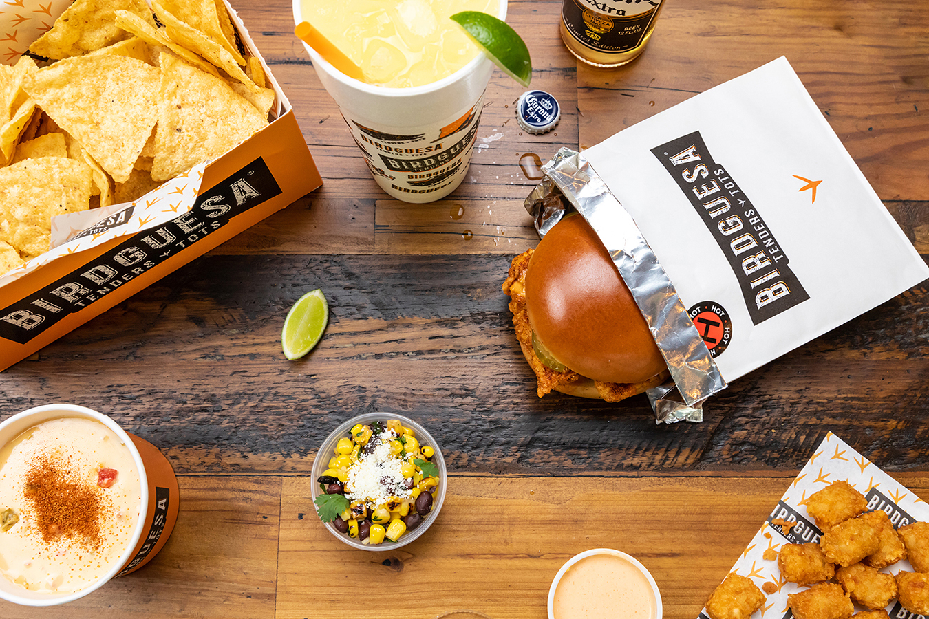
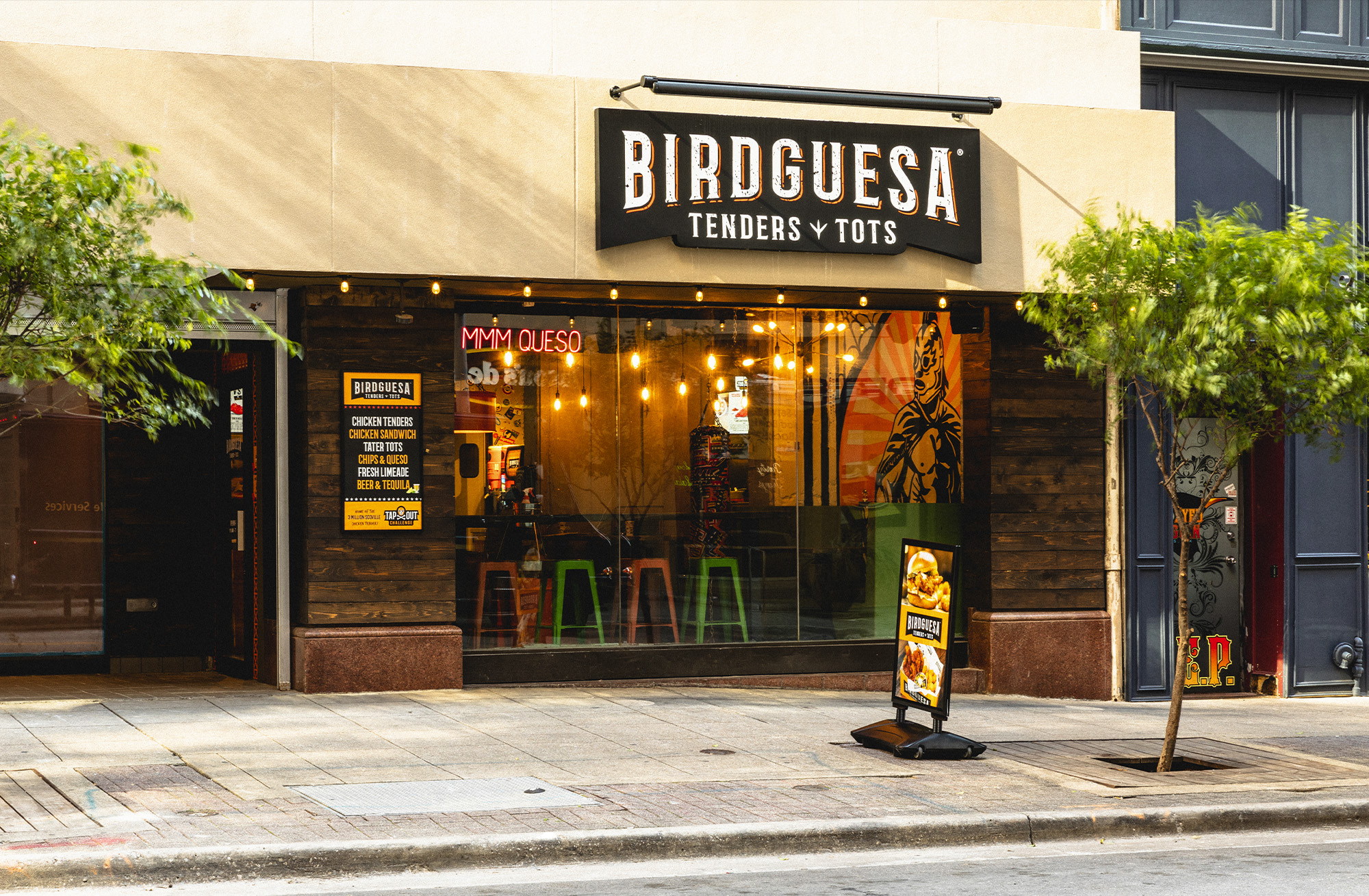
“Birdguesa has been the most FUN restaurant concept I’ve been a part of yet. I’d say it’s my “baby” but it’s really a “teenage boy” brand in every way. Mexican Wrestlers. Trophies. Hot Rods. And a 3-Million-Scoville butt-burner of a hot sauce Challenge.”
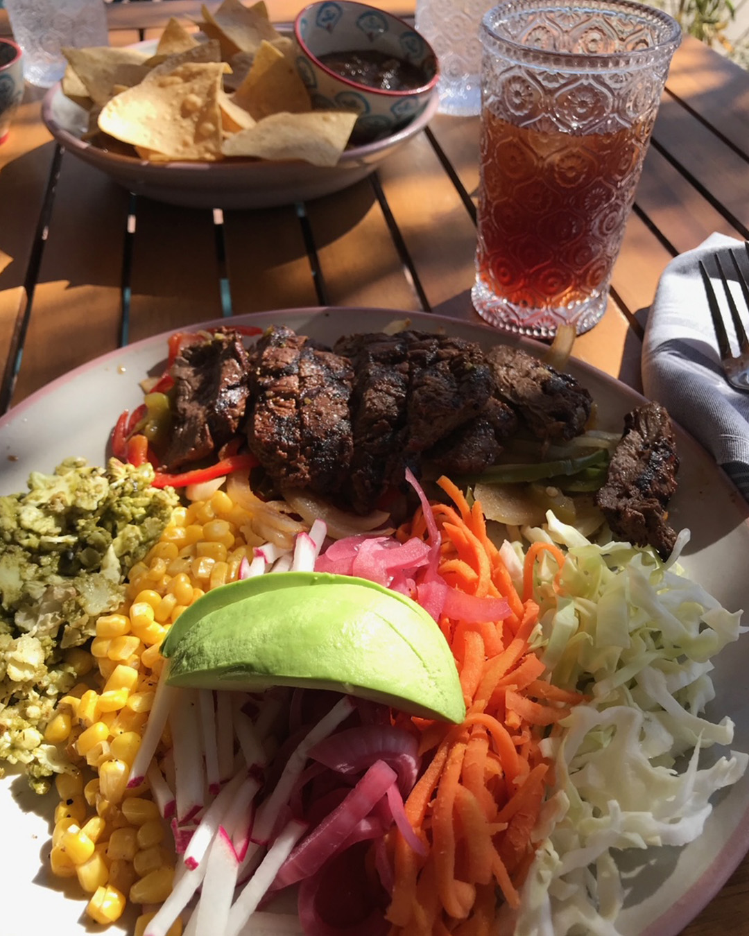
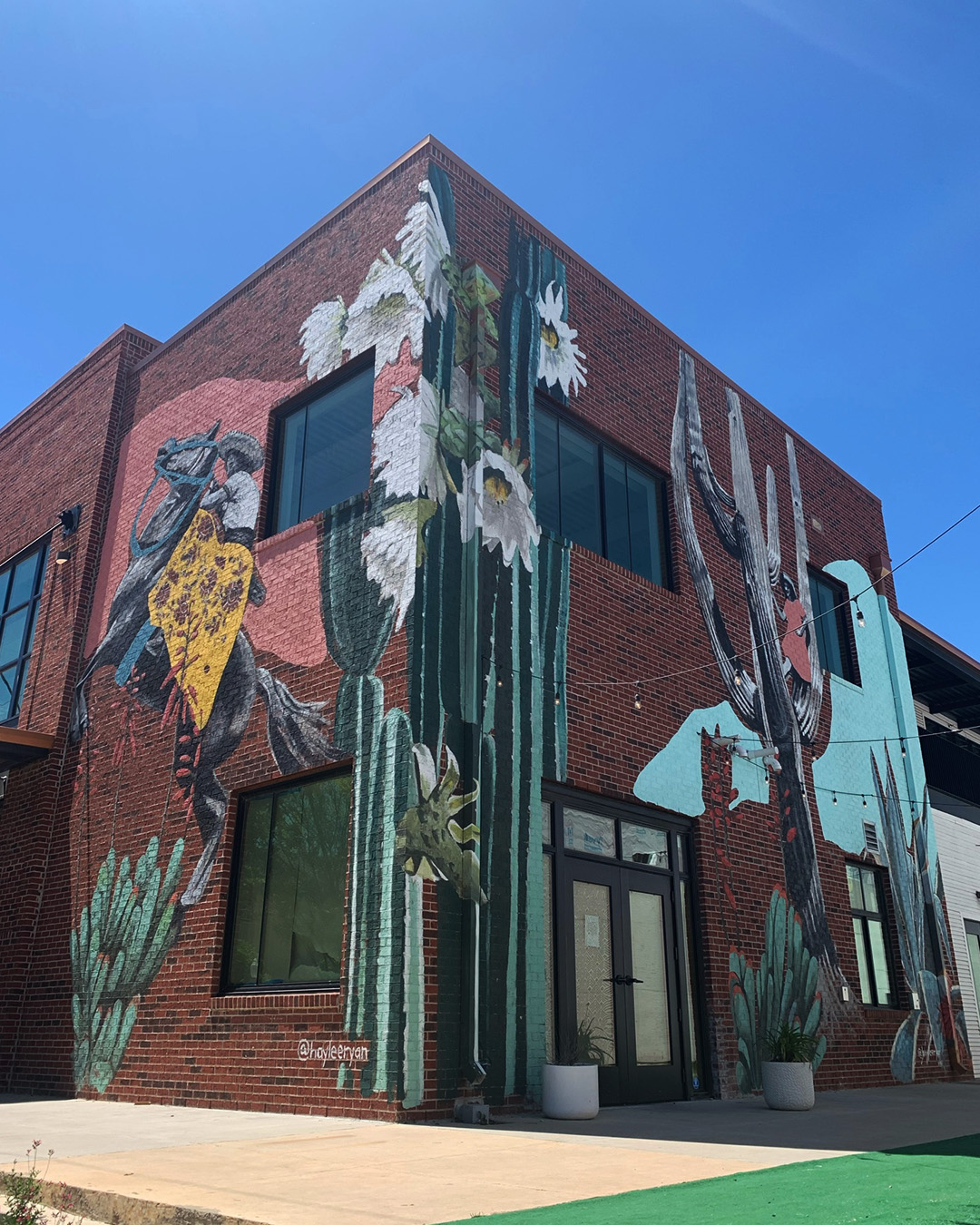
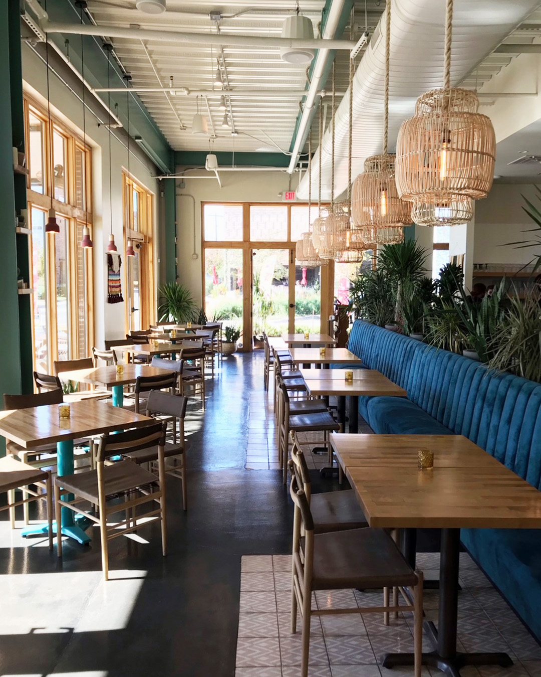
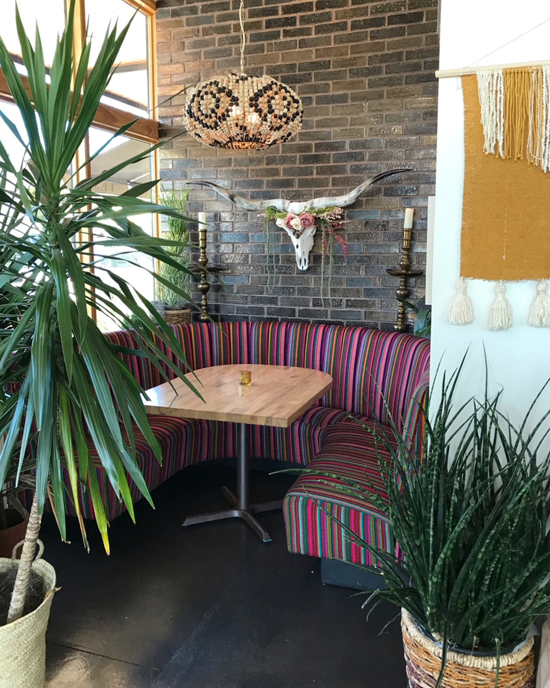
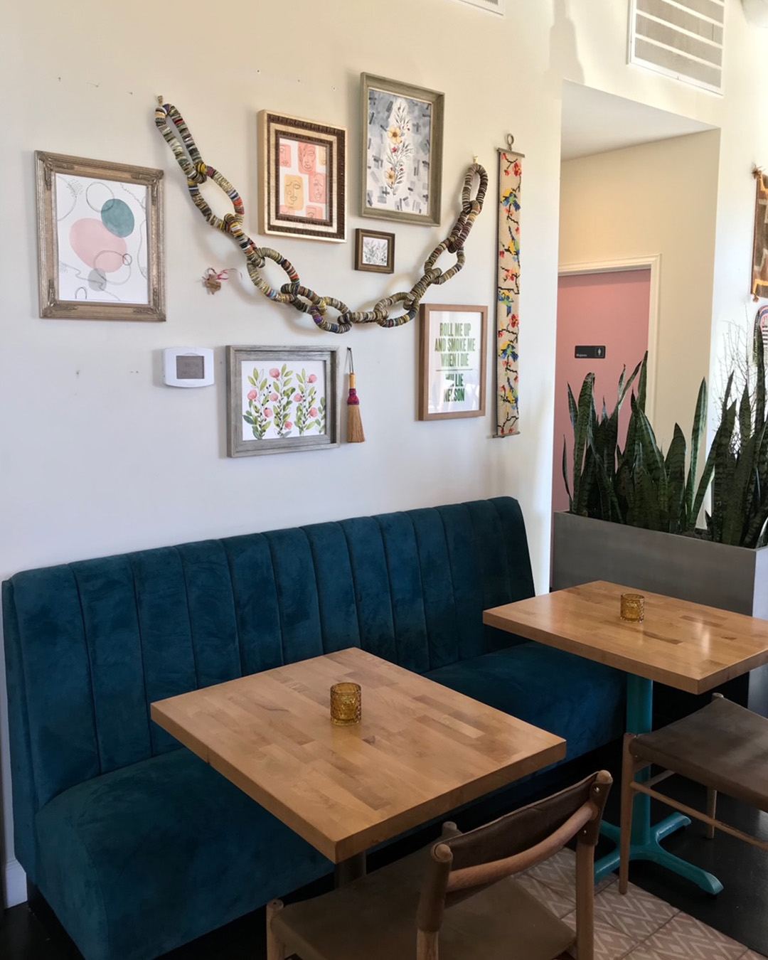
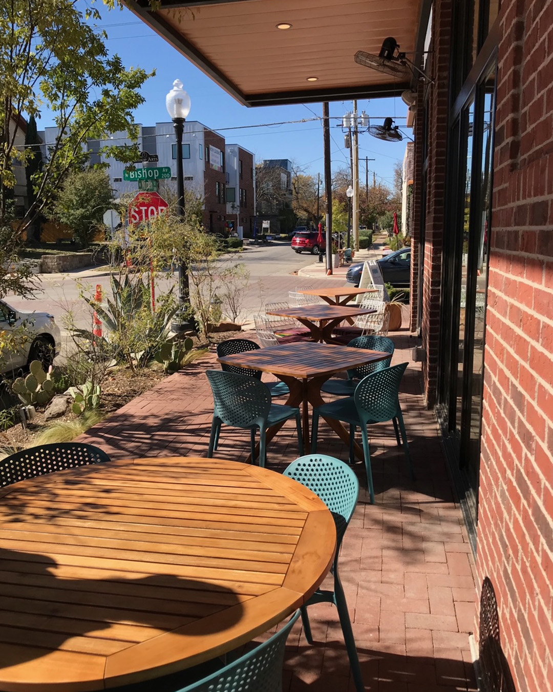
TEJAS – Tex-Mex done sexy. I’m in. This week’s #FridayFeed restaurant branding review is TEJAS at 250 N. Bishop at Ninth Street in Oak Cliff. Studio B just moved to the Bishop Arts District in June so we only heard about what Tejas used to be, which was apparently a counter service, fast casual Tex-Mex burger & fries place. By the time we got here, they had shut it down for a full Covid remodel which included a change in business model-from counter service to sit down casual Mexican cuisine. “Healthy Tex Mex” with bright fresh ingredients and craveable Tex-Mex favorites, vegan options and fresh-caught seafood.
Order Up!
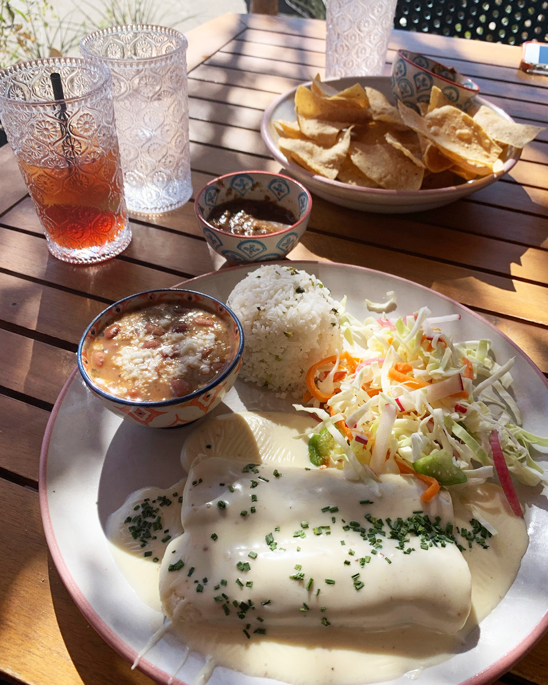
The menu is exactly the right size. Four kinds of guacamole, deliciously velvety queso, ceviche, carne aside fries, a poblano soup and few salads to start. Complimentary with meals, the chips and salsa are delicious. I’m sure they are fresh fried chips with sea salt and the salsa – I can’t describe – but is thick and tasty – not too much tomato. Entrees include standards like enchiladas, tacos, flautas, quesadillas, fajitas and a couple of plates – all with something just a little special, i.e. homemade flour tortillas, tomatillo slaw, house smoked brisket (which is to die-for). You can also get Skinny Fajitas with cauliflower rice and “cute, delicious and oh so mini!” mini tacos. Great for sharing with the No sugar added Margarita selections. My first lunch visit included brisket & queso tacos with fresh flour tortillas. Amazing. So good, in fact, that I ordered take out for dinner which included chicken enchiladas with a yummy creamy sauce and the enchiladas poblanos, also excellent. Danny and I went to review this week and I got the skinny steak fajitas with cauliflower rice. The steak was flawless and the cauliflower rice was really really good. I make A LOT of cauliflower rice variations so I know this veggie but I don’t know how they made theirs. It was delicious and I will snoop around to see if I can replicate at home. Danny got the brisket and queso enchiladas which came with special “rice and beans.” I say special because the rice was notably delicious and the beans were like a little bowl of savory bean soup. They were true sides vs plate fillers. Danny gave the whole meal a double thumbs up. Oh – and the tea was delicious.
Branding DNA/Environmental Branding:
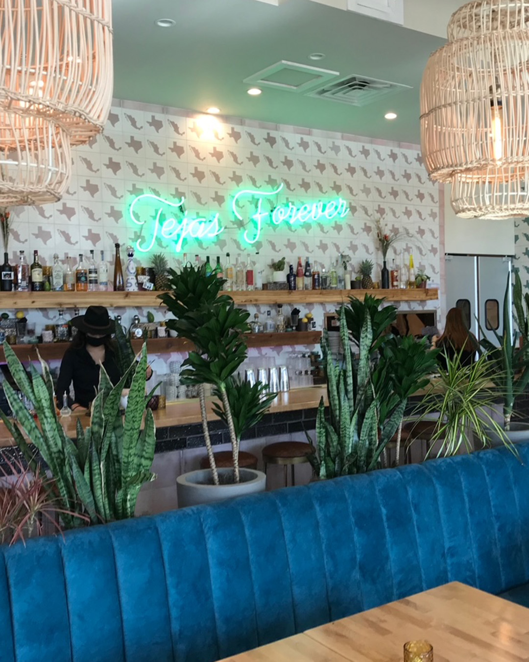
The brand comes from Exxir Capital led by Michael Nazerian who says “ Places are the canvas. Experiences are the glue.” Exxir is responsible for a large part of the development of Bishop Arts along with Good Spaces and Jim Lake Companies. The thing about Exxir though is their curation of the experiences with restaurants, apartments, offices and green spaces.* It’s been said that their design is Southern California and I would agree. Tejas is rich with design elements like custom tiles, loads of plants and planters, awesome pops of color and texture, cool furniture, quirky glassware and even the staff uniforms. I hate to call them uniforms because I think the rules are structured but loose, meaning dress for “this” vibe. The lunch and dinner bartenders were wearing different style black bolero hats. It wasn’t contrived. Somehow I think they just attract the right people for their brands and it seriously all works.
Digital Branding:
Tejas has a minimalist website that can be easily navigated and is all about their food. Their Instagram features beautiful candid food photography of their amazing dishes. Overall, their website and social work great together to drive consumers to their restaurant.
–Danny
MJ’s Brand Opinion:
If you’ve followed our Friday Feed Reviews pre-Covid, you know I don’t gush over restaurants very often. It is rare that a brand is buttoned up in pretty much every category. Many times a restaurant will look great but the staff is just wrong or the operations are clunky. I’m guessing that Nazerian is a control freak about his design and his teams – it works. If there’s anything I think that is a little weak it would probably be website interface and their choice for the take out packaging. My two person take out order included 2 kraft handled bags, 3 kraft Champak containers and 5 styrofoam containers with lids. Since we’re packaging designers, we know how much money that adds to the bottom line and this is stock, unbranded packaging, so…it’s costly and not too eco friendly due to the shear volume of pieces. Unbranded Packaging aside – it’s a heart emoji for me.
TMZ Celebrity Sighting Bonus: While we were patio dining – a porche pulled up and I recognized it was Michael Nazerian. Obviously there to check on his many projects. 😉 MN-Call me about that packaging.
*Exxir also owns Paradiso (review to come – second visit required), Botonist, Good Companions along with Bishop North apartments, Bishop Flats, Camp Bishop and more.
Score:
MJ and Danny give Tejas an A+ in all categories. Go.
#FridayFeed:
Every Friday, Studio B Dallas visits a local fast casual concept for lunch to critique the brand (and eat lunch). Three rules apply: it’s a concept we haven’t been to or it’s been in the restaurant news and it’s within 10 miles of our office. Wait, four rules – it can’t be sushi. Danny doesn’t do sushi. If you have any suggestions on where we should eat next, feel free to leave it in the comments. Look for our restaurant branding reviews each Friday! MJ & Danny

Recent Comments