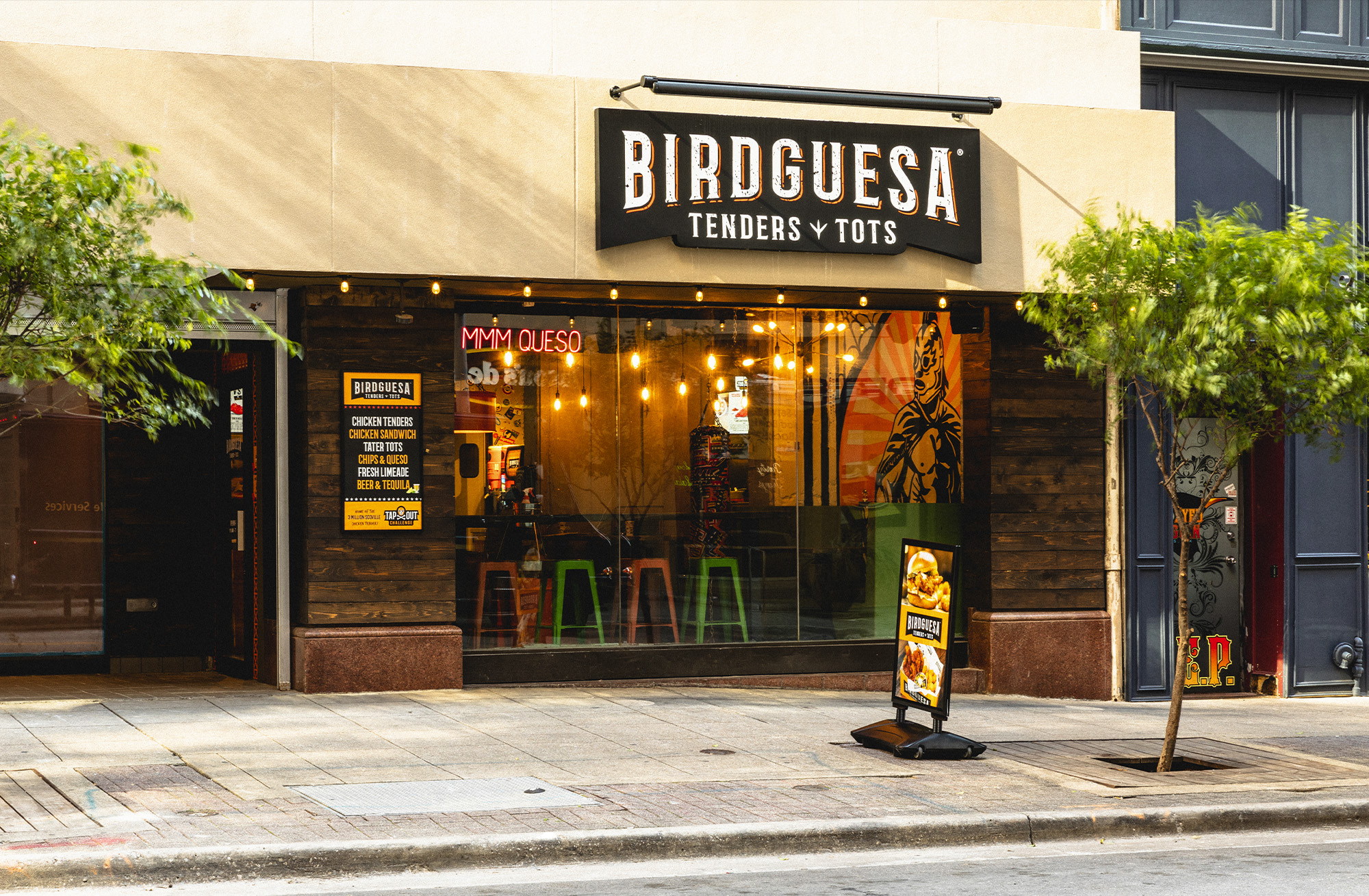
“Birdguesa has been the most FUN restaurant concept I’ve been a part of yet. I’d say it’s my “baby” but it’s really a “teenage boy” brand in every way. Mexican Wrestlers. Trophies. Hot Rods. And a 3-Million-Scoville butt-burner of a hot sauce Challenge.”
Check out the pics and take a 360˚photo tour here
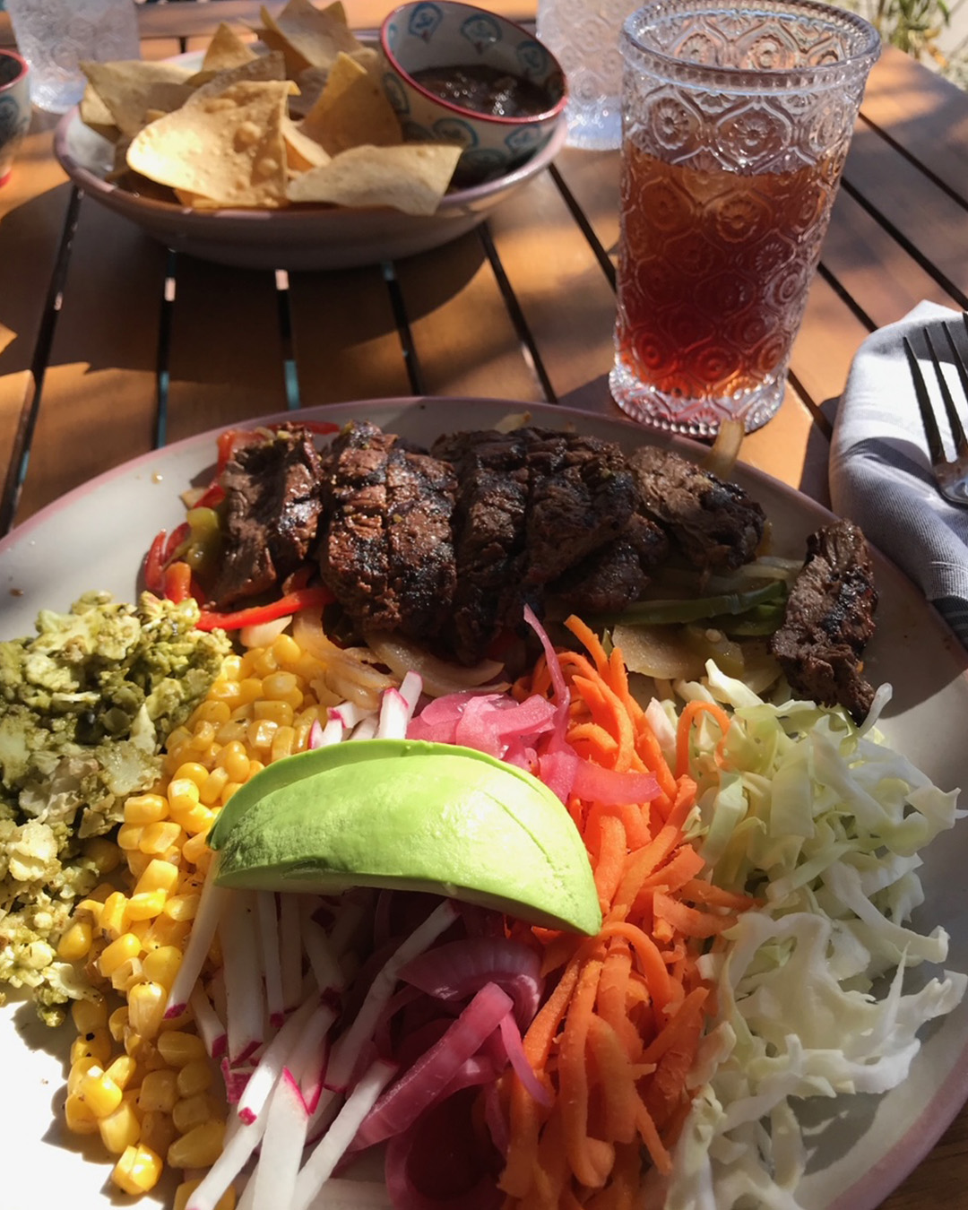
Skinny Fajitas
TEJAS – Tex-Mex done sexy. I’m in.
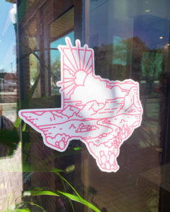
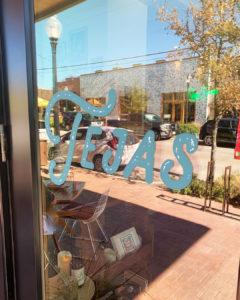
This week’s #FridayFeed restaurant branding review is TEJAS at 250 N. Bishop at Ninth Street in Oak Cliff. Studio B just moved to the Bishop Arts District in June so we only heard about what Tejas used to be, which was apparently a counter service, fast casual Tex-Mex burger & fries place. By the time we got here, they had shut it down for a full Covid remodel which included a change in business model-from counter service to sit down casual Mexican cuisine. “Healthy Tex Mex” with bright fresh ingredients and craveable Tex-Mex favorites, vegan options and fresh-caught seafood.
Order Up!
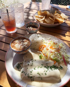
The menu is exactly the right size. Four kinds of guacamole, deliciously velvety queso, ceviche, carne aside fries, a poblano soup and few salads to start. Complimentary with meals, the chips and salsa are delicious. I’m sure they are fresh fried chips with sea salt and the salsa – I can’t describe – but is thick and tasty – not too much tomato. Entrees include standards like enchiladas, tacos, flautas, quesadillas, fajitas and a couple of plates – all with something just a little special, i.e. homemade flour tortillas, tomatillo slaw, house smoked brisket (which is to die-for). You can also get Skinny Fajitas with cauliflower rice and “cute, delicious and oh so mini!” mini tacos. Great for sharing with the No sugar added Margarita selections. My first lunch visit included brisket & queso tacos with fresh flour tortillas. Amazing. So good, in fact, that I ordered take out for dinner which included chicken enchiladas with a yummy creamy sauce and the enchiladas poblanos, also excellent. Danny and I went to review this week and I got the skinny steak fajitas with cauliflower rice. The steak was flawless and the cauliflower rice was really really good. I make A LOT of cauliflower rice variations so I know this veggie but I don’t know how they made theirs. It was delicious and I will snoop around to see if I can replicate at home. Danny got the brisket and queso enchiladas which came with special “rice and beans.” I say special because the rice was notably delicious and the beans were like a little bowl of savory bean soup. They were true sides vs plate fillers. Danny gave the whole meal a double thumbs up. Oh – and the tea was delicious.
Branding DNA/Environmental Branding:
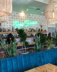
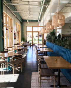
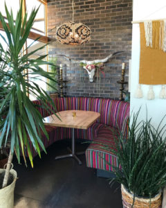
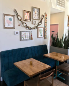
The brand comes from Exxir Capital led by Michael Nazerian who says “ Places are the canvas. Experiences are the glue.” Exxir is responsible for a large part of the development of Bishop Arts along with Good Spaces and Jim Lake Companies. The thing about Exxir though is their curation of the experiences with restaurants, apartments, offices and green spaces.* It’s been said that their design is Southern California and I would agree. Tejas is rich with design elements like custom tiles, loads of plants and planters, awesome pops of color and texture, cool furniture, quirky glassware and even the staff uniforms. I hate to call them uniforms because I think the rules are structured but loose, meaning dress for “this” vibe. The lunch and dinner bartenders were wearing different style black bolero hats. It wasn’t contrived. Somehow I think they just attract the right people for their brands and it seriously all works.
Digital Branding:
Tejas has a minimalist website that can be easily navigated and is all about their food. Their Instagram features beautiful candid food photography of their amazing dishes. Overall, their website and social work great together to drive consumers to their restaurant.
–Danny
MJ’s Brand Opinion:
If you’ve followed our Friday Feed Reviews pre-Covid, you know I don’t gush over restaurants very often. It is rare that a brand is buttoned up in pretty much every category. Many times a restaurant will look great but the staff is just wrong or the operations are clunky. I’m guessing that Nazerian is a control freak about his design and his teams – it works. If there’s anything I think that is a little weak it would probably be website interface and their choice for the take out packaging. My two person take out order included 2 kraft handled bags, 3 kraft Champak containers and 5 styrofoam containers with lids. Since we’re packaging designers, we know how much money that adds to the bottom line and this is stock, unbranded packaging, so…it’s costly and not too eco friendly due to the shear volume of pieces. Unbranded Packaging aside – it’s a heart emoji for me.
*Exxir also owns Paradiso (review to come – second visit required), Botonist, Good Companions along with Bishop North apartments, Bishop Flats, Camp Bishop and more.
Score:
MJ and Danny give Tejas an A+ in all categories. Go.
#FridayFeed:
Every Friday, Studio B Dallas visits a local fast casual concept for lunch to critique the brand (and eat lunch). Three rules apply: it’s a concept we haven’t been to or it’s been in the restaurant news and it’s within 10 miles of our office. Wait, four rules – it can’t be sushi. Danny doesn’t do sushi. If you have any suggestions on where we should eat next, feel free to leave it in the comments. Look for our restaurant branding reviews each Friday! MJ & Danny
- Brisket Enchiladas
- Exterior Mural
- Tejas Forever Neon
- Interior Dining
- Interior Dining 2
- Interior Dining 3
- Skinny Fajitas
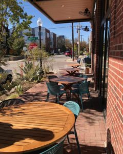
- Patio Dining
- Tejas Decal
- Tejas Logo
SKY ROCKET BURGER – Remember when it was cool to dine-in?
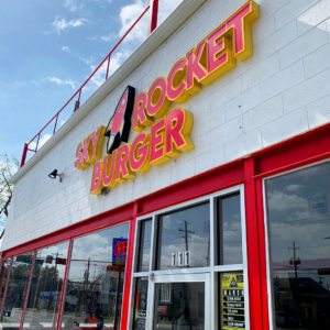
This week’s #FridayFeed restaurant branding review is SKY ROCKET BURGER at 111 S. Hall at Commerce in Deep Ellum. About 3 weeks ago we visited Sky Rocket Burger. We’d never heard of it but decided to go after some colleagues recommended we try it. We love a good burger and fries!
Order Up!
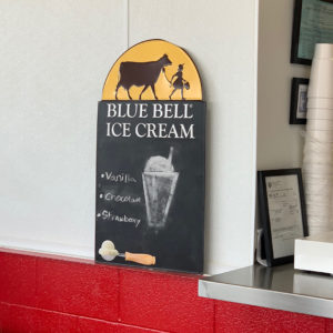
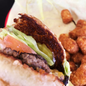
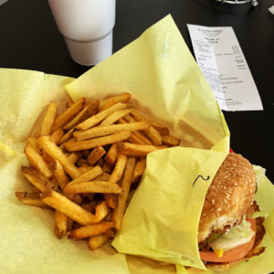
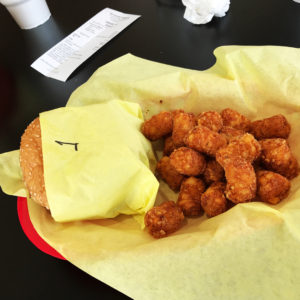
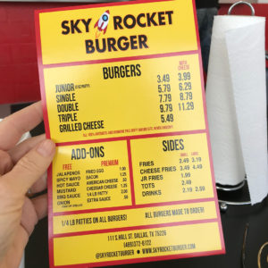
The menu is super simple. Fresh ground angus prime choice beef burgers, cooked to order with free add-ons like raw or grilled onions, jalapeños, spicy mayo, hot sauce, etc. Premium add-ons include a fried egg, cheddar cheese and bacon. I ordered the single burger with cheese – no changes to the way it comes which is with lettuce, tomato, pickles, served sauce and mayo on a FRESH BAKED TOASTED BUTTERED BUN. Let’s just linger here for a minute. Real butter (because I asked management) slathered generously on a fresh baked bun, toasted until crisp on a flat top grill. Ahhhh-mazing. Danny got the single burger also but added grilled jalapeños. We tried the fries, the tots and the fresh brewed tea. This was truly a classic burger lunch with a delicious fried potatoes. No pretense, no crazy ingredients. The rest of the menu includes: double burgers, triple burgers, grilled cheese and cheese fries. Drinks and a Blue Bell shakes sign indicates they have vanilla, chocolate and strawberry shakes.
Branding DNA/Environmental Branding:
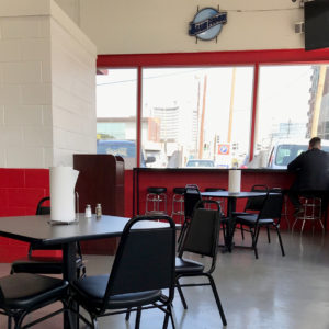
The branding is as basic as the burger. It works for the burger but since we’re restaurant “branders” we think there is much room for improvement here. I like the name but I think the logo and the menu and the interior provide opportunities for improvement. The website is really spare. The about us page says it is a family owned restaurant who takes pride in bringing best tasting food at best prices. What else? We did some googling and found that the concept was opened by Scott Wagner & his wife Tia. The couple has now partnered with a team that includes Alan Talebi who is known for Vidorra and Stirr. According to Culturemap, they opened the Deep Ellum location so they could have the burgers closer to where they lived. Another is planned for Arlington. How about a location in Oak Cliff next?!
Digital Branding:
There’s not much else to say except that we’ll go back – obviously for take out due to this Coronavirus quarantine. DoorDash, Grubhub, Uber Eats and Postmates all deliver according to their Instagram and Facebook pages.
–Danny
A Message to the Owners:
Studio B is a kick ass restaurant branding design studio in the Design District. You guys could use some branding. We could use a new project. We realize the restaurant business is in total crisis right now but there will be less competition when this is over. Let’s use this time and work something out. Let’s talk!
Score:
MJ and Danny give Sky Rocket Burger an A for the burger.
#FridayFeed:
Every Friday, Studio B Dallas visits a local fast casual concept for lunch to critique the brand (and eat lunch). Three rules apply: it’s a concept we haven’t been to or it’s been in the restaurant news and it’s within 10 miles of our office. Wait, four rules – it can’t be sushi. Danny doesn’t do sushi. If you have any suggestions on where we should eat next, feel free to leave it in the comments. Look for our restaurant branding reviews each Friday! MJ & Danny
- Sky Rocket Burger Exterior
- Sky Rocket Burger Interior
- Blue Bell Shake Sign
- Toasted Burger Bun
- Burger and Fries
- Burger and Tots
- Sky Rocket Burger Take Out Menu
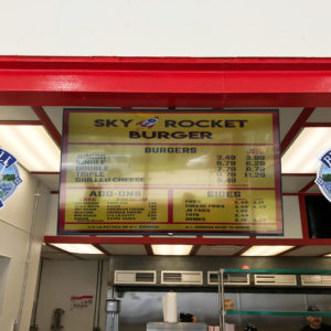
- Sky Rocket Burger Menu Board
#FridayFeed Scores:
#FridayFeed:
Every Friday, Studio B Dallas visits a local fast casual concept for lunch to critique the brand (and eat lunch). Three rules apply: it’s a concept we haven’t been to or it’s been in the restaurant news and it’s within 10 miles of our office. Wait, four rules – it can’t be sushi. Danny doesn’t do sushi. If you have any suggestions on where we should eat next, feel free to leave it in the comments. Look for our restaurant branding reviews each Friday! MJ & Danny
- Velvet Taco
- Fuzzy’s Tacos
- Torchy’s Tacos
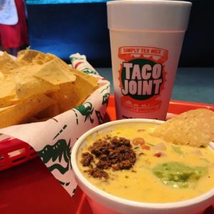
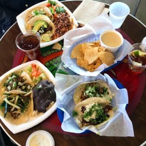
- Taco Joint
- Tacodeli
FUZZY’S TACO SHOP – Add Friends and Alcohol
This week’s #FridayFeed restaurant branding review is FUZZY’S TACO SHOP on Mockingbird near Love Field airport. I went to my first Fuzzy’s in Waxahachie about 12 years ago. Cool little taco shop, good food and that’s all I remember. After doing a little research on the brand, I learned that the original founder, Paul Willis was involved in a ton of restaurants and opened the original Fuzzy’s in Ft Worth, near TCU. In 2003, Father and son restaurateurs Alan and Chuck Bush bought the Shop and began franchising in 2009. The brand has more than 100 locations according to their website.
Order Up!
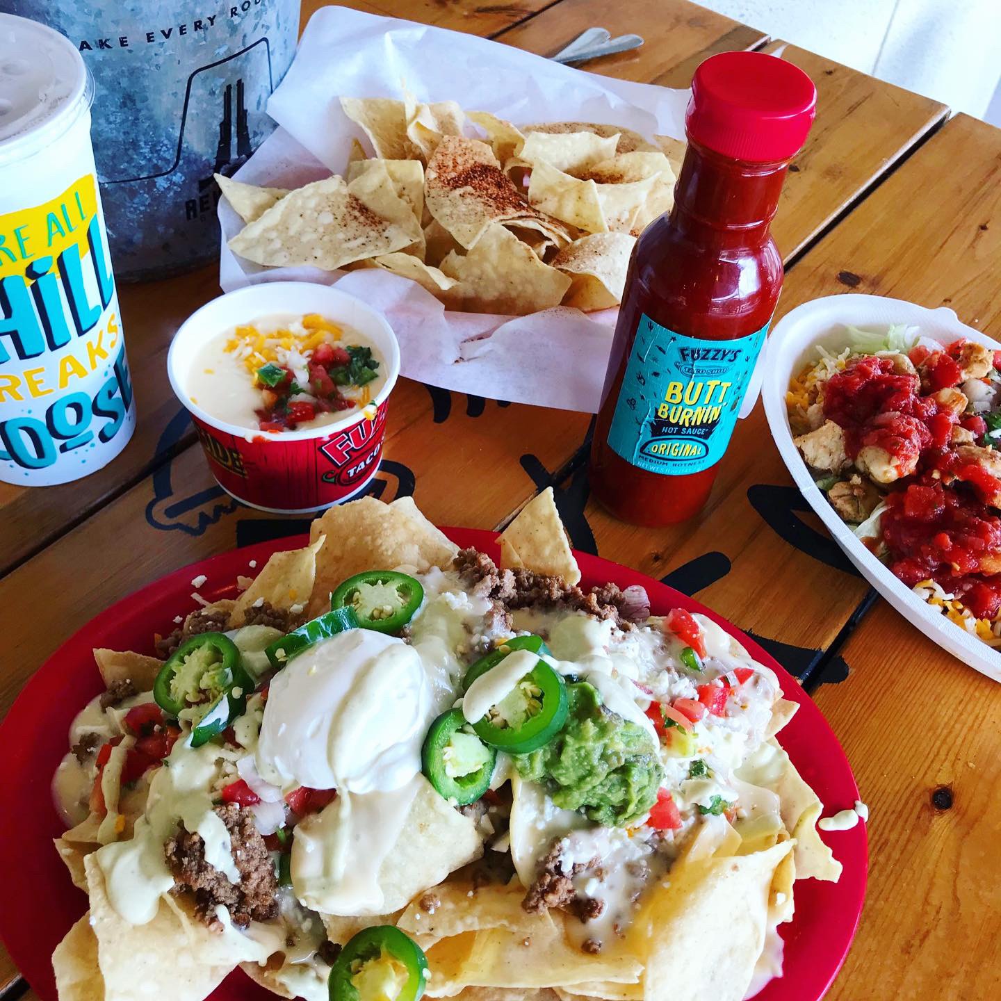
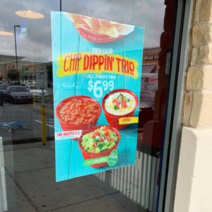
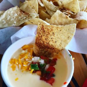
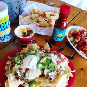
I ordered the nachos and made them “ultimate” by adding sour cream, fresh jalapeños and guacamole. Danny got a burrito bowl and we got a side of chips & queso, just because. My nacho order was a huge plate of yummy cheesy, creamy goodness. No complaints. Queso was so-so. I LOVE Queso, especially white queso. It was good but I just needed it to be awesome.
Branding DNA/Environmental Branding:
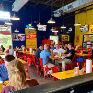
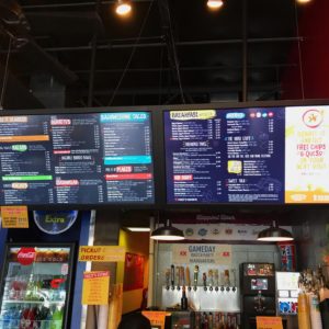
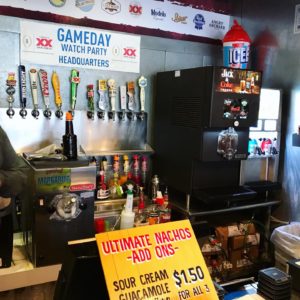
I didn’t notice anything super special about the interior design here. Lots of bright paint colors, MASSIVE – like the biggest I’ve ever seen – Digital Menu Boards and some nice outdoor seating. It’s ok but it’s just missing something. The interior is just a dining room with seats. I didn’t leave there knowing anything about Fuzzy’s tacos – why it’s named that or what it means or where they’re from, what they’re known for, what’s the deal with that cute fish? Don’t blame me but there’s a lot of pressure put on the experience in the fast casual space now. It’s not enough that you have to make great food with some blingy, instagram worthy items and be ever-present on social media – you have to deliver an “experience” on-site as well. Oh, and deliver. with drones. and CBD, make sure you’re thinking about adding something with that… To be fair – an experience can be had when you add friends, family and/or alcohol – which they have plenty in their small little service bar which I loved. Danny and I visit concepts specifically to see what a brand is delivering so we come in with white gloves and take note of everything we like and don’t like. Overall notes – I don’t get the Baja component. The Mockingbird location needs an update and re-paint. I loved the crazy little bar set up at the register. If I was in college still, drinking with friends at a cooler location, maybe I would love it more.
Marketing Miss:
We decided to go to Fuzzy’s because it was on our list but also because I recently connected with the VP of Development on LinkedIn. I’m also doing some research on queso for another project and I noticed their current promotion online. If you donate $2 to No Kid Hungry, you get FREE chips and queso* *Disclaimer – FREE on your next visit…psyche! Anyway…we got there and I realized that the cashier didn’t ask me to donate and I didn’t see a sign for the promotion so maybe this franchisee isn’t participating or maybe I just missed it. Here’s some FREE data for the Fuzzy’s marketing team: I saw FREE queso marketing online. I saw picture of queso & chips online. I went to Fuzzy’s to get queso and chips. I ordered nachos and STILL ordered Queso and chips. Data results: Queso sells!
Digital Branding:
Fuzzy’s Taco shop has a great website filled with bright color schemes and can be easily navigated. On their site they also have a stream of their social media post, which I think is brilliant! My only issue is the parallax scrolling on the menu page of the website. The images are not big enough vertically to be able to see the beautiful food photography. On their Facebook and Instagram account they mix some marketing with and large portion of great food photography and a dash of lifestyle. They do an awesome job with the food photos, but could use some more lifestyle imagery. Overall they have a good website and even better social media posts, but what they’re really missing is the unique factor that sets them apart from other taco joints.
–Danny
Score:
MJ gives FUZZY’S TACO SHOP a B- and Danny gives them a solid B+. This concept is missing something.
#FridayFeed:
Every Friday, Studio B Dallas visits a local fast casual concept for lunch to critique the brand (and eat lunch). Three rules apply: it’s a concept we haven’t been to or it’s been in the restaurant news and it’s within 10 miles of our office. Wait, four rules – it can’t be sushi. Danny doesn’t do sushi. If you have any suggestions on where we should eat next, feel free to leave it in the comments. Look for our restaurant branding reviews each Friday! MJ & Danny
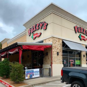
- Fuzzy’s Taco Shop
- Fuzzy’s Window Cling
- Fuzzy’s Interior
- Huge Digital Menu Boards
- Bar Setup at Register
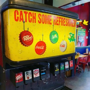
- Fuzzy’s Fountain Drinks
- Chips & Queso
- Nachos & Burrito Bowl
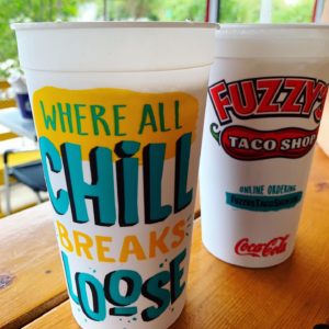
- Fuzzy’s Branded Cups
SERIOUS PIZZA + TATTOOS + TAKE OUT
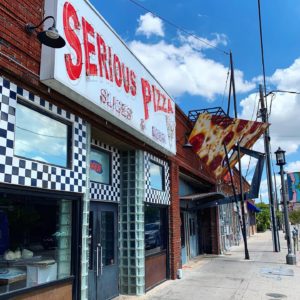
This week’s #FridayFeed restaurant branding review is SERIOUS PIZZA in Deep Ellum. I was seriously wanting to review some pizza this week. I love the &pizza brand but they aren’t in Texas yet. Mod Pizza is in Frisco – aka Oklahoma – too far north. With a quick internet search of pizza near me, I found Serious Pizza in Deep Ellum, right next door to the famous Elm Street Tattoo. I remembered that they are “famous” for their 30” pizza. EATER indicates the brand is now owned by MILKSHAKE CONCEPTS (Imran Sheikh, Citizen, Stirr and Vidorra) but founders Mike Turley and Andrew Phillips are still involved in Ops and culinary.
Order Up!
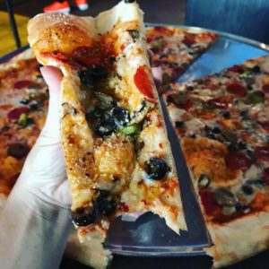
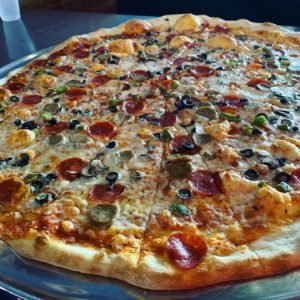
We ordered the Deluxe 30” pizza which has homemade dough and sauce, topped with pepperoni, italian sausage, bell pepper, black olive & fresh mushrooms. We didn’t order any sides or extras but we did see they had a cooler with some gelato and Ben & Jerry’s ice cream. They were sold out of the logo’d T-shirts but they had some “Supreme” styled Serious Pizza logo shirts for $25.
Branding DNA:
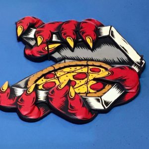
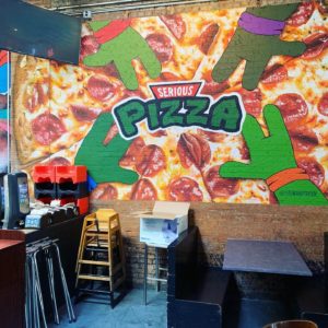
We usually review brands that have multiple locations and call out the work of the interior/brand firms that work on the projects, oooh and ahh over cool design features, etc. SERIOUS PIZZA has one location. I’m pretty sure the only artist or designers behind the brand involve the tattoo-esque logo and wall art and the guy that throws that massive pizza dough – which, that IS an art. I definitely give them props for the entertainment element.
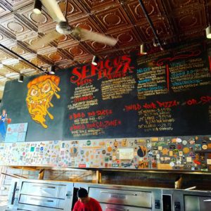
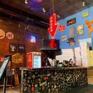
Chalkboard menu, random cool stickers stuck on everything. It’s basically a really good New York style thin crust pizza joint with a Texas sized novelty 30” product that occupies a stinky, dirty Deep Ellum bar space that has been every kind of bar since the 80’s. The spaces where they were making the pizzas looked ok but OMG – I hope the lease negotiation and renovation that CEO Imran Sheikh refers to in the Eater article is in progress. My advice is to get it to go and enjoy pics online until that happens.
Digital Branding:
Serious Pizza’s website could take a lesson from their social media accounts. Unlike their website, their Facebook and Instagram feature great candid photos of their delicious pizza with just the right amount of marketing. Their website is a pretty simple one page site and could use some love especially their about section. Under the info tab in the About section it only states “Huge Pizza!!! Slices & Beer!” While this could be seen as clever on their part, I see it as being just plain lazy. Under the hours tab in the About section it says “ No opening hours found.” How are your customers suppose to know when and what days you’re open? This is your website and more often than not it’s many consumers first impression of your restaurant. The lack of photographs on their website is baffling to me! Especially since their social media accounts have such great photos. A simple coding fix would push the beautiful food photography from their social media to their website and drastically change potential customer’s opinions. Serious Pizza could use more of a digital presence and it all starts with the website! While social media is great for promoting your brand, it should NOT be the only source of your digital presence. Especially in this day and age where there is a ton of amazing website templates available and all you have to do is plug in your info and upload your images.
–Danny
Score:
MJ gives SERIOUS PIZZA an A if you’re doing take out and a C- if you dine in during daylight hours or if your sober. Danny gives the food an A- and the website a C-.
#FridayFeed:
Every Friday, Studio B Dallas visits a local fast casual concept for lunch to critique the brand (and eat lunch). Three rules apply: it’s a concept we haven’t been to or it’s been in the restaurant news and it’s within 10 miles of our office. Wait, four rules – it can’t be sushi. Danny doesn’t do sushi. If you have any suggestions on where we should eat next, feel free to leave it in the comments. Look for our restaurant branding reviews each Friday! MJ & Danny
- Serious Pizza Exterior
- Chalkboard Menu
- Order Counter
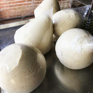
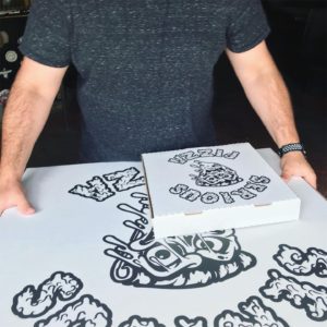
- Pizza Dough
- Giant Pizza Slice
- 30″ Deluxe Serious Pizza
- Serious Pizza Rack
- Interior Mural
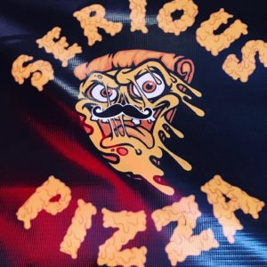
- Serious Pizza Banner
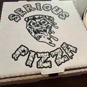
- Branded To-Go Box
- Leftovers for Days!
The Devil went down to Austin lookin’ for a soul to steal. He found Mike Rypka and Torchy’s was born!
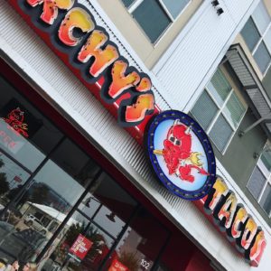
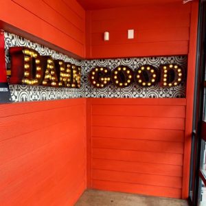
This week’s #FridayFeed restaurant branding review is Torchy’s Tacos on SMU boulevard. Let’s be honest, If you haven’t heard of Torchy’s by now, you’ve been living under a rock! They have DAMN GOOD tacos and queso that you’ll sell your soul for. Torchy’s is an Austin born brand and has over 60 locations and more in the queue.
Order Up!
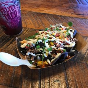
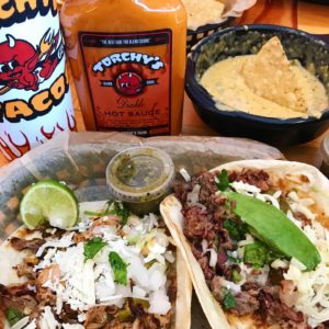
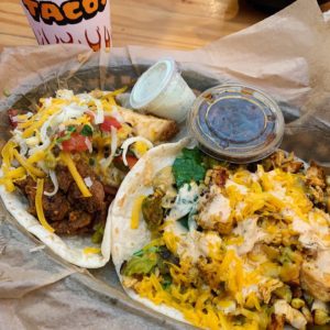
Let’s dive straight into the food. I ordered a Tipsy Chick taco off of their regular menu – grilled chicken breast, spinach, grilled corn, green chilies, and cheddar cheese with a side of bacon bourbon marmalade & a Trailer Park Hillbilly Style off of their secret menu – fried chicken, chorizo, chopped bacon, green chilies, green chile queso, cheddar jack cheese, and pico. If you know me, you know I love chorizo and have an unhealthy obsession with queso so this taco is by far, my all time favorite taco! MJ ordered the Green Chile Pork taco & Crossroads. And of course we had to order some Green Chile Queso & Chips to share. We didn’t get one this time, but they also have feature taco of the month similar to Velvet Taco’s Weekly Taco Feature (WTF).
Branding DNA:
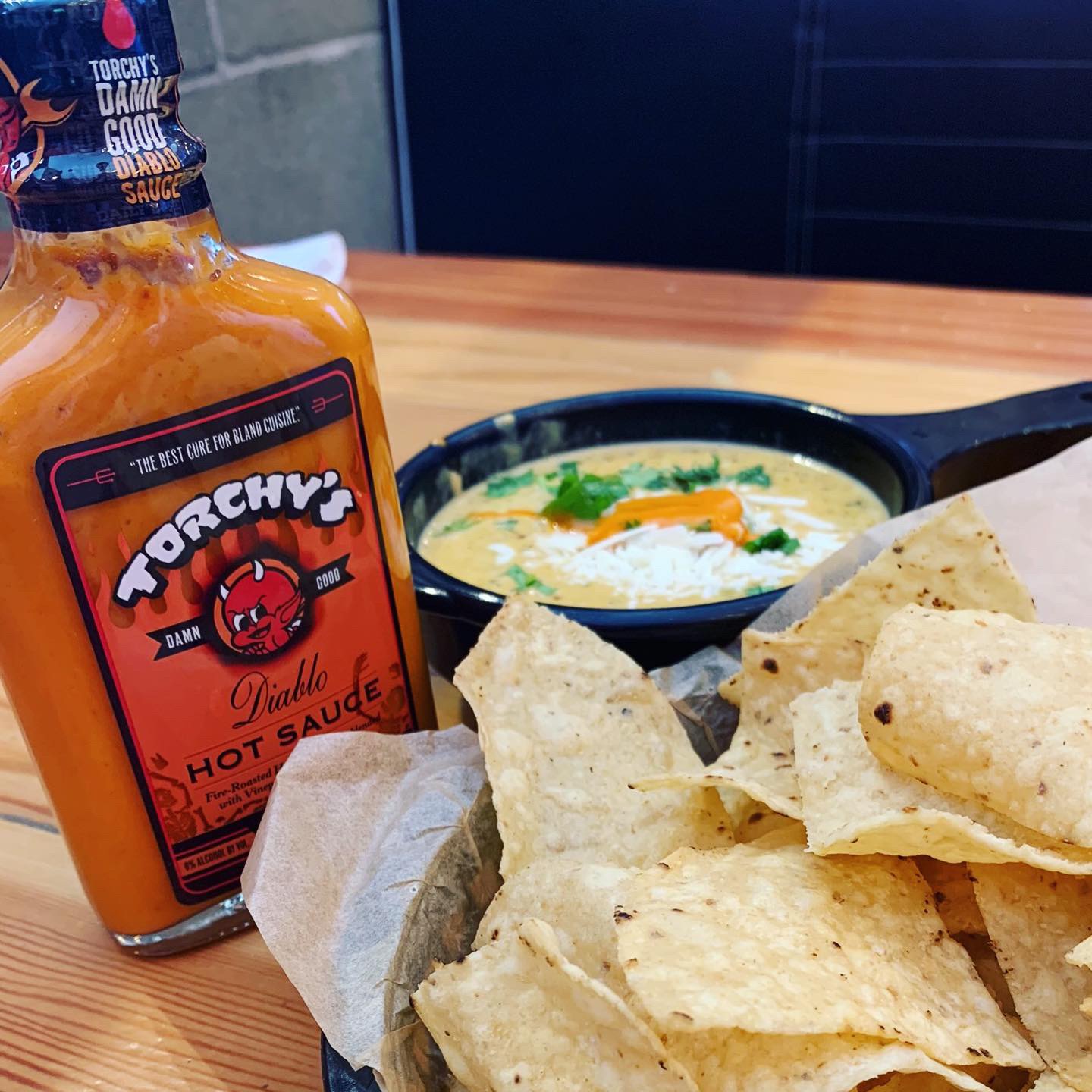
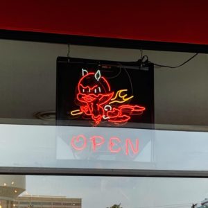
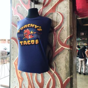
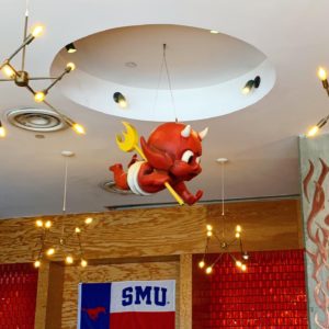
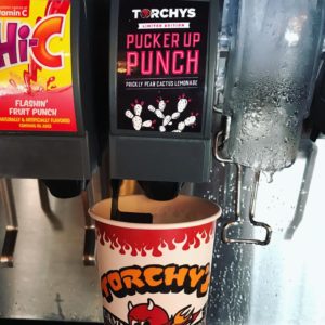
Torchy’s is a brand with Austin attitude. I would consider them one of the more ballsy fast casual restaurants. Not too many restaurants would use a baby devil for their mascot and DAMN GOOD as their tagline, but Torchy’s does! They started out as a food trailer in Austin by chef and founder Michael Rypka. They’ve kept some of that same grit as they’ve expanded into the fast causal market. Not only does Torchy’s have DAMN GOOD tacos, but they also have DAMN GOOD branding. They have branded shirts, hats, baby onesies, matchbooks, custom bottled Diablo hot sauce, and even their own soda-Pucker Up Punch.
Torchy’s restaurants are eco-friendly, something I wasn’t aware of until I visited the culture page of their website. They only use responsibly and ethically sourced ingredients which really shines in each of their tacos. They also only stock napkins, cups, and cutlery made from 100% renewable resources and turn their cooking oil into car fuel. In addition, Torchy’s donates tacos, time, and resources to a variety of charities.
Environmental Branding:
The devil baby, the exposed bulb lighting, the road reflector walls, concrete, steel, the whole cycle shop/tattoo parlor look is awesome. It looks and feels authentic.* Funky brass retro light fixtures, big graphic tiles, a bunch of COOL T-shirt designs – it all just really works. I’m not a big fan of the lacquered plywood but it fits with the space. We’re not sure who to give the logo and design credits to. It looks like a lot of people have been involved but we’re all in. Torchy’s brand really has street cred.
*Authentic like: they have real founders and struggles and stories vs being created in a conference room designed to “create” appeal to customers.
–MJ
Digital Branding:
Torchy’s website breaks the conventional mold and I wouldn’t expect anything less. They have a nontraditional header, beautiful food photography, and a website that is easy to navigate with a gritty tattoo-esque branded pattern. They have great Facebook and Instagram accounts that feature a mixture of mouthwatering food photography, fun lifestyle imagery, and a sprinkle of marketing. Overall, Torchy’s is a brand with attitude, great branding, and most important… great food!
Score:
Danny gives Torchy’s an A+ and MJ gives it an A.
#FridayFeed:
Every Friday, Studio B Dallas visits a local fast casual concept for lunch to critique the brand (and eat lunch). Three rules apply: it’s a concept we haven’t been to or it’s been in the restaurant news and it’s within 10 miles of our office. Wait, four rules – it can’t be sushi. Danny doesn’t do sushi. If you have any suggestions on where we should eat next, feel free to leave it in the comments. Look for our restaurant branding reviews each Friday! MJ & Danny
- Torchy’s Tacos
- Torchy’s Mascot Open Sign
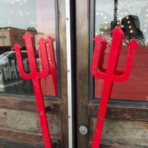
- Trident Door Handles
- Torchy’s Mascot
- Green Chile Queso & Chips
- Trailer Park Hillbilly Style & Tipsy Chick
- Torchy’s Branded Soda
START. by maybe changing your name but DON’T STOP cooking those awesome Start Burgers!
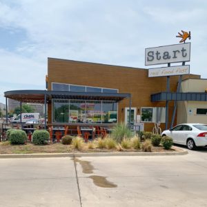
This week’s #FridayFeed restaurant branding review is START on Lemmon Avenue. The concept a healthy FAST FOOD restaurant with a drive through. Think McDonalds with tasty, healthy food! Start is a Dallas based brand with 2 locations open from 7am to 11pm, serving breakfast, lunch, dinner and catering.
Order Up!
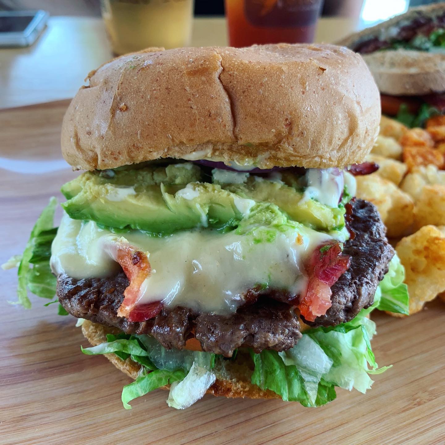
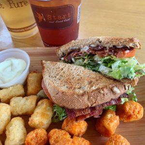
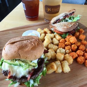
I’m going to start with the START Burger. In a word, amazing. Seriously, this burger competes with my unhealthy love of Rodeo Goat. The Start Burger is a grass-fed beef burger patty, applewood smoked bacon, white cheddar, red onion, avocado, tomato, romaine lettuce and homemade dijonnaise on a really fresh and tasty wheat bun. I know that ingredient list doesn’t sound crazy unique, but it was so fresh and the flavors were all just perfect. Danny ordered the BLT and sweet potato tots. He said it was the second best BLT he’s ever had; East Hampton’s version being his favorite.
They don’t fry anything but the baked tater tots were crispy and delicious. They make their own mayonnaise and dressings. They also have a flourless chocolate cake that is gluten free and made with quinoa. Because this was our first time at Start, we were given a bite-sized cake “on the house.” You would never know it was made with quinoa, it was decadent and delicious. We ate them before we could get a picture, sadly. “Everything” is either humane, antibiotic, hormone and nitrate Free, organic, filler-free, scratch made, fair trade, shade-grown, you get it… They use paper straws, eco friendly packaging and don’t use fryers, aspartame, corn syrup or plastic water bottles.
Branding DNA:
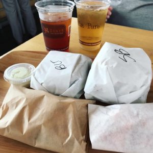
We normally review fast casual brands so the expectation is branded paper goods or sometimes on glass plates with real silverware. We forgot we were in a fast food environment until our food came out in unbranded packaging wrapped to-go on a bamboo tray. Once we unwrapped it, the food looked great. The take out bags are stamped and the cups are logo’d but no custom branded packaging really anywhere else, including the menu boards.
MJ’s Brand Commentary:
What’s cool about Start? It’s a Healthy, Fresh FAST FOOD CONCEPT with mass appeal potential (more so than a typical salad and wrap concept). The challenge with Start is getting customers to try them as an alternative to other fast food brands.” I’ve driven past this restaurant on Lemmon fifty times. I thought it was a breakfast place. I never even considered going there. The name, the logo and colors and exterior just don’t register as a fast food place or a lunch place. I’m not saying those elements are all wrong but when you’re trying to change the habits of the general fast food eating public (GFFEP), you’ve got a tough road ahead. So let’s say you’re NOT trying to convert the GFFEP and you’re just trying to be a healthy, fresh and fast restaurant that has a drive through – that’s also unique. I still have a problem with the name.
Environmental Branding:
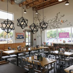
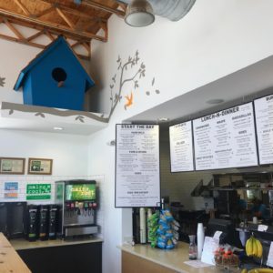
If you go inside, you’ll find contemporary materials, wood tables and booths, community table with really nice, wide-seat stools. A few touches of orange but beyond that mostly neutral natural woods, unfinished particle board used as wainscoting and booth framework. Then there are painted trees and orange birds on the walls which unfortunately look too much like a daycare center or children’s ward in the hospital. We’ve reviewed Modern Market (cool “unisex” design) and Unleavened which I would call healthy, clean eating places. Start has a better overall menu in my opinion because you CAN get a hearty burger and tots but you can also get a great salad or wrap. I only wish the brand had a different name and was a touch more masculine. The blue birdhouse, the murals, the low-energy music and the general vibe just wasn’t comfy or hip. I’d love to see somebody take a super BALLSY approach to this emerging restaurant segment. Like a healthy menu & drive through with a Torchy’s attitude.
Digital Branding:
Start’s website is fairly easy to navigate and has all the things you would expect from a healthy fast casual concept’s website; their story, press, online ordering, catering and their menu. Their Facebook and Instagram accounts showcase mouthwatering food photography, but leave much to be dissed in way of lifestyle marketing imagery. Having a balanced mix of food and lifestyle photography drives sales and customers into your restaurant. In short, the food is the big hero at Start.
–Danny
Score:
MJ gives START an A for food; C for branding and Danny gives it A for food and a B- for branding.
#FridayFeed:
Every Friday, Studio B Dallas visits a local fast casual concept for lunch to critique the brand (and eat lunch). Three rules apply: it’s a concept we haven’t been to or it’s been in the restaurant news and it’s within 10 miles of our office. Wait, four rules – it can’t be sushi. Danny doesn’t do sushi. If you have any suggestions on where we should eat next, feel free to leave it in the comments. Look for our restaurant branding reviews each Friday! MJ & Danny
- Start Exterior
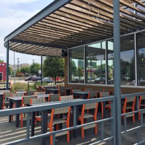
- Start Patio
- Start Interior
- Start Interior & Menu Boards
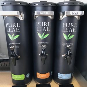
- Matte Black Tea Dispensers
- Bamboo Food Tray Presentation
- BLT & Tots
- Start Burger
- Amazing Food
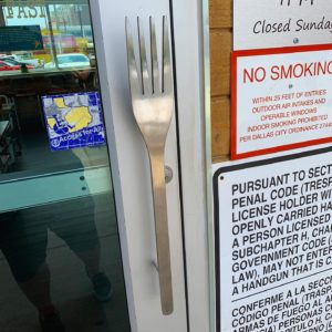
- Custom Fork Door Handle

7-Eleven Designed Deep Dish Cookie
Deep Dish Cookie Hits 5,000+ 7-Eleven store shelves!
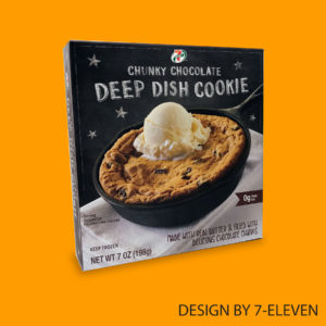
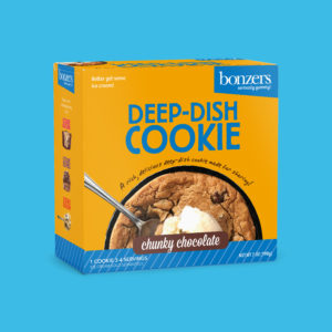
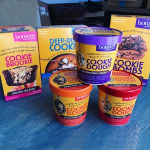
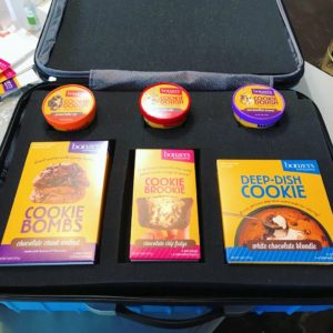
We designed a line of sweet treats for client Michael’s Cookies which included Deep Dish Cookies, Cookie Brookies, Cookie Bombs and Ready-to-eat Cookie Doughs. Last month, the Deep Dish Cookie debuted in more than 5,000 stores. While 7-Eleven’s design team modified the packaging, we are proud to say Studio B helped get this sweet product to market!
- 7-Eleven Designed Deep Dish Cookie
- Studio B Designed Deep Dish Cookie
- Lineup of Sweet Treats
- Custom Sales Case








Recent Comments