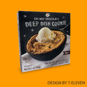
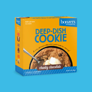
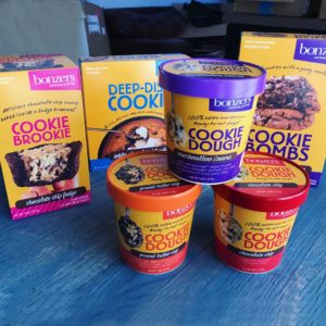
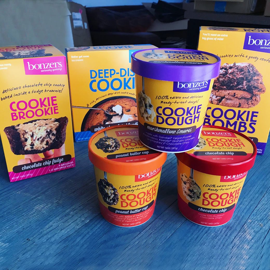
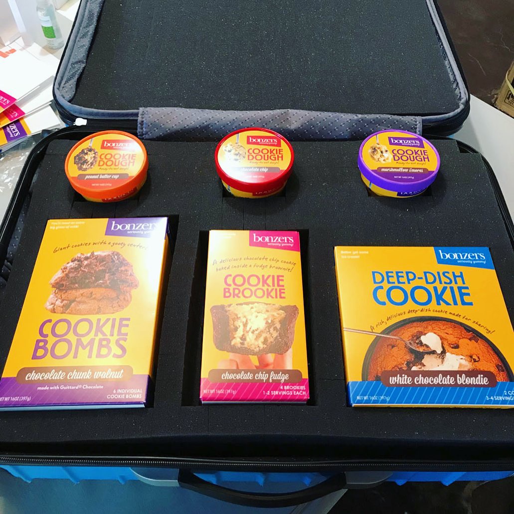
Deep Dish Cookie Hits 5,000+ 7-Eleven store shelves!
We designed a line of sweet treats for client Michael’s Cookies which included Deep Dish Cookies, Cookie Brookies, Cookie Bombs and Ready-to-eat Cookie Doughs. Last month, the Deep Dish Cookie debuted in more than 5,000 stores. While 7-Eleven’s design team modified the packaging, we are proud to say Studio B helped get this sweet product to market!
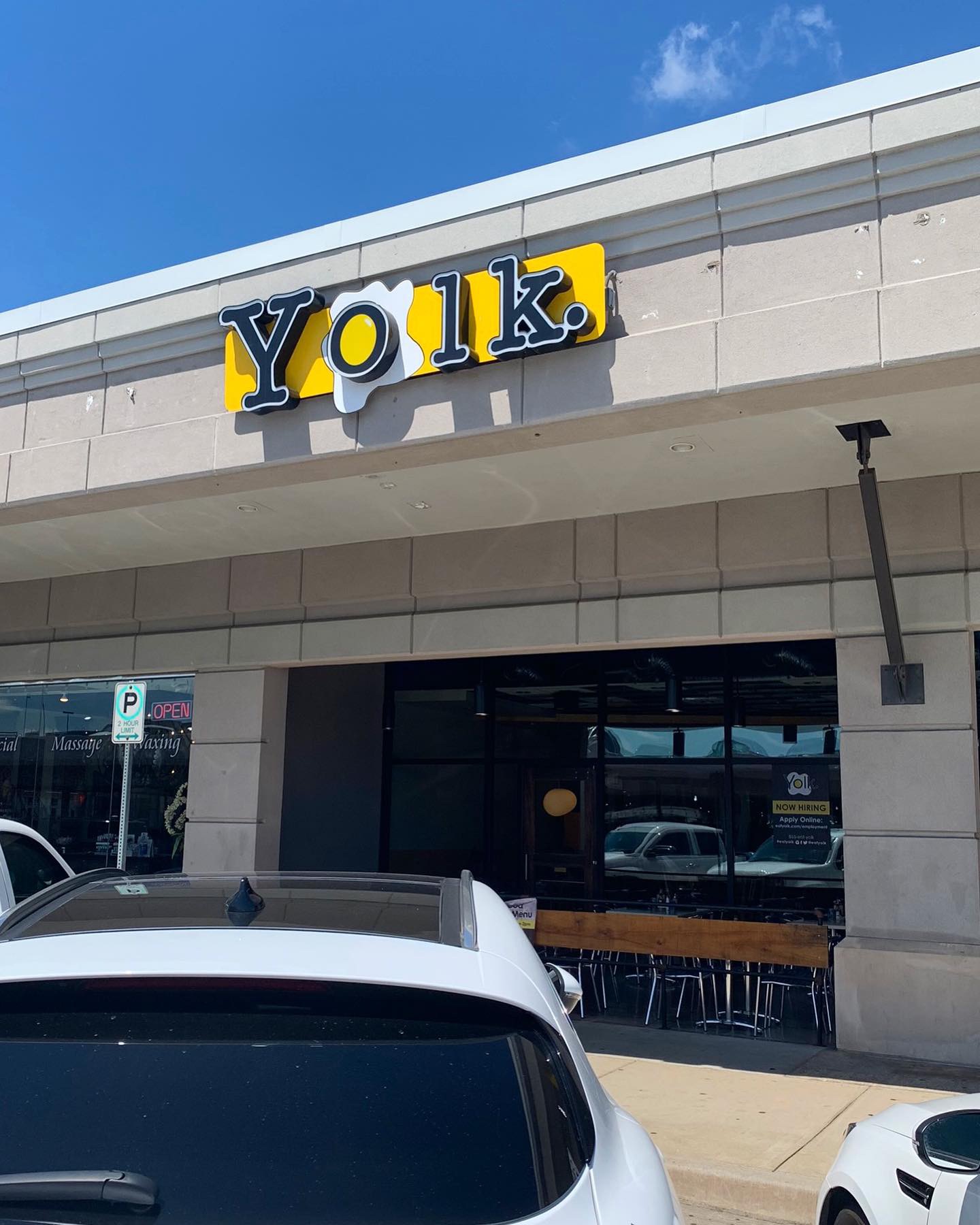
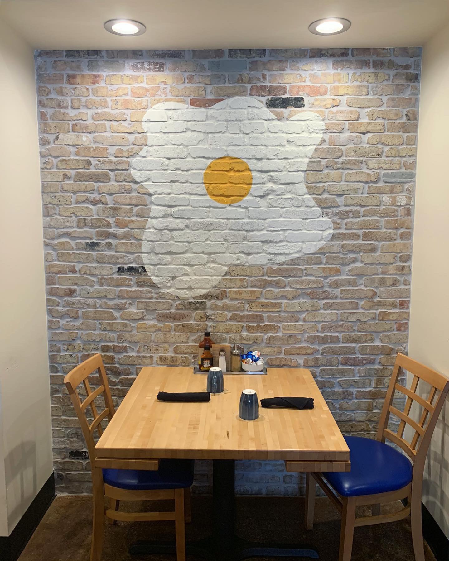
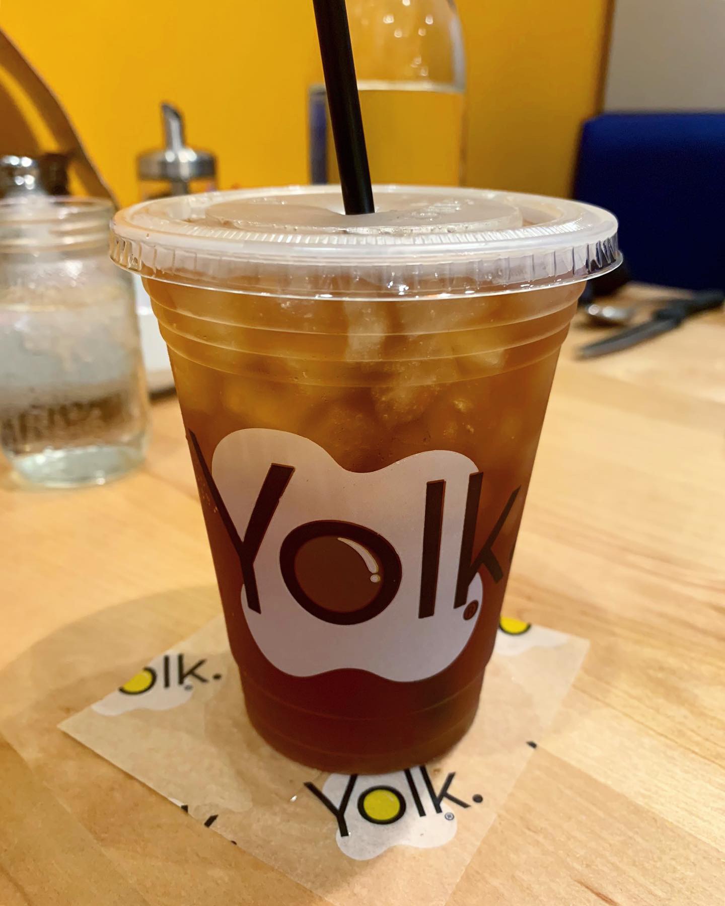
This week’s #FridayFeed restaurant branding review is YOLK in Preston Center. The concept was developed by Taki Kastanis who was born into the restaurant business. Yolk is a Chicago based brand with 16 US locations in Chicago, Dallas, Boca Raton, Indianapolis and Forth Worth. According to Forbes Yolk has been voted Best Breakfast in Chicago, Indianapolis, Dallas and Fort Worth.
Order Up!
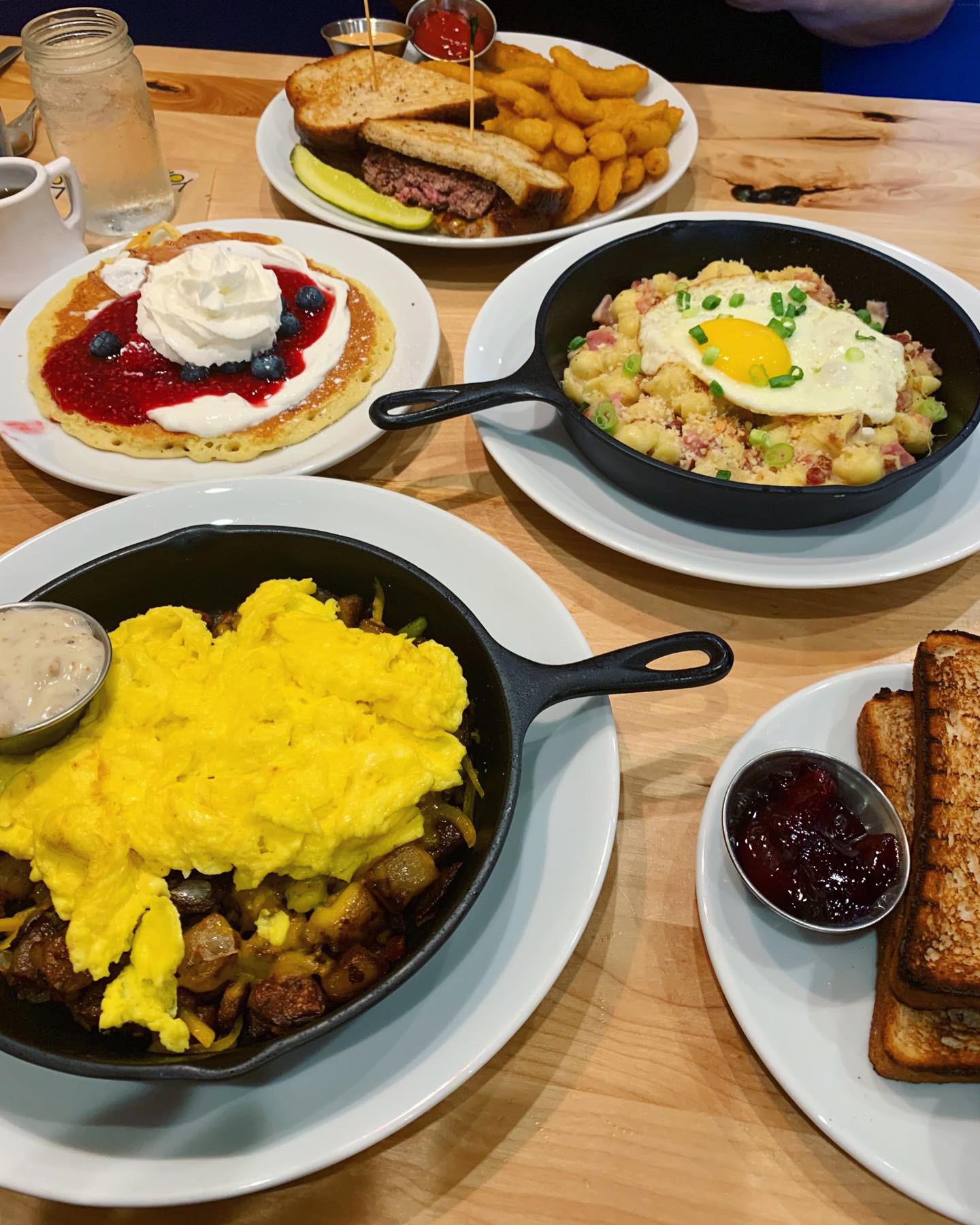
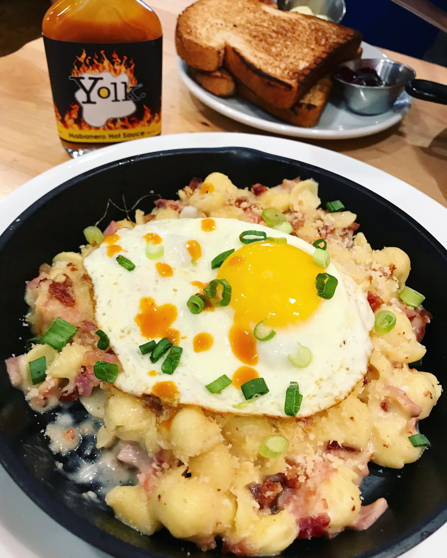
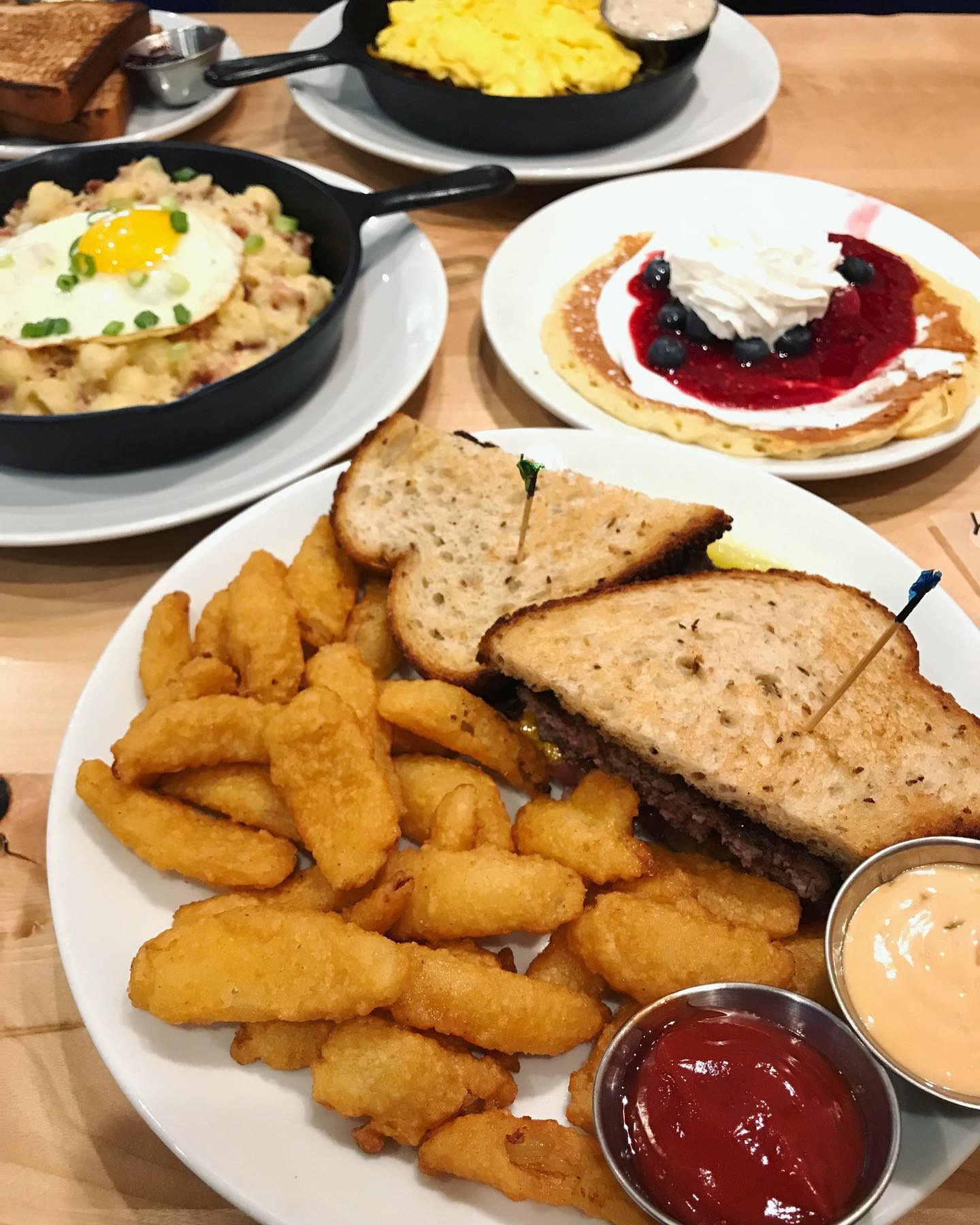
Studio B has reviewed Snooze am Eatery and The Biscuit Bar so we thought we should review Yolk this week. I’ve been to this location but Danny was a first-timer. He ordered the Countryside Skillet and I went for the Patty Melt on the lunch menu. We couldn’t resist trying the Breakfast Mac N Cheese that comes with a sunny side up egg on top. We put YOLK brand habanero sauce on it and it was really, really good. They offered an optional side upgrade with my patty melt of “onion chips” so I upgraded to check them out. Lastly, we ordered a single Pancake of the month which was a Red, White & Blueberry which is a pancake with yogurt, raspberry puree, blueberries, raspberries and whipped cream. Needless to say, we got a LOT of food on this review trip. The Skillet breakfast and the Mac N Cheese were the heroes. Onion chips I had higher hopes for and while the patty melt was good and the buttered, griddled rye bread was DELICIOUS, it wasn’t the best Patty Melt I’ve ever had. I don’t normally mention prices in our reviews but I will say this was a very pricey lunch. The Patty Melt was $15 plus an extra $1.50 for the onion chips.
Environmental Branding:
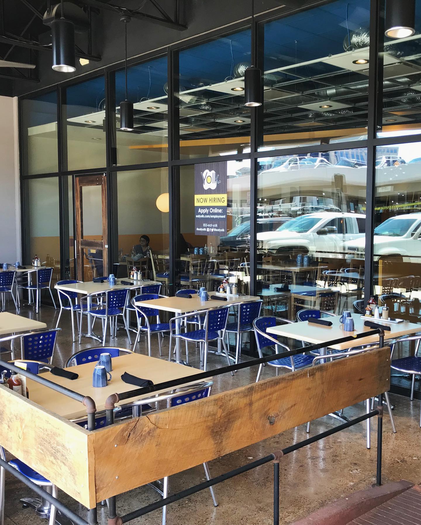
You’ll see below in the brand section that I love the YOLK branding and while I like some of the interior design, I don’t love it. I feel like the furniture needs a update. I have a particular dislike of this chair style and the blue is a little much, but that’s just my opinion. They do have some nice outdoor patio furniture and they do a great job with the retail section and pastry display. The exterior signage is also nice.
Branding DNA:
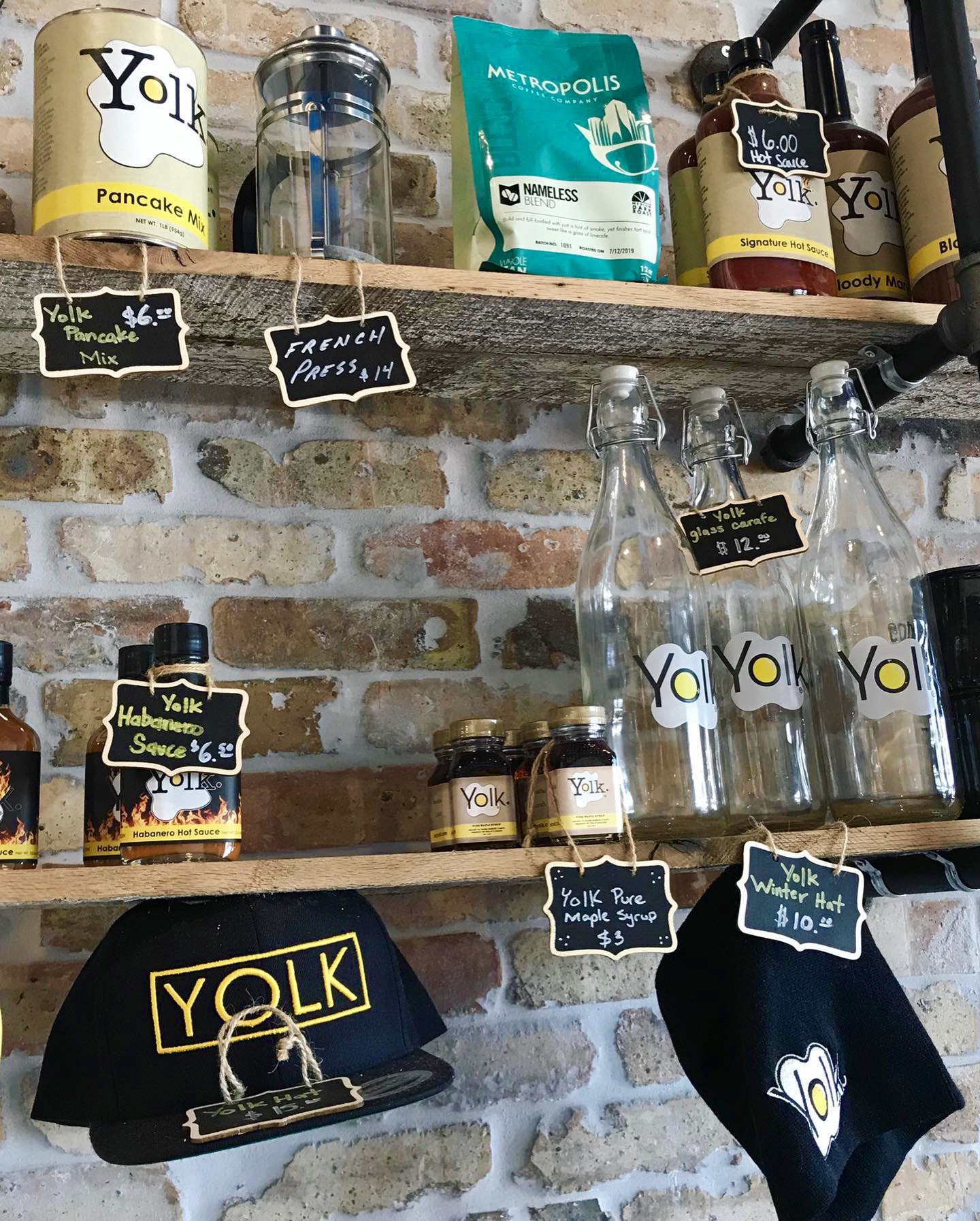
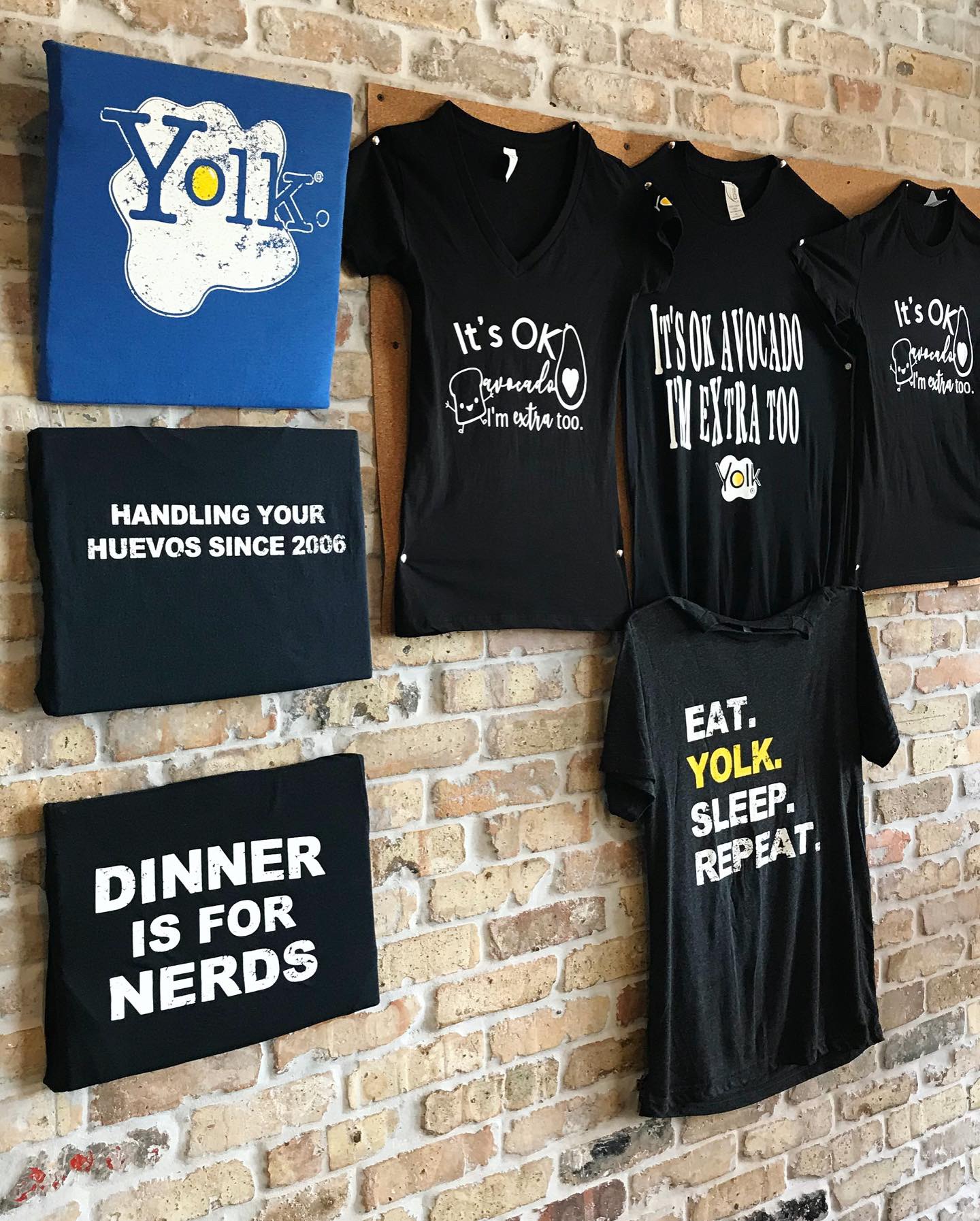
Yolk has great retail apparel, packaging, bottled sauces, cute coffee mugs and baby bibs, etc. They have really pretty glass water bottles with the logo and they serve beverages in several sizes of mason jars. Logo’d pens, free stickers, cute take out cups and tray liner. Menus are good. I love the logo.
Digital Branding:
Yolk has great Facebook and Instagram accounts that feature fun lifestyle imagery and beautiful food photography. A few of their images take advantage of marketing their branded products like their maple syrup and hot sauce. While they have great social media accounts, their website could use an update. They have a brick image background that is pretty distracting and could use a more modern flexible grid layout. –Danny
Score:
MJ gives YOLK an A- and Danny gives it an A.
#FridayFeed:
Every Friday, Studio B Dallas visits a local fast casual concept for lunch to critique the brand (and eat lunch). Three rules apply: it’s a concept we haven’t been to or it’s been in the restaurant news and it’s within 10 miles of our office. Wait, four rules – it can’t be sushi. Danny doesn’t do sushi. If you have any suggestions on where we should eat next, feel free to leave it in the comments. Look for our restaurant branding reviews each Friday! MJ & Danny
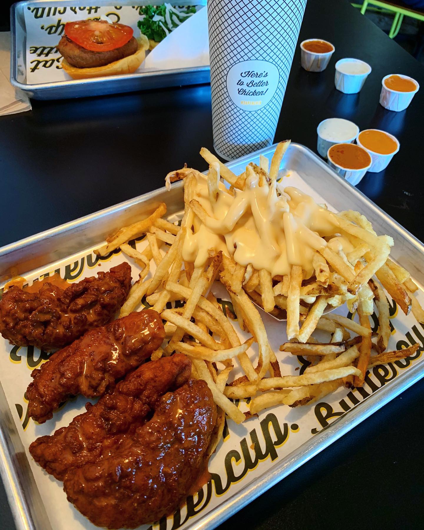
SUPER CHIX. SUPER DELICIOUS. Worth every last carb.
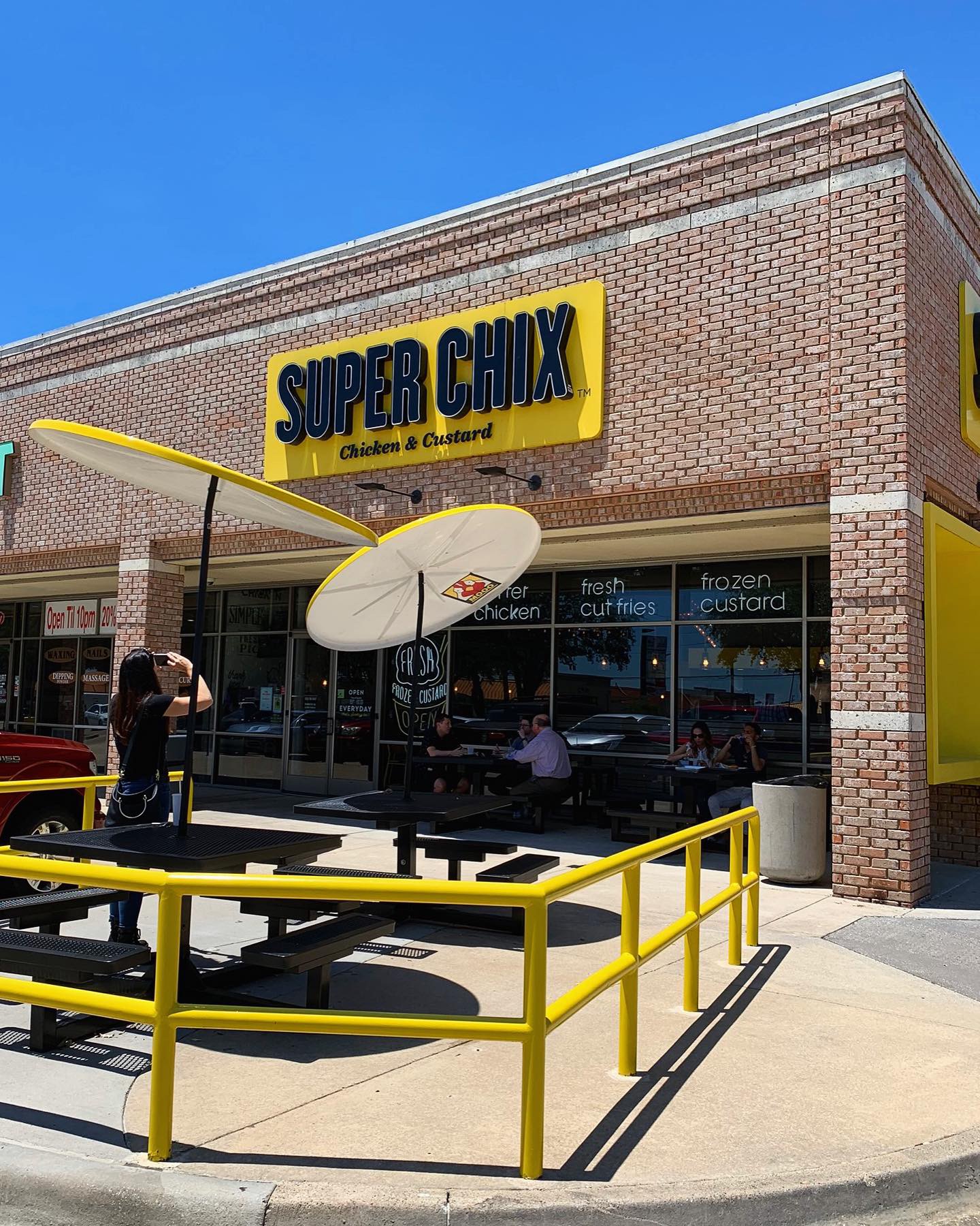
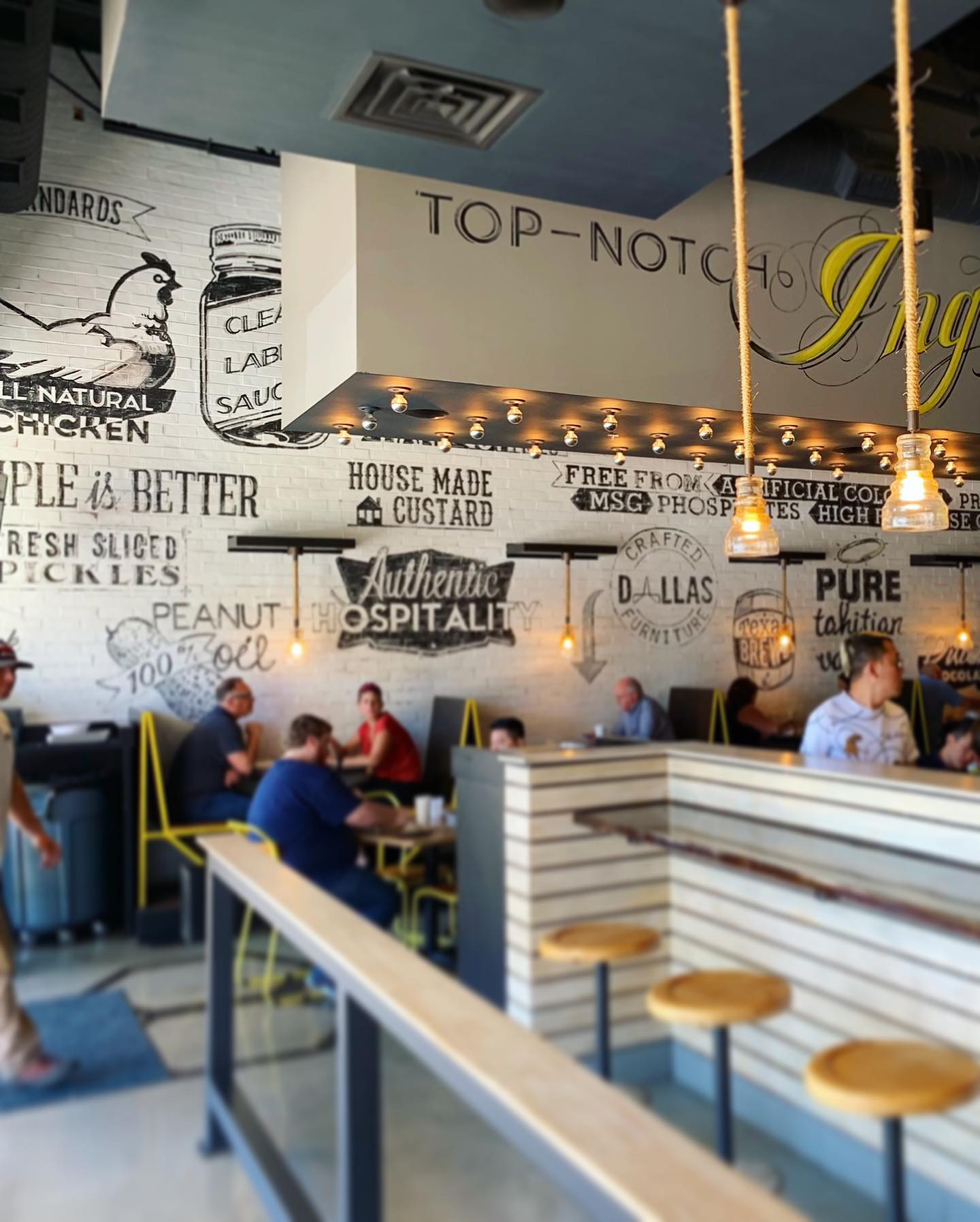
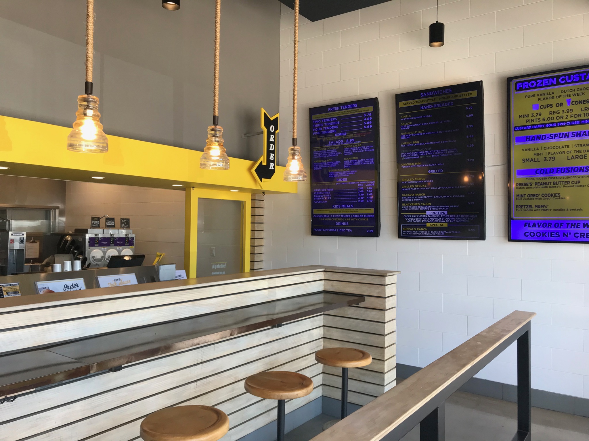
This week’s #FridayFeed restaurant branding review is SUPER CHIX in Addison at Preston & Beltline. The concept was developed by Yum! Brands and sold to Nick Ouimet, the concept founder. Read more about the partnership & expansion plans here. There are 4 DFW locations and one slated to open in Alabama this summer.
Order Up!
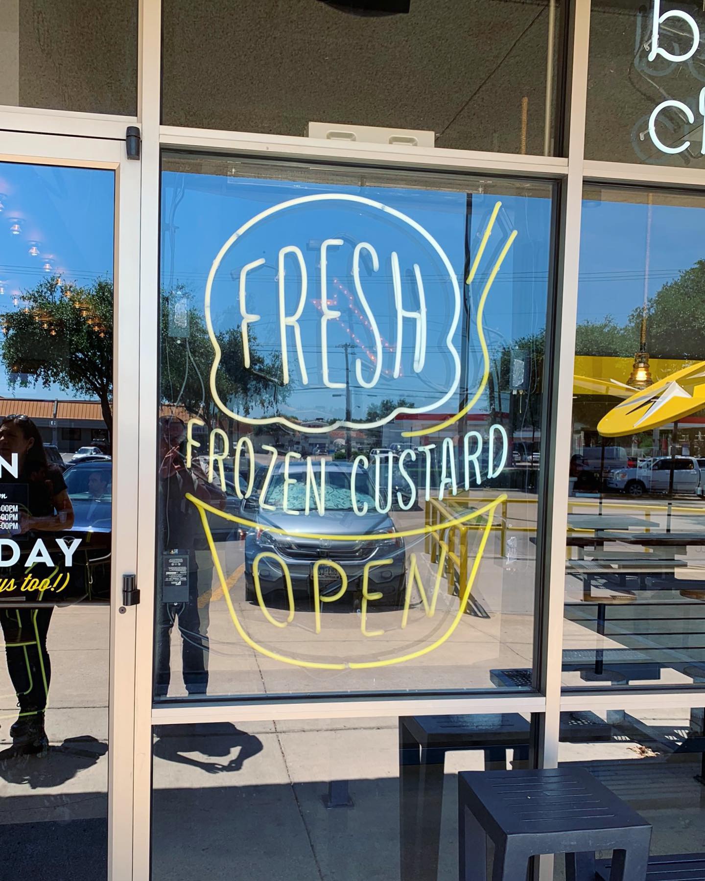
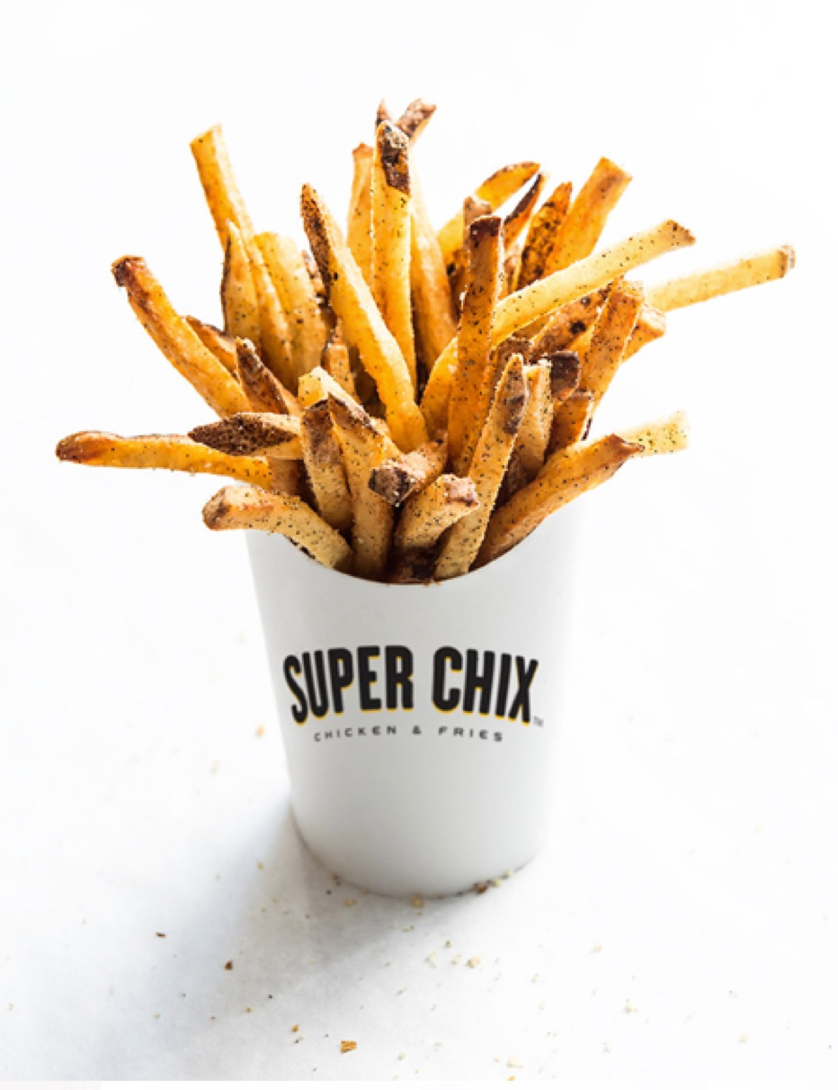
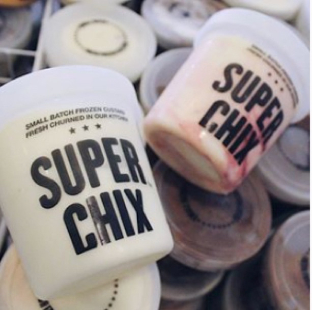
SUPER CHIX has the BEST chicken tenders I’ve ever had. SUPER CHIX hand cut fries might be the BEST fries I’ve ever had too. I was planning to order a chicken sandwich before we got there and then this Gouda cheese stuffed fried avocado sandwich with garlic aioli sandwich caught my attention. I ordered it and told Danny to order extra tenders so I could try both. The crispy avocado sandwich must have gotten a little too much seasoning because it was too salty to eat but the cashier gladly replaced it with 3 regular tenders which were game-changing and reminded me to always order the chicken when you go to a chicken restaurant! Danny ordered the Nashville Hot Tenders. Because nothing we ever order is really hot, Danny poured more Nashville hot sauce all over his tenders before dipping into Ranch. He found the heat this trip, haha! We also got an order of cheese fries and while they weren’t actually what we expected, having queso on top vs melted cheddar, they were SUPER delicious! We saw an order of the loaded fries come out and they looked even more delicious – will try next time. I know we didn’t mention frozen custard here which is a big part of this concept SUPER CHIX – “Chicken and Custard” but the photos look great and we saw tons of people ordering cups and shakes so it must be good. Sorry Nick, next visit for sure.
Environmental Branding:
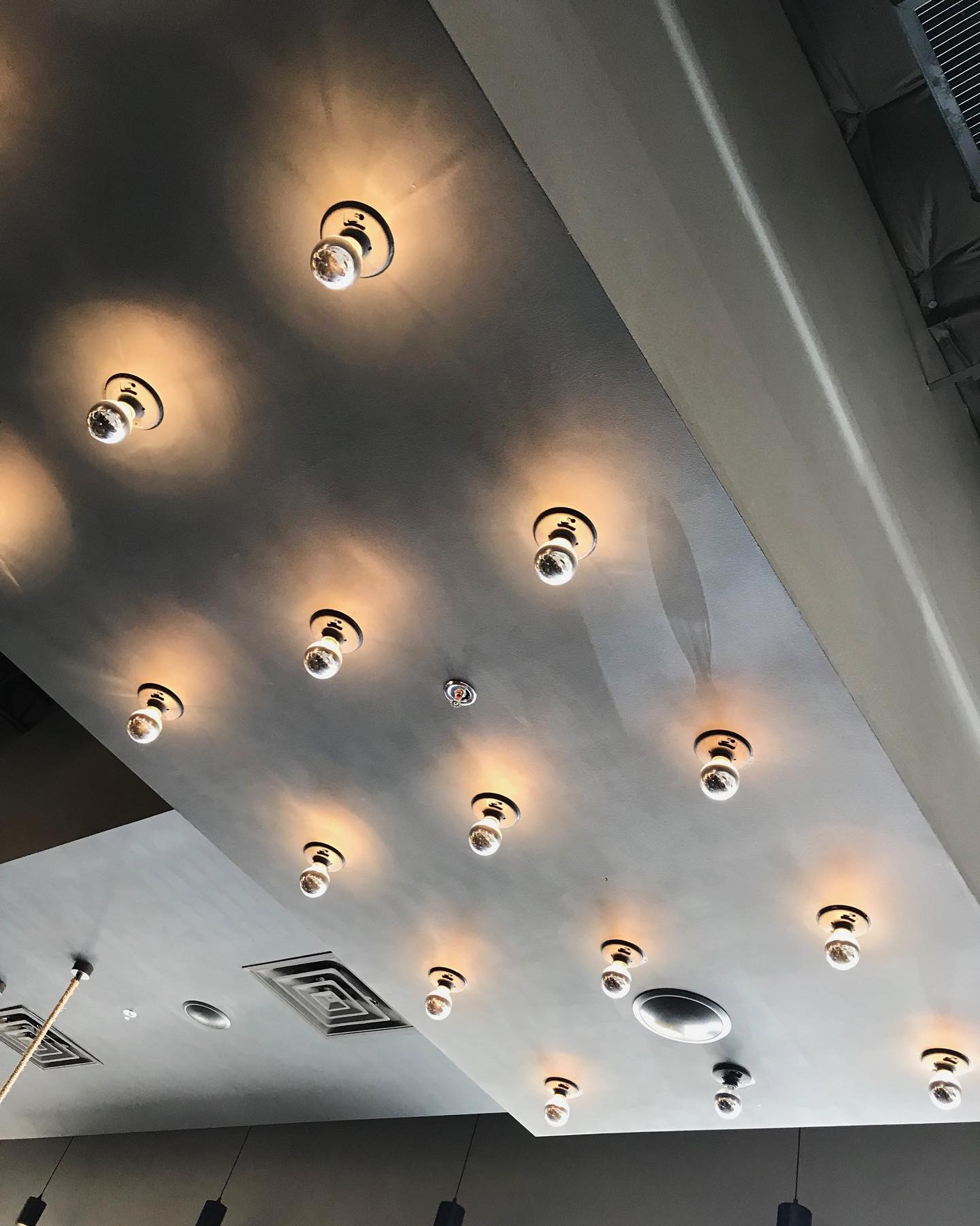
I love bold design so this yellow and black branding and interior design had instant appeal for me. So many fun details on the walls, on the floors, in the furniture design and lighting. I suspect that this is one of the early designs and we will see design modifications in future store roll-outs. The few things that seemed to be retro-fit items were the massive digital menu boards which seemed to be a little dark, glossy and blue tinted. The other area that could use some love is the order area and the semi-open kitchen area in full view behind the cashiers. Pretty much just stainless equipment. No graphics, no photos, no inset drink well, no custom counter display. There was also a giant white plastic bucket of iced bottled beverages on the counter. Too big and too tall for ease of use. It was all love after I got done ordering though. I love the layout, varied seating areas and all of the decor. Nice job STUDIO 11 DESIGN!
Branding DNA:
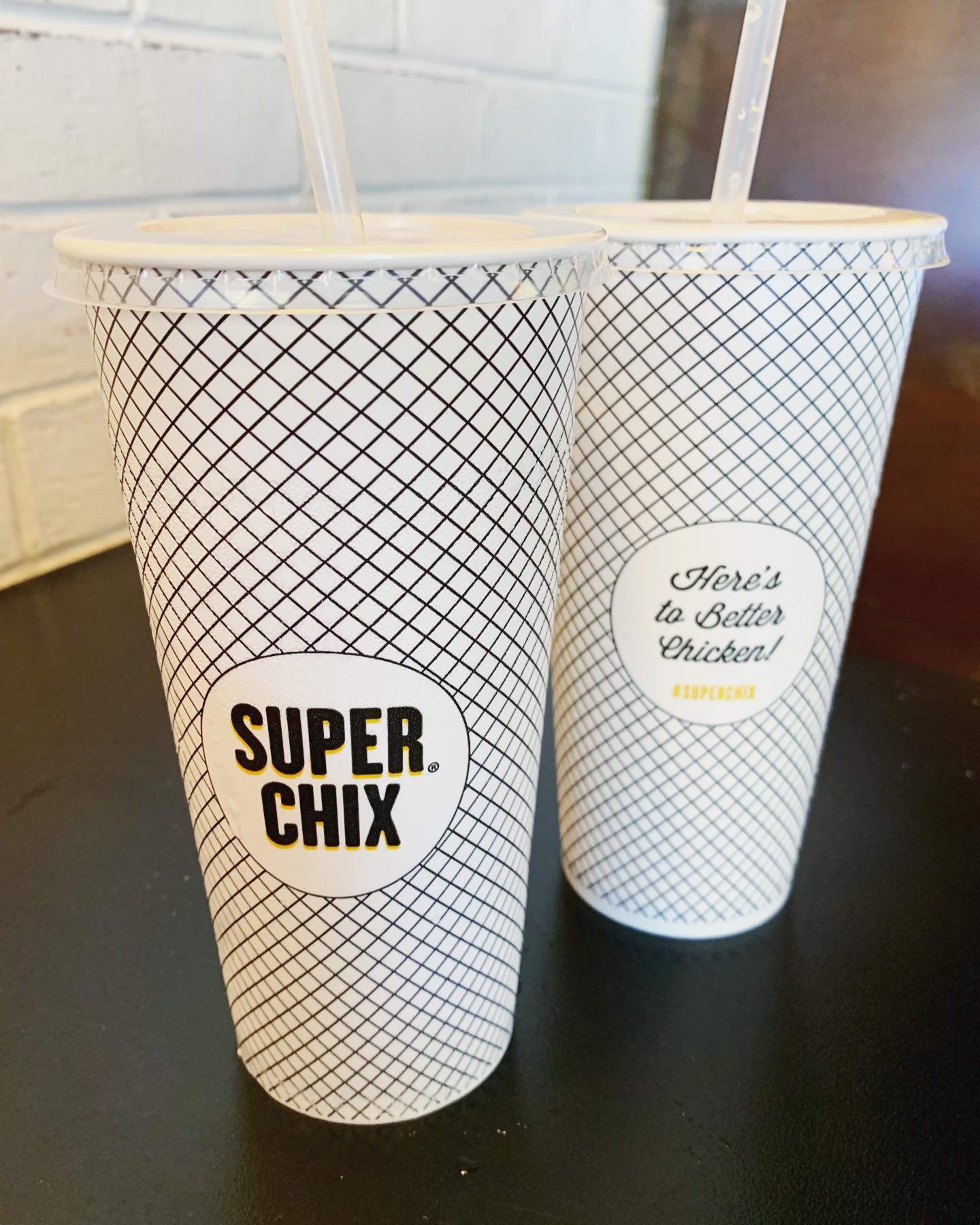
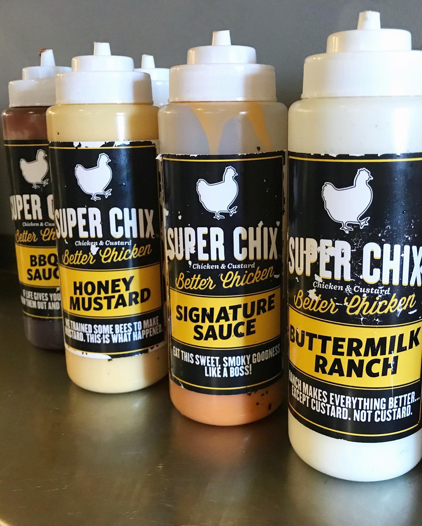
Super Chix has a great logo and signage. The cup and tray liner designs are also really fun. While we were eating, we were watching the digital displays in the dining room which rotated photos from their social media feed and website. The photos are great! They do however, show the food in some packaging that we didn’t get to enjoy. Maybe these cool fry packages and custard pint containers haven’t made it to the stores yet? See pics we grabbed from Instagram.
Digital Branding:
Super Chix has a bright, clean website that highlights the freshness and quality of their ingredients as well as their chicken. Their website is easy to navigate, has a mouthwatering photo gallery, and even has a section dedicated to their flavor of the week frozen custards. They have great Facebook and Instagram accounts, no shocker here, that primarily focus on beautifully shot food photography. In fact, their Instagram feed will make you insta-drool! Overall Super Chix has awesome digital branding, but could use a few more lifestyle images to elevate the brand even more. –Danny
Score:
MJ and Danny give SUPER CHIX an A! We’ll go back for sure for loaded fries, custard and the pickles we forgot to try.
#FridayFeed:
Every Friday, Studio B Dallas visits a local fast casual concept for lunch to critique the brand (and eat lunch). Three rules apply: it’s a concept we haven’t been to or it’s been in the restaurant news and it’s within 10 miles of our office. Wait, four rules – it can’t be sushi. Danny doesn’t do sushi. If you have any suggestions on where we should eat next, feel free to leave it in the comments. Look for our restaurant branding reviews each Friday! MJ & Danny
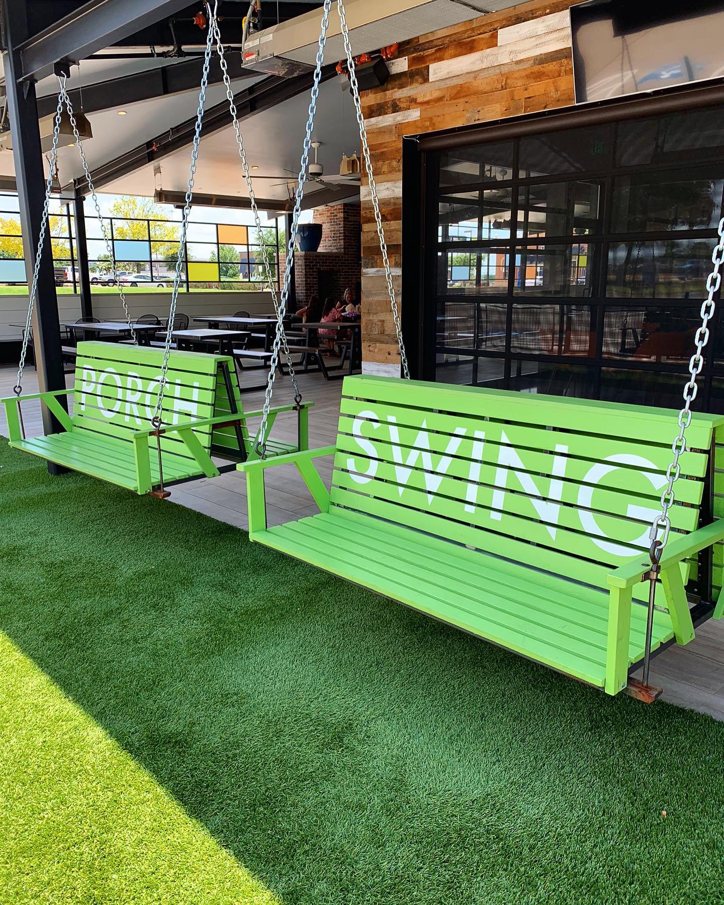
This week’s #FridayFeed restaurant branding review is Porch Swing in Mesquite, near Town East Mall at I30 & 635.
Order Up!
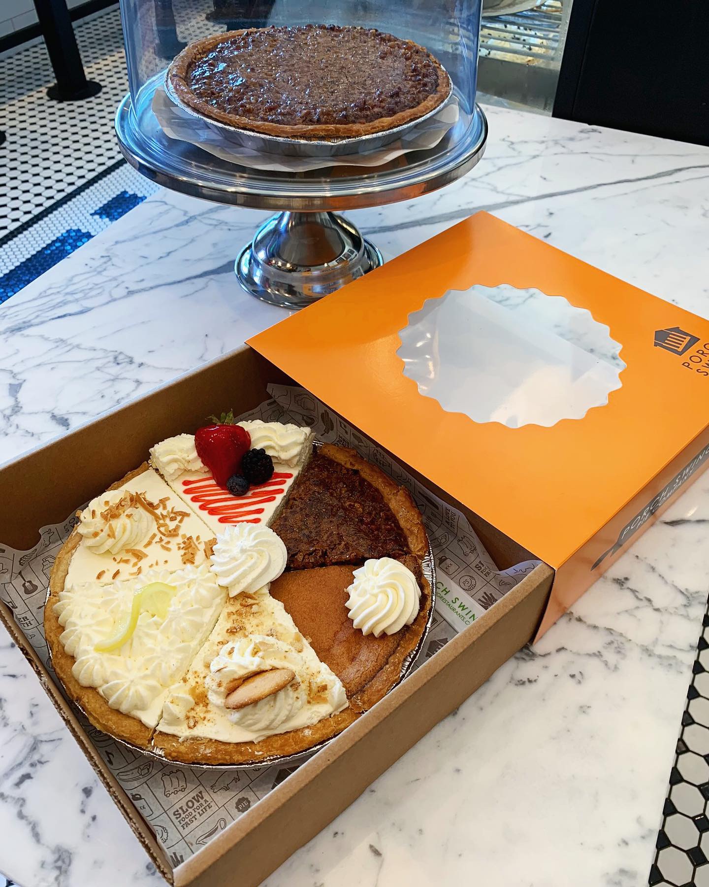
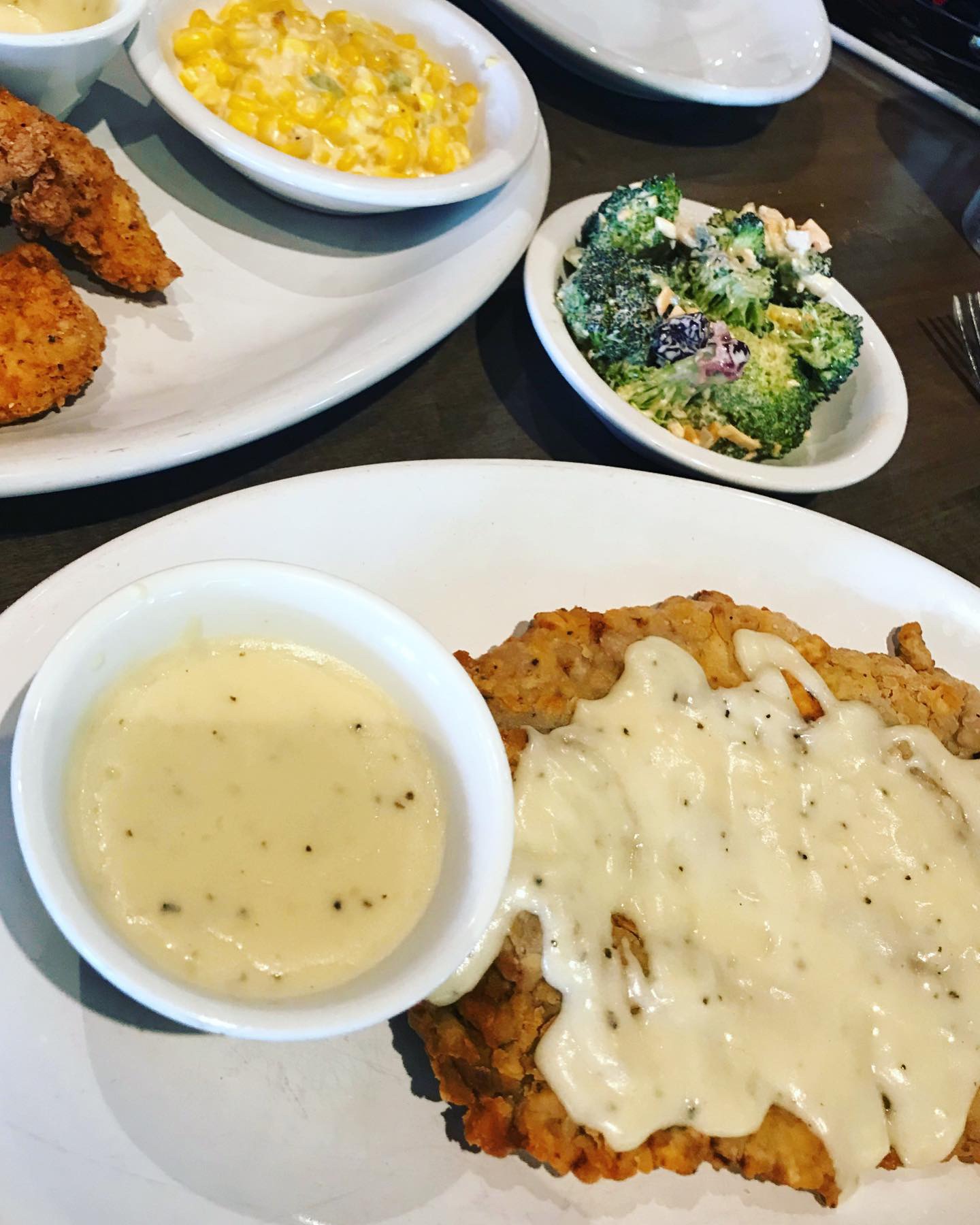
Because we’re friendly with the owner, we asked for a tasting of several entrées and sides so we could review more than a few dishes. Here’s what we tasted: Grilled Meatloaf, Chicken Fried Steak, Chicken Tenders and Fried Catfish. Sides included the Broccoli Bliss, REAL Mashed Potatoes, Collard Greens, Cheesy Corn Bake plus Cream Gravy, Rib Sauce, Hot Honey and steaming hot Yeast Dinner Rolls. I kid you not, the grilled meatloaf was outstanding! It comes with it’s own meatloaf gravy which was sublime. The Cheesy Corn Baked is corn, butter, cream cheese and jalapeños – SO good and has a nice little kick. Broccoli Bliss is fresh broccoli florets with shredded cheddar cheese and cranberries mixed with a creamy homemade dressing – a nice take on a cold salad. The REAL mashed potatoes were REAL good, especially with the cream gravy which I will put on everything. Last note – the house made Hot Honey is a beautiful red orange color, has a subtle but noticeable heat. Hot Honey is available for sale in the Pie Company store. Speaking of pies, Porch Swing features homemade pies sold in the brand-within-a-brand Pie Company store. I ordered a 6 flavor sampler to take to an Independence Day event. Toasted Coconut Cream, Homemade Banana Cream, Ol’ Fashioned Buttermilk Custard, Cookie Top Pecan, Cheesecake and Lemon Cream. I had a bite of every single one. All amazing.
Environmental Branding:
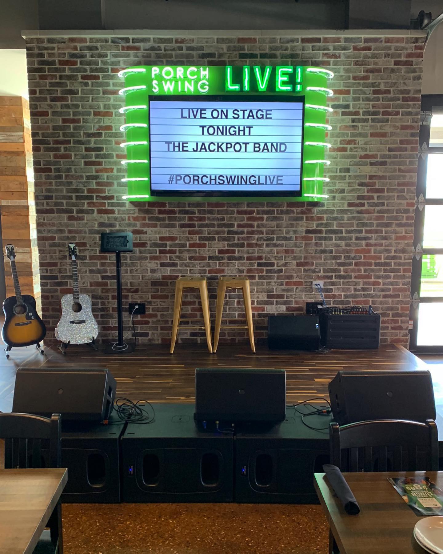
In the spirit of transparency, Studio B was responsible for the interior design so we think it’s great but so do so many others! This concept has gotten a lot of press. The owner is Antonio Swad, the founder of Wing Stop and Pizza Patrón. Antonio had a vision for this restaurant and he was able to communicate to us in a way that we could translate it to the space. It’s quirky, it’s Southern but it’s polished. In fact, Mr. Swad has coined the term “Polished Comfort” to describe his latest restaurant venture. Finish details include custom stained maple butcher block tables, custom made branded picnic tables for the porch, custom branded sconces, a steel rolling pin for the door handle of the pie shop. The list goes on… The review isn’t complete without mentioning the massive outdoor covered porch and the Porch Swing LIVE stage where bands perform every Friday and Saturday Night. Guests are welcomed to get on stage, grab a guitar and take photos in front of the neon marquee.
Branding DNA:
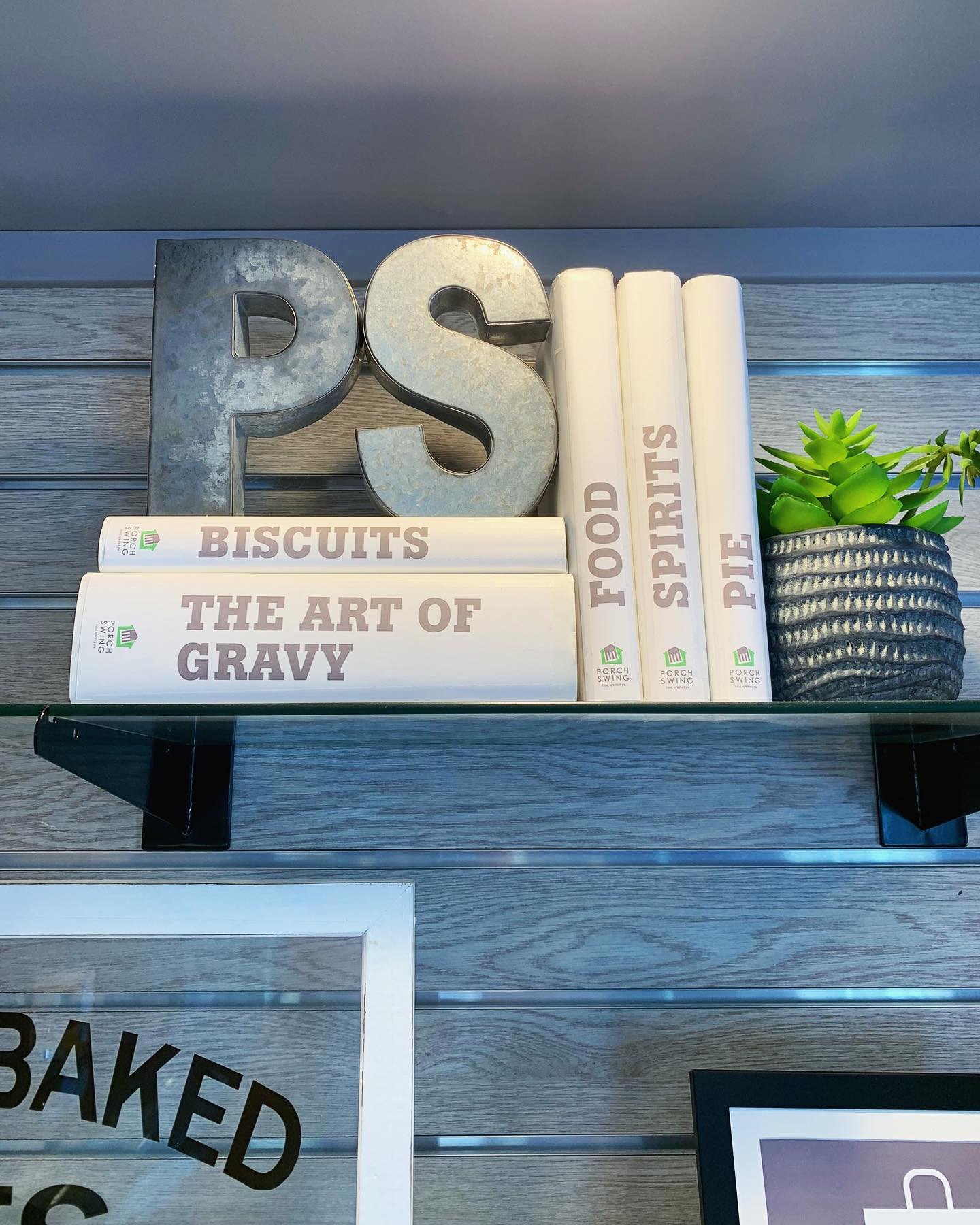
Studio B was also responsible for the branding and packaging at Porch Swing. A version of the logo was given to us in the beginning and the color palette was established. Beyond that, we designed the sign package, menus, custom packaging, apparel, retail items, etc. The Pie Company is a separate brand within the restaurant and uses complementary graphics and colors. Individual pie slices to-go come in a cute little box with branded belly band and fork. Whole pies are sold in custom two piece pie boxes.
Digital Branding:
Porch Swing has a beautifully designed website by Raze Media. Their website uses amazing food photography, is easy to navigate and engages the user. Porch Swing has Facebook,Instagram and Twitter accounts that they post to quite frequently. Their social media highlights the mouthwatering food and the live music performing every Friday and Saturday night with a dash of marketing. –Danny
Score:
We give Porch Swing an A+!
#FridayFeed:
Every Friday, Studio B Dallas visits a local fast casual concept for lunch to critique the brand (and eat lunch). Three rules apply: it’s a concept we haven’t been to or it’s been in the restaurant news and it’s within 10 miles of our office. Wait, four rules – it can’t be sushi. Danny doesn’t do sushi. If you have any suggestions on where we should eat next, feel free to leave it in the comments. Look for our restaurant branding reviews each Friday! MJ & Danny
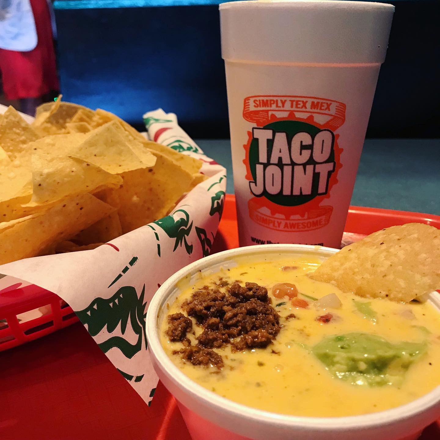
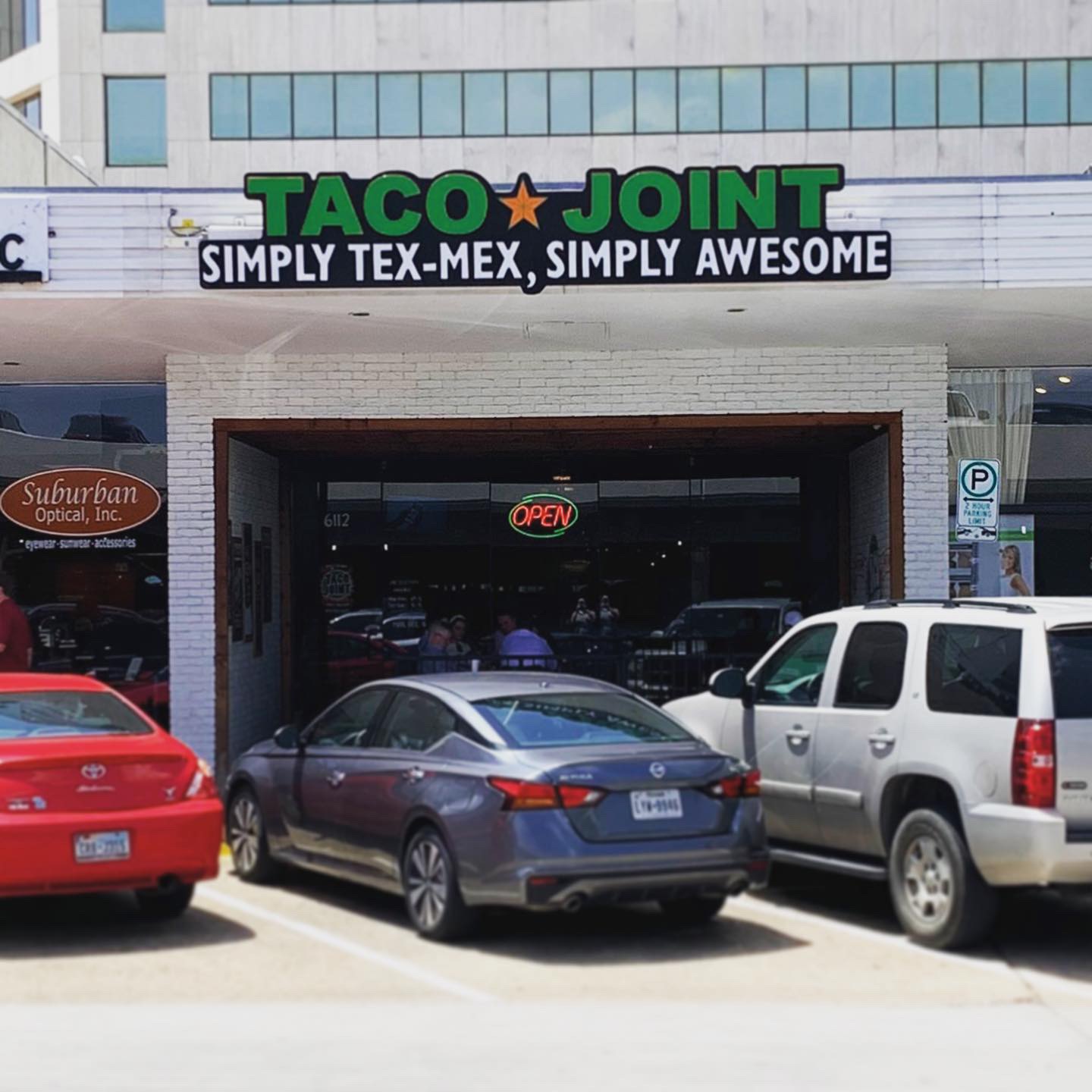
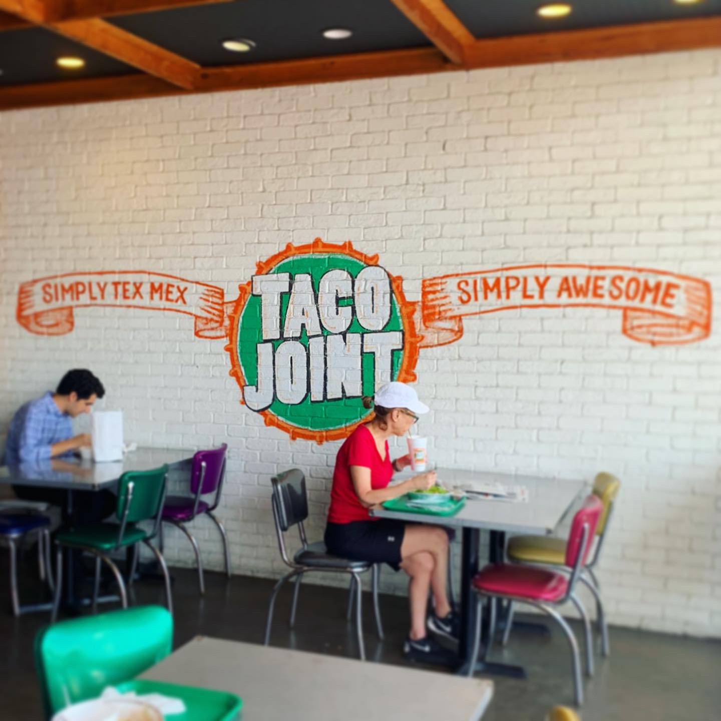
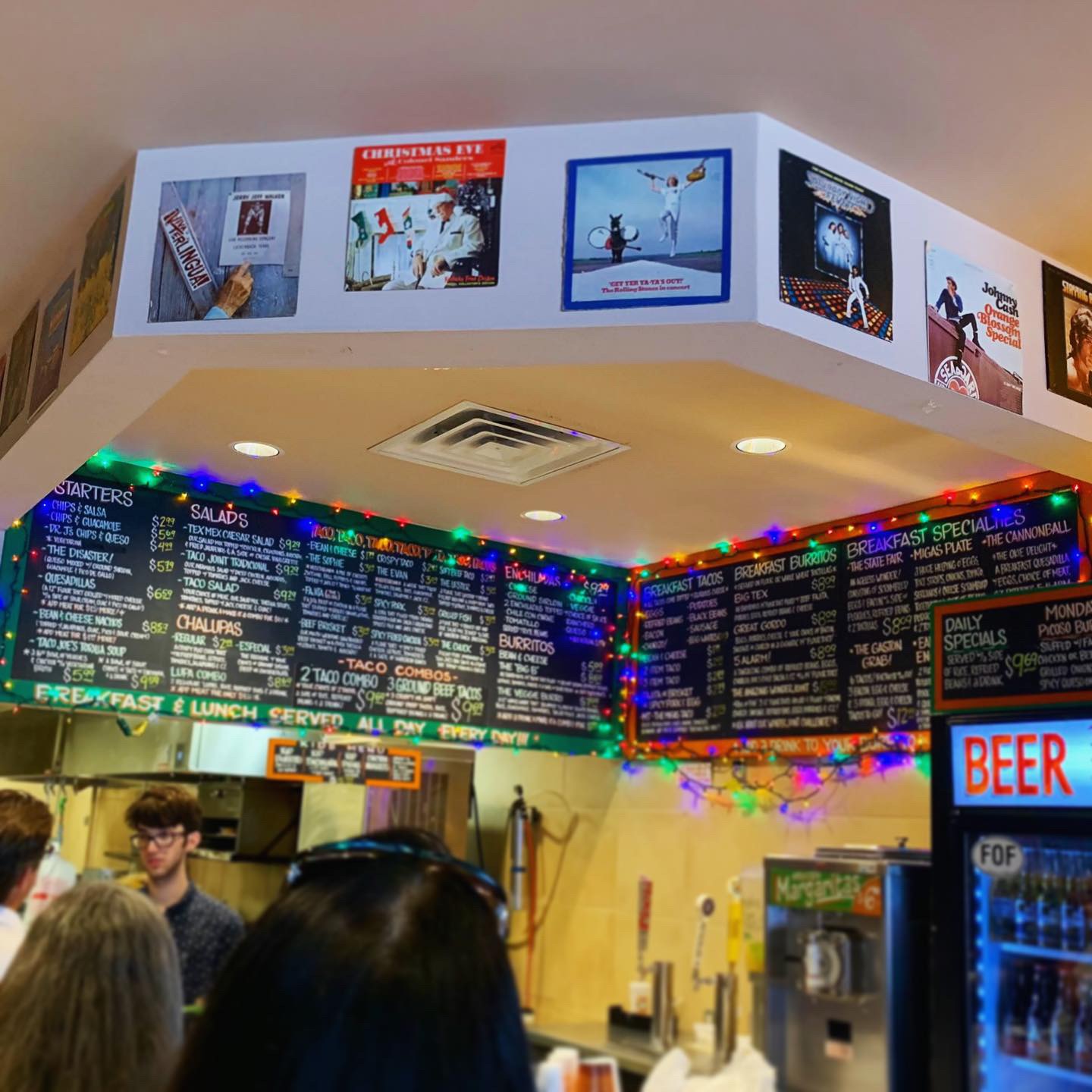
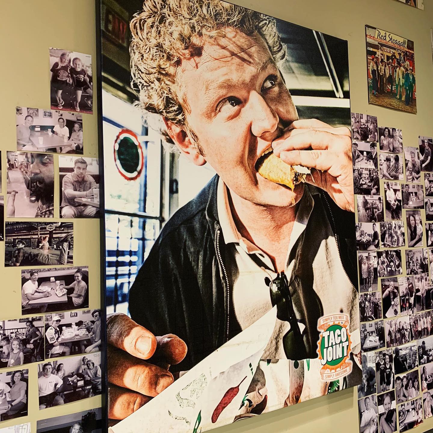
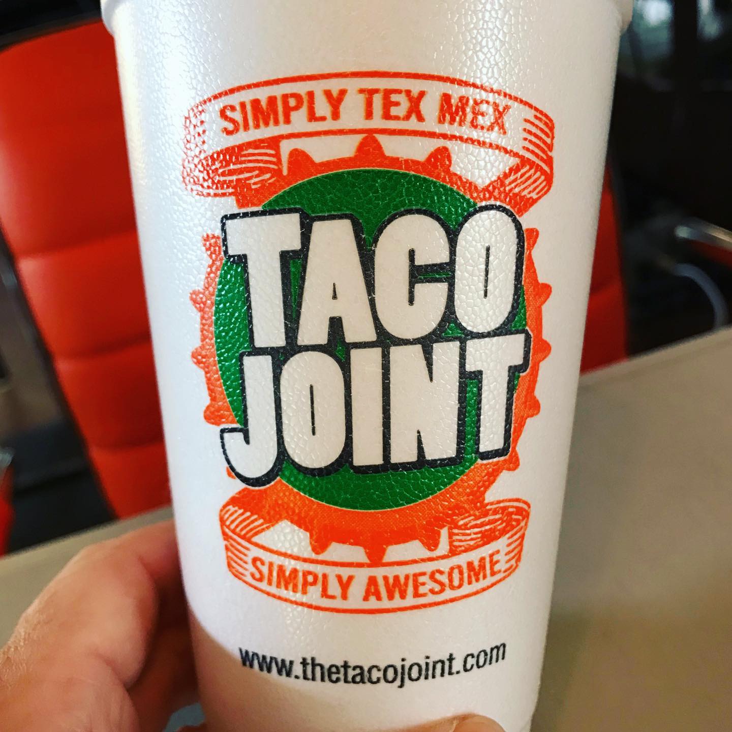
“Simply Tex-Mex” “Simply Ok” This week’s #FridayFeed restaurant branding review is Taco Joint in Preston Center.
Order Up!
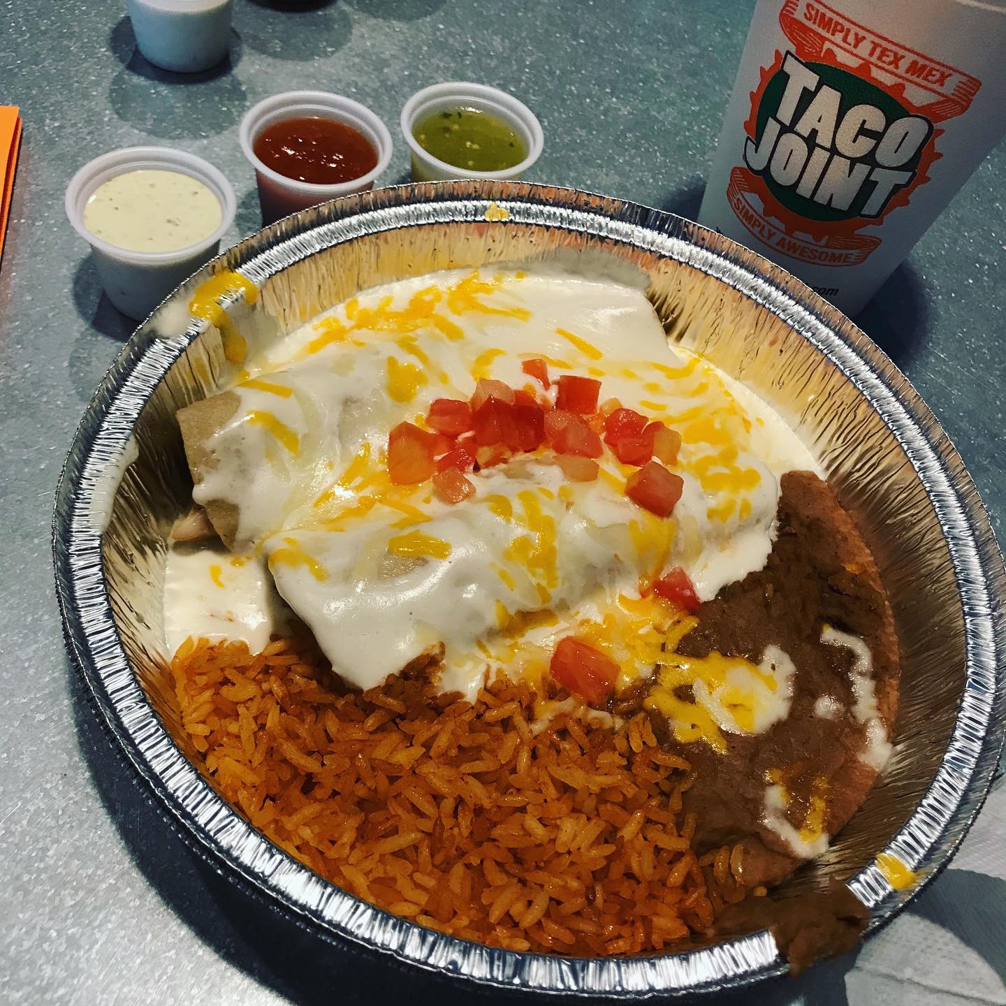
I like tacos and I love queso, so taking a preview of the menu on the website, I was prepared to order the “Disaster” which is a big bowl of cheesy queso with meat, pico and guac and a giant basket of chips. I got suckered into ordering the Wednesday special – the sour cream chicken enchiladas, because obviously the specials sign caught my eye AND because the menu was pretty busy AND I felt “order pressure” at the counter with people waiting behind me. You know what I’m talking about. Danny ordered the Spicy Pork and the Spicy Fried Chicken tacos. As we find at most restaurants, what most people think is spicy is not really spicy at all. I guess spice is different than hot, that’s fair. He said they were “ok but not hot.” The disaster & chips came out first and it was pretty good. My enchiladas were ok but presentation was not great. It came in a round aluminum pan. My issue with the food is that there are so many taco concepts in Dallas that have elevated their food and presentation and brand, that while it might be pretty popular with the locals, I just didn’t see anything WOW on the menu, on the walls or on the table. The iced tea was fresh. 😉
Environmental Branding:
Taco Joint’s Preston Center location is the brand’s fourth location. It occupies the former Extreme Pizza space. I’ve always loved this space because it has a built in covered outdoor patio in front which I think makes for a nice inviting entry and opportunity to put your brand in the face of passers-by. This strip gets lots of walking traffic and it was pretty busy when we got there with a line at the counter. Beyond my love of the entry, this brand is not very polished like many of the other restaurant brands we review. It reminds me of Texadelphia – just a neighborhood joint with unspectacular furniture and decor. The walls were filled with album covers stapled to the wall. There were some painted murals as well. The menu board is total chaos. Chalkboard-style, filled edge to edge and draped with some colored christmas lights. No signature light fixtures, no feature decor items. Since “joint” is in the name, the environment did meet that expectation.
Branding DNA:
Taco Joint has a decent logo and custom printed cups. They serve their food in red plastic baskets lined with tissue & foil. I didn’t see any custom bags or other branded items. The had good exterior signage. I think part of the mass appeal of this brand is its “joint-ness” and its history. I give mad props to restaurants that make it 11 years and expand because they must have decent food and a local following. I’m just saying that new customers can only judge a place on its current merits and I think it could up its game.
Digital Branding:
We always check out the website before we visit a restaurant. The design of the website was pretty good I thought. Great use of color, graphics and typefaces. I only had issue with using the menu. I’d prefer that Breakfast, Lunch/Dinner and Tacos/Combos were one scrolling menu so I could see everything without having to click on a different tab. To say their social media accounts could use some love would be an understatement. Taco Joint has social media accounts, but it’s been years since they’ve made any posts. To me this feels like a huge missed opportunity, especially in today’s digital age. –Danny
Score:
MJ gives it a B- and Danny gives it B
#FridayFeed:
Every Friday, Studio B Dallas visits a local fast casual concept for lunch to critique the brand (and eat lunch). Three rules apply: it’s a concept we haven’t been to or it’s been in the restaurant news and it’s within 10 miles of our office. Wait, four rules – it can’t be sushi. Danny doesn’t do sushi. If you have any suggestions on where we should eat next, feel free to leave it in the comments. Look for our restaurant branding reviews each Friday! MJ & Danny
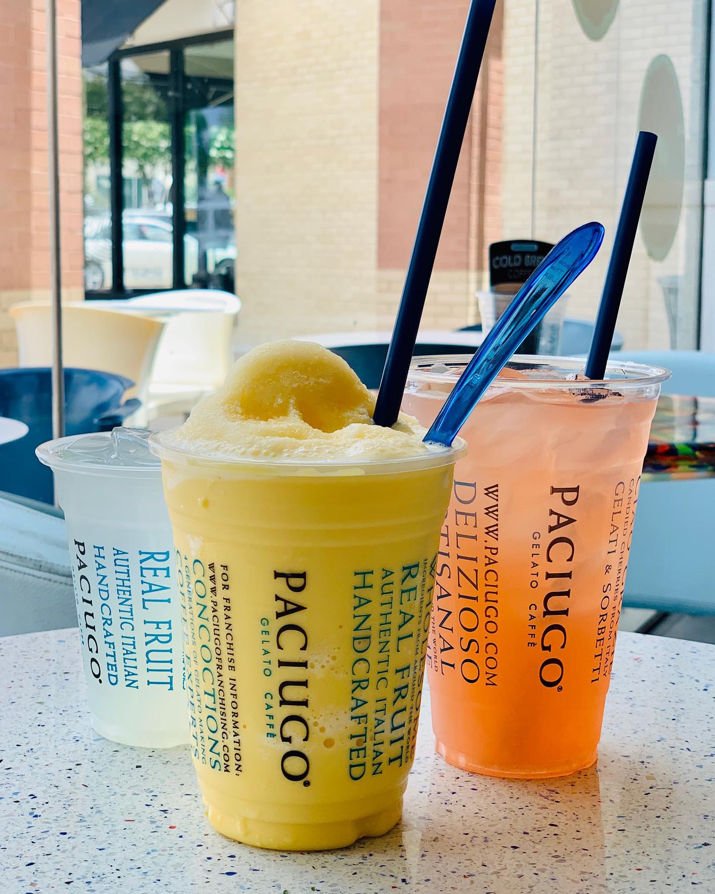
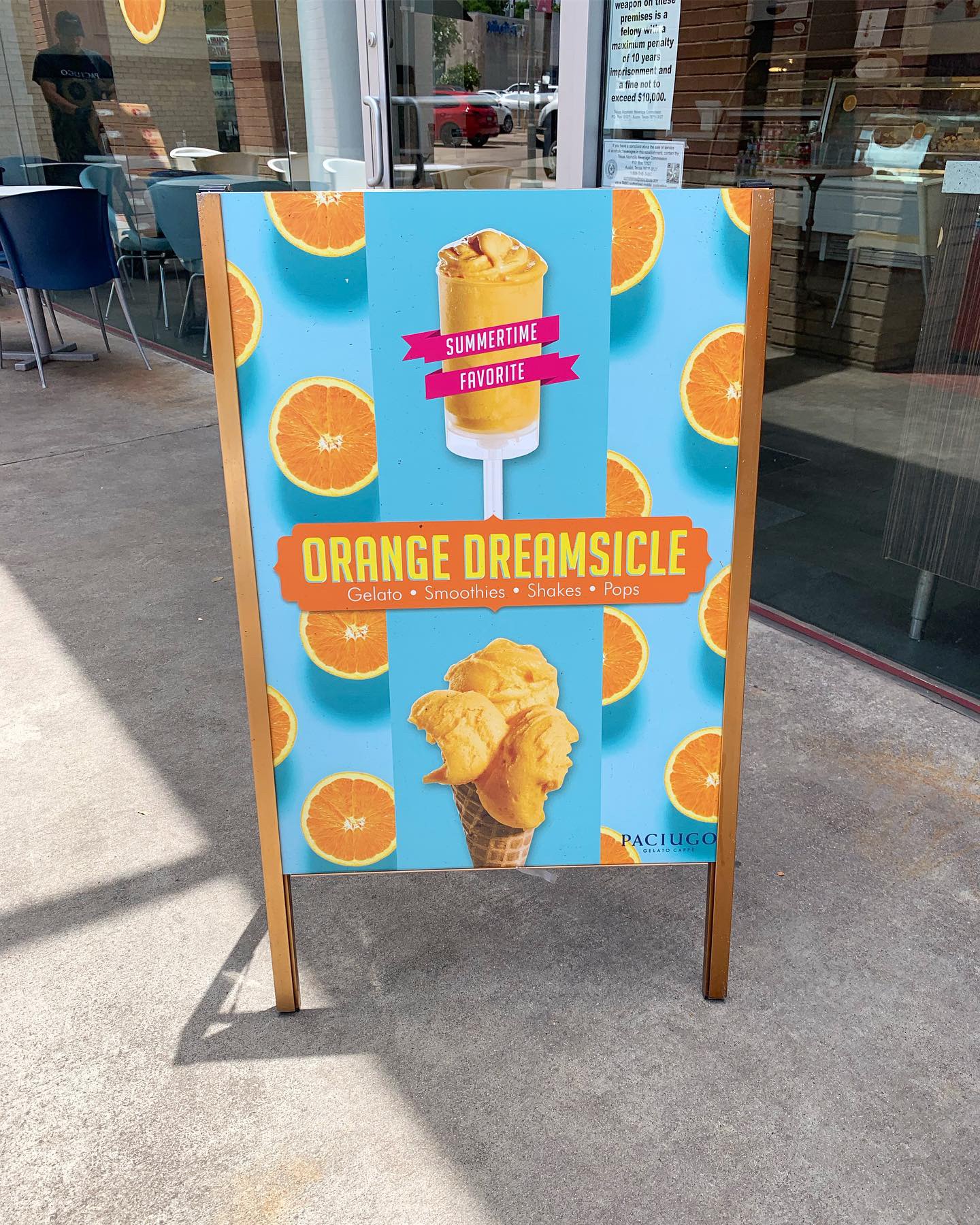
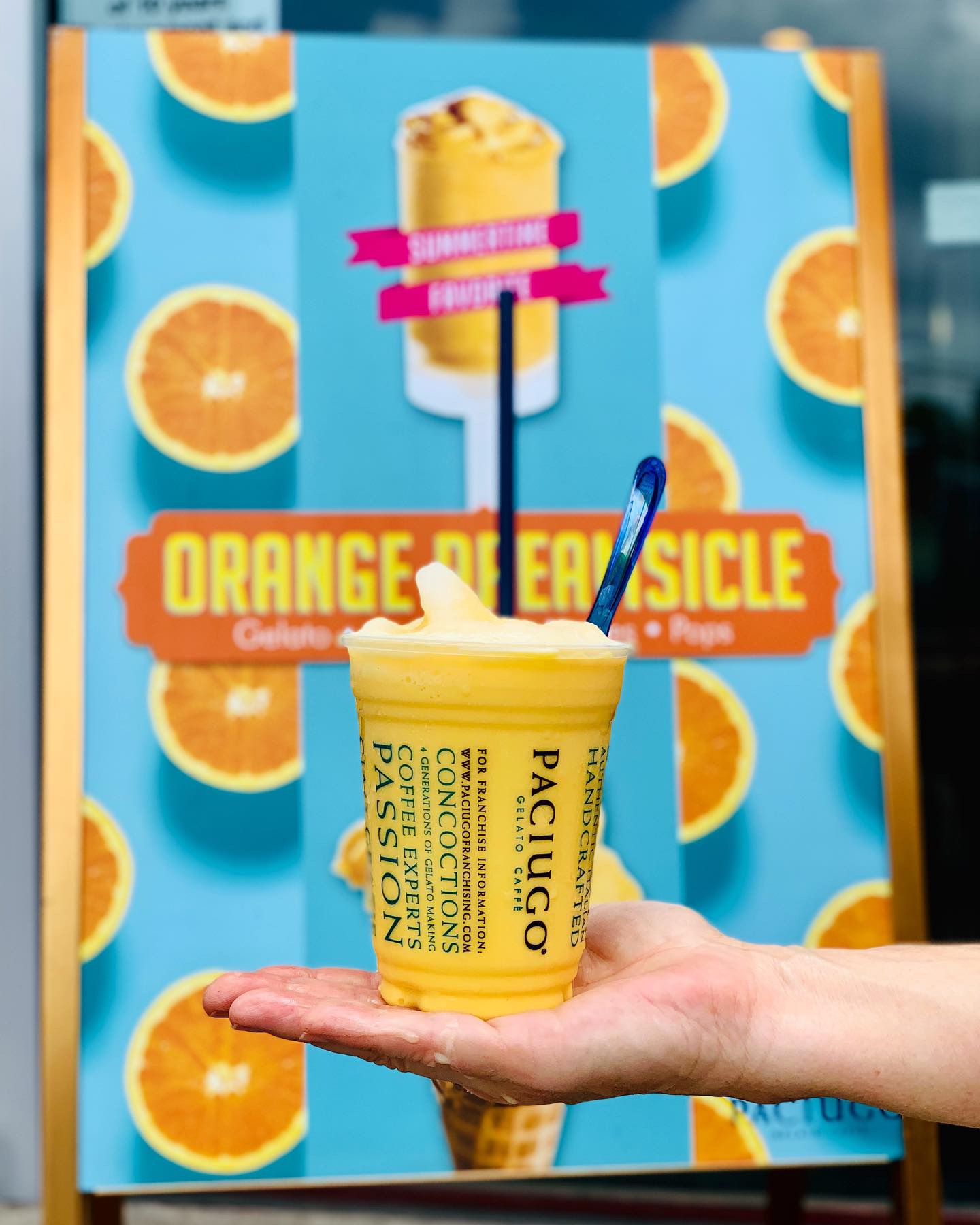
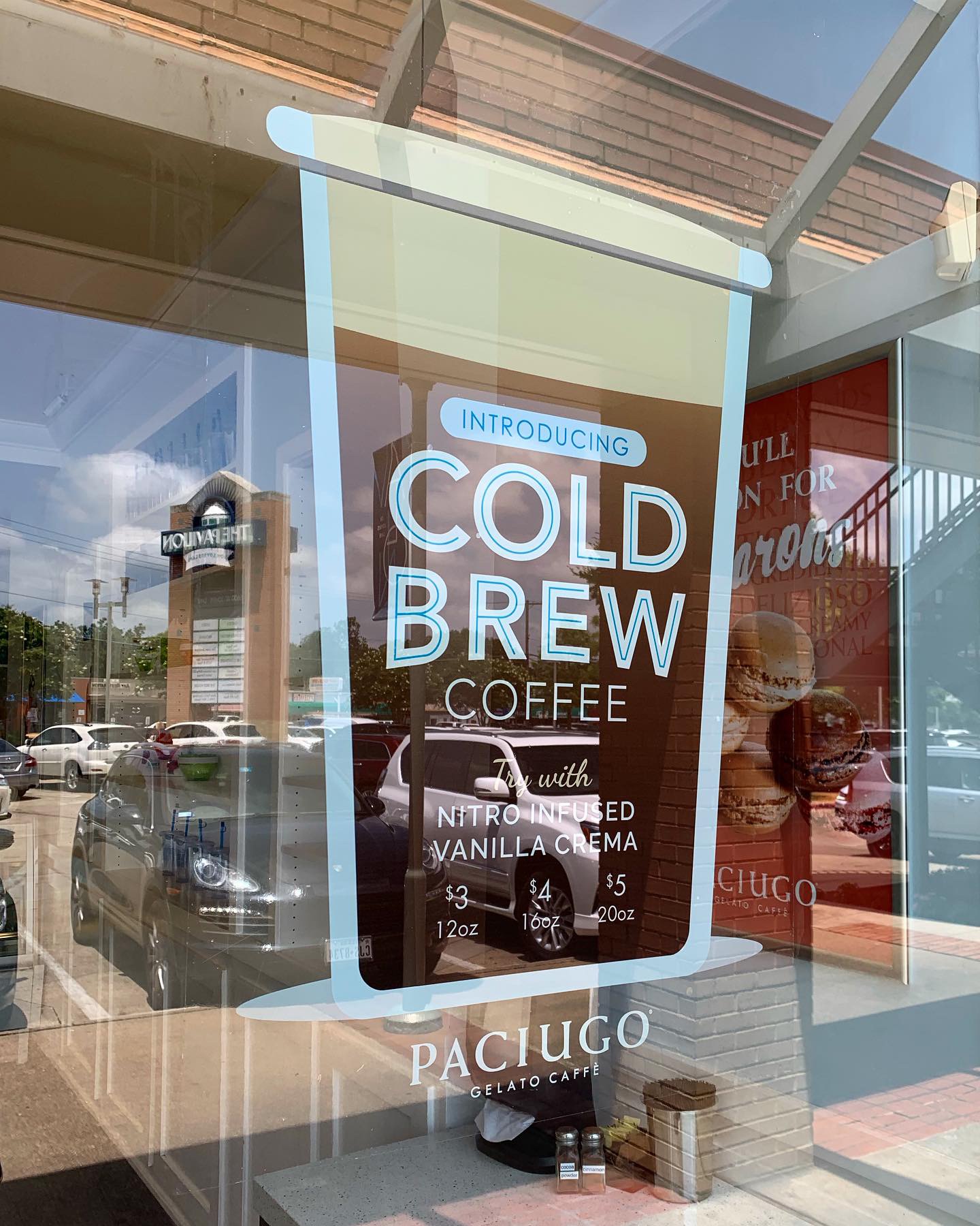
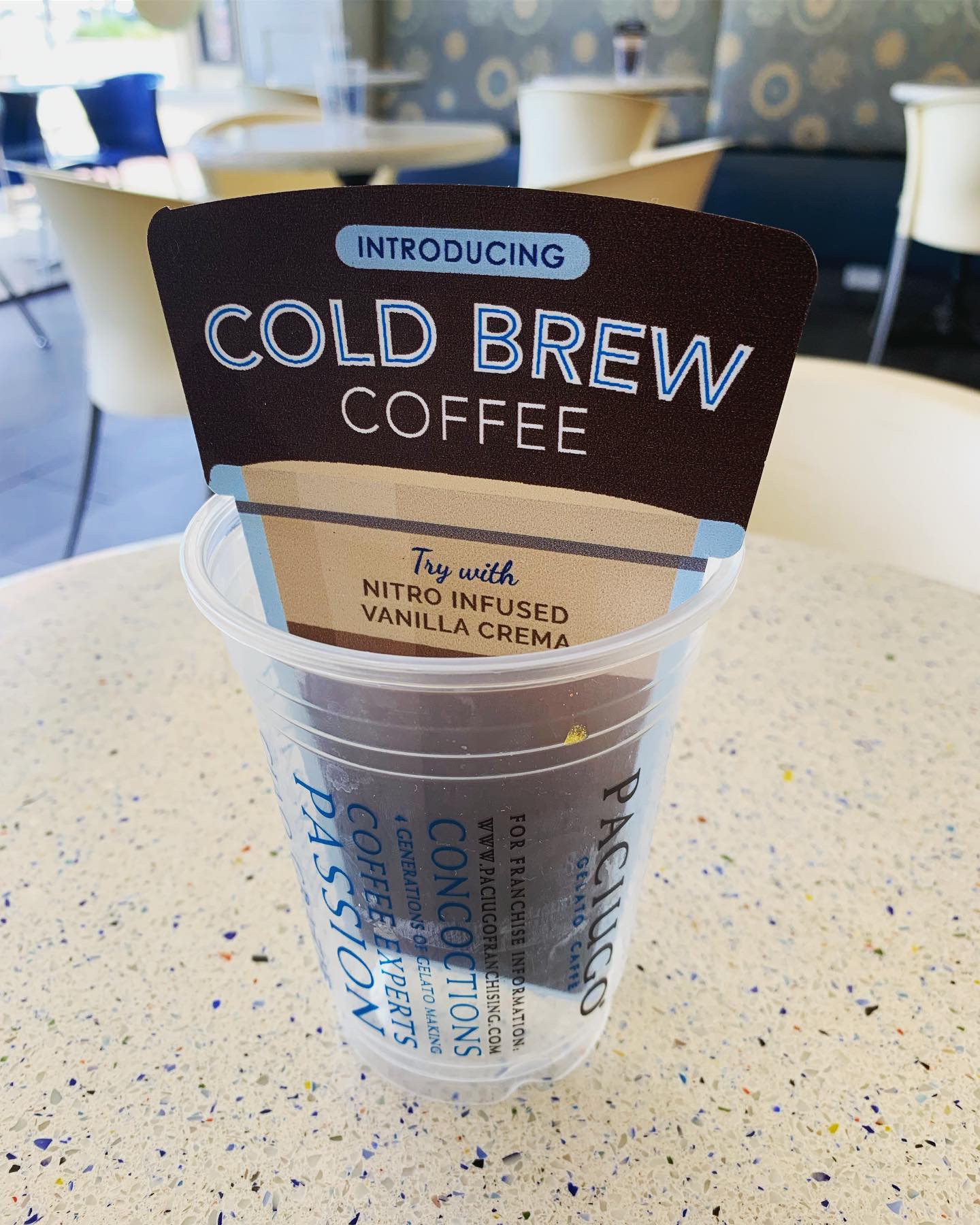
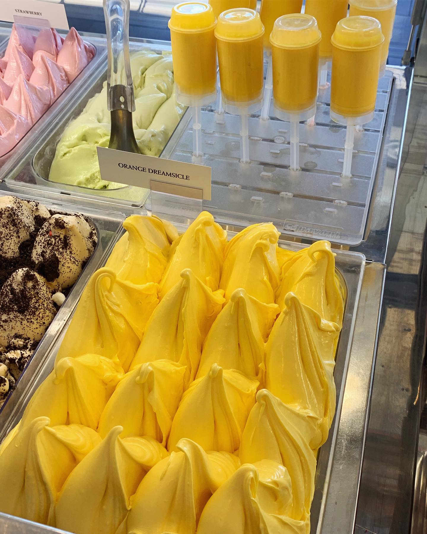
Shout out to our client Paciugo Gelato and the recent launch of the Orange Dreamsicle Gelato and Cold Brew Coffee promotions! Studio B designed all in store marketing materials for these campaigns. Go get yourself a Dreamsicle Pop or Gelato cone. It’s a summertime favorite!
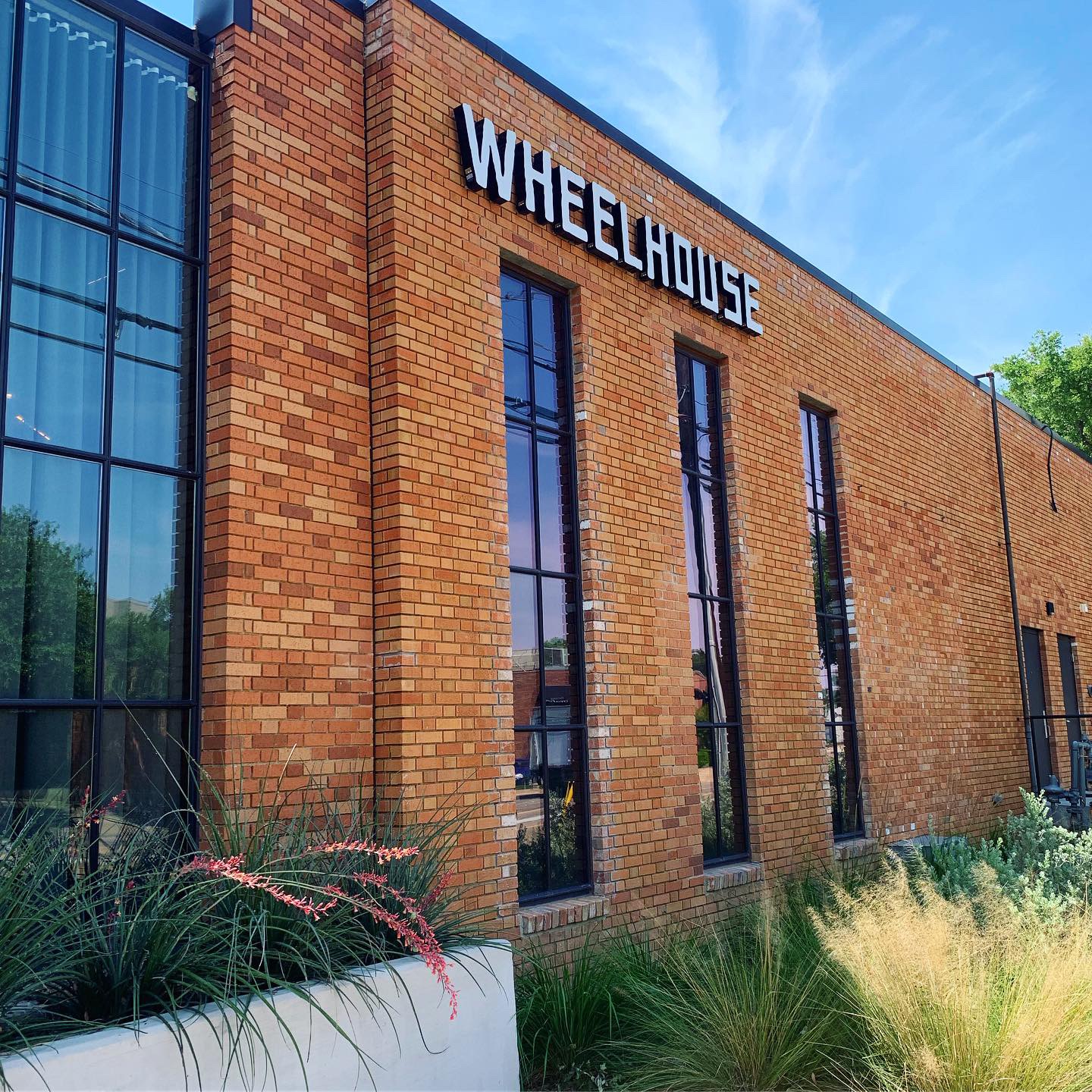
#FridayFeed happy hour edition! This week’s restaurant branding review is Wheelhouse located in the Design District.
This week MJ is on vacation, so Kinsey and I are taking over! Wheelhouse is located off of Oak Lawn and Hi Line in the Design District.
Order Up!
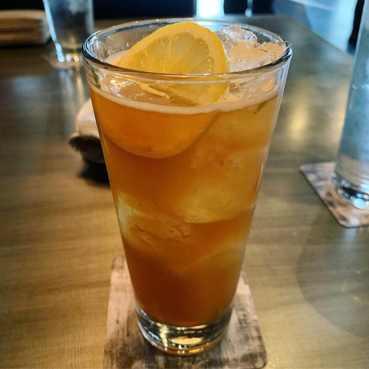
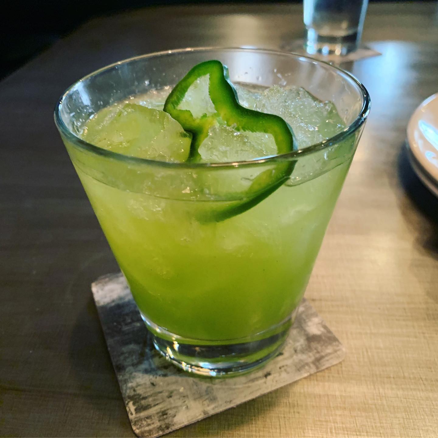
Let’s dive straight into the drinks! I ordered a Sippin’ Time – Texas sweet tea vodka, mint, lemon and club soda that come in a tall glass. It was the perfect drink to order for a hot summer day. Kinsey ordered a Kickstarter – a bright green drink with mezcal, poblano pepper, lime, pineapple and cumin bitters. Fair warning, this drink is not for everyone. If you don’t like the combination of sweet and smoky flavors, then this drink probably isn’t for you. The menu is a bit pricey, but I guess that’s to be expected given the location.
Environmental Branding:
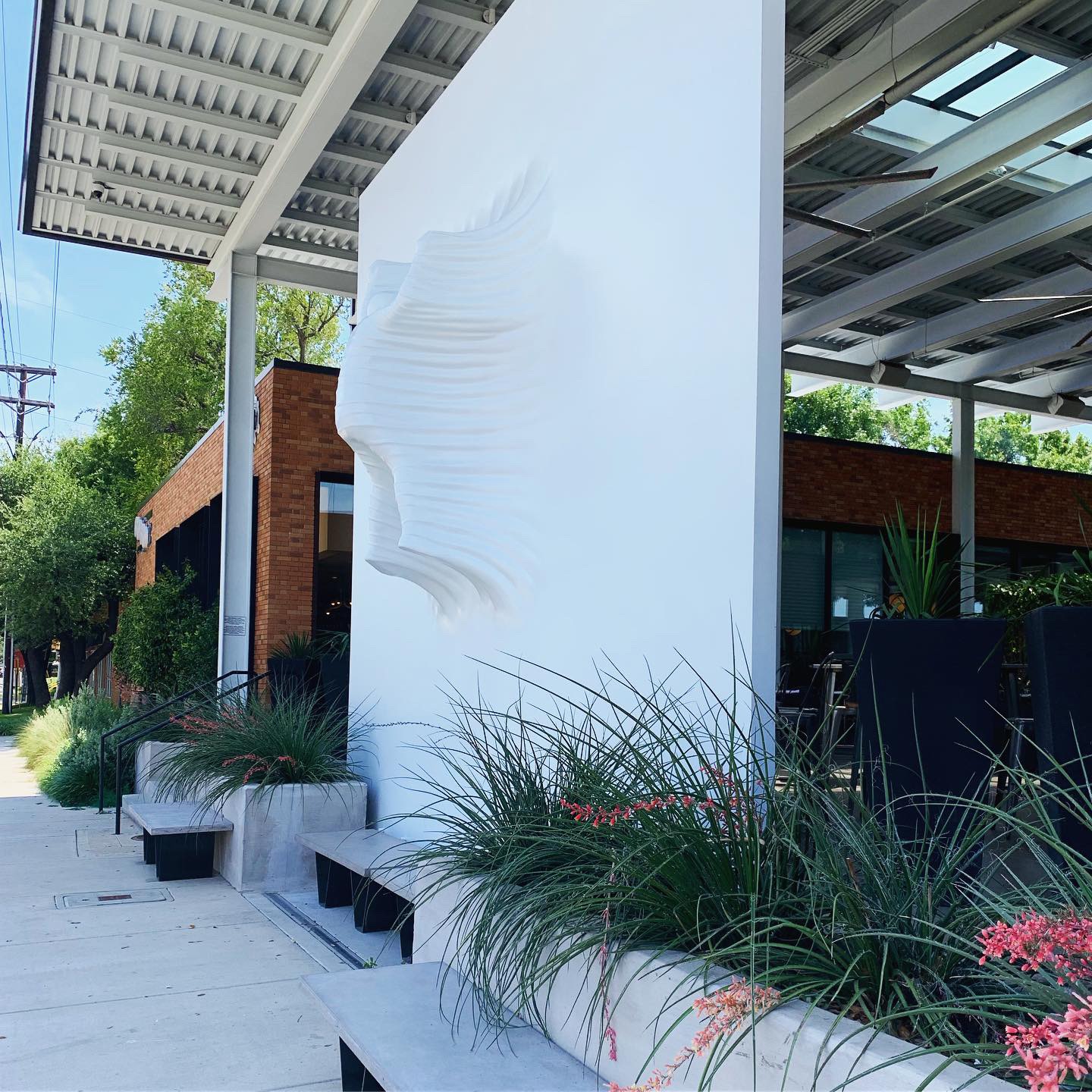
Wheelhouse has a great industrial interior complete with large doors that span along one side of the exterior and open up to the outdoor shared patio space with sister brand Sassetta. A huge 18-foot all white art installation of a falling man, located on their patio, is arguably their most distinct feature aside from their refreshing cocktails. You can spot this enormous installation driving along Oak Lawn.
Score:
Overall, Wheelhouse is a great place to hangout and have a couple of drinks. Danny and Kinsey give it a solid A.
#FridayFeed:
Every Friday, Studio B Dallas visits a local fast casual concept for lunch to critique the brand (and eat lunch). Three rules apply: it’s a concept we haven’t been to or it’s been in the restaurant news and it’s within 10 miles of our office. Wait, four rules – it can’t be sushi. Danny doesn’t do sushi. If you have any suggestions on where we should eat next, feel free to leave it in the comments. Look for our restaurant branding reviews each Friday! MJ & Danny
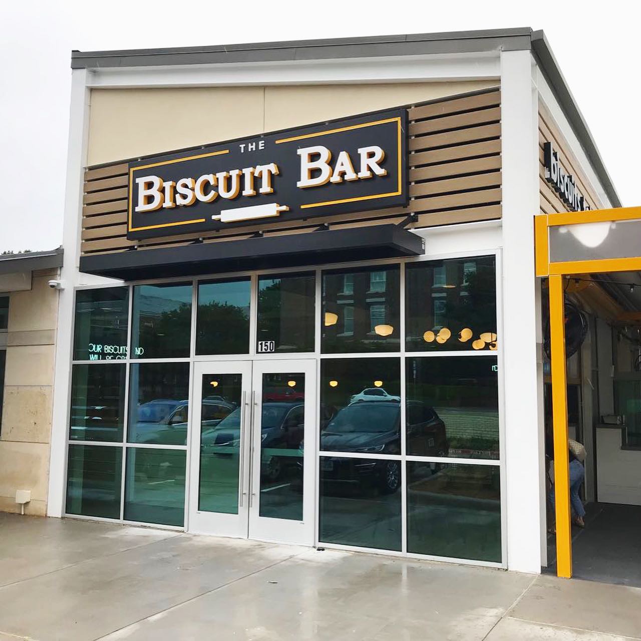
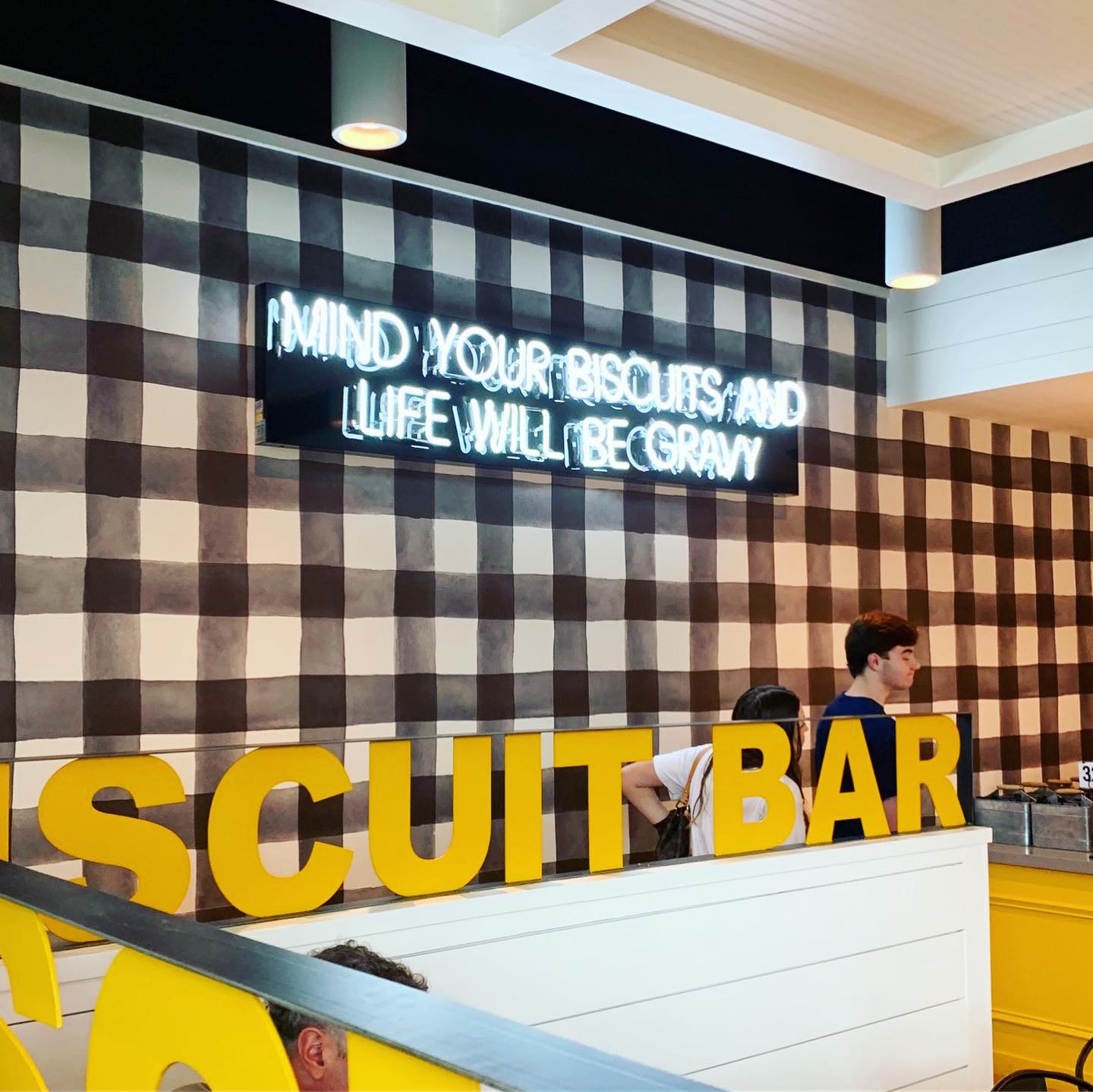
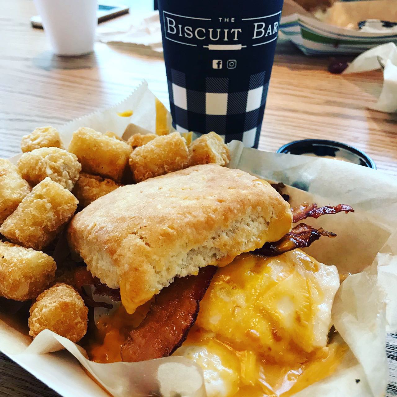
This week’s #FridayFeed restaurant branding review is The Biscuit Bar on Hillcrest near the SMU campus.
The Biscuit Bar has 1 other location in Plano and I’m guessing more on the way. They have a touchingly sad but inspirational story behind the concept. Go. Read. Grief to Gravy.
Order Up!
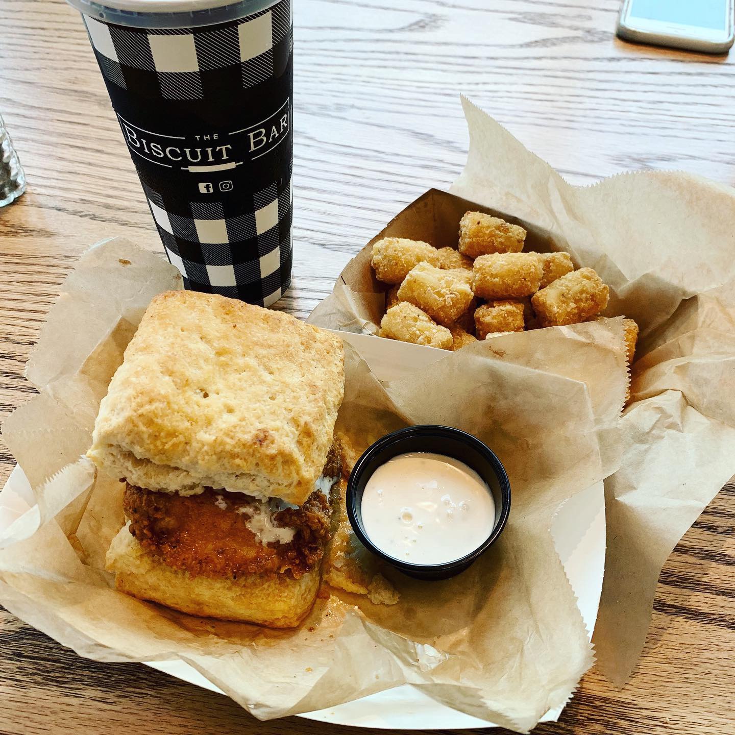
I was really excited to try The Biscuit Bar because I love southern food and I love biscuits. I didn’t have faith that the biscuit would handle like a bun so I went for the Bacon, Egg + Cheese with an extra egg and Tater Tots. Danny looked at the menu beforehand and he already knew he was getting the Hot Hot Chicken which is Nashville style hot chicken, dill pickles and house made ranch and Tots. Erin got the Monte Cristo minus the ham. It had a giant portion of smoked turkey, jack cheese on a french toast biscuit with strawberry jam and the sweet potato Tots. We all agreed that the biscuits were good. We weren’t super impressed with the rest though. When you name something HOT HOT Chicken – it should be smokin’ hot spicy – otherwise, just use one HOT, right? It was seasoned nicely but was not spicy. My Bacon Egg(s) and Cheese was just ok – did not love the cheese – I think it was a slice of American – could have used a sharp cheddar. I did save my top biscuit to try a side of sausage gravy and Strawberry preserves. The preserves were really good. Erin’s Monte Cristo kind of fell apart on the first bite so a little messy. All in all – the food was ok but unlike the awesome plating at Whistle Britches, the food was served in paper boats with tissue and plasticware which downgraded the presentation. I like the concept, I just think the biscuits are almost too small to make a “meal” sized “sandwich” but maybe too large to work like sliders. I think if you kept the biscuits a little smaller and served on a plate you could encourage ordering 2 or 3, kind of like tacos. More fun, more sales. Just my opinion.
Environmental Branding:
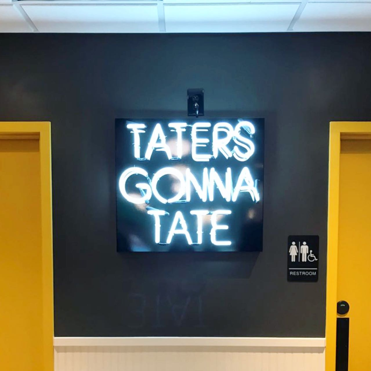
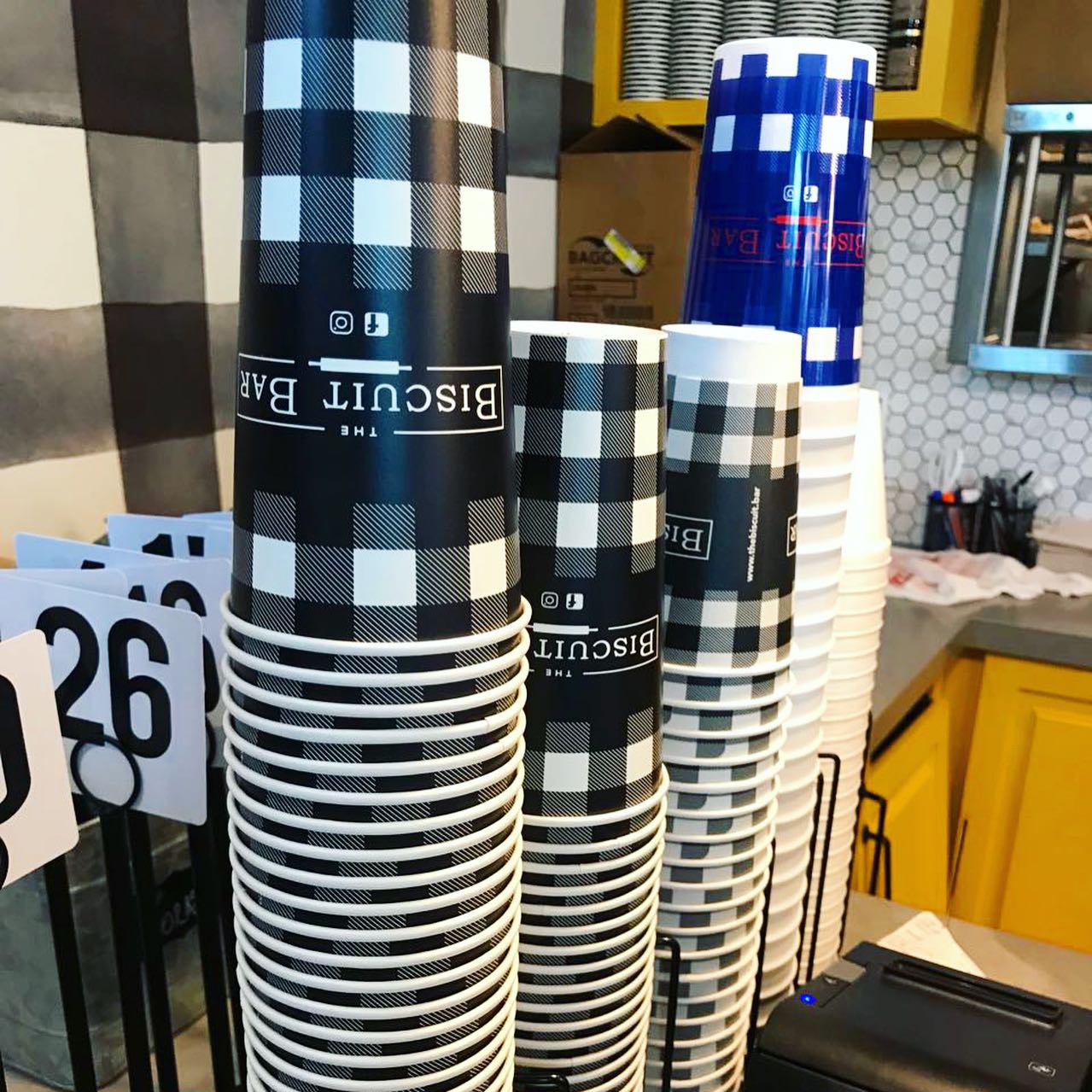
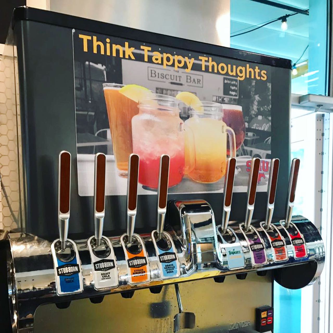
The interior is super cute. There’s a bar, nice indoor and outdoor patio seating, big yellow garage doors to separate the two. A cool Stubborn Soda drink machine with pull handles which is fun. You could tell immediately that there was a quality design shop behind this brand and shocker…Plan B Group gets the honors. You guys rock – Studio B is continuously proud to be sometimes confused with you! Luscious creamy egg-yolk yellow cabinetry details, super cute oversized black & white gingham check wallpaper, farm style tables, butcher block tables, ship lap plank walls and lots of great neon sayings on the walls. TATERS GONA TATE…that’s so clever!
Branding DNA:
Cute name, nice logo, great colors and brand assets. Custom printed cups – love all of that. Branding is spot on.
Digital Branding:
The Biscuit Bar does a great job at social media content. Both their Instagram and Facebook have beautiful food photography mixed with fun and family lifestyle imagery. Their website is easy to navigate and has a fun neon vertical scrolling banner at the top of their homepage. Overall, they have great digital branding! –Danny
Score:
MJ and Danny give it an A for branding and generously, a B- for food.
#FridayFeed:
Every Friday, Studio B Dallas visits a local fast casual concept for lunch to critique the brand (and eat lunch). Three rules apply: it’s a concept we haven’t been to or it’s been in the restaurant news and it’s within 10 miles of our office. Wait, four rules – it can’t be sushi. Danny doesn’t do sushi. If you have any suggestions on where we should eat next, feel free to leave it in the comments. Look for our restaurant branding reviews each Friday! MJ & Danny
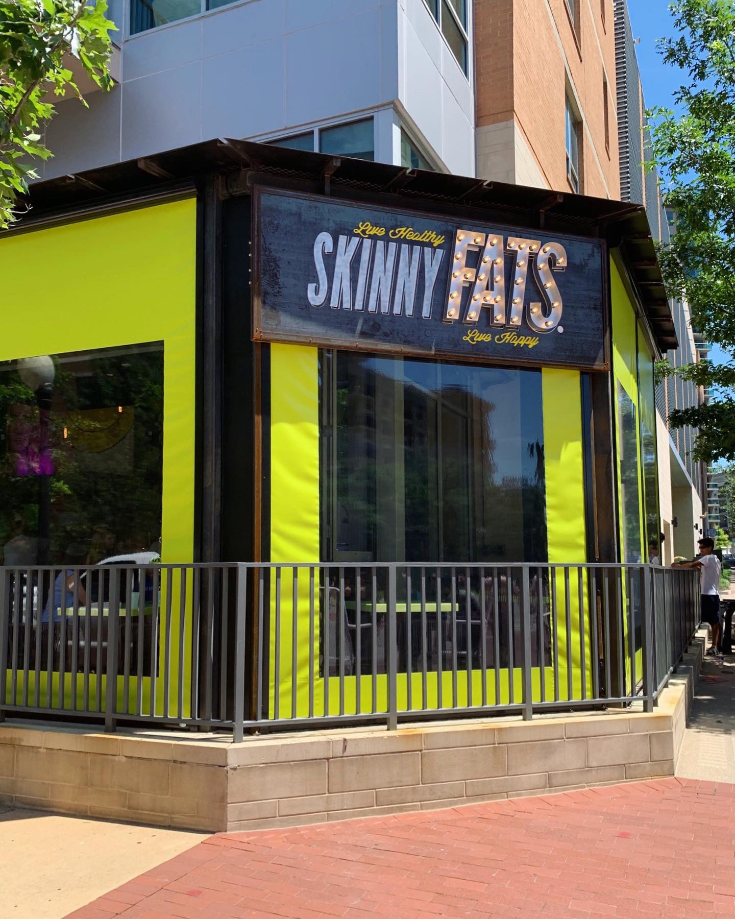
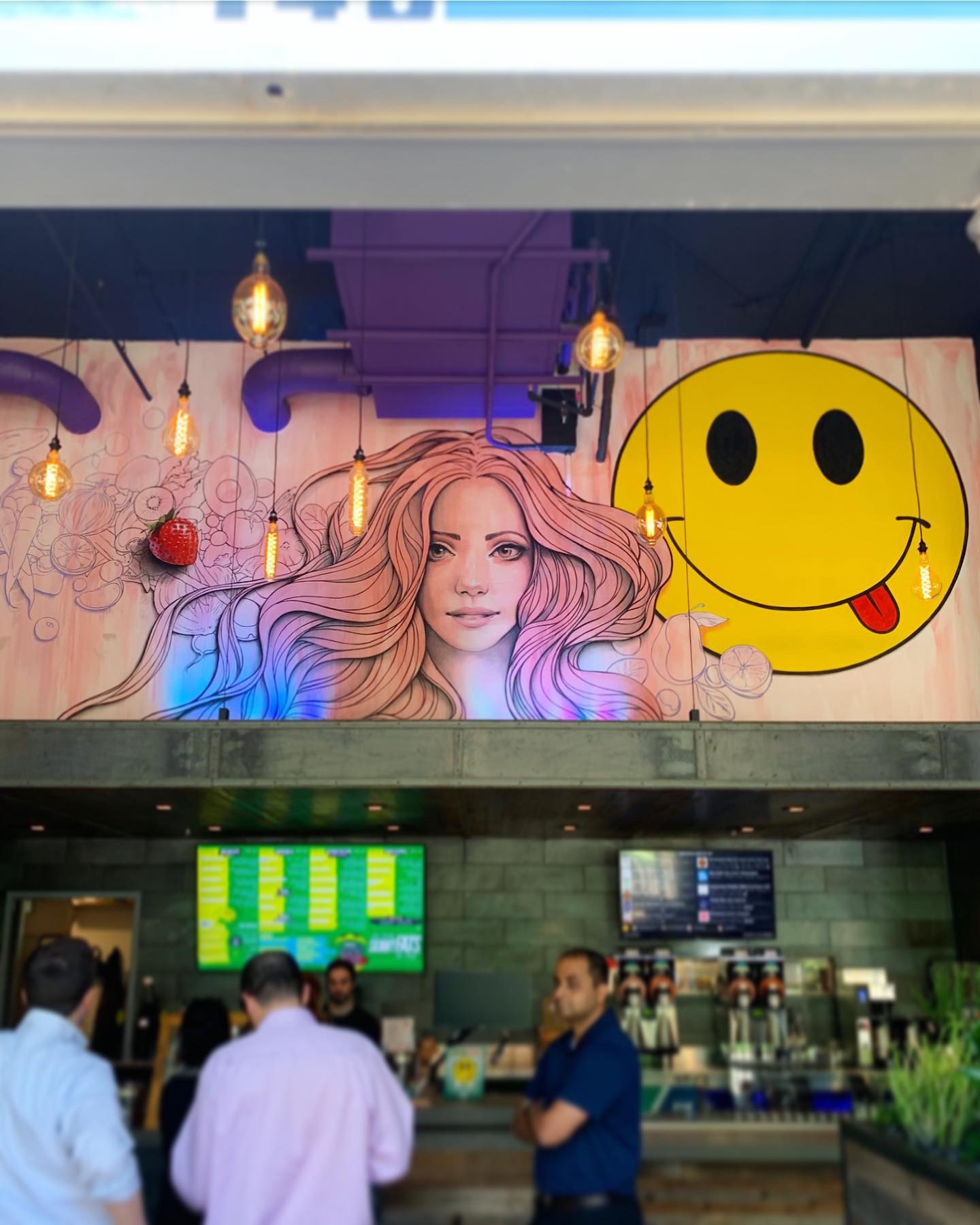
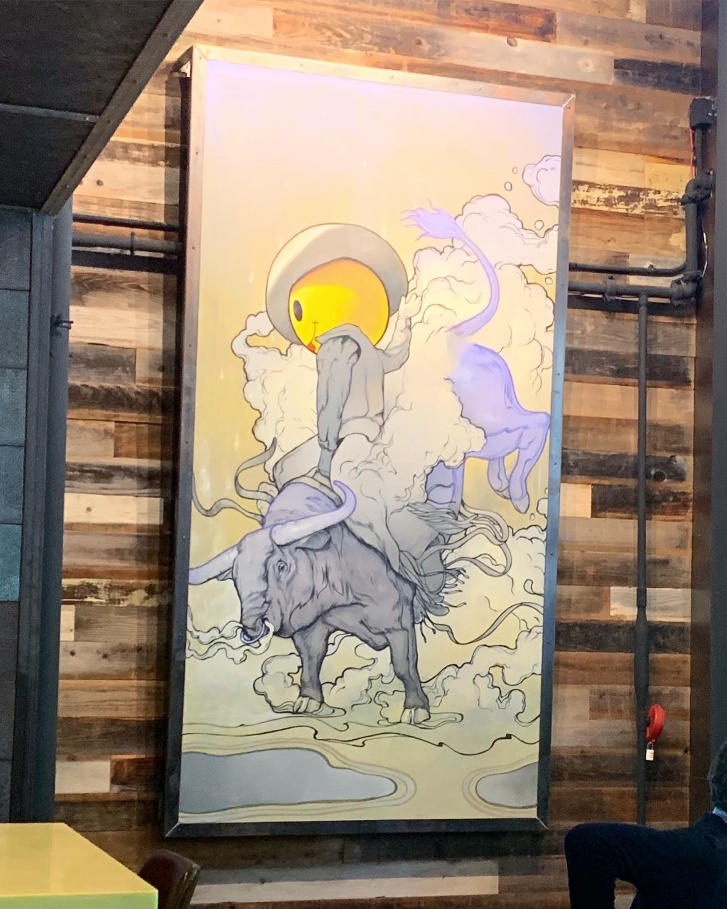
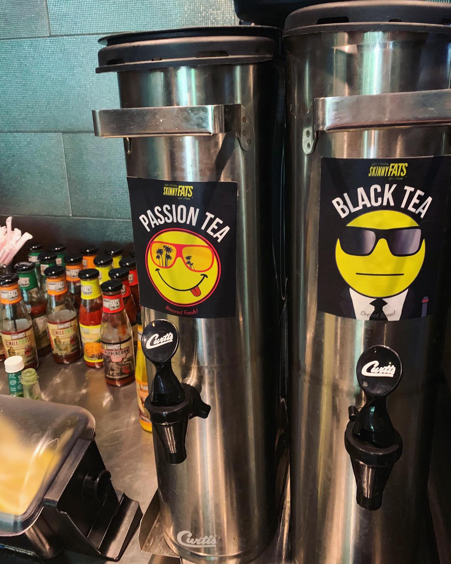
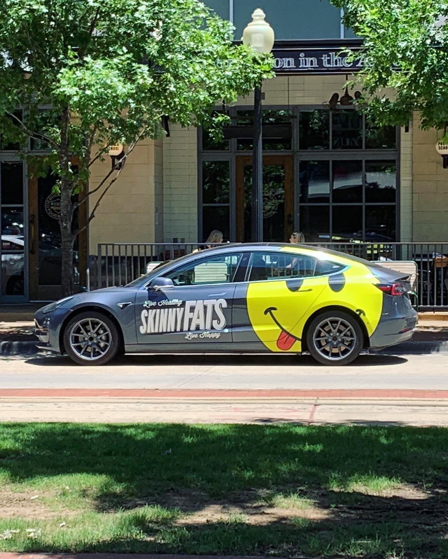
This week’s #FridayFeed restaurant branding review is SkinnyFATS in Uptown (Dallas).
Order Up!
They have 6 locations in Nevada, 1 in Dallas and one coming soon to Salt Lake City. Their tagline is Live Healthy, Live Happy and their primary brand icon is a happy face emoji which they have incorporated into custom paintings, drink cups, custom paper straws, tray liners, etc.
Per QSR Magazine article, the story is “the consultant-turned-restaurateur chose to split the menu in two: the Healthy Side with 600 calories or less per item, and the Happy Side, which is more about taste than calorie counting. His chef consultants had health-food backgrounds, but with the location being in a very industrial area of Las Vegas, Slobusky knew the concept needed to serve both the working man and the indulgers, too.” The menu reminded me of the Larry North North/South concept where you could choose the healthy version of a menu item or you could get it “fattened” up a bit. In fact, each section of the menu is divided into a “healthy side” and a “happy side”. The menu is a great mix of foods and the menu items have great names. Offering both healthy and happy is a great cure for avoiding the “veto vote” when someone in the group just won’t buy in to going somewhere that has only healthy or only happy foods.
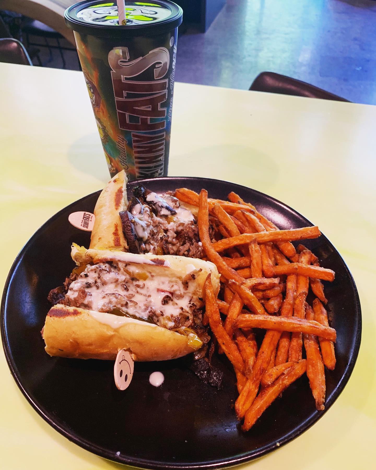
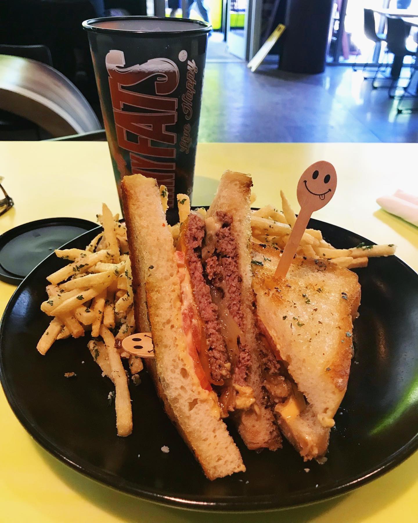
I was looking for the fattest thing I could find because butter and cheese makes me really happy. I stepped up to the counter service bar and ordered the Meltdown. Two 1/4 lb beef patties, cheddar, provolone, caramelized onions, tomato, spicy aioli on grilled sourdough bread that was so buttery and crispy. Got the truffle fries as the side. Danny ordered the Sweet Cheese Us with shaved steak, pepper marmalade, caramelized onions, pepper jack, portobello and cheddar sauce on a hoagie with sweet potato fries. The hoagie bun didn’t hold up past the first bite but it looked really tasty. Other fun menu names include the Cranburkey, Steakation, Cherry Popper, Yummus and pre Birds (deviled eggs – clever but I don’t like to think about my eggs turning into birds really). I want to go back and try the S’motherload breakfast with filet mignon, sausage, fajita pepper, potato & egg burrito, cajun cheddar sauce and pico. Sorry – I know I haven’t really talked about the healthy items on the menu – you can go find those later. They offer Vegan, Vegetarian, Gluten Free and lots of HOT stuff – love that.
Environmental Branding:
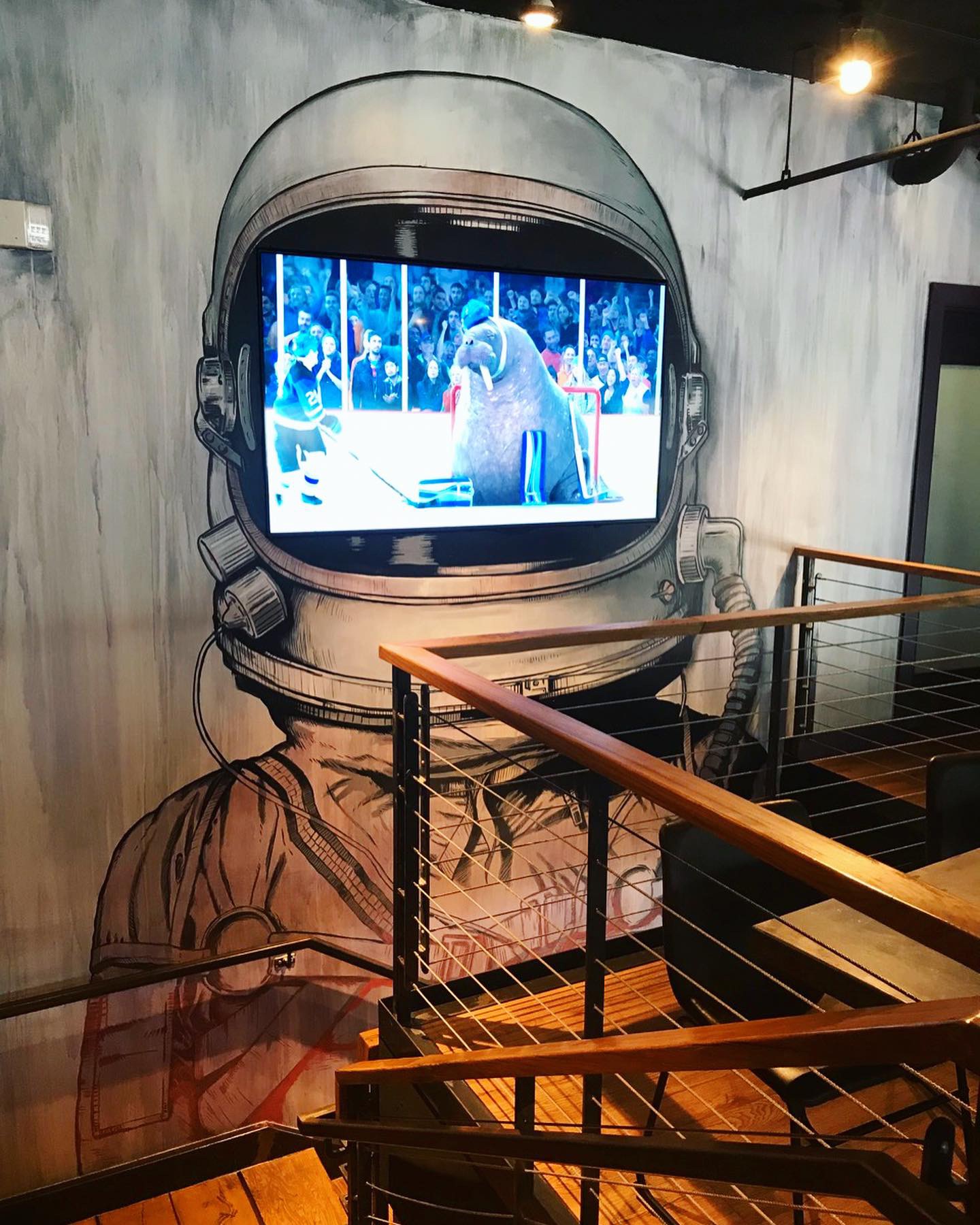
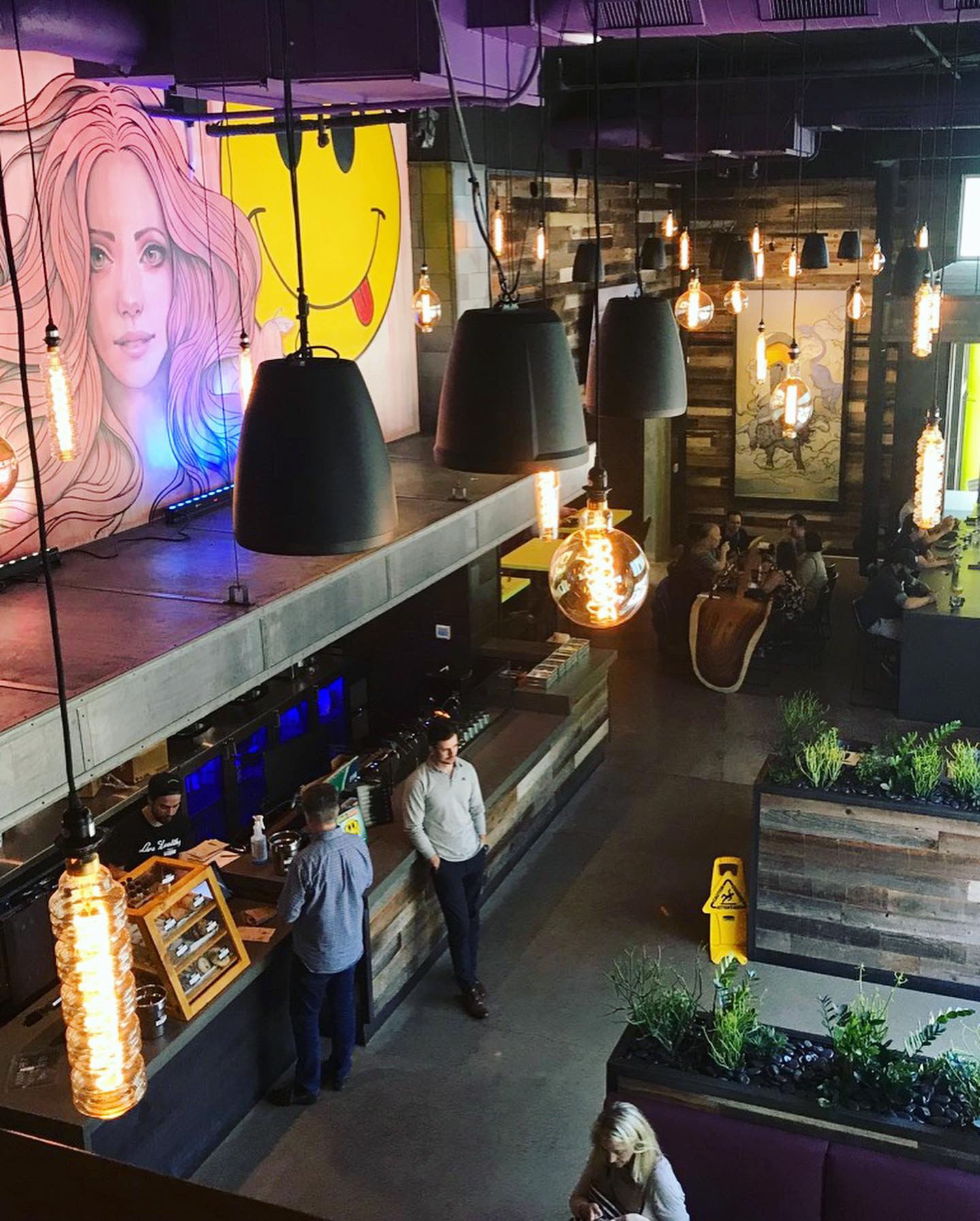
SkinnyFATS in Uptown (Dallas) was designed by LEBODESIGN. The decor elements in the Dallas location are primarily industrial with reclaimed wood and lots of steel coupled with live edge tables, giant edison bulbs, big TVs and as I mentioned before, custom paintings and artwork that are really crazy – kind of Salvador Dali-esque. Two items worth mentioning are the live edge table that looks like its drips to the floor (where did they get that???!!) and the giant TV inside of a space helmet painted on a two story wall mural in the stairwell to the loft seating area that overlooks the main dining room. They clearly have a lot of fun with their environment design and maybe just maybe, they enjoy some form of mood enhancing drugs when they sit down to brainstorm ideas. Where the ideas come from or why doesn’t really matter, it’s part of the fun. It is a great example of an instagram brand!
Branding DNA:
Strategically speaking, the name SkinnyFATS is a good description for the brand. The logo isn’t anything earth shattering or genius, but it works for the brand. Their smiley face reminds me of the old Nirvana logo. In fact, they even have shirts and stickers that highlight this resemblance.
Digital Branding:
SkinnyFATS has a website that is both easy to navigate and user friendly. The G.O.T.M. (Guest Of The Month) highlights specially selected guests from one of their various locations and is a great way to give their guests more of voice. Their Instagram and Facebook focus heavily on their beautiful food photography and feature the Guest Of The Month. Overall, they have awesome digital branding that primarily focuses on their food and the customer. –Danny
Score:
MJ and Danny give it an A.
#FridayFeed:
Every Friday, Studio B Dallas visits a local fast casual concept for lunch to critique the brand (and eat lunch). Three rules apply: it’s a concept we haven’t been to or it’s been in the restaurant news and it’s within 10 miles of our office. Wait, four rules – it can’t be sushi. Danny doesn’t do sushi. If you have any suggestions on where we should eat next, feel free to leave it in the comments. Look for our restaurant branding reviews each Friday! MJ & Danny
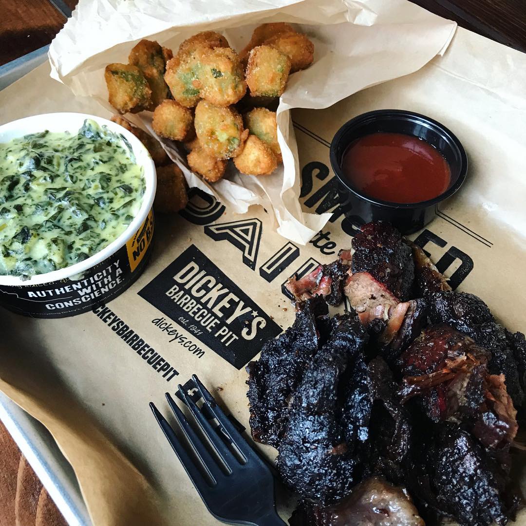
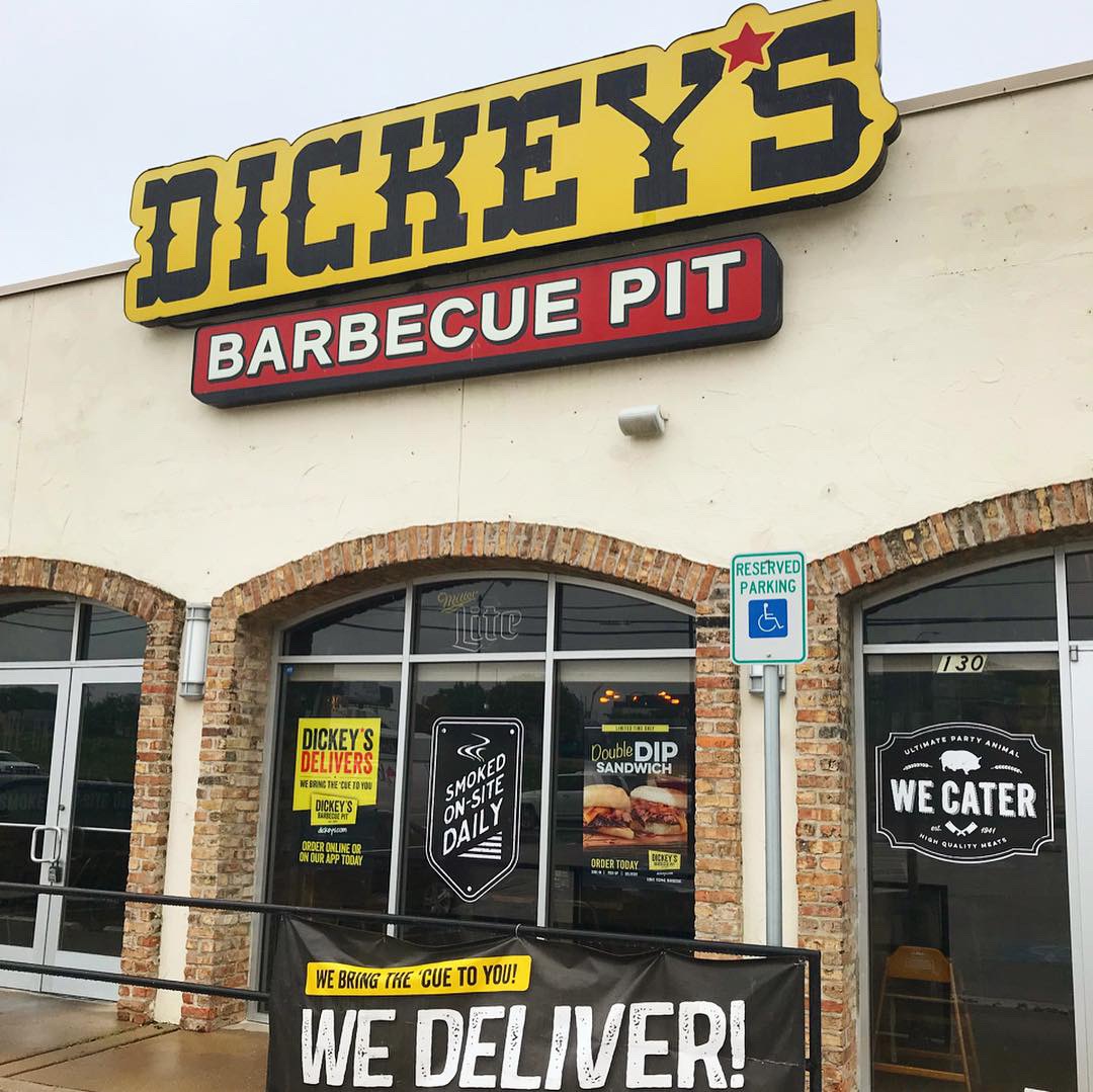
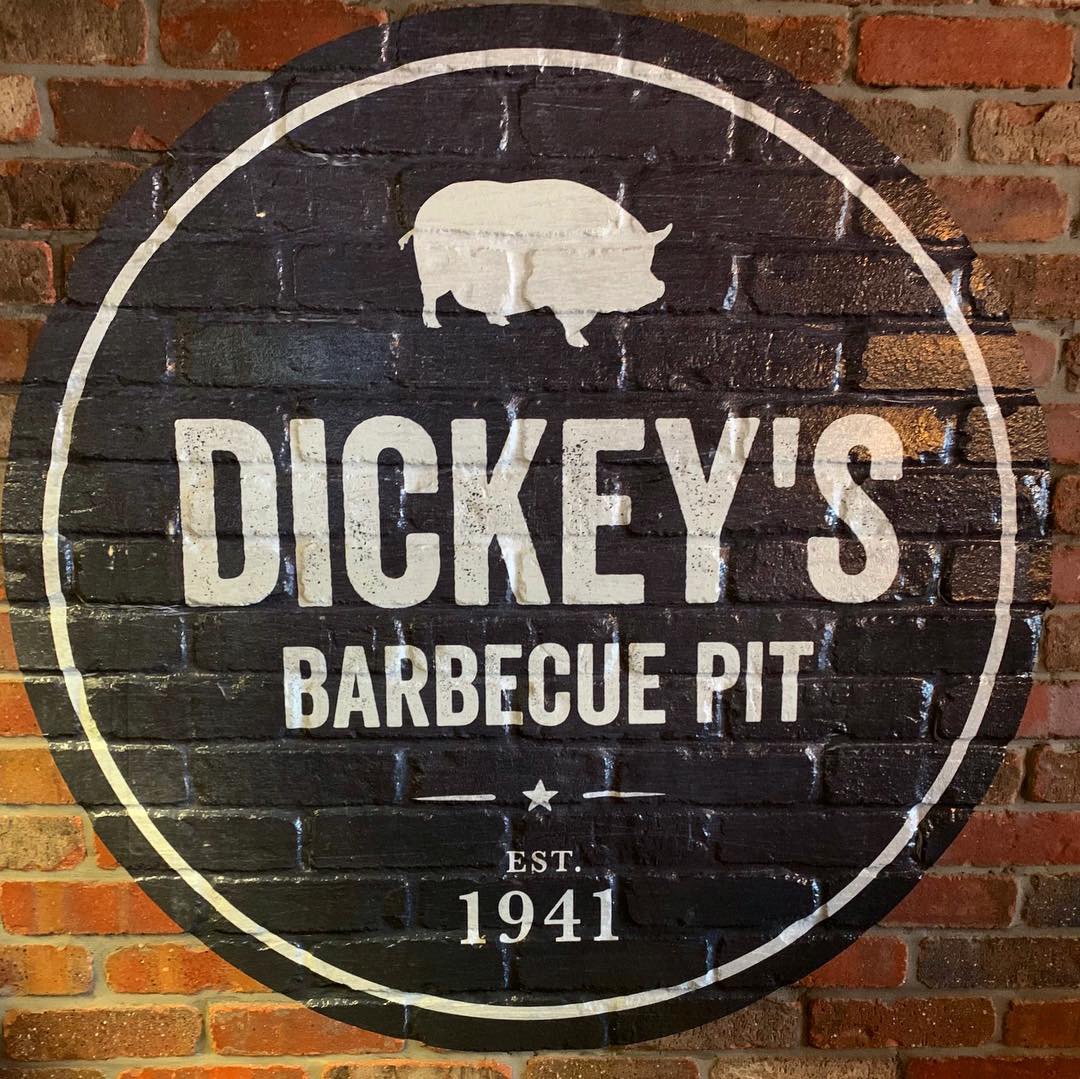
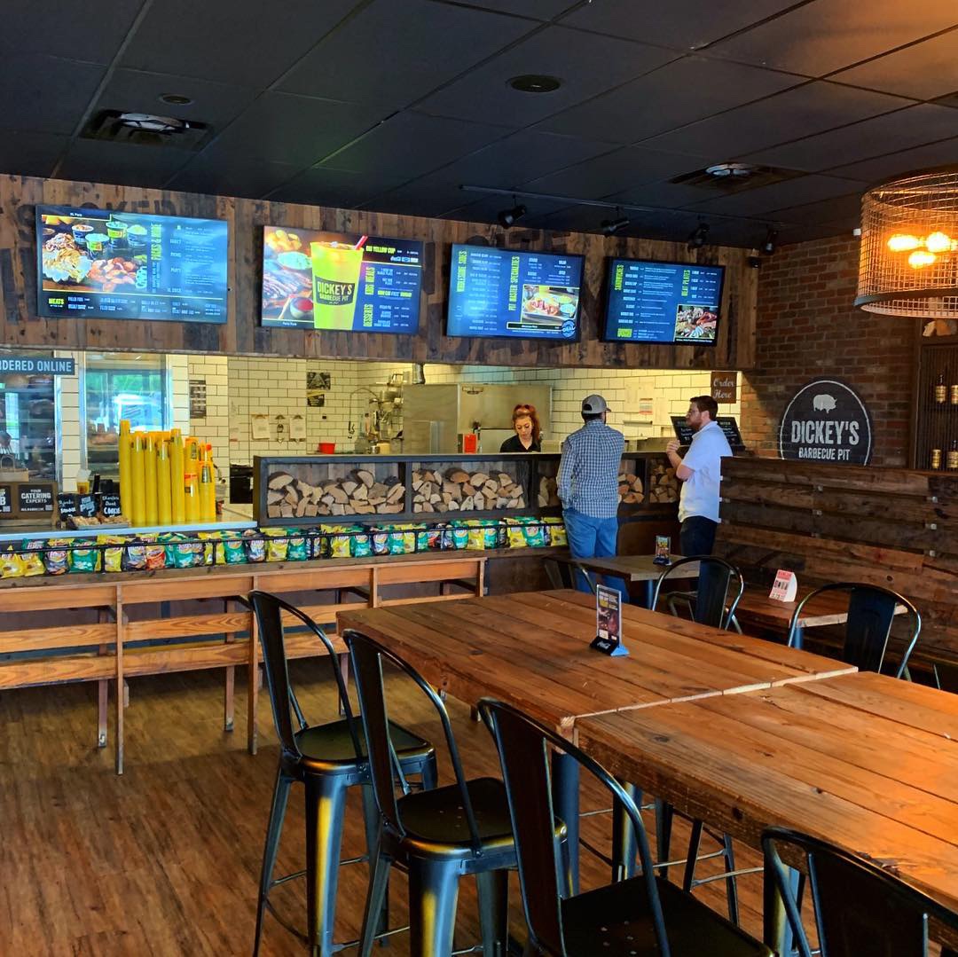
This week’s #FridayFeed restaurant branding review is Dickey’s Barbecue Pit on Wycliff by the Tollway.
Order Up!
Danny and I were looking at our categories and realized we hadn’t reviewed any barbecue. Oddly, there are very few concepts that fall into the Fast Casual BBQ space but Dickey’s does! Dickey’s has 512 locations with 137 in Texas.
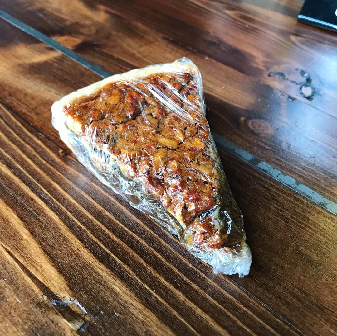
I love brisket but I also love pretty much everything barbecue. I was so happy when they added some unique sides to the menu a few years back. I always get the creamed spinach and I never pass up fried okra. This trip I was told they had a new item: BURNT ENDS! Get out! I got ‘em and they were delicious – see my photos. Danny ordered the jalapeño cheese sausage, the creamed spinach and fried okra. We’re SUPPOSE to get different things but he didn’t get the memo. We also decided to grab a piece of pecan pie but only so we could test how difficult this was going to be to unwrap and eat. As much as I love you, Dickey’s, please put this pie in a container or on a plate? Saran wrap is not working. I worked through it but it wasn’t pretty.
Environmental Branding:
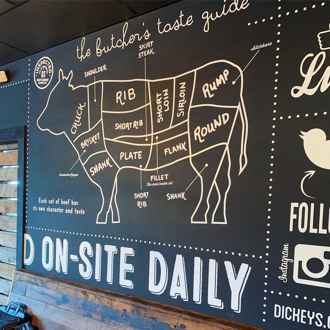
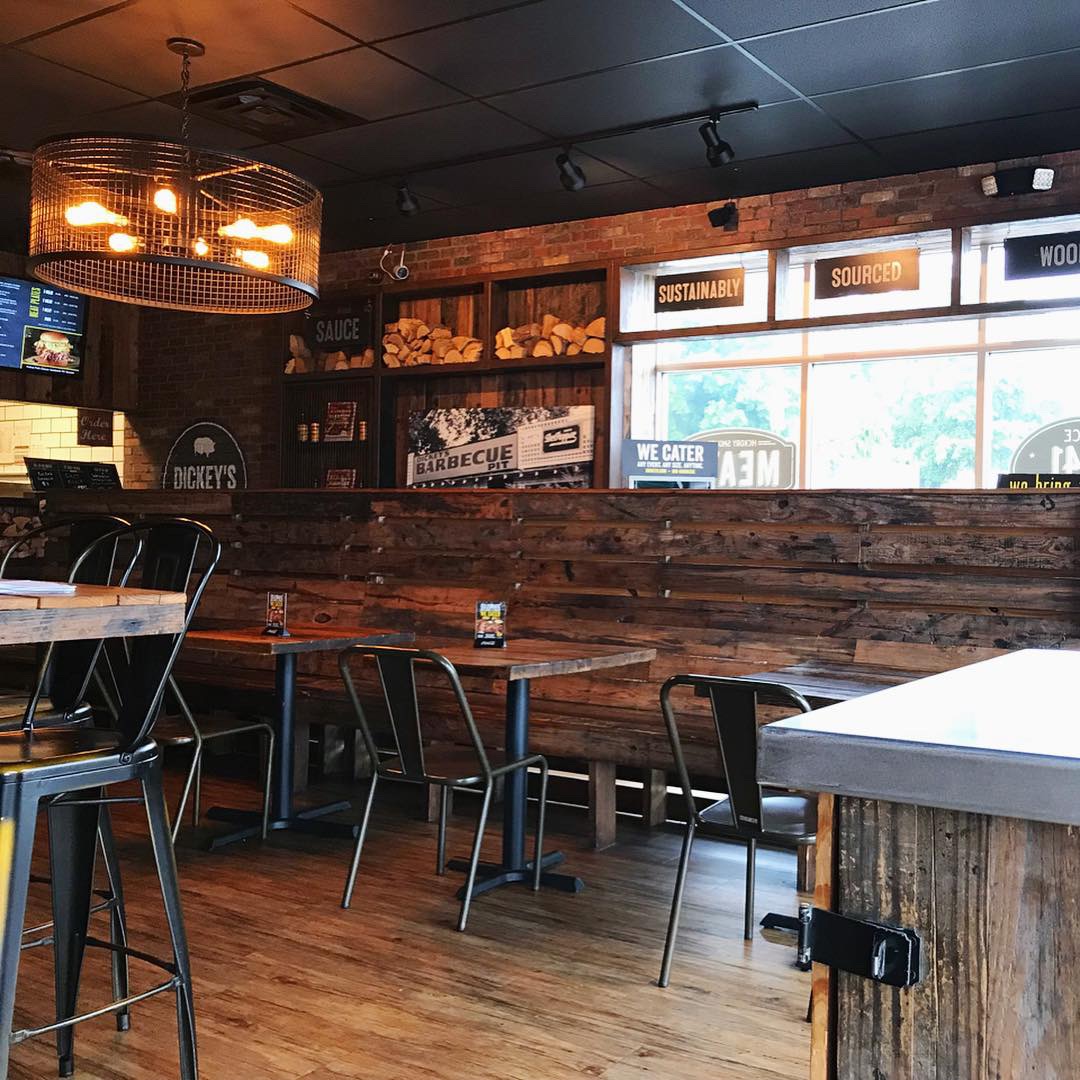
The Wycliff location is the Corporate Testing and Training store so this is where all the cool stuff is. Also – there are always lots of corporate types in there training so the service is fantastic. The outside of this store is not impressive but walk inside and “instant cool.” Nice warm decor and furniture with lots of attention to the details, like little chunks of wood stacked up at the line. I have to assume this is Hickory wood since that’s what gives their BBQ its signature flavor. Great light fixtures and wall graphics. This location also has a secondary room that can be closed off with a big wooden slat sliding door – a great solution for the space that adds to the overall decor. They also have a large glass-front meat cooler behind the register that shows off big cuts of meats. I love this. I noticed on this visit, they are testing digital menu boards. They look great and have enough interactivity with rotating images but not too much that it’s distracting.
We asked one of the “corps” if he knew who designed the interior and graphics. He put us in touch with the Director of Communications, Ashley Richardson, who told us this: “we have an in-house design team that is responsible for all graphics on the Walls inside the Dickey’s stores. Our partner, Stanford Sonoma, is responsible for all furnishings and fixtures. Together, we think they create a great vibe to enjoy our authentic, Texas-style barbecue!” We agree Ashley.
Branding DNA:
Classic logo. Good name. Rich history and BEAUTIFUL, MOUTH WATERING photos of food. They also do a great job with their “brand language.” Example – they have a sandwich called the CUEBEN, love it. There are a few new copy lines in use that I like also – “SMOKED ON SITE” and “LEGIT. TEXAS. BARBECUE. There’s so much you can do with BBQ words and phrases, like PIT MASTERS, PIT CREWS, LOW & SLOW, IT’S NOT LEGIT WITHOUT THE PIT. That reminds me of a cool T-shirt I saw online that says “MY HUSBAND SMELLS LIKE BRISKET”. Love that.
We’re big on packaging so we want to give a shout out to the team who designed the take out bags – those are legit and we love all of the iconography. The BIG YELLOW cup, of course, is an icon of the brand and fans take selfies with the cup all over the world to show their love of the brand.
Digital Branding:
Dickey’s has a great website that is easy to navigate. When you first visit the site, you’re greeted with a big scrolling banner full of beautiful food photography with hints of marketing sprinkled in. Their Instagram and Facebook features mouthwatering food videos and imagery, great lifestyle photography, and just like their website hints of marketing. Overall, Dickey’s has amazing digital branding across the board! –Danny
Score:
MJ and Danny give it an A.
#FridayFeed:
Every Friday, Studio B Dallas visits a local fast casual concept for lunch to critique the brand (and eat lunch). Three rules apply: it’s a concept we haven’t been to or it’s been in the restaurant news and it’s within 10 miles of our office. Wait, four rules – it can’t be sushi. Danny doesn’t do sushi. If you have any suggestions on where we should eat next, feel free to leave it in the comments. Look for our restaurant branding reviews each Friday! MJ & Danny


Recent Comments