
This week’s #FridayFeed restaurant branding review is Tacodeli at Sylvan | Thirty with celebrity guest, Bret Sano from Caliber Creative.
Order Up!
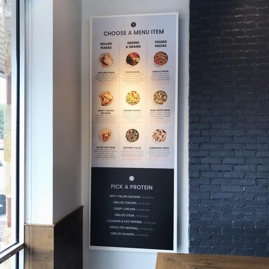
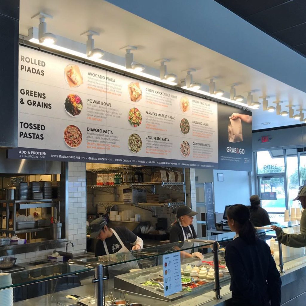
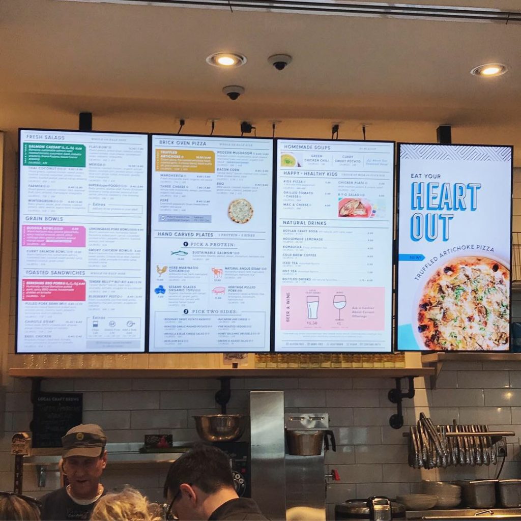
Tacodeli has 10 locations in Austin, Dallas, Houston. Big menu with lots of “Farm to Taco” menu items. Everything is made fresh daily including a nice selection of fresh salsas and sauces. Delicious queso – a little thinner than I like it but the flavor is really nice. Before I talk about the food, I’m going to say what I’m sure so many people say about Tacodeli – Why are they not open for dinner???!” In a city where you can pretty much get anything you want, any time you want, this makes me crazy – like how Chick-Fil-A is not open on Sunday.
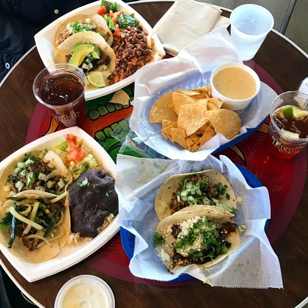
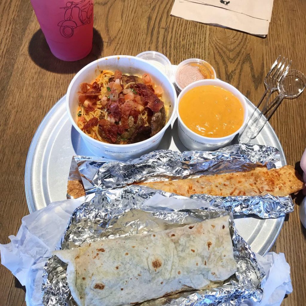
They ARE open for breakfast every day and lunch is served until 3pm which would be GREAT for Tacodeli if that location was in the heart of a business district vs surrounded by apartments. I ordered the Frontera Fundido Sirloin with grilled sirloin, jack cheese glaze, and sautéed poblano-onion rajas and an Akaushi Picadillo which is a ground beef, jack cheese glaze, cilantro and onion. Now, I don’t know what Fundido is and I don’t know what a jack cheese “glaze” is but I do know that I like them both. I rarely order anything sirloin unless it’s the fajitas at Uncle Julio’s (yum) but this sirloin was tender and delicious. Bret got the Happy Taco, and the Carne Asada. Danny got the Tacoloco and Akaushi Picadillo. We shared a queso and chips and we sampled all of the sauces.
Environmental Branding:
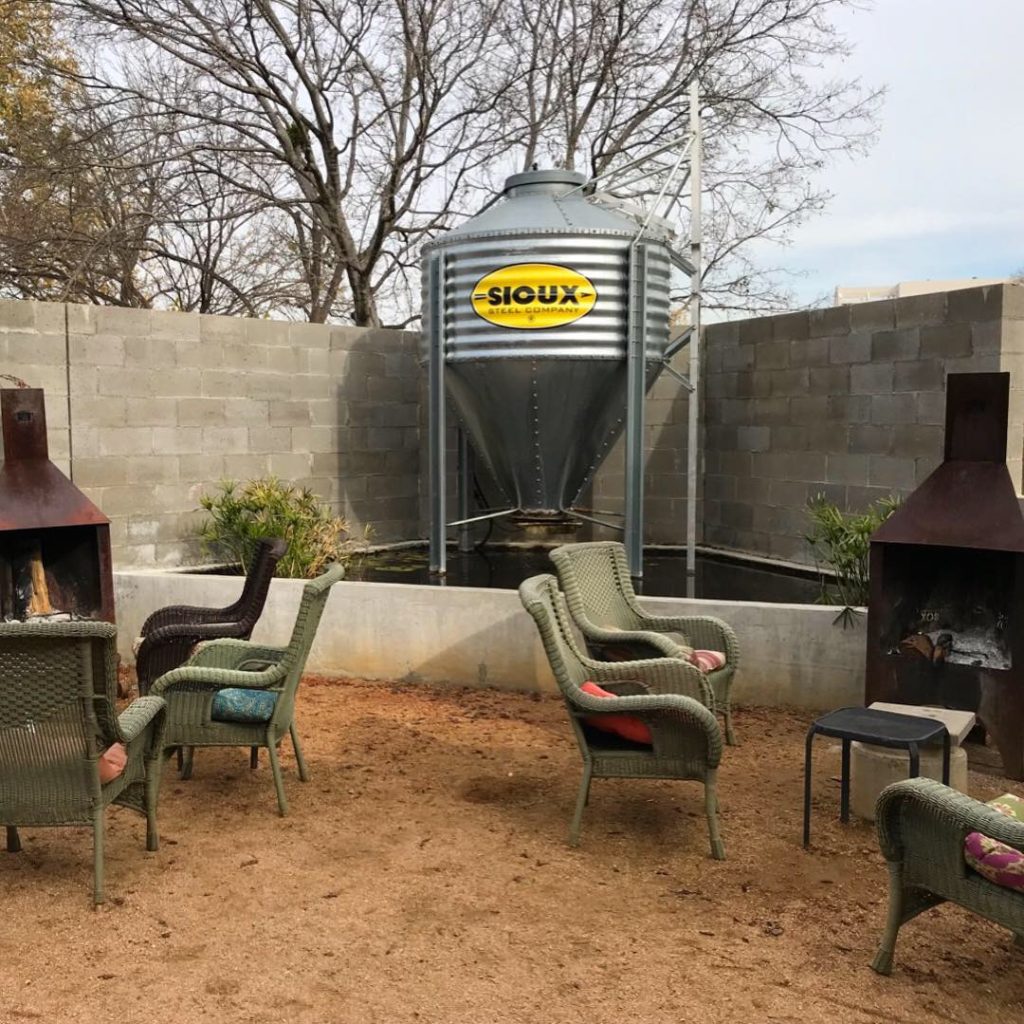
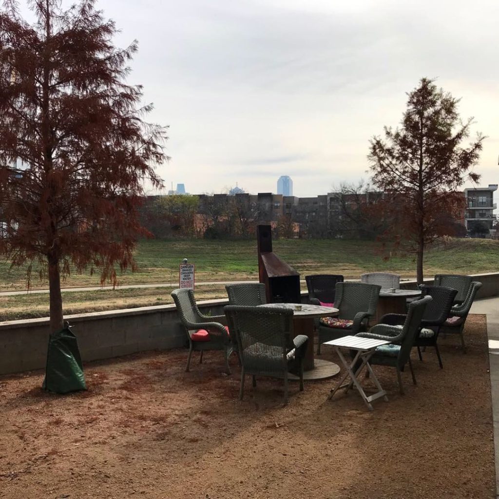
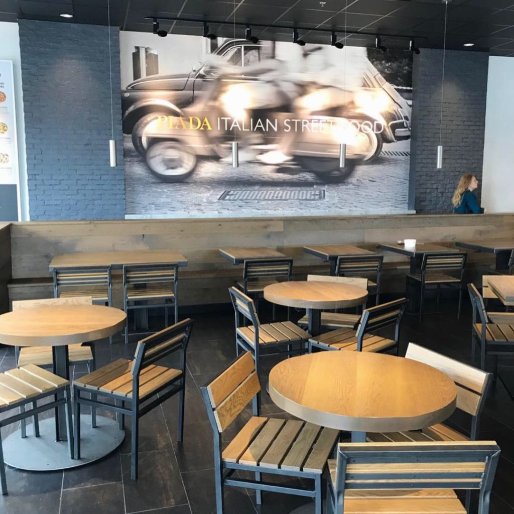
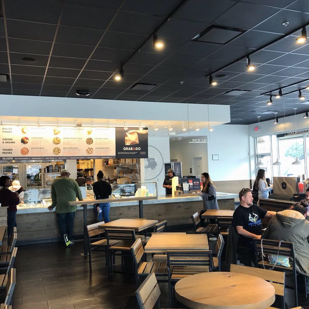
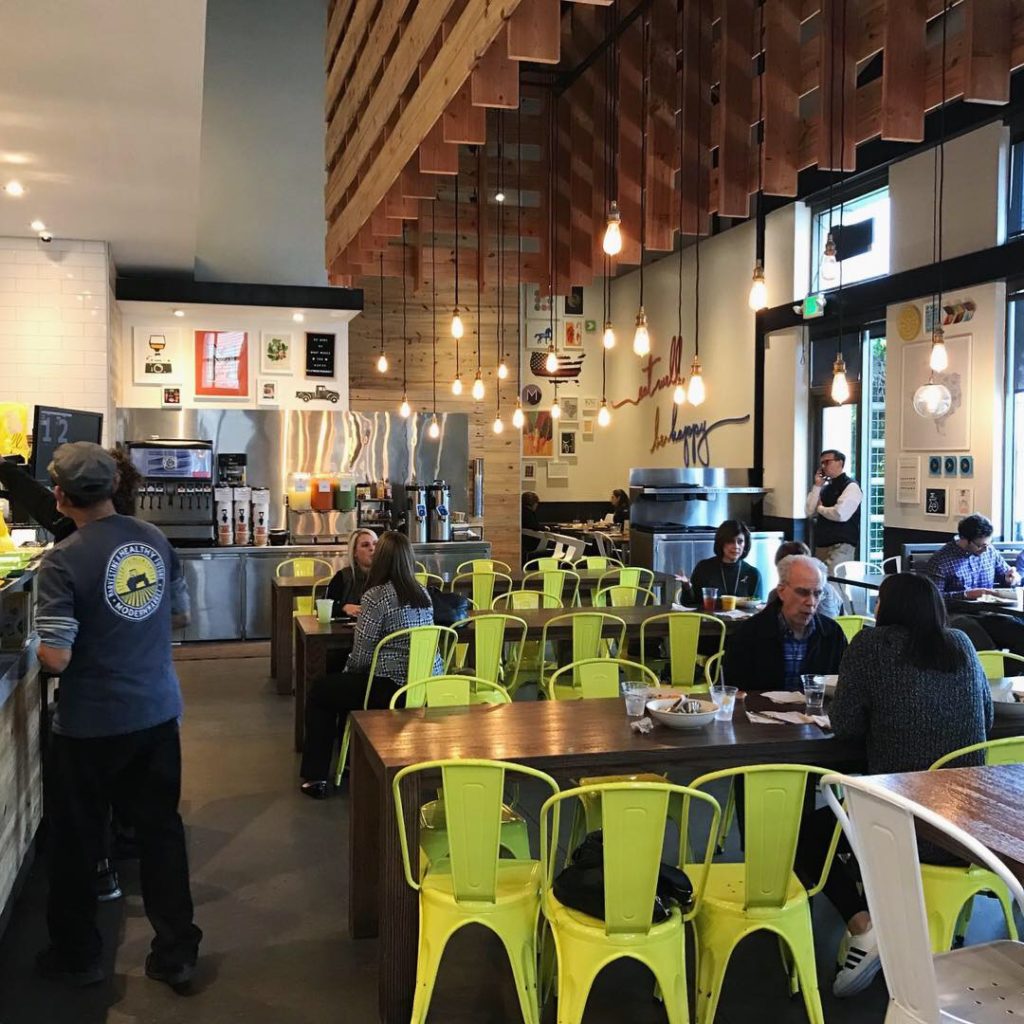
The interior design at this location is very light and bright. They use a large format octagonal tile in grey, black and white which dominates more than I like. I actually had to go back and look at the photos to remember anything about the floor, tables, chairs and lighting. The dining room has a variety of “hard” seating and this location also has outdoor seating. I wouldn’t say that the decor says anything about the concept.
Branding DNA:
I went to the website to learn more about the brand. Labeled Farm to Taco, the website tells the story of founder Roberto who was born in Mexico and started Tacodeli in Austin in 1999. The logo was updated just last year, retiring the cartoon Mexican eating a taco (still found at the Sylvan | Thirty location, however). I’d like to see a slogan or something to help me connect the brand a little more. While “farm-to-table”, “organic”, “locally sourced”, have dominated the restaurant scene this last 5 years, it’s time for something new. It might have been “different” in Austin in 1999 but if you’re going to enter the taco scene in the Dallas Market without benefit of your history, you better bring your A-game. Just sayin…
Bret’s Thoughts:
Overall, I’d say the branding is not bringing much new and different to the table. The tone and style of the logotype and brand typography are definitely kicking a casual, approachable vibe, which is appropriate and fits the category. The logotype itself comes across as both custom and stock typeface at the same time. You could see it either way. The style of it reminds me of infamous 90’s gimmick display fonts like Fajita and Remedy, which is not for me, but it’s not nearly as obnoxious as those were. The color palette is pretty standard and basic, which is fine, but again not differentiating itself much. I think the ancillary branded graphics like the t-shirts are a missed opportunity. For me they blend together with a multitude of other Tex Mex restaurants and brands – Chuy’s comes to mind. All that said, the tone and personality of brand is authentic and true to what it is — it’s not hipster food, it’s not elevated food, it’s Tex Mex comfort casual, and the branding speaks to that in my opinion.
Celebrity Guest, Bret Sano is a principal and creative director at award-winning Dallas design firm Caliber Creative. He also happens to be the very first designer I ever hired at Studio B in the mid 90’s when we officed in the White Swan Building (now House of Blues). He and his company do beautiful work
Digital Branding:
Tacodeli’s social media is full of taco and promotional imagery, but showcase only a few lifestyle photographs. In such a competitive market, Tacodeli would benefit by mixing in more posts about their brand’s uniqueness i.e. their farm fresh produce, locally sourced ingredients and their ties to the community.
Something to Chew On:
Tacodeli uses a variety of tattoo-esque illustrations on their tabletops, various secondary signage and even on retail merchandise. The use of this secondary art style should be carried throughout the branding more or remove it entirely. Their primary design of clean and modern clash with the ancillary tattoo-esque illustrations.
– Danny
Score:
MJ gives it a B, Danny gives it a B+ and Bret gives it a B.
#FridayFeed:
Every Friday, Studio B Dallas visits a local fast casual concept for lunch to critique the brand (and eat lunch). Three rules apply: it’s a concept we haven’t been to or it’s been in the restaurant news and it’s within 10 miles of our office. Wait, four rules – it can’t be sushi. Danny doesn’t do sushi. If you have any suggestions on where we should eat next, feel free to leave it in the comments. Look for our restaurant branding reviews each Friday! MJ & Danny
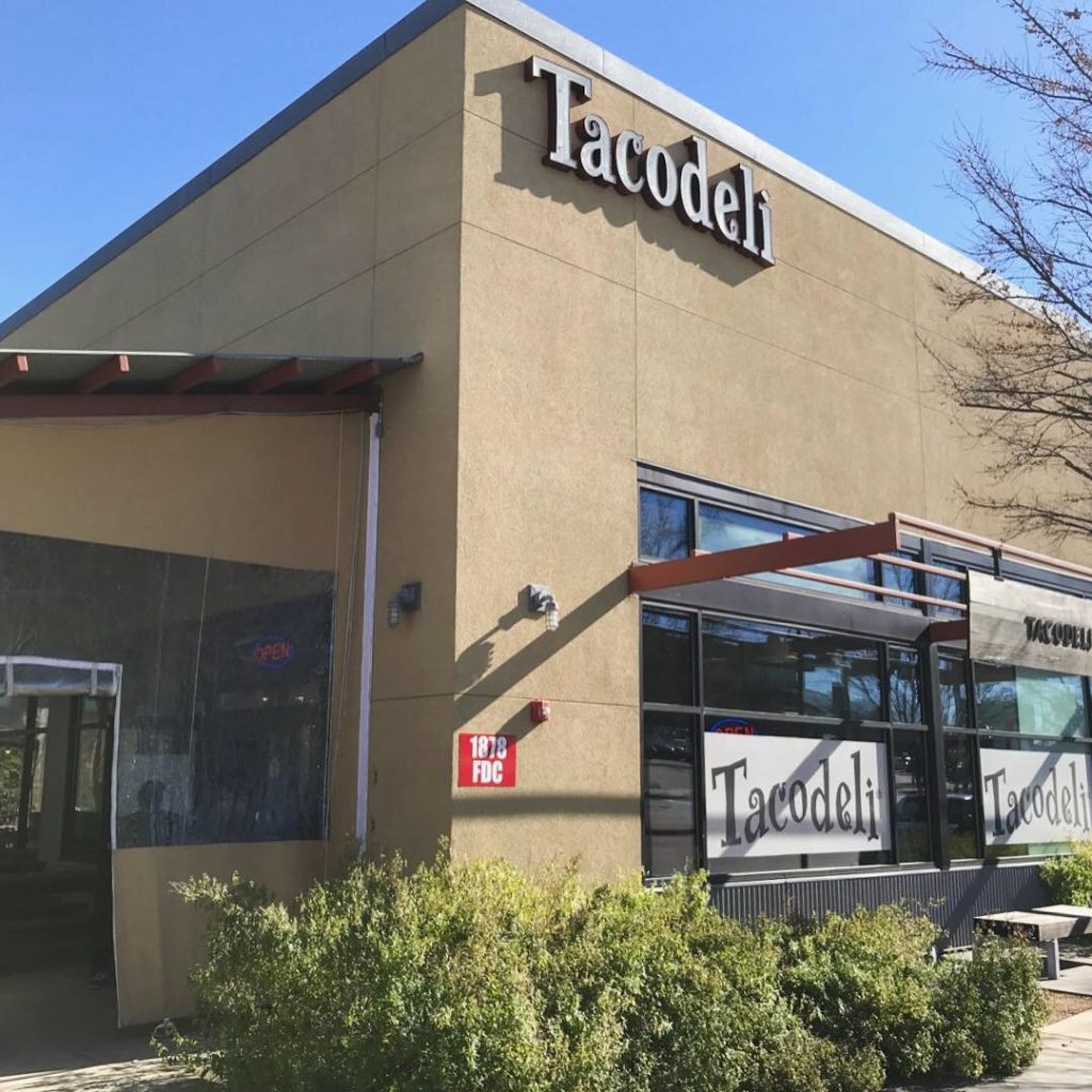
Tacodeli 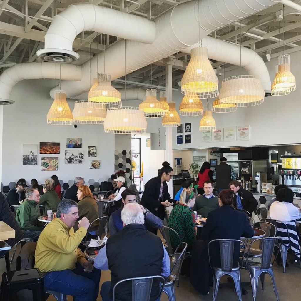
Light & Bright Interior 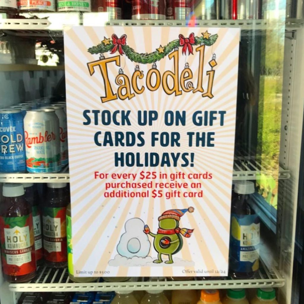
Drink Cooler Promo 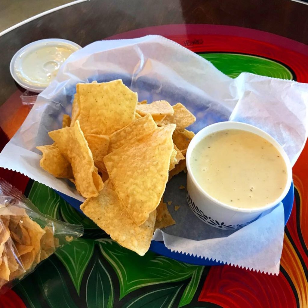
Chips & Queso 
Delicious Tacos 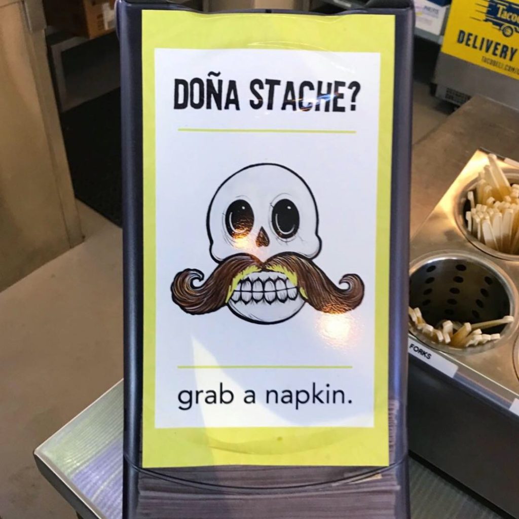
Tattoo-esque Illustration 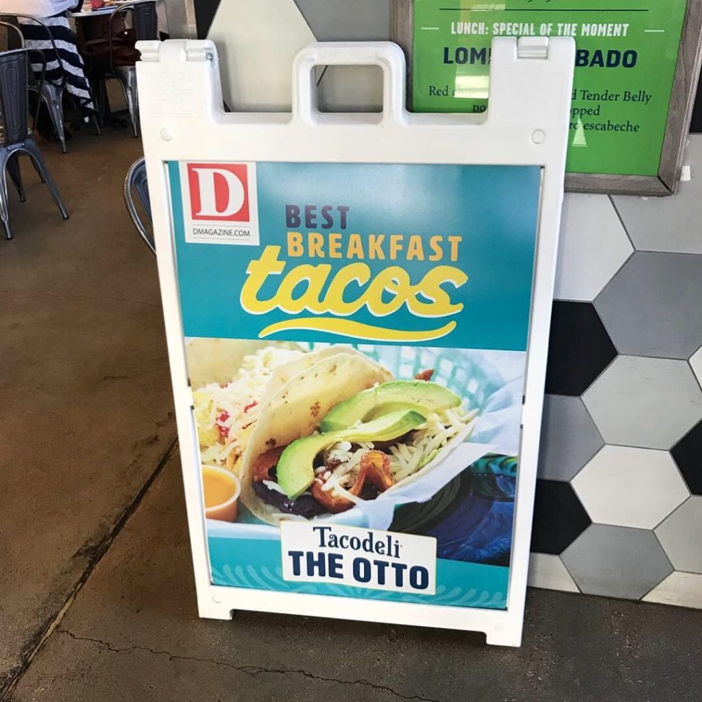
D Magazine Award


Recent Comments