
This week’s #FridayFeed restaurant branding review is Modern Market – Farm Fresh Eatery at Central Expressway and Walnut Hill Lane.
We mixed things up this week by going to the website first. I wanted to see if the branding on the website would deliver the experience in the store. I was instantly captivated by a video on the home page of the cook preparing a salad, grilling meats and chopping. They also tagged a photo at the end of the video of a salad with a wine glass with Modern Market logo. Within 15 seconds – I know that they grill and chop my salad fresh and I can get a glass of wine with my lunch or dinner. Great photos throughout the site mixed in with lifestyle photos – also smart! The founder video in the “About Us” page was also great. As opposed to counting on me to read the information or translate icons to concepts, the founder told me all about eating well and importance of sourcing fresh, healthy food that fills you up and makes you feel good.
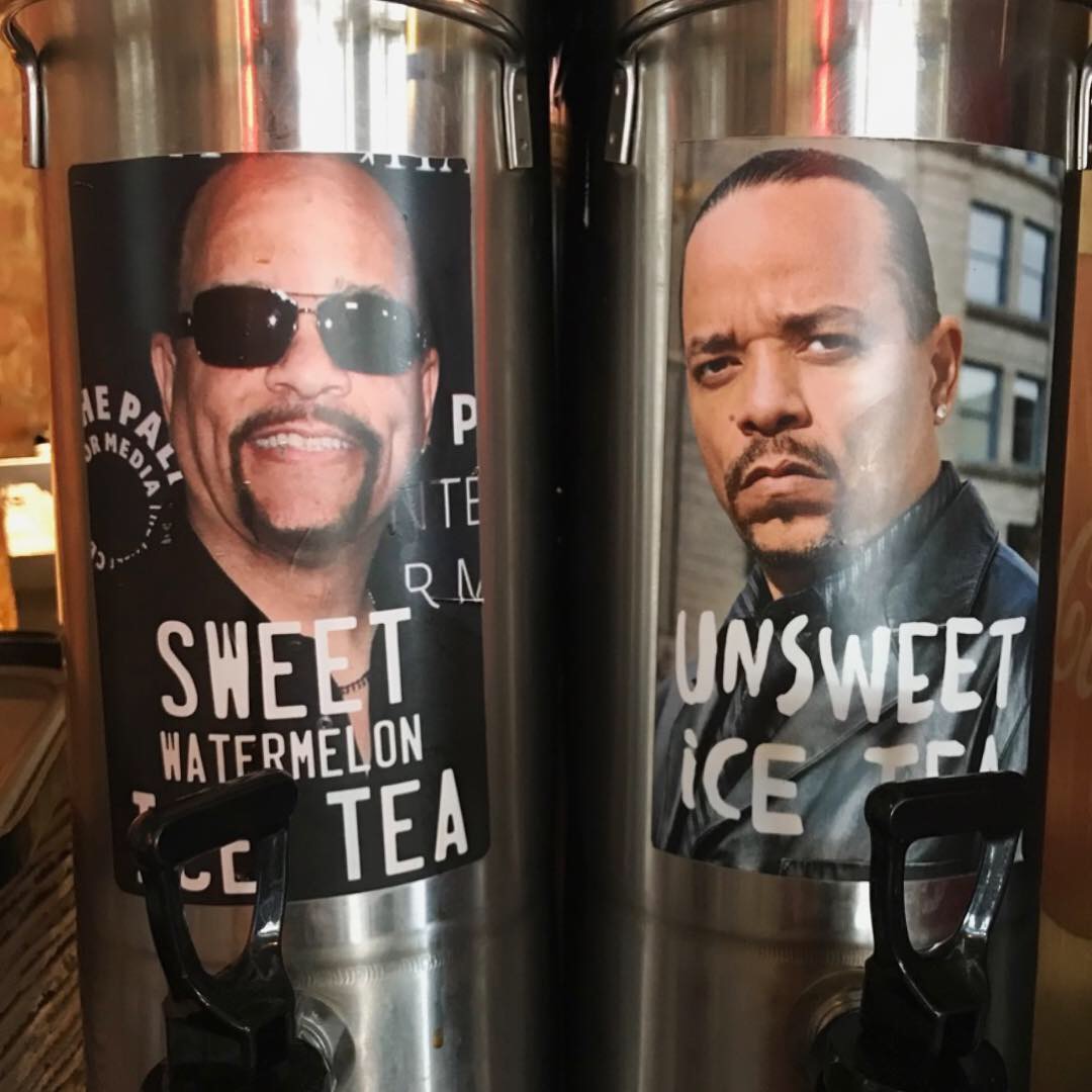
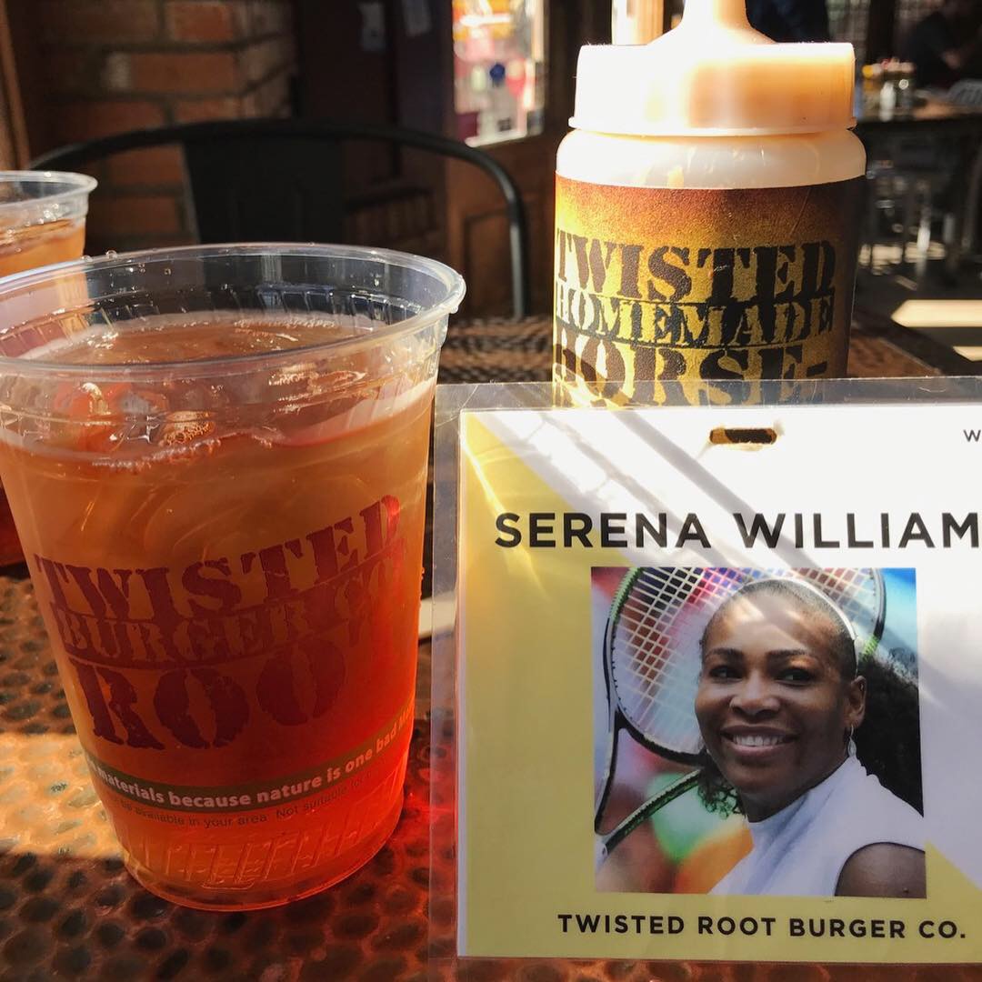
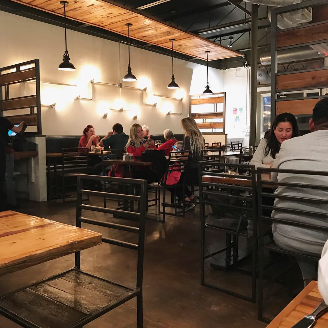
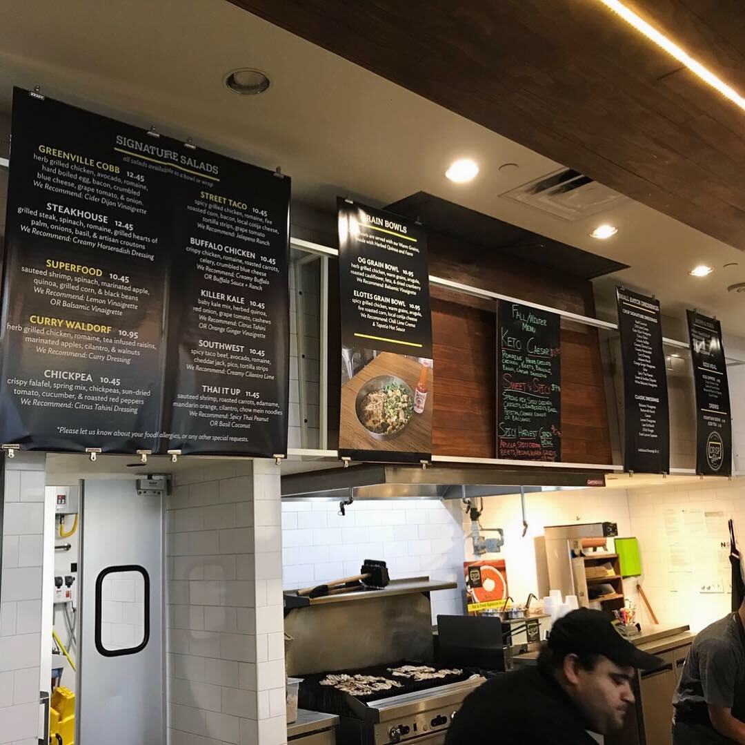
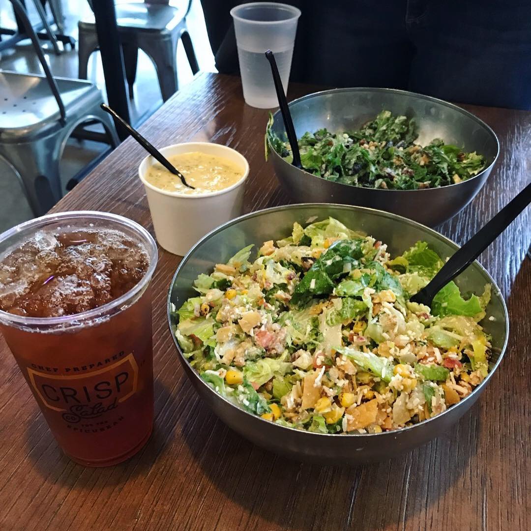
After seeing the website, Danny and I had big expectations and were not disappointed. The interior design was fresh, clean and comfortable. There were walls of framed prints and decor that added lots of color and interest. The yellow metal chairs were comfortable and sturdy. The large video menu boards were bright and easy to read. They offer salads, grain bowls, brick oven pizzas and carving plates (protein plus 2 sides), a couple of soups and desserts, wine and beer. We got our glasses and headed to the beverage station where we had a choice of custom fountain drinks, 3 teas, 3 beautiful lemonades (regular, carrot and cucumber mint) plus 2 coffees.
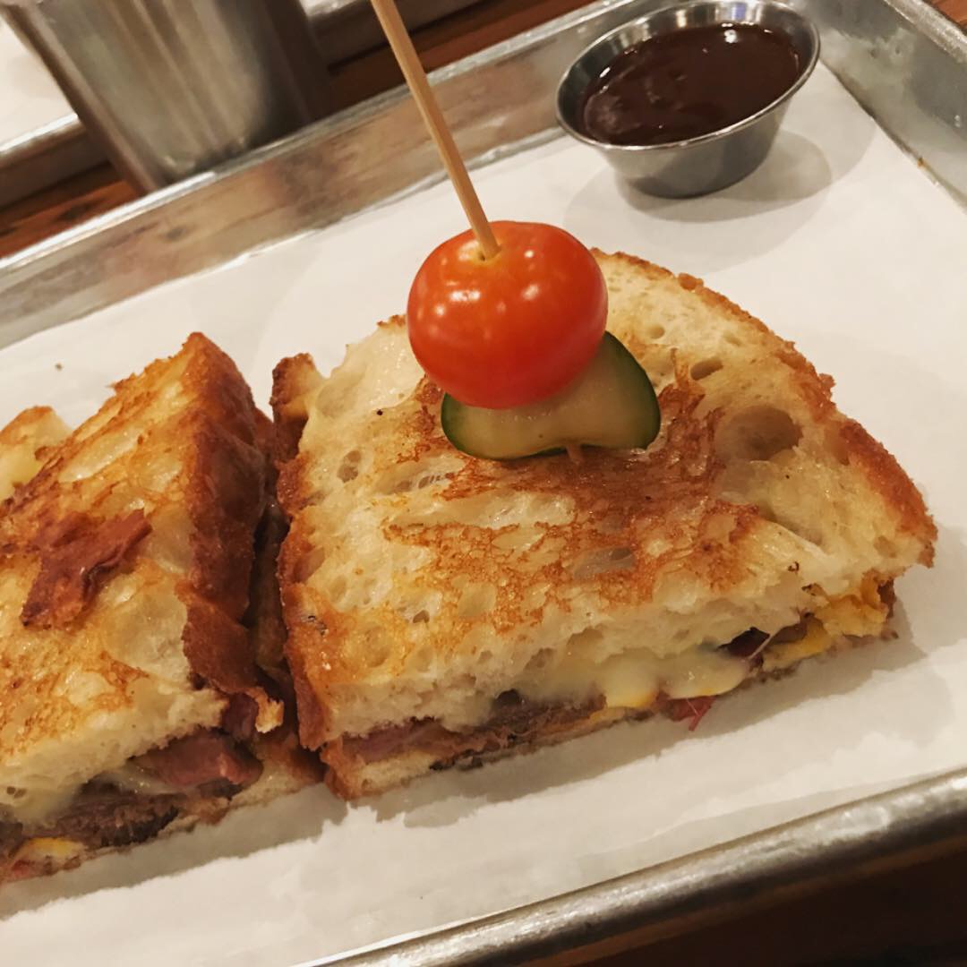
I ordered the Truffled Artichoke Pizza – in Half Size. I knew from reading the pizza boxes on display that they make their own crust and sauce. Danny ordered the Tender Belly™ BLT+A on sourdough. We also ordered a had carved plate of humanely-raised, herb marinated beef with chimichurri and sides to-go. We were served quickly and the food was fantastic.
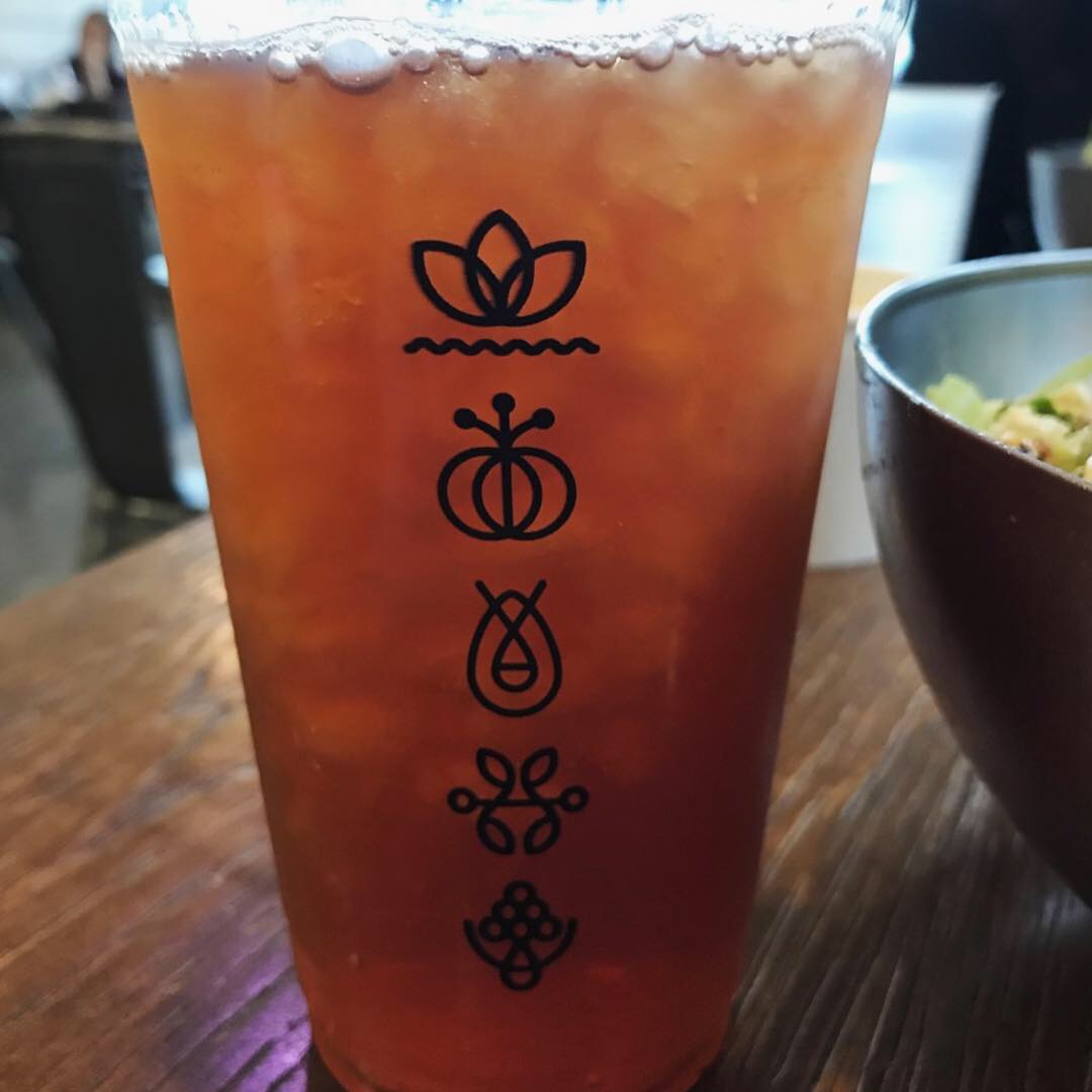
The packaging was really nice as well. Clear plastic drink cups to highlight the colorful beverages and pretty yellow take out bags that say “Eat Well” and “Be Happy.” I know I’ve used the word “pretty” and “beautiful” so you may be thinking this is a female-centric place but there was an equal mix of men and women and a few families.
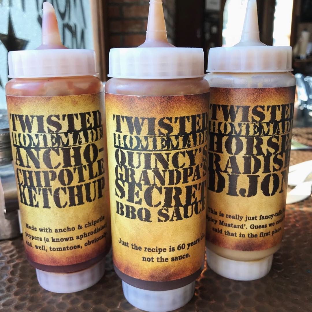
Signage, custom door handles, staff apparel and packaging were all very nicely branded. There really wasn’t anything we didn’t like here! I looked around for the agency/design firm who is responsible for the branding as well as who designed the interior but we couldn’t find anything. Add a comment if you know. I think there have been a few versions.
Modern Market has 28 restaurants across Colorado, Texas, Arizona, Washington, D.C., and Maryland. QSR magazine reports that MM was acquired by LA Private Equity Group, Butterfly, in February. This happens to a lot of hot concepts and the founders usually justify the acquisitions by saying it will allow for rapid expansion. The rapid expansion part is true. Hopefully the brand is able to maintain what made it great during the expansion because we really like it!
Now back to their website. Modern Market’s website is engaging, modern and inviting with crucial components that captivate consumers. Their social media has beautiful photographs that look professional while still maintaining a candid feel.
MJ and Danny give it a solid A+ for food and branding.
Every Friday, Studio B Dallas visits a local fast casual concept for lunch to critique the brand (and eat lunch). Three rules apply: it’s a concept we haven’t been to or it’s been in the restaurant news and it’s within 10 miles of our office. Wait, four rules – it can’t be sushi. Danny doesn’t do sushi. If you have any suggestions on where we should eat next, feel free to leave it in the comments. Look for our restaurant branding reviews each Friday! MJ & Danny
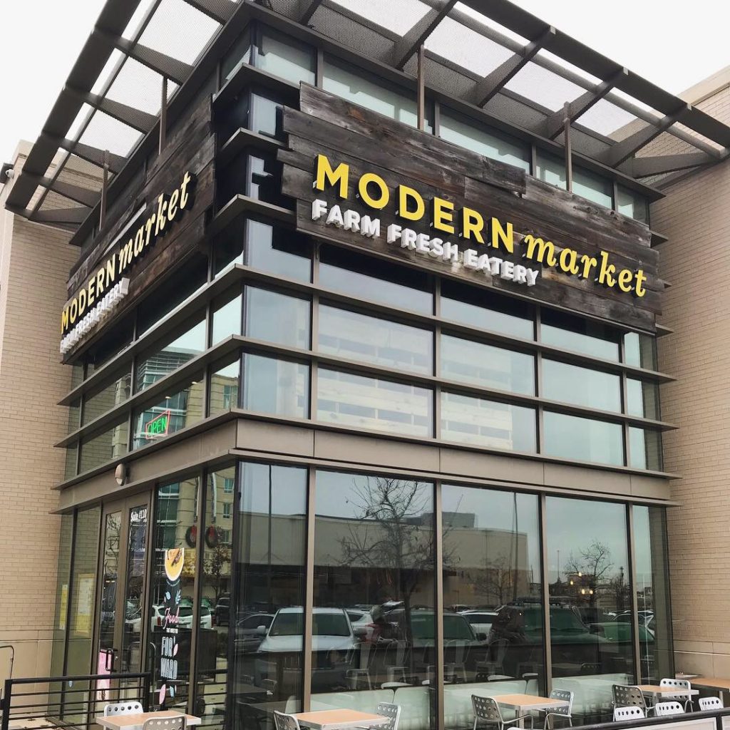
Modern Market Farm Fresh Eatery 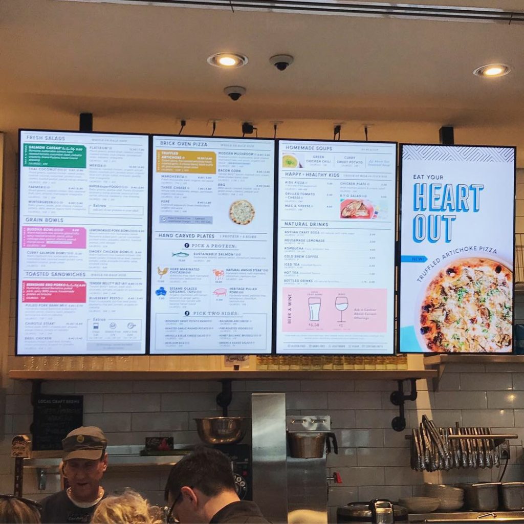
Digital Menu Boards 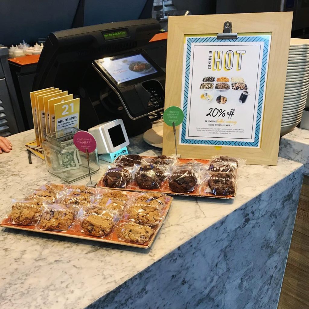
Counter Display 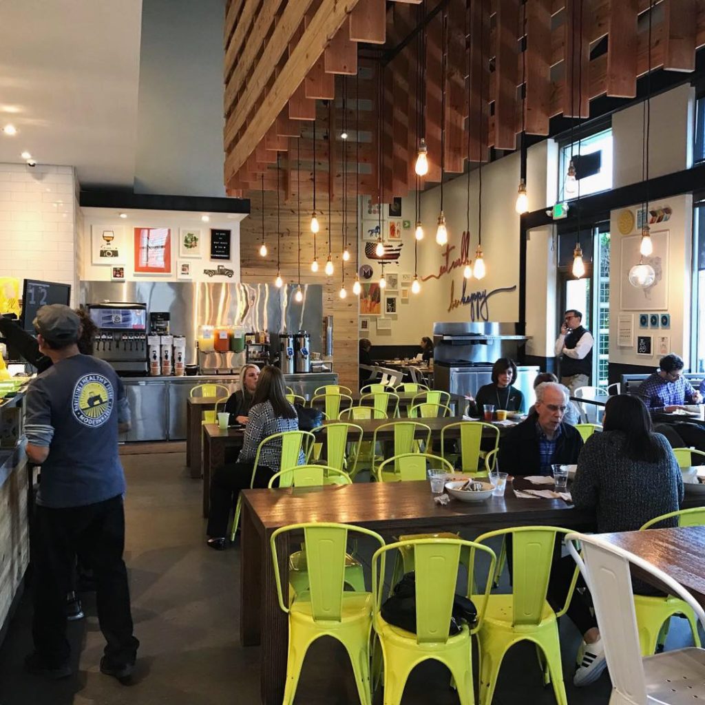
Dining Area 
Beverage Counter 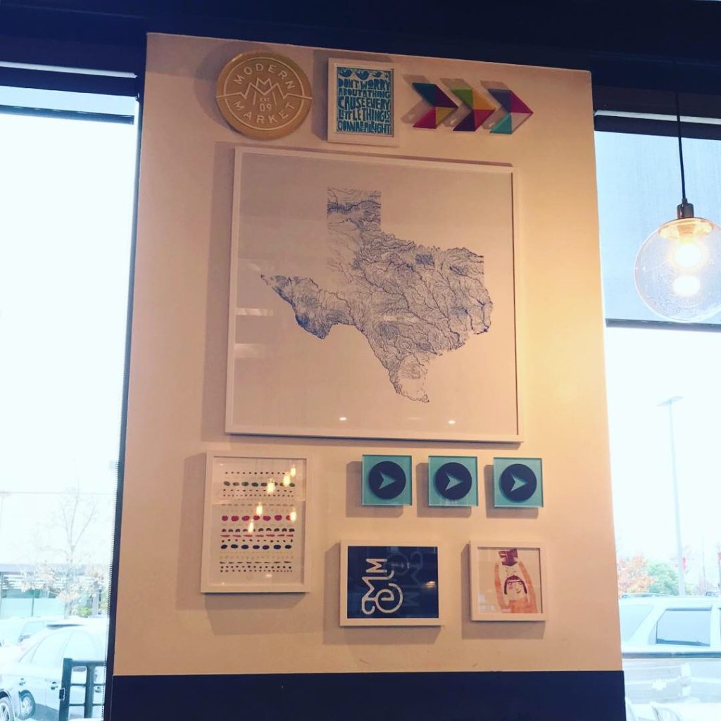
Interior Decor 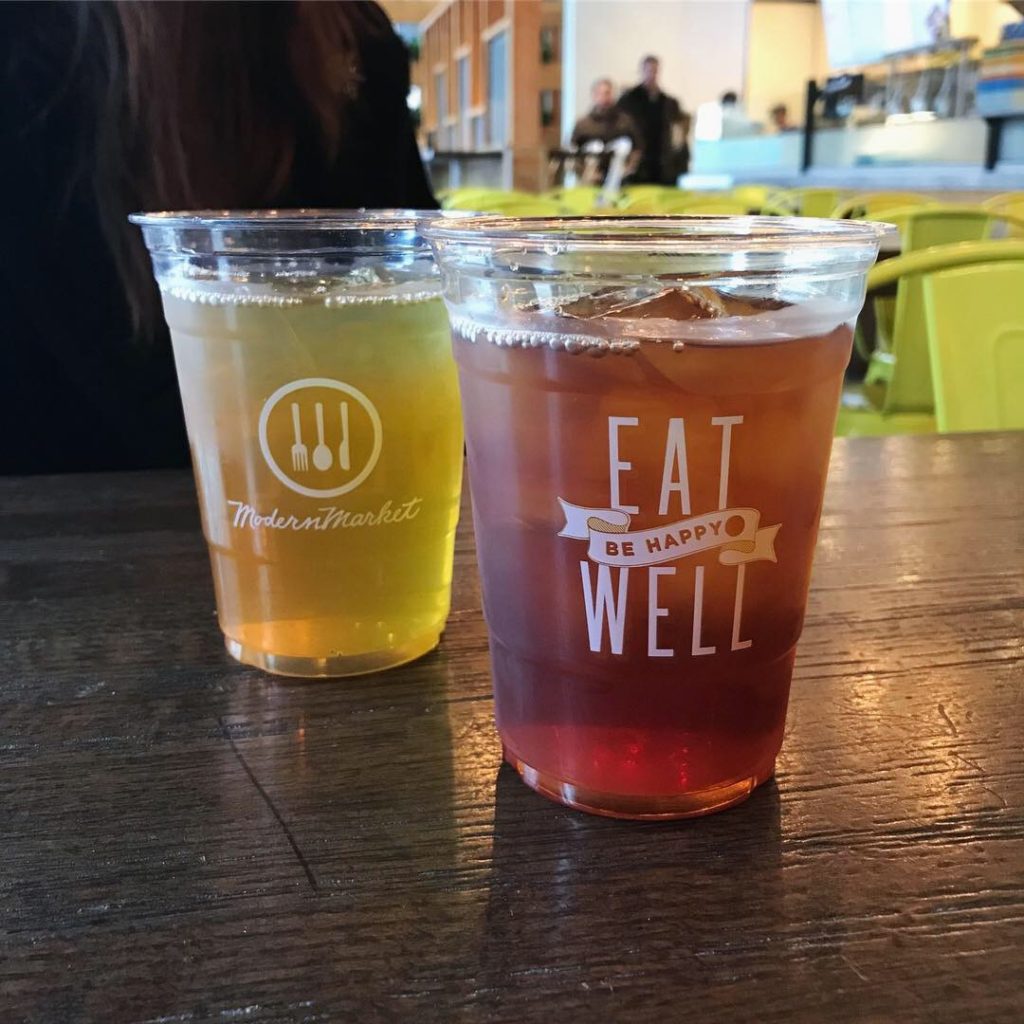
Beverage Branding 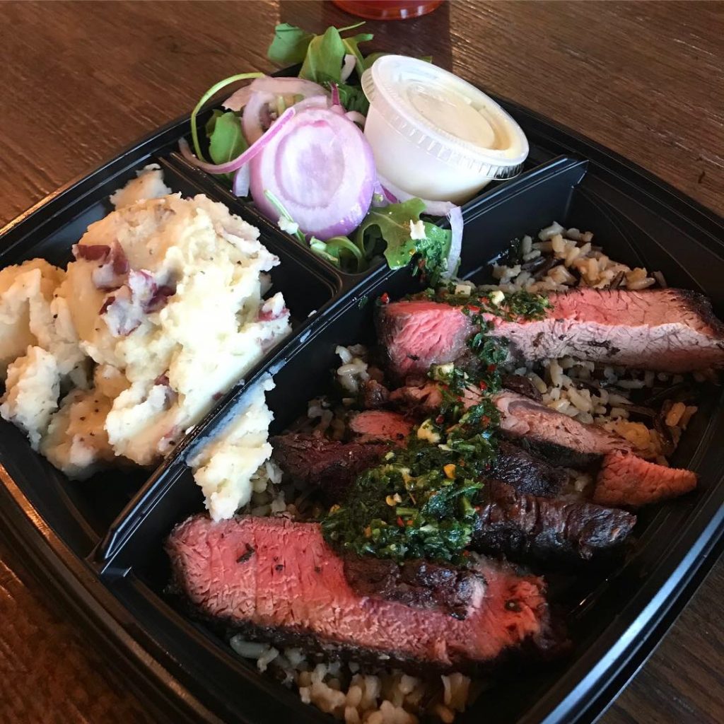
Herb Marinated Beef with Chimichurri 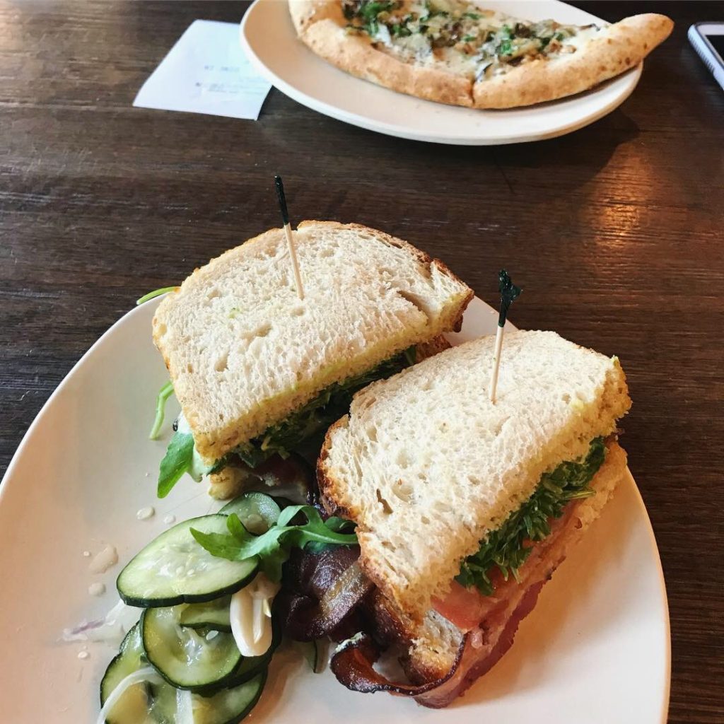
Tender Belly™ BLT+A


Recent Comments