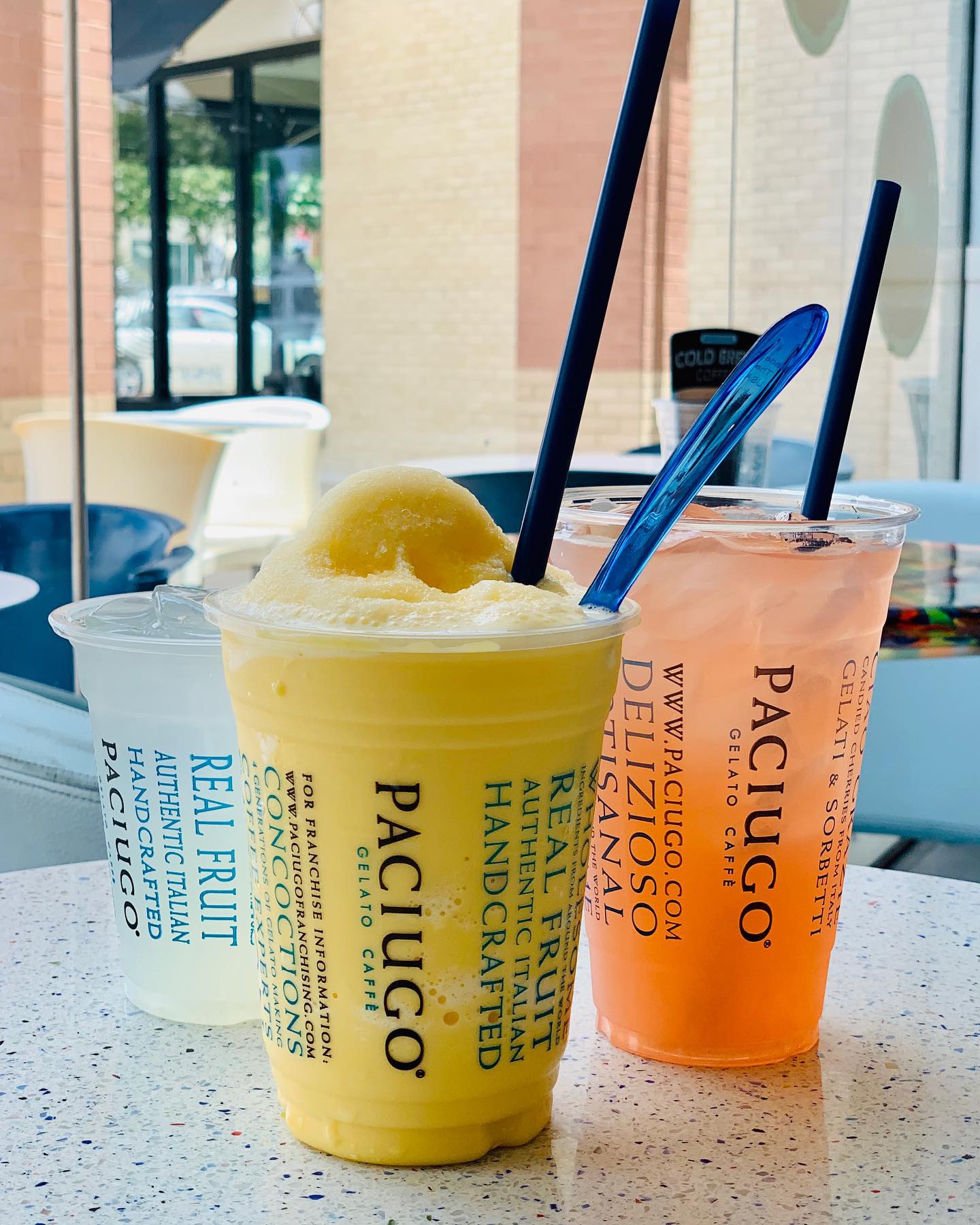
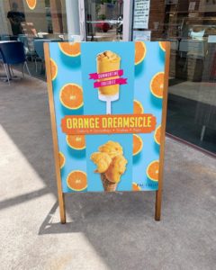
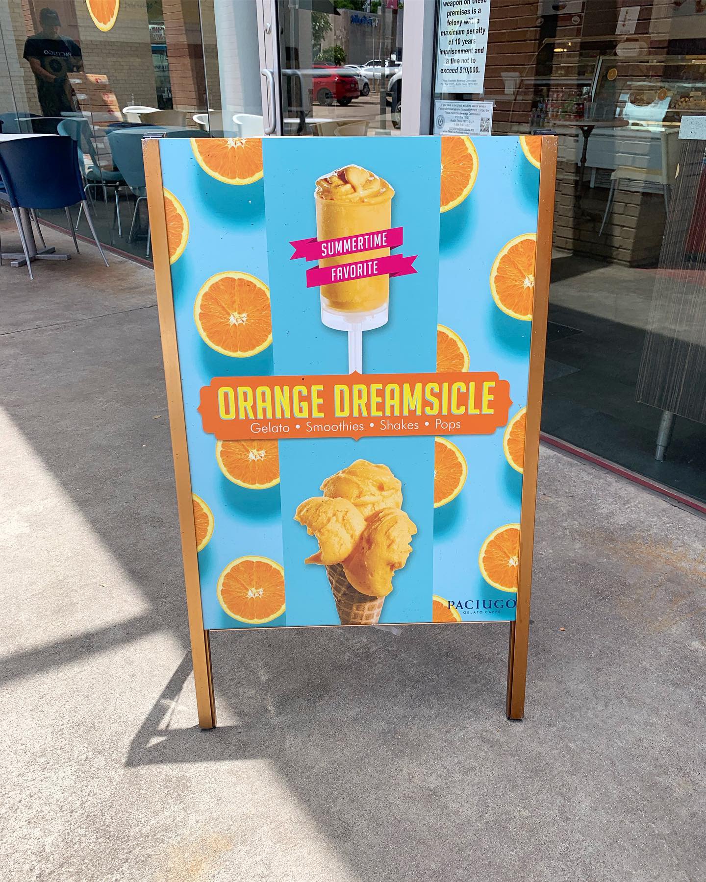
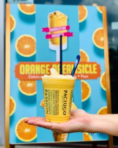
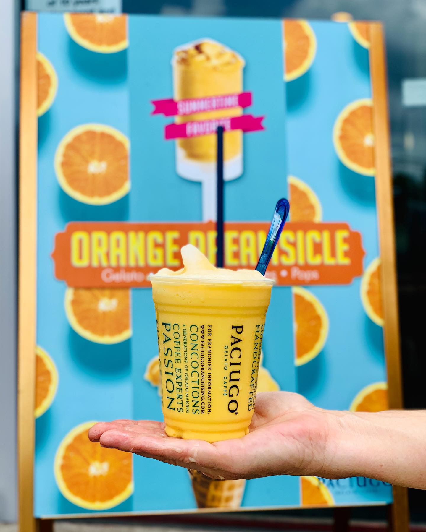
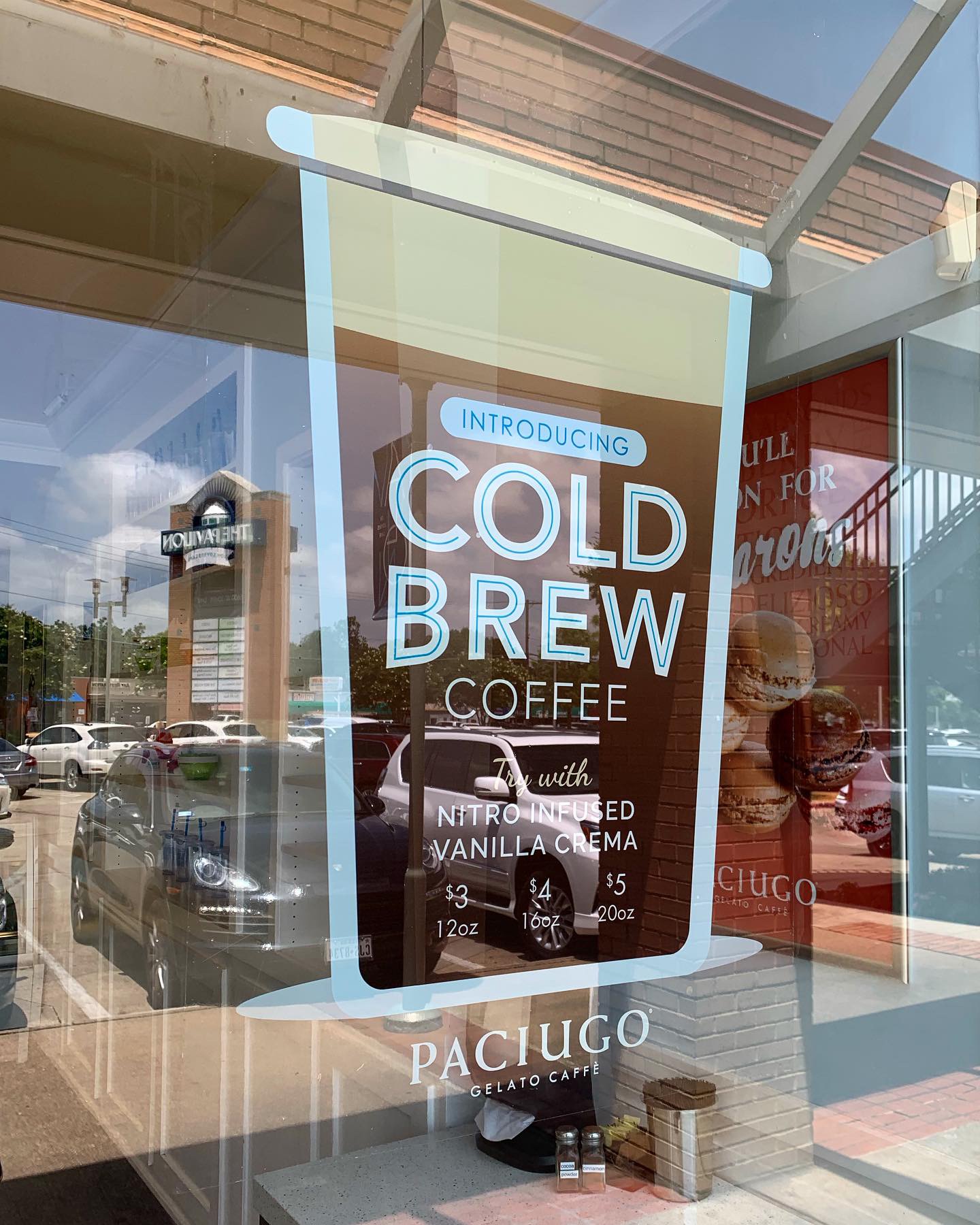
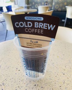
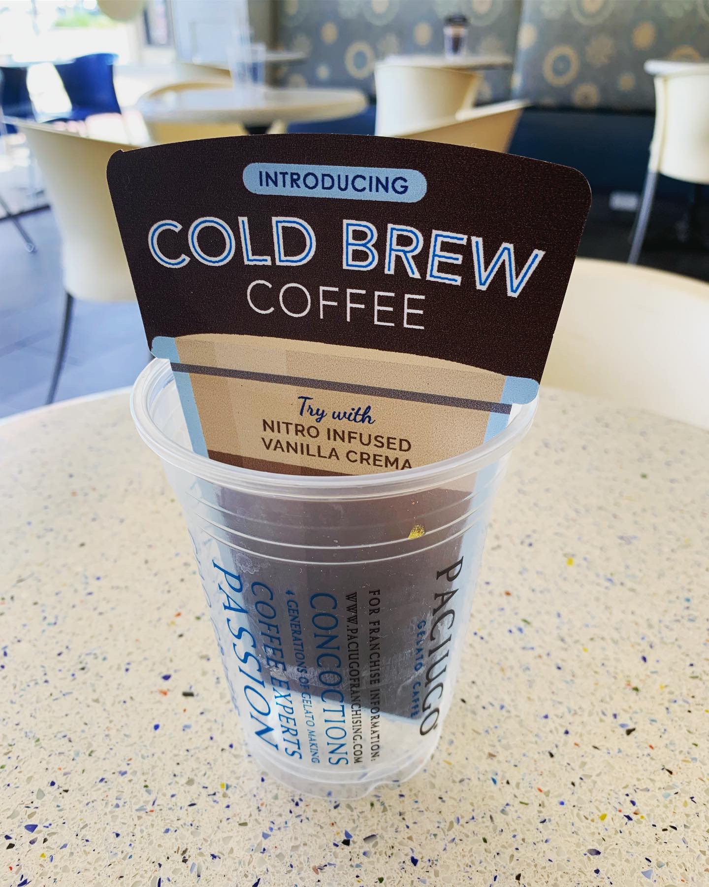
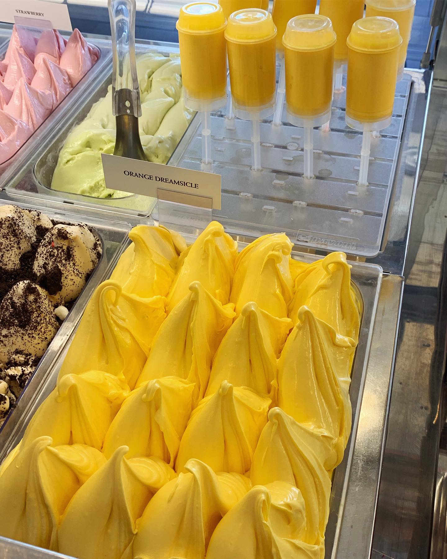
Shout out to our client Paciugo Gelato and the recent launch of the Orange Dreamsicle Gelato and Cold Brew Coffee promotions! Studio B designed all in store marketing materials for these campaigns. Go get yourself a Dreamsicle Pop or Gelato cone. It’s a summertime favorite!
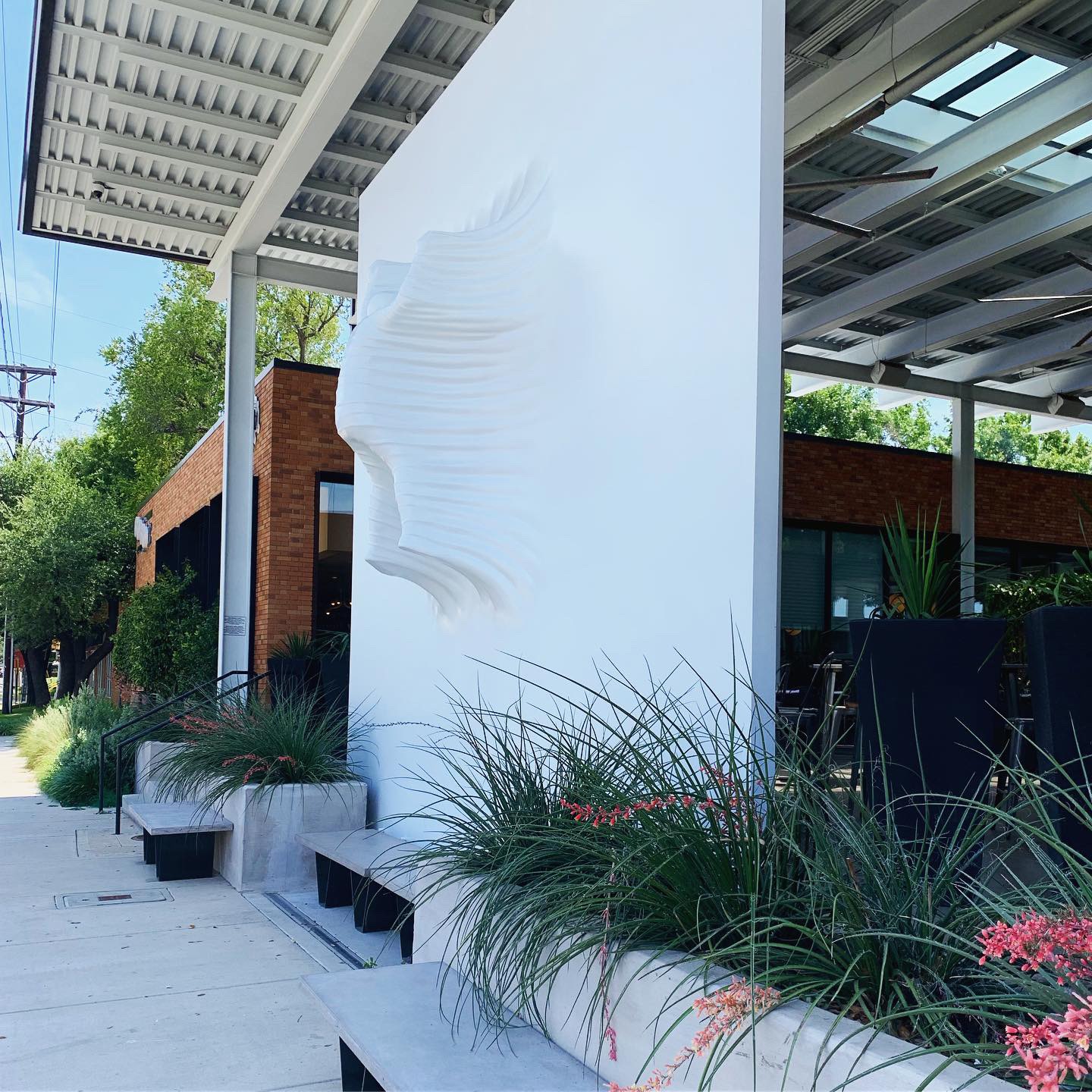
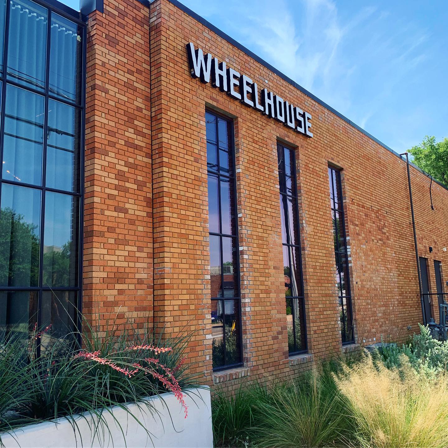
#FridayFeed happy hour edition! This week’s restaurant branding review is Wheelhouse located in the Design District.
This week MJ is on vacation, so Kinsey and I are taking over! Wheelhouse is located off of Oak Lawn and Hi Line in the Design District.
Order Up!
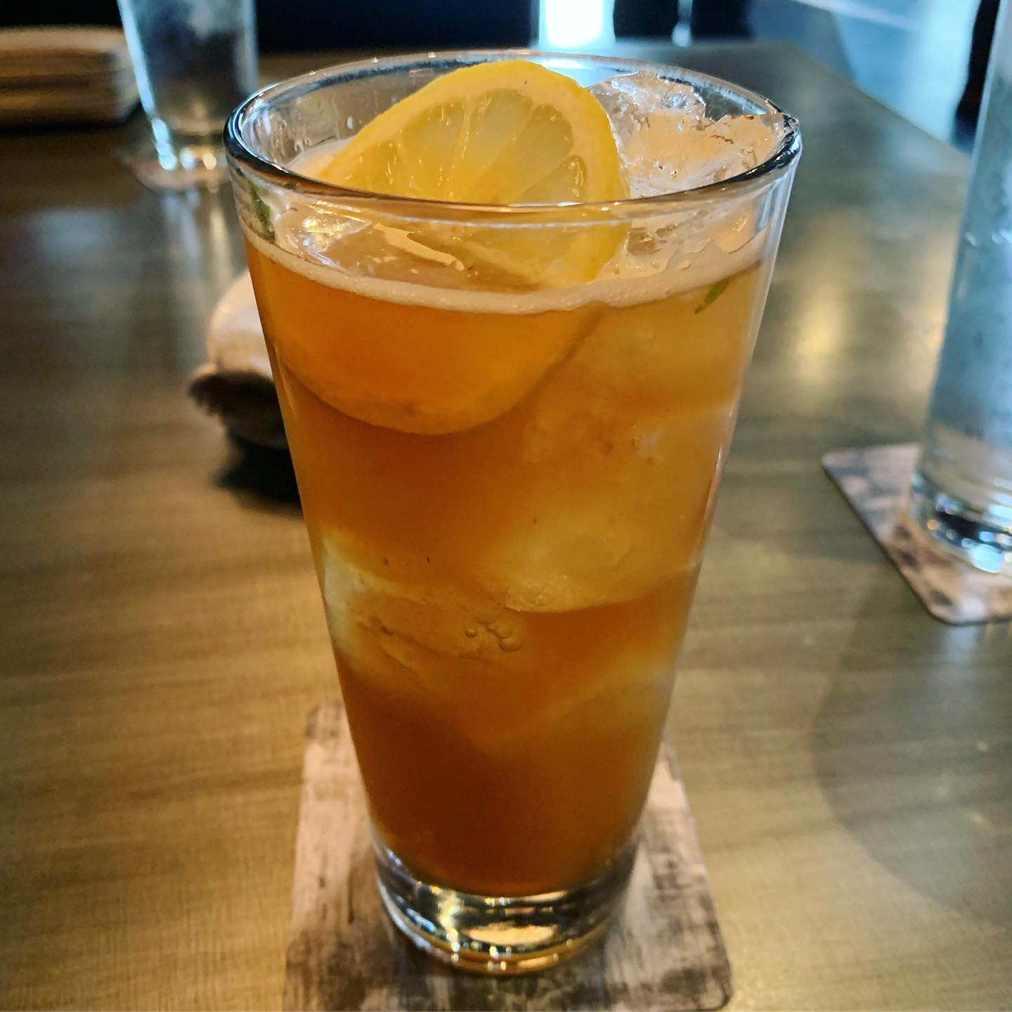
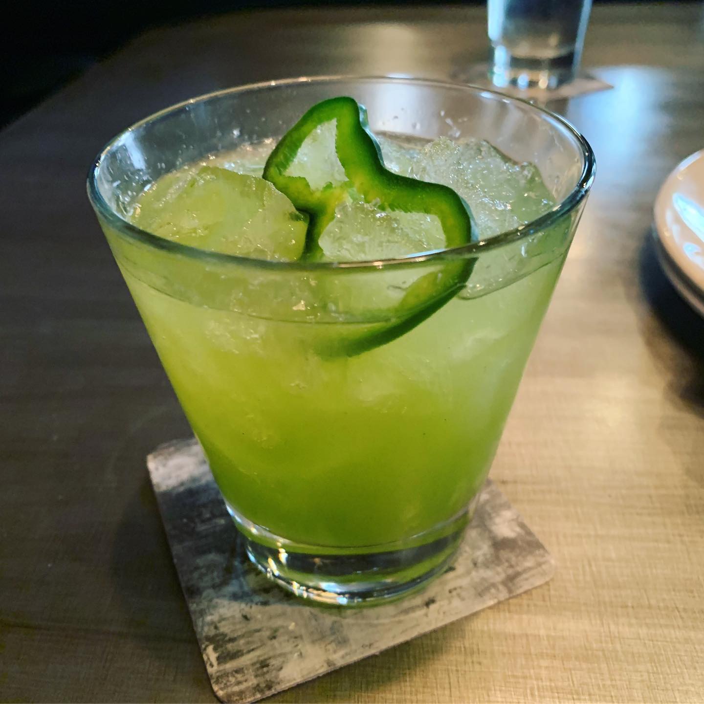
Let’s dive straight into the drinks! I ordered a Sippin’ Time – Texas sweet tea vodka, mint, lemon and club soda that come in a tall glass. It was the perfect drink to order for a hot summer day. Kinsey ordered a Kickstarter – a bright green drink with mezcal, poblano pepper, lime, pineapple and cumin bitters. Fair warning, this drink is not for everyone. If you don’t like the combination of sweet and smoky flavors, then this drink probably isn’t for you. The menu is a bit pricey, but I guess that’s to be expected given the location.
Environmental Branding:
Wheelhouse has a great industrial interior complete with large doors that span along one side of the exterior and open up to the outdoor shared patio space with sister brand Sassetta. A huge 18-foot all white art installation of a falling man, located on their patio, is arguably their most distinct feature aside from their refreshing cocktails. You can spot this enormous installation driving along Oak Lawn.
Score:
Overall, Wheelhouse is a great place to hangout and have a couple of drinks. Danny and Kinsey give it a solid A.
#FridayFeed:
Every Friday, Studio B Dallas visits a local fast casual concept for lunch to critique the brand (and eat lunch). Three rules apply: it’s a concept we haven’t been to or it’s been in the restaurant news and it’s within 10 miles of our office. Wait, four rules – it can’t be sushi. Danny doesn’t do sushi. If you have any suggestions on where we should eat next, feel free to leave it in the comments. Look for our restaurant branding reviews each Friday! MJ & Danny
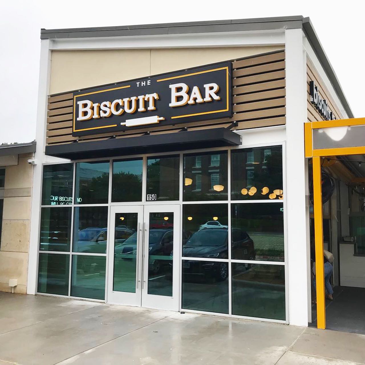
This week’s #FridayFeed restaurant branding review is The Biscuit Bar on Hillcrest near the SMU campus.
The Biscuit Bar has 1 other location in Plano and I’m guessing more on the way. They have a touchingly sad but inspirational story behind the concept. Go. Read. Grief to Gravy.
Order Up!
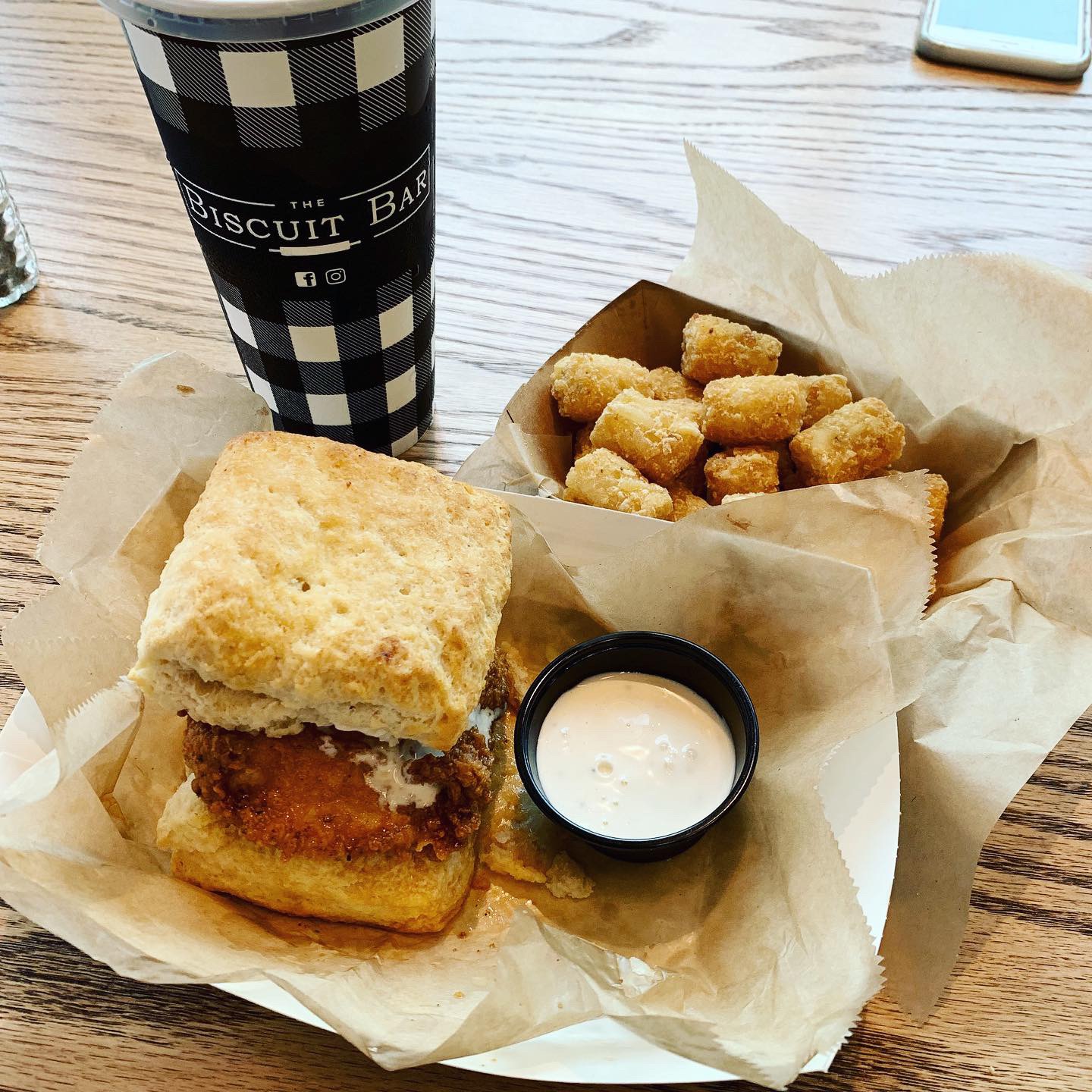
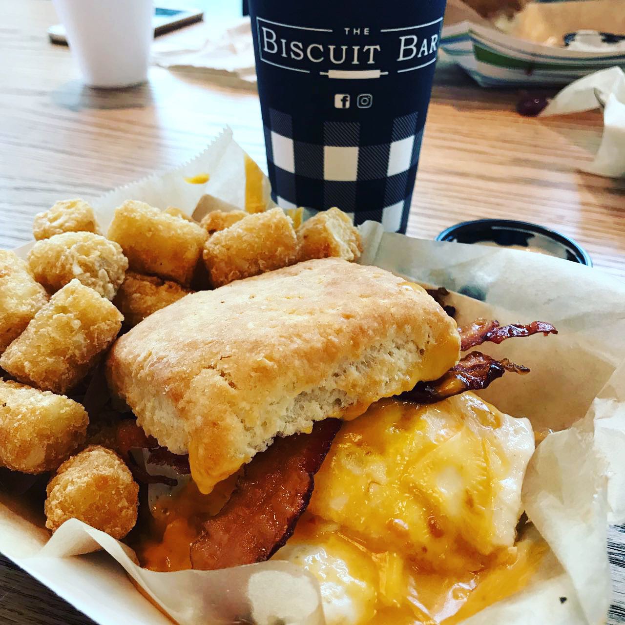
I was really excited to try The Biscuit Bar because I love southern food and I love biscuits. I didn’t have faith that the biscuit would handle like a bun so I went for the Bacon, Egg + Cheese with an extra egg and Tater Tots. Danny looked at the menu beforehand and he already knew he was getting the Hot Hot Chicken which is Nashville style hot chicken, dill pickles and house made ranch and Tots. Erin got the Monte Cristo minus the ham. It had a giant portion of smoked turkey, jack cheese on a french toast biscuit with strawberry jam and the sweet potato Tots. We all agreed that the biscuits were good. We weren’t super impressed with the rest though. When you name something HOT HOT Chicken – it should be smokin’ hot spicy – otherwise, just use one HOT, right? It was seasoned nicely but was not spicy. My Bacon Egg(s) and Cheese was just ok – did not love the cheese – I think it was a slice of American – could have used a sharp cheddar. I did save my top biscuit to try a side of sausage gravy and Strawberry preserves. The preserves were really good. Erin’s Monte Cristo kind of fell apart on the first bite so a little messy. All in all – the food was ok but unlike the awesome plating at Whistle Britches, the food was served in paper boats with tissue and plasticware which downgraded the presentation. I like the concept, I just think the biscuits are almost too small to make a “meal” sized “sandwich” but maybe too large to work like sliders. I think if you kept the biscuits a little smaller and served on a plate you could encourage ordering 2 or 3, kind of like tacos. More fun, more sales. Just my opinion.
Environmental Branding:
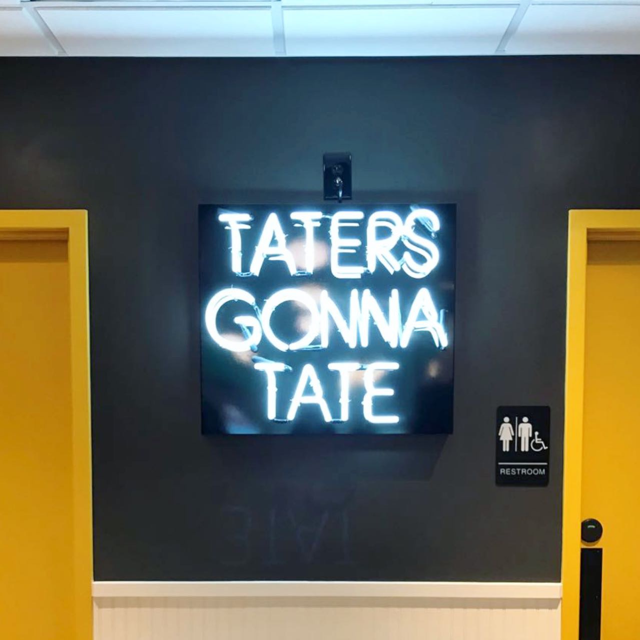
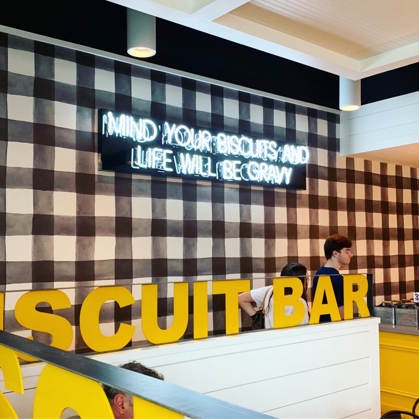
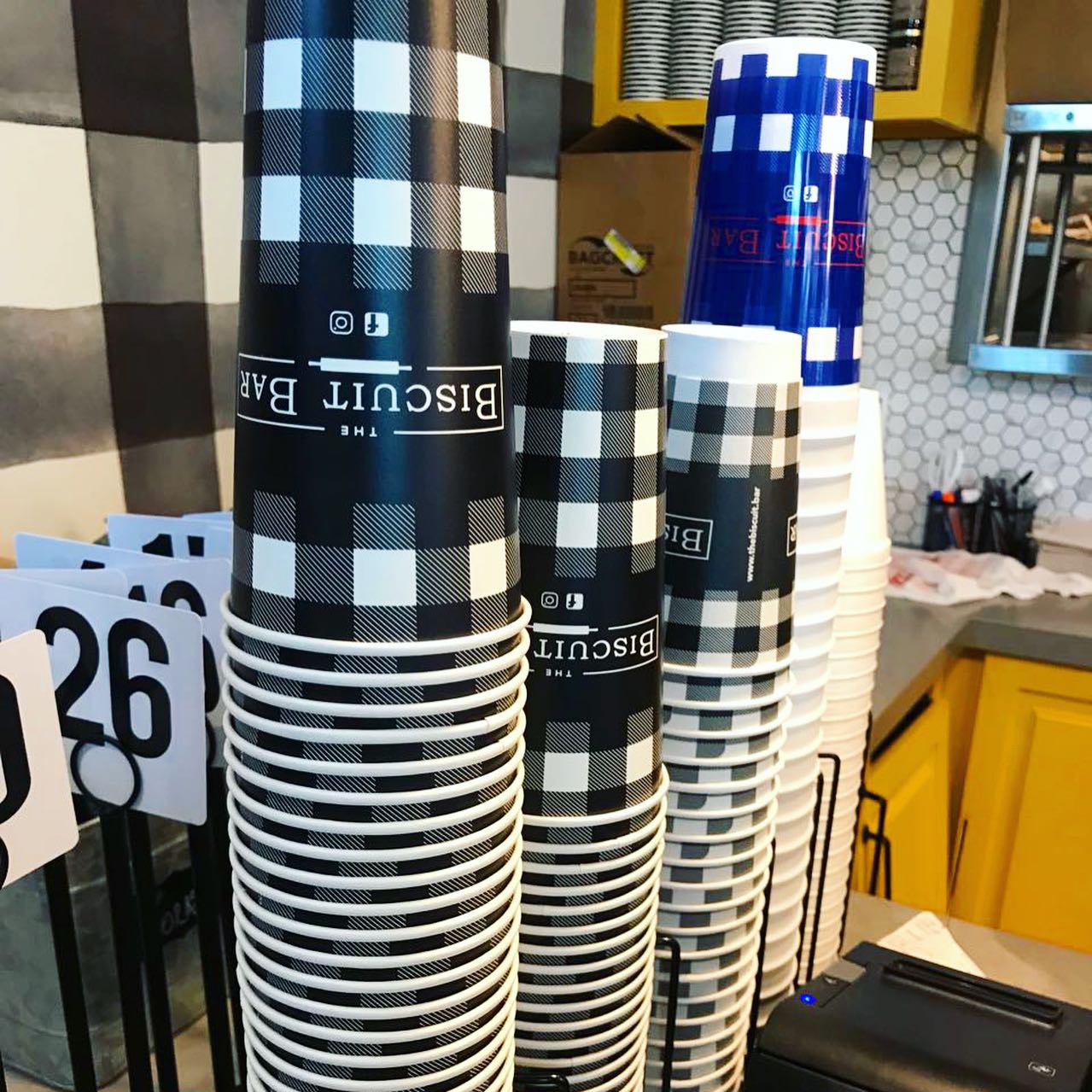
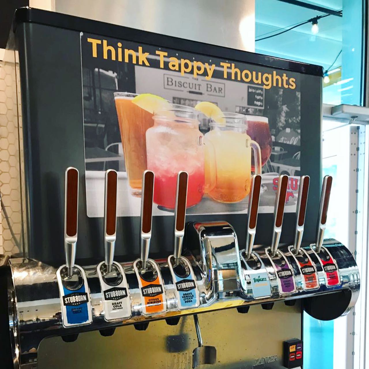
The interior is super cute. There’s a bar, nice indoor and outdoor patio seating, big yellow garage doors to separate the two. A cool Stubborn Soda drink machine with pull handles which is fun. You could tell immediately that there was a quality design shop behind this brand and shocker…Plan B Group gets the honors. You guys rock – Studio B is continuously proud to be sometimes confused with you! Luscious creamy egg-yolk yellow cabinetry details, super cute oversized black & white gingham check wallpaper, farm style tables, butcher block tables, ship lap plank walls and lots of great neon sayings on the walls. TATERS GONA TATE…that’s so clever!
Branding DNA:
Cute name, nice logo, great colors and brand assets. Custom printed cups – love all of that. Branding is spot on.
Digital Branding:
The Biscuit Bar does a great job at social media content. Both their Instagram and Facebook have beautiful food photography mixed with fun and family lifestyle imagery. Their website is easy to navigate and has a fun neon vertical scrolling banner at the top of their homepage. Overall, they have great digital branding! –Danny
Score:
MJ and Danny give it an A for branding and generously, a B- for food.
#FridayFeed:
Every Friday, Studio B Dallas visits a local fast casual concept for lunch to critique the brand (and eat lunch). Three rules apply: it’s a concept we haven’t been to or it’s been in the restaurant news and it’s within 10 miles of our office. Wait, four rules – it can’t be sushi. Danny doesn’t do sushi. If you have any suggestions on where we should eat next, feel free to leave it in the comments. Look for our restaurant branding reviews each Friday! MJ & Danny
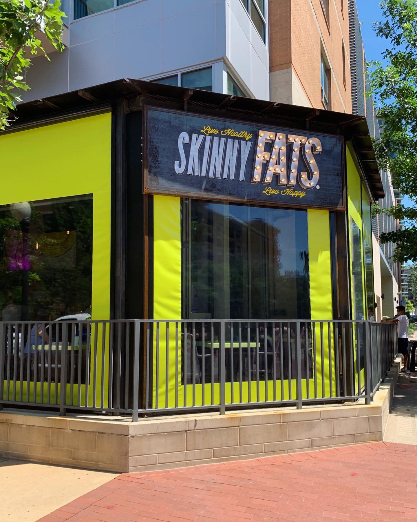
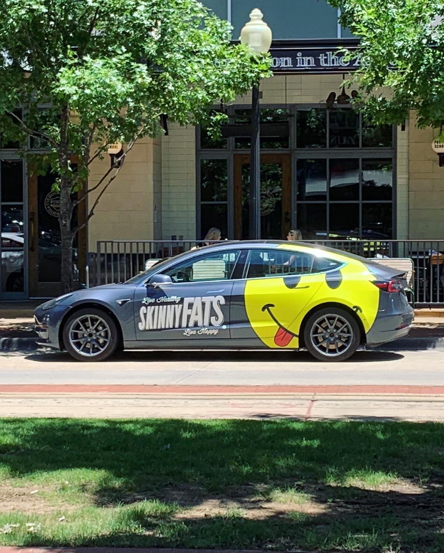
This week’s #FridayFeed restaurant branding review is SkinnyFATS in Uptown (Dallas).
Order Up!
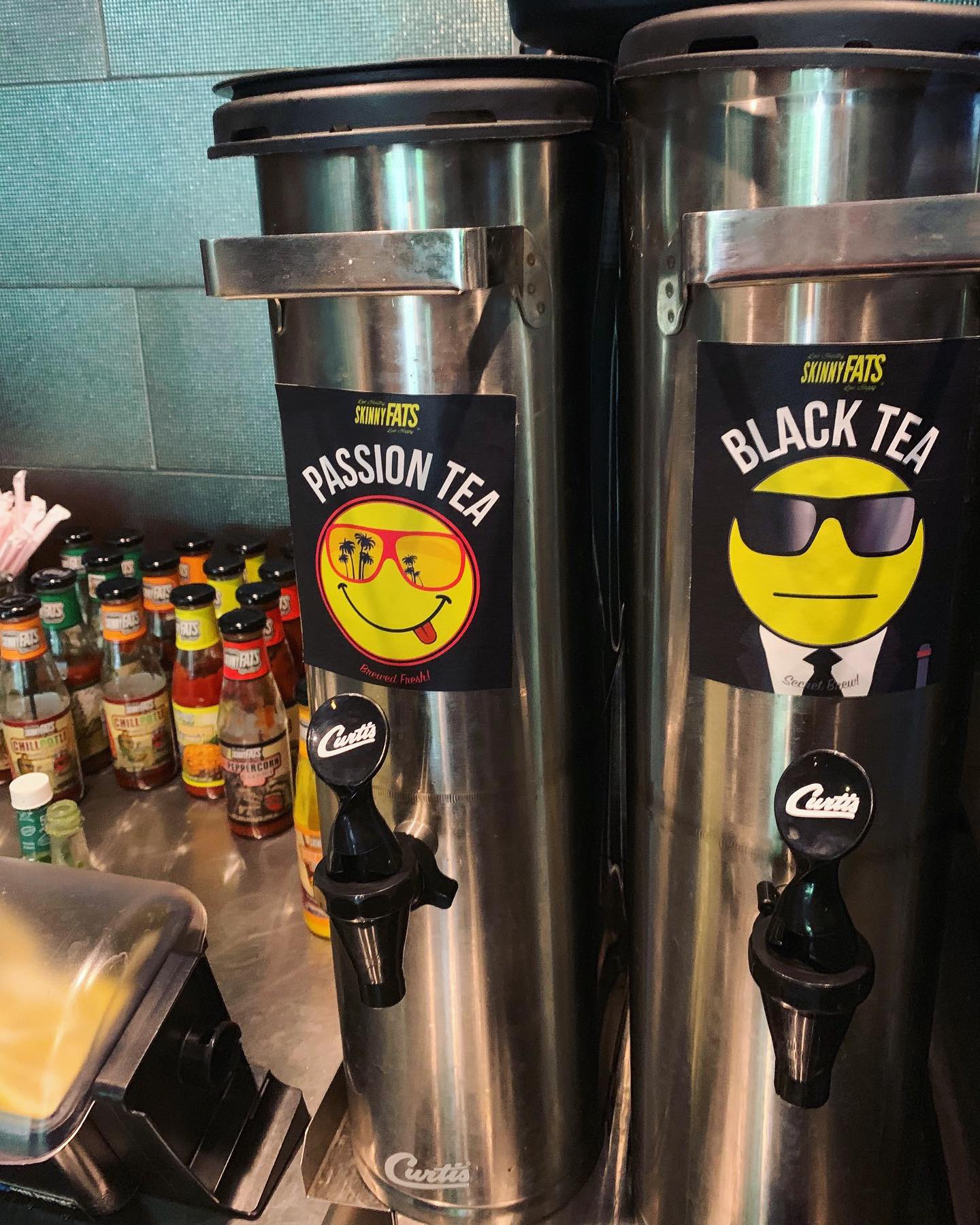
They have 6 locations in Nevada, 1 in Dallas and one coming soon to Salt Lake City. Their tagline is Live Healthy, Live Happy and their primary brand icon is a happy face emoji which they have incorporated into custom paintings, drink cups, custom paper straws, tray liners, etc.
Per QSR Magazine article, the story is “the consultant-turned-restaurateur chose to split the menu in two: the Healthy Side with 600 calories or less per item, and the Happy Side, which is more about taste than calorie counting. His chef consultants had health-food backgrounds, but with the location being in a very industrial area of Las Vegas, Slobusky knew the concept needed to serve both the working man and the indulgers, too.” The menu reminded me of the Larry North North/South concept where you could choose the healthy version of a menu item or you could get it “fattened” up a bit. In fact, each section of the menu is divided into a “healthy side” and a “happy side”. The menu is a great mix of foods and the menu items have great names. Offering both healthy and happy is a great cure for avoiding the “veto vote” when someone in the group just won’t buy in to going somewhere that has only healthy or only happy foods.
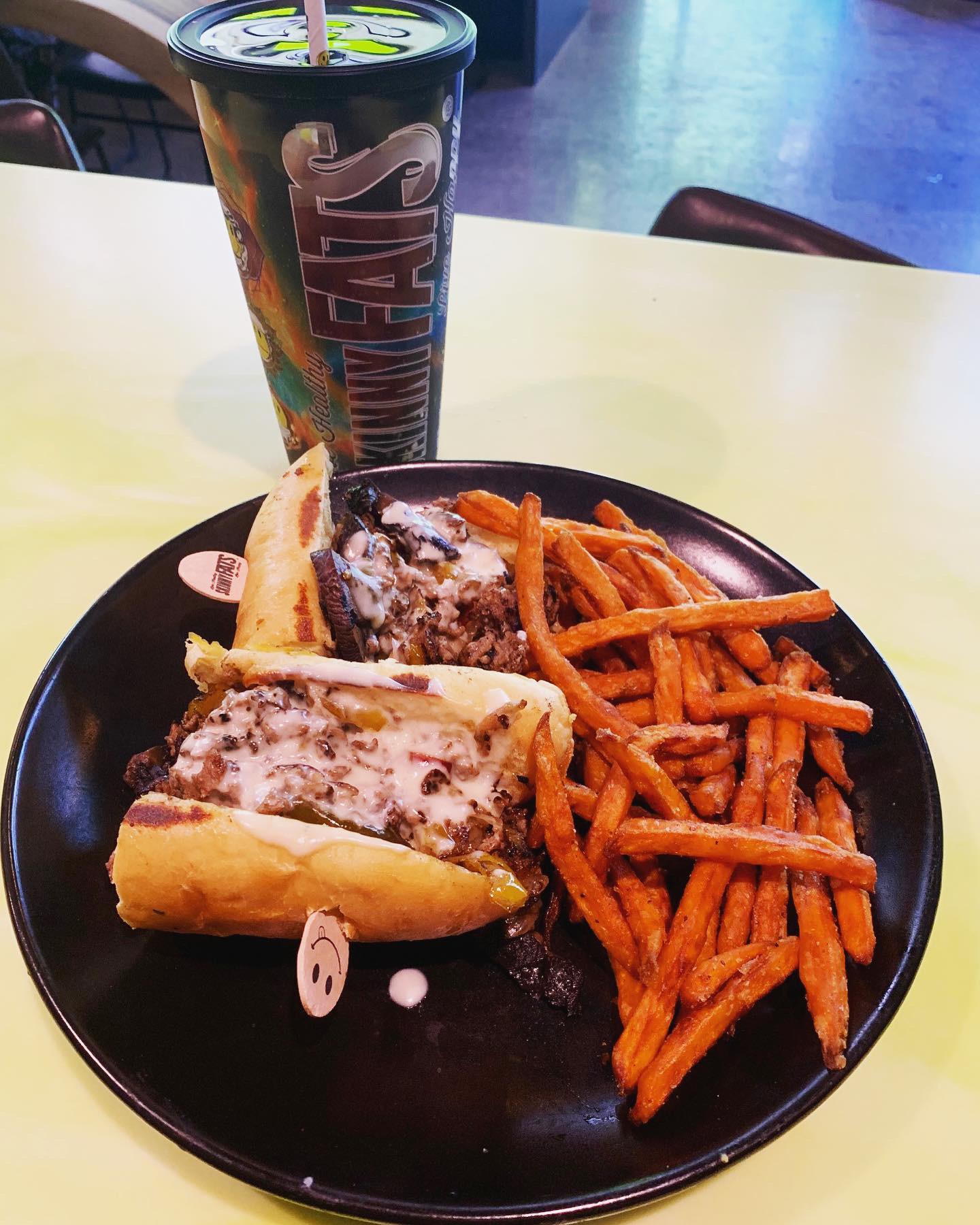
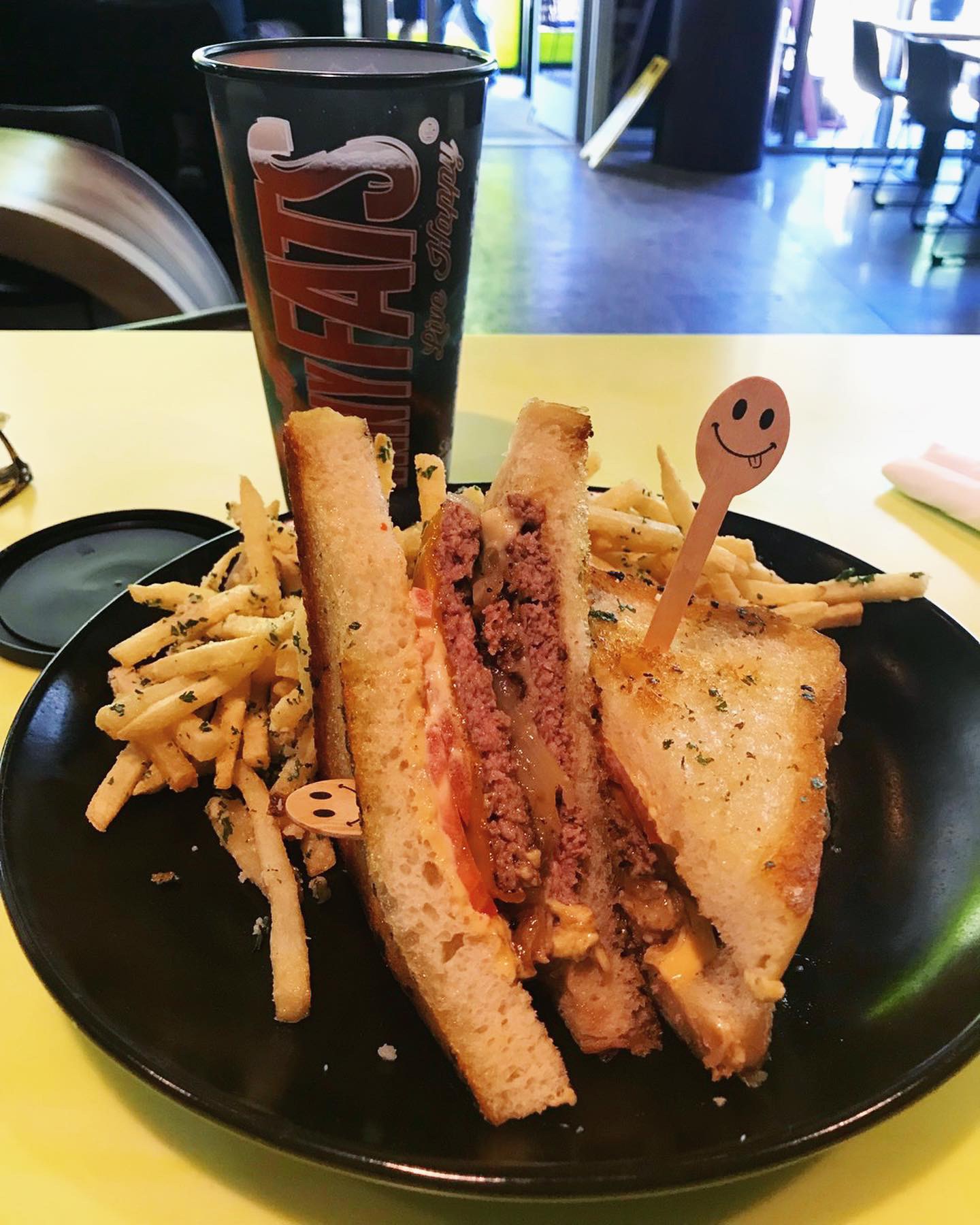
I was looking for the fattest thing I could find because butter and cheese makes me really happy. I stepped up to the counter service bar and ordered the Meltdown. Two 1/4 lb beef patties, cheddar, provolone, caramelized onions, tomato, spicy aioli on grilled sourdough bread that was so buttery and crispy. Got the truffle fries as the side. Danny ordered the Sweet Cheese Us with shaved steak, pepper marmalade, caramelized onions, pepper jack, portobello and cheddar sauce on a hoagie with sweet potato fries. The hoagie bun didn’t hold up past the first bite but it looked really tasty. Other fun menu names include the Cranburkey, Steakation, Cherry Popper, Yummus and pre Birds (deviled eggs – clever but I don’t like to think about my eggs turning into birds really). I want to go back and try the S’motherload breakfast with filet mignon, sausage, fajita pepper, potato & egg burrito, cajun cheddar sauce and pico. Sorry – I know I haven’t really talked about the healthy items on the menu – you can go find those later. They offer Vegan, Vegetarian, Gluten Free and lots of HOT stuff – love that.
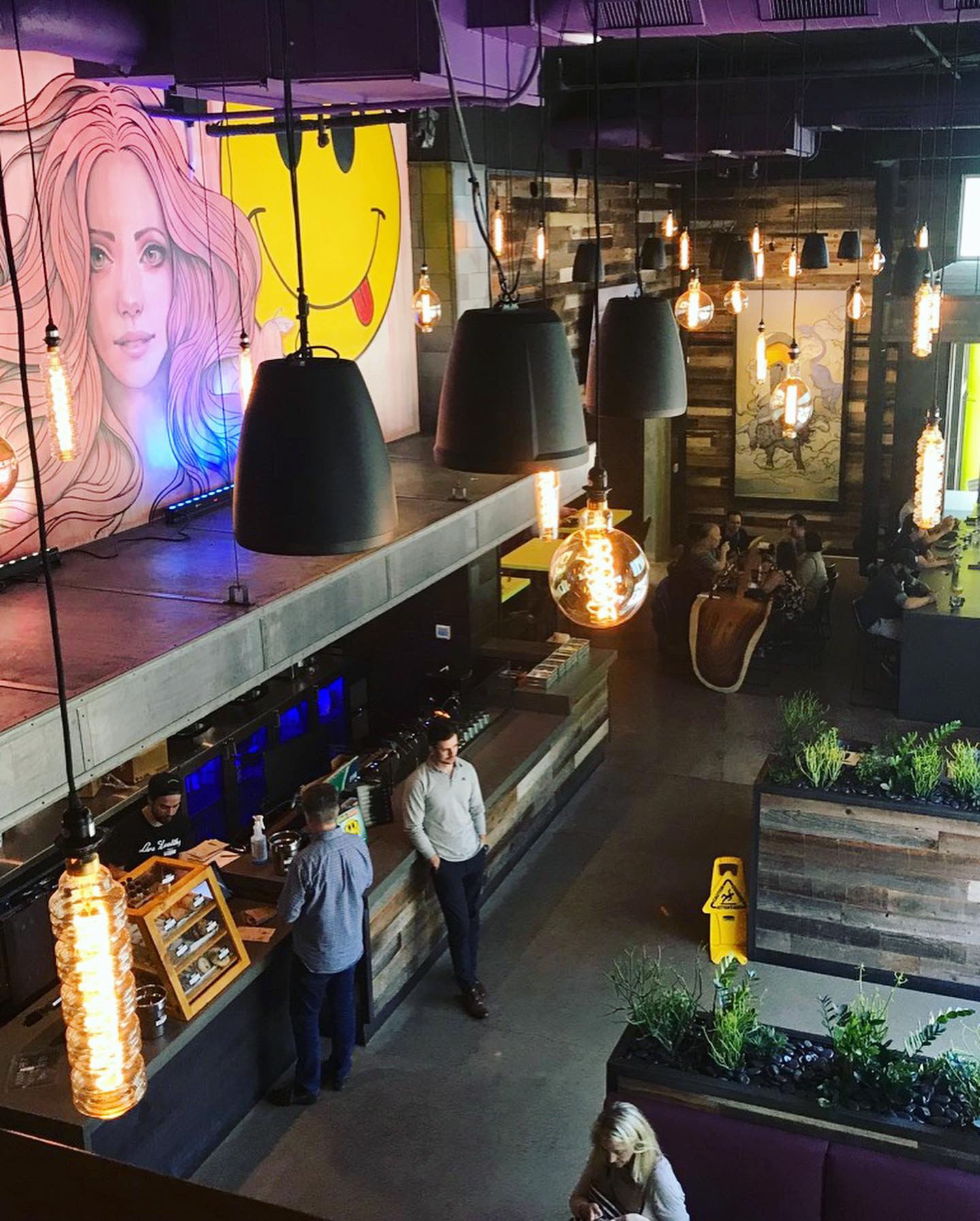
Environmental Branding:
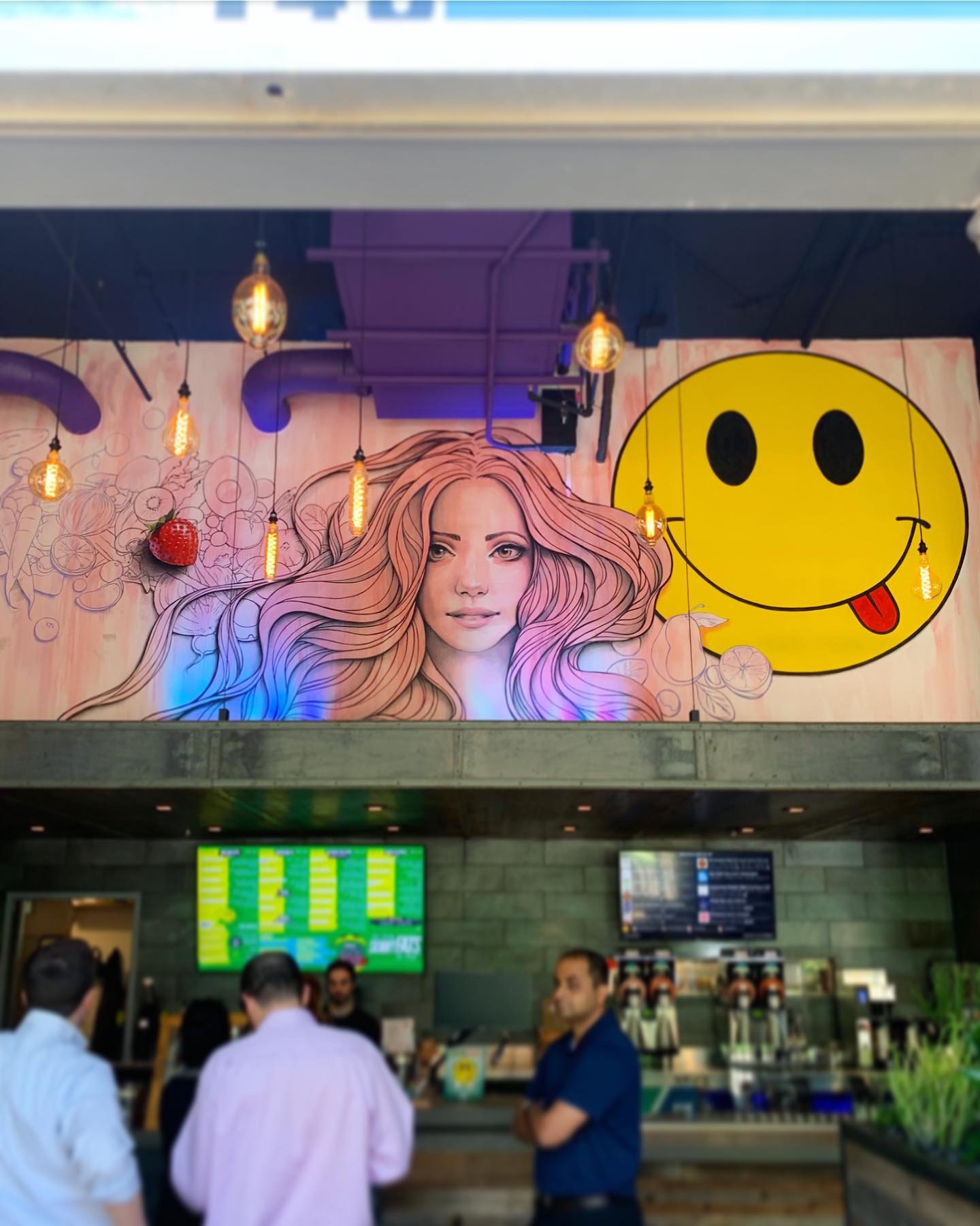
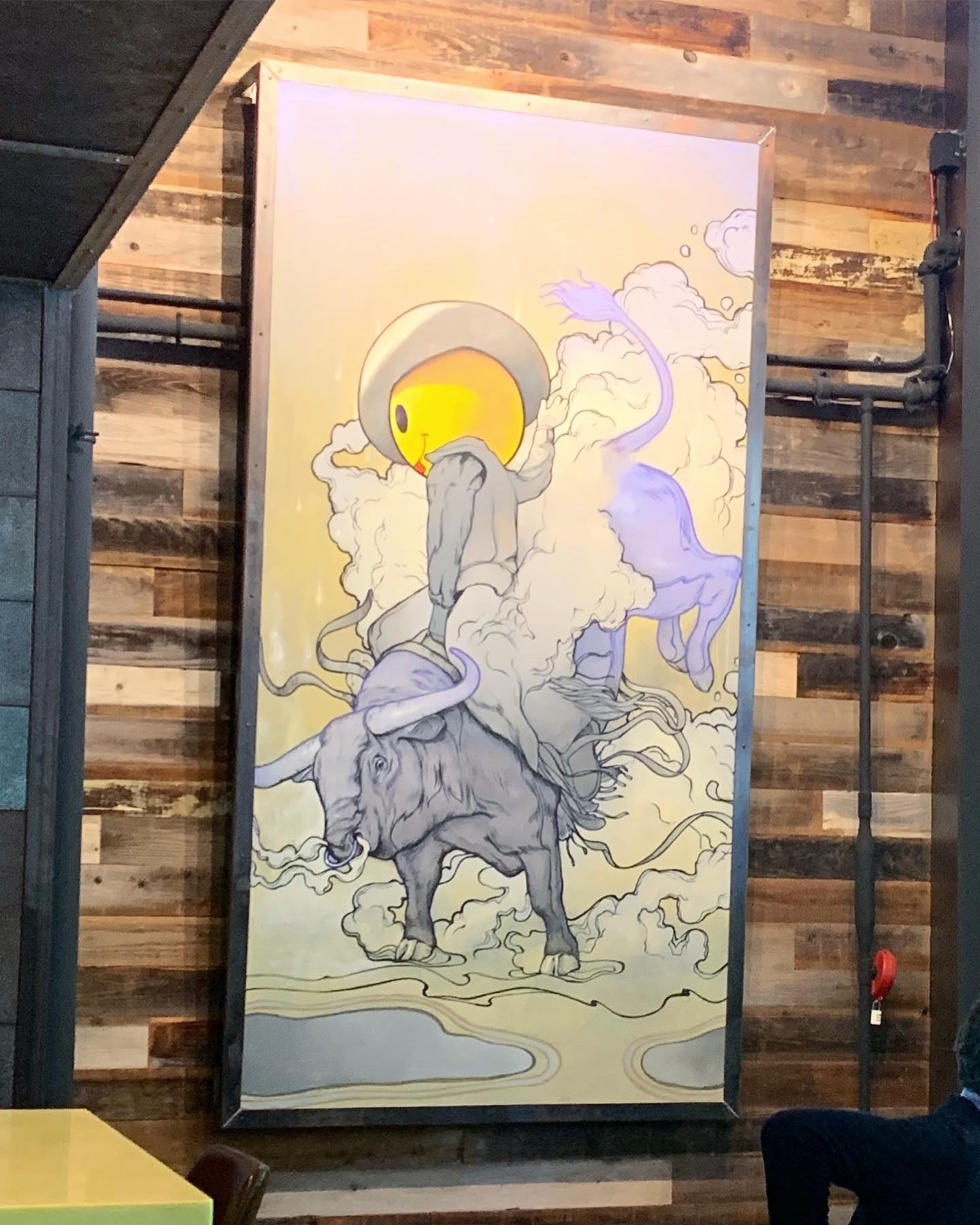
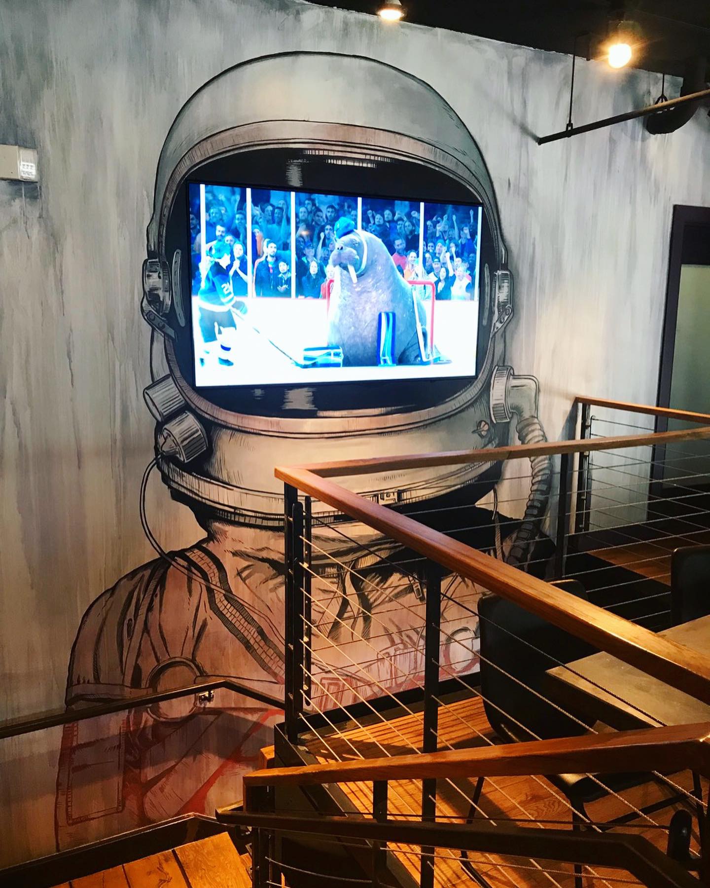
SkinnyFATS in Uptown (Dallas) was designed by LEBODESIGN. The decor elements in the Dallas location are primarily industrial with reclaimed wood and lots of steel coupled with live edge tables, giant edison bulbs, big TVs and as I mentioned before, custom paintings and artwork that are really crazy – kind of Salvador Dali-esque. Two items worth mentioning are the live edge table that looks like its drips to the floor (where did they get that???!!) and the giant TV inside of a space helmet painted on a two story wall mural in the stairwell to the loft seating area that overlooks the main dining room. They clearly have a lot of fun with their environment design and maybe just maybe, they enjoy some form of mood enhancing drugs when they sit down to brainstorm ideas. Where the ideas come from or why doesn’t really matter, it’s part of the fun. It is a great example of an instagram brand!
Branding DNA:
Strategically speaking, the name SkinnyFATS is a good description for the brand. The logo isn’t anything earth shattering or genius, but it works for the brand. Their smiley face reminds me of the old Nirvana logo. In fact, they even have shirts and stickers that highlight this resemblance.
Digital Branding:
SkinnyFATS has a website that is both easy to navigate and user friendly. The G.O.T.M. (Guest Of The Month) highlights specially selected guests from one of their various locations and is a great way to give their guests more of voice. Their Instagram and Facebook focus heavily on their beautiful food photography and feature the Guest Of The Month. Overall, they have awesome digital branding that primarily focuses on their food and the customer. –Danny
Score:
MJ and Danny give it an A.
#FridayFeed:
Every Friday, Studio B Dallas visits a local fast casual concept for lunch to critique the brand (and eat lunch). Three rules apply: it’s a concept we haven’t been to or it’s been in the restaurant news and it’s within 10 miles of our office. Wait, four rules – it can’t be sushi. Danny doesn’t do sushi. If you have any suggestions on where we should eat next, feel free to leave it in the comments. Look for our restaurant branding reviews each Friday! MJ & Danny


Recent Comments