

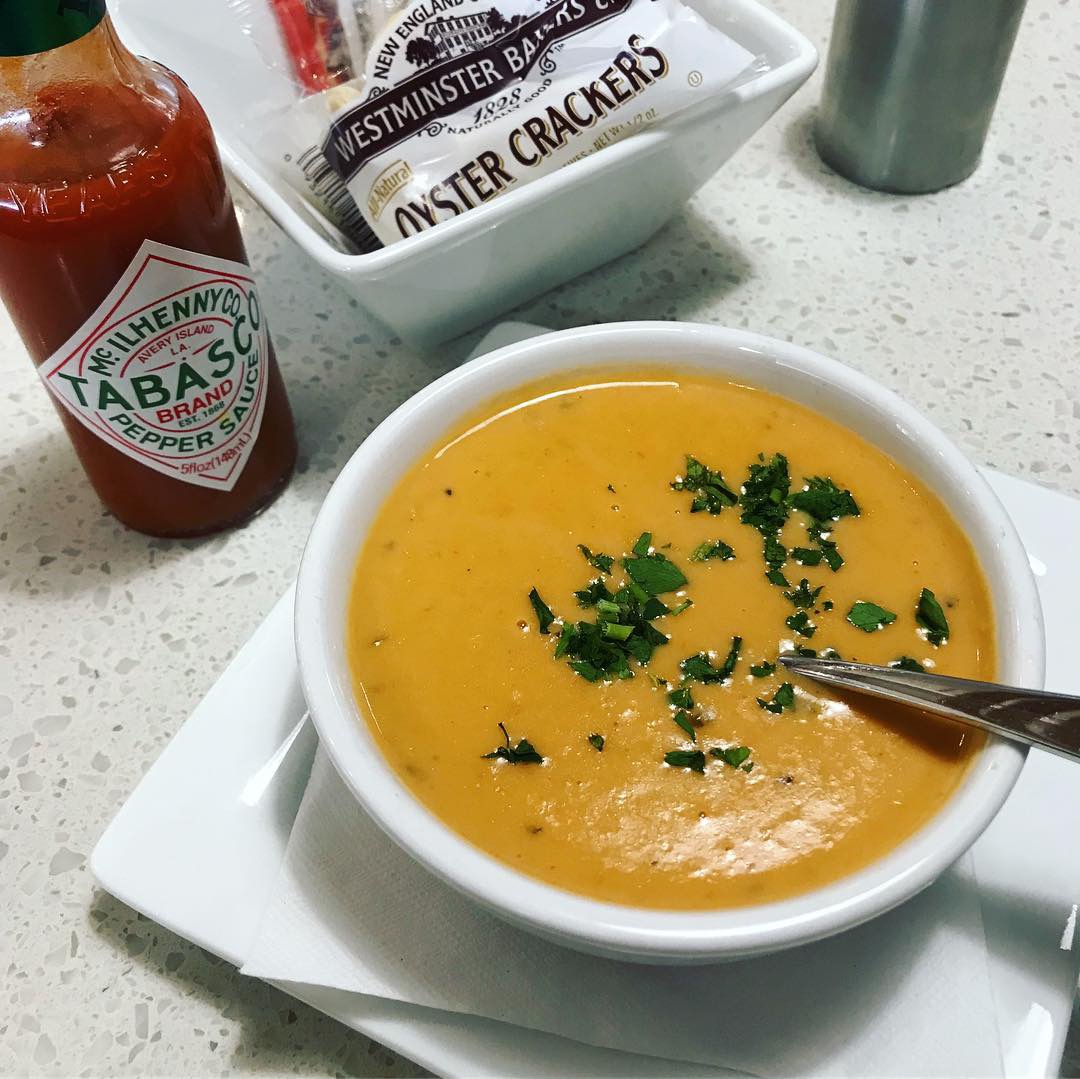
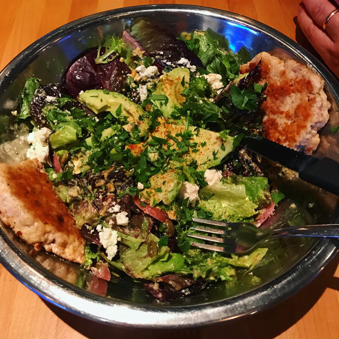
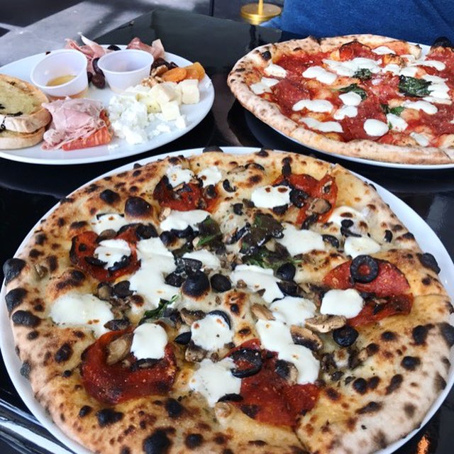
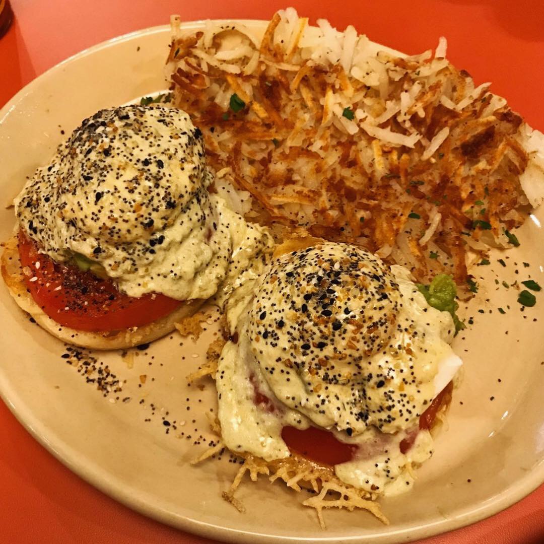
Farmstand Salad
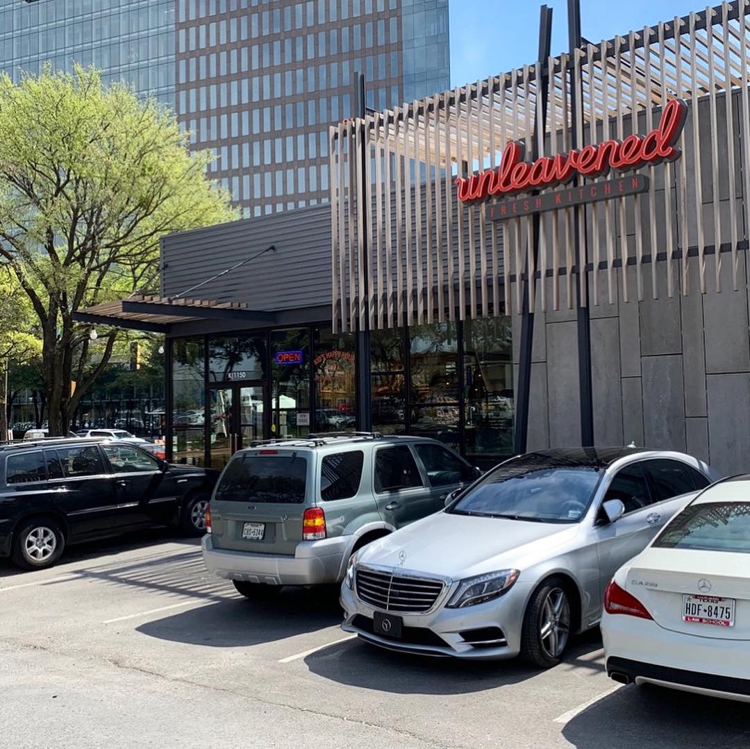
This week’s #FridayFeed restaurant branding review is Unleavened fresh kitchen at 75 and Walnut Hill in The Hill Shopping Center.
Order Up!
Unleavened Fresh Kitchen has 4 locations in Dallas. I have to start by saying I don’t love the name. It starts with “UN” and I don’t know that I have ever craved unleavened bread. It just doesn’t make me hungry. I know the name includes fresh kitchen but people don’t read so… (That’s not snark folks, I know people don’t read). The logo on the other hand, I really like. A nice fun script face in my favorite color, orange.
While I wasn’t really in the mood for something healthy, our office neighbor Erin, who reviews with us on occasion was really wanting to go there. She said all of her friends LOVE it. I believe it does skew toward the female crowd and I found out why all of Erin’s friends love it so much – free kids meals EVERY DAY after 4pm (dine in, with adult meal, 12 and under). I don’t have kids at home anymore so I don’t care about kids meals or people with kids, hahahaha – That is definitely snark – if you missed it.
Food:
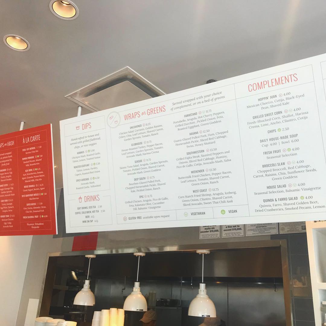
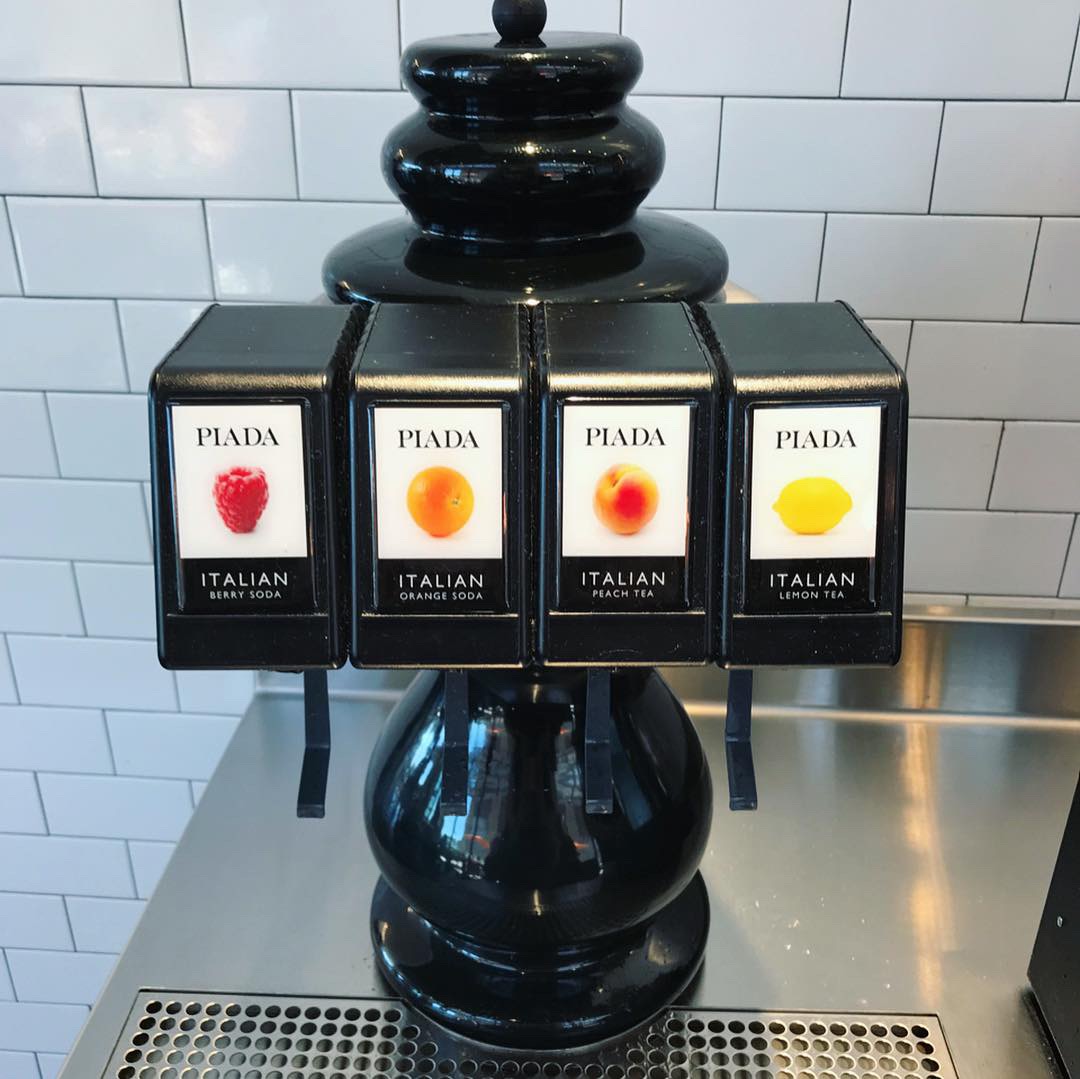
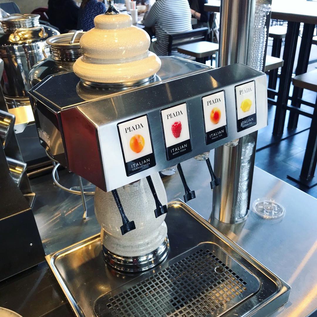
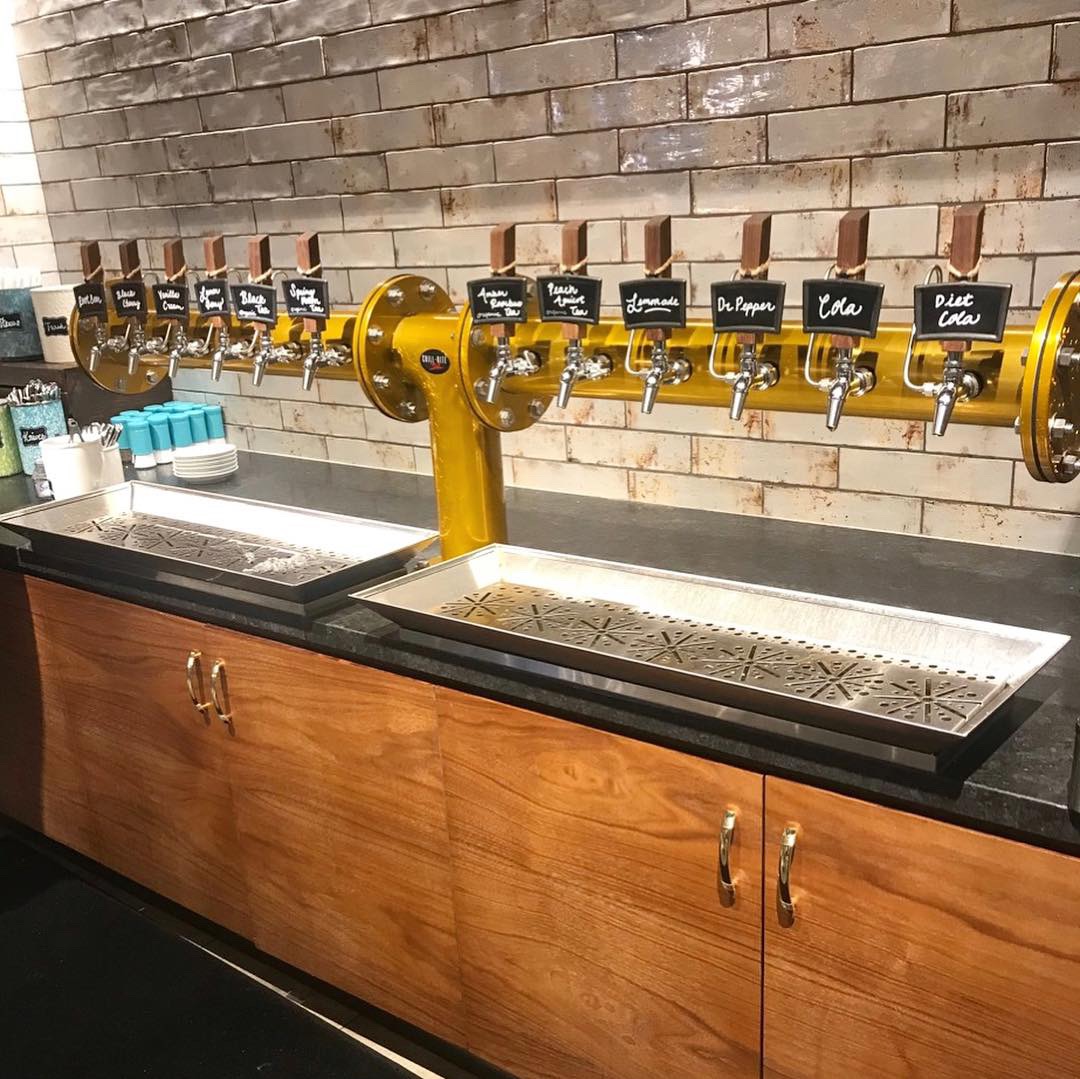
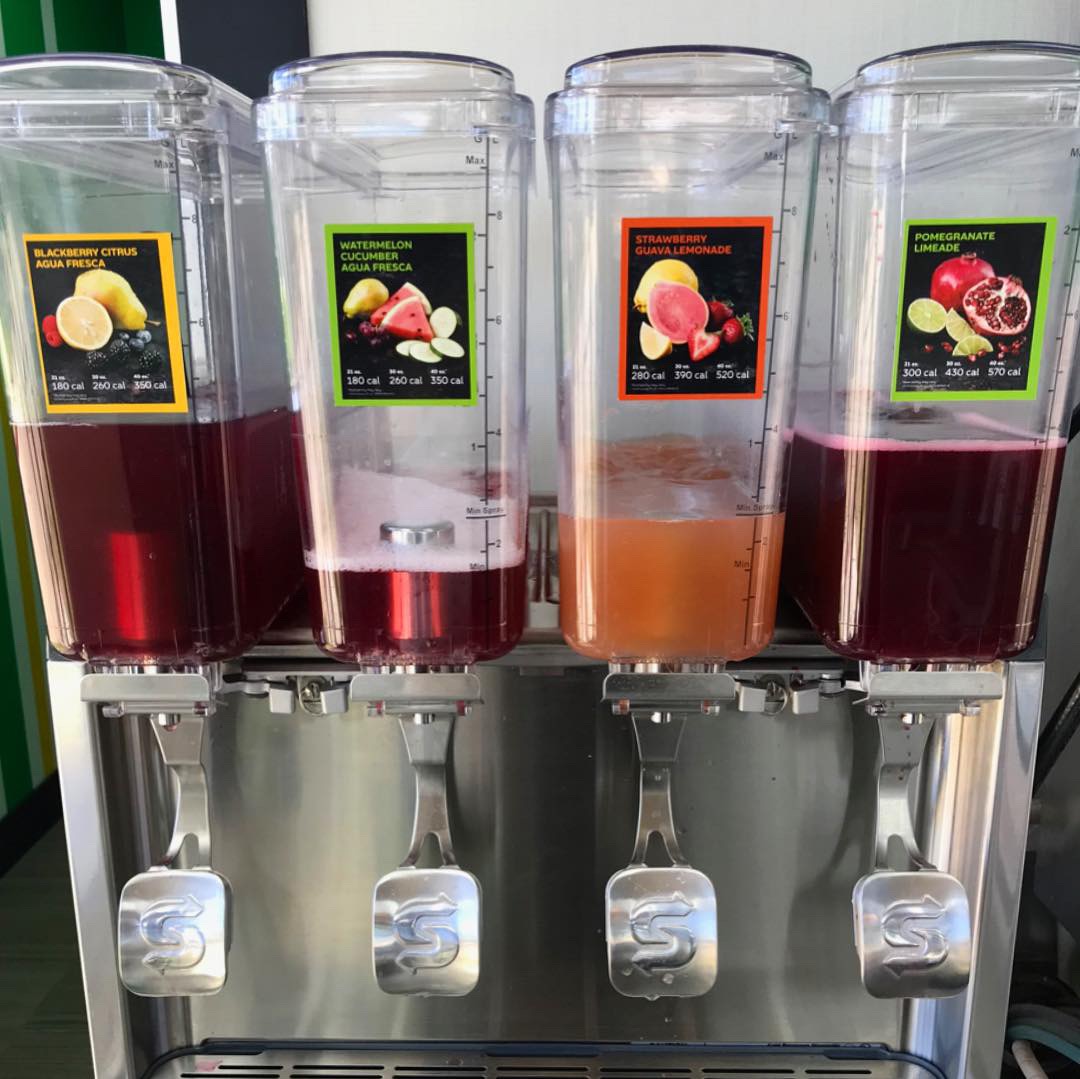
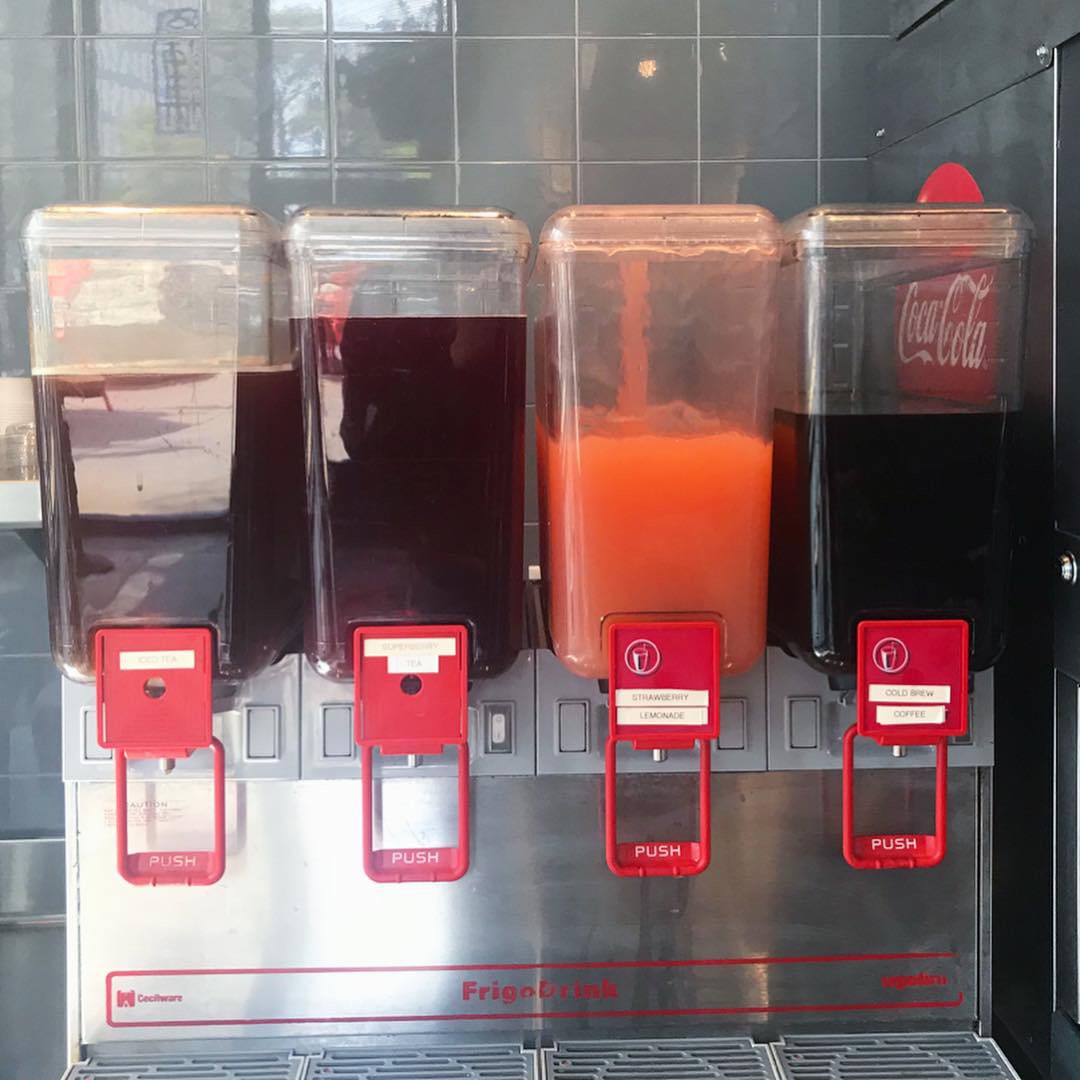
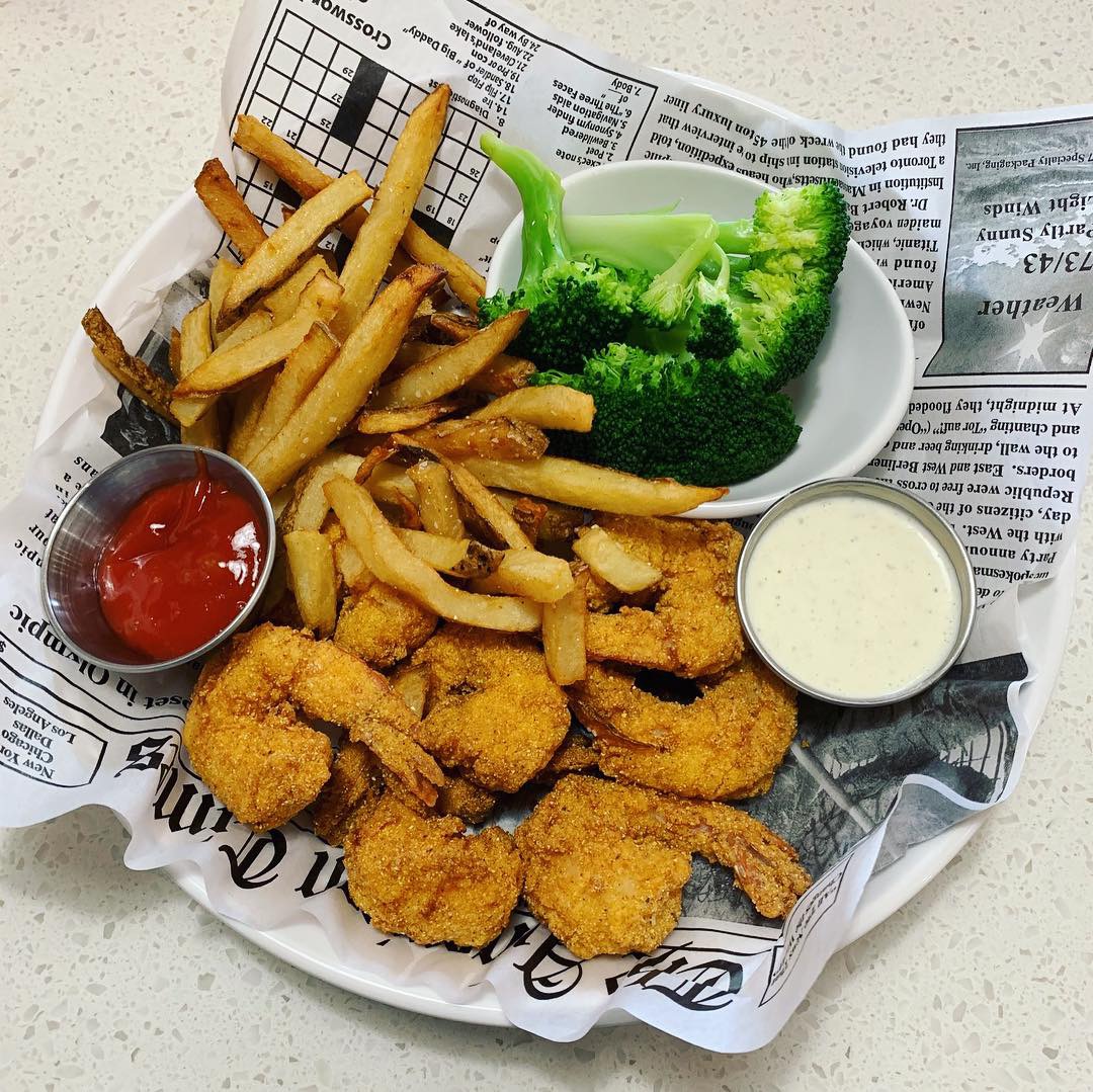
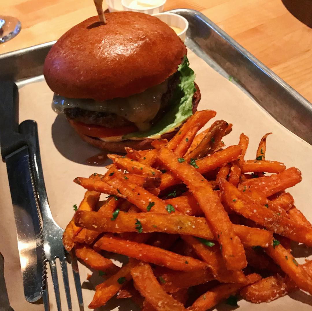
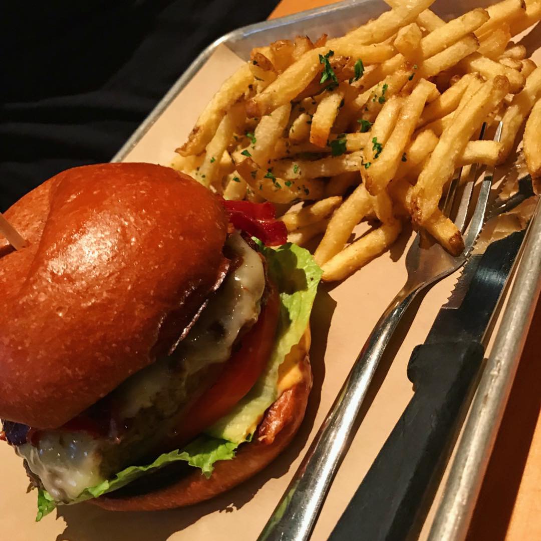
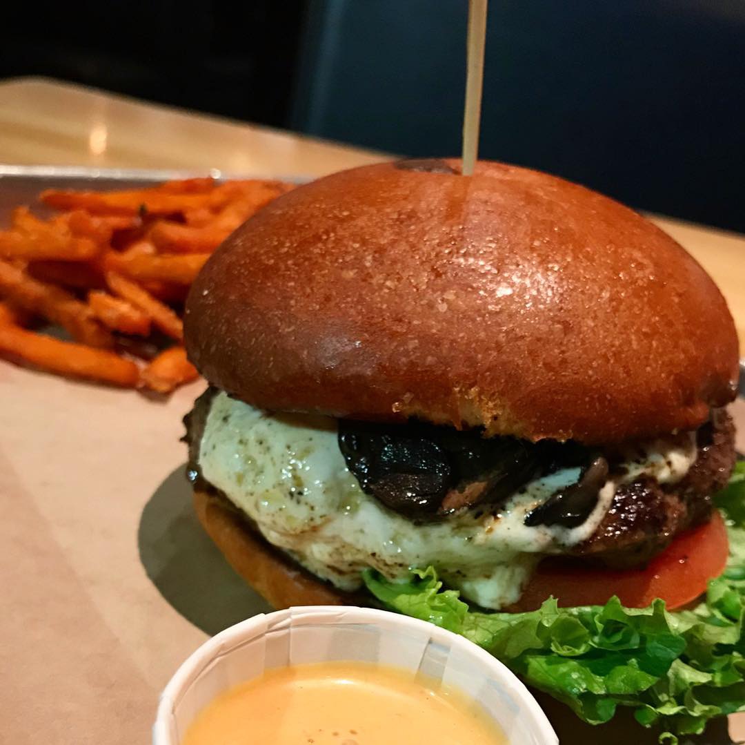
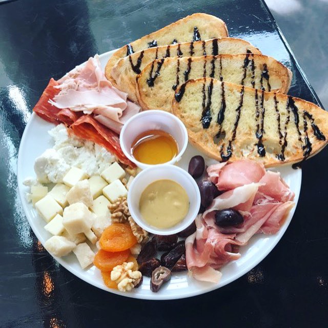
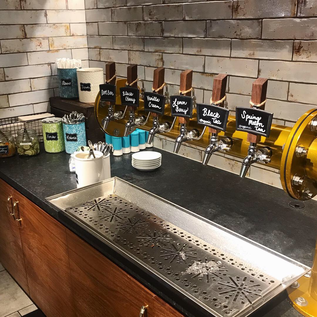
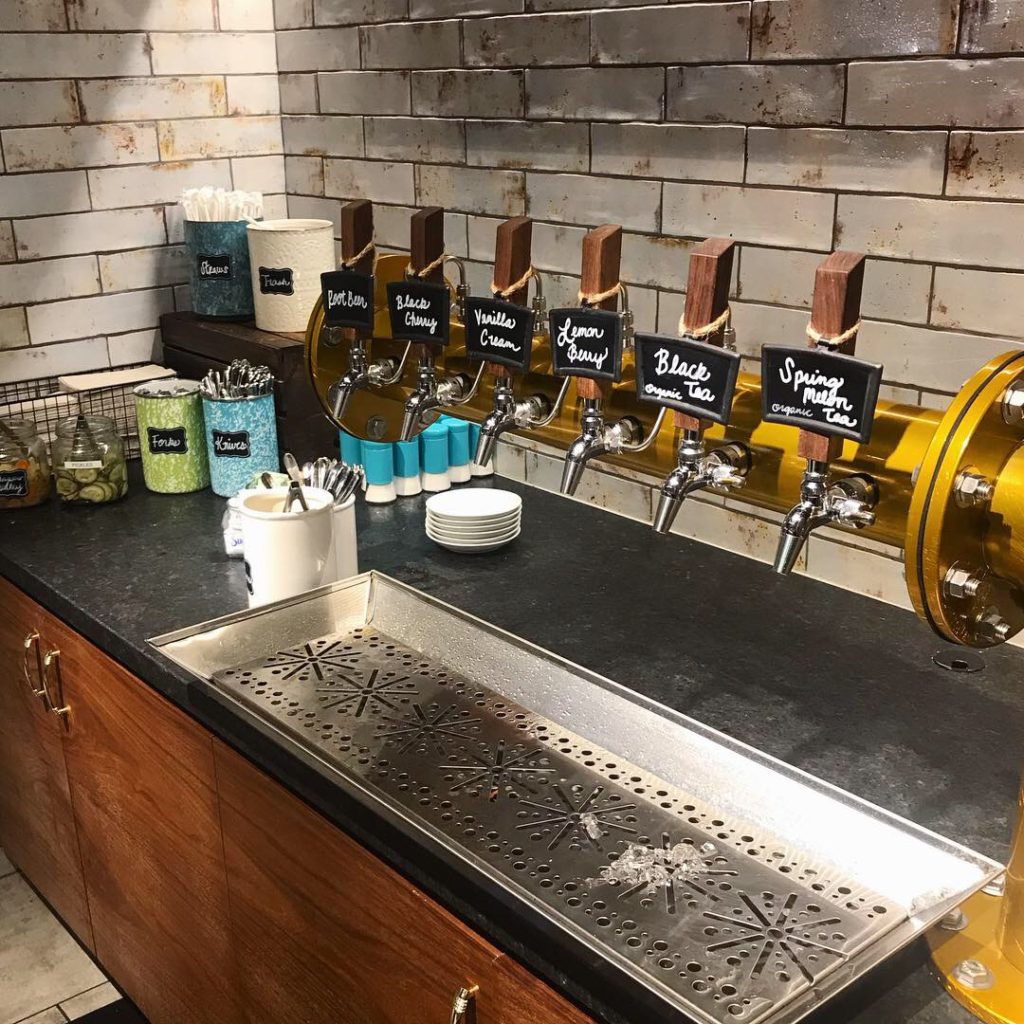
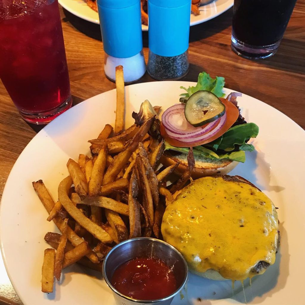
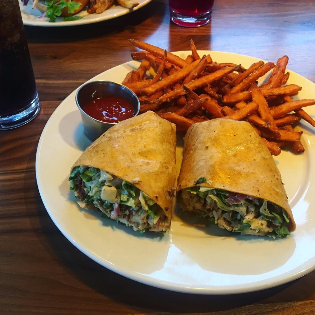
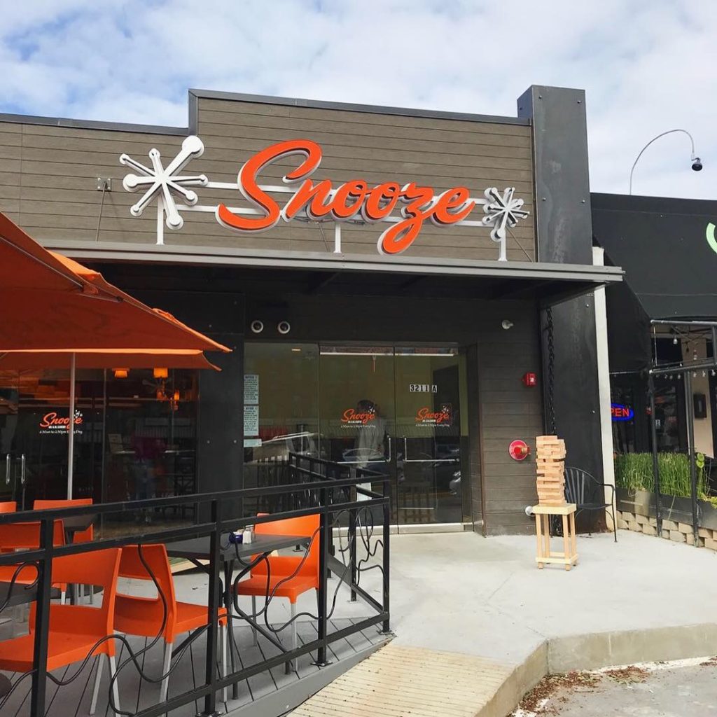
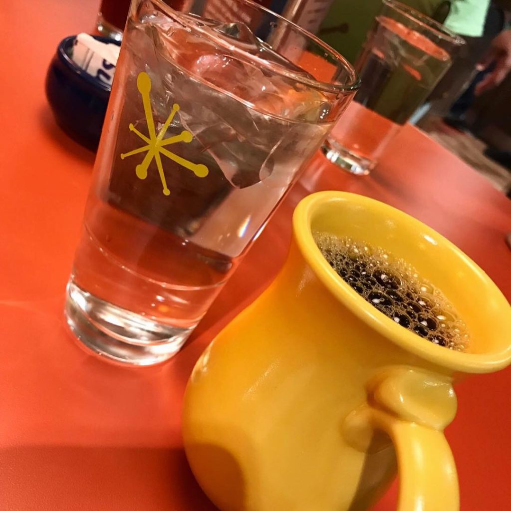
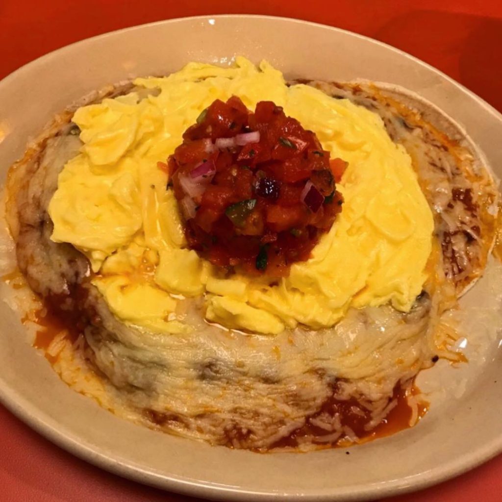
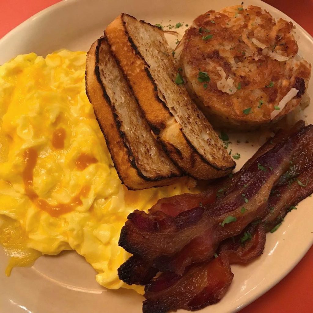
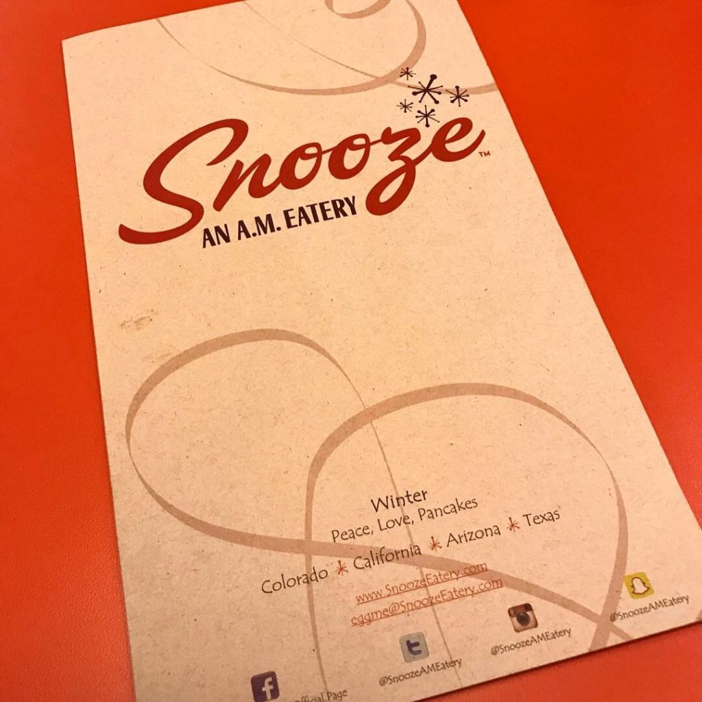
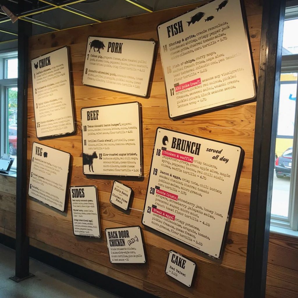
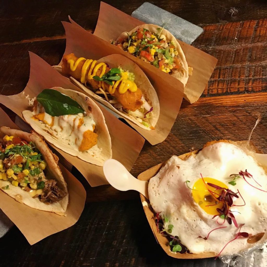
The menu was not very large and it was definitely healthy. Wraps and Greens are the staples. I ordered the Farmstand “salad” and it was beautiful and tasty and very healthy. Danny ordered the Southwestern wrap in a spinach tortilla with a side of grilled sweet corn and a Superberry tea to top it off. They had a nice selection of fresh and colorful beverages and teas, including cold brew in the bubblers. They do have a morning menu which includes wraps or hash. Hash “anything” sounds good but they are across the street from Snooze a.m. Eatery so it wouldn’t get my vote in a draw. If you haven’t read our review of Snooze, go.
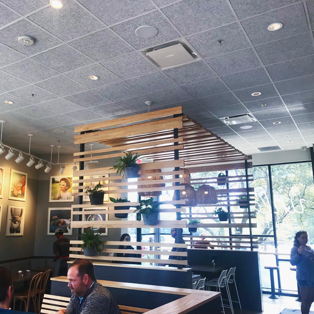
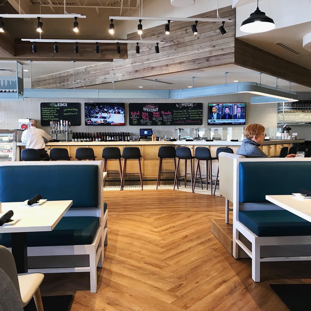
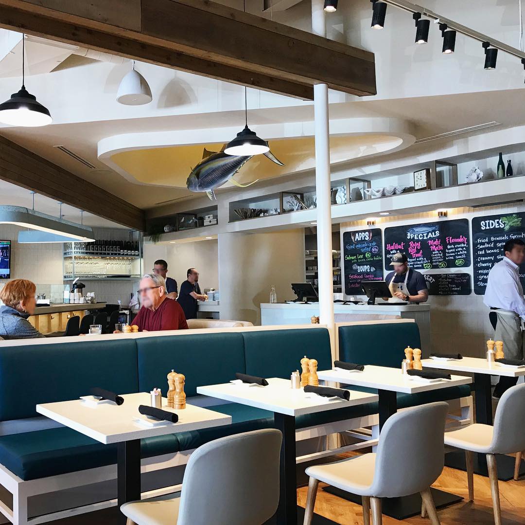
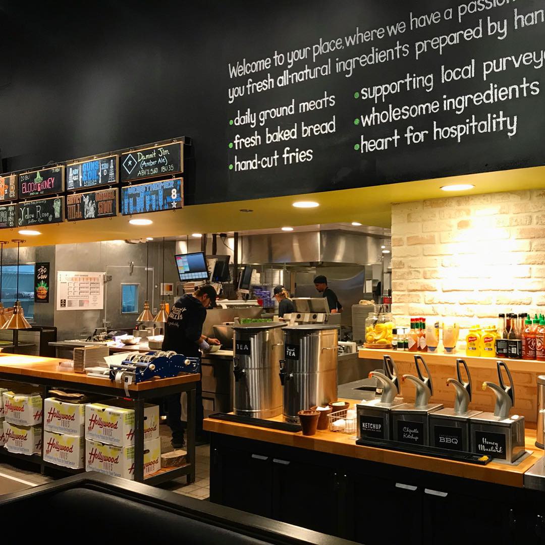
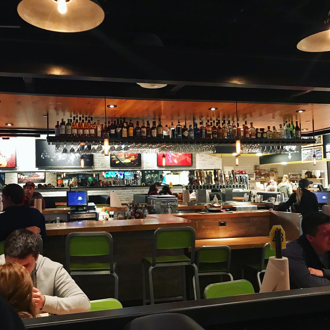
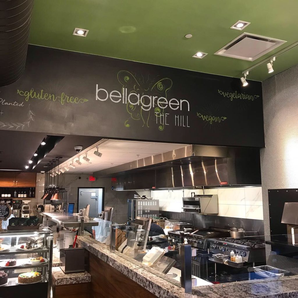
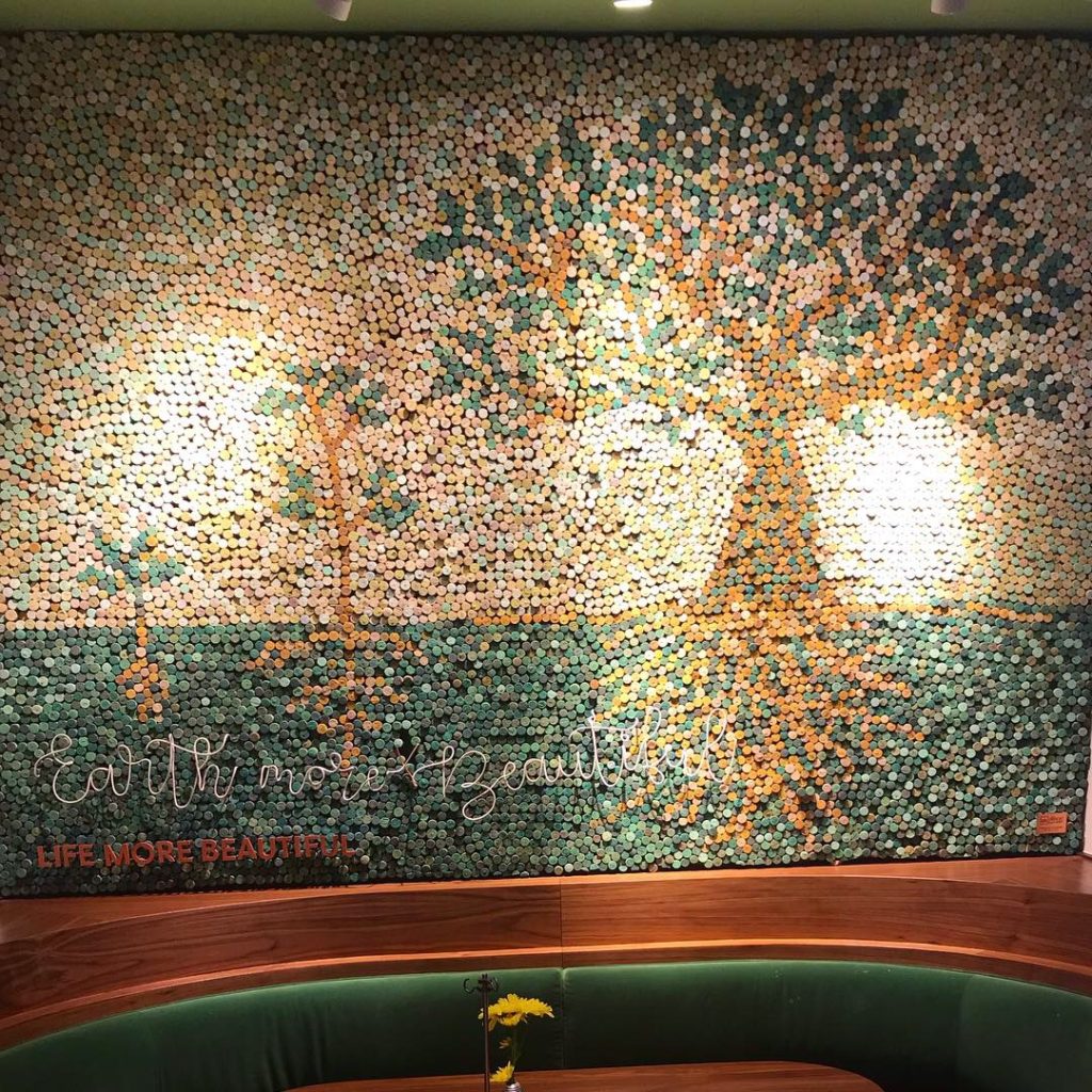
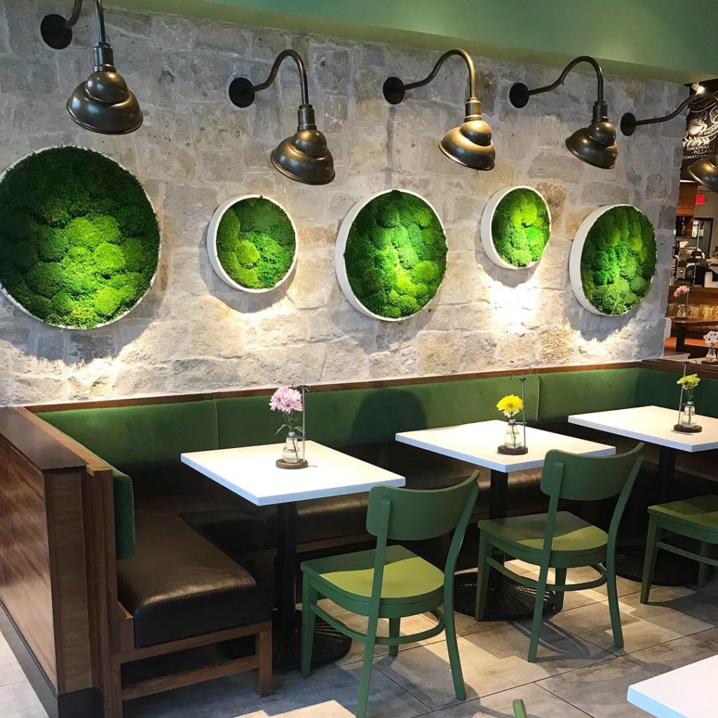
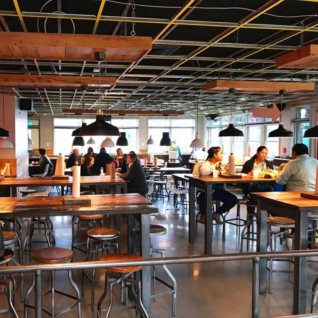
Environmental Branding:
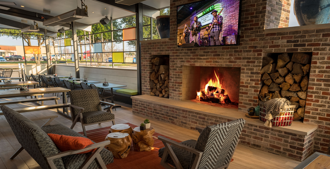
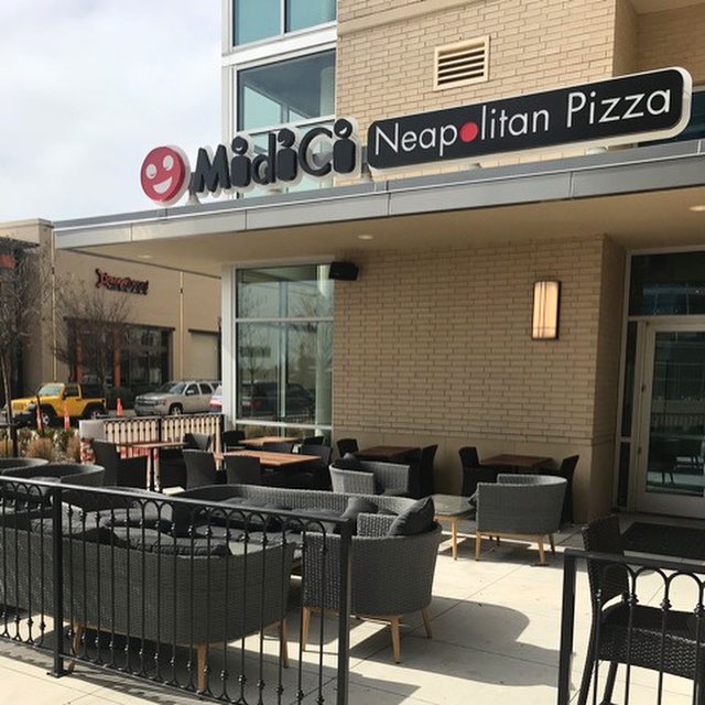
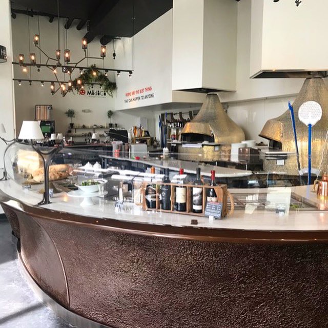
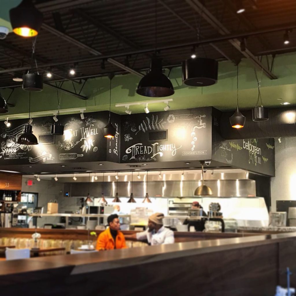
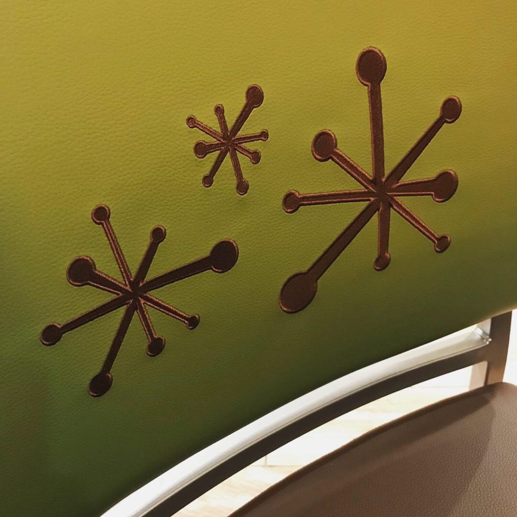
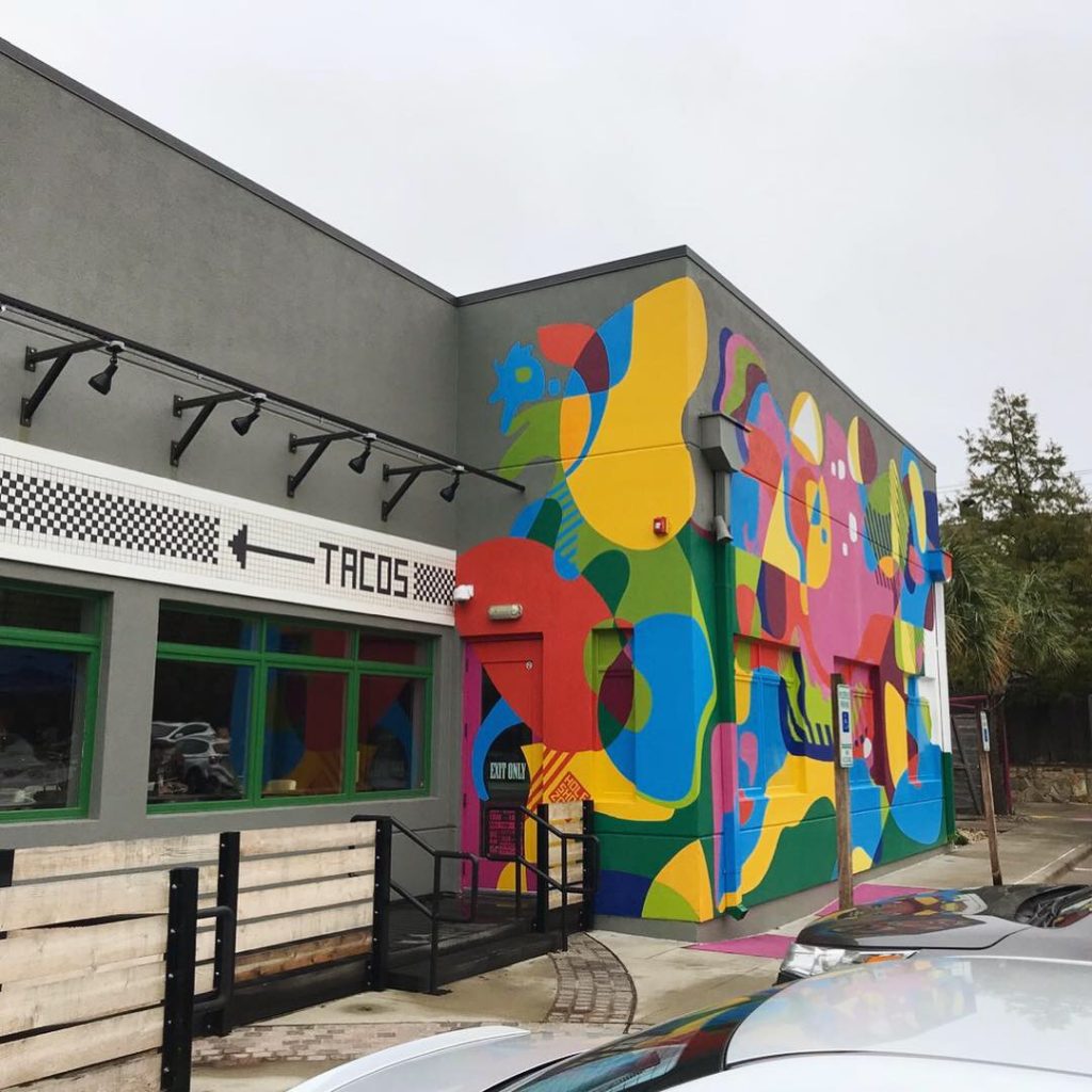
The place was super cute – I loved the interior design. Very bright and modern and clean. Great chairs and varied seating. Designed by Mitchell Garman Architects, I discovered this design team is also responsible for Ascension, Twisted Root, and many others.
Branding DNA:
Great logo. Great colors. Great interior design. Really fresh, clean, healthy food with an UNcompromising commitment to fresh, creative salads and wraps. Naturally, they play off of the “UN” in the name to call out their uncommon goodliness. “Uncommon, untraditional, unexpected. This is our promise to you. Every meal. Every day.” This place is awesome if you are craving fresh healthy gluten-free foods including quinoa, farro, eggplant dip and hummus. Go! Enjoy!
Digital Branding:
Unleavened has a refreshingly UNtraditional website that features an upward scrolling banner rather than the more traditional side to side. Their website is beautifully designed, but lacks in functionality. When you visit their website you only have two navigation options, our locations and view the menu. If you want to learn more about the brand you’re out of luck. There is a video, that you have to scroll a few times to get to, that will give you a round-about idea on what to expect when you visit one of there locations, but doesn’t actually speak about the brand or their story. As for their social media, on their Instagram and Facebook accounts they blend enticing food photography with great lifestyle imagery.
–Danny
Score:
MJ gives it a B only because of the name. Danny gives it a B+ only because of their website downfalls.
#FridayFeed:
Every Friday, Studio B Dallas visits a local fast casual concept for lunch to critique the brand (and eat lunch). Three rules apply: it’s a concept we haven’t been to or it’s been in the restaurant news and it’s within 10 miles of our office. Wait, four rules – it can’t be sushi. Danny doesn’t do sushi. If you have any suggestions on where we should eat next, feel free to leave it in the comments. Look for our restaurant branding reviews each Friday! MJ & Danny
-

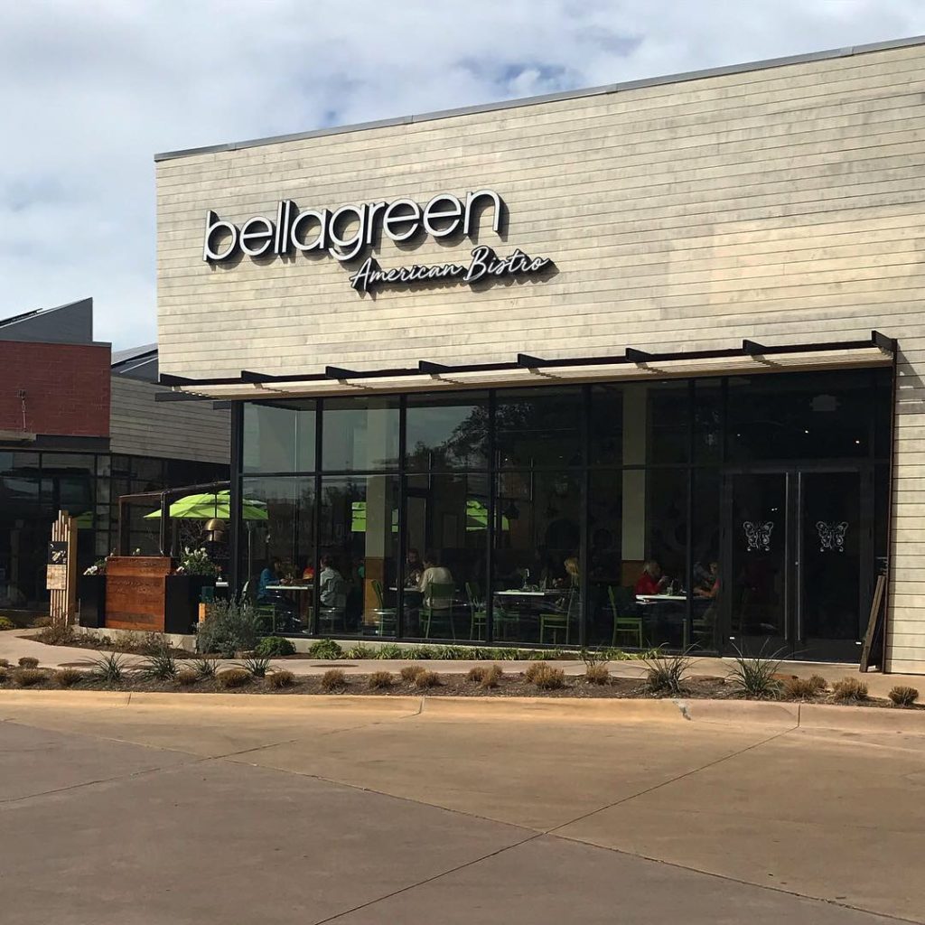
- Unleavened Exterior
-
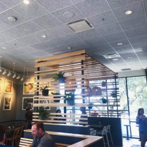
- Unleavened Interior
-
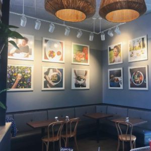
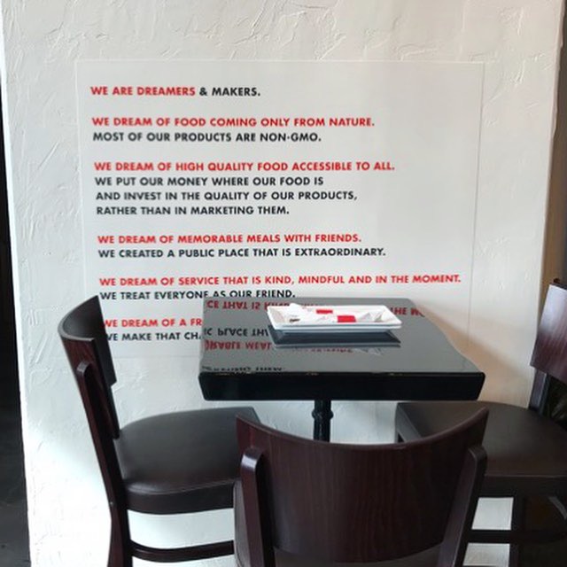
- Photo Wall

-
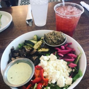
- Farmstand Salad
-
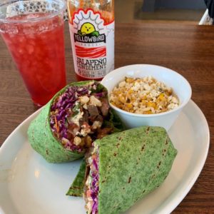
- Southwestern Spinach Wrap

-
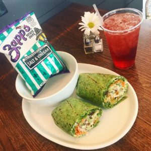
- Clubhouse Spinach Wrap

-
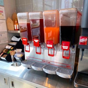
- Fresh Colorful Beverages

-
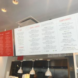
- Menuboards


Recent Comments