
This week’s #FridayFeed restaurant branding review is Twisted Root Burger in Deep Ellum.
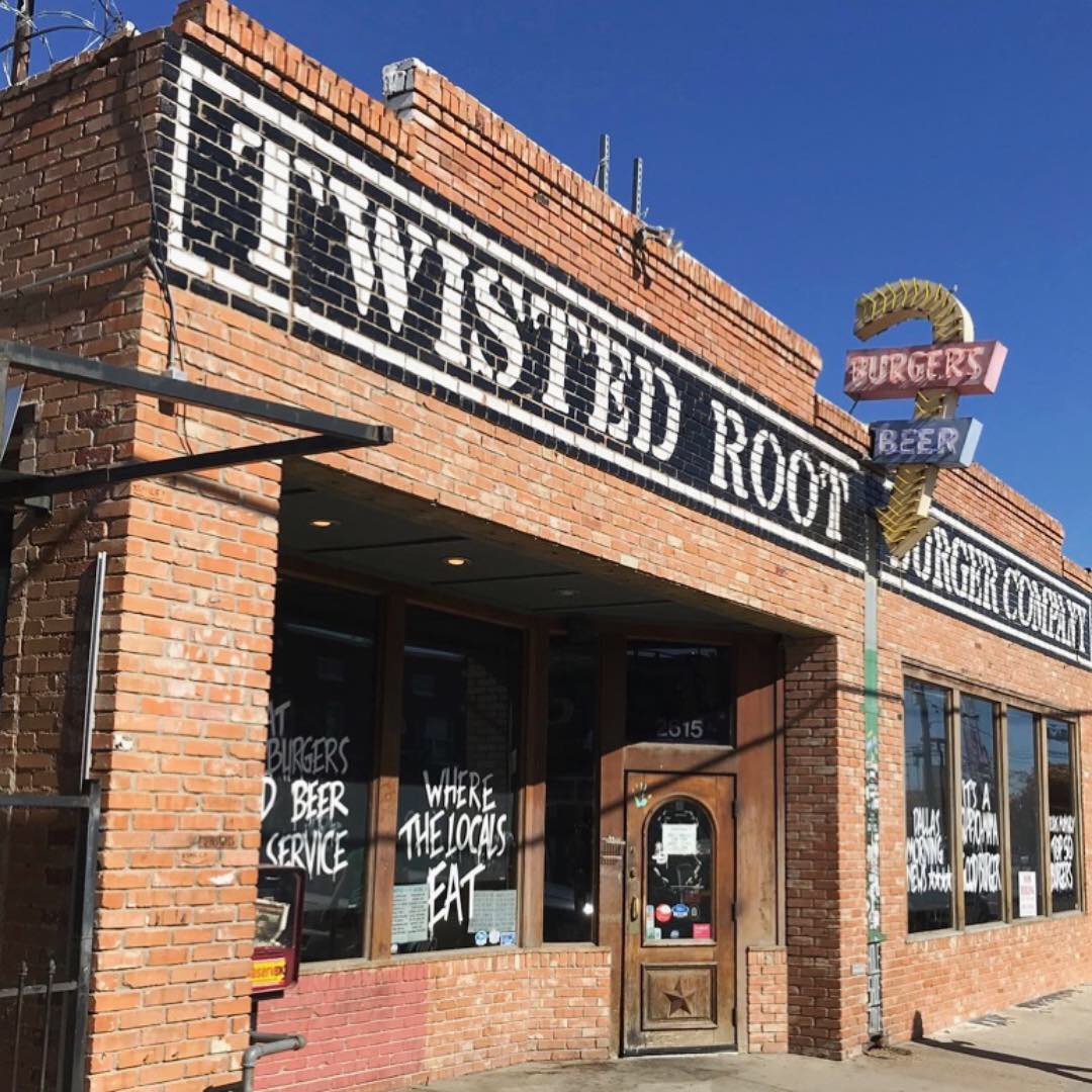
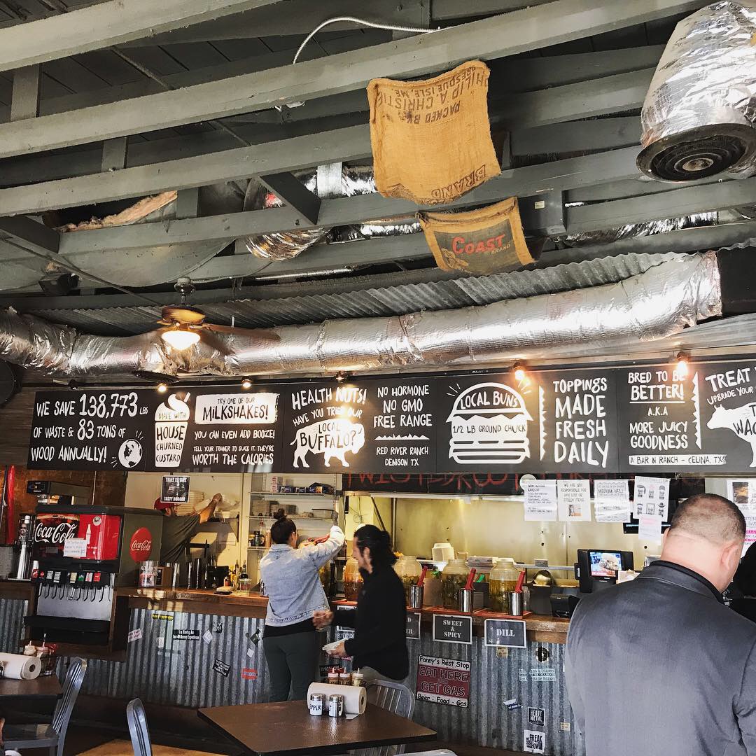
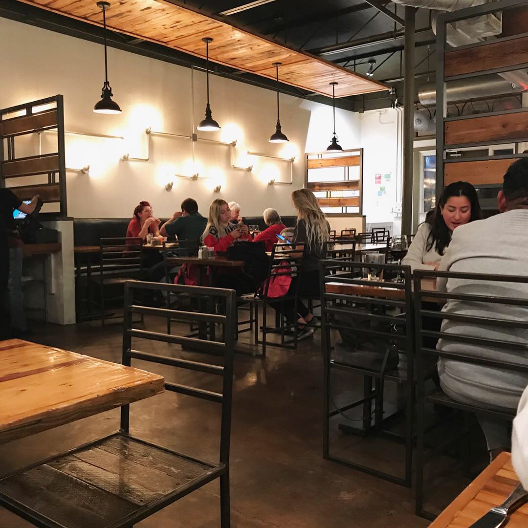
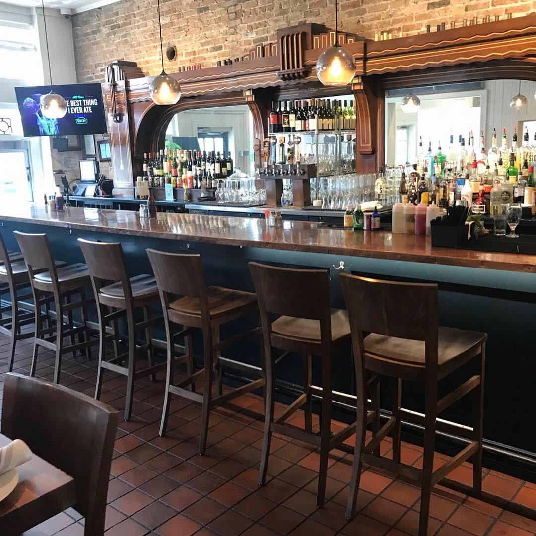
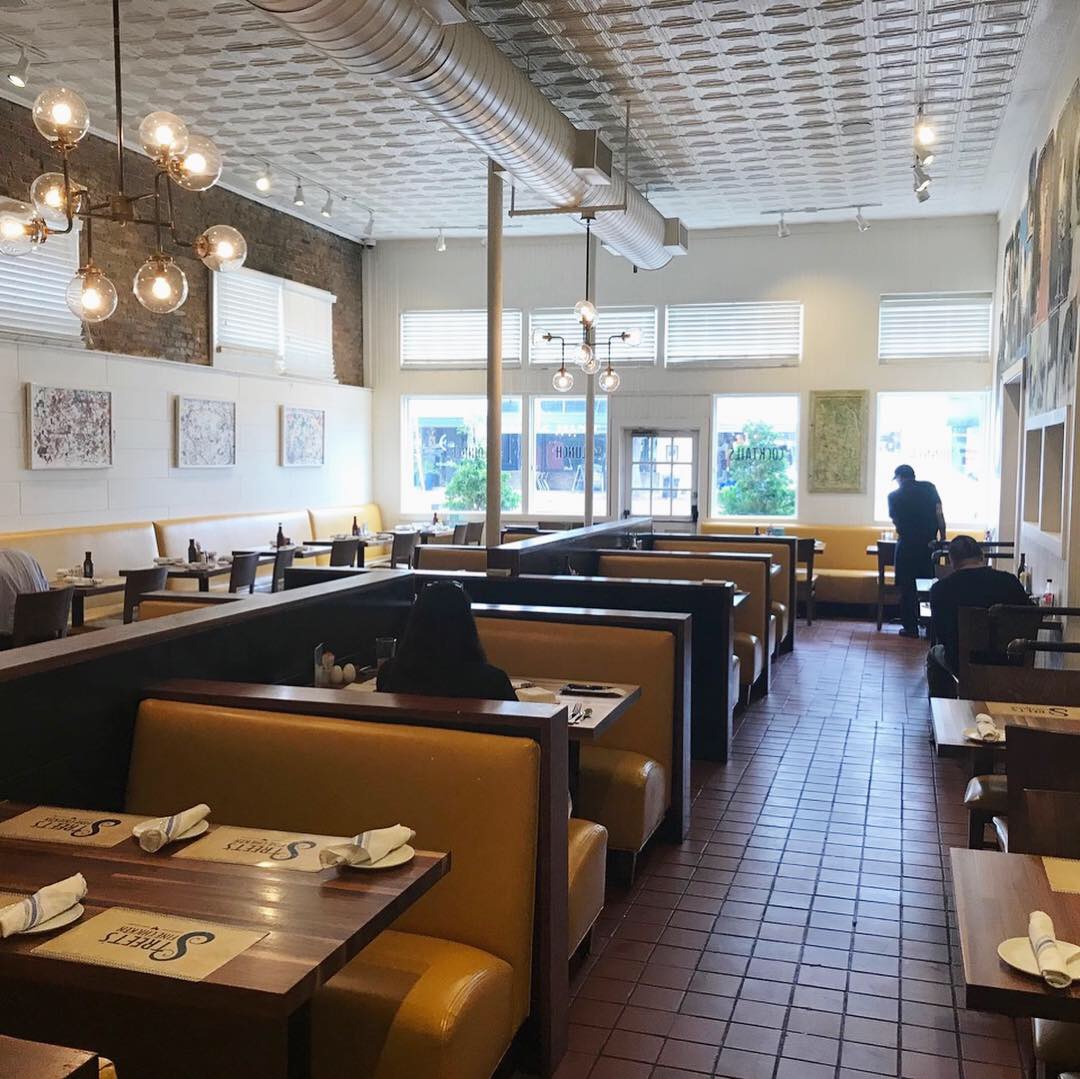
Danny and I chose the original location to review so we could see this brands roots! Deep Ellum is Deep Ellum so there’s not much to say about the exterior. The interior looks like it’s the original. It functions well and it wasn’t dirty, it just needs a new paint job and a little freshening up. The brand is “college burger & beer joint” with stickers on everything so it’s not suppose to look chic but you CAN scrape the tape scraps off of the windows and add some new stickers and paint every once in a while. Upon checking out the website, I see they have 19 locations. I’m going to guess that the newer locations are probably a little “shinier.”
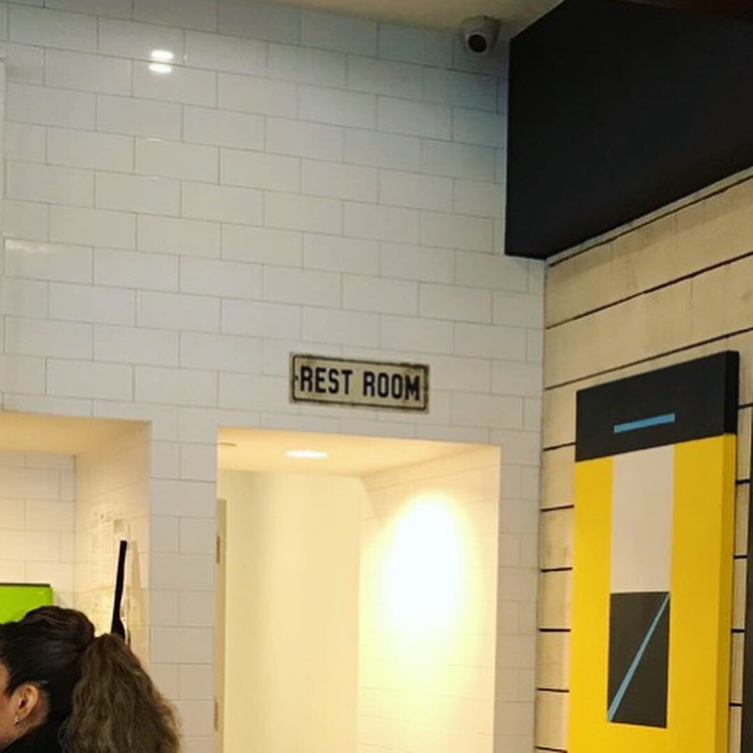
I don’t want that intro to make you think I don’t like this place. I think the branding is fantastic. This brand constantly delivers throughout the experience. When you order they give you a laminated name card from a giant stack of famous people. I was Serena Williams. Oprah was there, Betty White, Ice Cube. That’s cool and everybody seemed to enjoy it. Chuck Norris plays a huge part here. The bathroom was filled with Chuck Norris joke graffiti. I love Chuck Norris jokes.
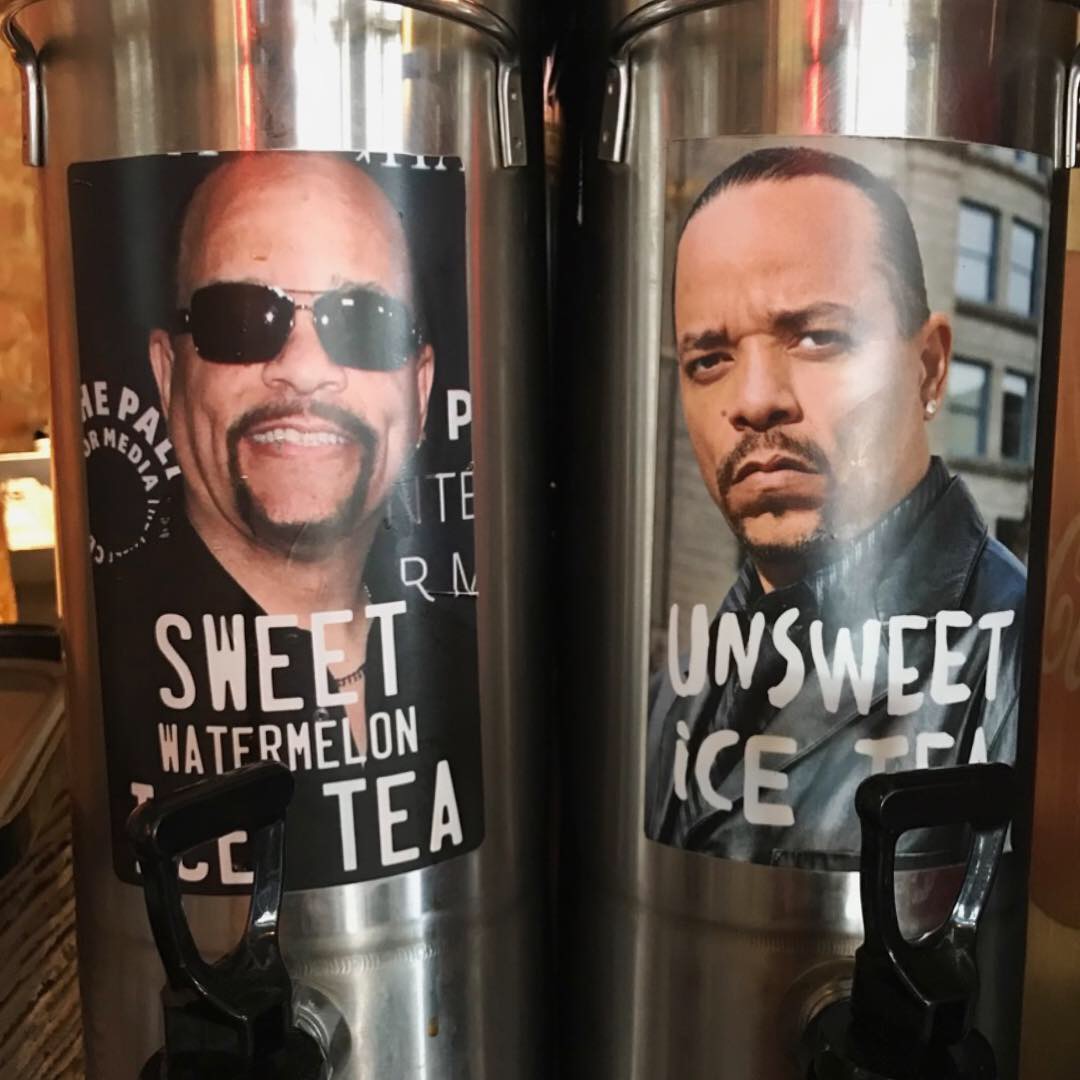
The fun continues as you reach the tea dispensers. There’s Sweet watermelon Ice Tea and UnSweet Ice Tea with photos of the actor smiling and scowling. That’s funny.
Owners Quincy and Jason “met in culinary school, after jobs in stock brokerages and telephone line repair’, and opened Twisted Root in 2006 making “ gourmet burgers” before they were a thing. Diners Drive-In’s and Dives visited in 2009 which put them on the map.
Probably the most genius thing I’ve seen in a while, was the tv screen that was a loop of the brand story. No volume, just a really well done video that told the story of “everything Twisted Root.” While I was eating, I discovered that they make their own buns, burgers, sauces, etc. They also offer Wagyu beef and wild game burgers. They even make their own whiskey. It’s a great story and it created a “connection” of the brand to the founders which adds emotion to the experience. This brand ENGAGES with its customers on many levels. This especially apparent on their social media platforms. It makes me want to meet Jason and Quincy!
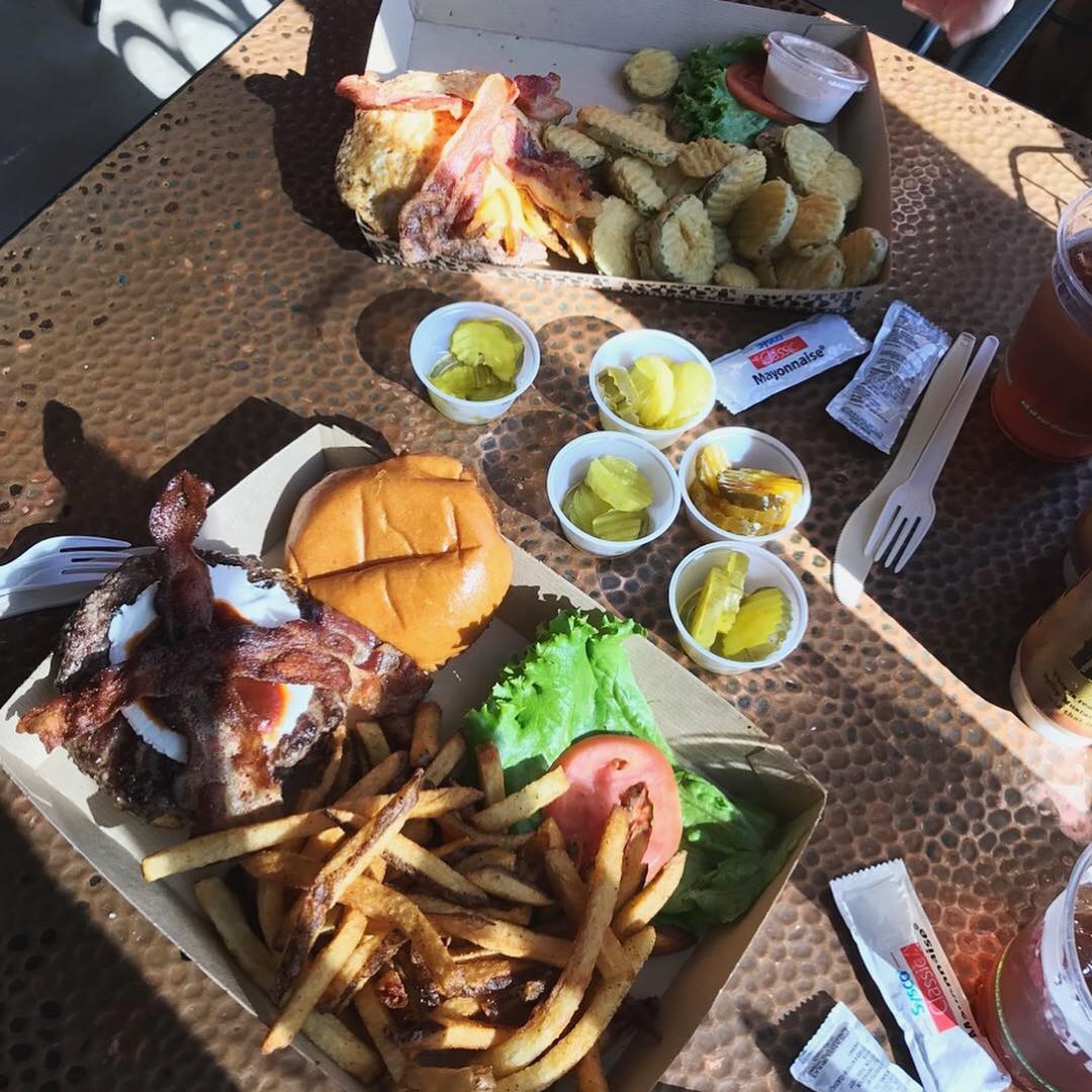
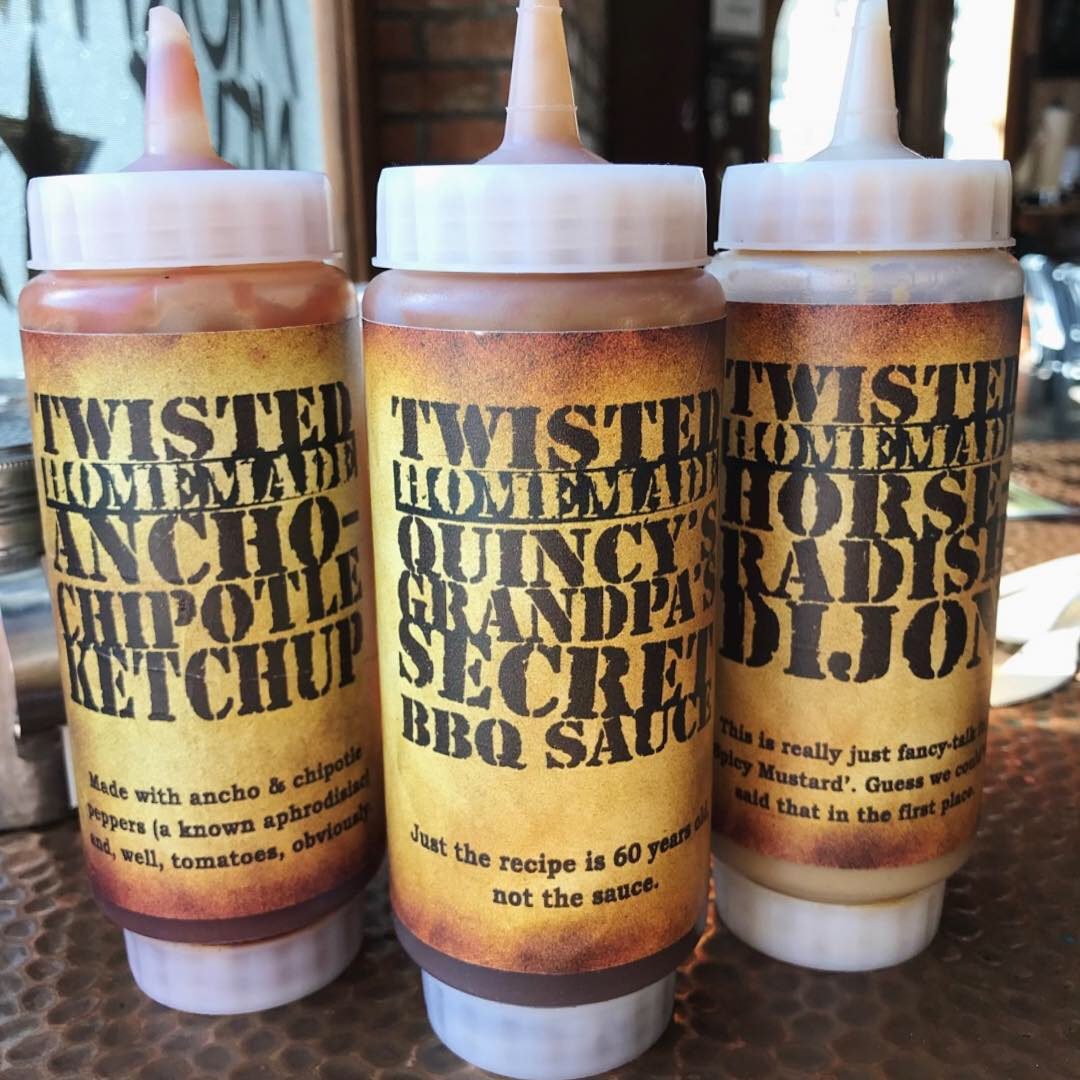
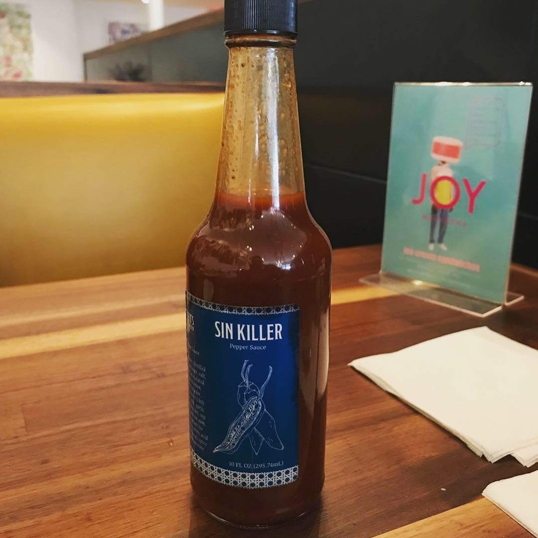
Packaging was good. The burgers were served in branded disposable trays. The cups were branded and their custom sauces were on each table with branded labels which included Quincy’s Grandpa’s Secret BBQ Sauce.
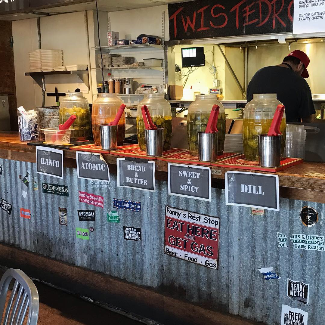
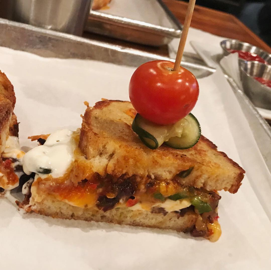
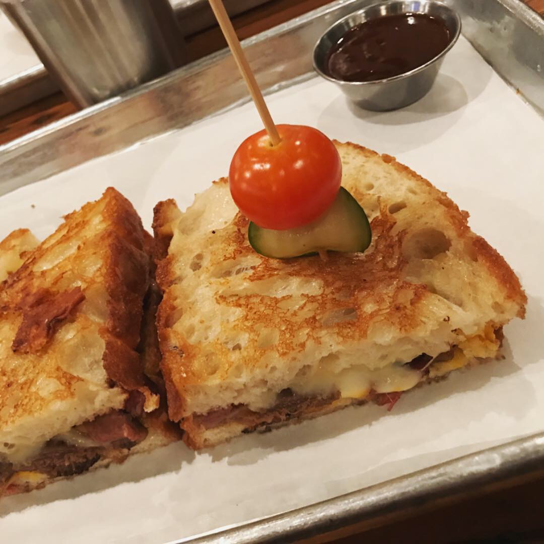
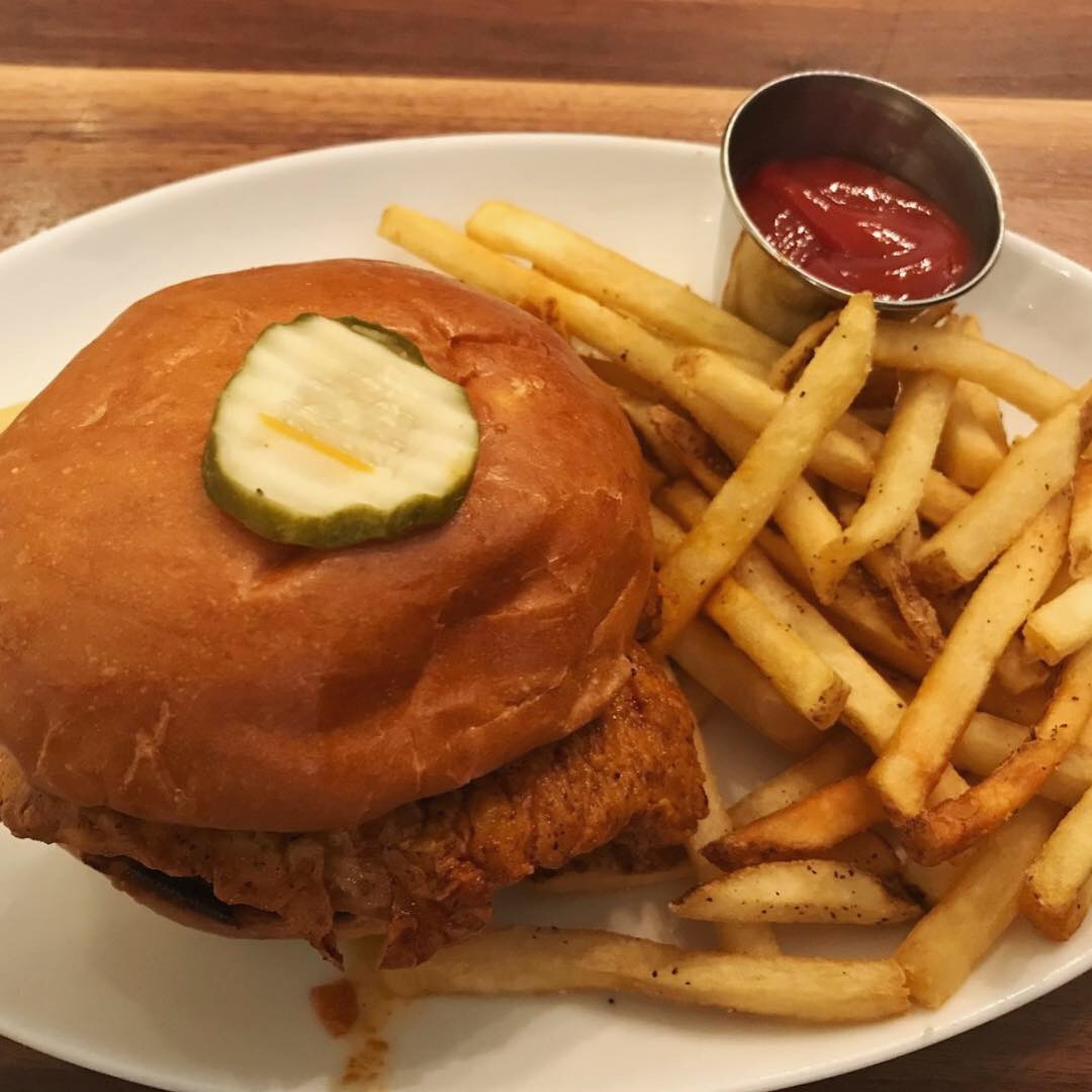
Let’s get to the burgers! I ordered the Freshman 15 “topless” – that’s a beef patty, cheese, smashed French fries, bacon and a fried egg minus the top bun. JUST the thought of my Freshman year at college added to my enjoyment! Danny ordered The Spicy Goat and a side of fried pickles. We also tried all five of the pickles from the complimentary pickle bar. The homemade custard shakes looked delicious – we just can’t eat dessert if we want to actually work the rest of the afternoon.
MJ gives Twisted Root Burger Co an A+ for branding and Danny gives it an A.
Every Friday, Studio B Dallas visits a local fast casual concept for lunch to critique the brand (and eat lunch). Three rules apply: it’s a concept we haven’t been to or it’s been in the restaurant news and it’s within 10 miles of our office. Wait, four rules – it can’t be sushi. Danny doesn’t do sushi. If you have any suggestions on where we should eat next, feel free to leave it in the comments. Look for our restaurant branding reviews each Friday! MJ & Danny
-
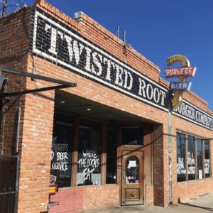
- Twisted Root Burger Exterior
-
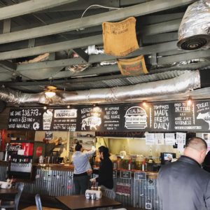
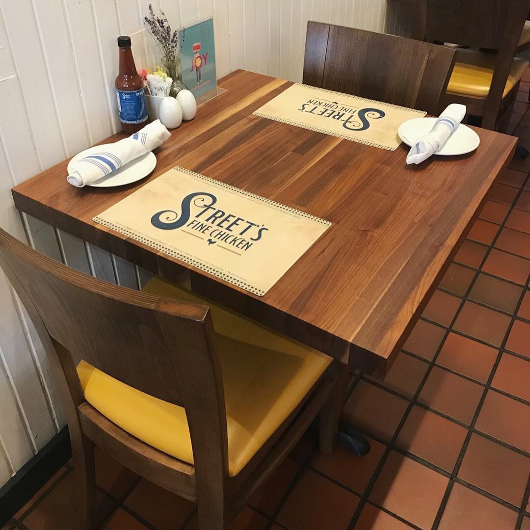
- Twisted Root Interior
-
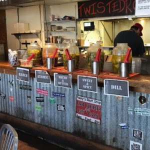
- Pickle Bar
-
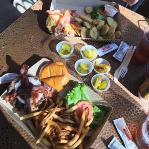
- The Spicy Goat & Freshman 15
-
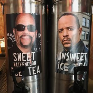
- Clever “Ice Tea” Dispensers
-
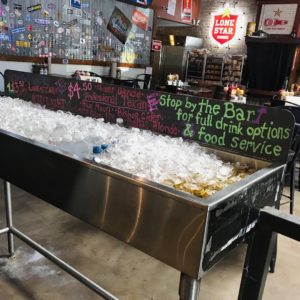
- Beer Cooler

-
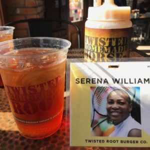
- Order Card

-
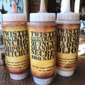
- Twisted Root Sauces
-
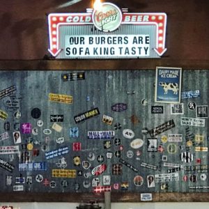
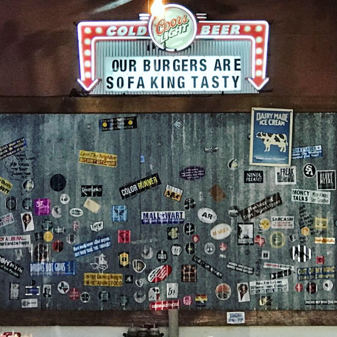
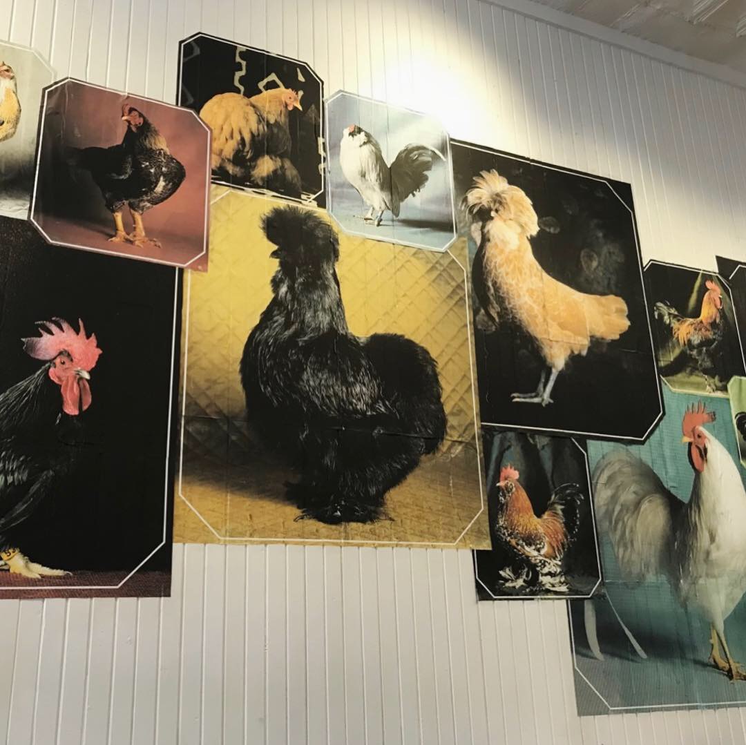
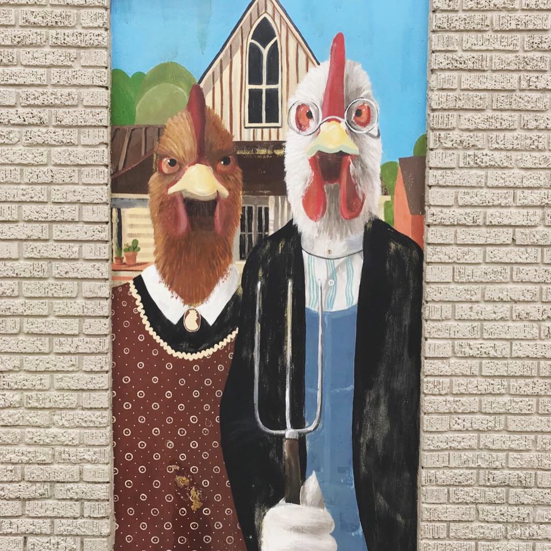
- Interior Wall


Recent Comments