

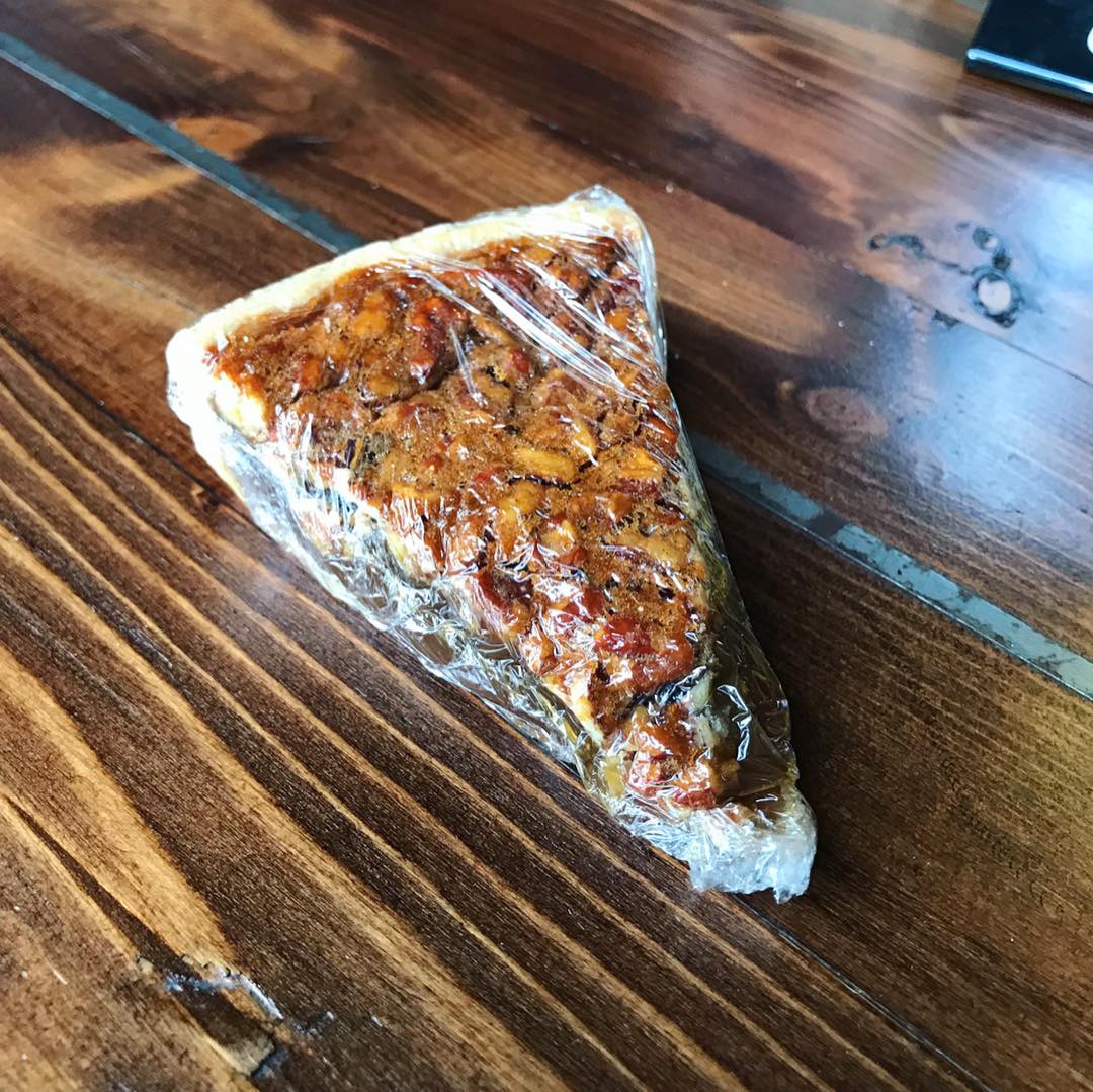
6 Flavor Sampler Pie
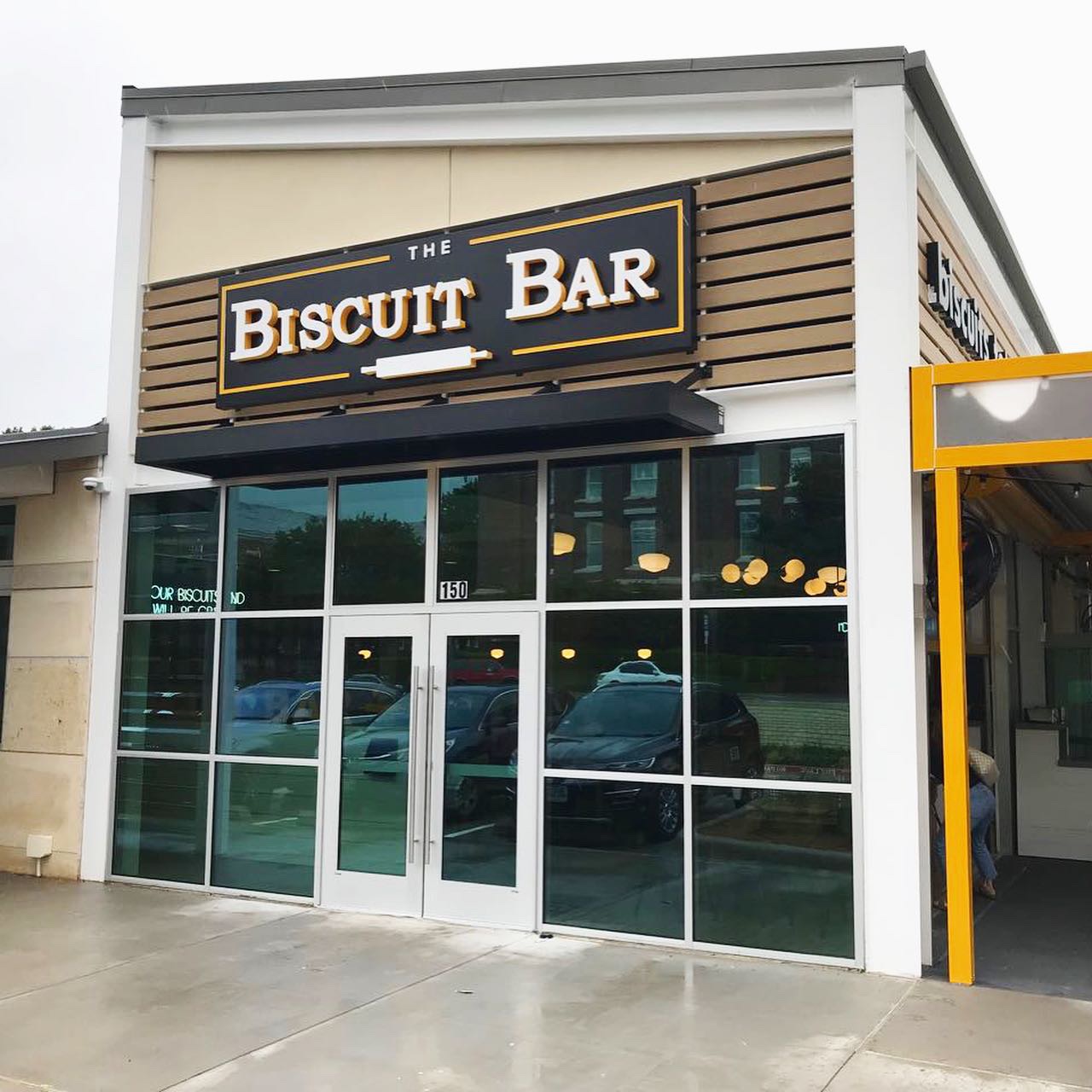
This week’s #FridayFeed restaurant branding review is Porch Swing in Mesquite, near Town East Mall at I30 & 635.
Order Up!
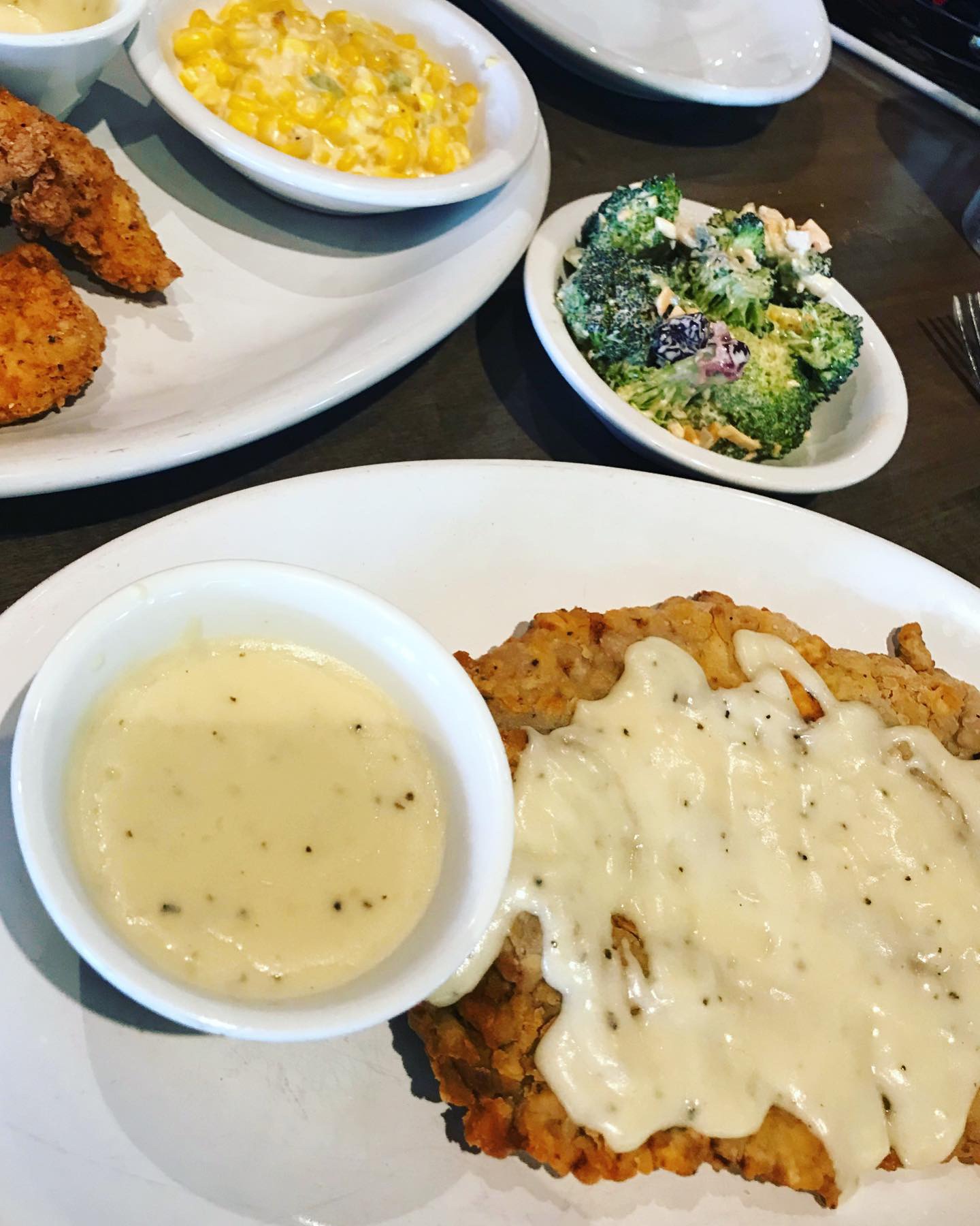
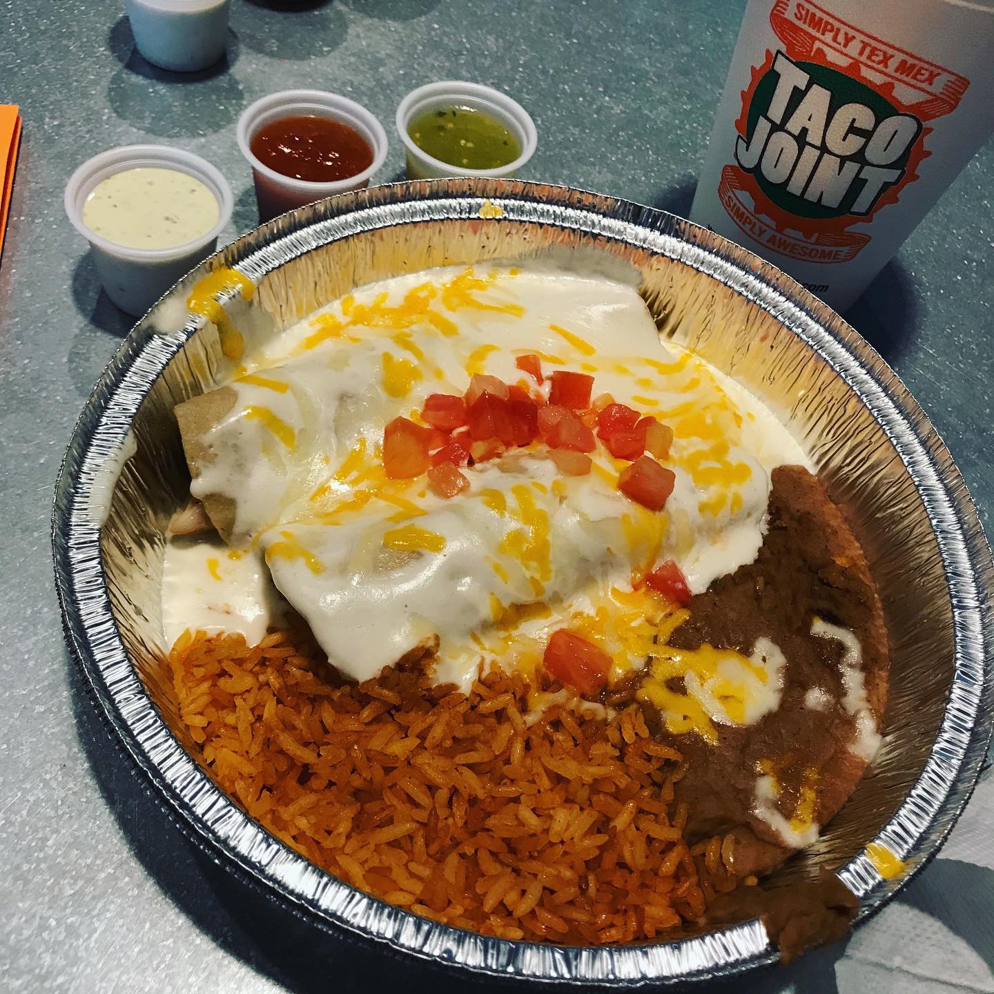
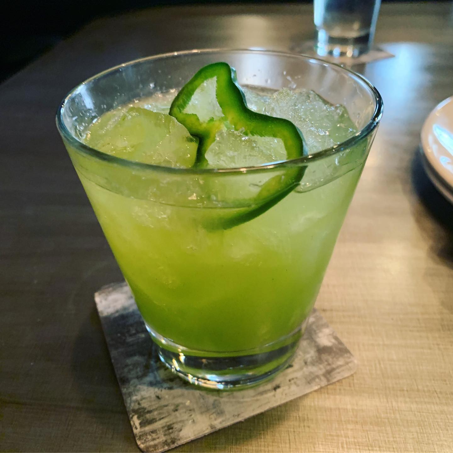
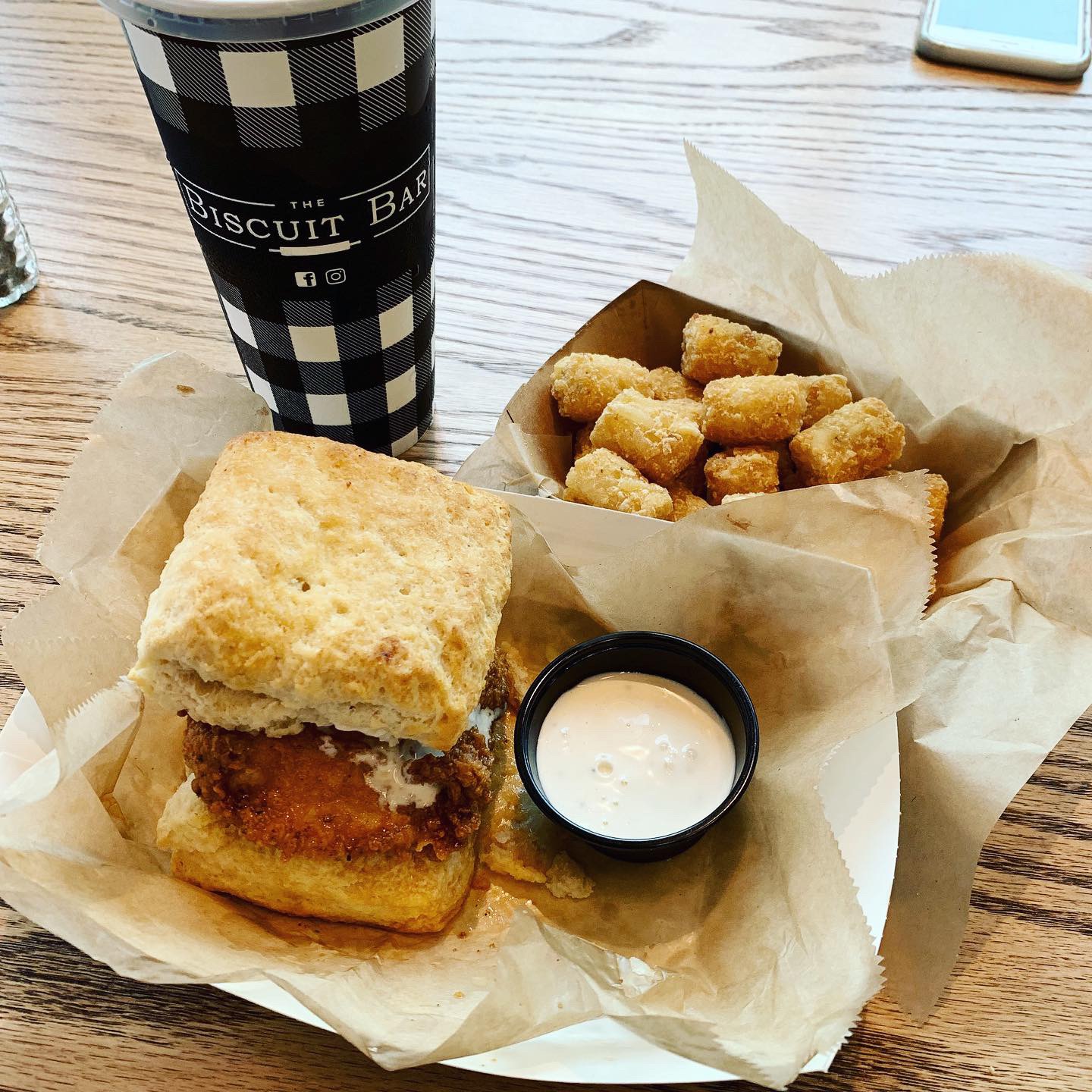
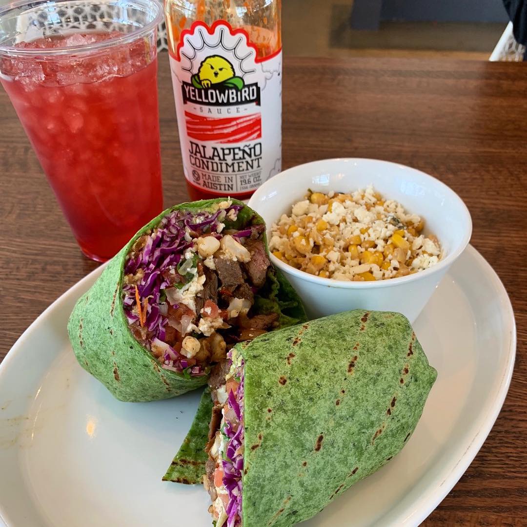
Because we’re friendly with the owner, we asked for a tasting of several entrées and sides so we could review more than a few dishes. Here’s what we tasted: Grilled Meatloaf, Chicken Fried Steak, Chicken Tenders and Fried Catfish. Sides included the Broccoli Bliss, REAL Mashed Potatoes, Collard Greens, Cheesy Corn Bake plus Cream Gravy, Rib Sauce, Hot Honey and steaming hot Yeast Dinner Rolls. I kid you not, the grilled meatloaf was outstanding! It comes with it’s own meatloaf gravy which was sublime. The Cheesy Corn Baked is corn, butter, cream cheese and jalapeños – SO good and has a nice little kick. Broccoli Bliss is fresh broccoli florets with shredded cheddar cheese and cranberries mixed with a creamy homemade dressing – a nice take on a cold salad. The REAL mashed potatoes were REAL good, especially with the cream gravy which I will put on everything. Last note – the house made Hot Honey is a beautiful red orange color, has a subtle but noticeable heat. Hot Honey is available for sale in the Pie Company store. Speaking of pies, Porch Swing features homemade pies sold in the brand-within-a-brand Pie Company store. I ordered a 6 flavor sampler to take to an Independence Day event. Toasted Coconut Cream, Homemade Banana Cream, Ol’ Fashioned Buttermilk Custard, Cookie Top Pecan, Cheesecake and Lemon Cream. I had a bite of every single one. All amazing.
Environmental Branding:
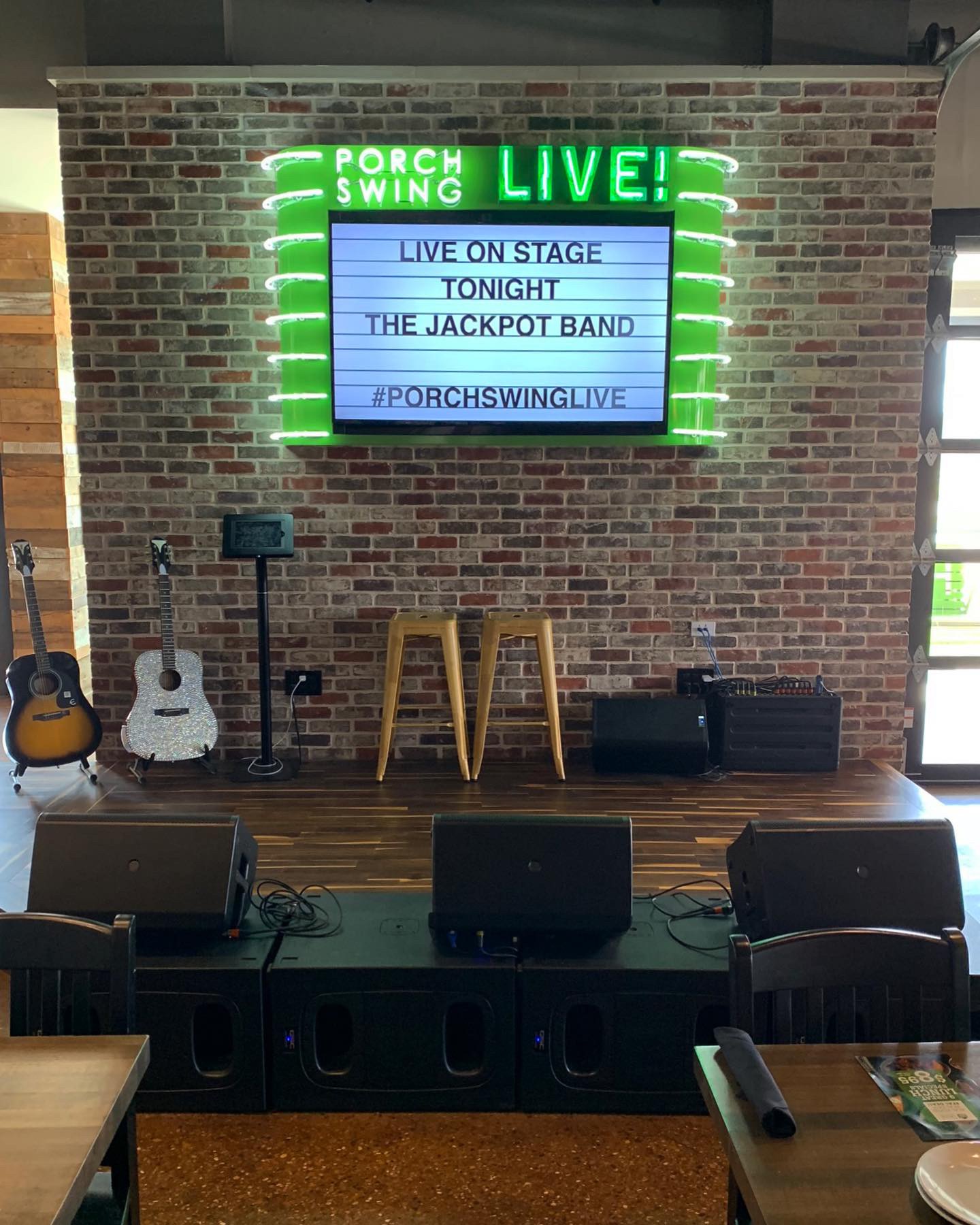
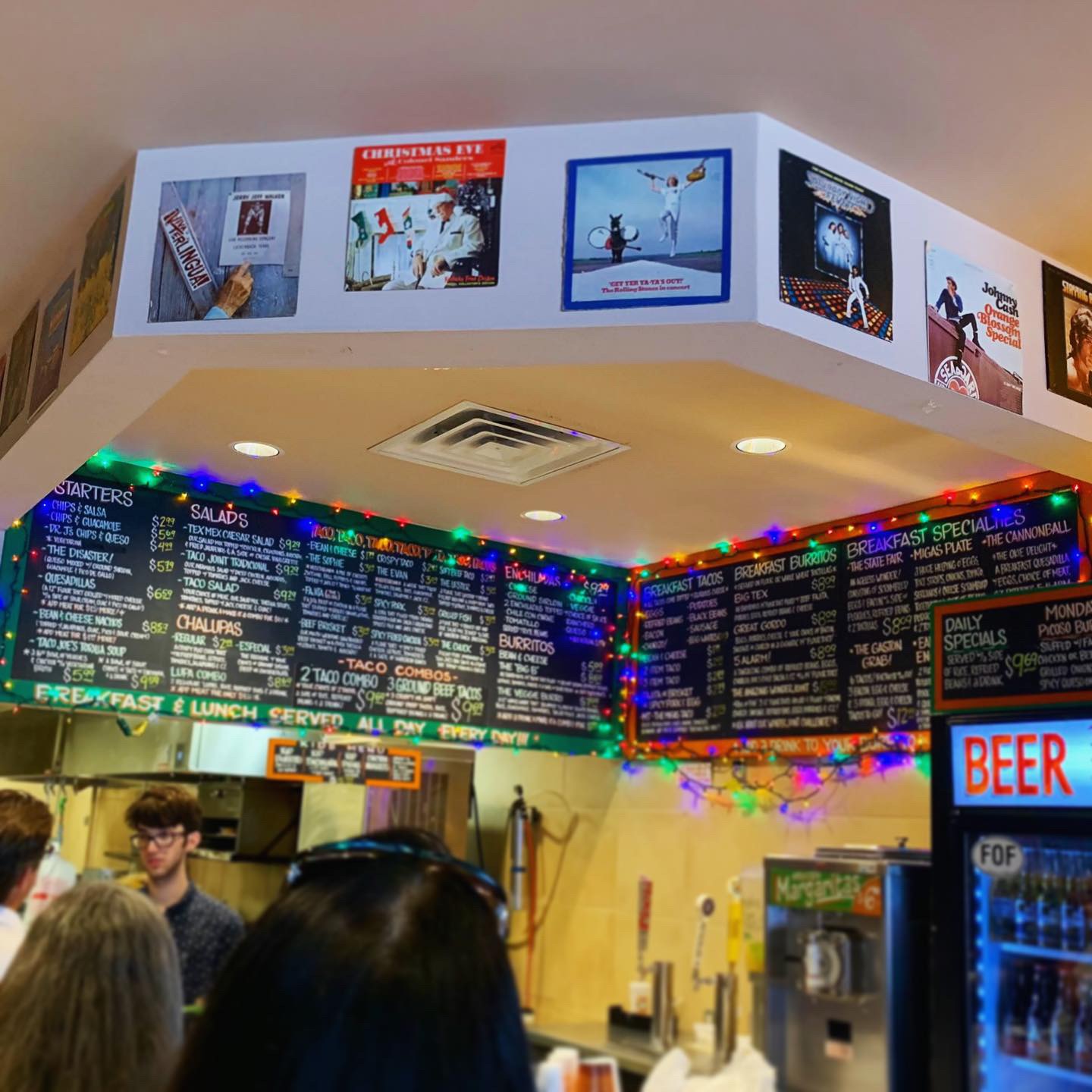
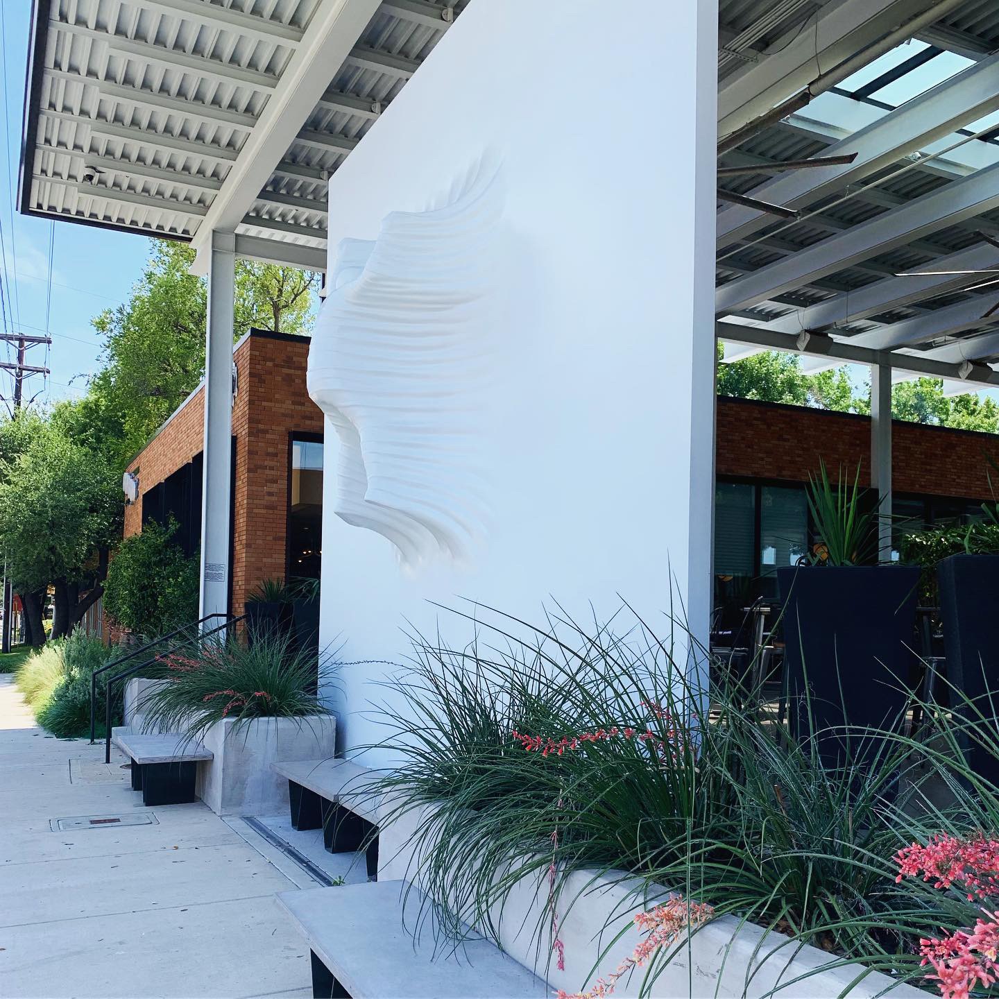
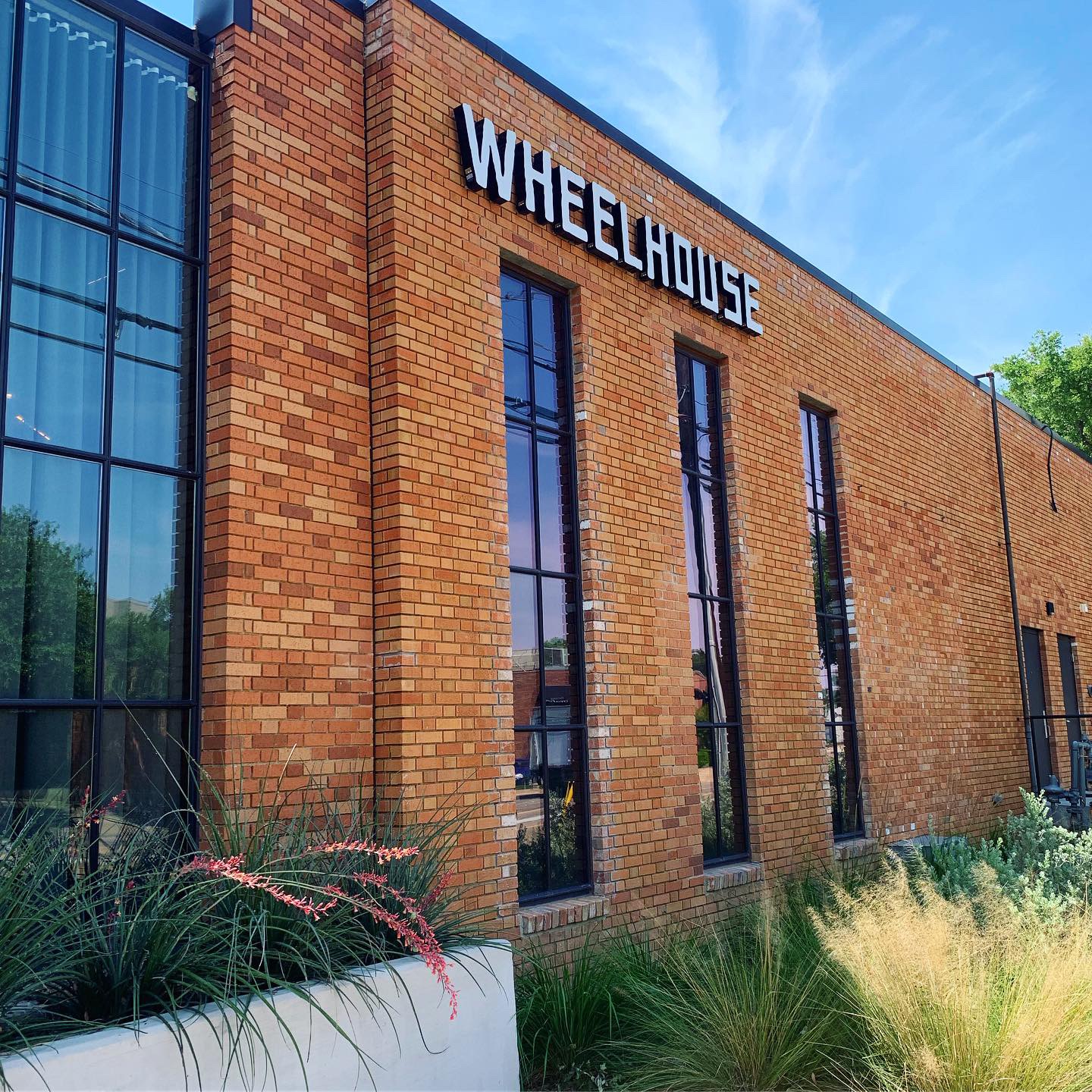
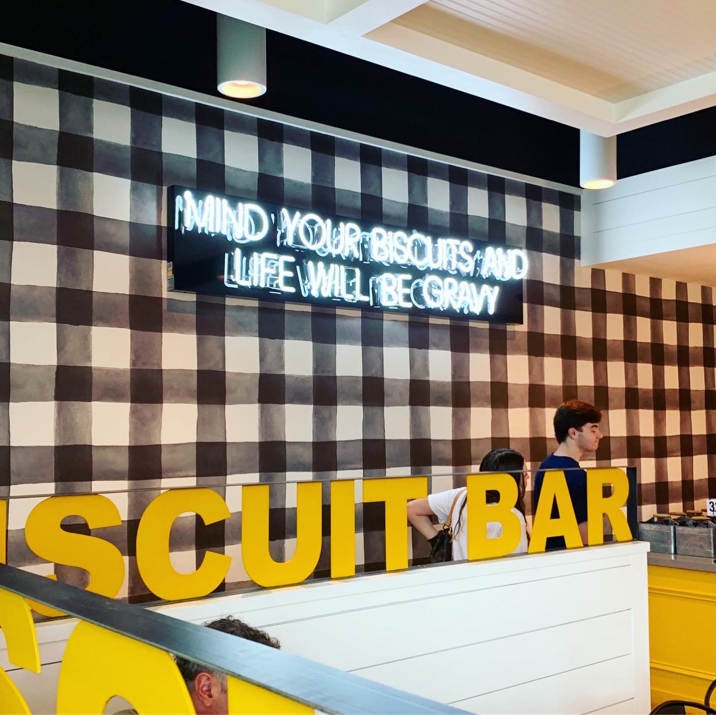
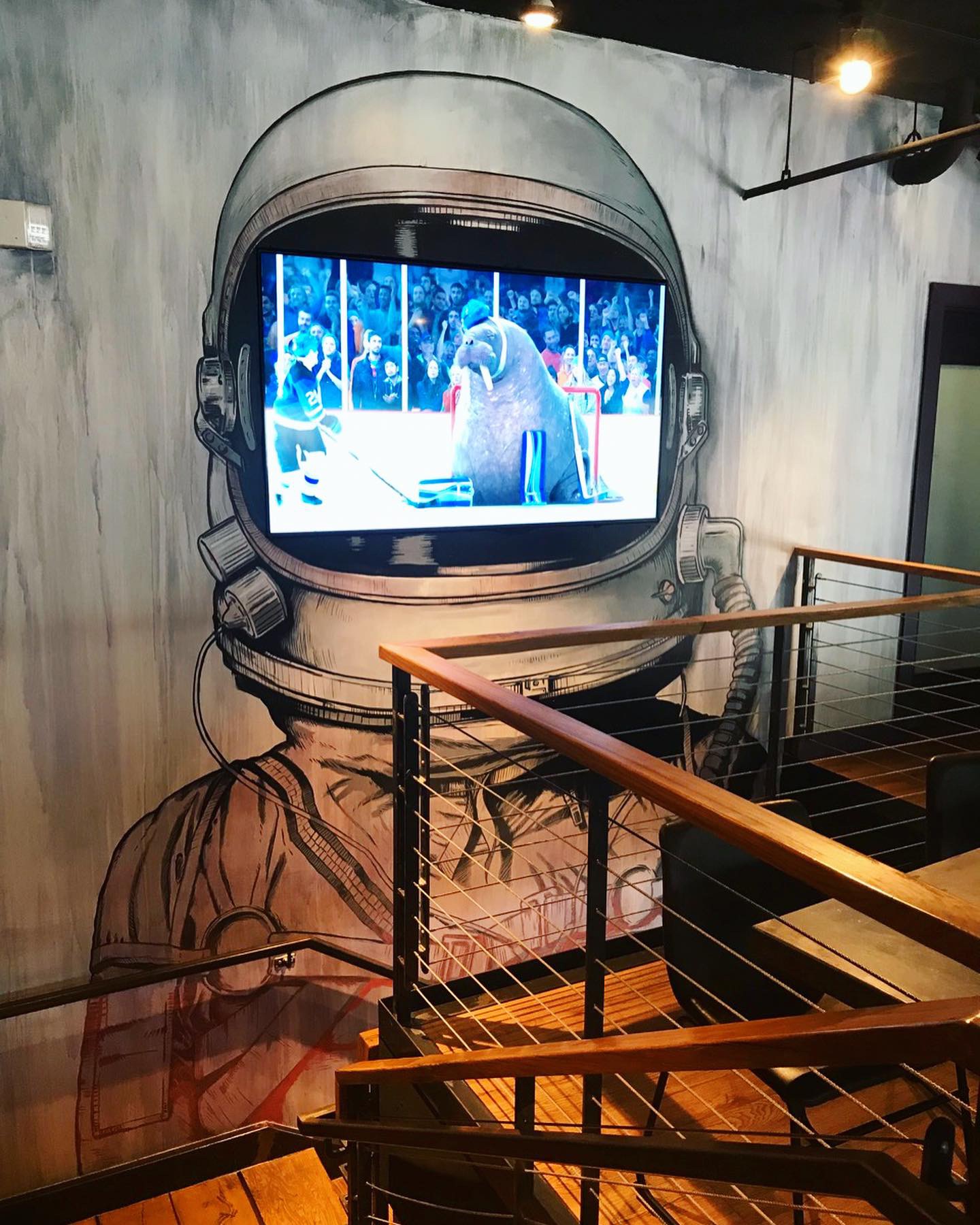
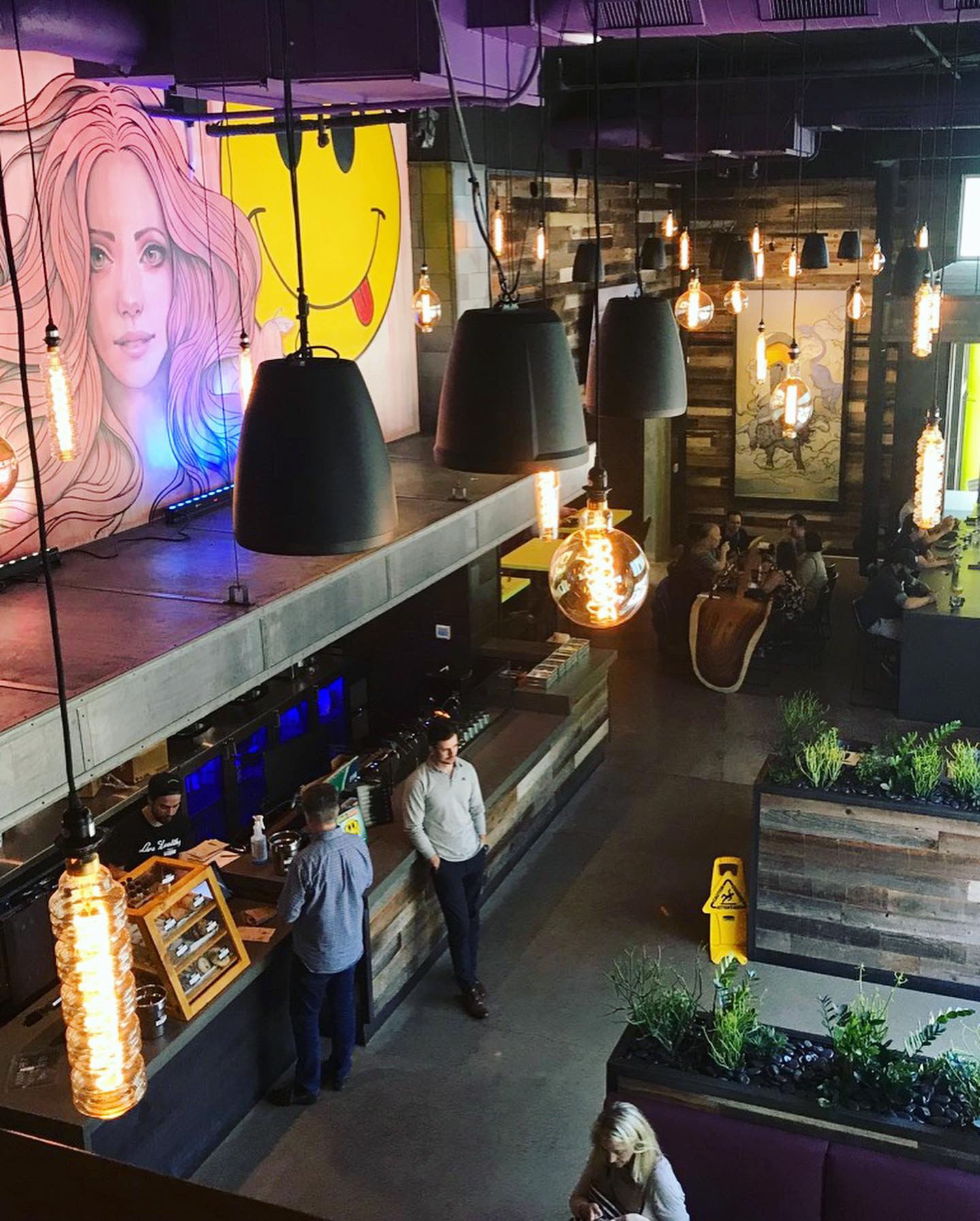
In the spirit of transparency, Studio B was responsible for the interior design so we think it’s great but so do so many others! This concept has gotten a lot of press. The owner is Antonio Swad, the founder of Wing Stop and Pizza Patrón. Antonio had a vision for this restaurant and he was able to communicate to us in a way that we could translate it to the space. It’s quirky, it’s Southern but it’s polished. In fact, Mr. Swad has coined the term “Polished Comfort” to describe his latest restaurant venture. Finish details include custom stained maple butcher block tables, custom made branded picnic tables for the porch, custom branded sconces, a steel rolling pin for the door handle of the pie shop. The list goes on… The review isn’t complete without mentioning the massive outdoor covered porch and the Porch Swing LIVE stage where bands perform every Friday and Saturday Night. Guests are welcomed to get on stage, grab a guitar and take photos in front of the neon marquee.
Branding DNA:
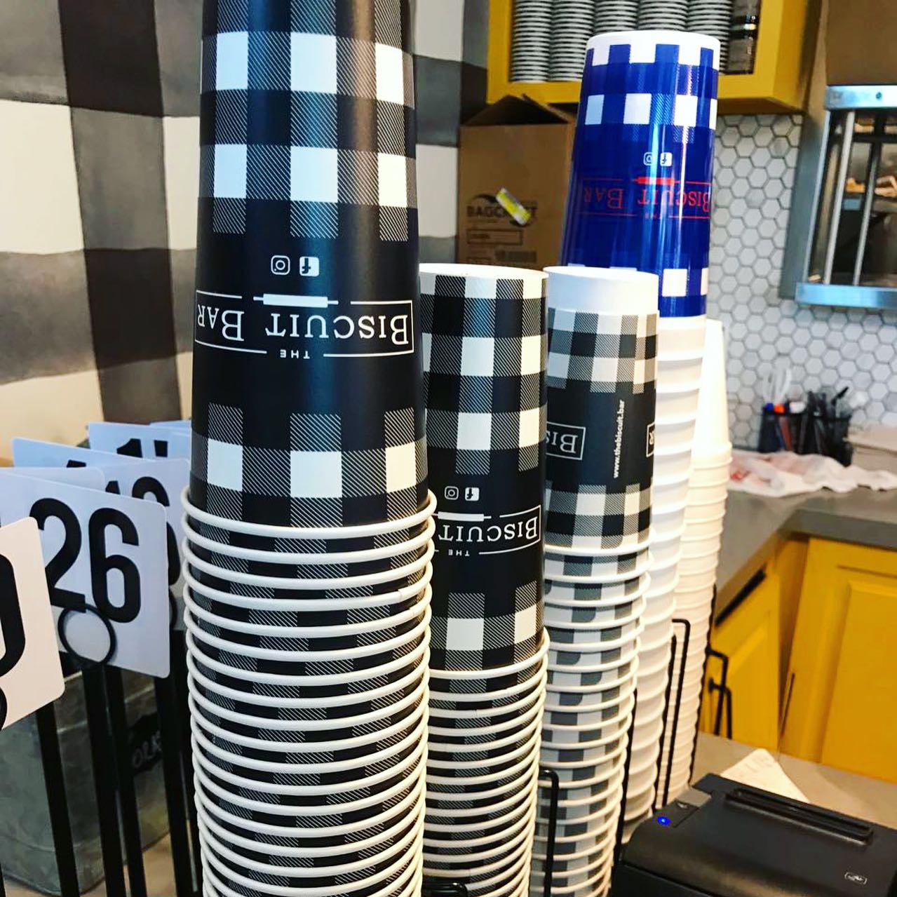
Studio B was also responsible for the branding and packaging at Porch Swing. A version of the logo was given to us in the beginning and the color palette was established. Beyond that, we designed the sign package, menus, custom packaging, apparel, retail items, etc. The Pie Company is a separate brand within the restaurant and uses complementary graphics and colors. Individual pie slices to-go come in a cute little box with branded belly band and fork. Whole pies are sold in custom two piece pie boxes.
Digital Branding:
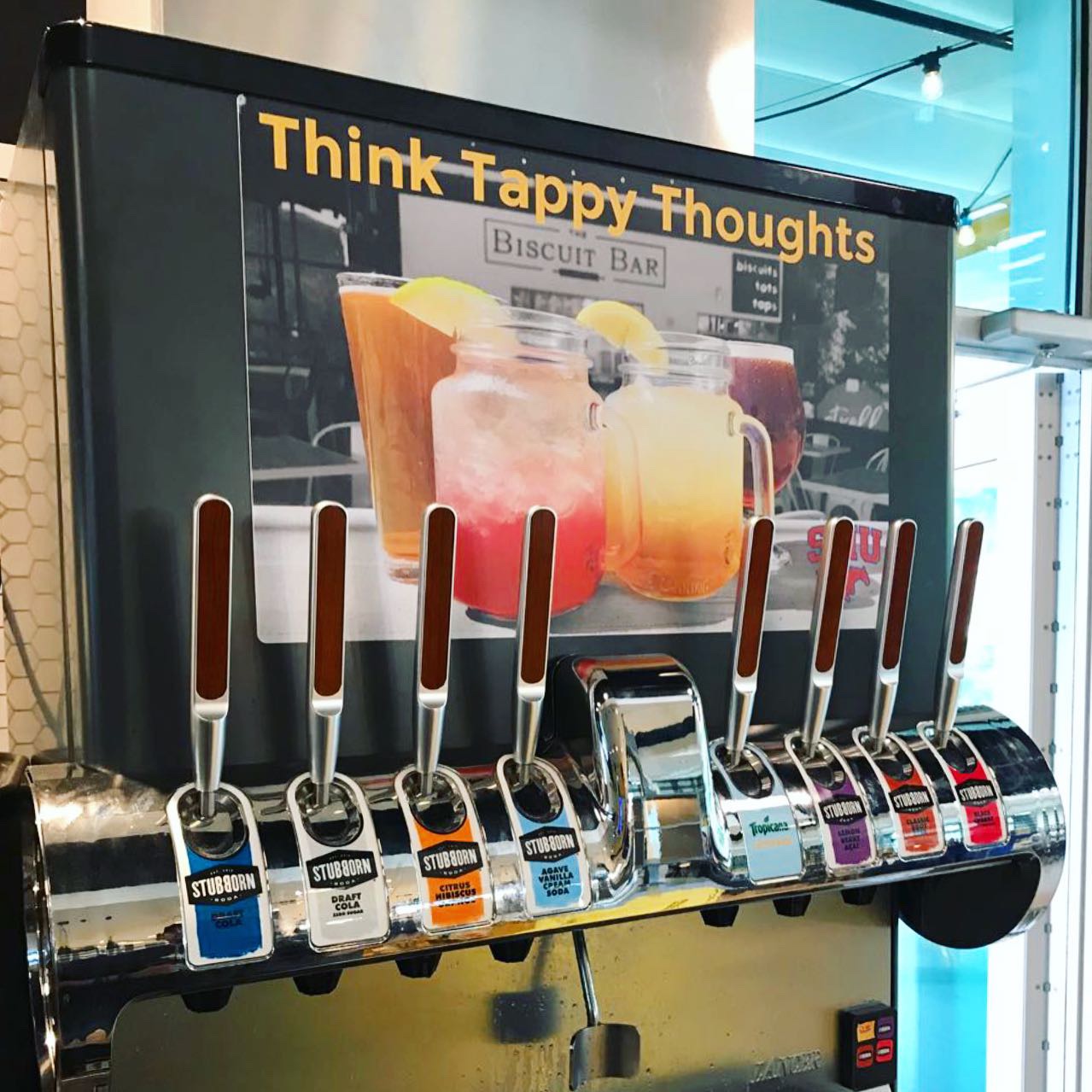
Porch Swing has a beautifully designed website by Raze Media. Their website uses amazing food photography, is easy to navigate and engages the user. Porch Swing has Facebook, Instagram and Twitter accounts that they post to quite frequently. Their social media highlights the mouthwatering food and the live music performing every Friday and Saturday night with a dash of marketing.
–Danny
Score:
We give Porch Swing an A+!
#FridayFeed:
Every Friday, Studio B Dallas visits a local fast casual concept for lunch to critique the brand (and eat lunch). Three rules apply: it’s a concept we haven’t been to or it’s been in the restaurant news and it’s within 10 miles of our office. Wait, four rules – it can’t be sushi. Danny doesn’t do sushi. If you have any suggestions on where we should eat next, feel free to leave it in the comments. Look for our restaurant branding reviews each Friday! MJ & Danny
-
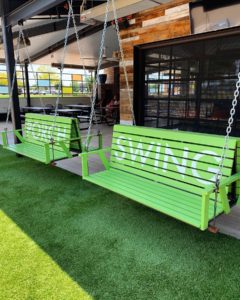
- Branded Porch Swings

-
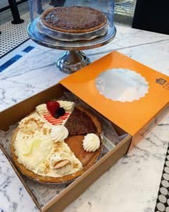
- 6 Flavor Sampler Pie
-
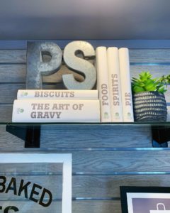
- Branded Book Sleeves

-

- Chicken Fried Steak & Broccoli Bliss
-
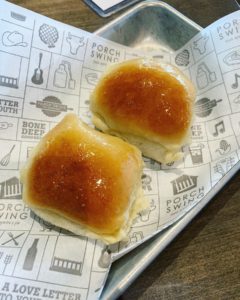
- Porch Swing Dinner Rolls

-
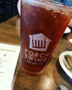
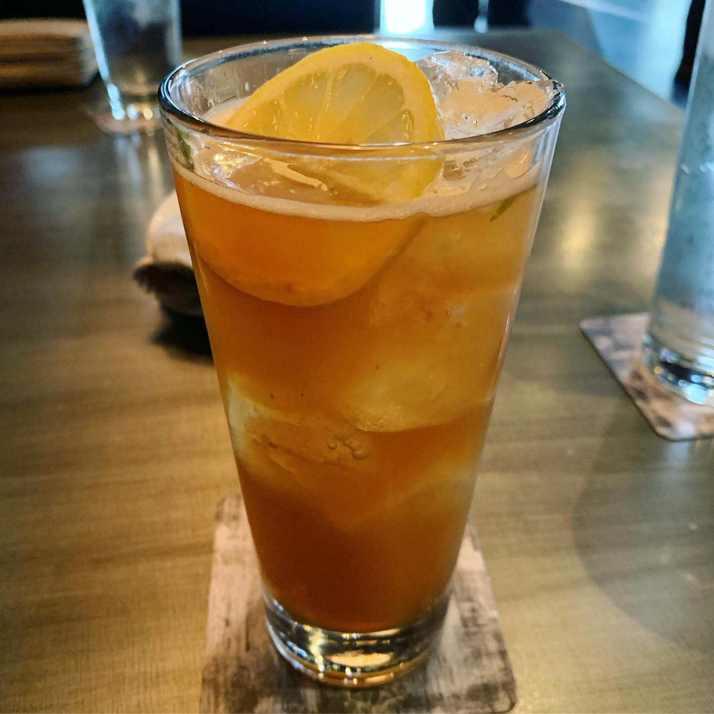
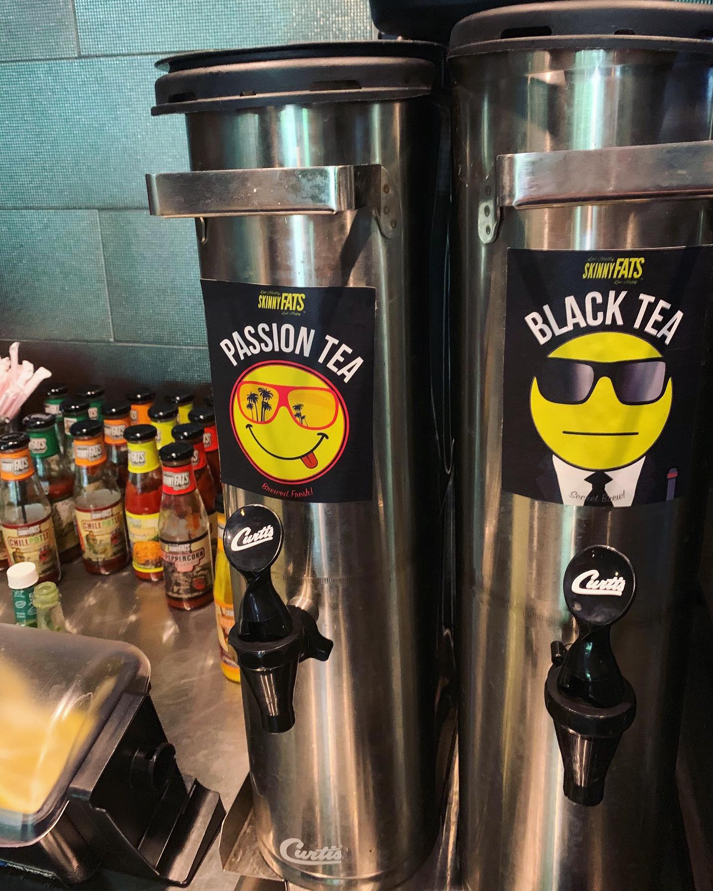
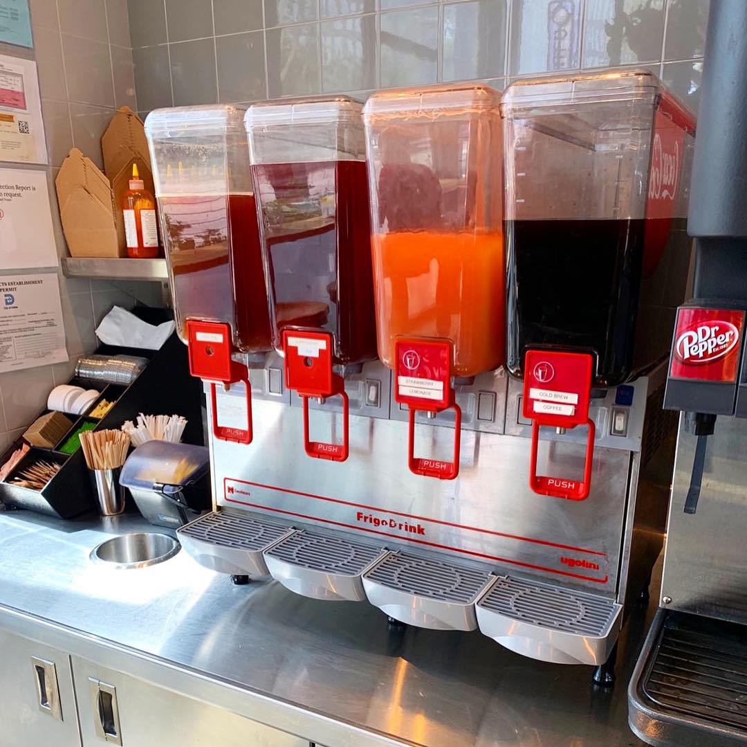
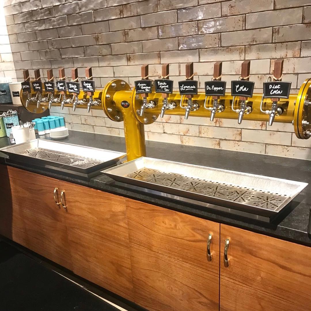
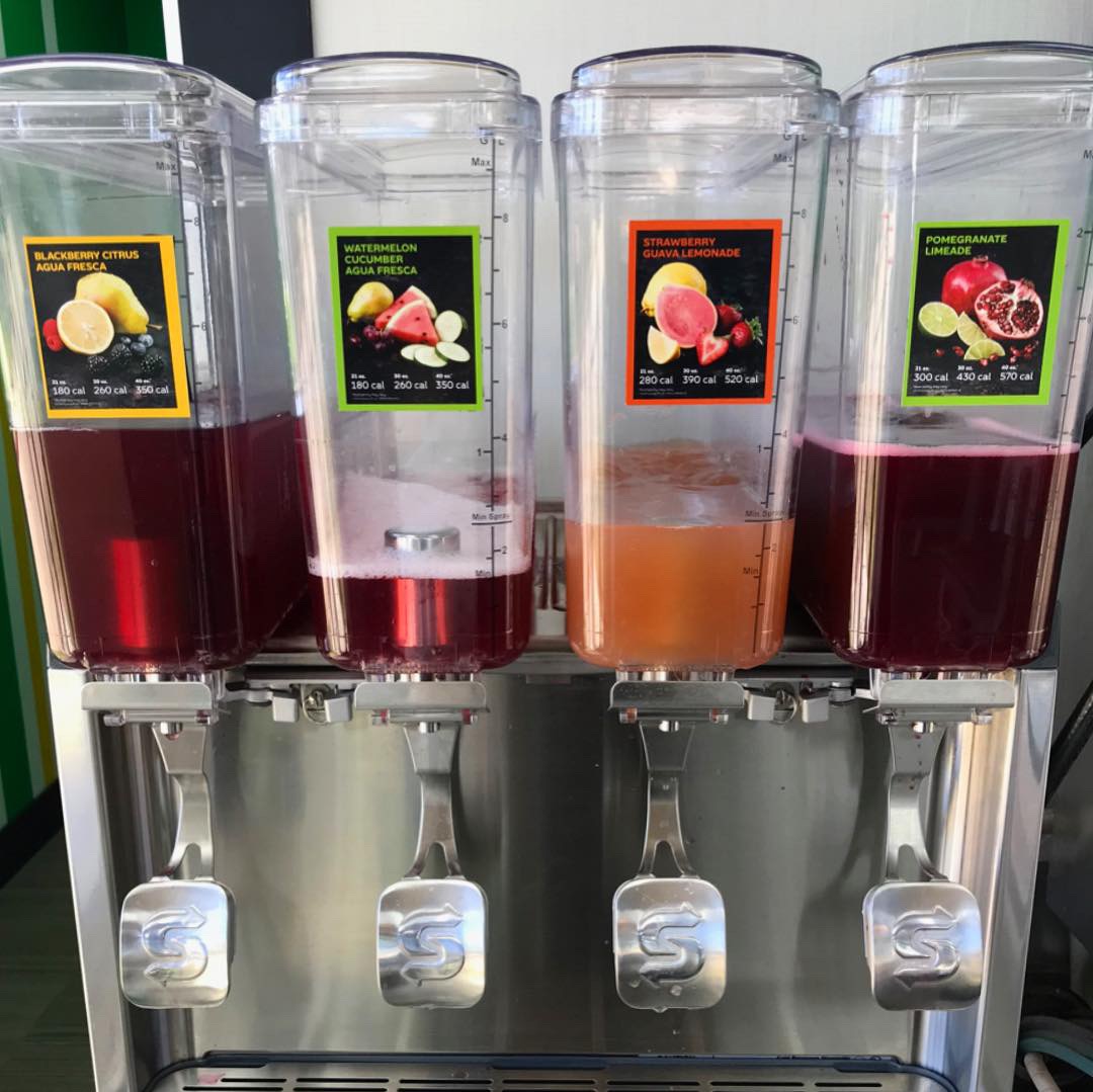
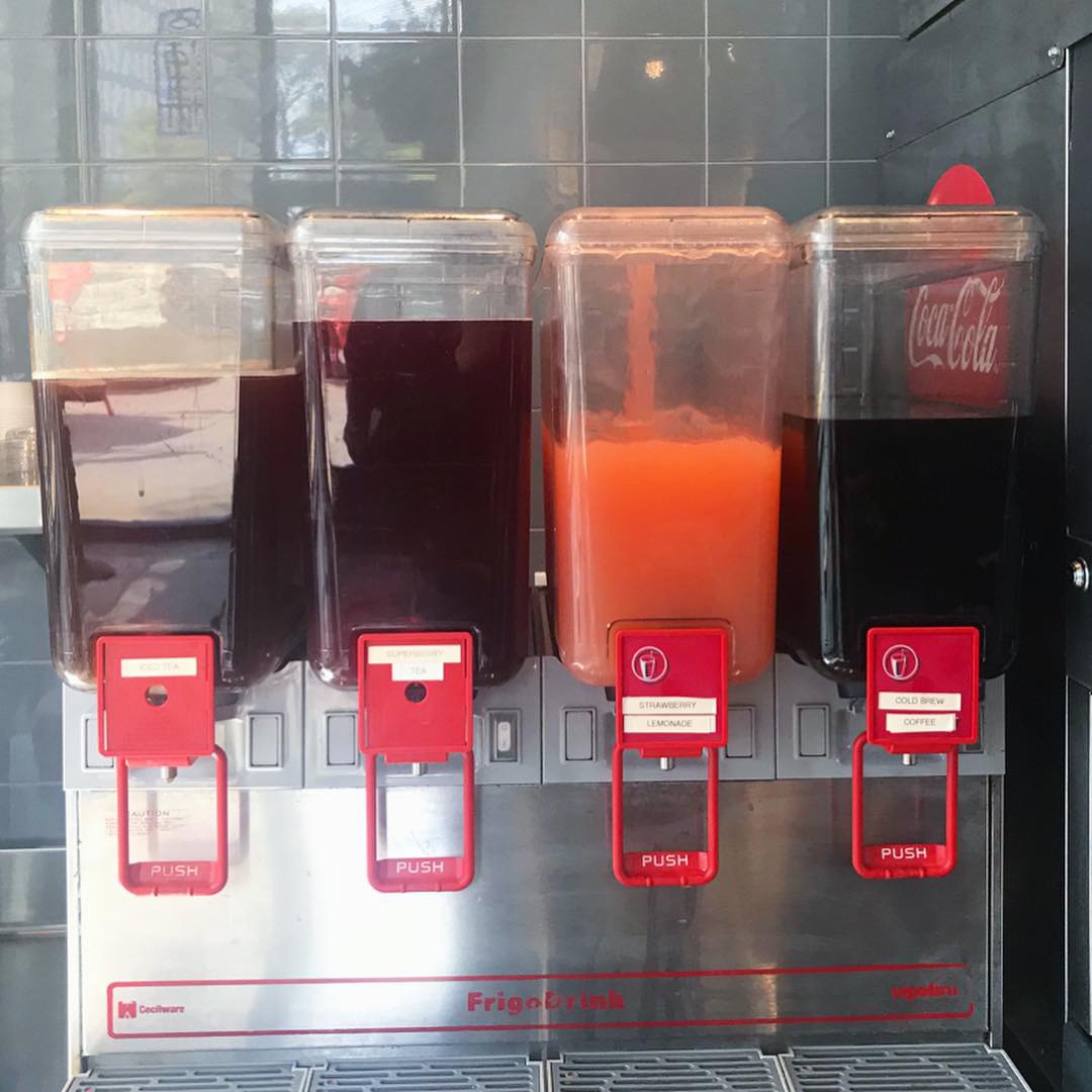
- Fresh Brewed Tea

-
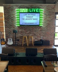
- Custom Porch Swing Live Marquee
-

- Branded Apparel


Recent Comments