
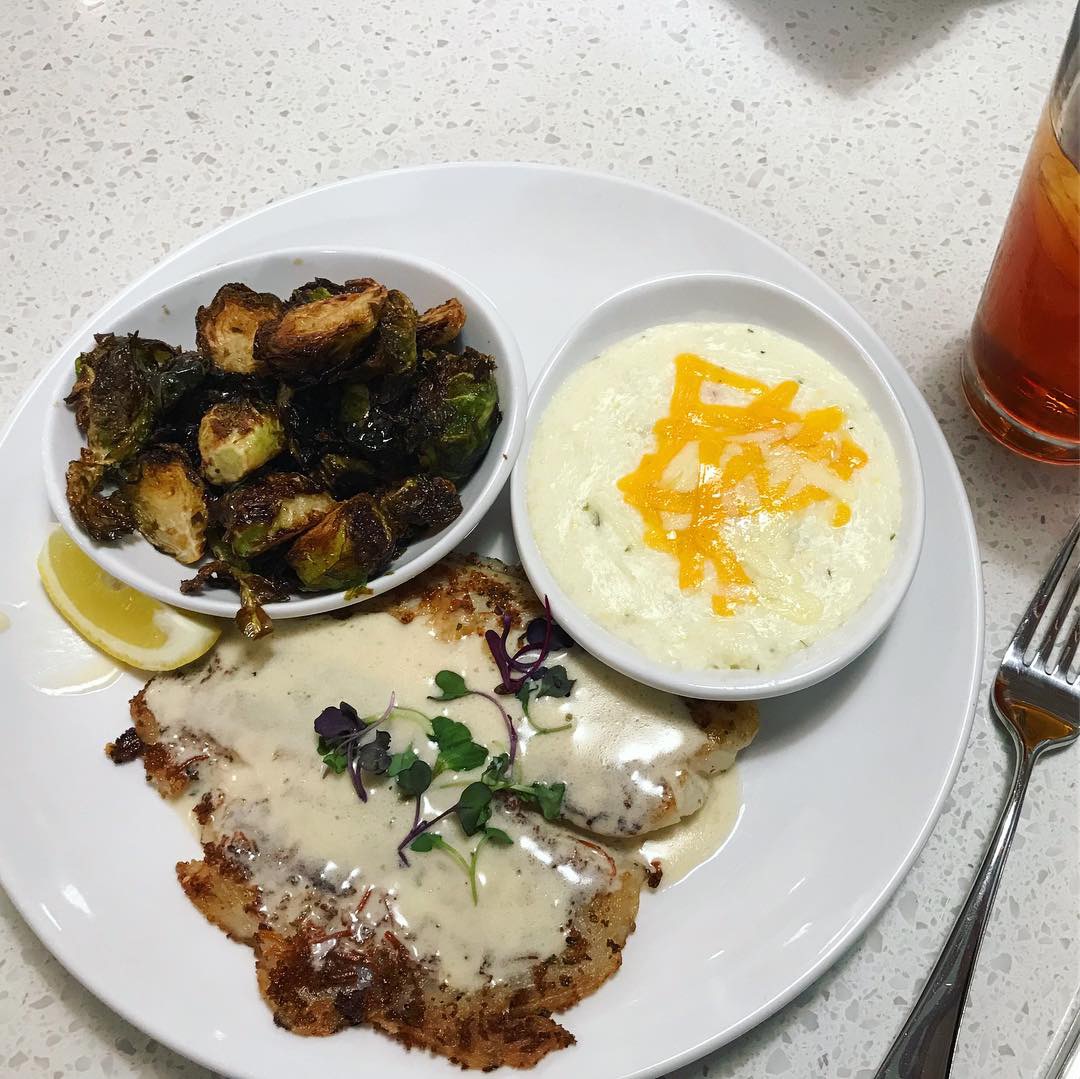
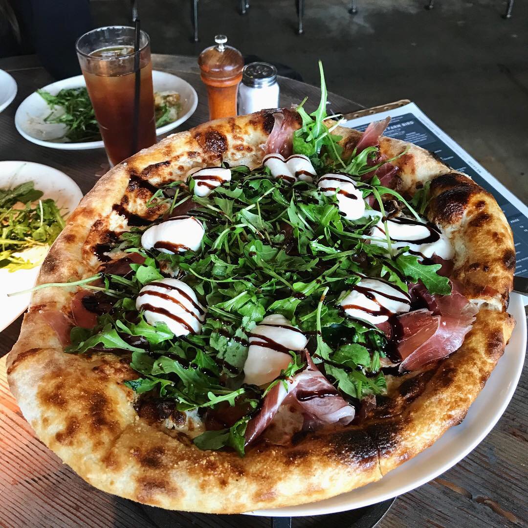
Parmesan Crusted Tilapia
This week’s #FridayFeed restaurant branding review is Rex’s Seafood & Market on NW Hwy and Hillcrest in Dallas.
Order Up!
Rex’s has a super popular location at the Farmer’s Market and we heard they were opening a traditional location near Highland Park. Rex’s doesn’t really fit into a fast casual category – actually we don’t know any seafood concepts that do. You go from Long John Silvers (fast) to Joe’s Crab shack (casual) pretty much, right? But – we haven’t reviewed any seafood yet and figured it was close enough. AND, we heard that Coeval had done the design – more on them later – let’s talk food.
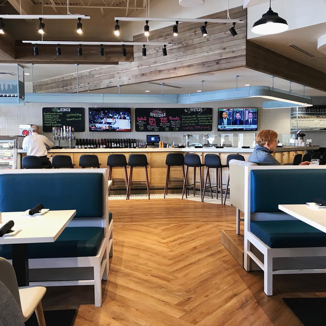
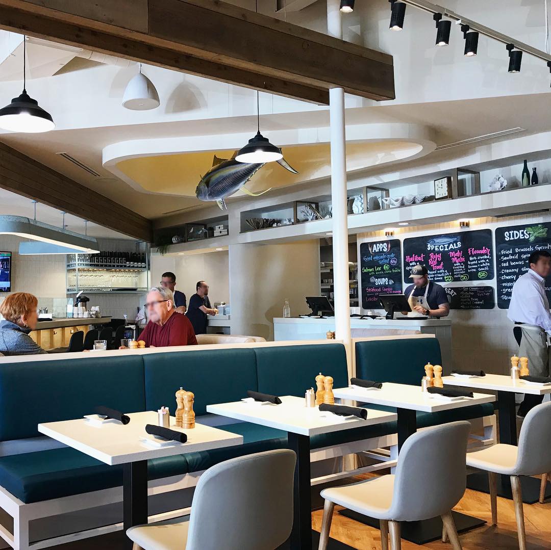
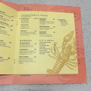
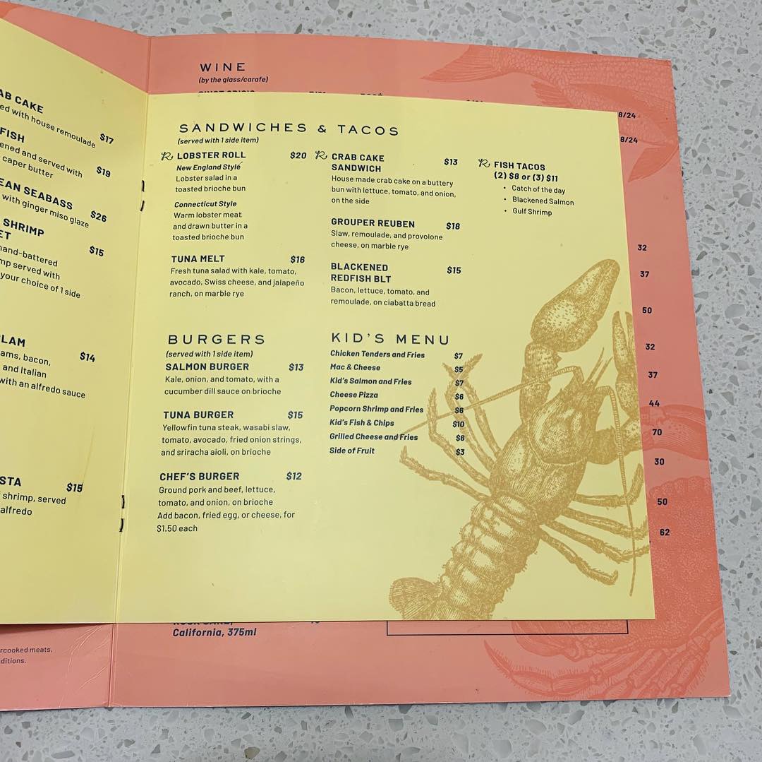
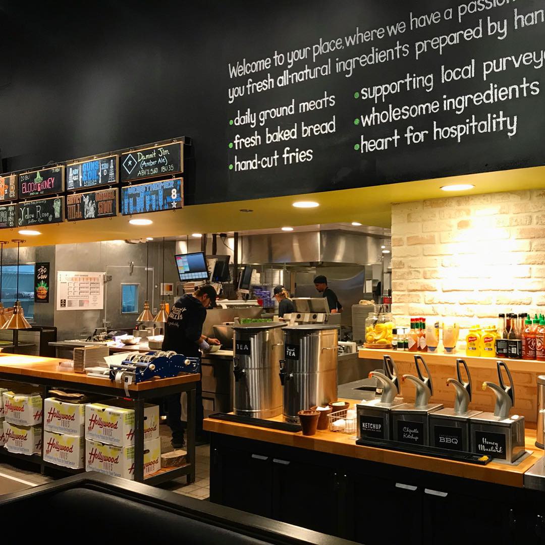
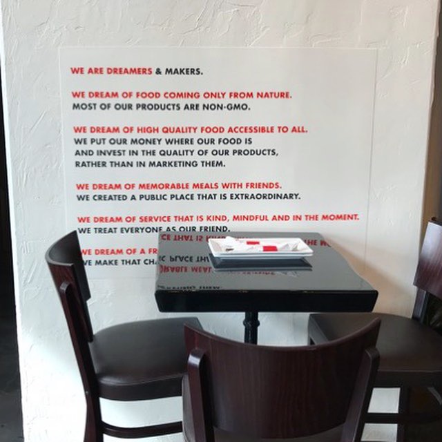
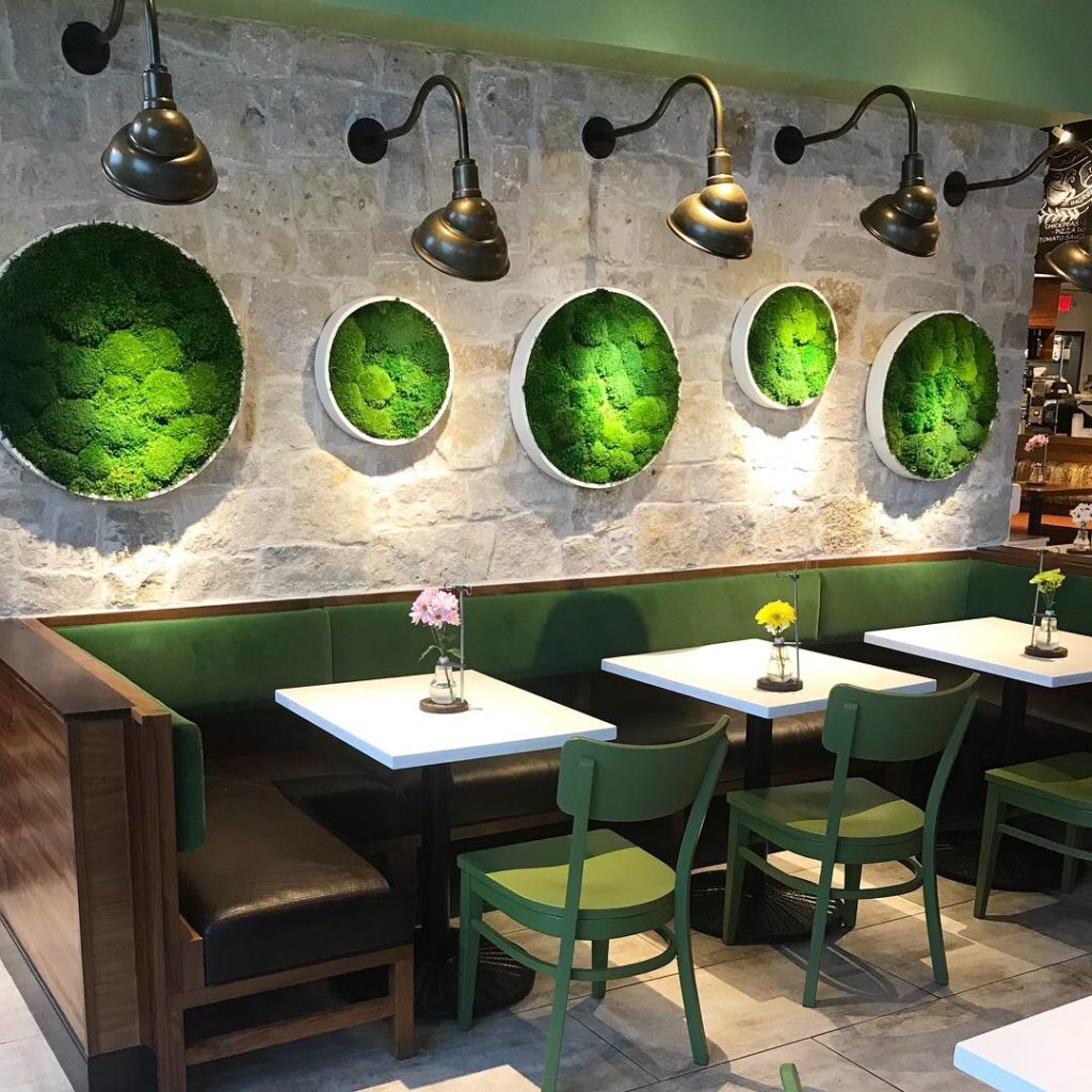
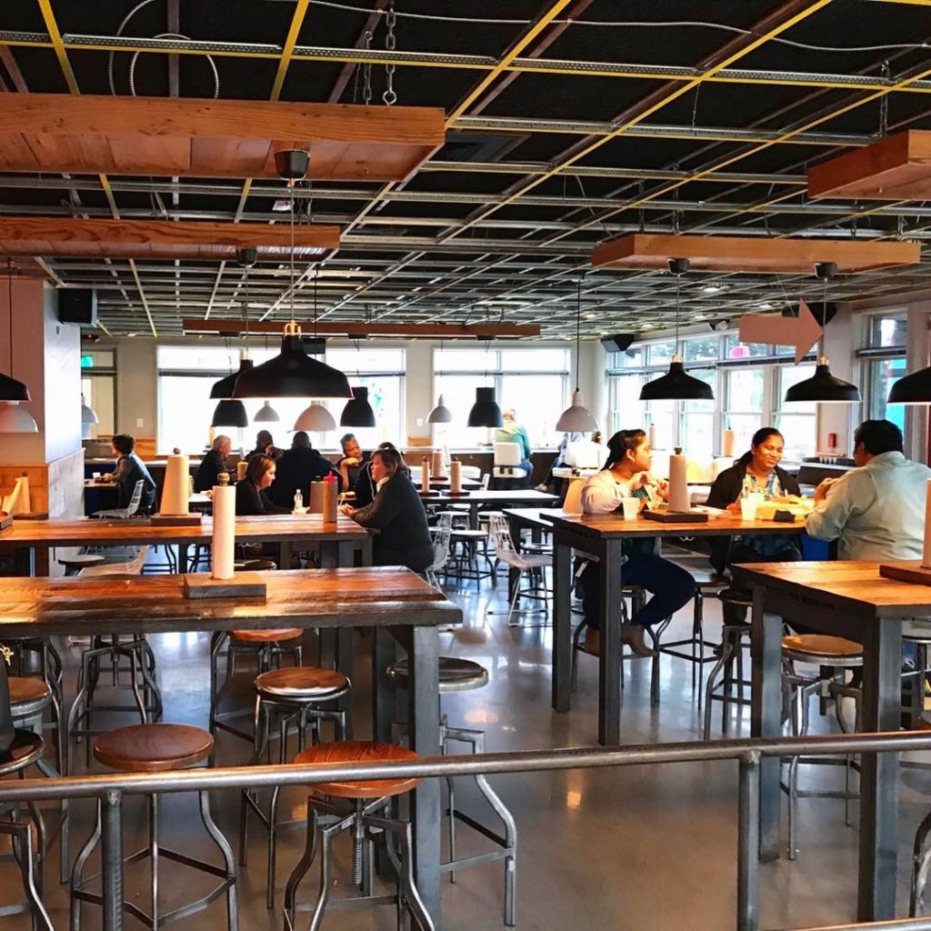
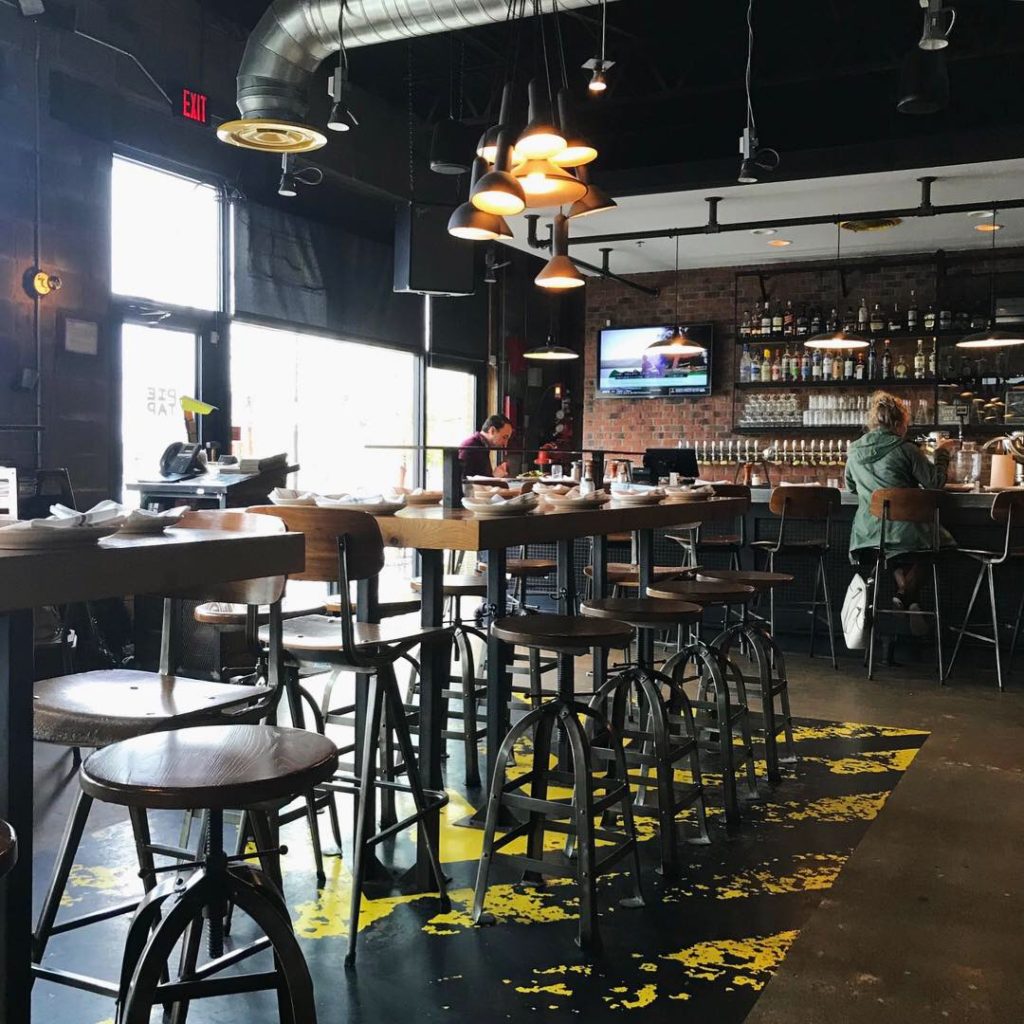
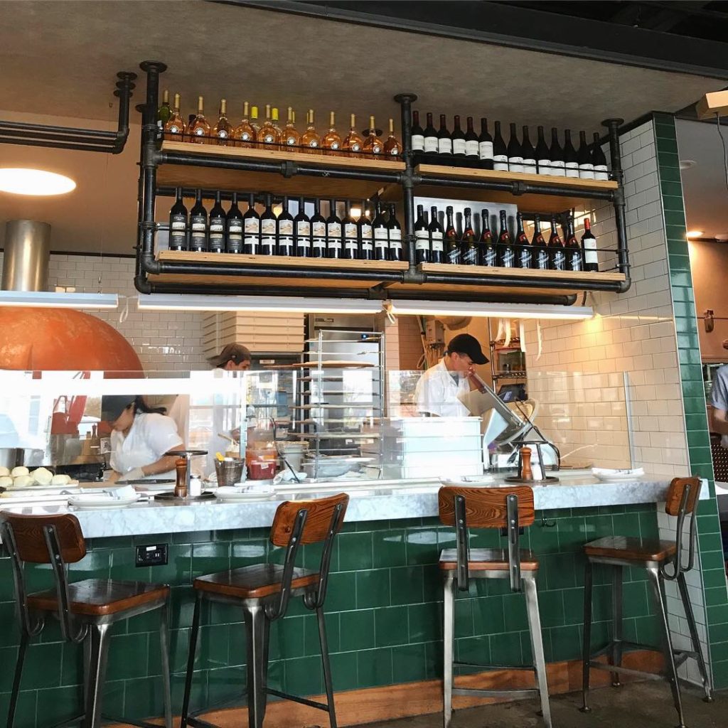
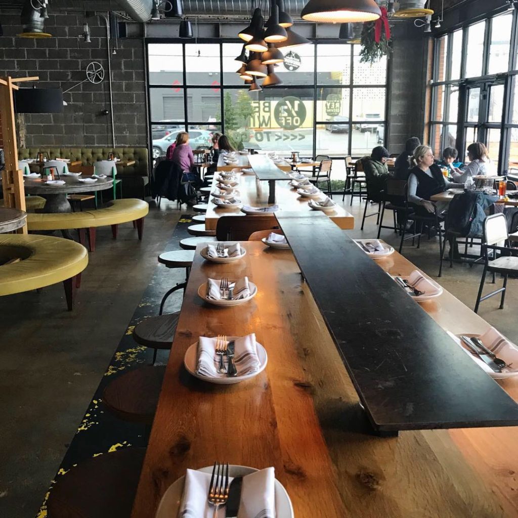
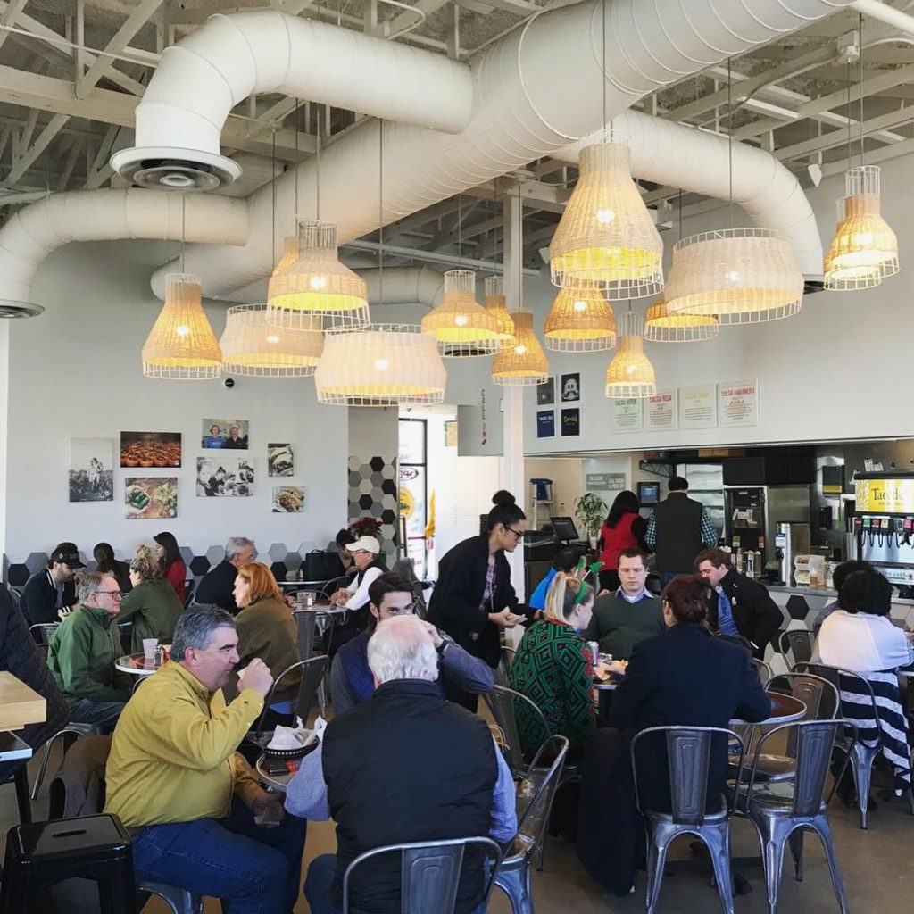
Upon entry, we were greeted by a server who offered us a look at the “market” case of fresh seafood, a seat at the bar or a table for two for lunch. We chose a nice booth along the wall where we had a good view of the open space. The menus were nicely designed and pretty – not a piece of paper on a clip board or busy laminated kind with cartoon photos of crabs and such. Colors are a deep ocean blue and butter yellow.
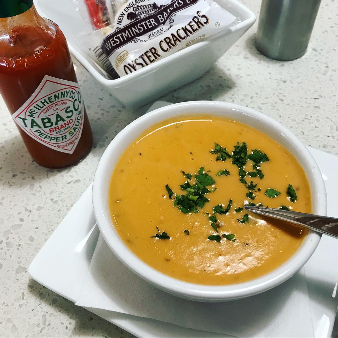
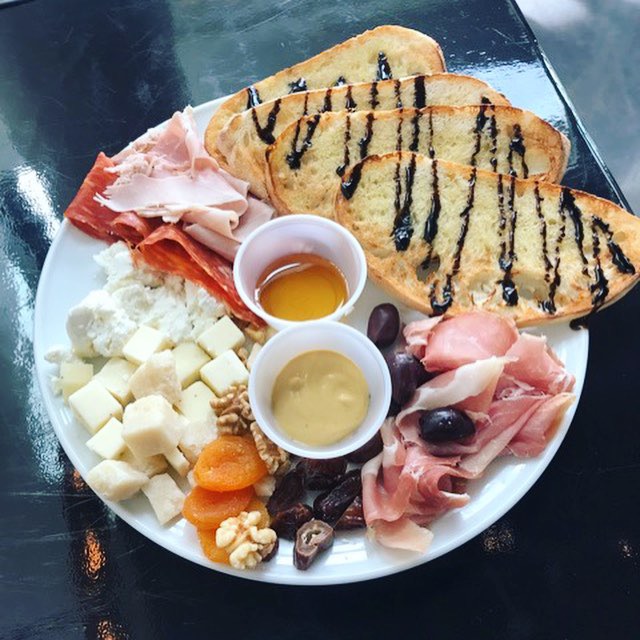
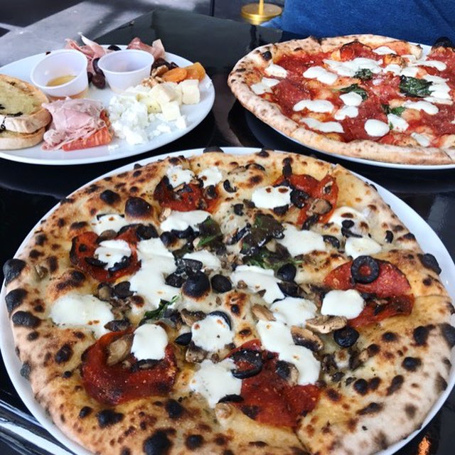
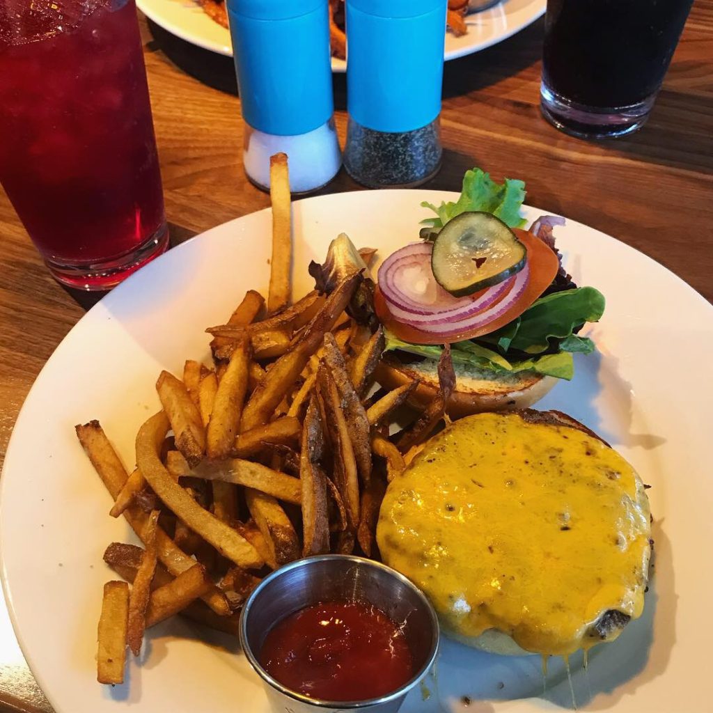
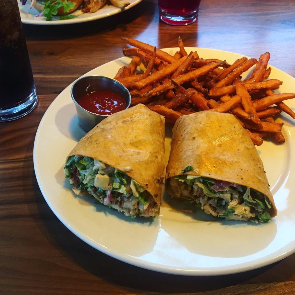
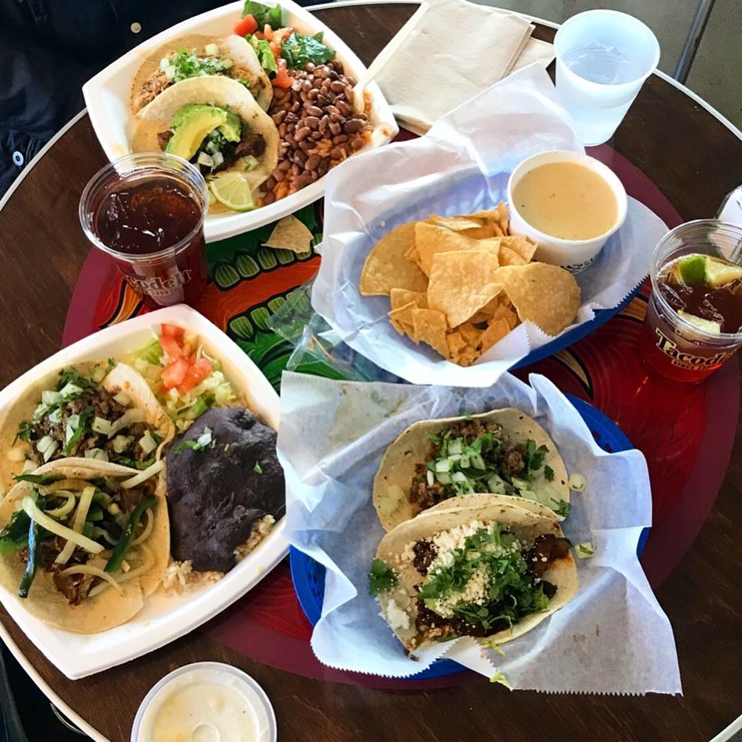
I love lobster bisque so I ordered a cup to start with and the parmesan crusted Tilapia with fried Brussel sprouts and cheesy grits for my entrée. Danny ordered the fried shrimp basket with fries and broccoli with a side of jalapeño ranch. The bisque was perfect. Creamy, velvety, yummy. The tilapia came with a lemon butter sauce on top and it was delicious. Fried Brussel sprouts – yum. Cheesy grits – could have been cheesier. I love grits so I inquired about shrimp & grits which they said they have on the weekend brunch menu. They offer a nice selection of desserts and ice cream as well .:) They have daily specials and a sweet happy hour special M-F from 3-6 – Gulf Oysters $1 and Premium Oysters for $2 each and $2 off all draft beer and wine.
Environmental Branding:
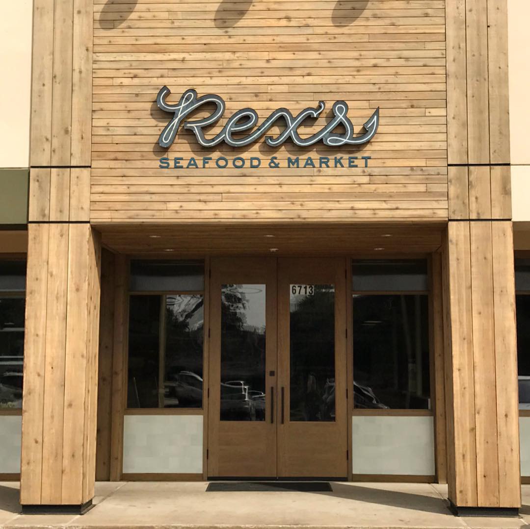
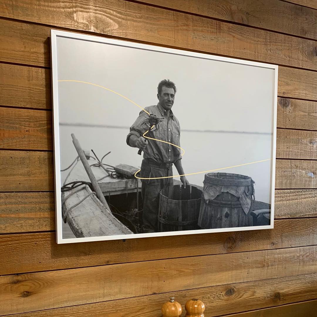
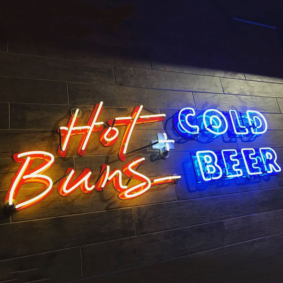
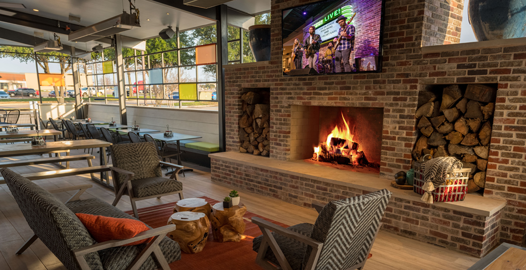
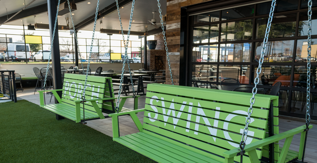
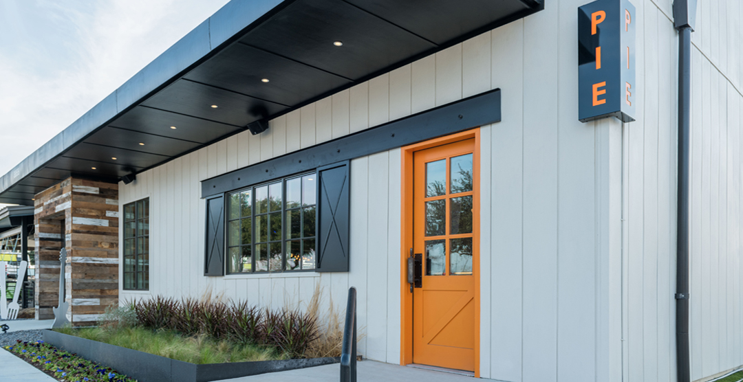
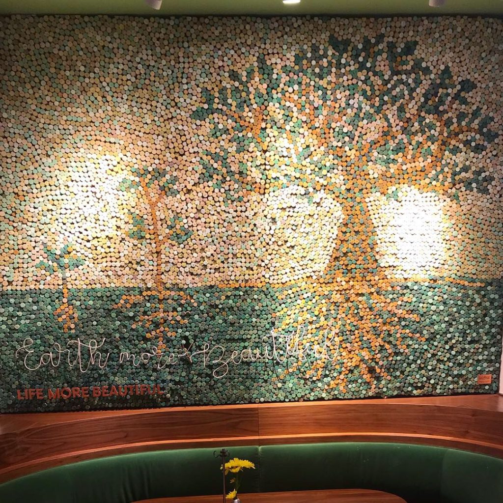
Rex’s has a really nice neon script logo sign on a background of clean plank wood and a storefront of windows so the natural light is really nice. The overall interior design is really buttoned up. They chose a nice mix of materials and colors and have several unique design features. The nods to “seafood/ocean” were more like home decor than pier & bait shack – I didn’t see one galvanized bucket of crackers or a lifesaver or net and buoy – thank goodness! I’d call it refined casual – a great middle space between a crab shack and an Oceanaire – a neighborhood restaurant where you can get beautiful fresh seafood for lunch or dinner or pop in and have a cold draft or glass of wine while you have the market steam some clams for take out.
Since our reviews include interior design, we like to give credit to the designers. Coeval Studio is responsible for the design and have worked on so many great concepts – Whistle Britches, Liberty Burger, El Bolero, The Rustic, Happiest Hour…nice work!
Branding DNA:
Great logo, nice menus, pretty interior. The only thing missing was a view of the ocean.
Digital Branding:
Rex’s Seafood has a great website. Easy to navigate, parallax scrolling and user-friendly online ordering for pick-up. Their social media accounts feature great lifestyle photographs, mouthwatering food imagery and even some shout outs to their suppliers. Their supplier spotlight is brilliant! This shows customers that they put thought and care into where their ingredients come from.
–Danny
Score:
MJ and Danny give it an A.
#FridayFeed:
Every Friday, Studio B Dallas visits a local fast casual concept for lunch to critique the brand (and eat lunch). Three rules apply: it’s a concept we haven’t been to or it’s been in the restaurant news and it’s within 10 miles of our office. Wait, four rules – it can’t be sushi. Danny doesn’t do sushi. If you have any suggestions on where we should eat next, feel free to leave it in the comments. Look for our restaurant branding reviews each Friday! MJ & Danny
-
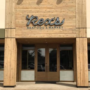
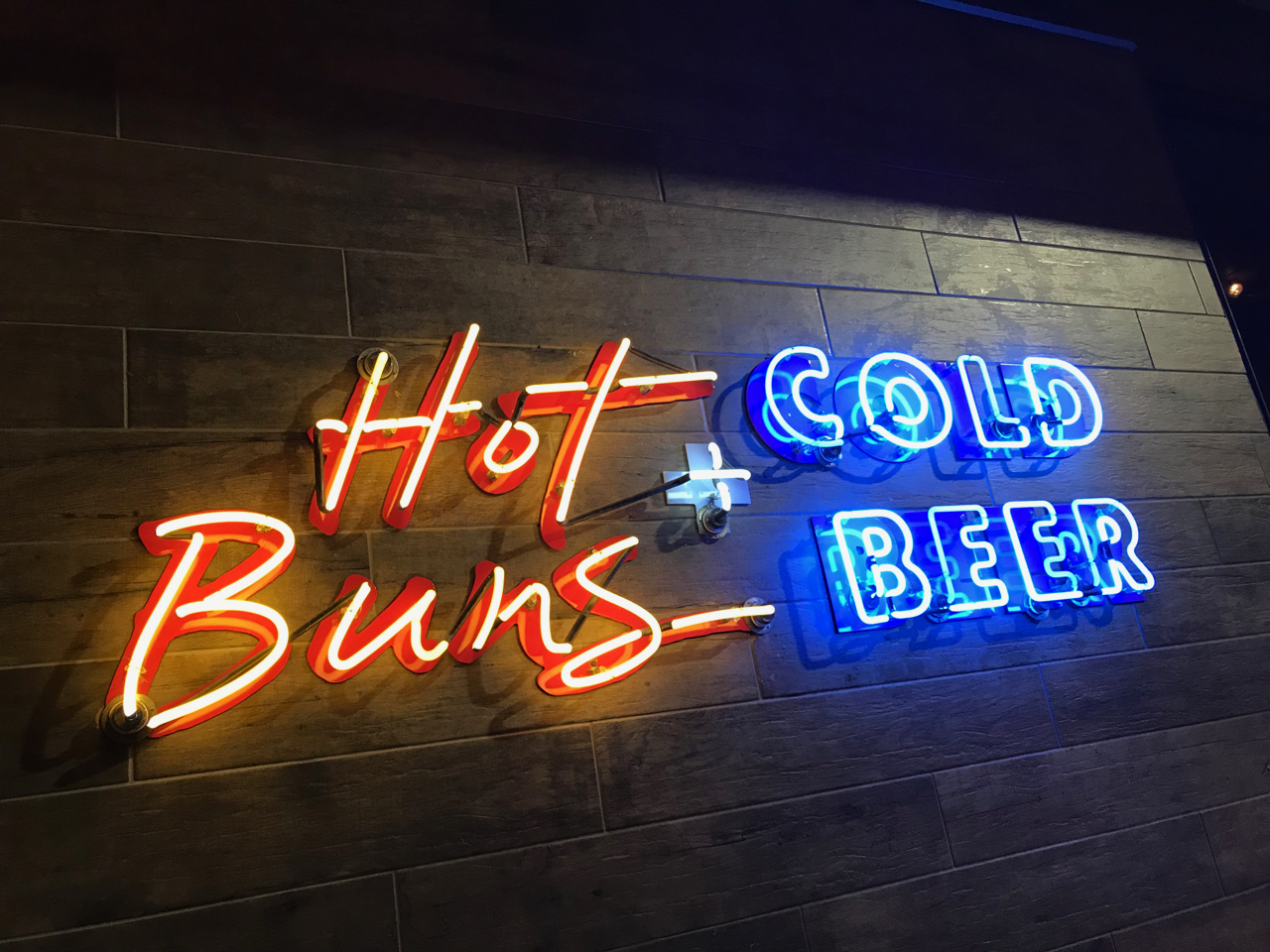
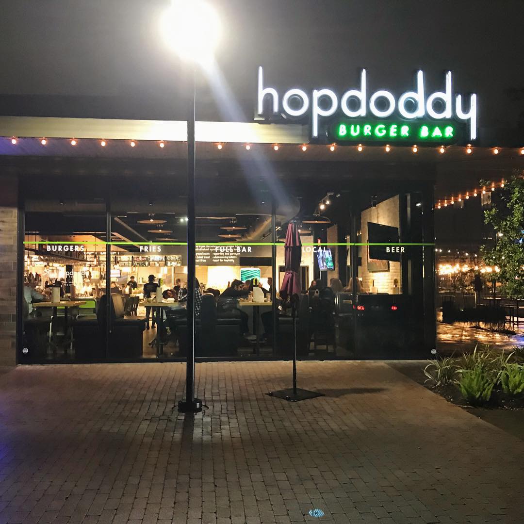
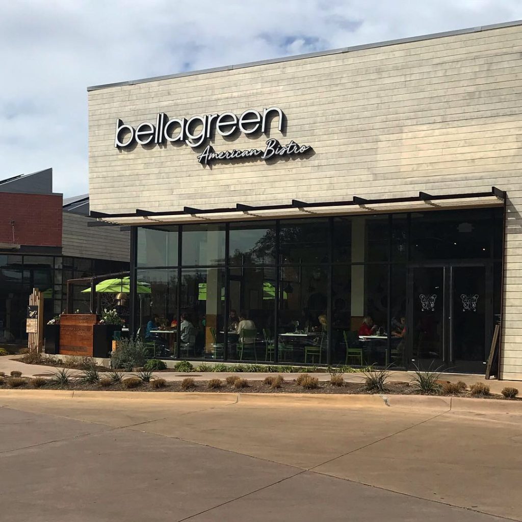
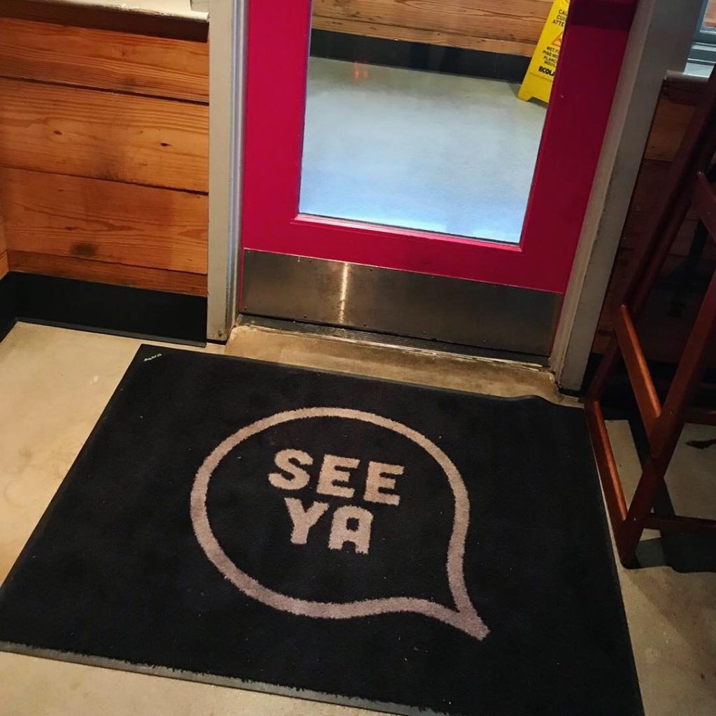
- Rex’s Seafood & Market
-

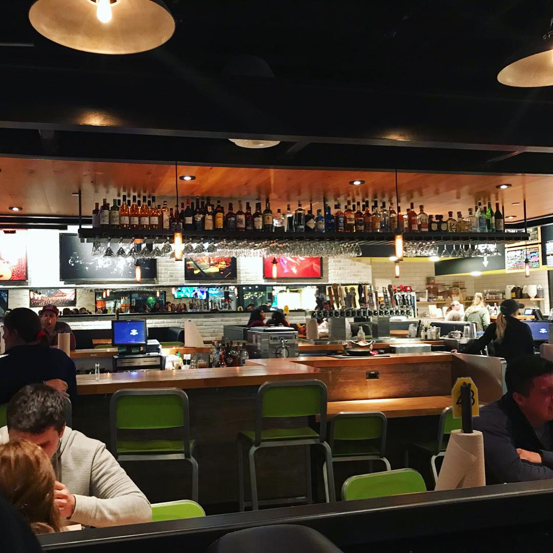
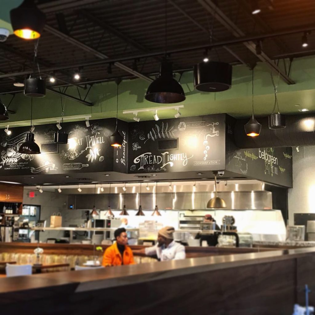
- Bar Area
-

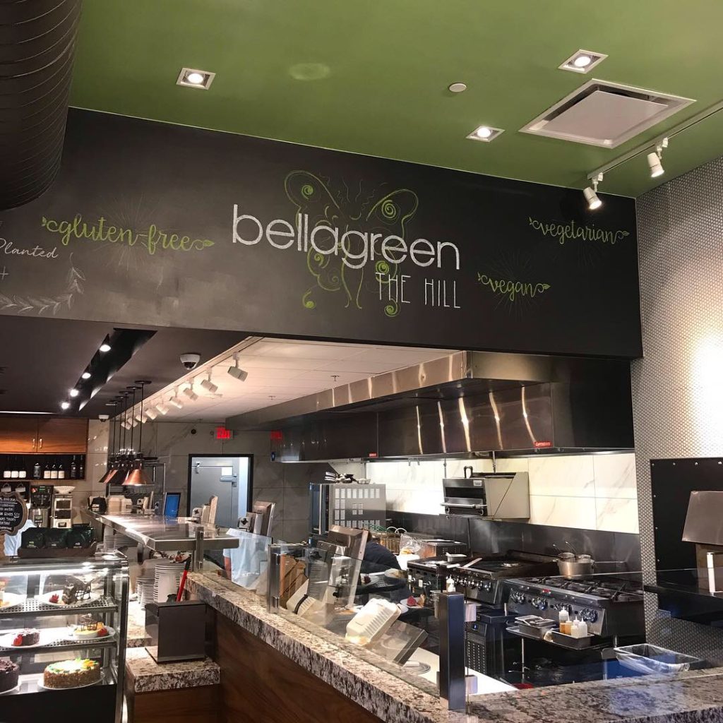
- Interior Decor
-

- Interior Wall Art
-
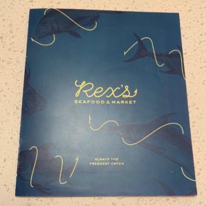
- Rex’s Menu Cover
-
- Rex’s Menu Interior Pages
-

- Lobster Bisque
-

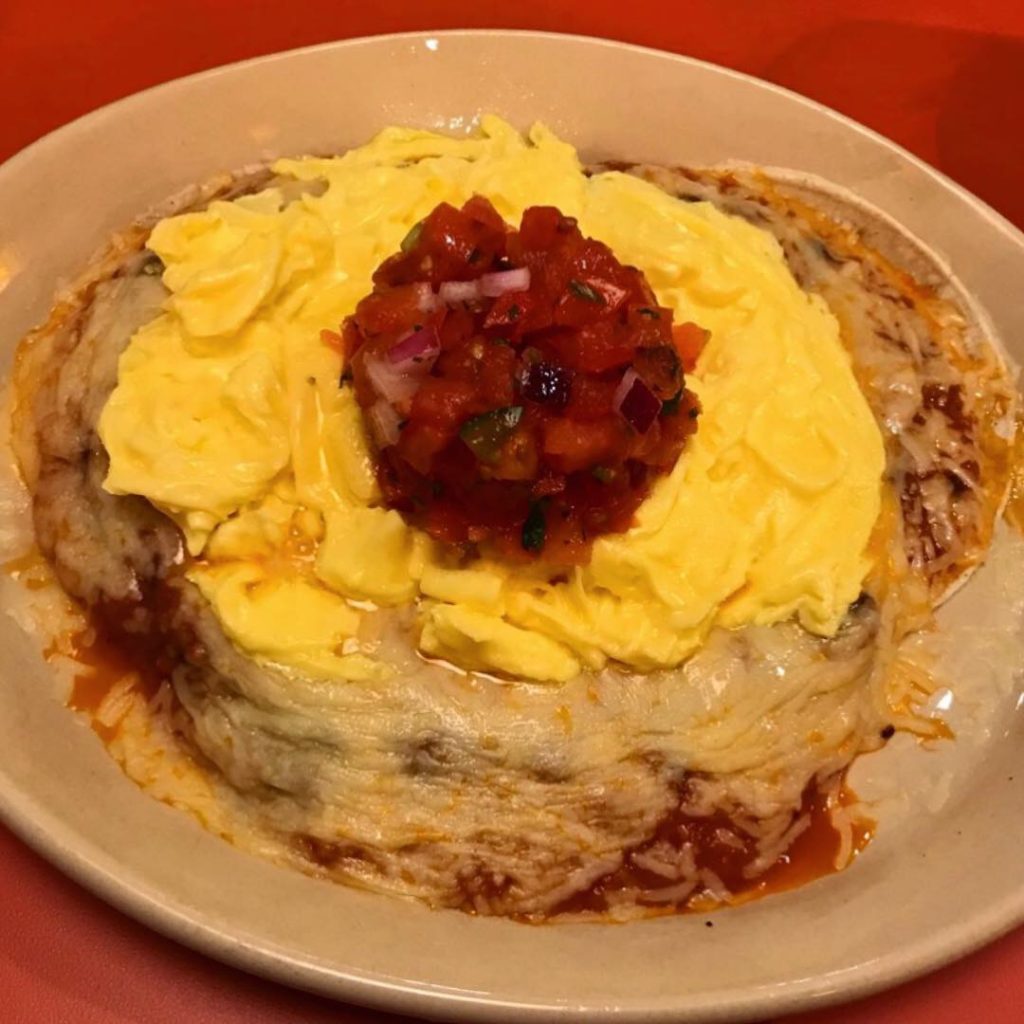
- Parmesan Crusted Tilapia
-
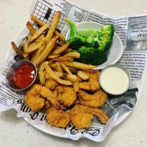
- Fried Shrimp


Recent Comments