
This week’s #FridayFeed restaurant branding review is Pie Tap at Market Center and Oak Lawn in the Design District.
Order Up!
Pie Tap has 3 locations and another on the way. I really like this place. The exterior, the interior, the photos, the food, the website and finally, the SPIEDINI (oven fired skewers of prosciutto wrapped fontina cheese served with a small arugula salad). The Spiedini is a Keto eaters dream.
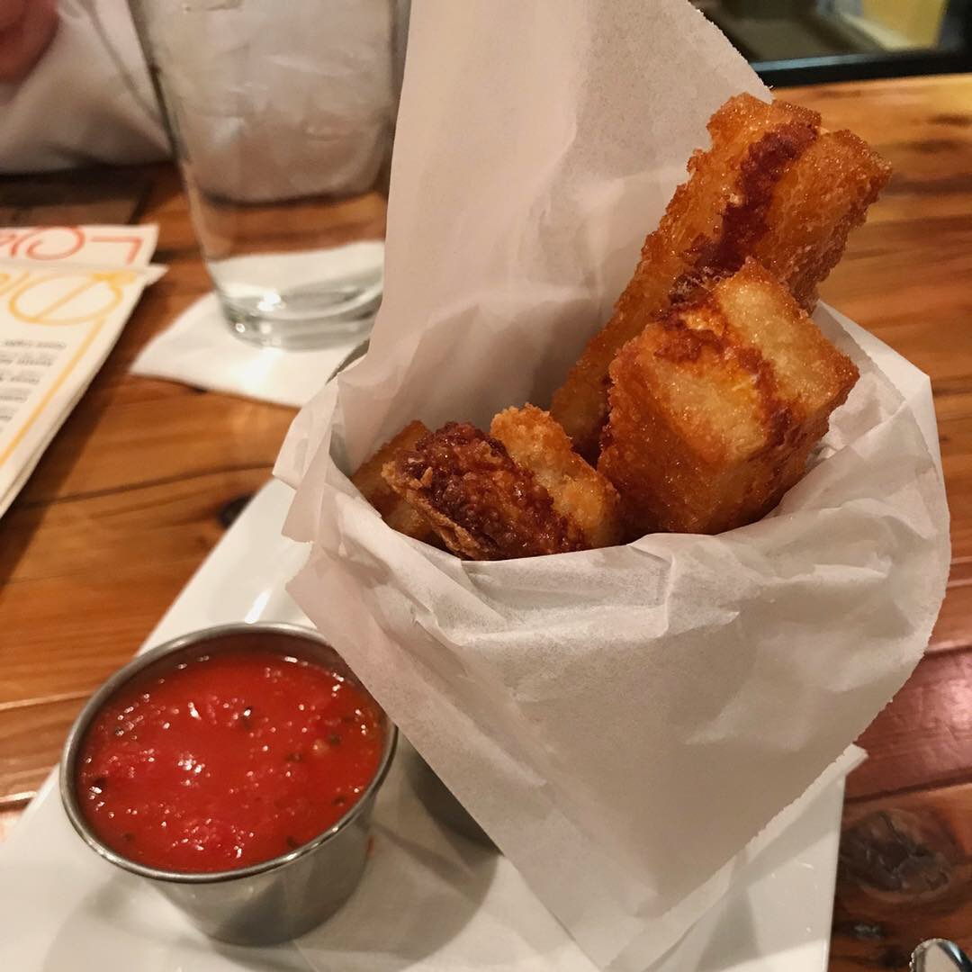
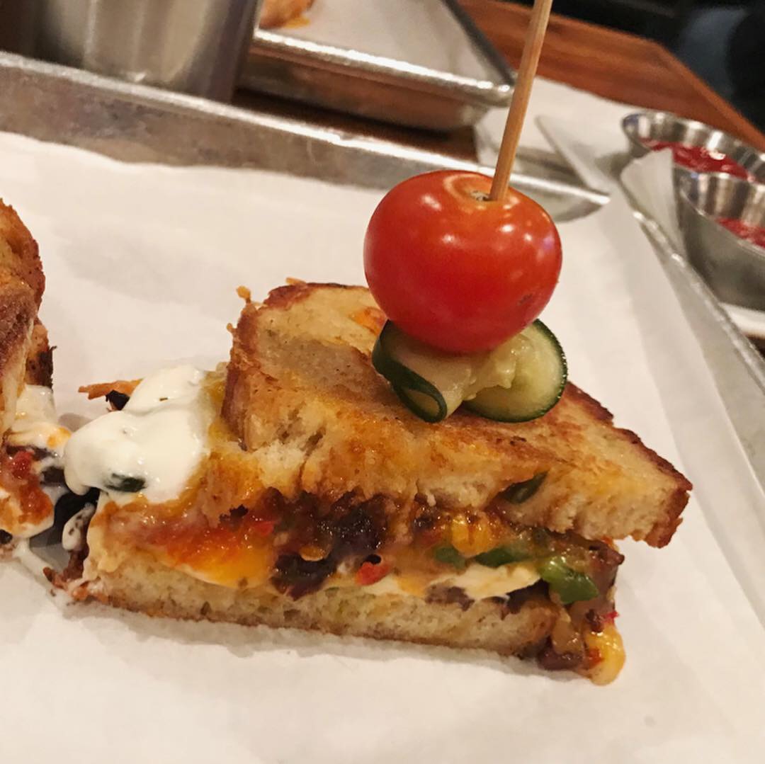
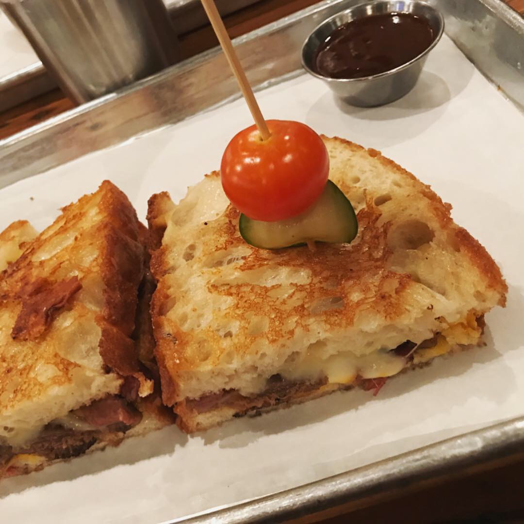
I haven’t really found much reason to leave the “snack” menu yet. Our office neighbor Erin has an unnatural relationship with the Goat cheese fondue served with toasted pecan pepper jam and fresh made rosemary bread puff -it’s nothing less than sensual. Really.
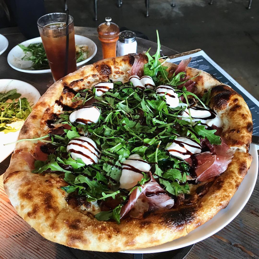
Danny is a pizza guy so he got the Prosciutto pie. It has la quercia prosciutto, medjool dates, pistachio, arugula, house ricotta, parmigiano-reggiano and is topped with a balsamic drizzle. Even though he meant to get the Salami pizza, he said the Prosciutto pizza was a sweet and savory surprise.
In 2017, Pie Tap was voted the Best New Restaurant in Dallas and won Culturemap’s Tastemaker Award.
It’s clear that there’s a chef behind the food and that he’s Italian and it’s obvious that they are having fun here. This place is cool and “neighborhoody!”
Environmental Branding:
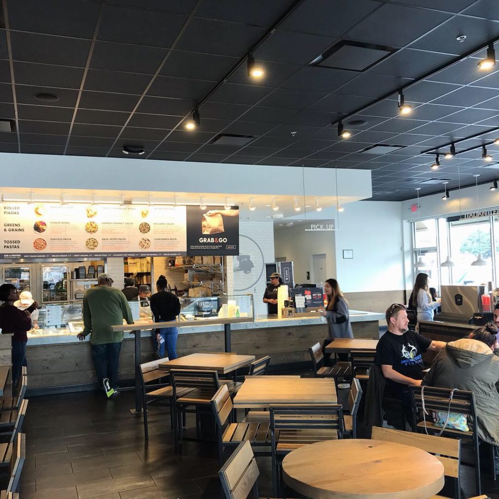
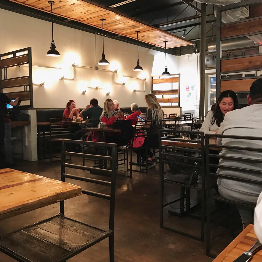
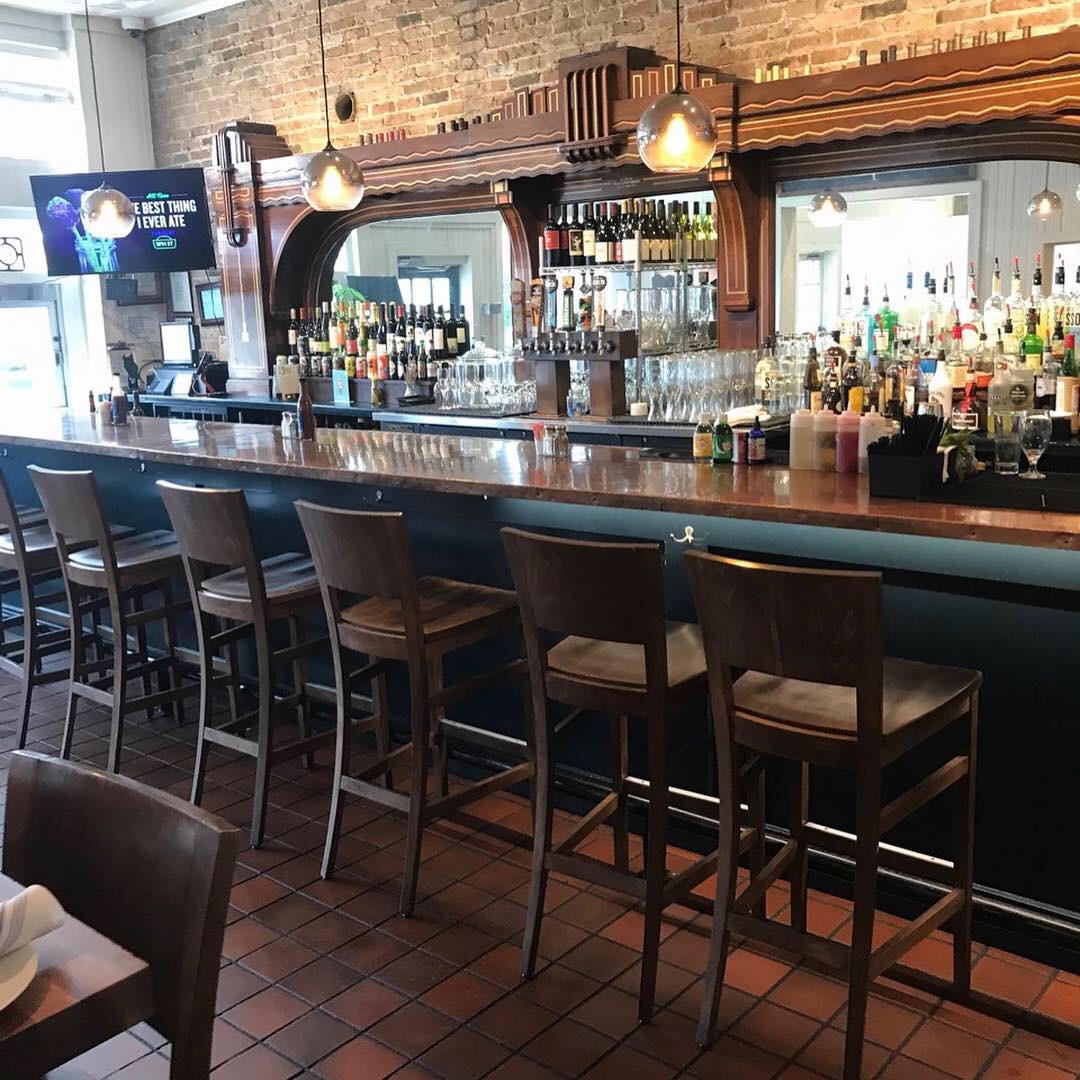
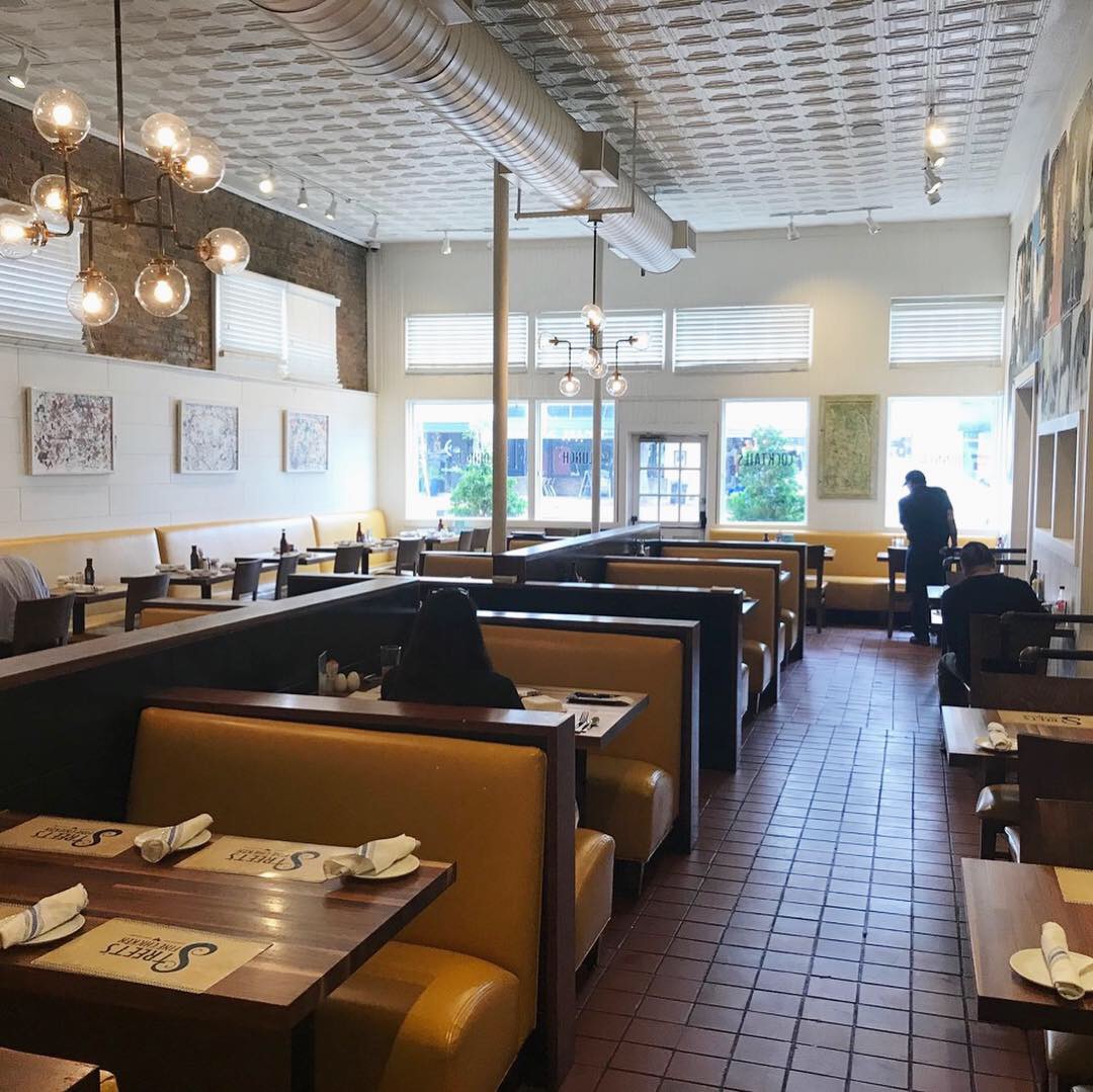
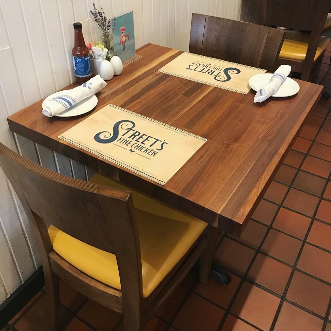
When a place is “cool” it’s really hard to describe it because, well, it’s just cool. I’m going to try anyway – one thing about this place is the WARMTH. It is true industrial design but somehow it’s not cold and uncomfortable. I think the open kitchen with two massive and beautiful italian ovens is a big part of it. The smooth warm wood tables and touches of gold upholstery make for nice and toasty interior. It actually smells warm too!
It’s not a very big place but the layout is great. I pretty much like everything except the blue and green argyle tile wall and the lightbulbs in the bathroom.
Pie Tap was designed by Plan B Group. Plan B is Royce Ring and Alex Urrunaga. They are credited with LOTS of cool restaurants – check ‘em out. Name dropping sidebar: Way back when – I worked on a few projects for Club Nikita – a basement level Russian vodka bar in West Village owned by Russell Hayward who was partners with Royce in Triple R Group. Russell owns Ascension Coffee – another great place just down the street.
Branding DNA:
The design district location has great curb appeal with lots of visibility for signage including a billboard. Window graphics advertise 1/2 price wine. There’s a big pizza wheel sculpture on the corner and outdoor seating. Everything ties in and results in one nice big branding package.
Digital Branding:
Pie Tap’s website has a scrolling banner that mixes mouthwatering food photography with decor and employee imagery that lets the consumer know what to expect any time you visit one of their locations. Their Instagram and Facebook have the perfect balance of food, marketing and lifestyle images. Pie Tap’s photographs look professional while still retaining a candid feel.
-Danny
Score:
MJ and Danny give it a solid A.
#FridayFeed:
Every Friday, Studio B Dallas visits a local fast casual concept for lunch to critique the brand (and eat lunch). Three rules apply: it’s a concept we haven’t been to or it’s been in the restaurant news and it’s within 10 miles of our office. Wait, four rules – it can’t be sushi. Danny doesn’t do sushi. If you have any suggestions on where we should eat next, feel free to leave it in the comments. Look for our restaurant branding reviews each Friday! MJ & Danny

Pie Tap Pizza Workshop + Bar 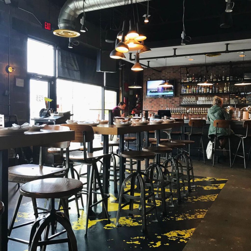
Interior Facing the Bar 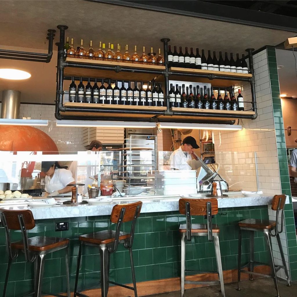
Open Italian Kitchen 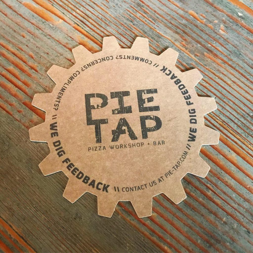
Branded Coasters 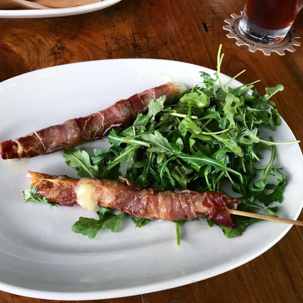
Spiedini with Arugula Salad 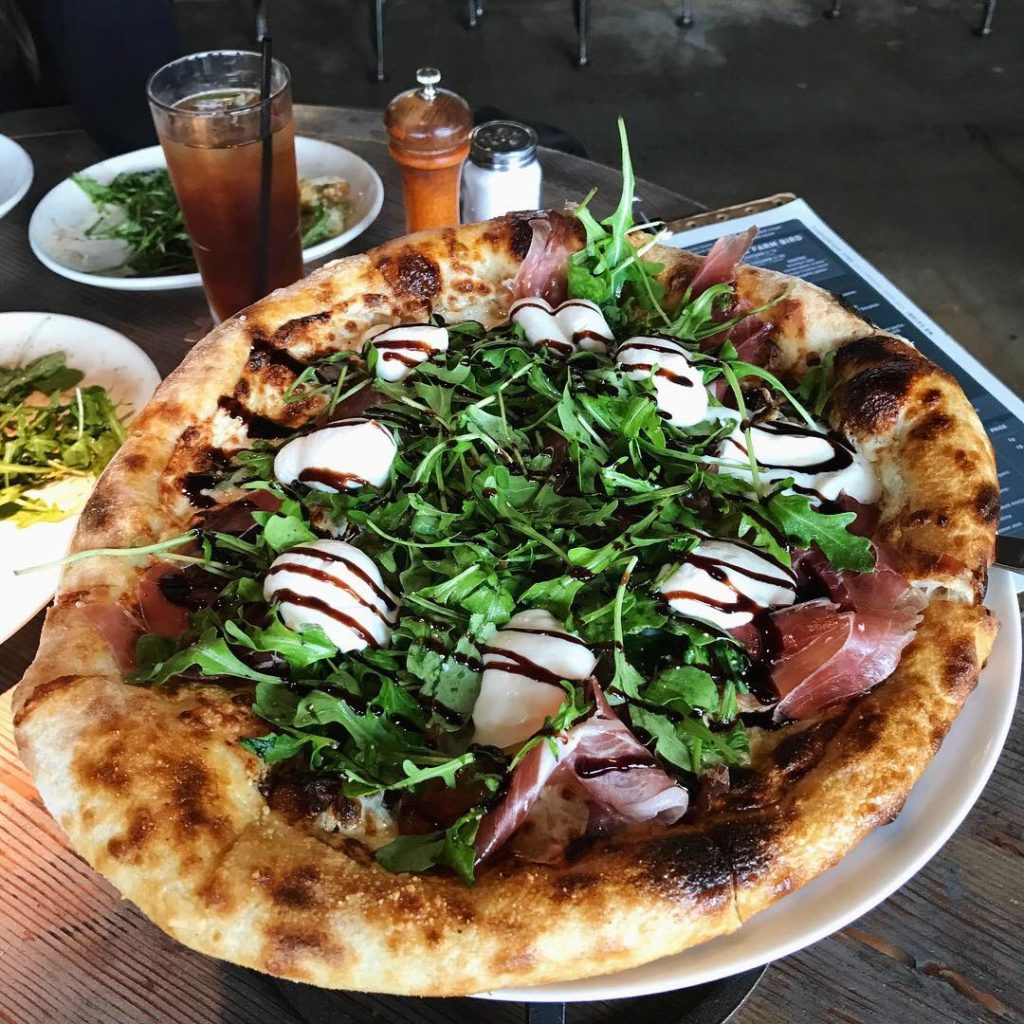
Prosciutto Pizza 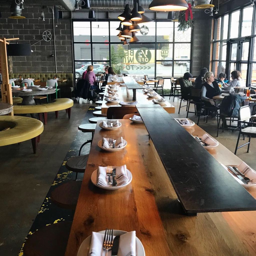
Interior Decor


Recent Comments