
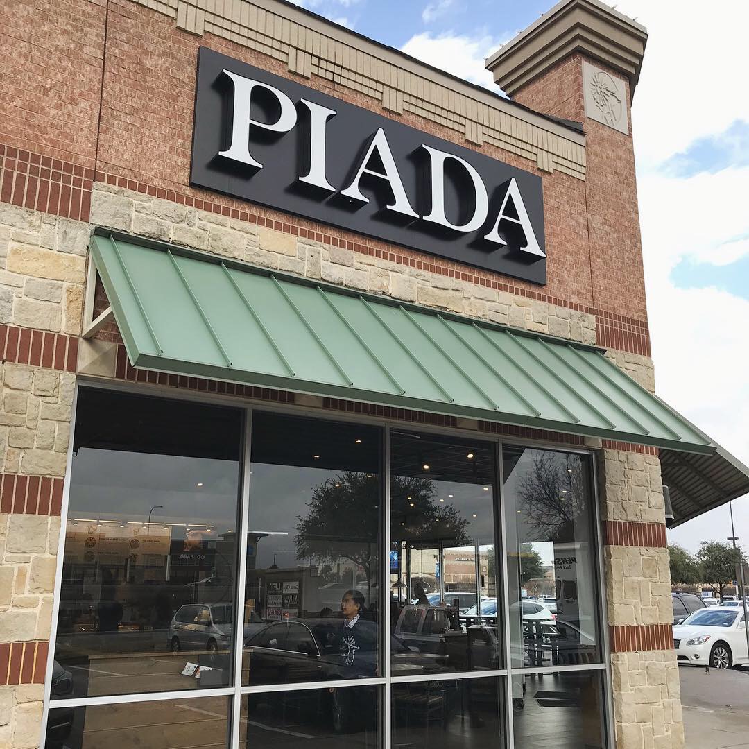
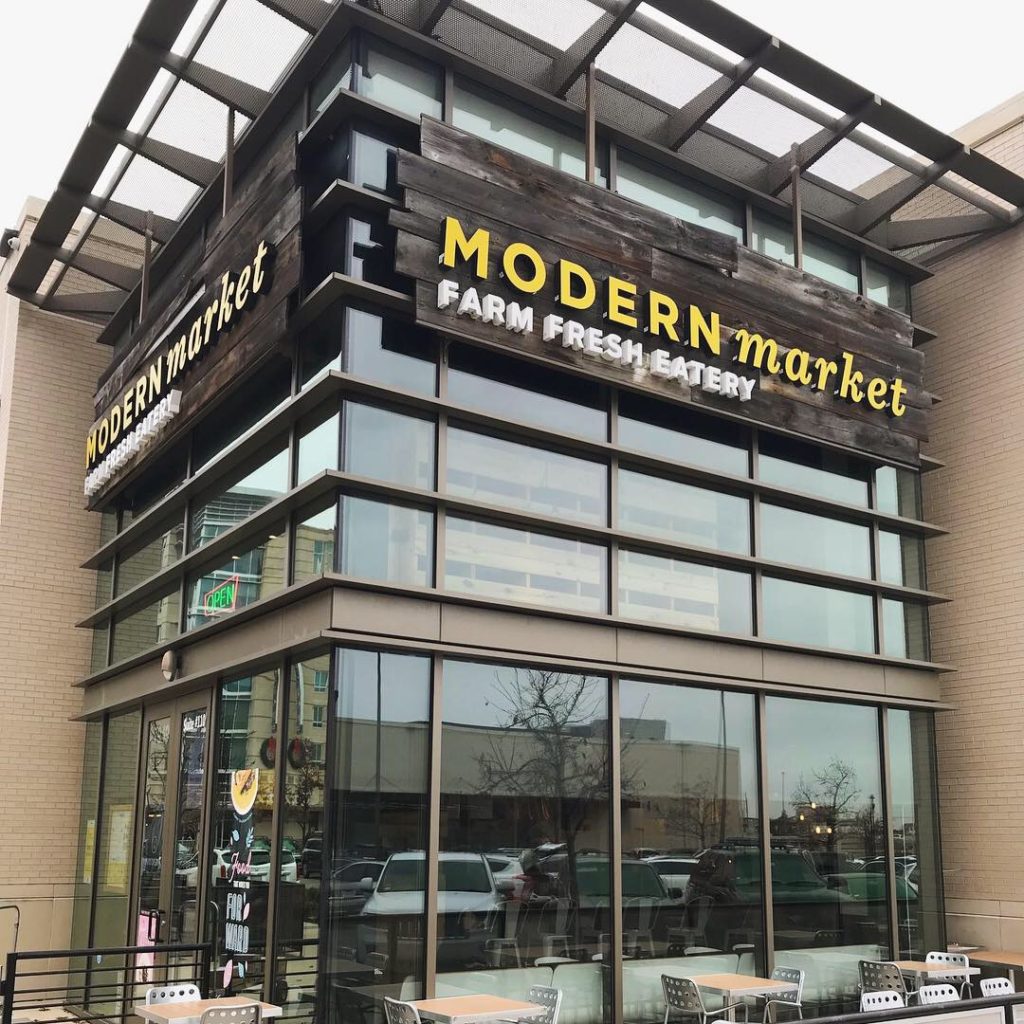
This week’s #FridayFeed restaurant branding review is Piada Italian Street Food at Parker and the Tollway. Piada has 41 locations concentrated in and around Ohio, Michigan, Minnesota and Dallas.
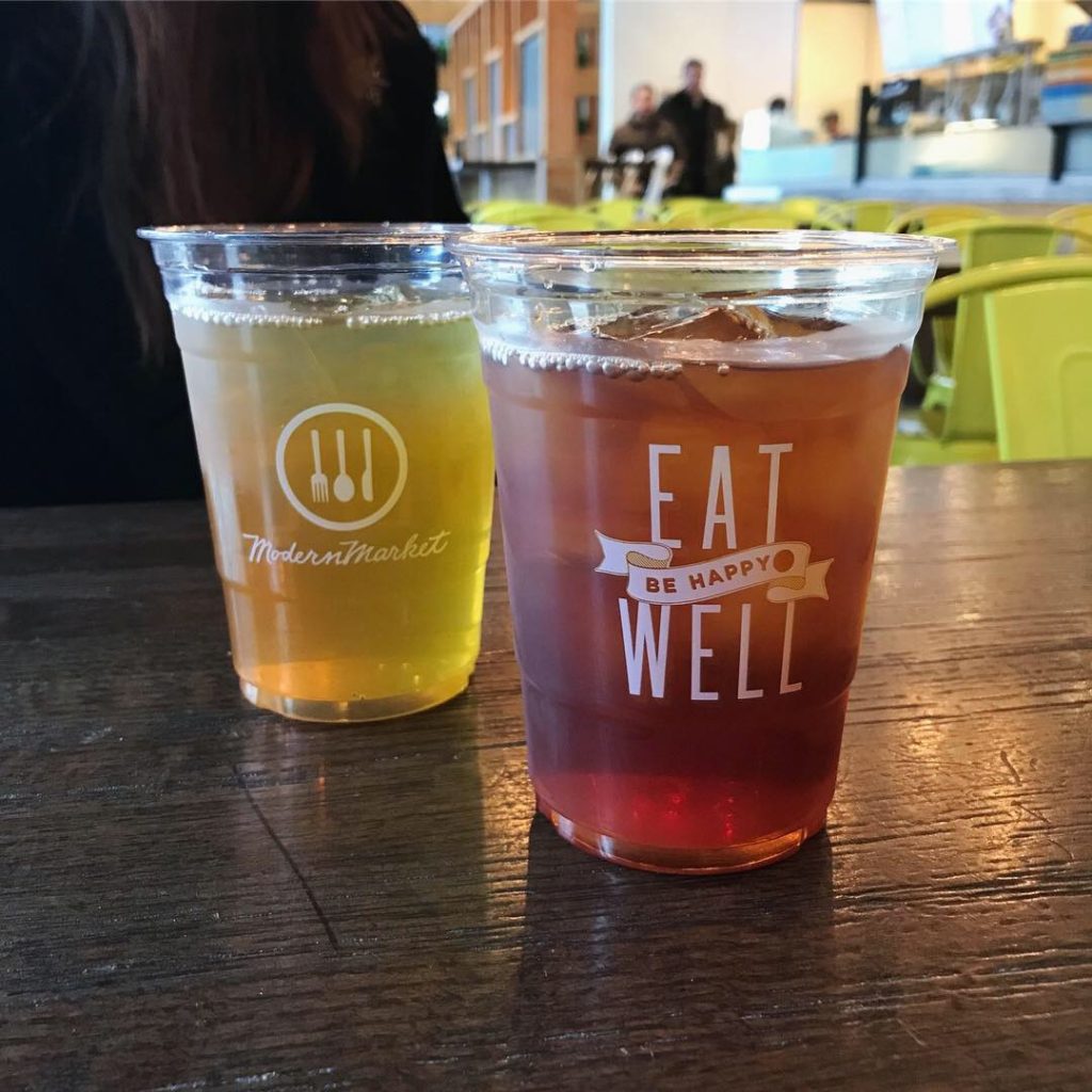
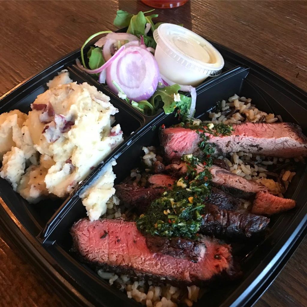
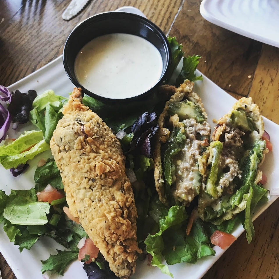
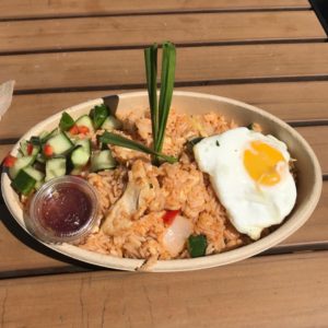
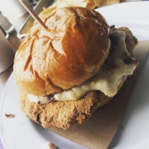
Danny and I spend a lot of time looking at fast casual concepts. Italian fast casual concepts are rare if you don’t include pizza. Piada follows the popular “food in a line” model so imagine Chipotle with Italian ingredients. Pasta instead of rice. Piada instead of flour tortilla. Diavolo sauce instead of salsa. Their point of difference is the Piada – a very thin tortilla-like wrap that they brush with olive oil, dust with spices and warm on a stone grill before filling it with good stuff. You can choose a Piada, a Pasta Bowl or a Salad plus delicious sides, which include lobster bisque, calamari, or their signature parmesan or pepperoni Piada sticks. We ordered a pasta bowl with Diavolo sauce, the Italian Trio Piada, a cup of lobster bisque and a parmesan stick. All delicious! The beverage choices are teas, Italian sodas and a blackberry hibiscus lemonade served from a very well designed beverage bar. The thing that makes this beverage bar so nice is the actual equipment they have chosen. Every single item from the beautiful Italian soda dispenser to the containers for the lids and straws were thoughtful decisions. They do a great job incorporating the function with design. This is a nice break from the giant soda machines everywhere else.
The packaging was nice and clean. They have about 5 different sizes of branded paper bowls – all white. Paper drink cups in the same clean white with minimal branding plus a large clear cup with a large simple line drawing of the scooter. Oh, and orange straws. They use brown kraft take out bags which is the only disconnect I could see. The orange is so nice, I would love it if the take out bags were white with that pop of color. We noticed that even the plasticware was branded – something we never see.
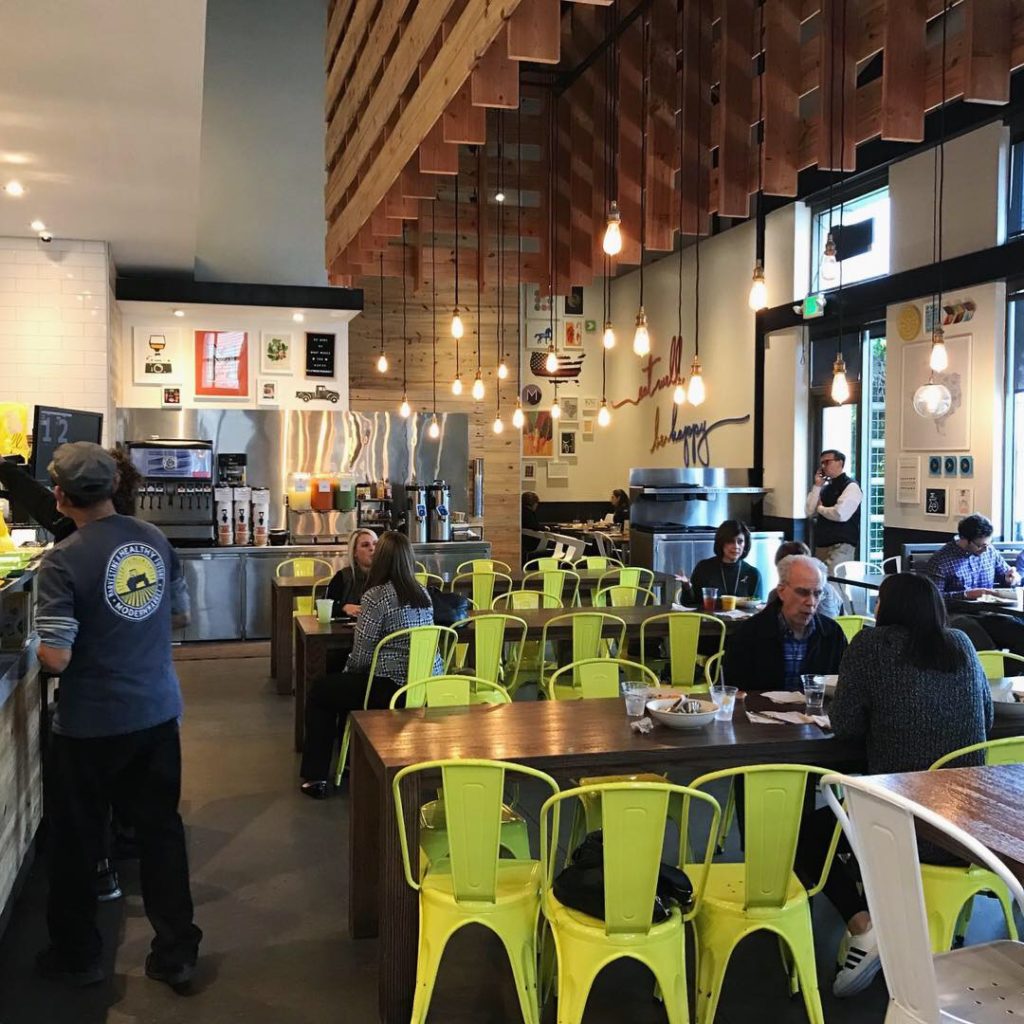
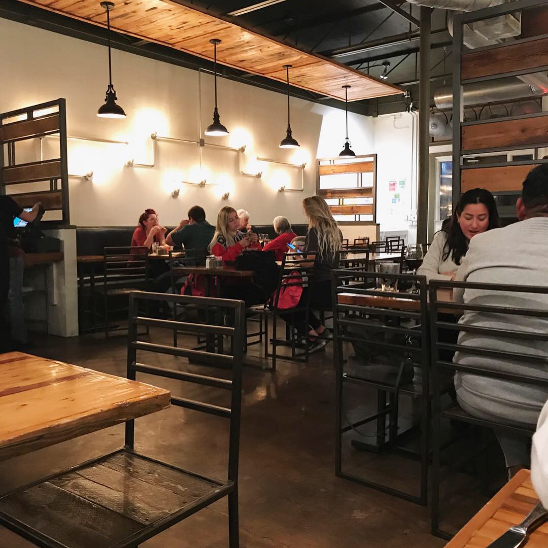
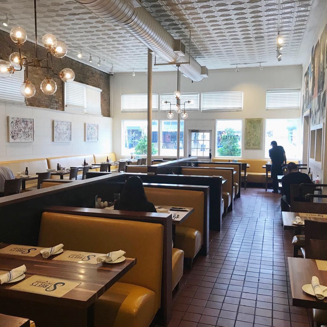
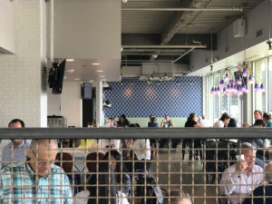
Speaking of color, while we were impressed with the thickness and quality of the pricey wood tabletops, there was nothing in the dining room to break it up. Unfortunately it resulted in monotony. Sadly, no upholstery or soft seating to be found. (If you’ve been following my reviews you know that I love brisket and upholstered booths.) Clearly there was a professional behind the branding. Credit goes to Big Red Rooster who also does work for YUM! brands and many others.
The website is nice and easy to navigate although I was annoyed with the screen-size ad for gift cards. Why don’t brands show photos of their interiors? How about a video of brushing that piada with olive oil on that stone grill? Moving on to the CONNECT tab, you can download their app, read the blog or check out their swag. I love swag. But, this is where it gets kind of weird. The photo is an annoyed blonde in a T-shirt that says “SOCIALLY FATIGUED” with some anti-social copy about grab n go. I keep clicking and find a another “Introverted Tee” that says “DON’T TALK TO ME.”
Completely contrary to this, the career/culture page talks about how passionate they are about the guest experience and hospitality. So, if you WORK here, you need to be really nice and hard working and love food. But if you EAT here, I guess it’s ok if you’re a social grump and want to just get your food from the grab n go shelf and run. Hmmm…
Danny’s social media commentary:
Piada’s social media has very clean and professional looking images with crafted copy and content that draws in a younger health-conscious demographic. However, their imagery falls a little heavy on the marketing side with multiple posts with things like gift cards and their odd way of promoting their new grab n go with socially awkward t-shirts. They should mix in more lifestyle posts and let some of the food in their shots look more natural and less staged.
I give Piada Italian Street Food an A for food and packaging, a B+ for the interior design and a “WHAT?” for introverted pride. Danny gives Piada an A for food and packaging, an A- for interior design and an B+ for their social media.
Every Friday, Studio B Dallas visits a local fast casual concept for lunch to critique the brand (and eat lunch). Three rules apply: it’s a concept we haven’t been to or it’s been in the restaurant news and it’s within 10 miles of our office. Wait, four rules – it can’t be sushi. Danny doesn’t do sushi. If you have any suggestions on where we should eat next, feel free to leave it in the comments. Look for our restaurant branding reviews each Friday! MJ & Danny

Piada Italian Street Food 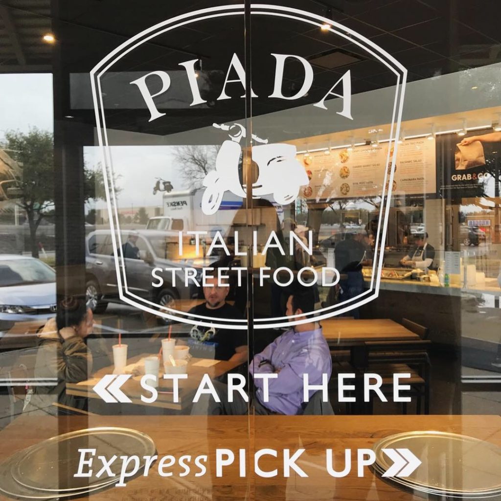
Piada Window Vinyl 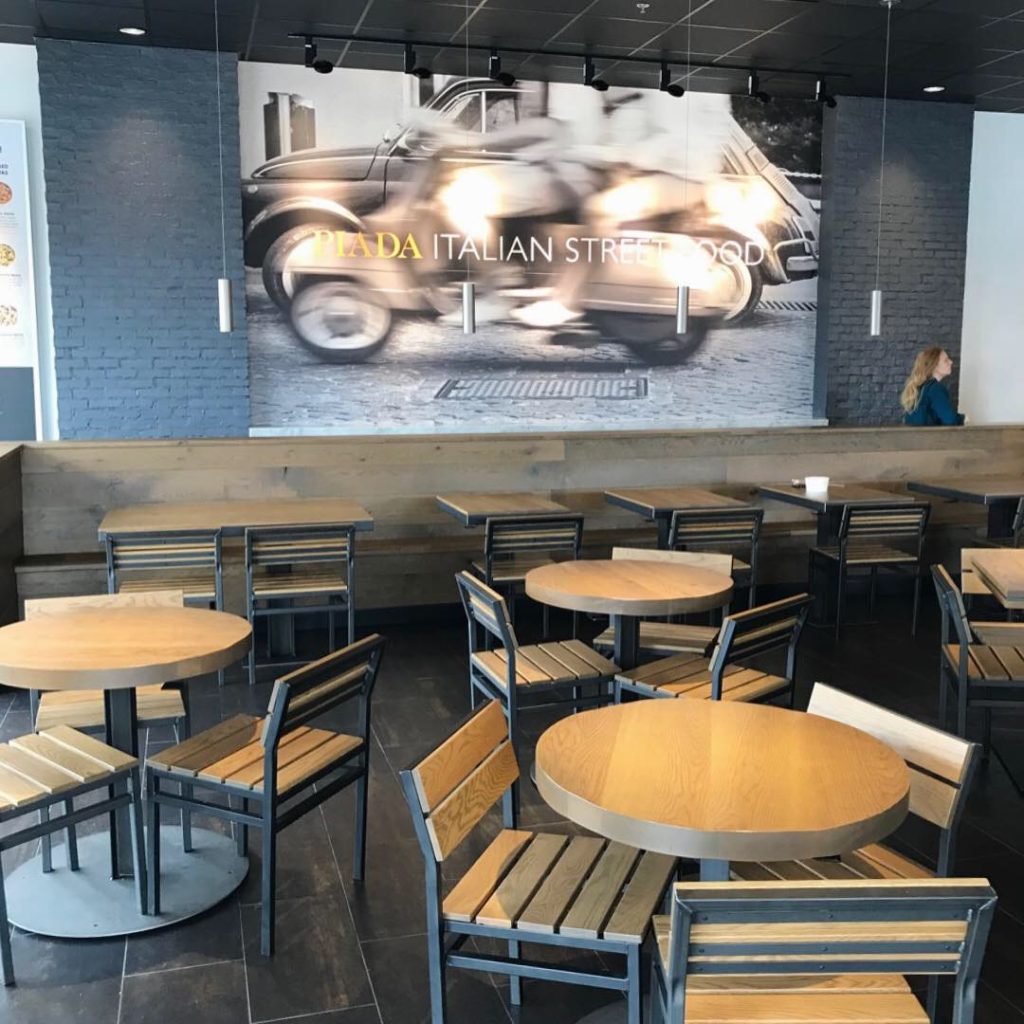
Interior Decor 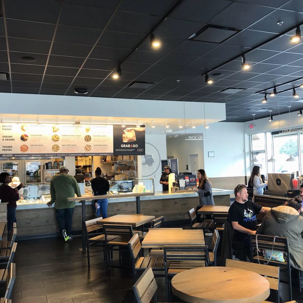
Interior Dining 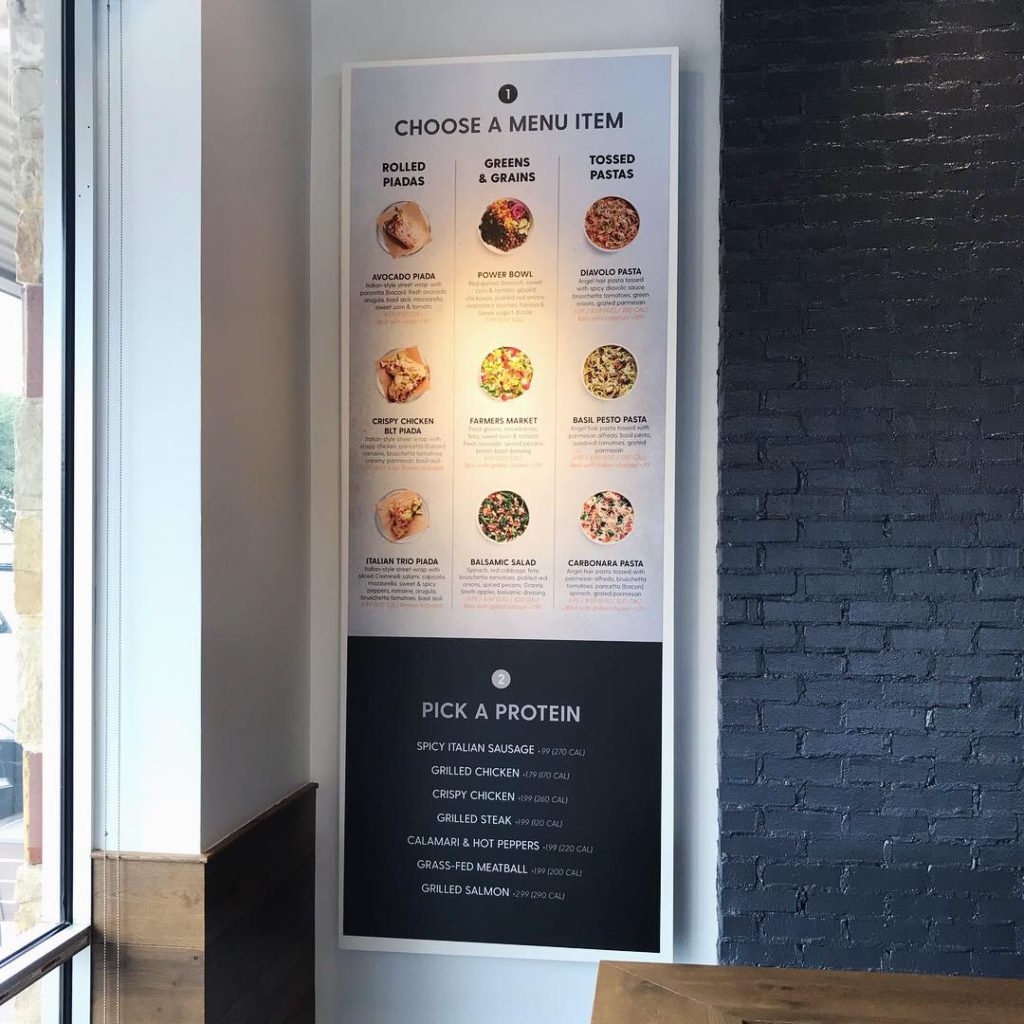
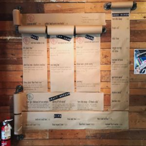
Menu Board 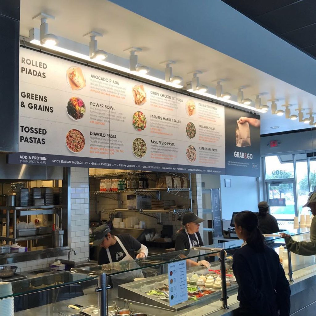
Ordering Counter 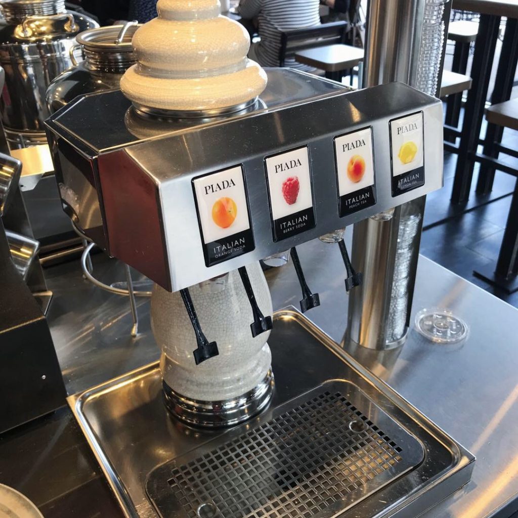
Italian Sodas 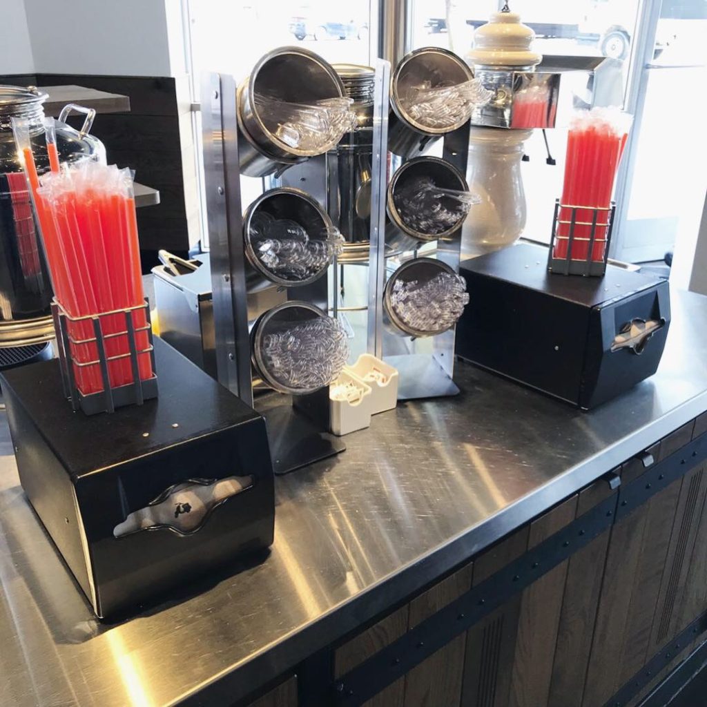
Branded Cutlery 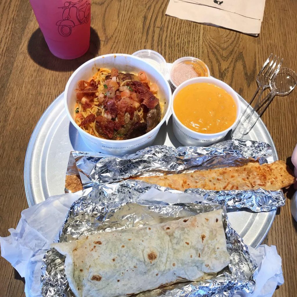
Amazing Italian Food


Recent Comments